Joanna Gaines shares my biggest design pet peeve – here's why your seemingly unimportant grout choices could be ruining your interiors
In her latest Mini Reni, the designer shares how the right grout can make or break your tile design


Design expertise in your inbox – from inspiring decorating ideas and beautiful celebrity homes to practical gardening advice and shopping round-ups.
You are now subscribed
Your newsletter sign-up was successful
Want to add more newsletters?
I've renovated two kitchens, three bathrooms, designed a Victorian entryway mosaic, and a fireplace in my time, so I am no stranger to sourcing the perfect tiles. And there's one very important (yet tiny) detail a lot of people are overlooking when it comes to tile ideas.
Whether you’re working with kitchen tiles or bathroom tiles, getting the grout right can elevate your space from fine to flawless. But don't just listen to me, take Joanna Gaines' word for it.
Posting on Instagram this week, the designer and TV star shared a behind-the-scenes tour of her latest Mini Reni series sunroom and bathroom makeover. Her biggest tip? Spend time on the little details, like grout color, to help tie everything together.
Article continues belowWhy you shouldn't forget your grout
A post shared by magnolia (@magnolia)
A photo posted by on
Grout is often one of those details that you leave the tiler to take care of for you, typically selecting a clean-looking white (that never actually stays looking clean) or perhaps a gray for a more modern look. But I hate to tell you – this decision is on you.
'I like to see grout in person, on site, with the actual tile,' says Joanna. 'If you've spent that much time on the colors and the actual material itself, why not spend just as much time to make sure that that grout color ties everything together?'
Seen making the final call on the grout to go with a green and white checkerboard tiled floor for her latest makeover, Joanna is presented with samples from white to beige to see which works best with the zellige tiles.

The video clearly demonstrates just how important it is to test and swatch your grout to avoid grouting mistakes. In Joanna's case, she finds the lighter shade too white and stark against the handmade nature of the chosen tiles, and selects a creamy beige tone that blends everything together.
Design expertise in your inbox – from inspiring decorating ideas and beautiful celebrity homes to practical gardening advice and shopping round-ups.
Think of grout almost like the outline of a drawing. It can enhance the lines and geometry of your tile, or blur them for a more tonal, textural effect. But it needs to be chosen with intent.
For example, in my home, I chose a rustic terracotta kitchen floor tile that has earthy, unique, handmade shapes and colors within each tile. I wanted to lean into those warm tones and pick a shade that almost melts into the tile, rather than defining each edge with a bold white or dark line.
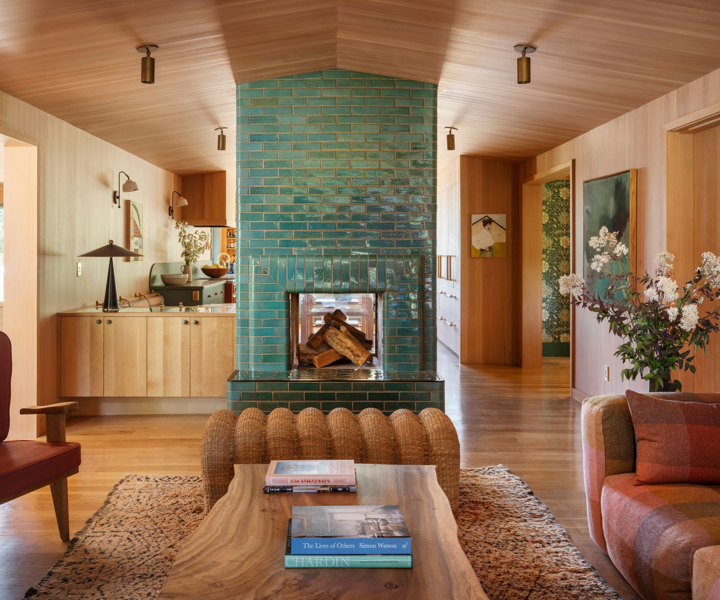
Similarly, in the retro river house kitchen by Jessica Helgerson, seen above, a teal fireplace tile has been used to make a design statement in the space. The chosen grout is an almost-perfect color match to the tiles, which gives a color drenched, unifying effect instead of creating contrast.

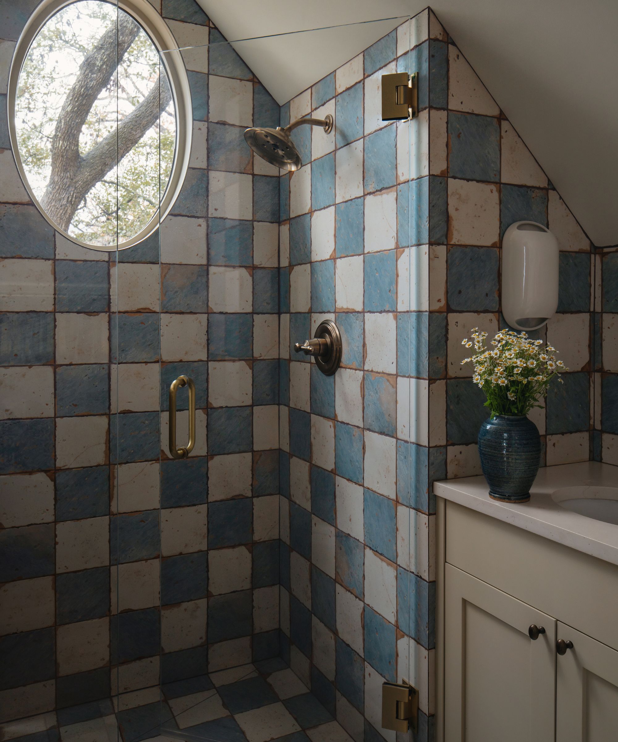
Alternatively, you can try some unexpected grout colors to make a statement. A popular choice is a dark gray or black grout with simple white subway tile, but you can make this work in a more traditional or rustic setting, as designer Shannon Eddings has achieved with this checkerboard shower above.
You can also go bold with your color combinations and try some vibrant pairings, such as white and ochre or a vibrant pink. It's also a great way to elevate budget tile or upcycle existing tile that's perhaps feeling a little tired or boring.
Sure, grout might not be the sexiest part of a renovation, but as I’ve learned – with thanks to Joanna Gaines – it’s one of the most important yet overlooked finishing touches. Taking the time to test different shades, see them in natural light, and truly consider how they interact with your tile or room scheme can make all the difference in how the final space feels.
It’s that extra 10% of effort that brings everything together.

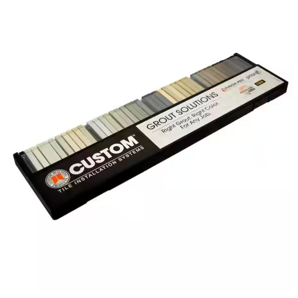
Much like paint brands, you can pick up sample kits or charts at DIY stores for you to take home and test. This kit has 40 colors of grout to choose from; each little color stick is roughly the diameter of your grout line, so you can play around with the tiles to get a good understanding of how the colors work together.
Trust me, I know this feels like one more thing to add to your never-ending list of design decisions, but I promise this isn't a small detail you can just leave to the contractors. I've been hurried into a grout choice or pushed into picking trade white by builders in the past, and have always regretted it afterward.
For me, grout is a make-or-break situation. So I treat it with the same care and attention I give to choosing paint colors, materials, or layouts. As Joanna says, why spend all that time finding the perfect tiles, just to ruin them with a dirty-looking grout color or a harsh, dark line? Let this be your sign to get yourself a color chart before you even think about how to grout tiles.

Charlotte is the style and trends editor at Homes and Gardens and has been with the team since Christmas 2023. Following a 5 year career in Fashion, she has worked at many women's glossy magazines including Grazia, Stylist, and Hello!, and as Interiors Editor for British heritage department store Liberty. Her role at H&G fuses her love of style with her passion for interior design, and she is currently undergoing her second home renovation - you can follow her journey over on @olbyhome