This Sherwin-Williams palette has been created for vintage decorating styles – 6 paint colors to add cozy charm to your space
Looking for the perfect paint colors to complement your vintage decor? Look no further than Sherwin-Williams' Eclectic Vintage palette


Design expertise in your inbox – from inspiring decorating ideas and beautiful celebrity homes to practical gardening advice and shopping round-ups.
You are now subscribed
Your newsletter sign-up was successful
Want to add more newsletters?
When incorporating treasured vintage pieces into your home, it's important that the rest of a room's decor only adds to its charm, and your color schemes are a key player within this.
It can often be tricky to know where to begin when choosing paint colors that don't lean too modern and work to complement vintage styles, but luckily, Sherwin-Williams has just the solution.
Recently revealing its Eclectic Vintage color palette, these paint shades go hand in hand with decorating with vintage, filled with warmth and a slightly muted quality inspired by the '70s. If you're looking for colors to tie together your retro home decor ideas, read on, where we get the lowdown on this characterful palette.
Article continues belowA post shared by Sherwin-Williams (@sherwinwilliams)
A photo posted by on
'Nostalgic patterning is paired with 70s color for this Eclectic Vintage palette,' says Emily Kantz, Color Marketing Manager at Sherwin-Williams. 'Throwback features of design periods of the past are a source of inspiration behind this small collection of colors.'
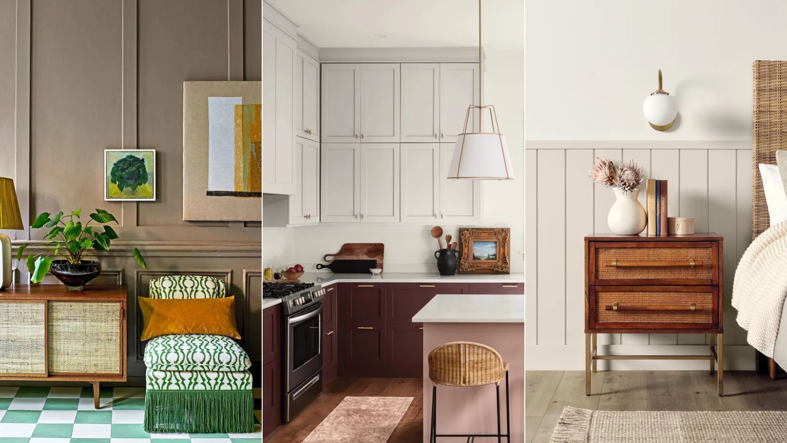
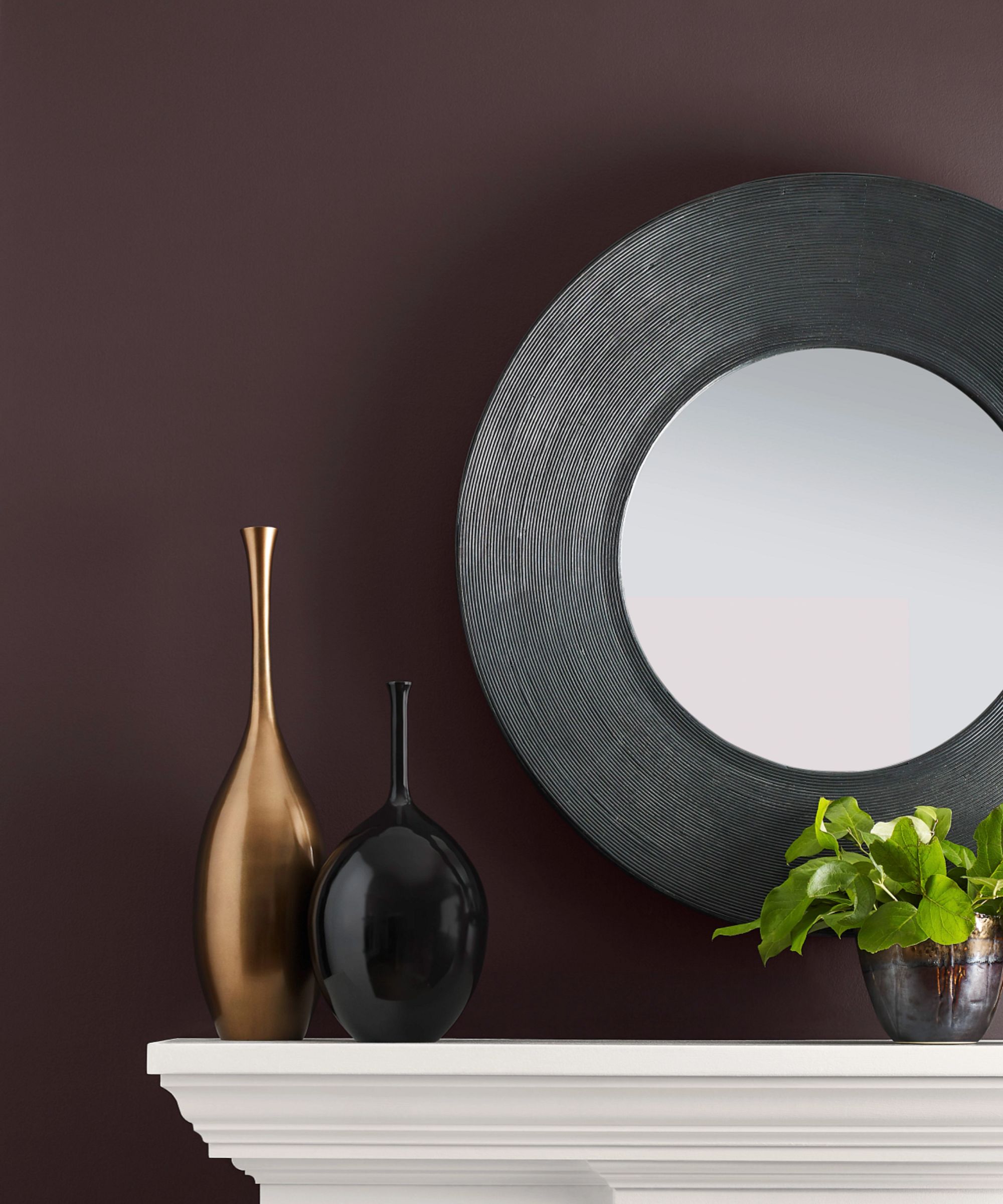
The Eclectic Vintage palette features six paint colors, from light to dark and warm to cool. Raisin SW 7630 is the darkest amongst them, a rich and warming deep brown; followed by Dark Auburn SW 6034, a warm dark red. Brandywine SW 7710, is an autumnal shade of orange, and Quixotic Plum SW 6265 is a dark, gray-toned purple. The lighter shades within the palette include Wickerwork SW 0010, a warm beige, and lastly, First Star SW 7646, a cool-toned white paint.
'These deeper tones are perfect for fall and winter months because they exude a warm and cozy vibe due to being on the warmer side of the color spectrum,' adds Emily.
How to decorate with the Eclectic Vintage palette

Raisin SW 7630
Bridging the gap between decorating with neutrals and bolder hues, the paint colors within the Eclectic Vintage palette bring depth and dimension to rooms, without overpowering. The slightly muted, earthy quality of the colors complements vintage decor, crucially avoiding feeling too 'new' or saturated.
Design expertise in your inbox – from inspiring decorating ideas and beautiful celebrity homes to practical gardening advice and shopping round-ups.
'Vintage styles of the 1970s are having a moment, and Brandywine is leading the charge in this refreshed styling of this iconic design period,' says Emily.
When it comes to incorporating these paint colors into your own home, you can do so in an all-out or reserved way. For a bolder approach, the colors can be used as color combinations for rooms, whereas keeping things pared back by using one shade as a backdrop color will allow your vintage decor to shine.
'This palette can be paired with the layered looks of maximalism,' adds Emily. 'The deeper shades or bright off-white First Star create a backdrop that can enhance this mix and match of design styles into one cohesive look.'
You can use all of these paint colors throughout the home, and since they have a timeless feel to them, you don't need to worry too much about the colors quickly feeling outdated. However, Emily shares below some of her favorite rooms in the home to decorate with the palette.
'Raisin would look stunning in a bedroom, creating this cozy retreat that will make you never want to leave your bed,' says Emily. 'In a family room, look to pair Wickerwork with Dark Auburn to accent an architectural feature of the home such as a built-in bookcase or a fireplace to add a rich color within a space.'
In addition to the main rooms of a home, consider decorating with these paint colors in small rooms for a playful pop of color. 'Add an autumnal shade of Brandywine to a space that is often overlooked such as a laundry room or a mudroom,' suggests Emily. 'Quixotic Plum can be a beautiful backdrop to a home office and First Star is a cooler toned off-white that can be the color that bridges the other colors all together throughout the home.'
This color palette is timeless and cozy, perfect for your fall color schemes. Whether you use these colors boldly or more sparingly, each of these paint colors will add depth to your home while making the most of all your vintage finds.

Emily is a freelance interior design writer based in Scotland. Prior to going freelance in the spring of 2025, Emily was Homes & Gardens’ Paint & Color Editor, covering all things color across interiors and home decor for the Homes & Gardens website. Having gained specific expertise in this area, Emily is well-versed in writing about the latest color trends and is passionate about helping homeowners understand the importance of color psychology in home design. Her own interior design style reflects the simplicity of mid-century design and she loves sourcing vintage furniture finds for her tenement flat.