The Brownstone Boys just revamped their Brooklyn home with Farrow & Ball paint colors – here's the exact shades used throughout
Color drenching ties together these bold color schemes, and the result is timeless yet playful

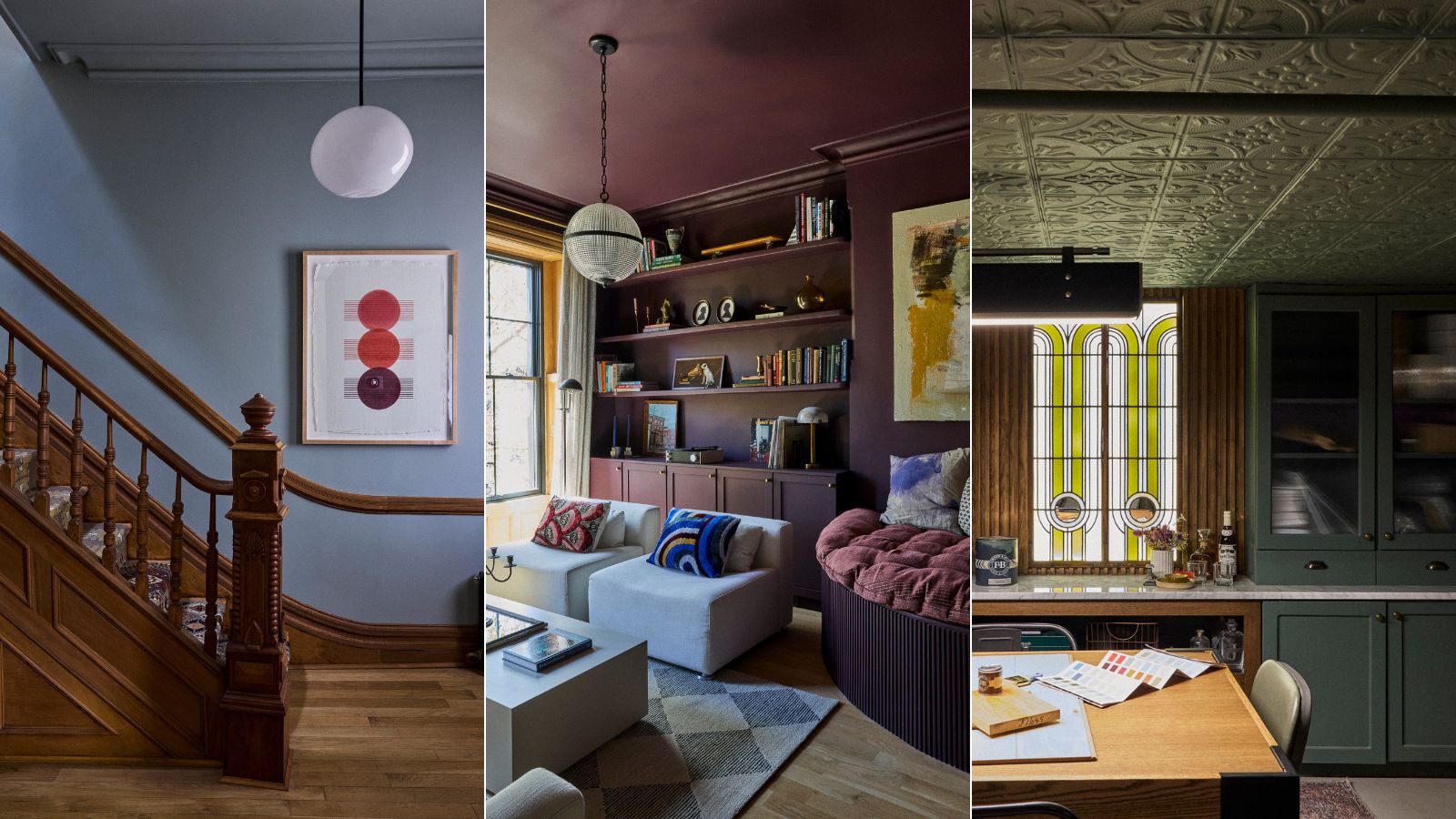
We can always rely on the timeless design style of The Brownstone Boys, and their recent Brooklyn home refresh is no different, serving up plenty of fresh room color inspiration.
The NYC-based interior design duo who place much of their focus on restoring historic homes, otherwise known as Barry Bordelon and Jordan Slocum, turned to the paint expertise of Farrow & Ball color consultants to reimagine three rooms within their Brooklyn Brownstone home with brand new color schemes.
The new room colors throughout their beloved Brooklyn home are as dreamy as you'd imagine, maintaining a timeless look without failing to feel exciting and slightly playful. Read on to uncover the new paint colors used in each room – from the moody home office to the light and calming entryway.
Article continues belowA post shared by Farrow & Ball (@farrowandball)
A photo posted by on
‘We decided to redecorate because we renovated our house about seven years ago', Barry explains in the Farrow & Ball YouTube video. 'By now, we’re ready to refresh some spaces; we’re ready to change things up and we really wanted the space to reflect who we are today.’
‘Our house was built in 1890, so it’s about 130 years old. One of the things that we were super passionate about is restoring it as much as we could back to its original beauty.'
Light Blue, Entryway
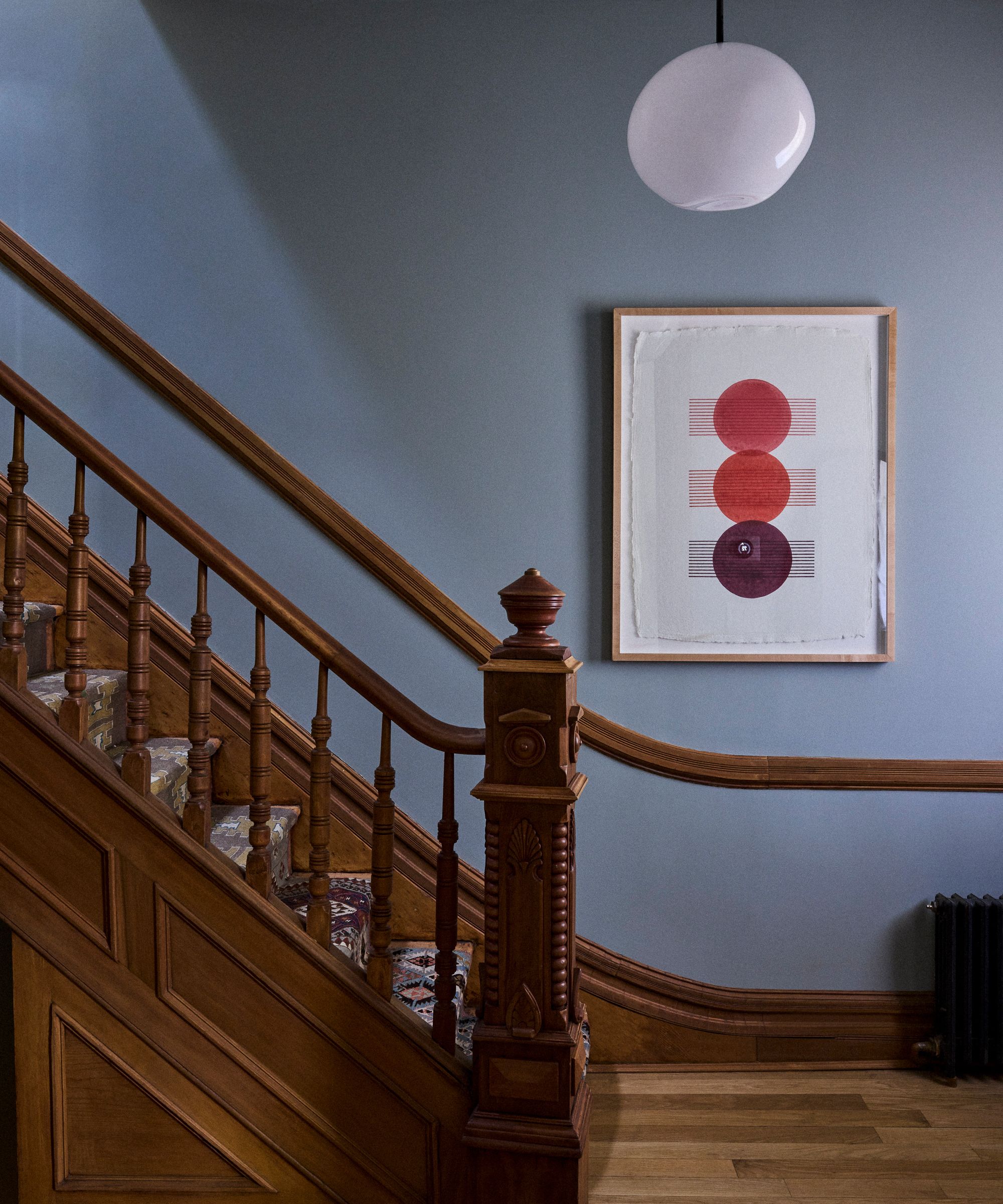
For the home's entryway, Farrow & Ball's Light Blue was used across the walls and the ceiling to refresh the space, continuing upstairs to the upper hallway. Described by Farrow & Ball as a 'light silvery blue' this pared-back paint color is a failsafe way to incorporate the calming quality of decorating with blue without going too saturated.
But it was the color's ability to enhance the home's prominent original features, such as the woodwork, that stood out to the designers. 'It has subtle hints of green, it has undertones of blue, and I just thought it would complement the original woodwork,' Jordan explains in the YouTube video. 'I think the two of those combined together just really complement and now accentuate some of the original details in the home.'
Design expertise in your inbox – from inspiring decorating ideas and beautiful celebrity homes to practical gardening advice and shopping round-ups.
Beyond the aesthetic appeal of this calming blue-green hue, the chosen Dead Flat finish boasts durability for this typically heavily trafficked area of the home, with its wipeable finish. 'We really wanted to make sure that this is not only a beautiful area but also a really durable space,' adds Barry.
Brinjal, Home Office
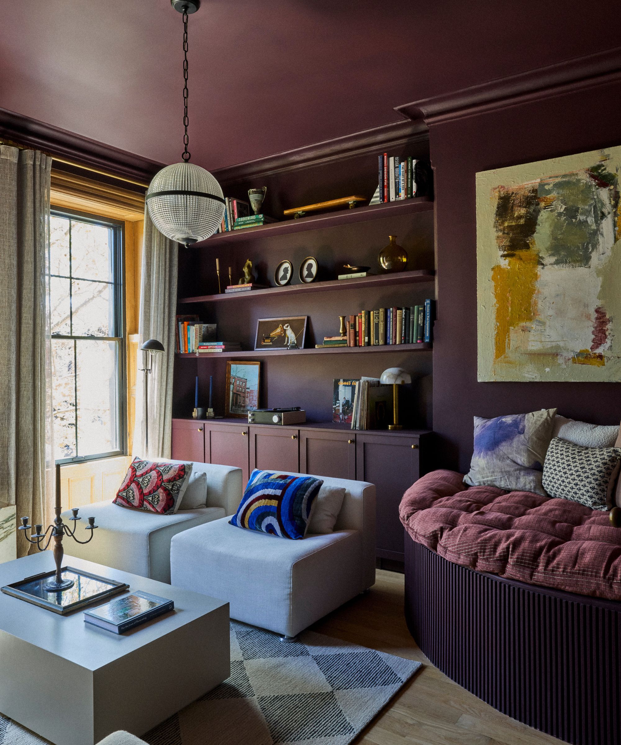
Venturing into the realm of dark and moody paint colors, Farrow & Ball's Brinjal in Dead Flat was used to color drench the home office, used across the walls and woodwork in addition to the ceiling.
'It was important for us to have a space where we can relax but also be very productive, and we wanted the tones of this room to inspire us,' says Jordan. A dark and warm aubergine color, Brinjal is a great way to embrace moody colors while maintaining warmth to ensure spaces feel cozy, and that's especially apparent in this space.
The key to the dramatic look of the room is the consistency of the color, achieved through the use of the same finish across all surfaces. ‘It’s so nice to actually be able to paint it on multiple types of surfaces and it also gives us a very consistent look which is what we’re going for when we color drench a room,' Barry adds of the chosen paint finish.
Green Smoke, Basement
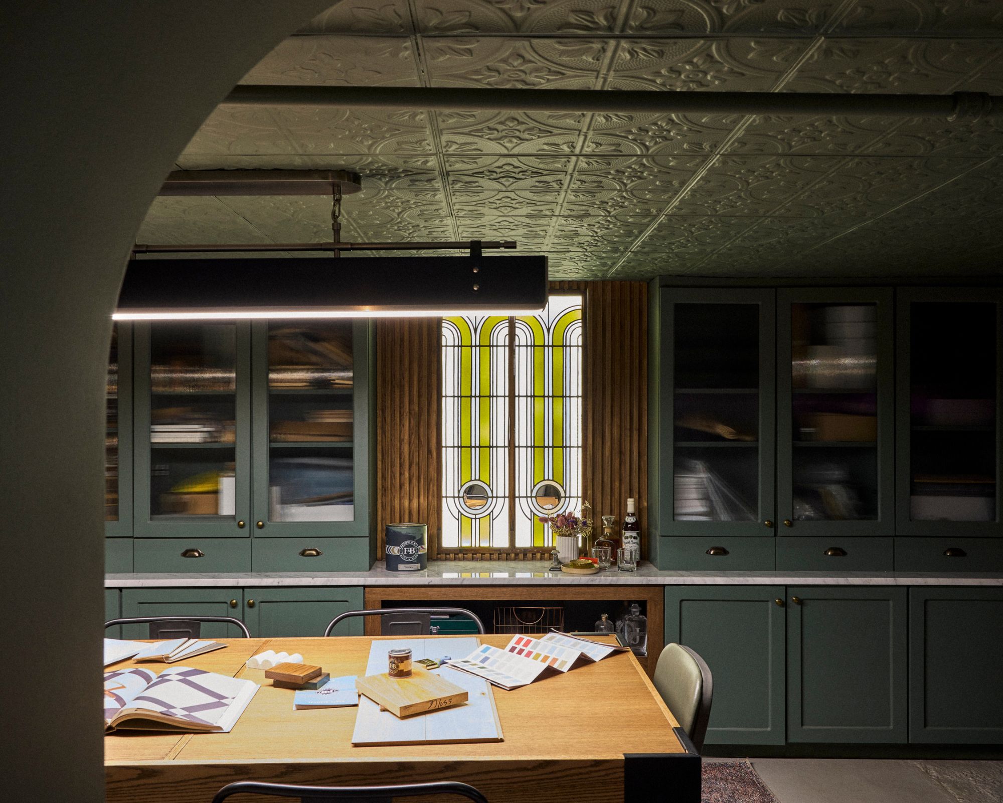
When it came to refreshing the home's basement speakeasy, the couple decided to embrace a moody look with Farrow & Ball's Green Smoke, also in Dead Flat. Again, the paint color was used for color drenching across the walls, ceiling, and cupboards, to create a cozy and cocooning feel with added impact.
As its name suggests, this paint color has a smoky quality, while its green-blue hues give it an instantly calming feel.
But beyond low-light rooms like these, which will always benefit from dark and moody paint colors, there are plenty of other ways to decorate with Green Smoke. Known to be a very versatile shade, this color works wonderfully in so many rooms, from living rooms to kitchens.
From moody paint colors to the light blue entryway, there's so much color inspiration to take from The Brownstone Boys' home refresh. Beyond the specific shades used, this approach to decorating with paint reinforces how effective color drenching is, and we predict this paint trend is here to stay for 2025.

Emily is a freelance interior design writer based in Scotland. Prior to going freelance in the spring of 2025, Emily was Homes & Gardens’ Paint & Color Editor, covering all things color across interiors and home decor for the Homes & Gardens website. Having gained specific expertise in this area, Emily is well-versed in writing about the latest color trends and is passionate about helping homeowners understand the importance of color psychology in home design. Her own interior design style reflects the simplicity of mid-century design and she loves sourcing vintage furniture finds for her tenement flat.
