6 color scheming mistakes – and how to avoid them, according to design experts
Top interior designers advise on what to avoid when color scheming – and how to get it right first time

Design expertise in your inbox – from inspiring decorating ideas and beautiful celebrity homes to practical gardening advice and shopping round-ups.
You are now subscribed
Your newsletter sign-up was successful
Want to add more newsletters?
Color scheming mistakes are easy to make if you are creating a new room scheme from scratch. After all, the fine balance of combining different colors with different patterns, all in different scales is easy to tip in the wrong direction.
And even if you’re looking to add color in a minimalist way, introducing it in a beautiful rug or a few cushions on a sofa, can be a minefield.
We spoke to five fabulous interior designers to get their top tips on how to achieve a perfect color scheme – and to highlight the mistakes to avoid.
Article continues belowSee: Living room color schemes – the best color ideas for living spaces
1. Not sticking to a cohesive color palette
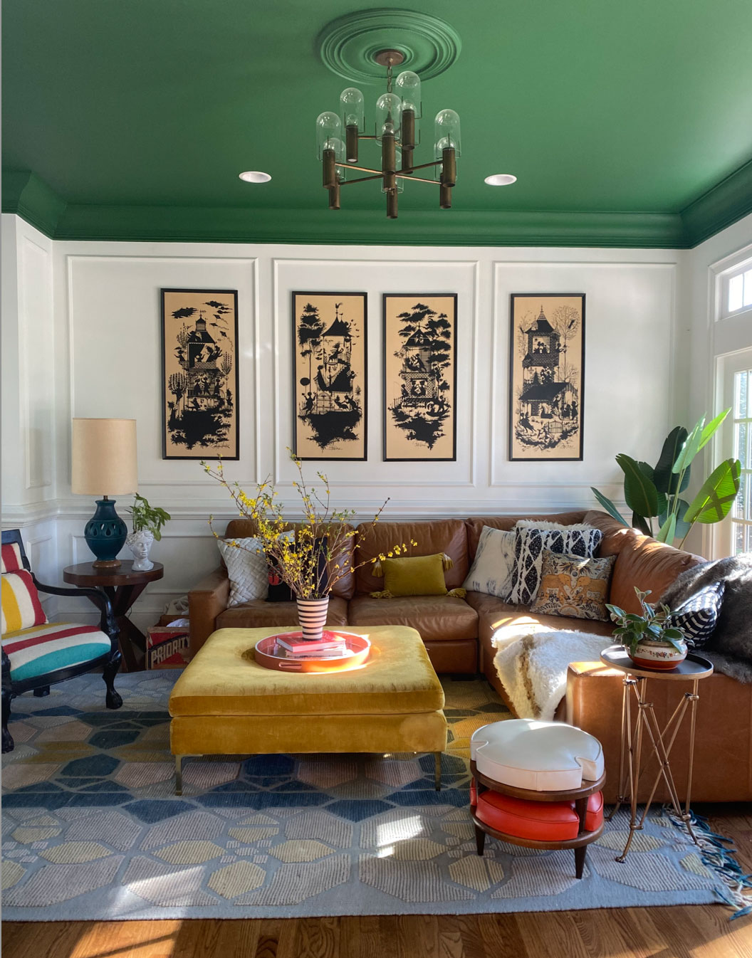
Natalie Papier is an artist, designer and influencer and owns Home Ec., a vintage and eclectic interior design company based in Chicago. Natalie's Instagram feed showcases her colorful home, which is the epitome of stylish buys, prints, textures and bold colors – which makes her a perfect expert to ask for advice.
Natalie believes that homes should be a reflection of the people who live in them, full of life and character, and says this can be achieved by embracing colorful patterns as well as other design aspects.
‘With pattern mixing it's important to keep scale in consideration for visual balance. I like to ground the space with solid elements and then layer in pattern mixing by balancing the scales of patterns so they don't compete with each other.
Design expertise in your inbox – from inspiring decorating ideas and beautiful celebrity homes to practical gardening advice and shopping round-ups.
Another way to successfully incorporate pattern mixing is by sticking with a cohesive color palette throughout.’
See: The Color Wheel – H&G's complete guide on how to mix colors
2. Not being bold enough with color

'An easy way to introduce color to any room is to go bold with your walls,' advises Emma Deterding, Founder and Creative Director of Kelling Designs and KDLoves. 'Whether you opt for a beautiful, bright paint color, or choose a wallpaper in a vivid tone, you can really transform a room quickly and easily.
'The key is to choose a color that you love and introduce it to all the walls as opposed to just an accent wall. Choose a shade that complements your existing furniture and accessories for a cohesive look, or if you're feeling brave, then go all out and use colors that clash to release your inner maximalist.'
See: Accent color ideas – how to use them and why they are important
3. Not introducing layering and pattern

London-based Gunter & Co is an international interior architecture and design studio founded by Irene Gunter in 2014. The team work on every style of home from London townhouses to New York brownstones, luxury villas to Cotswolds country estates.
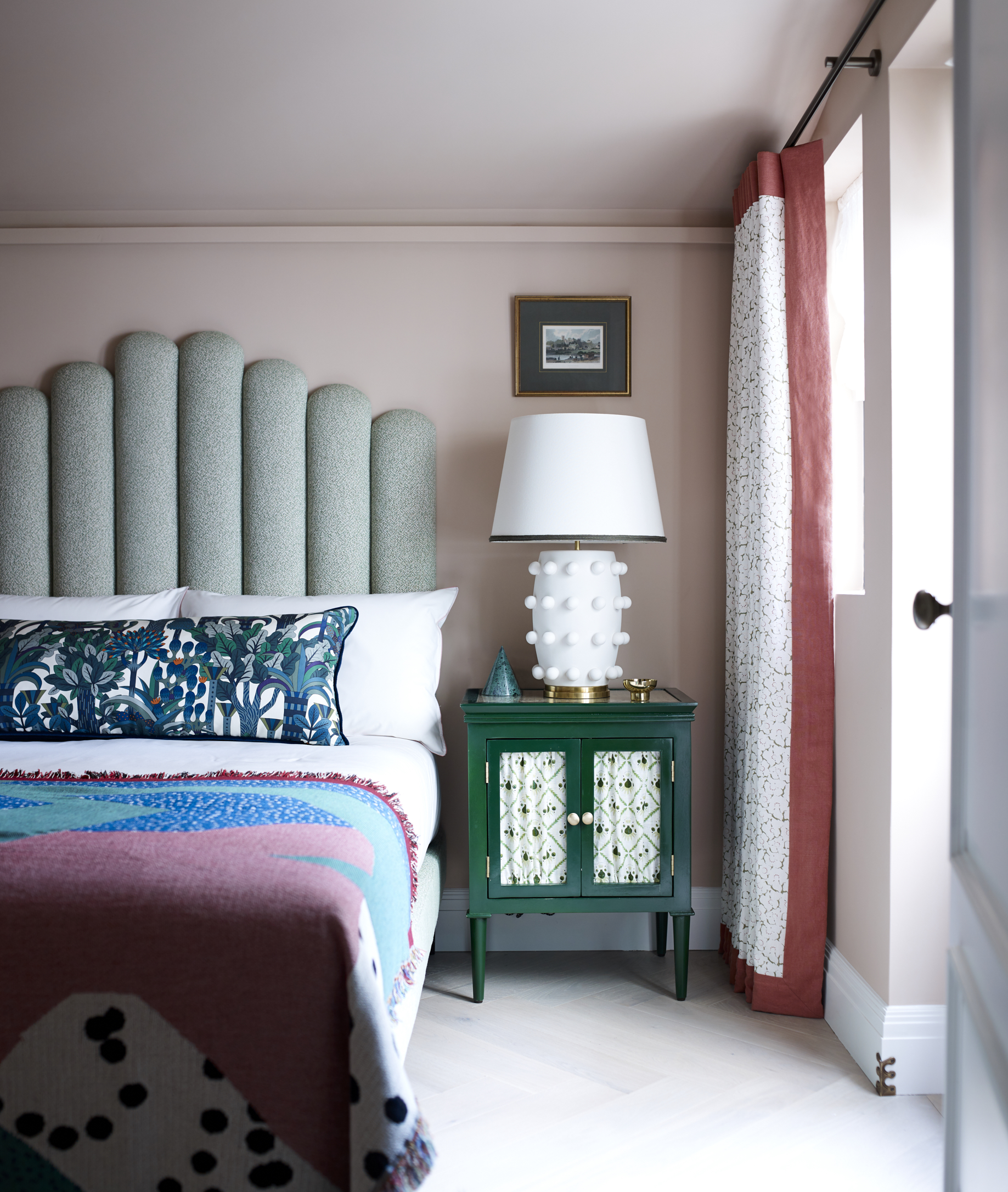
Irene Gunter says, ‘One of the best philosophies is that when you walk into a bedroom it should be easy on the eye and compatible in terms of the color scheme. But in order for it to feel cozy and rich – to give you a hug – it needs texture and layers.
'With lots of different details, the eye can focus on each element at different times, absorbing texture creates the luxurious cozy feeling. The best way to do this is by introducing different fabrics and prints. At the super luxury end you can have a decorative fabric-covered wall or layer the window treatments (sheer blind, black-out blind plus curtains).
'A more accessible way of creating the textured layers is with rugs and cushions. Fabrics from a natural source make the space more comfortable, both to the eye and touch, and it’s for this reason that we’re always drawn towards wool and linen – both of which come with patterns.’
4. Not choosing accent colors that blend
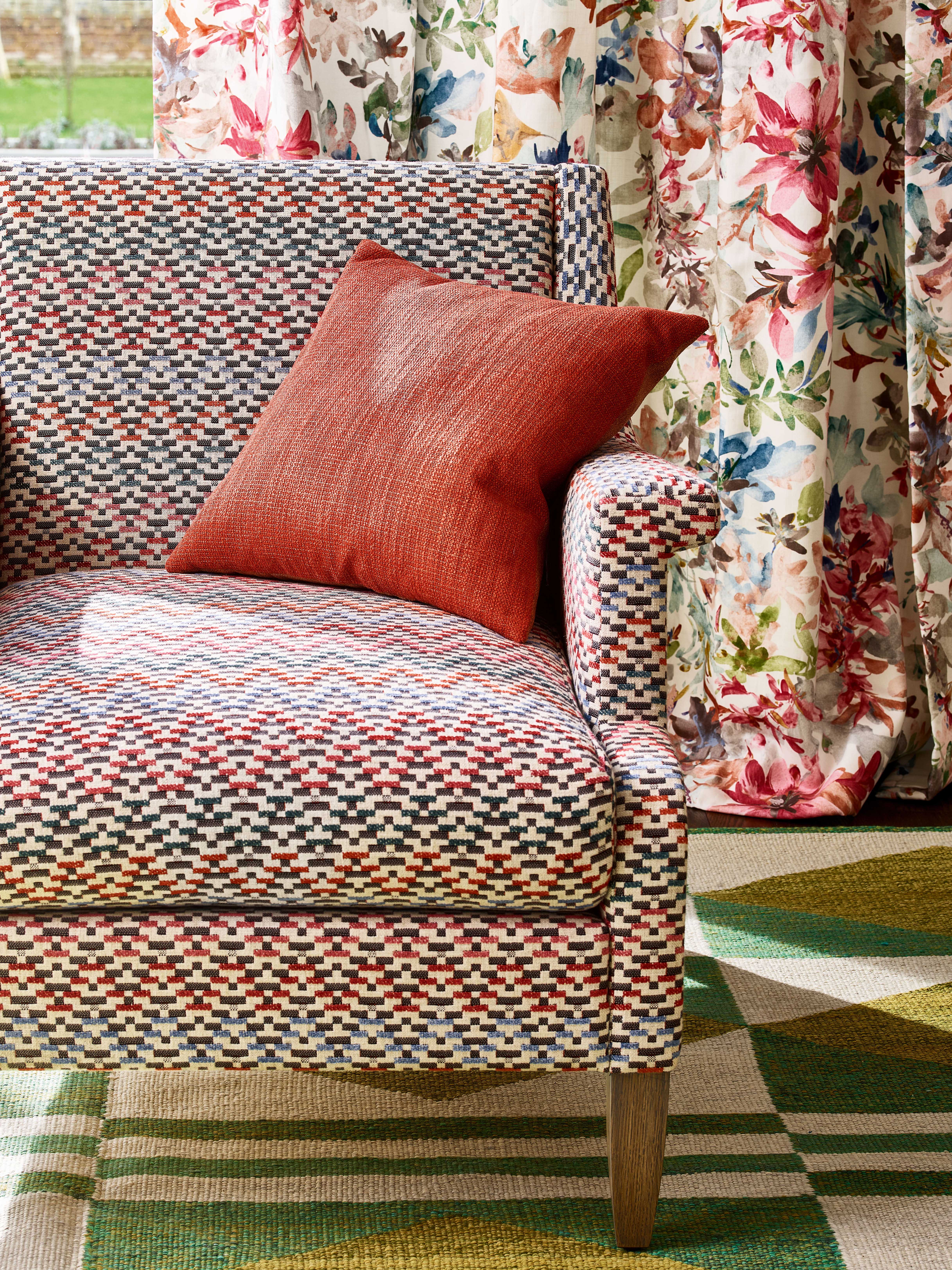
British brand and household name Jane Churchill was founded back in 1982 and was acquired in 1989 by renowned fabric studio, Colefax & Fowler, which itself was founded back in the 1930s by Sybil Colefax, later joined by the rising star of interior decorating, John Fowler. Today, Jane Churchill continues to be at the forefront of textile design and produces eye-catching prints for those who love vibrant color and pattern. The new range of fabrics and wallpapers is all about teaming vibrant prints with delicate embroideries and striking weaves.
Sarah MacGregor, Design Director at Jane Churchill shares the design combinations of the range and how to mix them.
‘The new collection combines graphic shapes with bold decorative textiles emphasizing color and pattern. Designs include vibrant prints, delicate embroideries and a striking range of handcrafted weaves. A stunning range of handcrafted, kilim-style designs provides a graphic contrast, while complementing the florals beautifully. The key component? The colors blend together whatever their pattern and that is what makes them work so well – even if it’s a graphic print sofa placed in front of a floral curtain.’
5. Not having a clear starting point for your scheme
A post shared by Matthew Williamson (@matthewwilliamson)
A photo posted by on
Matthew Williamson is a fashion designer, interior designer and creative director, who Matthew Williamson has graced us with fabulous color sense and designs for over two decades.
‘Color and pattern can be such vital elements in both our lives and our homes,' he says. 'They can speak to us at aesthetic and emotional levels, elevating our homes, infiltrating through the walls, the furnishings, and the floor. Where mixing-and-matching pattern is concerned, there is a danger of things looking old-fashioned. Sometimes, print combinations fail to complement each other, which can be hugely disappointing.
'However, I really don't believe there is one secret rule to getting pattern mixing "right". Looking at interior design like it's some form of code to unlock may not be the right approach. It's about finding a pattern you love for the colors, the scale and the repeat, and working out what works well with it. It doesn't have to be an arduous process.
'Everyone can reel off their favourite food, travel destination or book, so why not shop around to find your favourite kind of pattern? It should feel pretty instinctive. Ikat prints, stars and peacock feathers are my longstanding favorites, and still find their way into my schemes and product designs.’
Follow Matthew on Instagram to see his approach for mixing colors and patterns. His newest venture features a collaboration with Obeetee – a joyful and colorful collection of hand-tufted rugs inspired by the natural world and sun-steeped landscapes, and a great way to start adding print to a space.
See: How to choose a kitchen color scheme – even the smallest addition can make a difference
6. Not adding plain accessories in accent colors
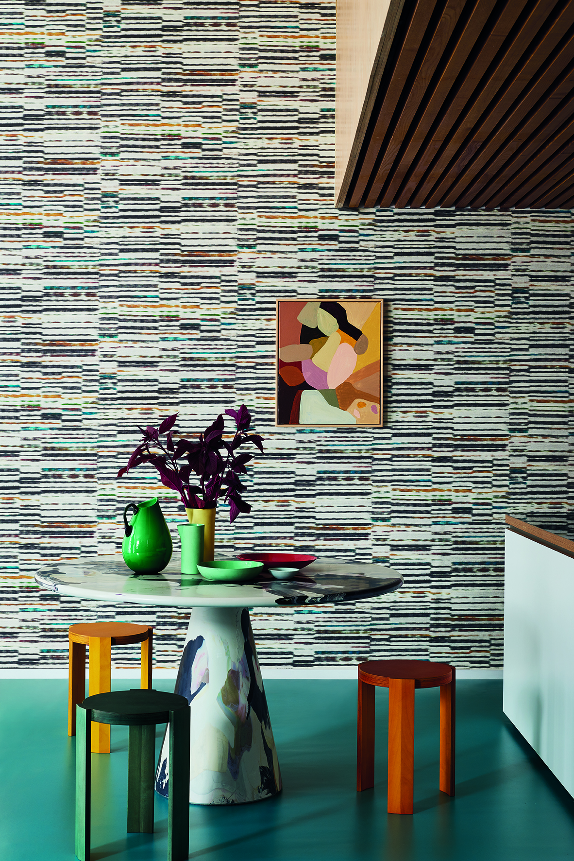
Part of the Romo group, Black Edition is like the grown-up sister – sophisticated and stunning fabric and wallcovering designs that have a contemporary elegance, they are innovative and stylish and you’ll see textures, prints and weaves in bold color palettes. Emily Mould, Design Director at Black Editions shares her tips on using decorative wallcoverings to add color.
‘Unleashing a spectacle of wonder, the Zafaro Wallcoverings collection sees abstract, graphic patterns and fluid watercolor designs infused with a sophisticated dose of color and unique textured surfaces. To create a graphic/abstract look choose your wallcovering first and use it as your starting point for the rest of the space.
'Then, pick other pieces that have similar colors, like this abstract wall art and the amazing marble style table. To finish off and to break up the pattern, use accessories like vases and tableware in plain colors and keep the floor plain.’
See: Dining room color schemes – from neutrals to navys, find the best shades for your space

Sophie has been an interior stylist and journalist for over 20 years and has worked for many of the main interior magazines during that time, both in-house and as a freelancer. On the side, as well as being the News Editor for indie magazine, 91, she trained to be a florist in 2019 and launched The Prettiest Posy where she curates beautiful flowers for modern weddings and events. For H&G, she writes features about interior design – and is known for having an eye for a beautiful room.