Gwyneth Paltrow's 'butter yellow' walls bring cozy, relaxed luxury to her living room – I wasn't sure about this color trend, but now I'm convinced
Behind the actress's indoor swing, a light yellow wall elevates her earthy and stylish living room – it's a major color trend for 2025

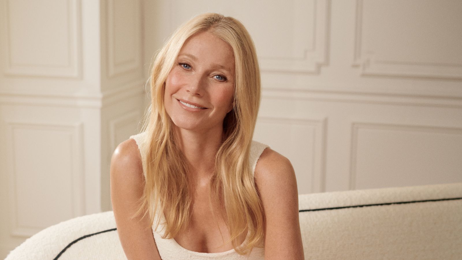
Since Pinterest announced 'Butter Yellow' as one of the key color trends of 2025, we've been seeing the shade everywhere. It's appeared across the fashion and interior space, as paint, furniture, and accessories.
I have a confession: so far, it hasn't been my favorite. I've always thought of the shade as slightly dated, and difficult to decorate around. Gwyneth Paltrow's muted yellow living room, however, changed all of that. In the actress's Montecito home designed by Roman and Williams, a butter-yellow wall grounds the brown and cream space. It makes it feel both elevated and relaxed. It includes a hanging swing as a sofa, a large plant, and a cushiony cream rug.
Gwyneth's space is a masterclass in decorating with yellow. What makes it good enough that it's convinced me of the shade? First, the designers have expertly styled color around it. They chose a palette of brown, butter yellow, and cream. The brown and cream are very simple, and natural, while the butter yellow adds a subtle pop of color. It is simultaneously subtle and brightening. It contrasts the darkness of the brown in the room, and adds some interest to the whites in Gwyneth's space.
Article continues belowA post shared by Roman and Williams (@roman_and_williams_)
A photo posted by on
Shop The Edit
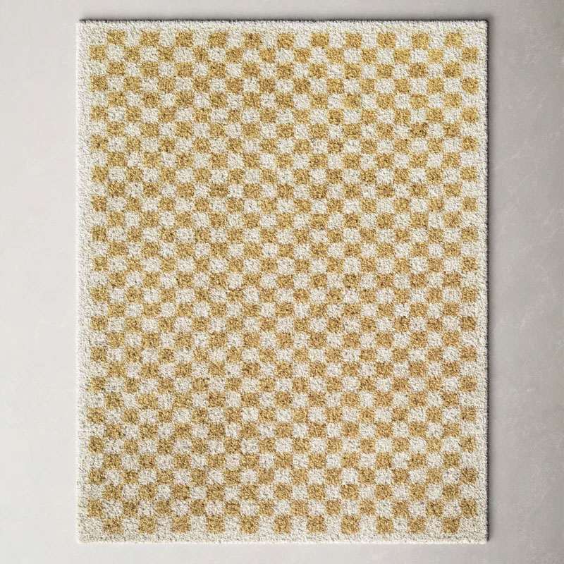
Decorating underfoot is always my first-port-of-call when using a bold color scheme. Arguably, rugs make the biggest difference to an overall scheme – and they are simple to change when fashions come and go.
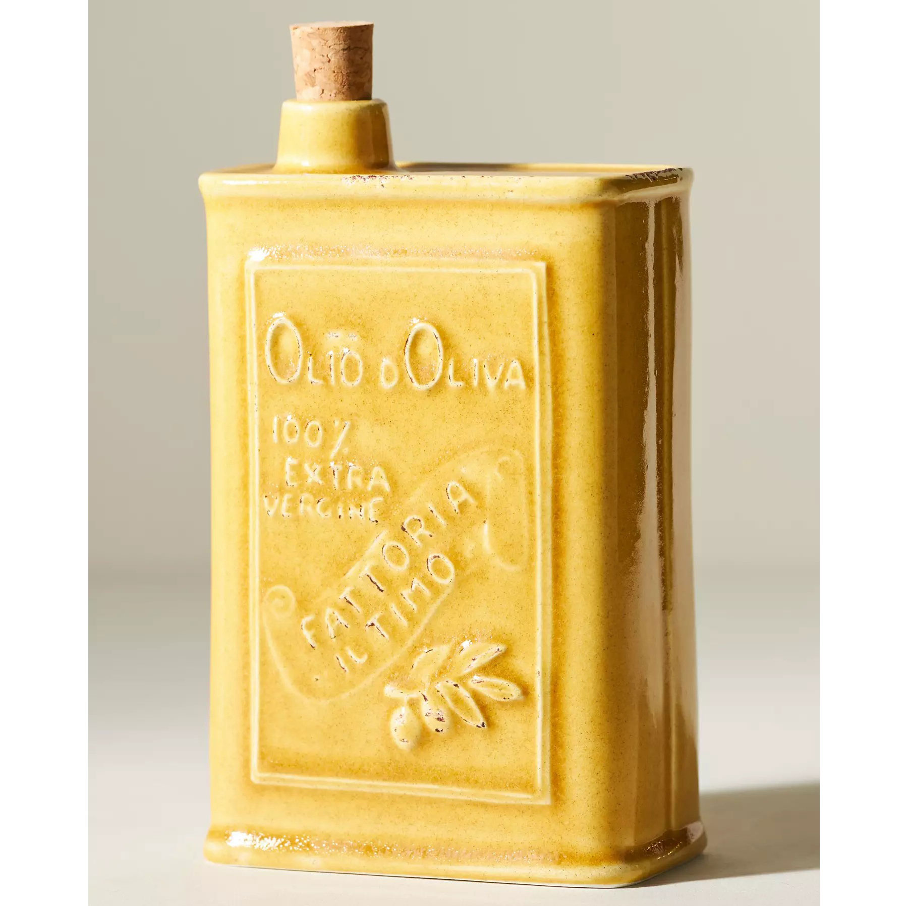
Olive oil adorns almost every home, and a good olive oil bottle – in a cheery butter yellow – is a must to liven up any scheme. Made from glazed earthenware, you will feel instantly transported to the Mediterranean.
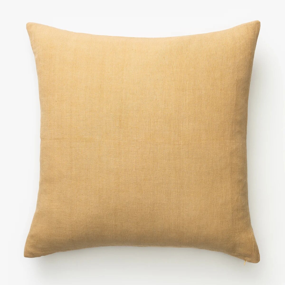
I have a confession to make. I change my pillow cases every season. It usually goes: red in winter, pink in spring, yellow in summer and olive green in fall. However, I am leaving my butter yellow cases on for a little longer – the color is just that delightful.
Another element of what makes Gwyneth's use of butter yellow so effective is how her designer uses texture in the living room. The multiple contrasts keep the color looking cozy and inviting, rather than dated. Gwyneth's woven rug adds texture to the floor, as does the fuzzy pillow and comfortable throw blanket. The towering plant in the background adds a touch of greenery that contrasts stylishly with the yellow walls. The chains that hang the swing add touch of metal that bring visual interest.
Though following color trends taps into what's current, it can also be a way to discover new timeless possibilities. A color like butter yellow is currently popular, but it will always be in style.
Design expertise in your inbox – from inspiring decorating ideas and beautiful celebrity homes to practical gardening advice and shopping round-ups.

Sophie is a writer and News Editor on the Celebrity Style team at Homes & Gardens. She is fascinated by the intersection of design and popular culture and is particularly passionate about researching trends and interior history. She is an avid pop culture fan and has interviewed Martha Stewart and Hillary Duff.
In her free time, Sophie freelances on design news for Westport Magazine and Livingetc. She also has a newsletter, My Friend's Art, in which she covers music, culture, and fine art through a personal lens. Her fiction has appeared in Love & Squalor and The Isis Magazine.
Before joining Future, Sophie worked in editorial at Fig Linens and Home, a boutique luxury linens brand. She has an MSc from Oxford University and a BA in Creative Writing and Sociology from Sarah Lawrence College.