What are the best Sherwin-Williams white paints? 6 favorite shades amongst interior designers
From classic whites to warm whites, these are the most loved Sherwin-Williams white paints

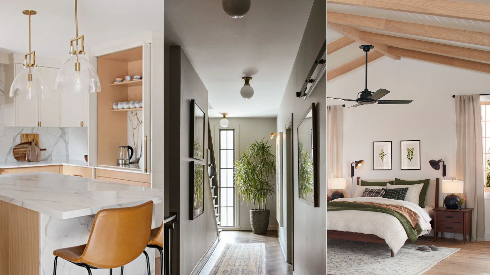
Of all the paint colors, there's no question that white paints are some of the most widely used. And Sherwin-Williams has some of the best white paints available, with many shades favorites among interior designers.
Although the differences between shades of white paint can seem subtle, landing on the right shade will go a long way in shaping the overall look and feel of a room. Sherwin-Williams offers many of the best white paints, ranging from warm to cool-toned with varying undertones, so there's something for every type of room and design style.
To gain some insight into the world of decorating with white, we asked designers for their favorite Sherwin-Williams white paints, which we've rounded up below.
Article continues below6 of the best Sherwin-Williams white paints
From warm whites to clean and classic white paints, these six suggestions have been used and loved by interior designers, making them the go-to choices for interior projects.
1. Alabaster
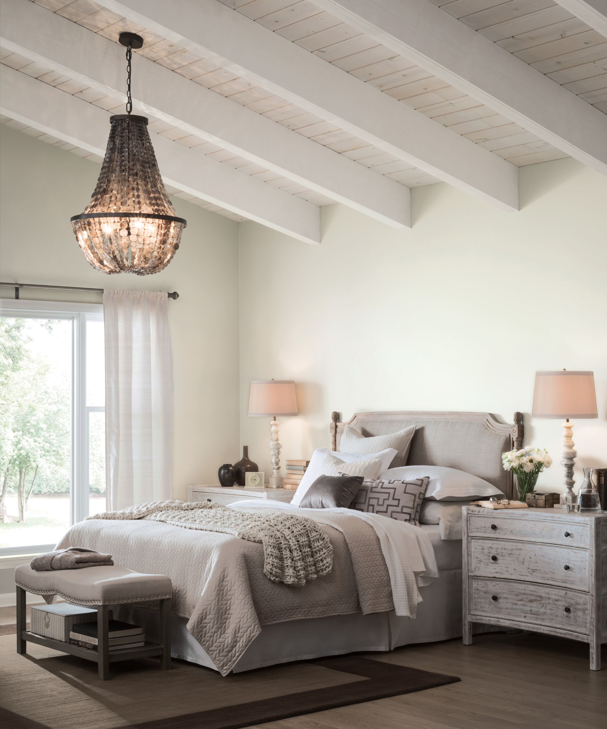
'Alabaster is, hands down, our favorite Sherwin-Williams white paint,' says interior designer and color expert Jennifer Guerin of JG Color Studios. 'It's clean and clear, yet has a lovely subtle neutrality to it allowing it to be used in almost any setting, both inside and outside of the house.'
One of the paint brand's best sellers, Alabaster is one of the best warm white paints, recommended repeatedly by designers. The paint color is known for providing enough warmth to create inviting spaces, while its undertones aren't so warm that it leans toward cream.
'Sherwin-Williams Alabaster is a fabulous warm white that doesn't go too yellow,' adds interior designer Laura Jenkins of Laura W. Jenkins Interiors. 'The undertones don't compete with your other colors and artwork in the room but it still works to warm the space up a bit.'
Design expertise in your inbox – from inspiring decorating ideas and beautiful celebrity homes to practical gardening advice and shopping round-ups.
Heather Kates, Design Director at MDI Luxury Design also loves decorating with Sherwin-Williams' Alabaster, adding that it's versatile to pair well with many other hues. 'It pairs beautifully with a wide range of colors, from light and airy pastels to bold, dramatic hues. Incorporating Alabaster throughout a home can create a cohesive feel while allowing for pops of color in furniture, artwork, and accessories.'
2. Egret White
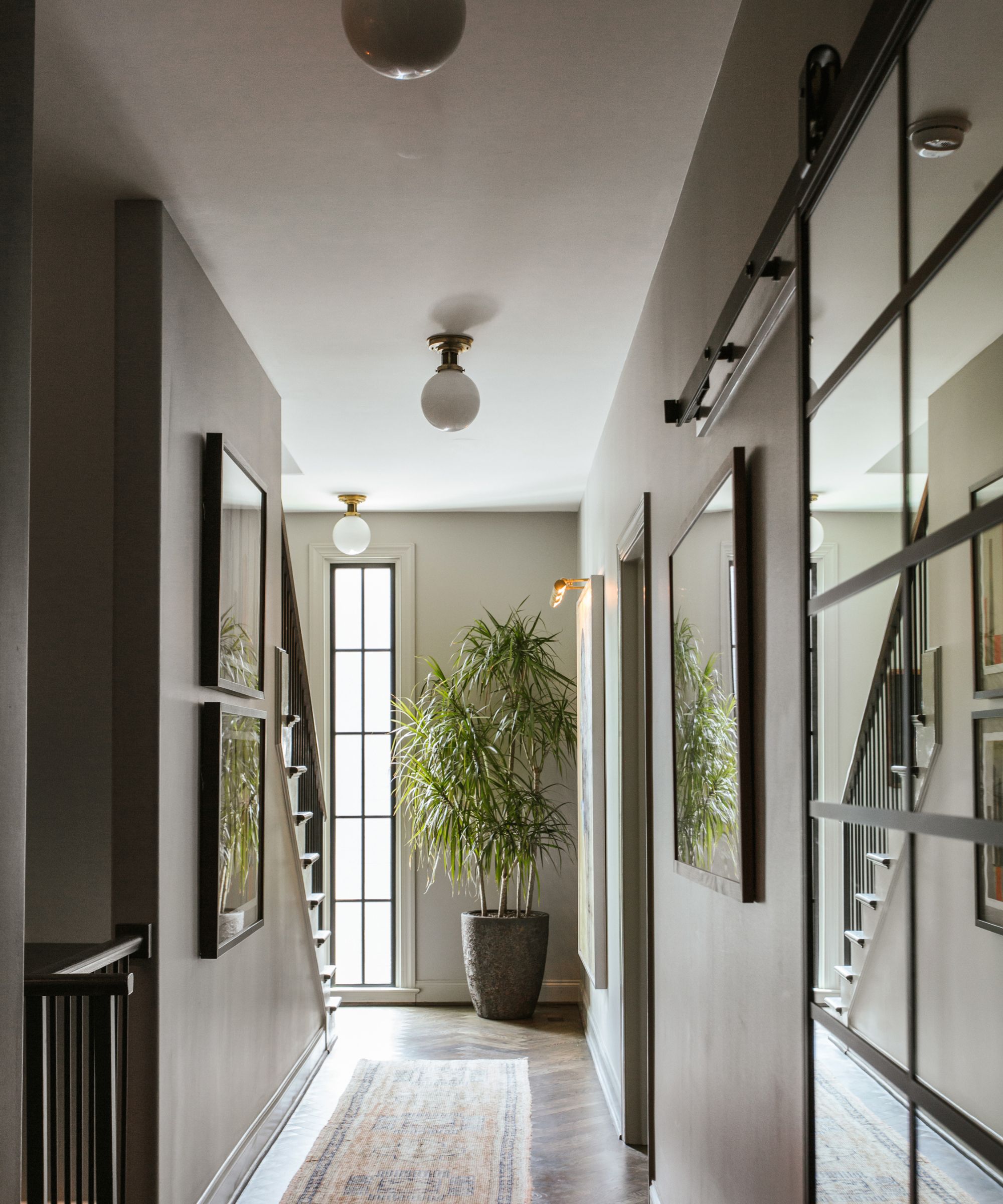
Bismark project
In this entryway designed by r.a.d. Interiors, Sherwin-Williams' Egret White is used across the ceiling ideas, a stony shade of white paint with gray undertones.
'I've always loved Sherwin-Williams' Egret White for its bone-like white notes and a subtle touch of warm gray, without the yellow undertones common in many white paints,' explains Ryan Austin Hagood, Principal Designer at the Atlanta-based interior design studio. 'This color is especially effective on ceilings, providing a cozy, grounding effect when paired with decorative finishes on the walls.'
3. Shoji White
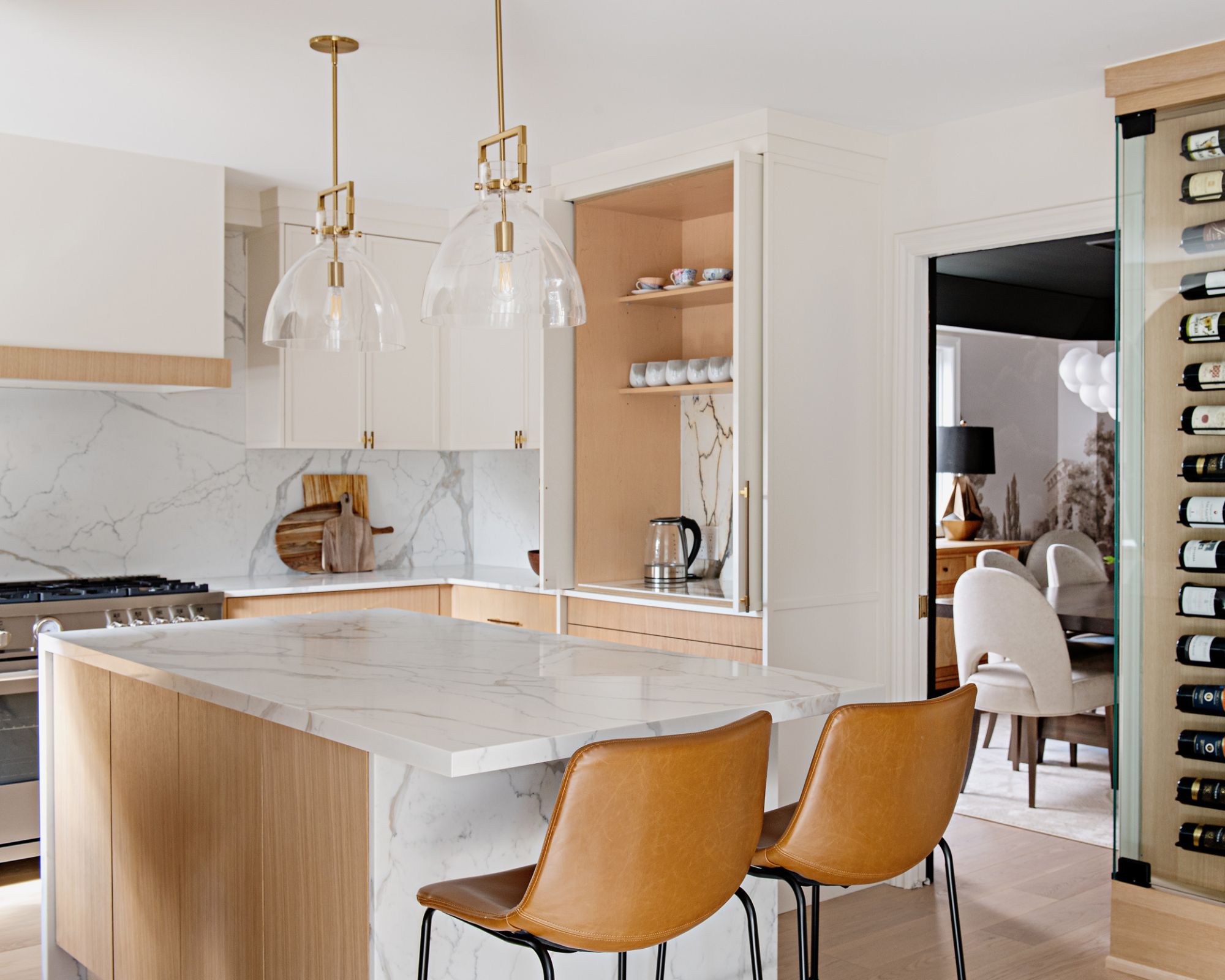
'My favorite Sherwin-Williams white paint color is Shoji White,' says Aman Than, founder and Principal Designer at Aman Than Interiors, who opted for this hue in this modern kitchen.
Appearing almost as greige, Shoji White is a great choice if you're looking to create a cozy look and feel that avoids the clinical look of white.
'I love it for its versatility and the way it brings a warm, inviting feel to any space,' continues Aman. 'Shoji White has gray and beige undertones, giving it a soft neutral quality that blends seamlessly with various design styles, from traditional to contemporary. Its warm undertones make it perfect for creating a calm, welcoming appeal without feeling too stark or cold in any lighting scenario.'
4. Pure White
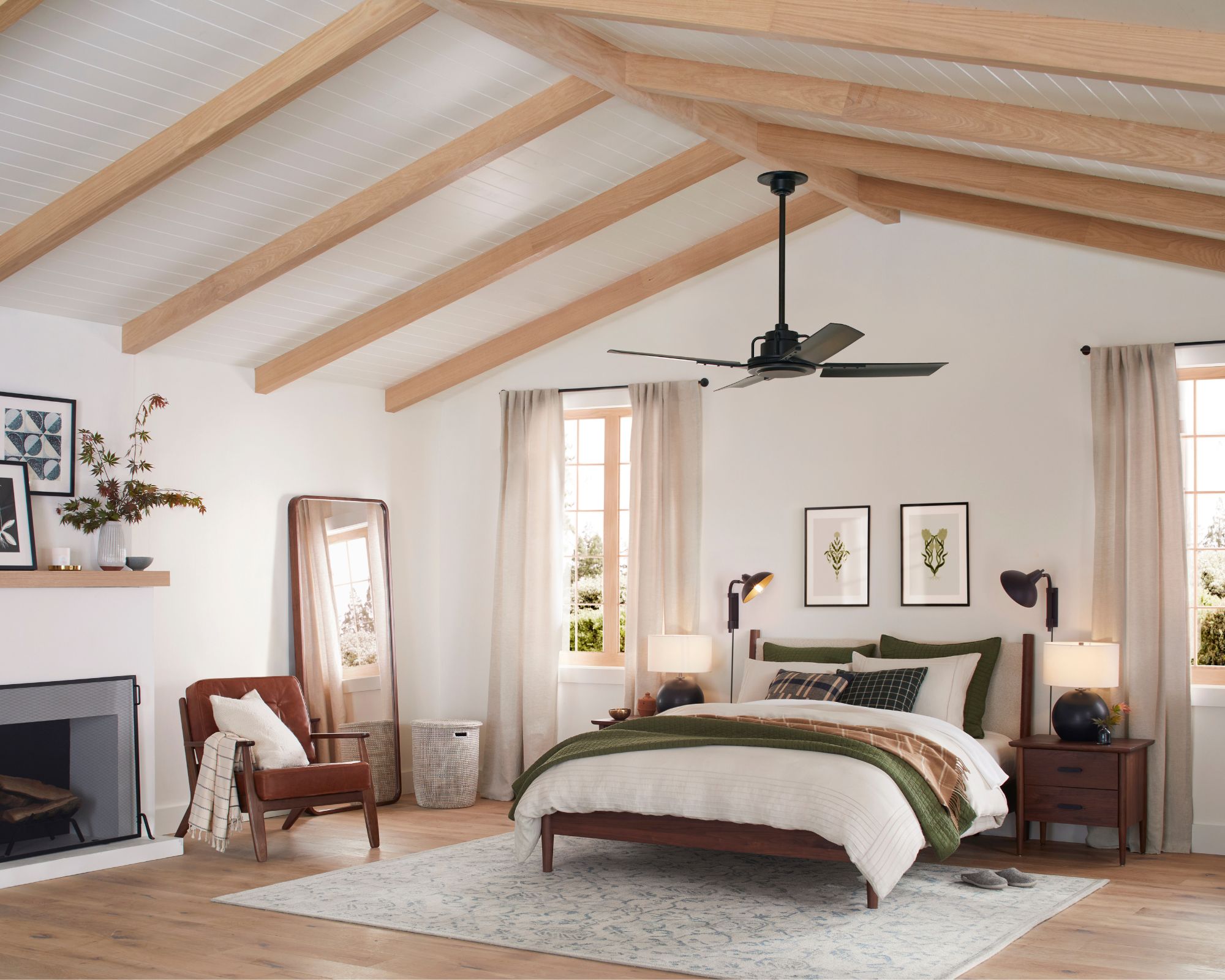
Marking a shift from the brand's hugely popular warm white paints, Pure White by Sherwin-Williams is a much more clean and classic shade.
'I love Sherwin-Williams' Pure White when I am looking for a classic white hue,' says designer Laura Jenkins. 'I like the shade so much because it doesn't lean too blue but also feels purely white versus cream.'
'Pure White is our favorite crisp white, offering a light and bright feel without going too stark,' agrees interior designer Julia Lauve, co-founder of Dallas-based design firm Workshop Studio. 'This color has a high light reflective value and provides a brilliant canvas for layering color.'
5. Greek Villa
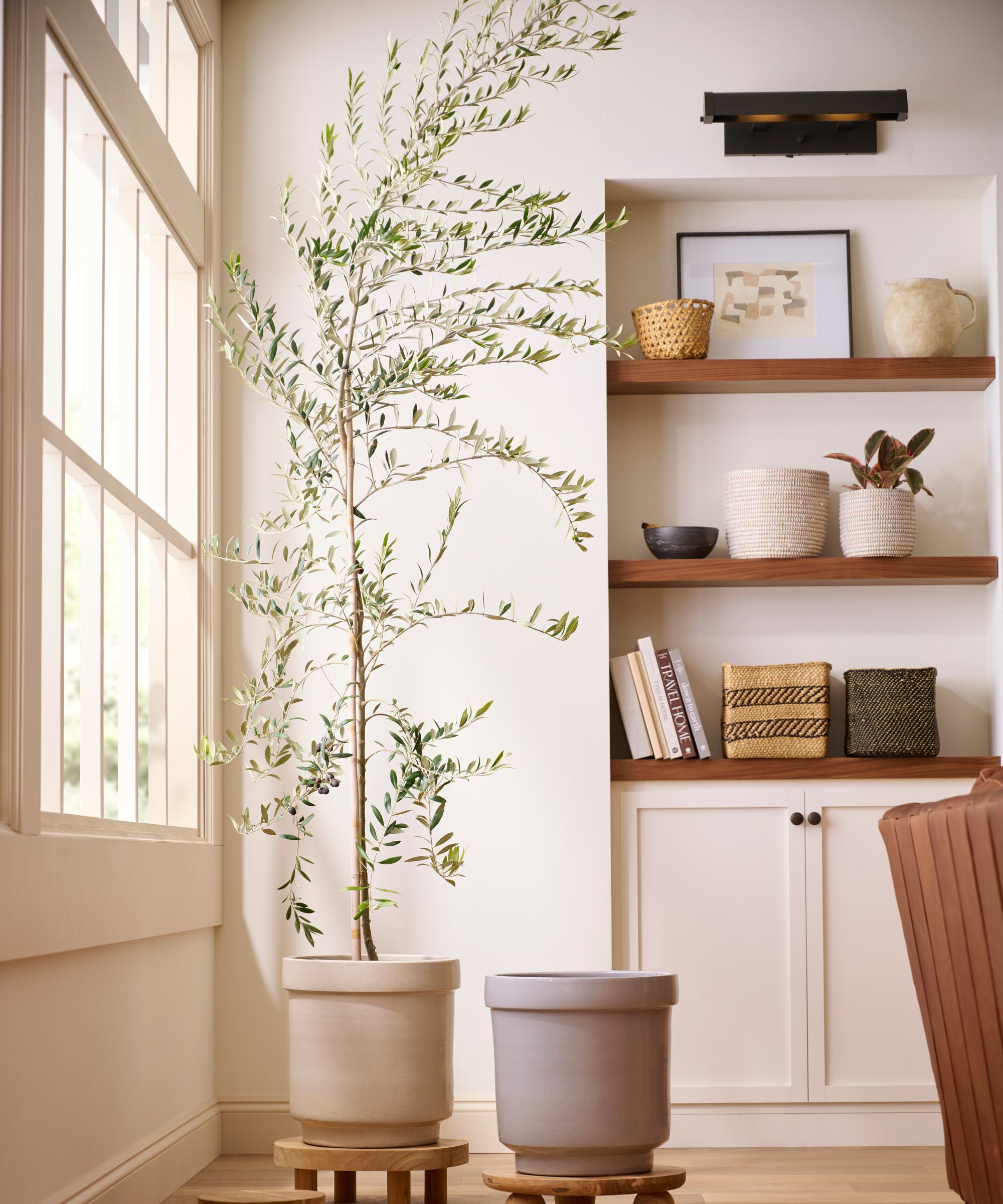
If you're looking for a white paint that works best in well-lit rooms that receive lots of natural light, Sherwin-Williams' Greek Villa makes a great choice. Balanced between warm and cool tones, Greek Villa helps to brighten rooms without appearing too warm.
'My favorite Sherwin-Williams color is Greek Villa,' says interior designer Jessica Dorling of Dorling Design Studio. 'I love its flexibility and perfect balance of undertones – it's neither too creamy nor too cool. I use it in both transitional and modern spaces, for both interior and exterior applications.'
6. Patience
For a much warmer white paint, Patience has tan undertones which makes it a very warm white, appearing almost as a beige.
'My current favorite white paint is Sherwin-Williams' Patience,' says Blair Moore, Creative Director and Principal of Moore House Design.
'This shade beautifully blends soothing cream with delicate peach undertones, creating a cozy, latte-like ambiance that adds warmth and tranquility to any space. Its subtle nuances make it perfect for achieving a serene and inviting atmosphere.'
Deciding on the right white paint often involves much deliberation, but to steer you in the right direction, we've explained how to choose the best white paint here. From testing out white paints in various lighting conditions to ensuring a cohesive approach from room to room, these expert tips will help you make the right choice for your space.

Emily is a freelance interior design writer based in Scotland. Prior to going freelance in the spring of 2025, Emily was Homes & Gardens’ Paint & Color Editor, covering all things color across interiors and home decor for the Homes & Gardens website. Having gained specific expertise in this area, Emily is well-versed in writing about the latest color trends and is passionate about helping homeowners understand the importance of color psychology in home design. Her own interior design style reflects the simplicity of mid-century design and she loves sourcing vintage furniture finds for her tenement flat.


