5 colors to avoid painting a home office – and an expert tip for choosing the right tone
Looking for a shade that will benefit your home’s style and your productivity? Designers urge against these popular hues

Design expertise in your inbox – from inspiring decorating ideas and beautiful celebrity homes to practical gardening advice and shopping round-ups.
You are now subscribed
Your newsletter sign-up was successful
Want to add more newsletters?
It is initially understandable why home office paint ideas may not be at the peak of your design-planning list.
This space is less intimate and much less sociable than arguably any other room in your home – after all, it is a place to concentrate more on work and less on your interior choices. However, the fact that this space is for work means quite the opposite – and your paint ideas in this room count as much – if not more – than any other. And this goes beyond cursing the perfect video call backdrop.
5 colors to avoid painting a home office – according to interior designers
Interior designers are urging us to bring our home office ideas to the top of our priority list, as our decor choices have an influence on our productivity and creativity in the room that matters the most. These are the colors they're avoiding – and why.
Article continues below1. Red
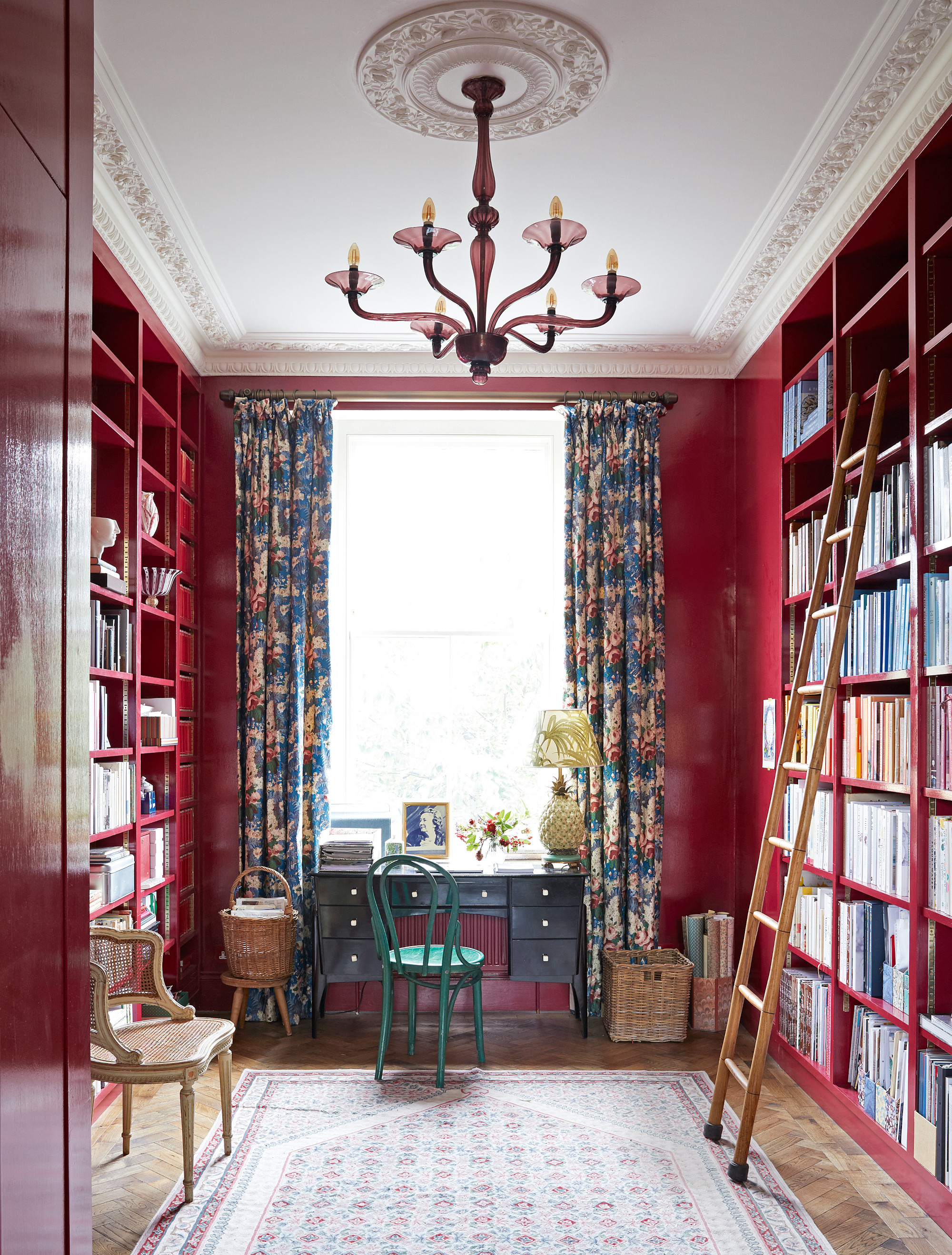
'While I love embracing bold colors in pops throughout a room, I would advise against red in a home office,' says interior designer Georgia Zikas from Georgia Zikas Design.
'While this is a vibrant, fiery color, it can be distracting and perhaps a little too intense for a space where you want to focus and do your best work.' Therefore reds, and often bright oranges, are better left beyond the home office.
2. Gray
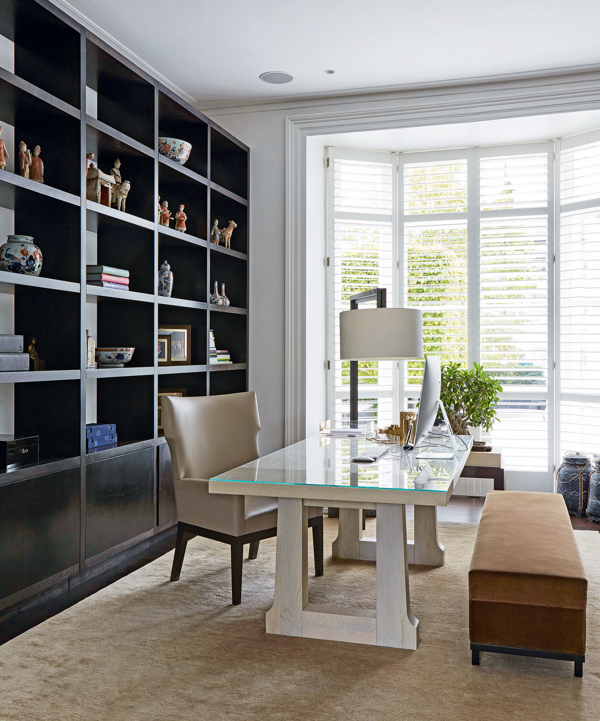
It's no secret that designers love decorating with gray. This color is rightly an eternally popular favorite amongst those in the know, in almost all rooms of the home. However, Georgia has a limit when it comes to your home office.
'I love all shades of gray, but gray in a home office can feel drab and depressing. After all, some corporate offices are gray, and they feel dull and uninspiring. There are plenty of other ways to keep your home office neutral but still engaging and inspiring,' she says.
Design expertise in your inbox – from inspiring decorating ideas and beautiful celebrity homes to practical gardening advice and shopping round-ups.
'I have some difficulty with gray, especially light gray. It reminds me of the clouds, which could be depressing after a certain time,' adds designer Samia Verbist from Samia Verbist Interior Design. Though, the designer adds that gray can act as a great foundation to add pops of brighter colors through furniture or art. 'Then you will bring some energy and happiness,' she says.
3. Black
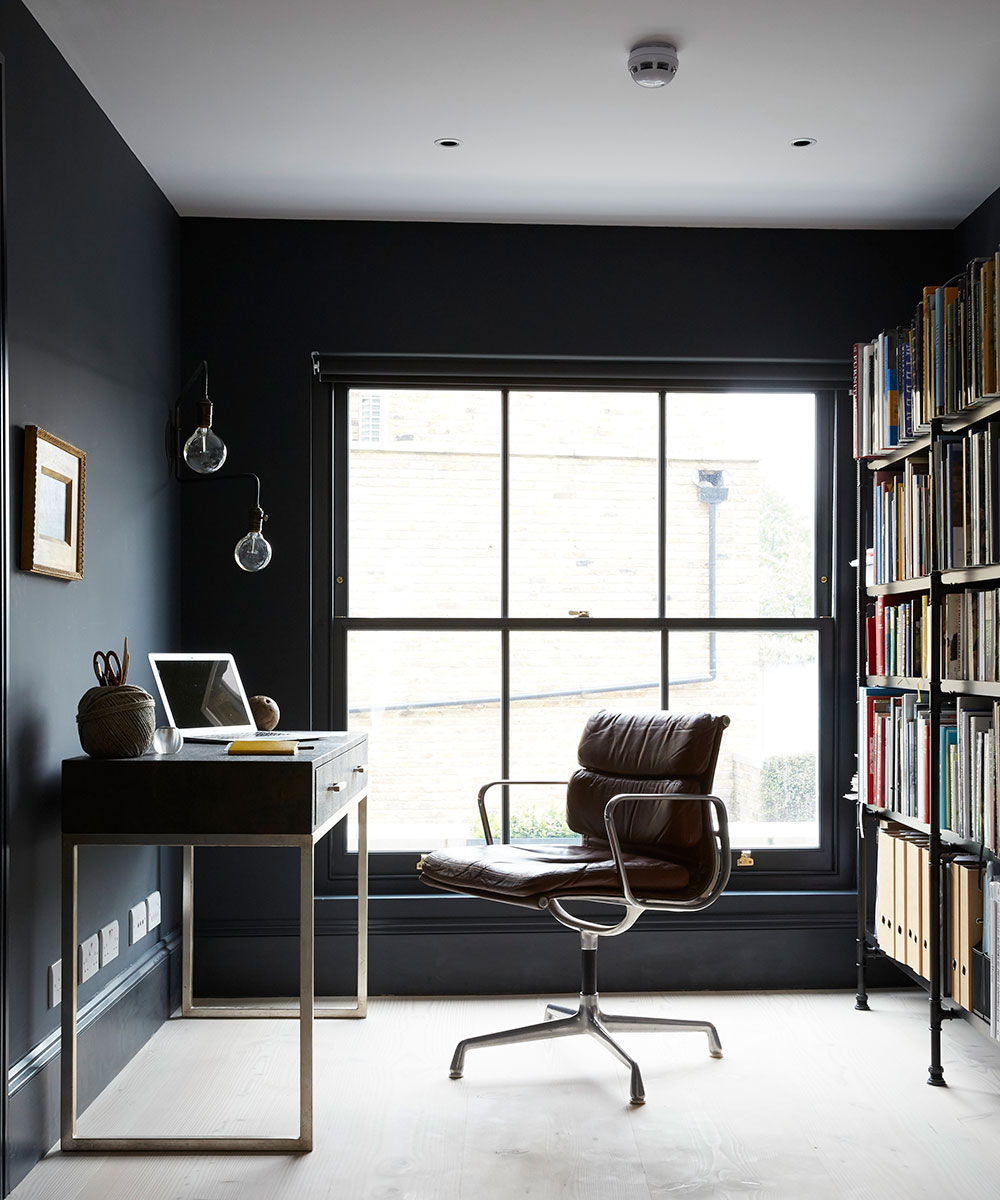
While decorating with black can have a powerful impact in many rooms, Georgia explains that this color can have a similar impact as gray in your home office.'
I would avoid it in large swaths as it can create a moodier, more melancholy feeling throughout your office. The only exception here would be a beautiful black & white graphic tile or print, which can add some personality,' she says.
4. Bright green
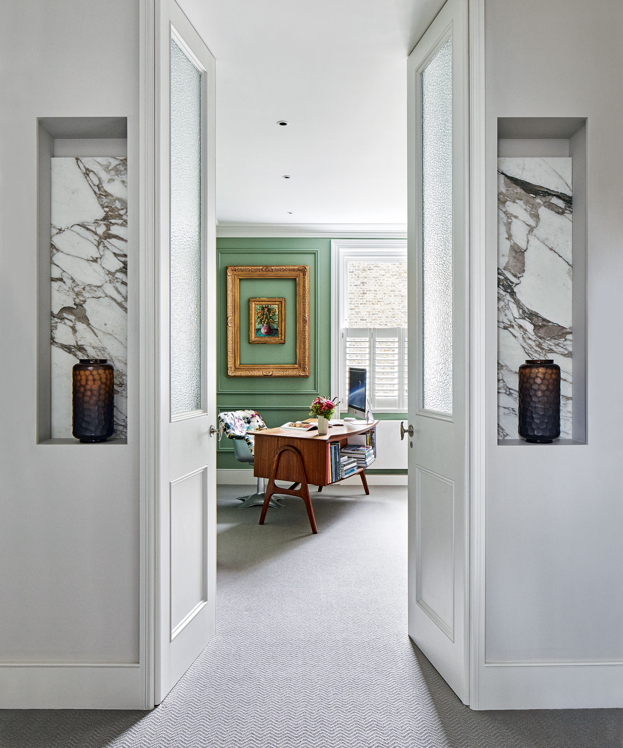
'I love the color green, but bright green isn't good for a home office. It can be too loud and energetic, which won't allow for a long attention span,' says Ellie Redders of Ellie Redders Interiors.
'While bright green can boost creativity, it and also cause a feeling of restlessness which leads to a lack of concentration. Stick to muted shades of green which invoke feelings of calmness and nature.' So, while this organic hue may be dominating room color ideas in many spaces around the home, it may be less appropriate for your home office.
5. White
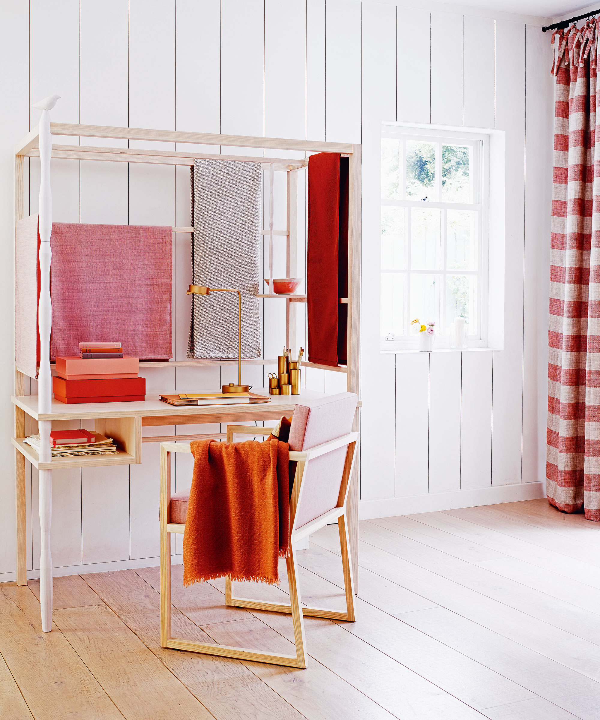
'Many office walls are white, it is neutral like a blank page, and that's the problem,' Samia says. The designer warns that this neutral could feel sterile and tedious, especially if you're searching for creativity.
'If your goal is to be minimalist, then you can have all white and add some light oak wood touches for earthiness and warmness,' she adds.
And alongside knowing what colors to avoid, it is equally important to know which colors work the best in our home office. Little Greene's Creative Director, Ruth Mottershead, has the answer.
What do you need to remember when painting a home office?
‘When decorating a home office, it’s important always to consider how you use the space and the atmosphere you want to create; this is particularly true when choosing paint,’ Ruth says. ‘An at-home office space should be somewhere that feels separate from the rest of the home, whether it be a study space or simply a corner within another room. By using color and pattern, you can create a space for creativity and focus that helps to aid your concentration.’
Ruth suggests opting for soft pastel colors and earthy shades that will ground your home office while bringing just the right vibrancy to the room.

Megan is the Head of Celebrity Style News at Homes & Gardens, where she leads the celebrity/ news team. She has a history in interior design, travel, and news journalism, having lived and worked in New York, Paris, and, currently, London. Megan has bylines in Livingetc, The Telegraph, and IRK Magazine, and has interviewed the likes of Drew Barrymore, Ayesha Curry, Michelle Keegan, and Tan France, among others. She lives in a London apartment with her antique typewriter and an eclectic espresso cup collection, and dreams of a Kelly Wearstler-designed home.