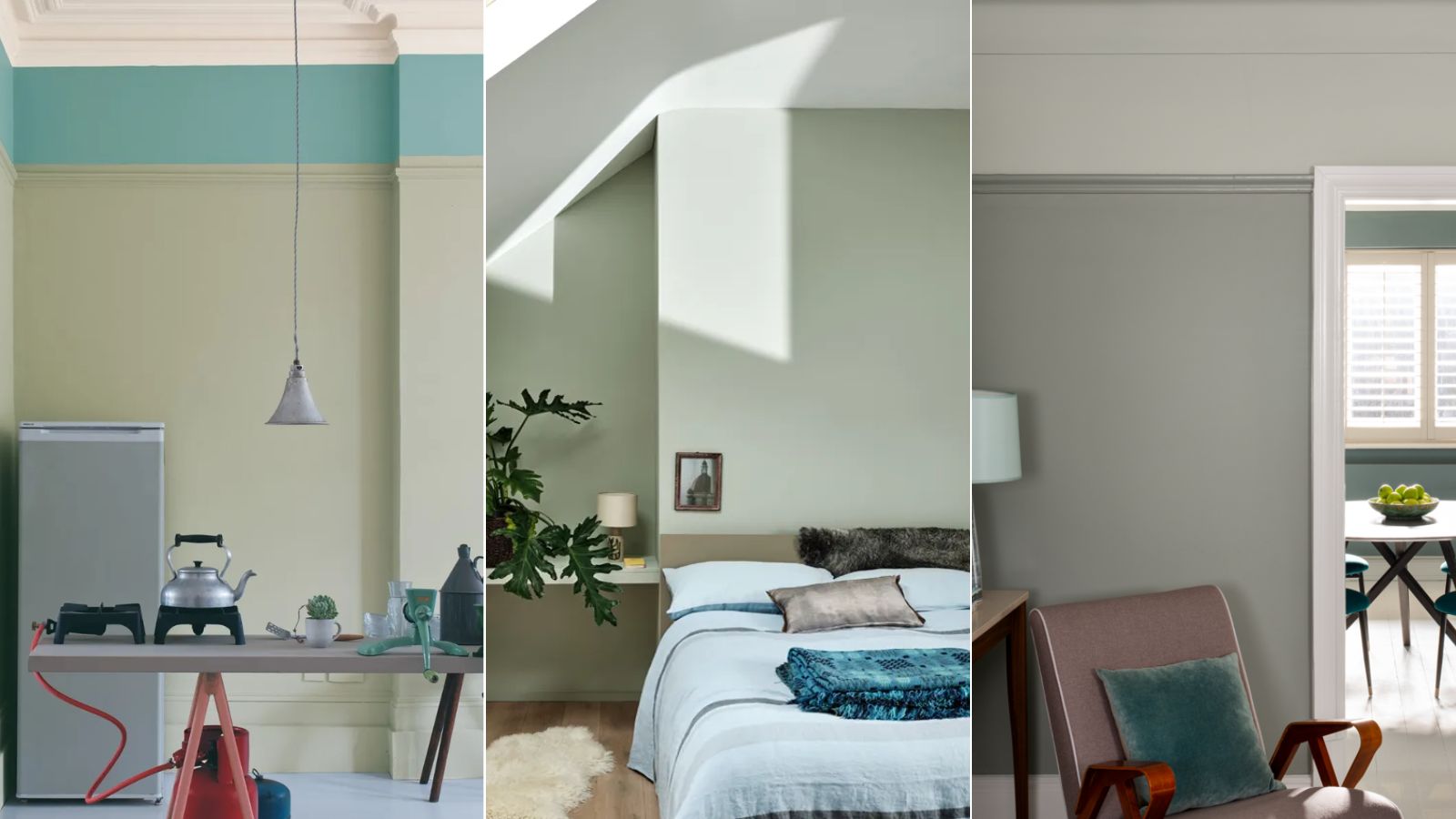
Farrow & Ball's Mizzle is 'packed with green so it never feels cold' – here's why this soothing shade is the perfect way to do neutrals in 2025
A light gray-green, this natural, calming paint color is a fresh take on neutrals


Many paint trends have caught our attention in recent months, but there's one that stands out more than most. That is, the emergence of 'in-between' hues that don't belong to just one color family and Farrow & Ball's Mizzle is the perfect example.
Described as a 'modest' gray-green paint, Mizzle is gentle enough to work as a neutral paint color, while its carefully considered undertones ensure it isn't at all cold, as can be the risk with gray paints.
If, like us, you're intrigued by this calming Farrow & Ball paint color and are looking for a fresh way to decorate with neutrals next year, read on.
Article continues belowA post shared by Farrow & Ball (@farrowandball)
A photo posted by on
'Glorious Mizzle has this fantastic sort of uncertain feeling to it, just like the ever-changing sky,' explains Farrow & Ball's Color Curator, Joa Studholme, in an Instagram video where she shares the inspiration behind and key qualities of this gray-green. 'And we’ve often called colors after weather conditions and this one is Mizzle, which is just the mix between mist and drizzle'.
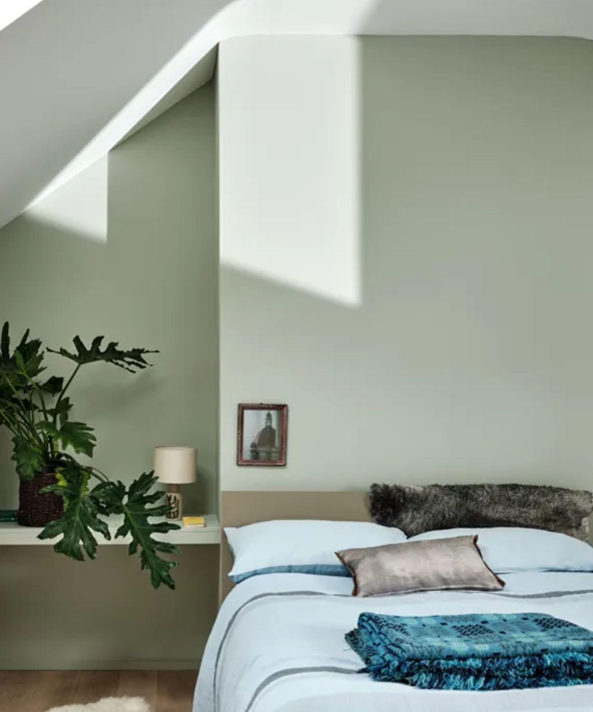
An interesting blend of undertones, Mizzle can appear as a blue paint but notably has plenty of green tones so it feels warm and not at all drab, and is said to be a lighter variation of Farrow & Ball's Pigeon.
'Mizzle definitely has a certain softness,' Joa adds in the Instagram video. 'Most people read it as blue but it is packed with green so it never feels cold.'
Since Mizzle's blend of hues makes it an 'in-between' color, its appearance will largely depend on the lighting of the room you use it in. In the video, Joa explains that in 'north-facing rooms it will indeed feel a little bit greener' whereas in 'south-facing rooms it becomes softer and bluer'.
Design expertise in your inbox – from inspiring decorating ideas and beautiful celebrity homes to practical gardening advice and shopping round-ups.

Farrow & Ball's Mizzle
Whether in cool or warm rooms, Mizzle is a soothing and balanced hue that works as a slightly darker-than-usual neutral paint. While lighter neutrals such as warm white paints and beige tones work well to maintain a clean look with subtle warmth, sometimes more depth is needed, and Mizzle, which feels natural and soothing, makes a strong choice, whether used for a kitchen color scheme or restful bedroom color scheme.
For an impactful scheme, opt to use Mizzle by color-drenching, taking it across the whole room to include the ceiling and trim in addition to all four walls. This is a good way to lean into a cocooning feel in snugs or cozy living rooms.
That said, Mizzle also works well as an accent color used in smaller volumes. School House White is its Farrow & Ball-recommended white paint pairing, but you could equally pair it with something darker like Railings for a bolder color scheme.
Whichever room you choose to decorate with Farrow & Ball's Mizzle, it'll no doubt feel timeless and calming, something we all want more of in 2025.

Emily is a freelance interior design writer based in Scotland. Prior to going freelance in the spring of 2025, Emily was Homes & Gardens’ Paint & Color Editor, covering all things color across interiors and home decor for the Homes & Gardens website. Having gained specific expertise in this area, Emily is well-versed in writing about the latest color trends and is passionate about helping homeowners understand the importance of color psychology in home design. Her own interior design style reflects the simplicity of mid-century design and she loves sourcing vintage furniture finds for her tenement flat.
