What colors work best with minimalist style? Interior designers weigh in on the best hues for a pared-back scheme
From warm neutrals to pops of green, these colors work wonders in a minimalist scheme

Design expertise in your inbox – from inspiring decorating ideas and beautiful celebrity homes to practical gardening advice and shopping round-ups.
You are now subscribed
Your newsletter sign-up was successful
Want to add more newsletters?
Minimalist style might favor neutral colors, but knowing which hues to decorate with can be a tricky decision. If you're wondering what colors work best with minimalist style, think beyond classic whites for a scheme that feels inviting.
Colors for a minimalist space vary from shades of white to warmer beige tones, so the color you choose really depends on the atmosphere you want to create in the space. It's not just about neutral hues either – when designed right, more saturated hues can work in harmony with the pared-pack palette.
From kitchens and bathrooms to bedrooms and living rooms, we've asked interior designers and color experts to weigh in on what colors work best with minimalist decor to nail the aesthetic.
Article continues below5 colors that always work with minimalist style
Decorating with neutrals is always a wonderful choice for a minimalist, calming scheme, but choosing the right hues can really make or break your design. Your space should feel relaxing and elevated, not empty and flat – these are the colors to choose for the perfect minimalist design.
1. Nuanced whites
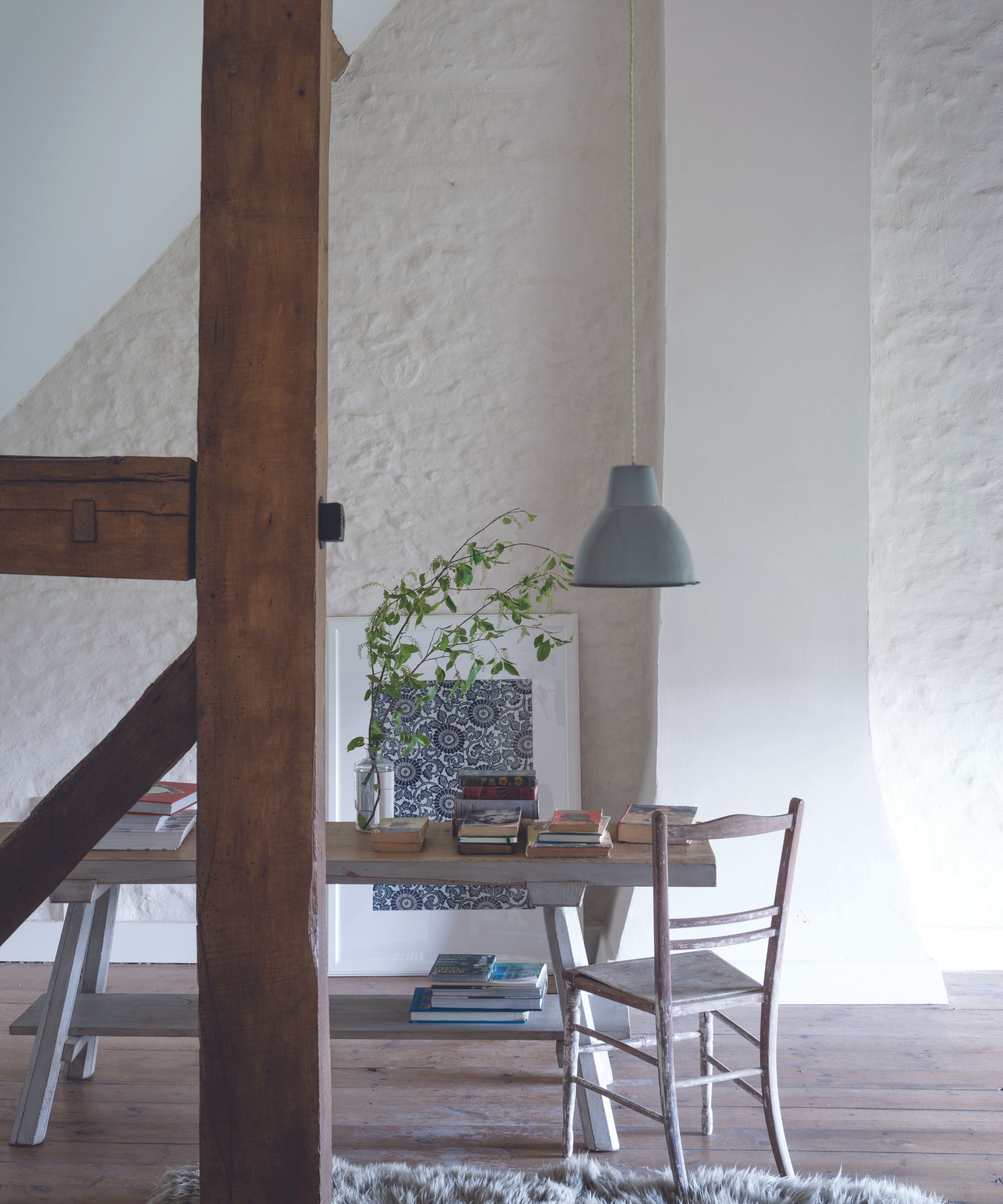
White has its place in almost every interior design style, and minimalism is no exception. Instead of choosing a bright, brilliant white, Farrow & Ball's brand ambassador Patrick O'Donnell suggests opting for more varied shades for a visually appealing scheme.
'Whilst whites seem the natural destination for a minimalist space, look to whites that are more nuanced rather than true – something with a specific undertone that will carry with the sparse elements of the interior. This could be anything that has a specific undertone, be it green (James White), blue (Dimpse), or even the softest pink note (Great White),' he says.
In this home office, the warm white paint used on the walls paired with the wood flooring makes the space feel inviting and calm, even though there are a lot of hard surfaces and textures.
Design expertise in your inbox – from inspiring decorating ideas and beautiful celebrity homes to practical gardening advice and shopping round-ups.
2. Shades of oatmeal
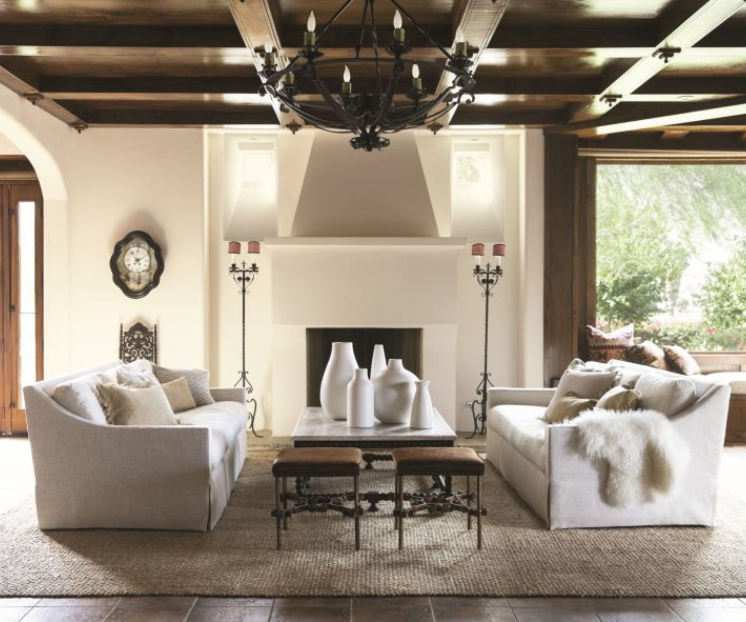
In recent years, minimalism has seen a clear shift towards warmer shades instead of the cooler tones that proved popular in the past. 'Creating a space that feels uncluttered yet warm and welcoming is hugely popular. The trend for warm minimalism does exactly that. Characteristically, this design style promotes a paired back aesthetic with a clean feeling where less is definitely more,' explains Helen Shaw, director of marketing at Benjamin Moore.
'Warm minimalism still allows us to create spaces that feel simple and open, yet without sacrificing the essential elements that make a house a home. Paint is perfect for creating a canvas to build your scheme around. Avoid hues with grey-blue undertones as these can feel cold, instead opt for yellow or red undertones which will add warmth to a room,' she suggests.
Decorating with beige has become a popular choice, but if you're looking for more of a middle ground between this warmer hue and classic whites, look to oatmeal tones. 'Shades of oatmeal are a wonderful, warm alternative to white without being too overpowering in color. These tones work especially well in living rooms with natural woods and linen textures to add depth to the scheme,' Helen adds.
3. Soothing neutrals
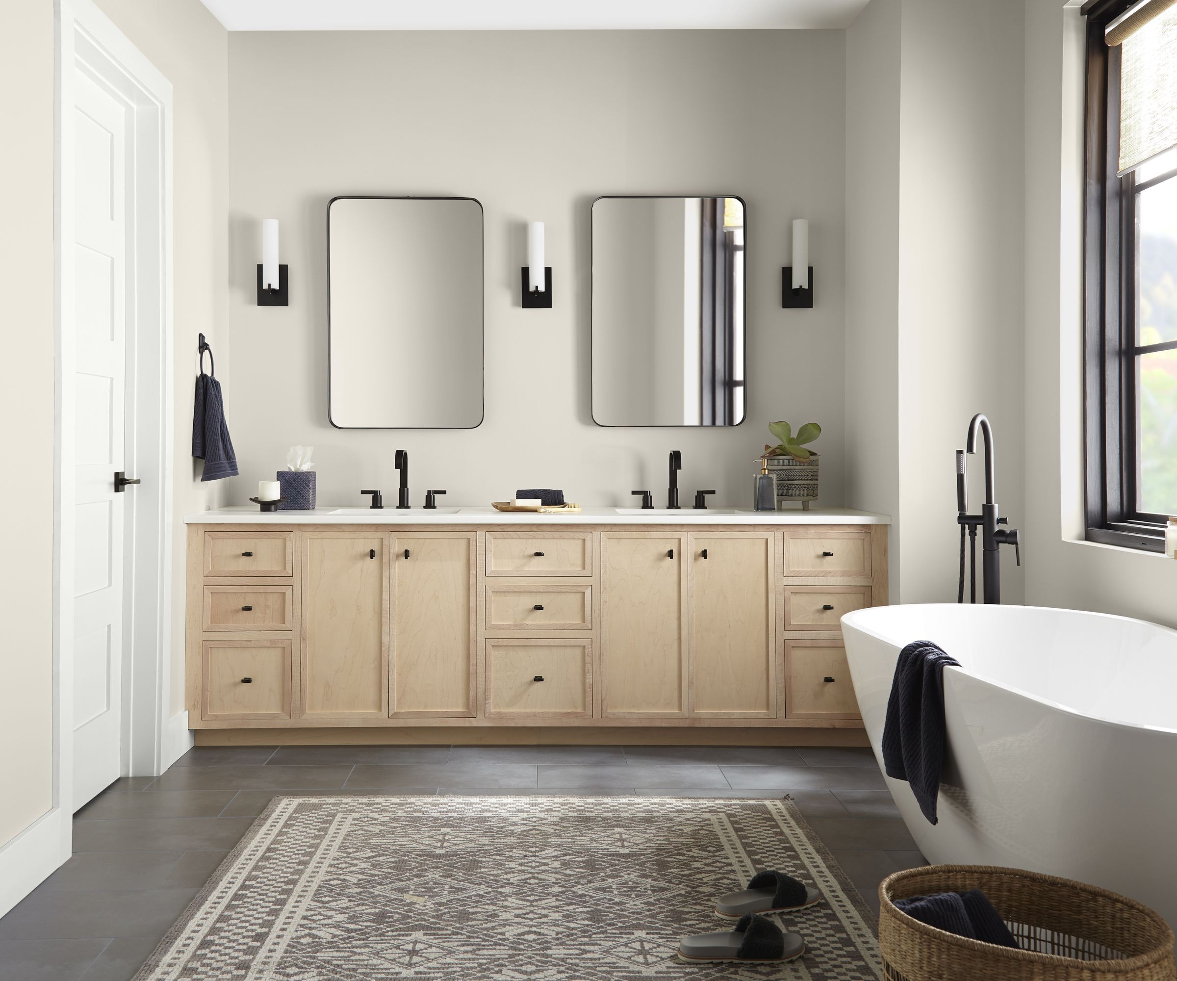
Soothing neutrals reign supreme in minimalist schemes, and in rooms such as bathrooms, bedrooms and living spaces, creating a tranquil, relaxing environment is key.
'In minimalist style, neutral colors like BEHR’s Whipped Cream, Even Better Beige, and Tranquil Gray work best because they create a clean, uncluttered look that emphasizes simplicity and functionality,' says Erika Woelfel, VP of color and creative services at Behr.
'These colors provide a calming and soothing atmosphere, allowing the focus to be on the essential elements of the space without distractions. Additionally, they enhance natural light, making the room feel more spacious and open,' she adds.
4. Pops of calming greens
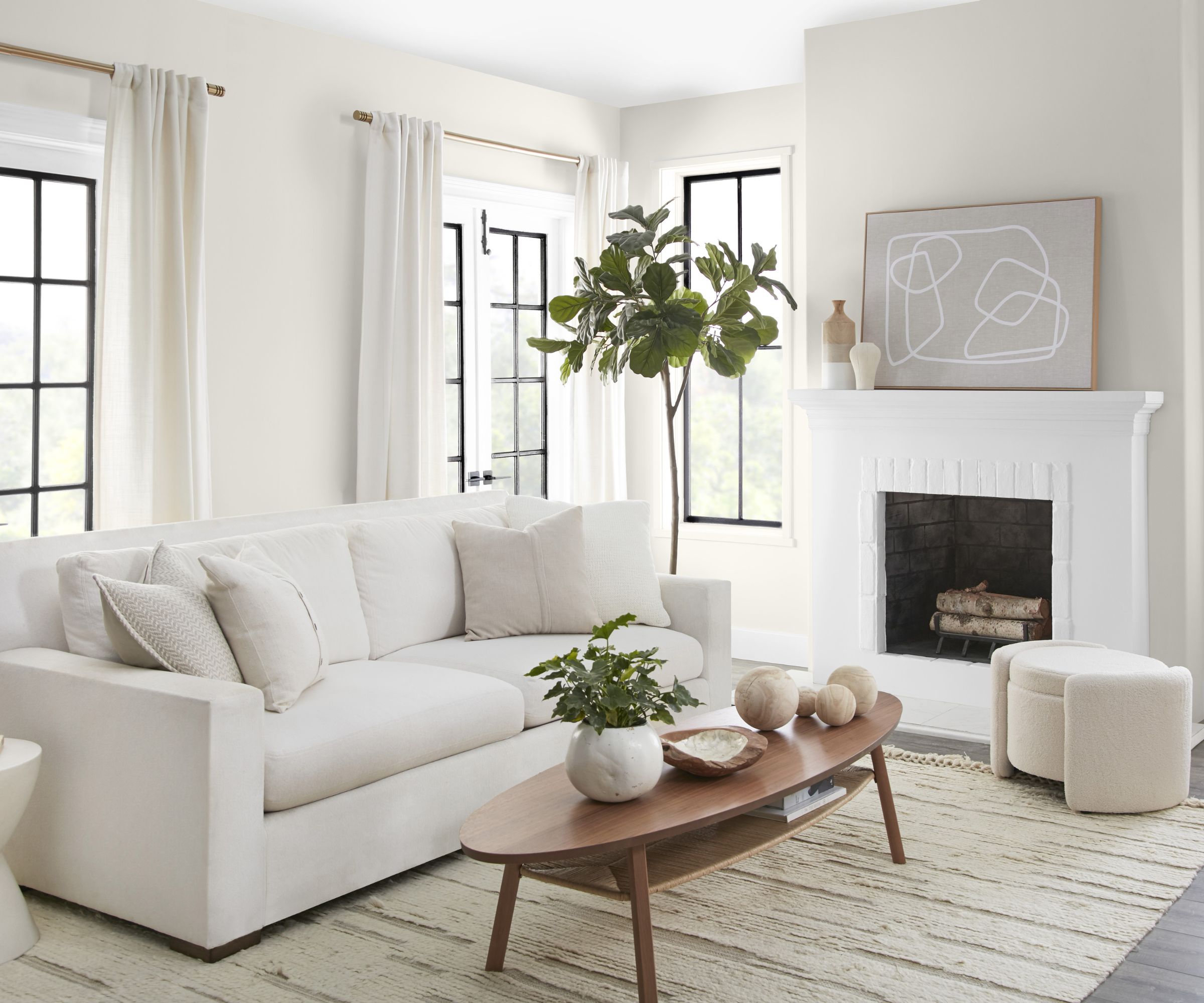
In a minimalist scheme, you might immediately lean towards white and light neutral hues, but adding a small hint of a more saturated color can add depth to your space without an overwhelming amount of color.
'A minimalist home design motif doesn't necessarily mean all black, white, and beige. It's really more about choosing a limited color palette and sticking with it. I love the idea of working with a warm neutral color palette and adding intentional pops of forest green or sage green for contrast. It still feels sleek and minimal, but there's still plenty of warmth and organic color,' says Kathy Kuo, CEO of Kathy Kuo Home.
In this living room color scheme, the majority of the design is filled with light and airy neutrals, but the addition of plants and a subtle green thread through the rug pulls the scheme together and provides some visual interest.
5. Neutral hues with natural tones
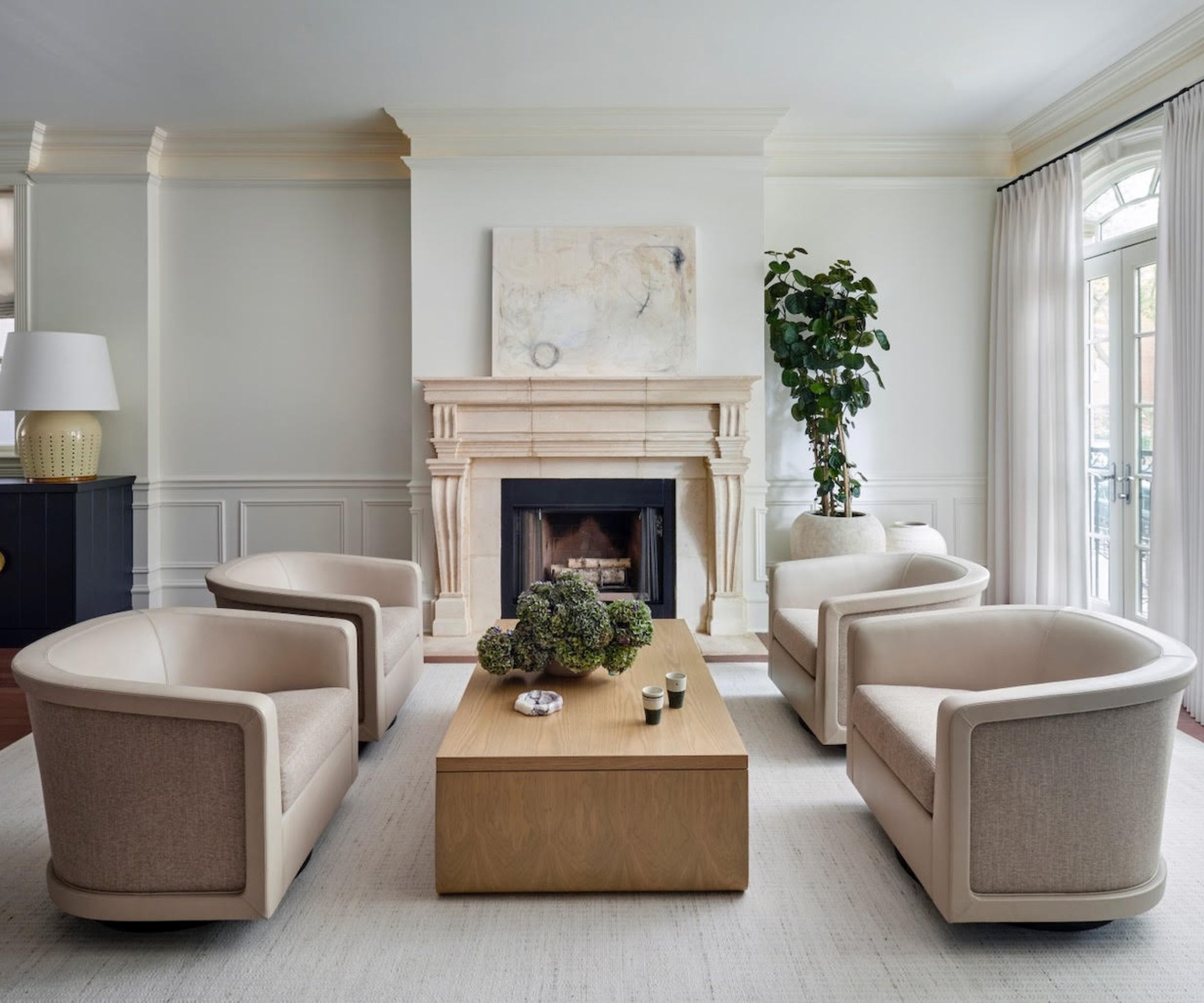
Color and texture don't just come from paint and furniture colors – the natural materials you introduce to your home can add character and textural interest without taking away from the minimalist style. If you're opting for a neutral scheme, consider adding contrast with wood or stone accents, like in the living room design.
'For a neutral living room to still look elegant and feel elevated, the combination of neutral colors and textures will prevent the space from feeling dull or bland,' explains Amy Kartheiser, of Amy Kartheiser Design. 'Using different shades of neutrals and mixing various textures, such as stone, wood, and fabrics, can add depth, visual interest, and sophistication to the design.'
In this living room, the stone fireplace introduces a warmer hue to the scheme, while a wooden coffee table centers the room and offers some textural interest. This mix of materials and colors still adheres to the minimalist aesthetic but prevents the room from feeling flat and uninviting.
Minimalist style works with more colors than you might think. From cool-toned whites to warm neutrals and even subtle hints of earthy hues, there are plenty of options to create a scheme that feels right in your home. The key takeaway is to strike a balance keeping things simple and paired back, but introducing enough visual interest through texture and contrast. So, whether you introduce a hint of green or add furniture made from beautiful natural materials, these tips are sure to help you create a home that celebrates minimalism!

I’ve worked in the interiors magazine industry for the past five years and joined Homes & Gardens at the beginning of 2024 as the Kitchens & Bathrooms editor. While I love every part of interior design, kitchens and bathrooms are some of the most exciting to design, conceptualize, and write about. There are so many trends, materials, colors, and playful decor elements to explore and experiment with.