'It was one of the most fun projects we've worked on' – 8 design lessons to learn from the most interesting gray kitchen I've seen in years
Kitchen designer Steven Cooper has done the seemingly impossible, mixing metallics, woods, and light and dark colors, but still created a cohesive and beautiful space

- 1. Pick a hero starting point and build from there
- 2. Create different color areas to keep the eye moving
- 3. If you're going to go dark, go big
- 4. Dark countertops can't be one color
- 5. Don't be afraid to mix metallics
- 6. A mix of wood tones is also encouraged
- 7. Create some sense of cohesion
- 8. Light sources don't have to all be on display
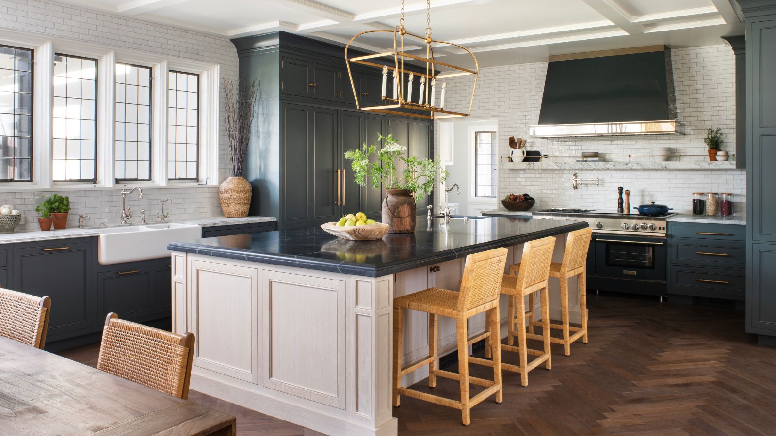
Creating a kitchen full of aesthetic contrasts is not for the faint-hearted. Bringing together different metals, a mix of woods, and pairing light and dark cabinets could, in the wrong hands, feel like a mishmash. But in this elegant and elevated gray kitchen by Steven Cooper of the LA-based studio Cooper Pacific, his masterful touch shows you can have fun with your choices even in the most functional of spaces.
'It was one of the most fun projects we've worked on,' Steven says. 'The home is 100 years old, which by L.A. standards, is historic. Much of it was in its original condition, so it was ready for a refresh, but we wanted to be mindful of its framework and respectful of its history, not just modernizing for the sake of it. But it was a bit quirky. Back in the 1920s, the original owners had staff, who had their own quarters on the back of this kitchen, and there was just a small receiving room. We wanted to reinterpret all that for today.'
The result is a scheme Steven was able to flex his design muscle in, pulling together different kitchen ideas in a way that has led to a rich and fascinating space. Here are the eight design lessons to take from it, to allow you to be a little more creative yourself.
1. Pick a hero starting point and build from there
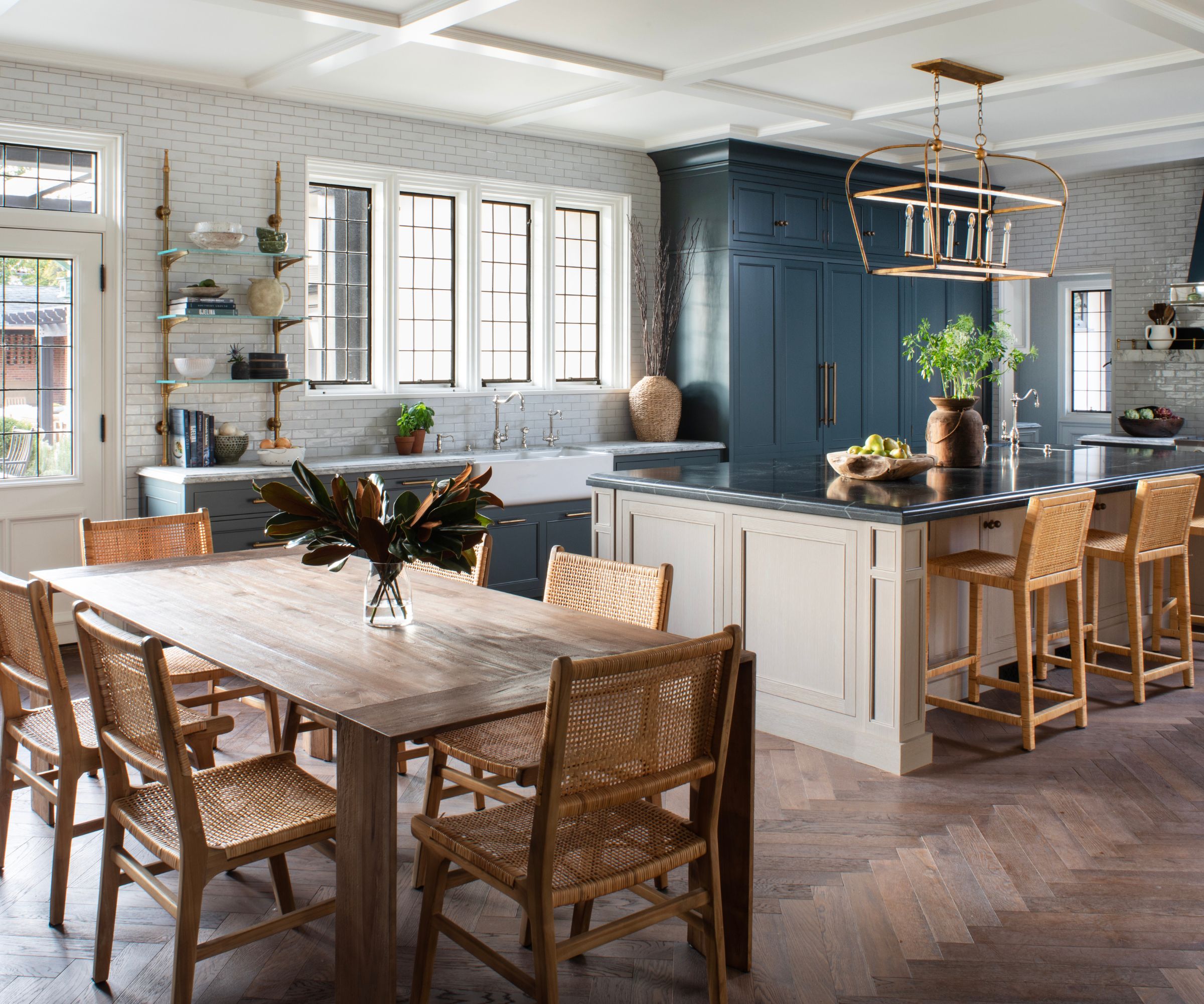
'I tend to always love a big, bold, rich tone in the kitchen,' Steven says. 'And being mindful of the home's architecture, the kitchen flooring was the place we started. Throughout the house, there was a wonderful herringbone wood floor, and although it was worn in the kitchen and needed to be replaced, if we'd gone for a modern, bleached-out oak it would have contrasted with the rest of the home too sharply.'
Choosing the floor was what set the rest of the room's design in motion. 'We wanted to balance it with something more neutral – you can't have too many heroes in one space,' Steven says. 'So the kitchen island was a nicely grounding and neutral element, pulling in that bigger, bolder color of the floor, which was also balanced by the white subway tiles and the large white ceiling. You need a bit of warmth somewhere if you're using white.'
2. Create different color areas to keep the eye moving
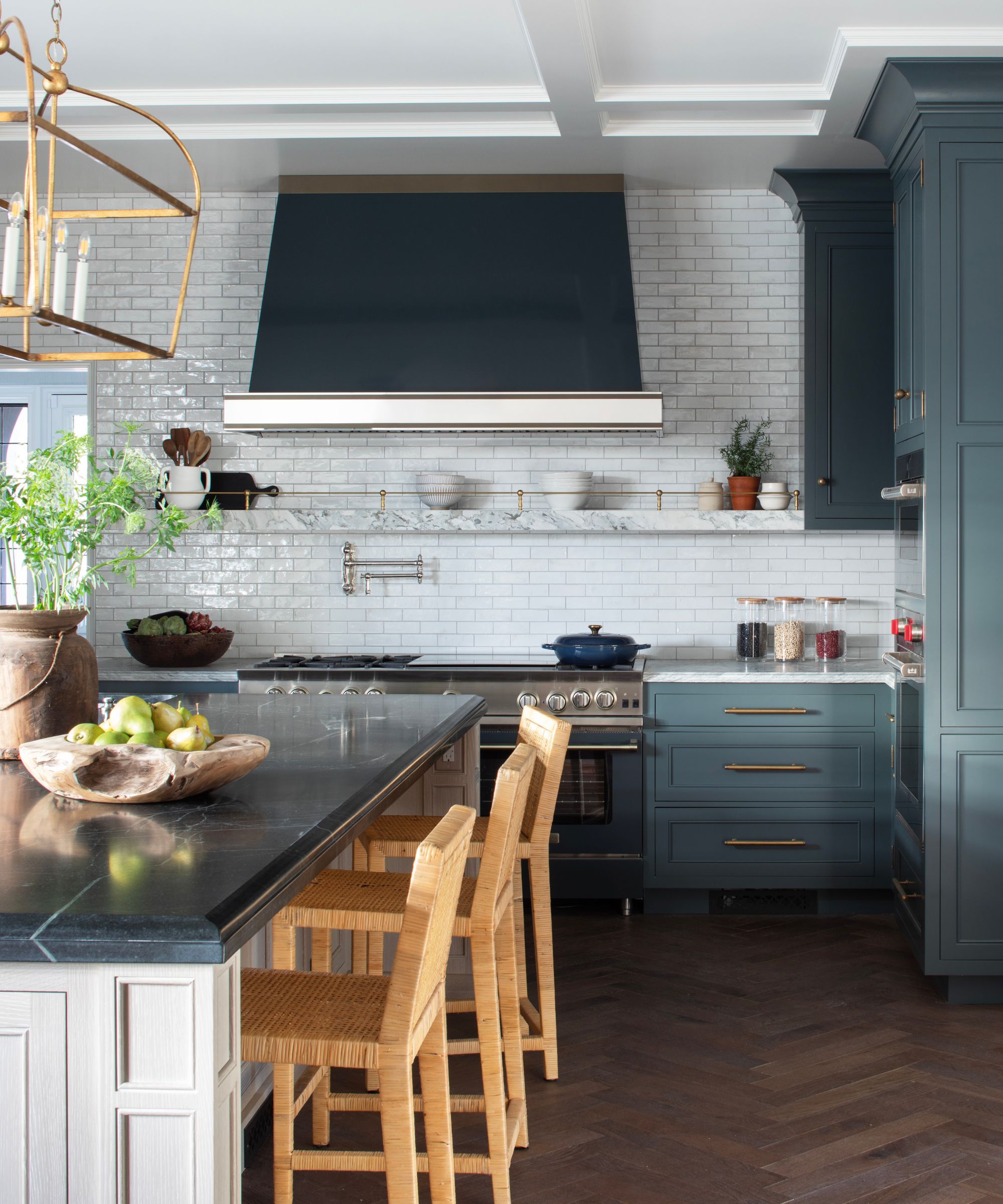
Part of the charm of this kitchen is that Steven wasn't afraid to create different areas of color. The dark kitchen cabinets around the edge, painted in Benjamin Moore's Dark Pewter, is the exact opposite of the creamy island in the center, painted in a very light wash of Benjamin Moore's Driftwood.
'You want to pull the eyes to the middle of the room, and then back out again,' Steven says. 'The big expanse of white subway tiles draws the attention to the back wall and window, creating an immediate understanding of how expansive the space is, while the depth of color from the darker cabinets around the perimeter was important to bring richness, and make those paler shades stand out.'
Design expertise in your inbox – from inspiring decorating ideas and beautiful celebrity homes to practical gardening advice and shopping round-ups.
3. If you're going to go dark, go big
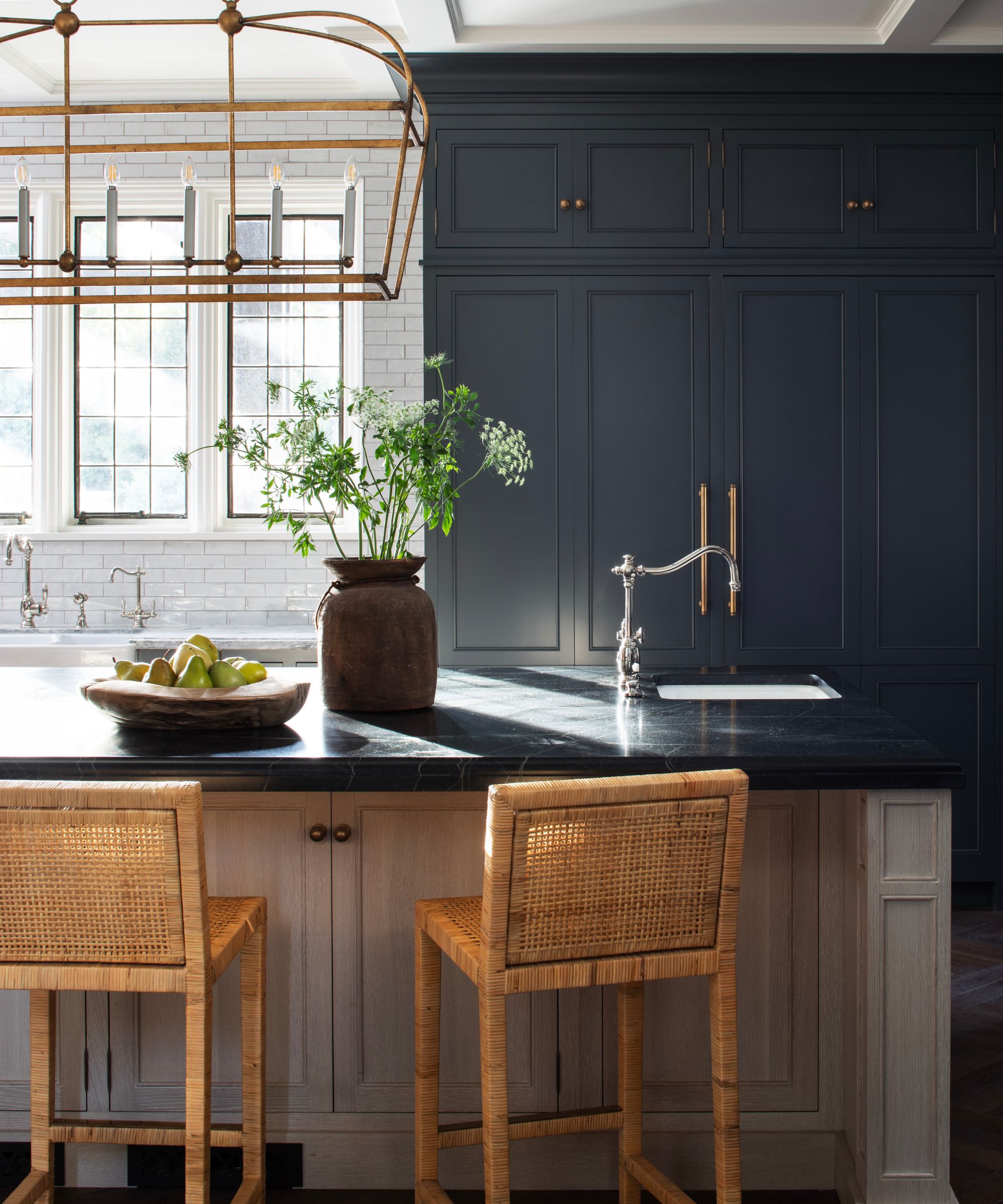
While using dark colors in a light-filled kitchen can seem counterintuitive, Steven says they're important to use, and important to use with courage. 'Having a push and pull between dark and light is key,' he says. 'In a space this grand and wonderful, you need a pop of negative color to offset all the grandness.'
That's why he took the dark cabinets all the way to the ceiling, instead of keeping them below counter height. 'It felt like a natural choice,' he says. 'It's a misnomer that bold tones can't be easy to live with. And if this kitchen had been all white, it would have felt too safe.'
4. Dark countertops can't be one color
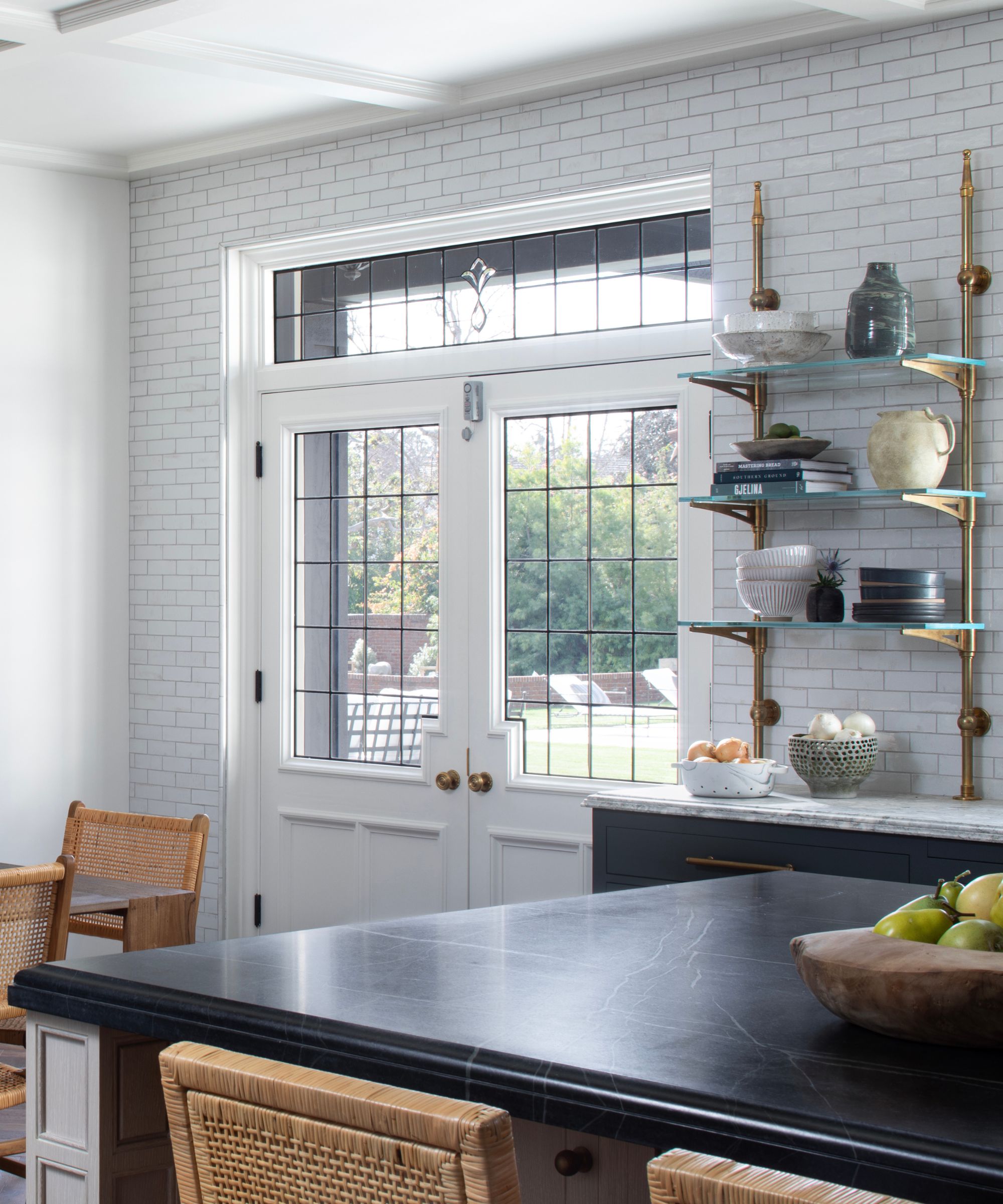
Dark countertops continue to be a big kitchen trend, but many of us are scarred by the way developers put a lot of big, black, glossy counters into modern homes in the last decade.
Steven has the answer as to how to make them work – texture. 'The island's countertop is black soapstone and has a subtle white veining to it,' he says. 'A fully white countertop would have been too easy on the eye, whereas a fully black one would have been too much. This sits somewhere in the middle and stops the surface from sucking in all the light.'
5. Don't be afraid to mix metallics
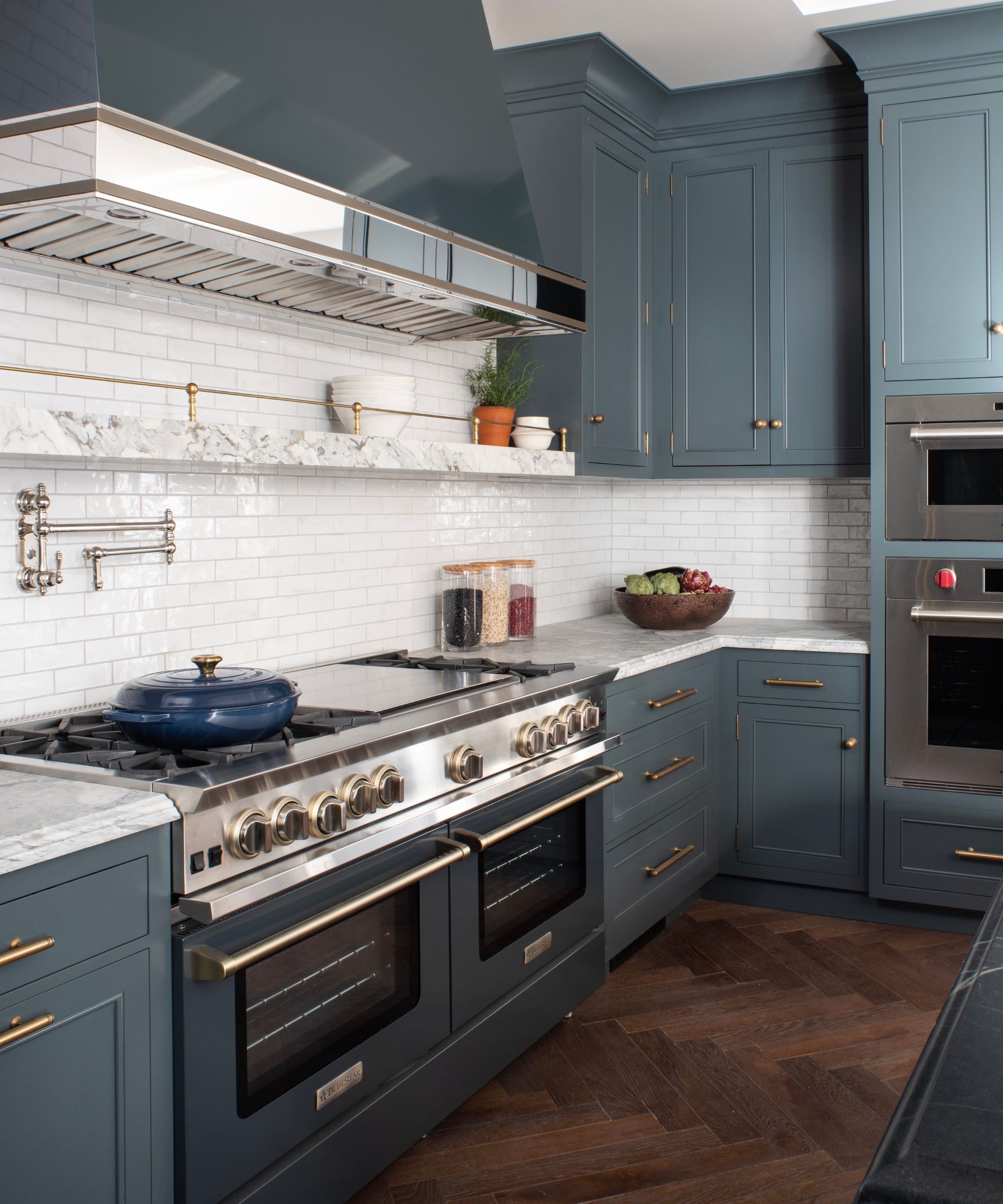
Conventional wisdom suggests we pick a metal finish and stick to it – aged bronze, perhaps, or on-trend chrome. But when there are as many metallic details as there are in this kitchen, having only one finish gets samey, fast so Steven chose to mix metals.
'It gets a bit repetitive to have the same metal throughout, especially when there is as much hardware as there is here,' Steven says. 'Waxed brass handles were informed by the home's existing architecture, and then contrasted by the chrome faucet. I always think chrome is a more practical choice for a faucet because it doesn't patina from water like brass does, and it recedes from the eye a little, meaning you tend to focus on the more interesting details elsewhere.'
6. A mix of wood tones is also encouraged
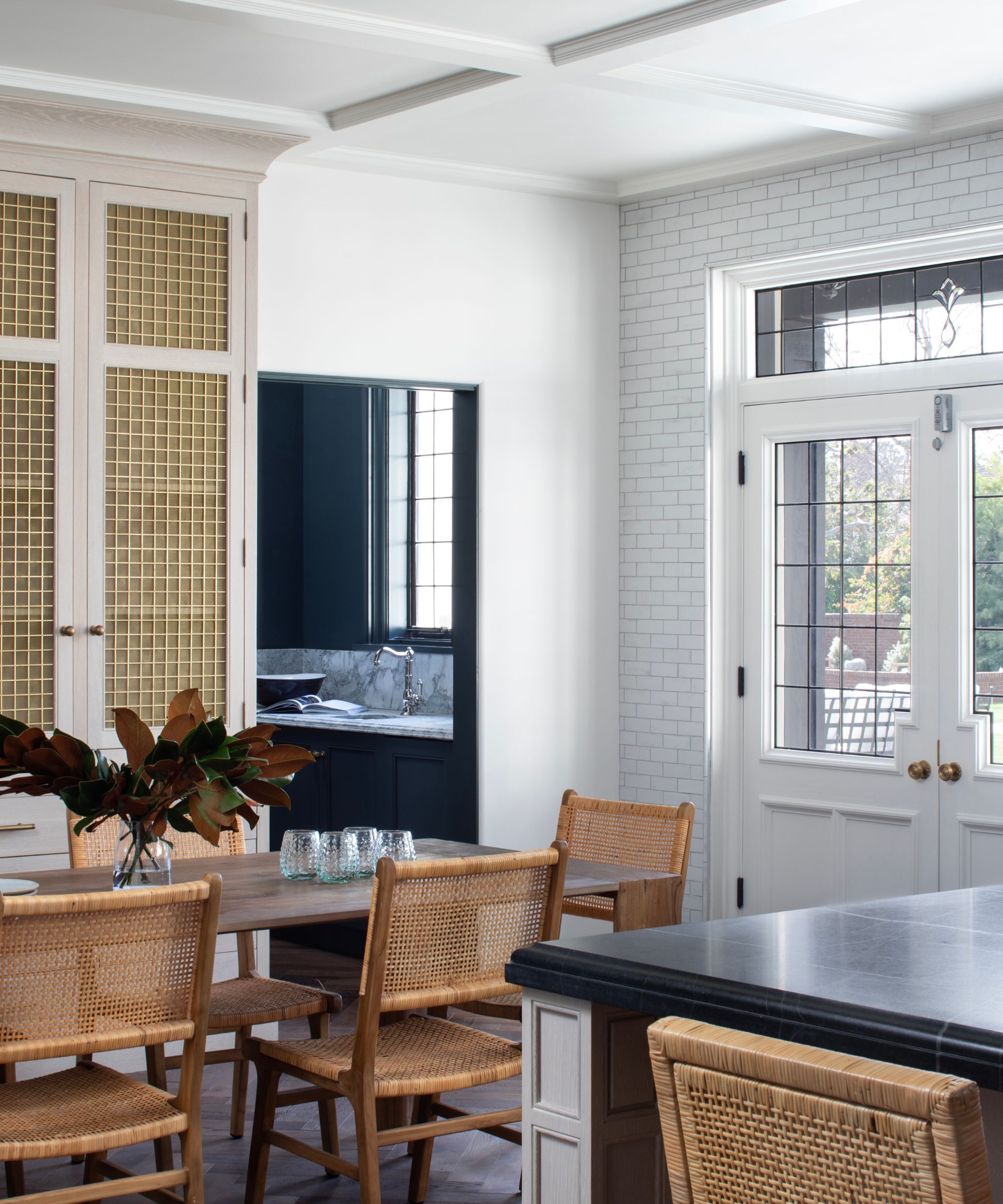
There are several different wood tones in this space – the floor, the counter stools, the table – and this approach flies in the face of the basic design rules that require uniformity. But Steven says they were essential to giving this kitchen the personality it has.
'The choice of woods was less about the color and more about the texture,' he says. 'The older farmhouse-style table has a real texture to it, while there is some relief in the grain of the stools, too. I like the thought of those pieces having their own resonance and character, that complements that which already comes from the floor.'
7. Create some sense of cohesion
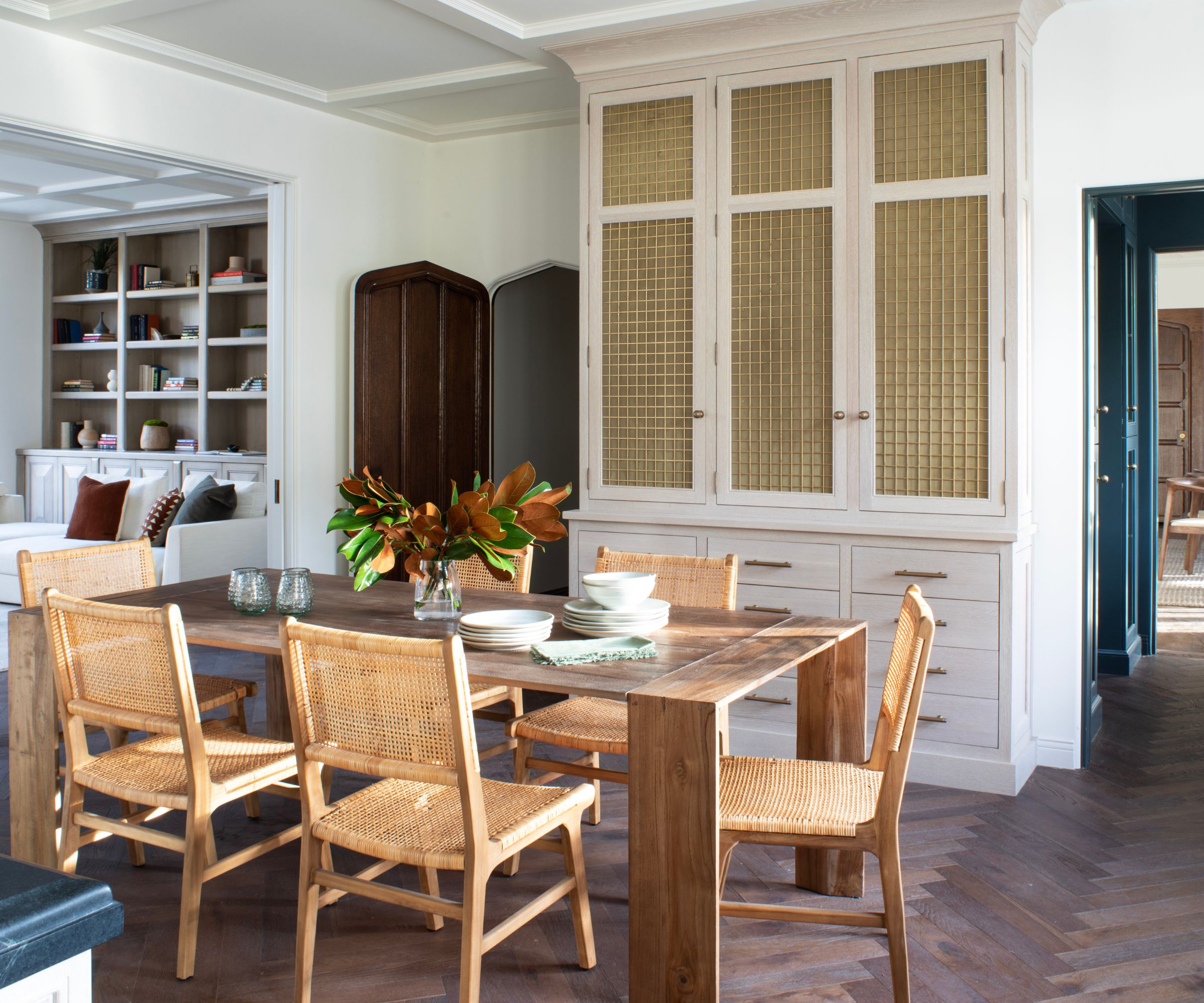
Despite the mix of colors, metals, and woods in this kitchen design, Steven hasn't just used whatever he was drawn to whenever he felt like it. There are themes here that connect every choice and make them all work together.
They come together on the brass-fronted cabinets which line the dining table. 'They actually pull in all the elements of this kitchen,' Steven says. 'Their dark color reflects the darker cabinets on the other side of the room. Their gridded brass fronts mirror the gridded detailing on the ceiling. And their texture is similar to that found on the floor. Having a through-line like this allows you to be more playful in your design choices.'
8. Light sources don't have to all be on display
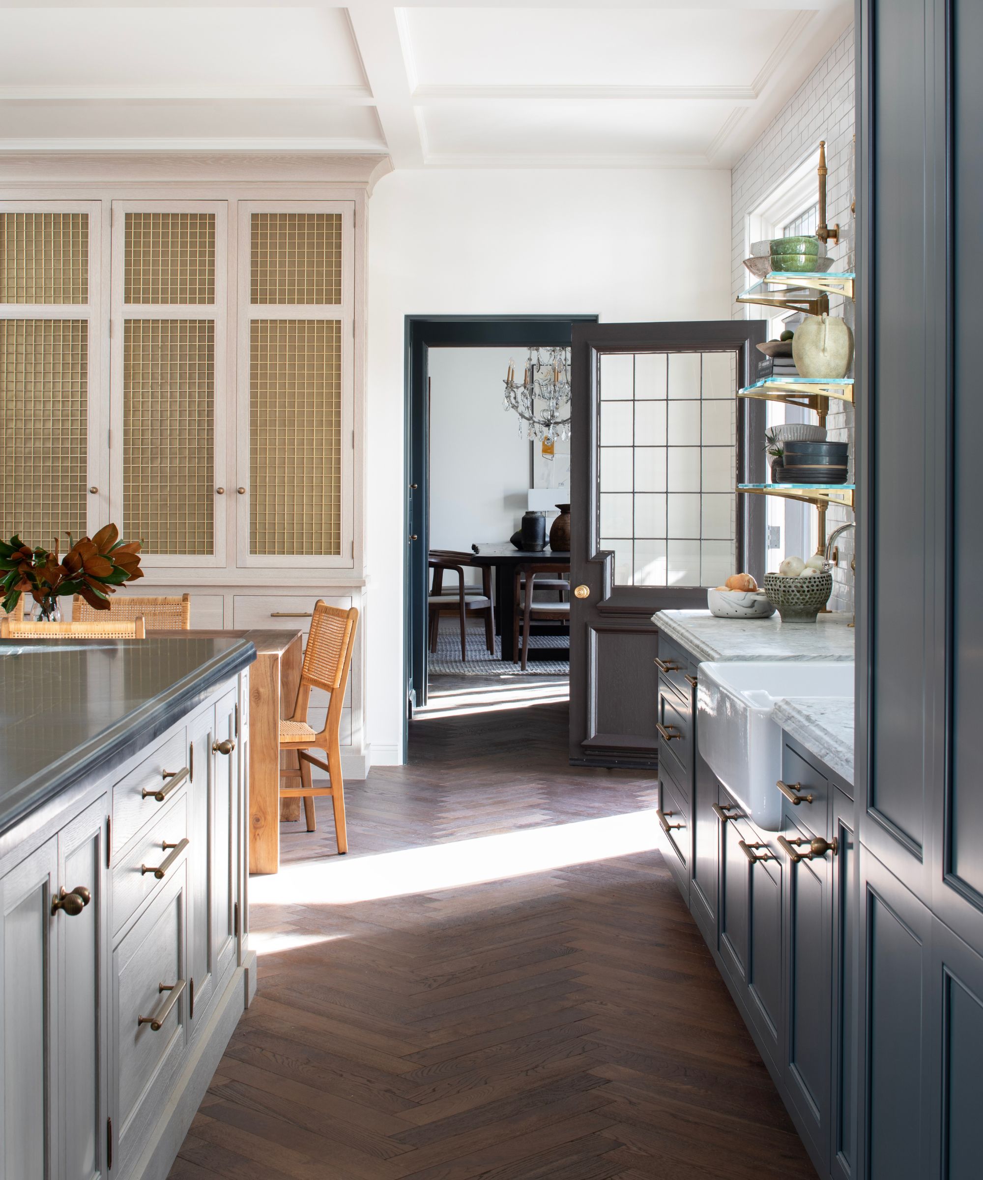
Dark gray kitchen with white countertops, with an island in light beige and a darker countertop and dark herringbone flooring
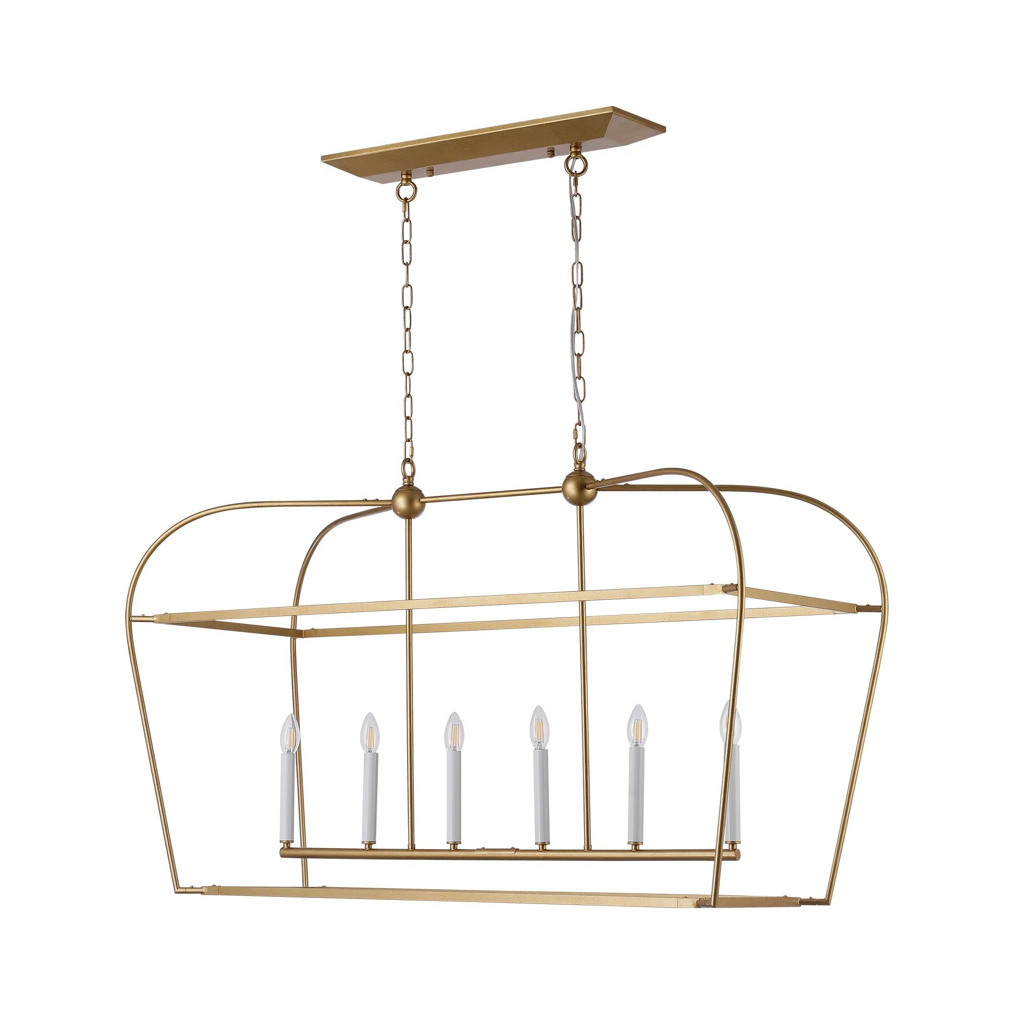
You'll notice the impactful light above the island, but other than that, you won't be able to see any other light sources in this kitchen design. But of course they're there, hidden in the details of the ceiling and cabinets.
'There is plenty of recessed kitchen lighting, hidden around the room,' Steven says. 'This allows you to wash the space with light, bathing you in a gentle glow that makes you feel so much more convivial than, say, spotlights would. Recessed lights are perfect for relaxed evenings in the kitchen.'
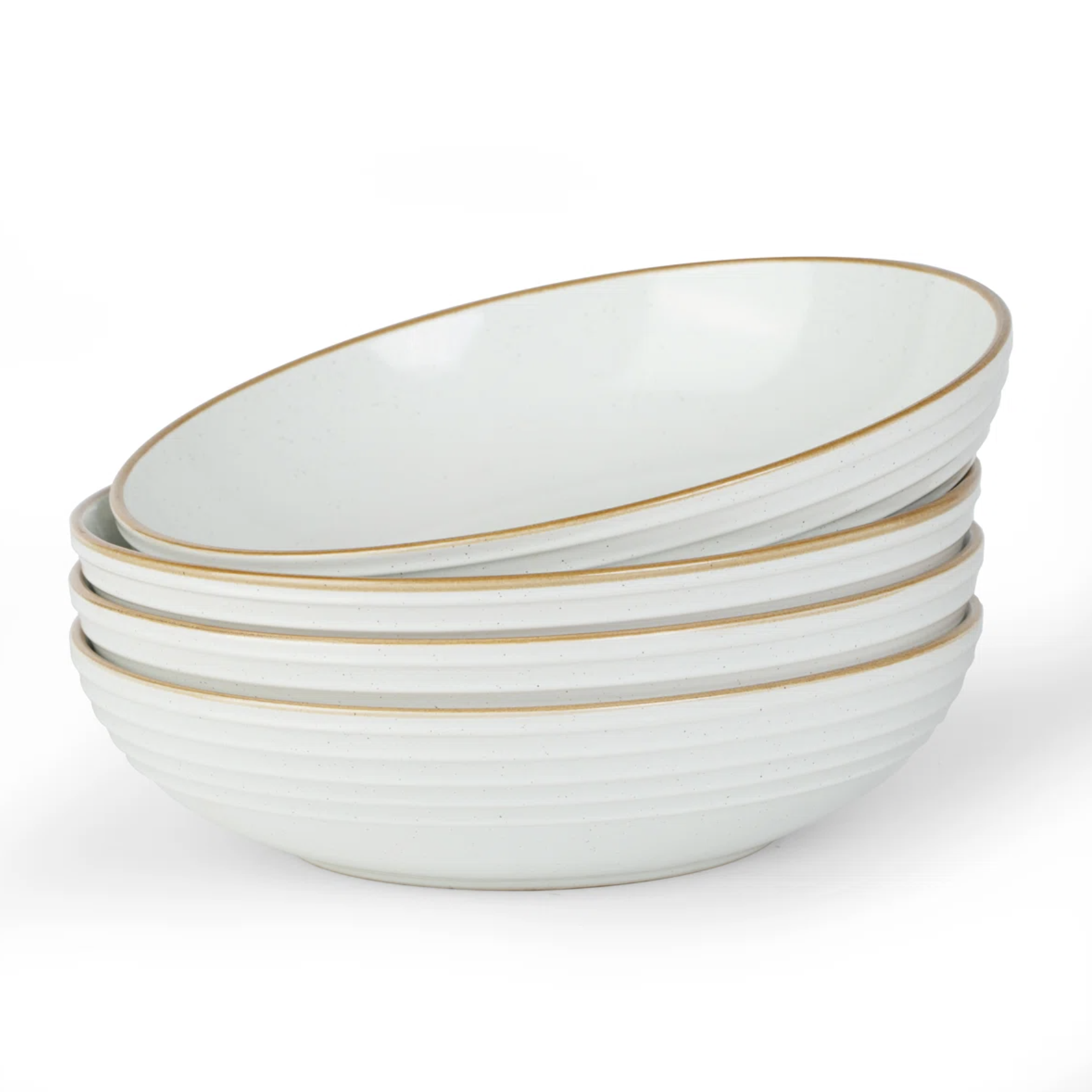
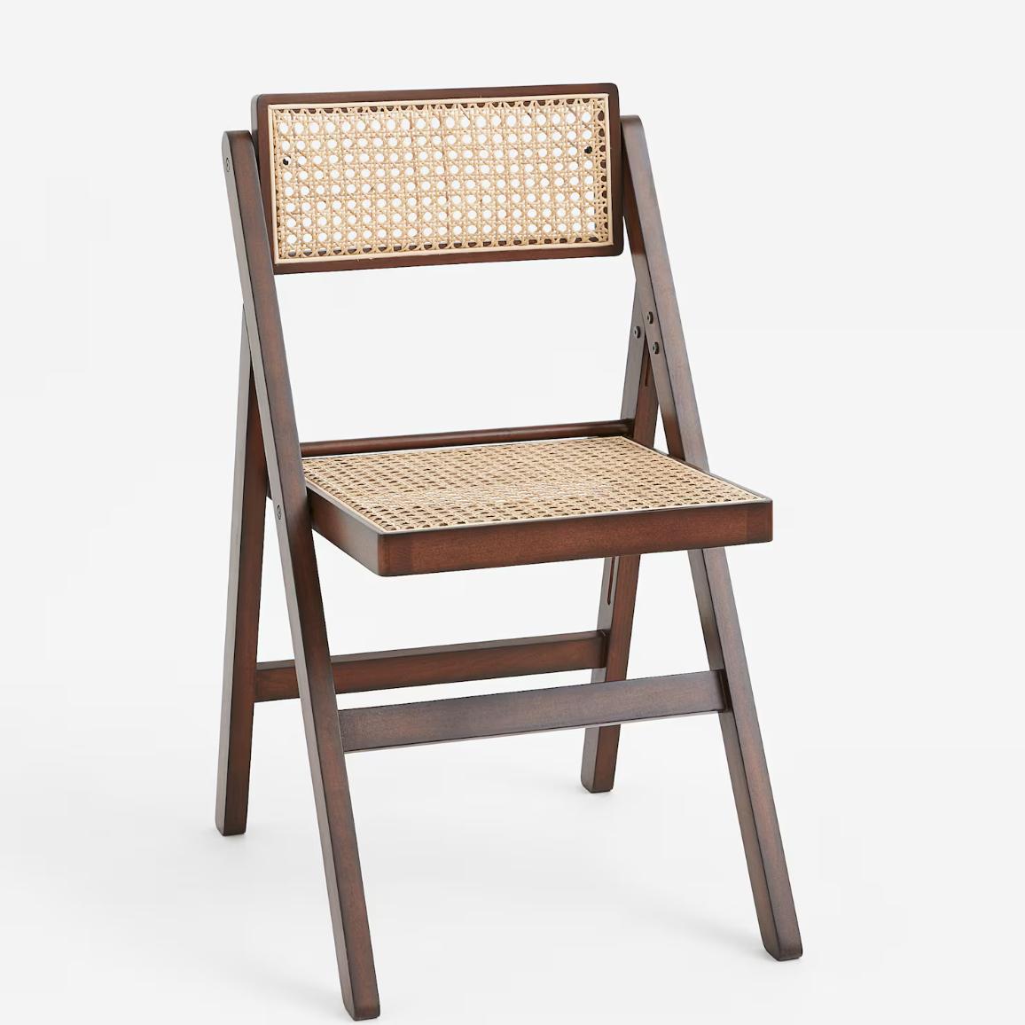
Shop the look
Steven has shown that, with a little cohesion and a lot of confidence, it's easy to mix colors and materials in the kitchen. Brass, silver, dark, light, they all come together here. These pieces will help you put together his look yourself.
Pip Rich is an interiors journalist and editor with 20 years' experience, having written for all of the UK's biggest titles. Most recently, he was the Global Editor in Chief of our sister brand, Livingetc, where he now continues in a consulting role as Executive Editor. Before that, he was acting editor of Homes & Gardens, and has held staff positions at Sunday Times Style, ELLE Decoration, Red and Grazia. He has written three books – his most recent, A New Leaf, looked at the homes of architects who had decorated with house plants. Over his career, he has interviewed pretty much every interior designer working today, soaking up their knowledge and wisdom so as to become an expert himself.

