9 ways this bright kitchen remodel gives original features a new chance to shine
The kitchen in this historic San Francisco home showcases original features alongside modern updates and practicalities

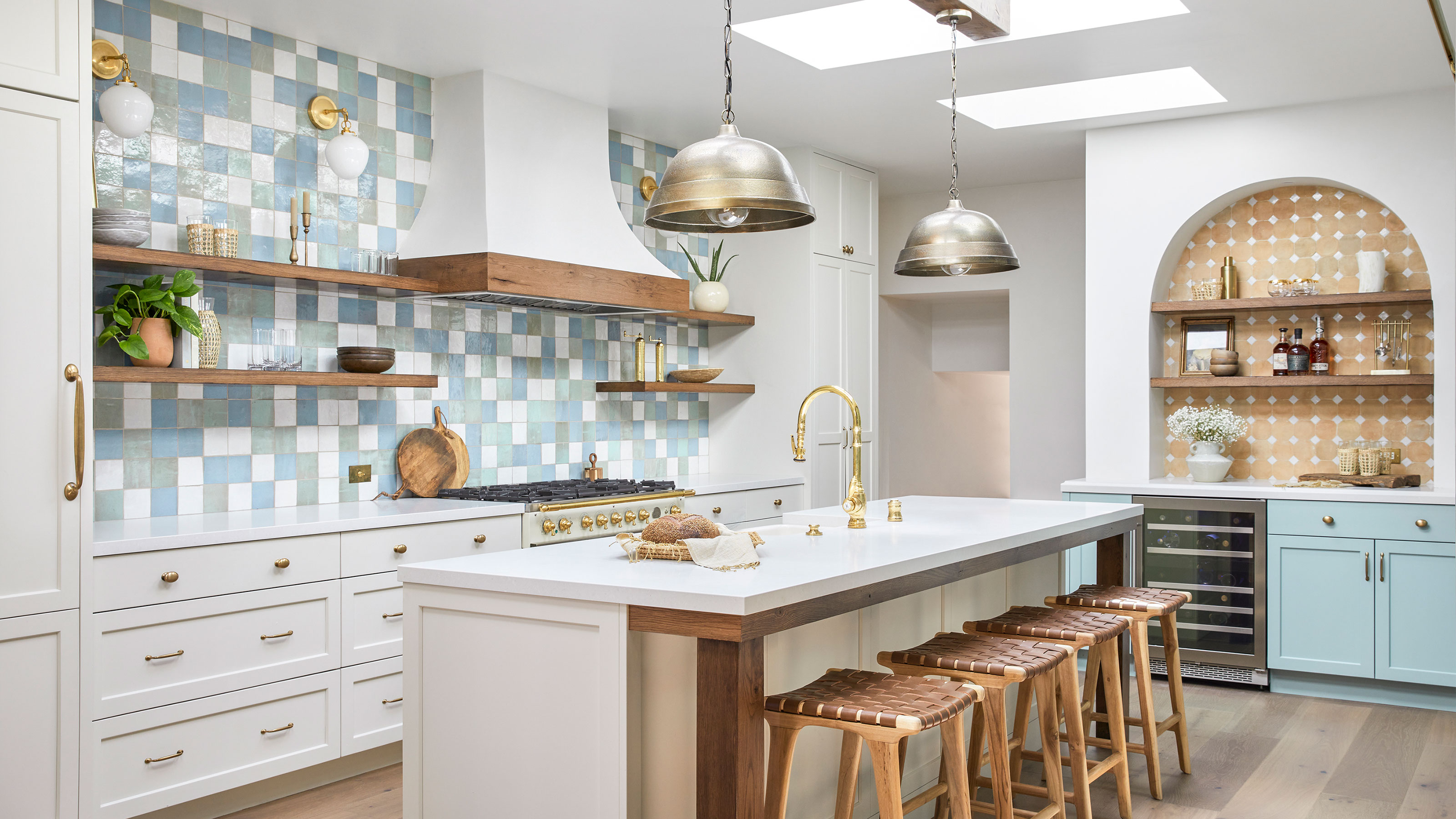
The brief for this San Francisco kitchen remodel sounded relatively simple. Create a light and spacious new look that remained in keeping with the overall feel and original features of the 1913 Spanish-colonial style home. So far, so simple. However, the key kitchen ideas for the remodel also had to blend the wife and husband owners' different design preferences. She likes colorful, bohemian looks while he prefers mid-century modern styling.
The interior designer tasked with this careful balancing act was Adrian Dagli, founder of Interior Wanderer. Adrian worked with the couple to ensure all their priorities for the new kitchen were addressed.
1. Keeping the kitchen light and bright
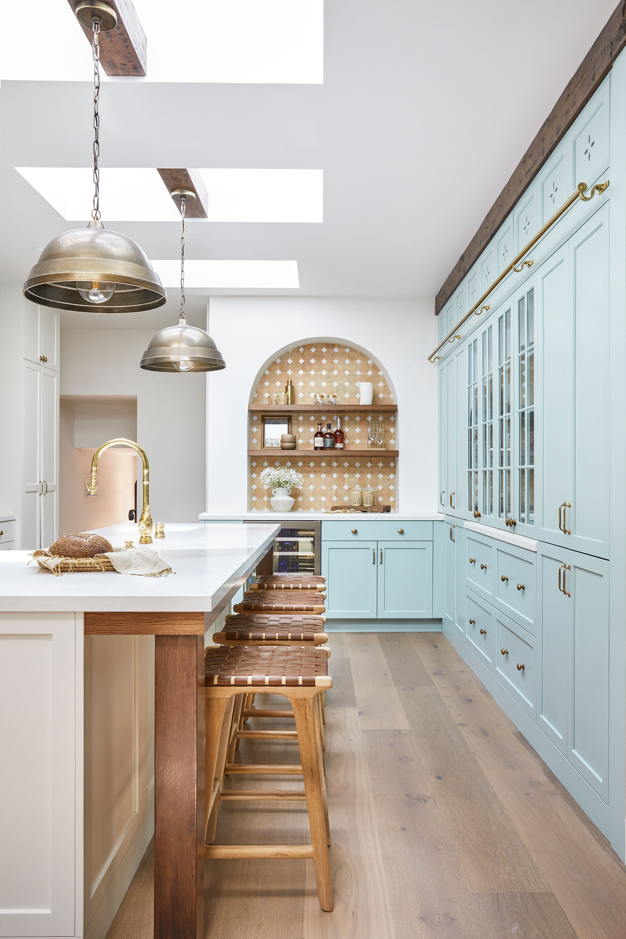
One of the owners' major concerns was that in enclosing a central atrium to increase the kitchen square footage they would lose some of the natural light to the room. With this in mind, says Adrian, 'keeping everything feeling light and bright with all finish selections was an absolute must'.
Adrian advised keeping kitchen countertop ideas pared back and simple, to ensure that light reflected back into the room. So the Caesarstone in organic white was the perfect choice for this.
Similarly by selecting light paint shades for the cabinetry – Benjamin Moore's Soft Chamois for the base cabinets and island with Sherwin Williams' pale blue-green Quietude for the wall of cabinets – the room remains a bright space.
Suspended from wooden beams across the skylights are two large antique brass pendant lights that ensure the island is well lit in the evenings as well as in daytime.
2. The bar area reflects the home's original features
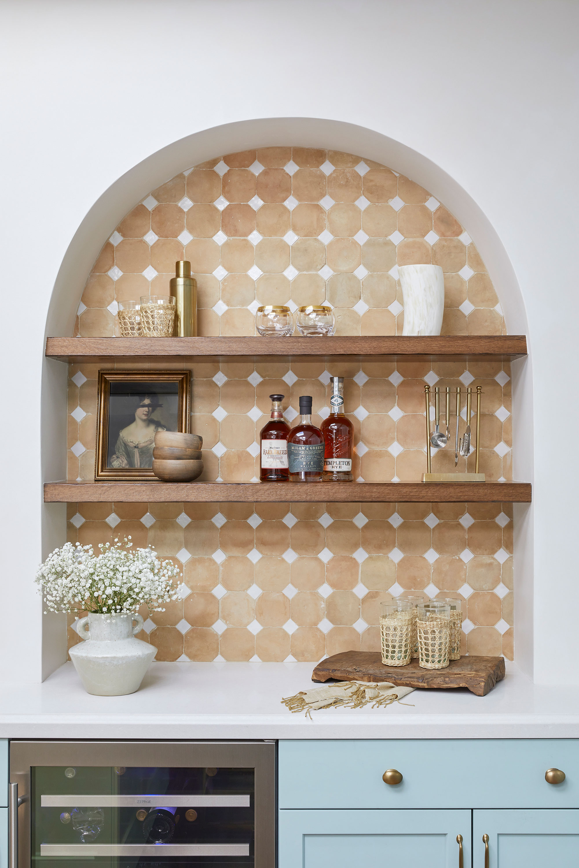
No single design element in this kitchen says 'Spanish-colonial' quite like this new bar area. That's because when Adrian was considering home bar ideas for the new space, it seemed the perfect spot to reference the home's original architecture. In fact, Adrian says the design inspiration for this bar area came to her on her initial visit to the home.
Design expertise in your inbox – from inspiring decorating ideas and beautiful celebrity homes to practical gardening advice and shopping round-ups.
'We knew many of the storied characteristics of the home were going to be demolished,' says Adrian. 'Our goal was to restore them in a modern way – and an arched bar seemed like the perfect opportunity, not to mention a natural fit to restore the terracotta we lost when the old kitchen was removed.'
3. A standout range cooker sets the style theme
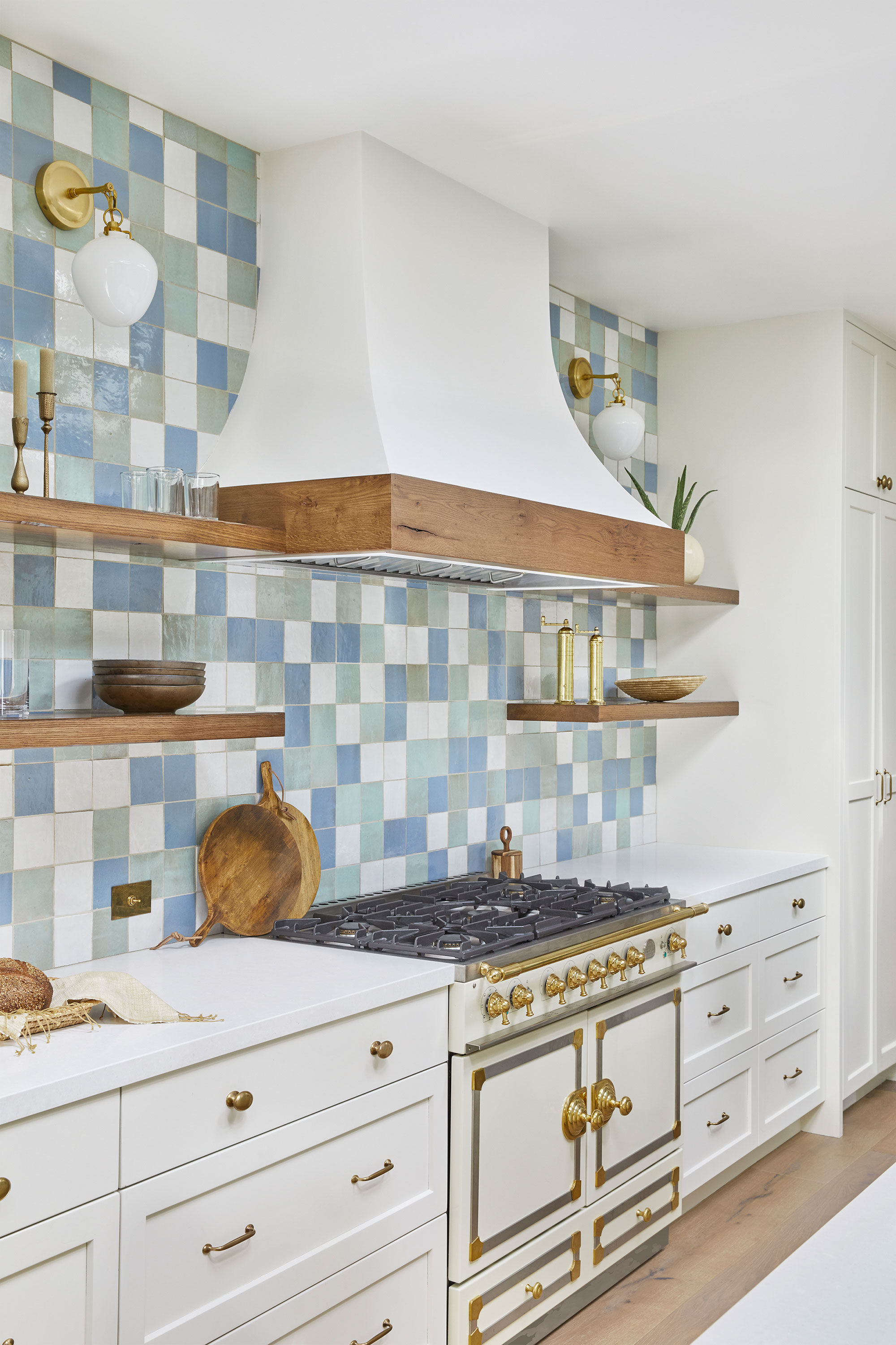
When it came to key appliances, top of the list and the first item to be ordered was the La Cornue range cooker.
'The clients wanted a double oven from the start, and we all fell in love with the distinguishable character of the La Cornue,' explains Adrian. 'We knew this would be a colorful kitchen, so we opted for ivory to ensure it would fit with future design plans. This little number helped to set the tone right away.'
What about the inspiration for the retro oven hood? 'We knew that a large, custom oven hood would add so much architectural charm to the expansive range wall,' explains Adrian. But it didn't stop there. 'Every curve in this kitchen was engineered to perfection,' she adds, 'not least of which was matching the arc of the range hood to the bell of the sconces'. That's true attention to detail.
4. Key design detail? The tiled backsplash
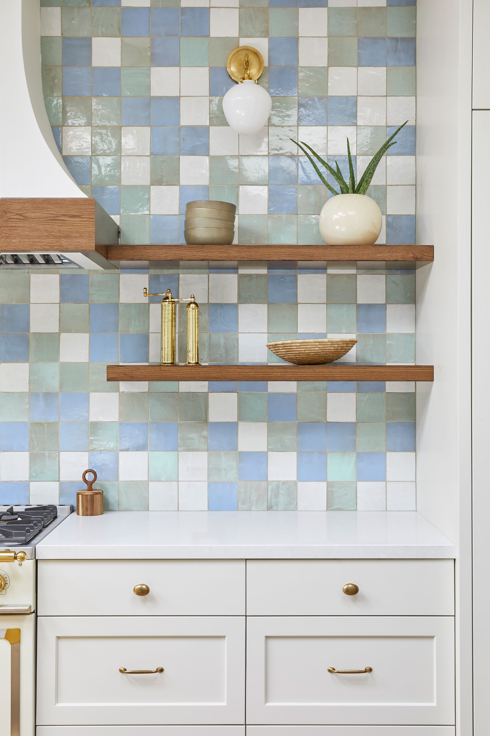
Another key design element came about when Adrian was looking for kitchen backsplash ideas. Although she had shown the clients a selection of traditional tile samples, these striking blue, green and white zellige tiles from Tiles of Ezra were the ones that stood out.
If ever you wanted to hear a backsplash success story – and let's face it, who doesn't – this is it. 'At install, after several hours of dry lay exercises, the wall came to life in the most magical way. The sun beamed from it,' recalls Adrian. 'None of us even wanted to grout it. And that is possibly where the best design decision was made. The clients pushed us to retain the raw look as much as possible, and Urban Putty grout saved the day. It. was. perfect.'
5. A sociable and practical kitchen island
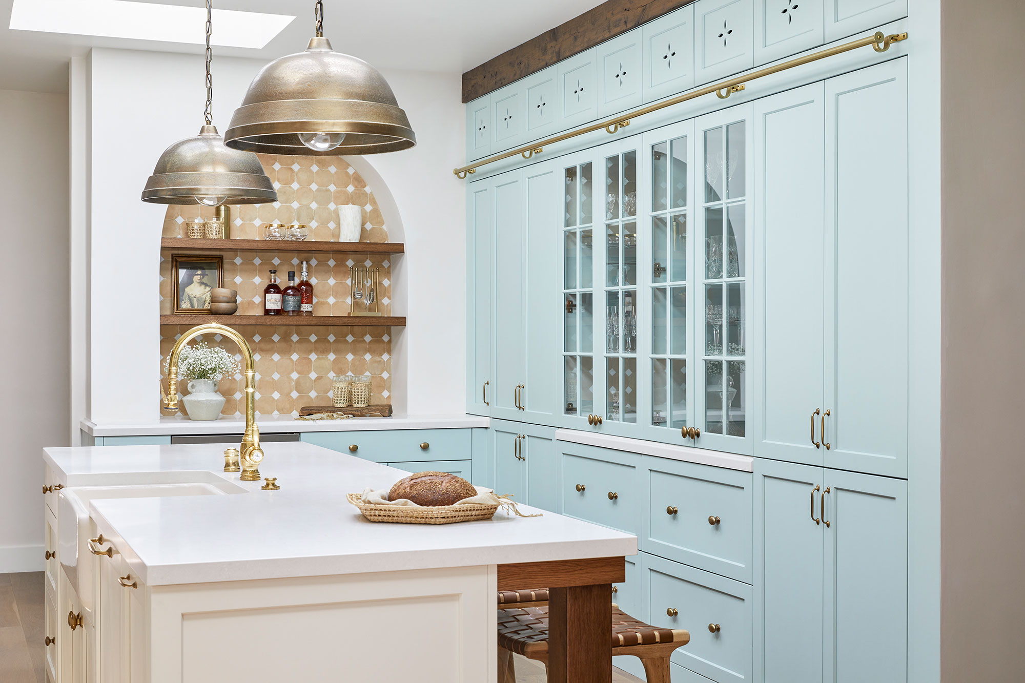
'A large island was part of the plan from the start,' says Adrian. 'A place where the family of four (or five if you count their handsome St Bernard) could gather. And we hid charging stations under the apron for maximum functionality during WFH times.'
Among the kitchen island ideas that are bound to inspire, are the traditional unlacquered brass Waterstone faucet and Armac Martin hardware. Both were chosen to echo the old-world feel of the La Cornue range. Rich wood island posts and a wood apron meet the countertop overhang, referencing the home's original wood finishes and creating harmony with the engineered wood flooring.
6. Aesthetic storage solutions
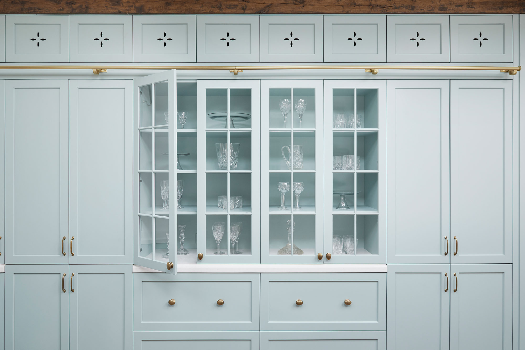
The couple were keen to maximize storage. However, as she considered the various kitchen storage ideas, designer Adrian knew that a floor-to-ceiling pantry wall would simply feel too heavy in the space.
'Our work was to determine the best way to visually break up a wall of cabinets without compromising storage,' she explains. 'We incorporated French glass doors that rested on an ogee countertop edge, allowing depth and light to reflect into the space.'
Deep drawers underneath accommodate bulkier storage items and bring design interest to the other vertical doors. While details, like the warm brass ladder rail and custom motif detail add further personal touches. A hand-hewn wood header above the cupboards connects with the ceiling beams in the dining room (see below) and the finish in the living room. Continuing details like this into adjoining spaces in the home helps to maintain a sense of harmony and reflects the home's original features.
7. A dining area that continues the style themes
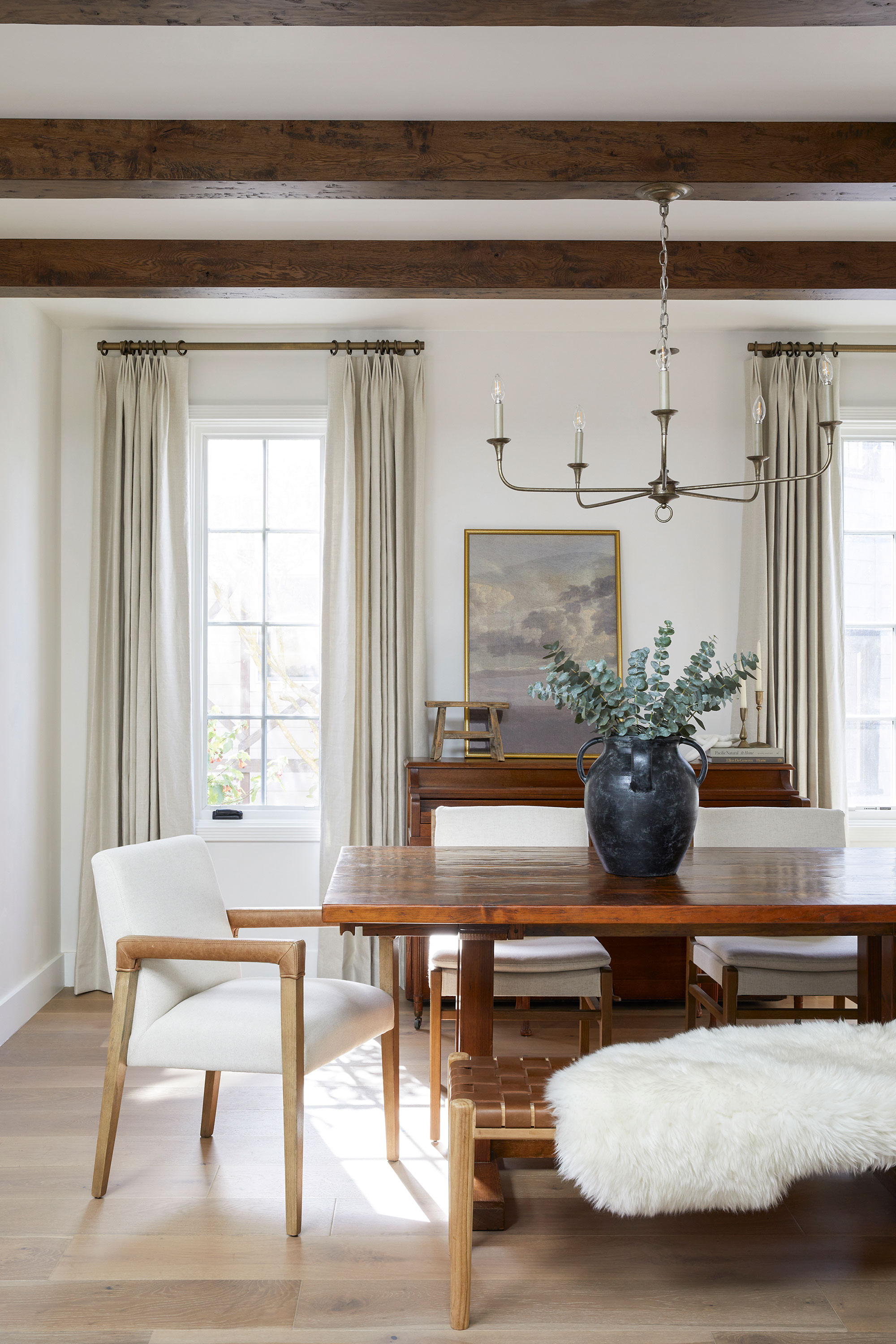
With the atrium removed, the kitchen now adjoins the existing dining area. And thanks to the original expansive archways, the dining space flows into the living room. Ensuring the new kitchen finishes were woven throughout the dining and living space was an absolute must.
Adrian's dining room ideas included a wood beamed ceiling treatment for the dining room with hand-hewn beams, that were stain-matched to the original living room molding (see below).
These rich wood tones and textures appear in the kitchen with wane-edged shelves, the rustic oven hood trim and the wood apron at the island.
'As a final touch, we pulled the softer finishes from the kitchen into the dining room,' says Adrian. 'Antique brass, warm leather, and creamy textiles from my Interior Wanderer shop fill the dining space. All of these finishing touches allowed each space to share the connected charm and feel of the remodeled kitchen.'
8. A living room – with more style references
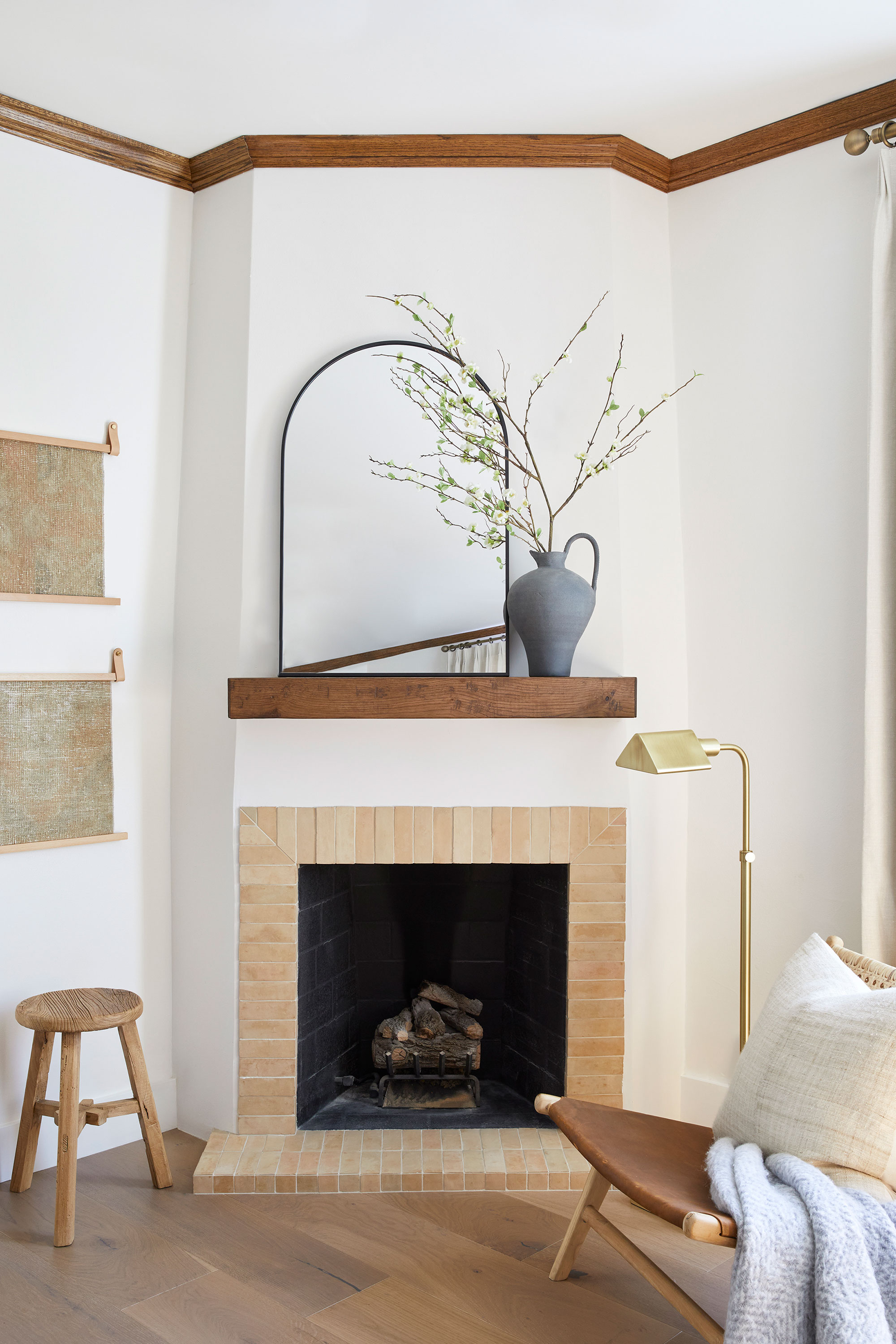
As we saw, the living room's original wooden molding inspired key details in the new kitchen but there was a two-way share of details between the spaces in this house. Central to the living room ideas was working out a way of updating the original plaster fireplace, as Adrian explains.
'Nestled in the corner of the room, it was packed with architectural intrigue thanks to its angled chase,' she says. 'We knew we wanted to repeat the unglazed terracotta finish from the arched bar and so we opted for terracotta zellige bricks. As with all zellige, it’s perfectly imperfect. After considerable demo work and plaster-crafting, the chase met perfectly flush with the stunning zellige surround as we had hoped.'
Above it, a hand-hewn wooden mantle connects to the adjacent dining room beams and the fireplace is styled with more Interior Wanderer shop items alongside a Saffron & Poe lounge chair.
9. Perfect style harmony

The finished look of the remodelled kitchen, in context with the dining and living rooms, is stunning, a true collaboration between designer and clients, but also between new and existing style references.
'The kitchen was designed for a couple who had colorful design desires, rooted in a Spanish-style home,' says Adrian. 'They were a huge catalyst for all of our choices and the reason this kitchen design is so unique. They were willing to go bold but understood the need to root the design with earthier elements.'
Design: Adrian Dagli, Interior Wanderer
Build: Kevin Laiks, The Urban Builder
Architect: Kevin Maxey, KMD
Photographs: Margaret Austin
Karen sources beautiful homes to feature on the Homes & Gardens website. She loves visiting historic houses in particular and working with photographers to capture all shapes and sizes of properties. Karen began her career as a sub-editor at Hi-Fi News and Record Review magazine. Her move to women’s magazines came soon after, in the shape of Living magazine, which covered cookery, fashion, beauty, homes and gardening. From Living Karen moved to Ideal Home magazine, where as deputy chief sub, then chief sub, she started to really take an interest in properties, architecture, interior design and gardening.
