Farrow & Ball's color expert reveals the entryway paint mistake to avoid
The paint guru teaches you how to play with the limitations of space – for the right first impression


Your paint choices are transformative in every room, but none more so than your entryway. In this room, your design decisions have the ability to create the right first (and lasting) impression – so it's important to get the color right.
To maximize your chance of success, you could do far worse than following the advice of Patrick O'Donnell, Farrow & Ball's International Brand Ambassador. In his time at the prestigious paint company, Patrick has observed paint ideas – including the hues that work well in the space – and, perhaps even more importantly, the tones to avoid.
Sharing his entryway ideas with H&G, Patrick revealed the biggest mistake you can make when painting – and the tones to use instead.
Article continues belowThe biggest entryway paint mistake – according to Farrow & Ball

The Farrow & Ball expert explains that the biggest error you can make is not considering the light in your hallway. And, even if your space is naturally shaded, you can still utilize the light with paint – and make the area feel bigger.
Many hallways can feel starved of natural light, so most people tend to address this by painting it a shade of white. Whilst this should feel like a logical solution, it can often be a big no-no,' Patrick says. The expert suggests that white paint is likely to lead to the opposite of the desired effect. 'What can happen is you end up in a cold and gloomy space,' he adds.
What should you choose instead?

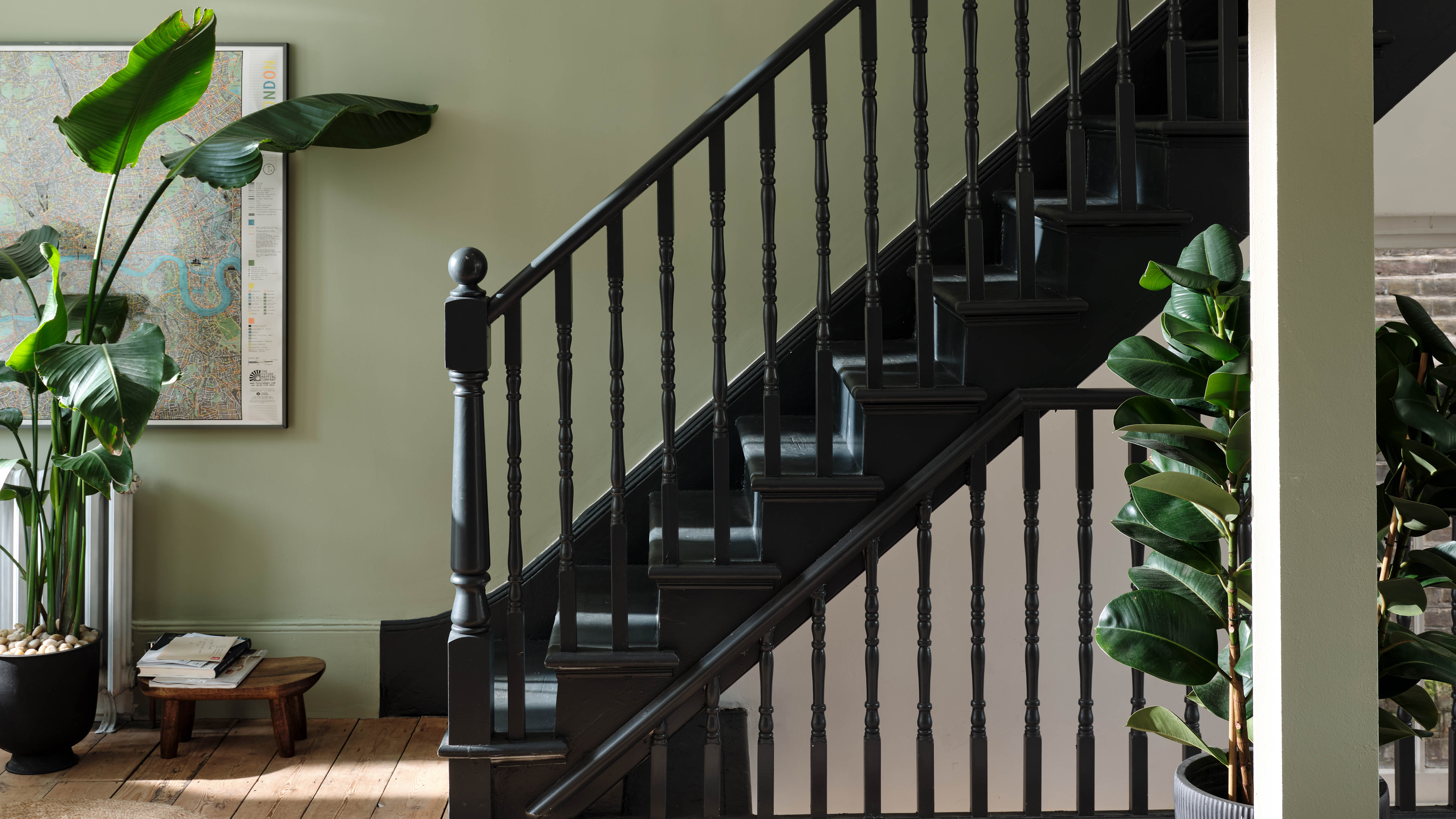
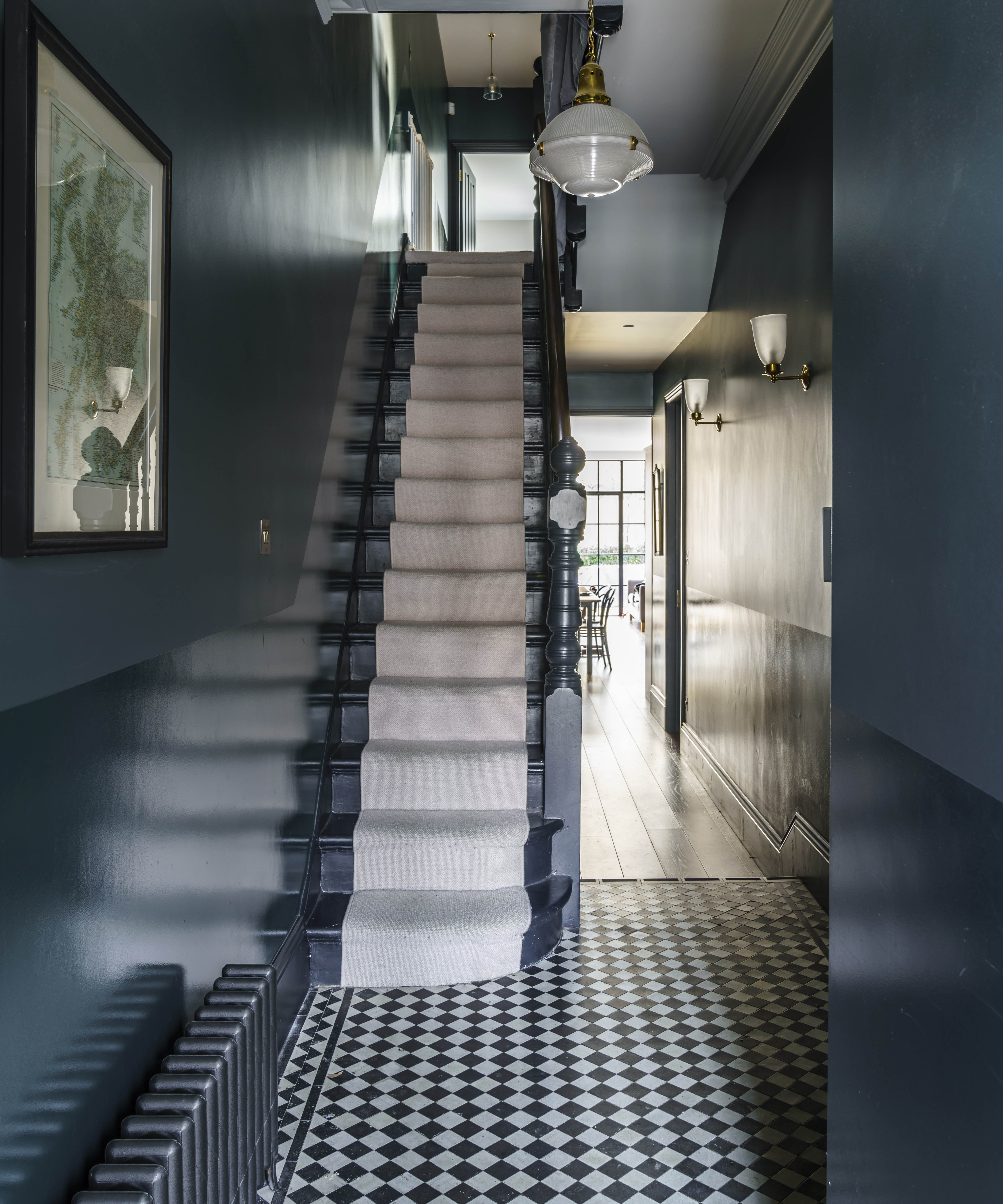
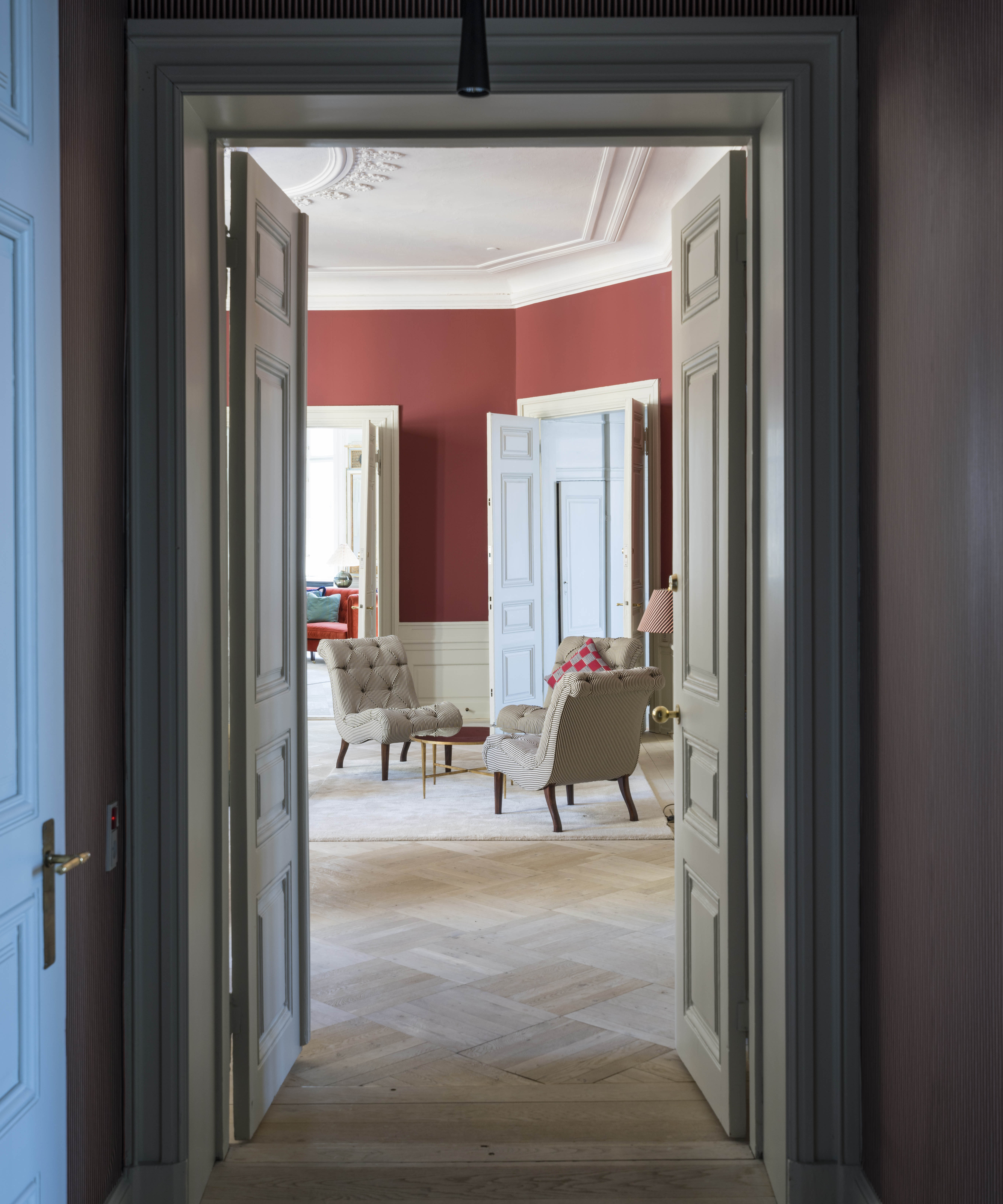
When considering your hallway paint ideas, Patrick suggests opting for warmer shades – 'essentially anything with underlying red and yellow tones,' which can still be neutral. However, if you're tempted to go more dramatic, the expert recommends going dark.
'It always works a treat as you are playing with the limitations of the space, not fighting them,' he says.
Design expertise in your inbox – from inspiring decorating ideas and beautiful celebrity homes to practical gardening advice and shopping round-ups.
Patrick isn't alone in his admiration for darker tones in small entryways. From Farrow & Ball to Benjamin Moore – the paint houses are in agreement: you should go to the dark side.

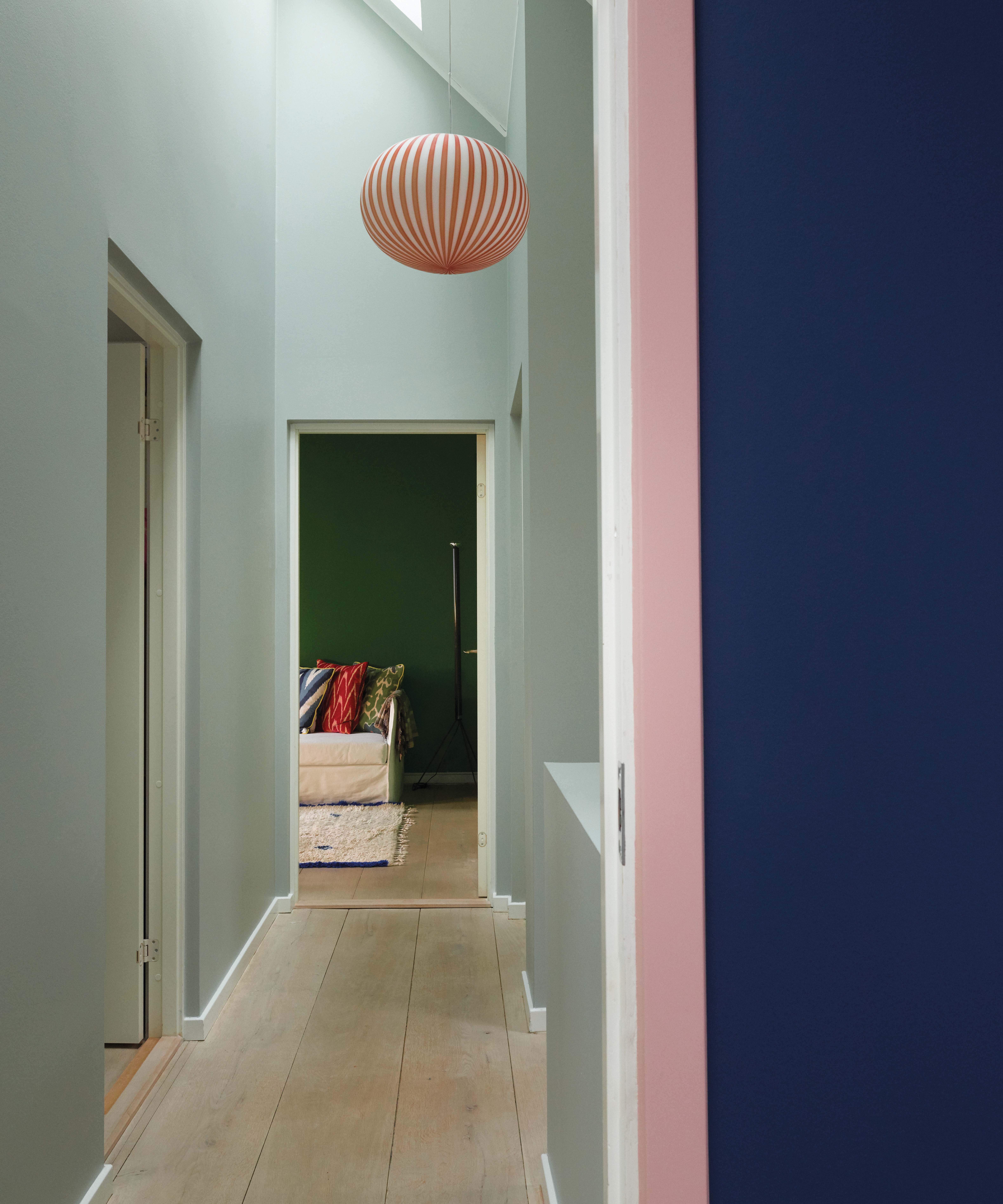
'If you are working with a long narrow space, like a hallway, you can use a darker color at the end to draw the eye through the room and make the area feel more spacious,' says Helen Shaw, the Director Of Marketing at Benjamin Moore.
'As well as using color to create the impression of a larger space, your hallway connects to each room, so the hue chosen should feel harmonious with the rest of the house,' she adds.
Is it time to turn away from a white entryway? If these experts suggest so, we surely won't disagree.

Megan is the Head of Celebrity Style News at Homes & Gardens, where she leads the celebrity/ news team. She has a history in interior design, travel, and news journalism, having lived and worked in New York, Paris, and, currently, London. Megan has bylines in Livingetc, The Telegraph, and IRK Magazine, and has interviewed the likes of Drew Barrymore, Ayesha Curry, Michelle Keegan, and Tan France, among others. She lives in a London apartment with her antique typewriter and an eclectic espresso cup collection, and dreams of a Kelly Wearstler-designed home.