Designer Kit Kemp shares why she doesn't like turquoise – and key times she breaks her own rule to use it
The color master usually avoids this oceanic hue – but there's the exception to her rule

Design expertise in your inbox – from inspiring decorating ideas and beautiful celebrity homes to practical gardening advice and shopping round-ups.
You are now subscribed
Your newsletter sign-up was successful
Want to add more newsletters?
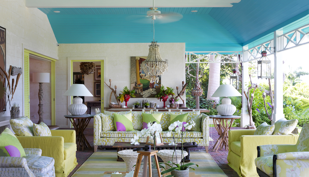
Interior designer Kit Kemp is synonymous with color... Her palette is so iconic that it has shaped hotels on both sides of the Atlantic while creating the most beautiful homes in the process.
Kit is celebrated for her rainbow-infused spaces, which she curates through kaleidoscopic wallpapers, bold textiles, and vibrant artworks. Despite her fearless schemes, there is one color that Kit urges you to use with caution: turquoise.
Kit usually avoids this daring color; however, rules are made to be broken, and even she has succumbed to this vivid tone under specific circumstances. Here, Kit shares her interior design tips – and when to indulge in this aquatic hue – in a recent post.
Article continues below 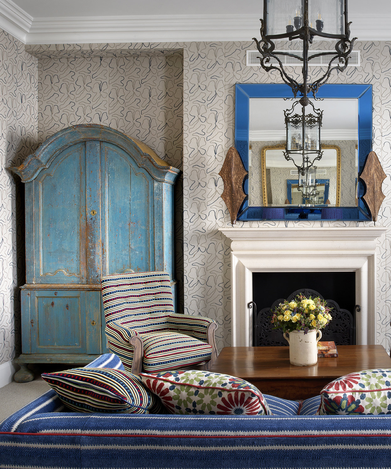
'When it comes to turquoise, the truth is, we don't really like it. Of all the wondrous shades of blue, turquoise is a color I'm forever telling my team to avoid. It can often feel sickly, and a little distasteful,' Kit says. However, when the correct tones of turquoise have the potential to work in a room, Kit isn't afraid to break her rule.
'Perfectly pairing turquoise is key to its success in a room,' Kit reveals. 'Turquoise and all its varying tones can often be the spark that gives a room strength, the happy injection that provides that uplifting feeling as you enter a space, and the twist that gives it interest,' she confesses.
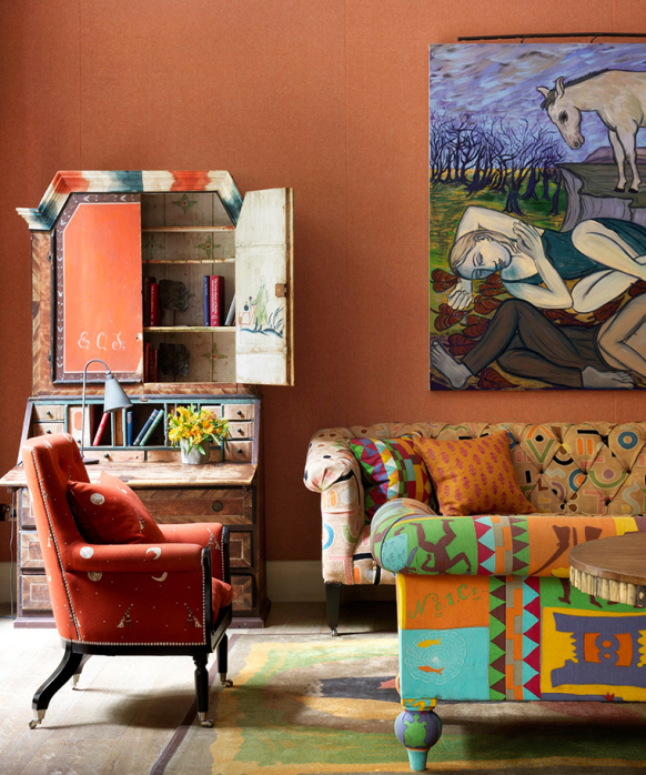
The Drawing Room in Kit's Ham Yard Hotel in London (above) epitomizes Kit's use of turquoise and how to experiment when the right shade of turquoise comes into play. 'Turquoise can be the zing in a room that adds a lively and uplifting feel,' Kit shares. 'The turquoise that comes through in the sofa fabric is a welcome change of pace for the wider room, providing a sharp contrast to the orange and brown tones.'
Decorating with blue can be tricky, and while turquoise is not Kit's first choice, she shares that the color is sometimes the key to a balanced – and wholly exciting – scheme. The secret to success is found in the room's broader scheme and how it pairs with other colors in the space.
Design expertise in your inbox – from inspiring decorating ideas and beautiful celebrity homes to practical gardening advice and shopping round-ups.
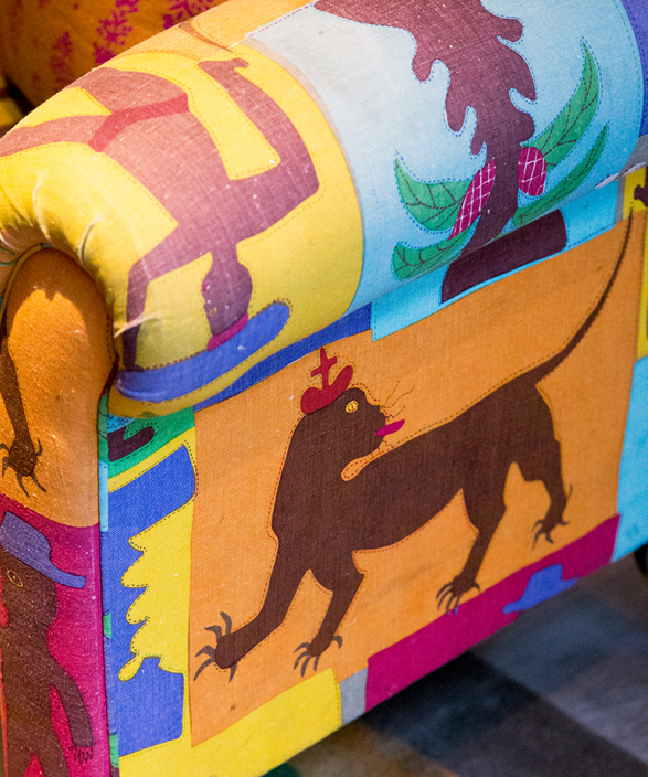
'This lovely zingy green fabric on the chairs is perfectly balanced by the inclusion of turquoise. In the wider room, we also brought it in on the sofa cushions to ensure this energy is seen throughout the space. Together green and turquoise create a beautiful jade-like color, which is rich and exciting to use,' she says.
'Choosing turquoise is a matter of going for the most beautiful jewel tones that sit within the broader spectrum of the color,' Kit adds.
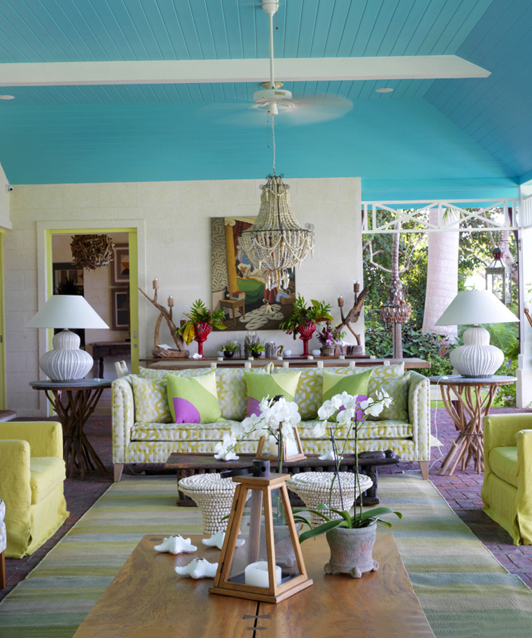
So, the only time you should use turquoise in your home is alongside a suitable color pairing, as seen in Ham Yard Hotel. Plus, Kit Kemp's interior design tips don't stop here, as she exhibits more turquoise interiors over on her blog.

Megan is the Head of Celebrity Style News at Homes & Gardens, where she leads the celebrity/ news team. She has a history in interior design, travel, and news journalism, having lived and worked in New York, Paris, and, currently, London. Megan has bylines in Livingetc, The Telegraph, and IRK Magazine, and has interviewed the likes of Drew Barrymore, Ayesha Curry, Michelle Keegan, and Tan France, among others. She lives in a London apartment with her antique typewriter and an eclectic espresso cup collection, and dreams of a Kelly Wearstler-designed home.