Prediction: 2022's rooms are going to be bright, bold and beautiful – here's how they will look
The latest, exuberant shades to paint your rooms back our theory entirely – plus advice on using them from Little Greene's color expert

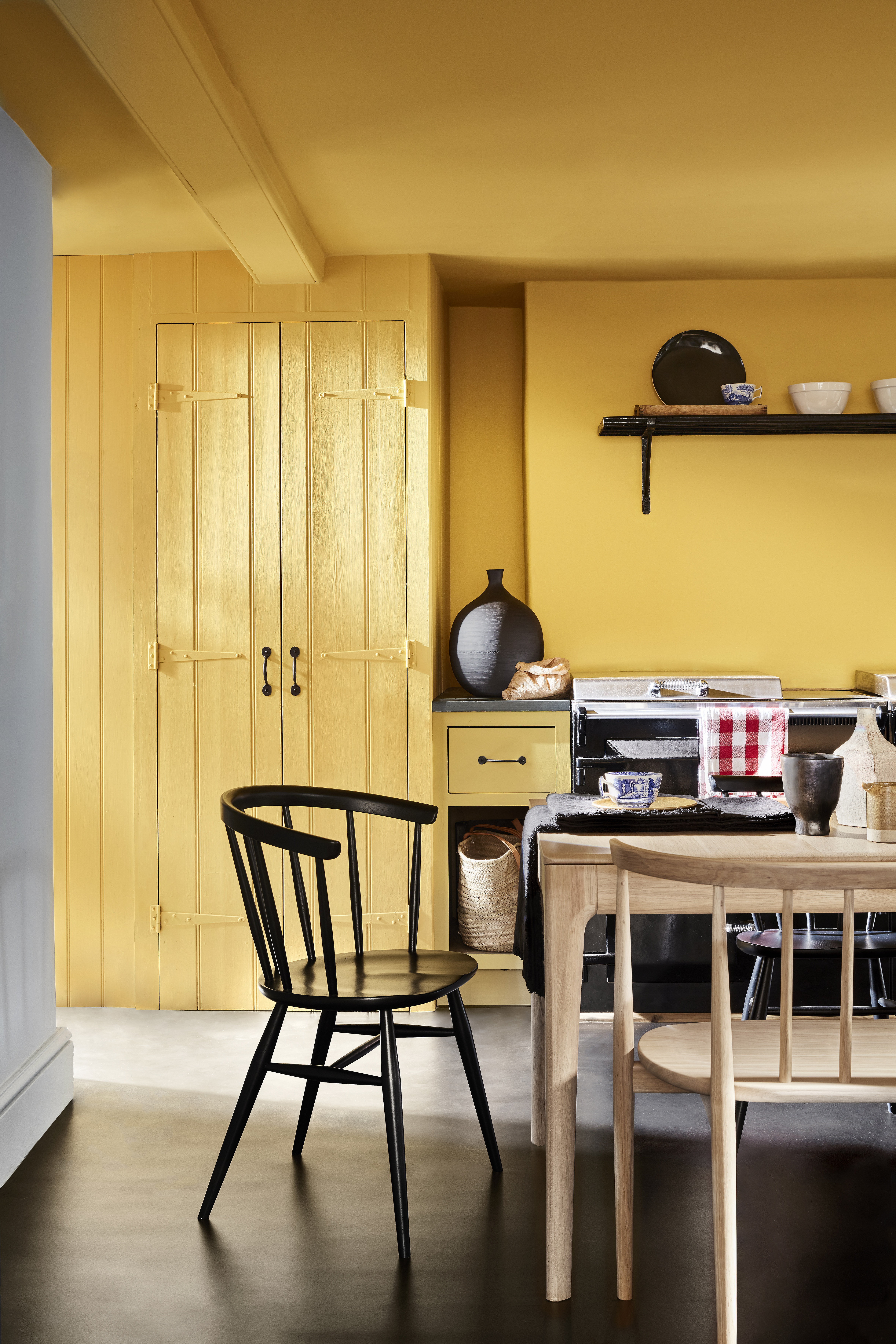
We all know that interiors trends follow what's on the catwalk and – in conversation with our colleagues in the fashion industry – we've been predicting for some time that bright, bold colors would be finding their way into our homes from summer 2021 onwards – largely in response to the pandemic, of course.
So, imagine our delight when Little Greene released its newest, drama-packed colors. There are 14 of them, and even their names – ‘Bassoon’, ‘Indian Yellow’, ‘Giallo’, ‘Etruria’, ‘Silent White’, ‘Masquerade’, ‘Vulcan’, ‘Obscura’, ‘Bone China Blue – Faint‘, and ‘Garden’ (the latter revived from the Little Greene archive) sound fun, exotic – and just what we/our homes need.
See: Living room paint ideas – stylish ways with paint, and expert decor tips
So, without further ado, we introduce you to our pick of the colors that will be gracing our rooms from this summer – Little Greene's Creative Director Ruth Mottershead dispenses wisdom and advice on each, too.
1. Masquerade
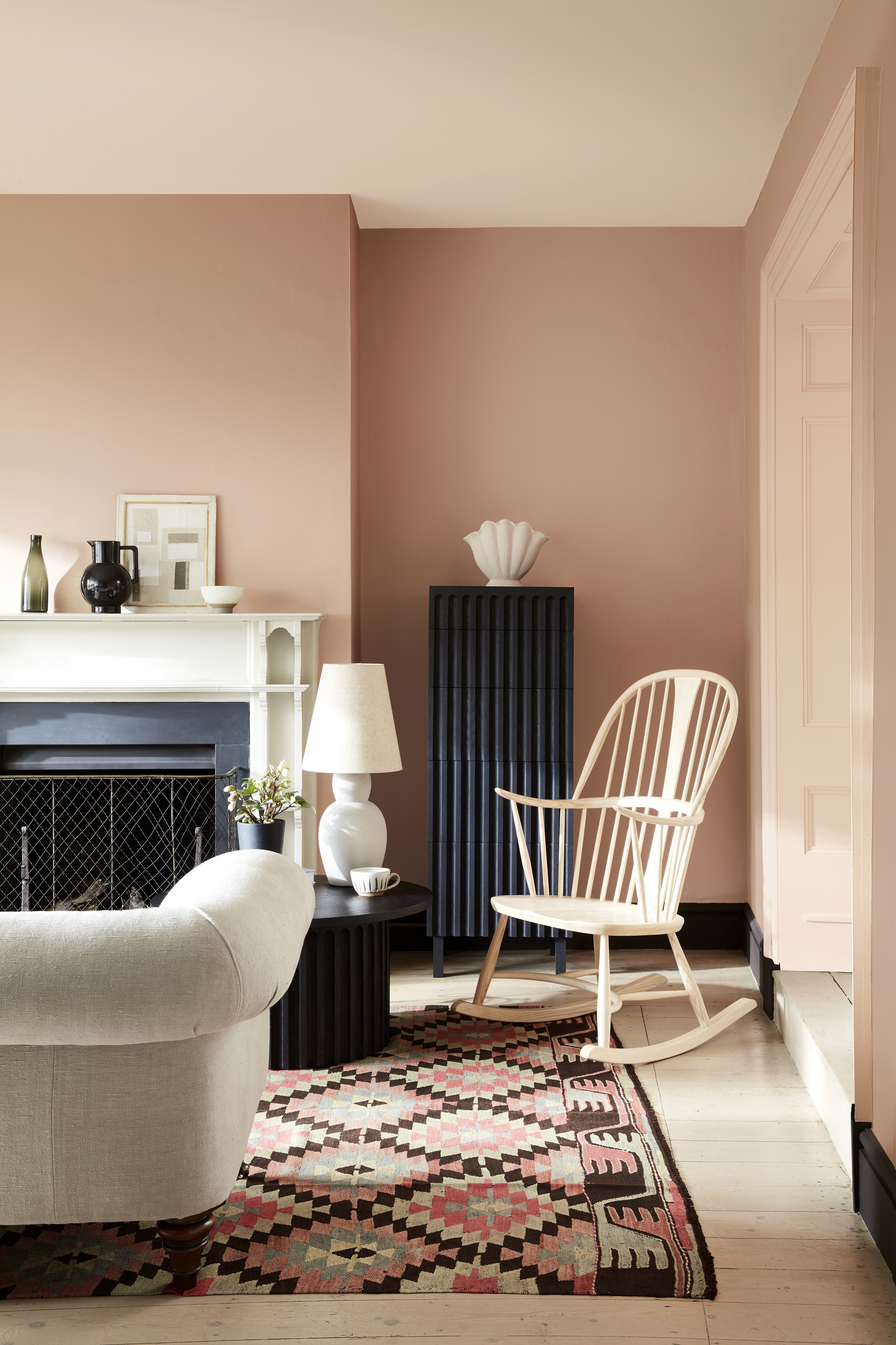
Ceiling: Julie’s Dream 26 in Absolute Matt Emulsion; Left Wall: Masquerade - Mid 333 in Absolute Matt Emulsion; Right Wall: Masquerade 334 in Absolute Matt Emulsion; Panelling: Masquerade - Light 332 in Intelligent Satinwood
'Masquerade provides warmth to a space whilst remaining light and airy, making us feel uplifted and calm,' says Ruth. 'With its delicate, powder-like hue, Masquerade – alongside the diluted Color Scales versions of it – offers an alluring, natural undertone that is as at-home in the bedroom as it is in the ballroom.'
‘Masquerade is offered alongside Masquerade Light and Masquerade – Mid; these Color Scales of the earth-pink ‘Masquerade’ offer graduated tones, made using the same pigments, but in different strengths, allowing for the creation of a harmonious, design scheme that provides movement within a space. They are easy to use in combination on walls, ceiling and trim as well as providing a seamless color journey from room to room.
'For something bolder, you can highlight architectural features or areas of interest by using vibrant, contrasting colors; Tuscan Red or Bronze Red will work fantastically alongside Masquerade to add drama to a space, whilst delicate white Julie’s Dream would work beautifully in place of a pure white to bring a sense of harmony.'
Design expertise in your inbox – from inspiring decorating ideas and beautiful celebrity homes to practical gardening advice and shopping round-ups.
See: Pink room ideas – for spaces that are fresh, warm and surprising
2. Etruria
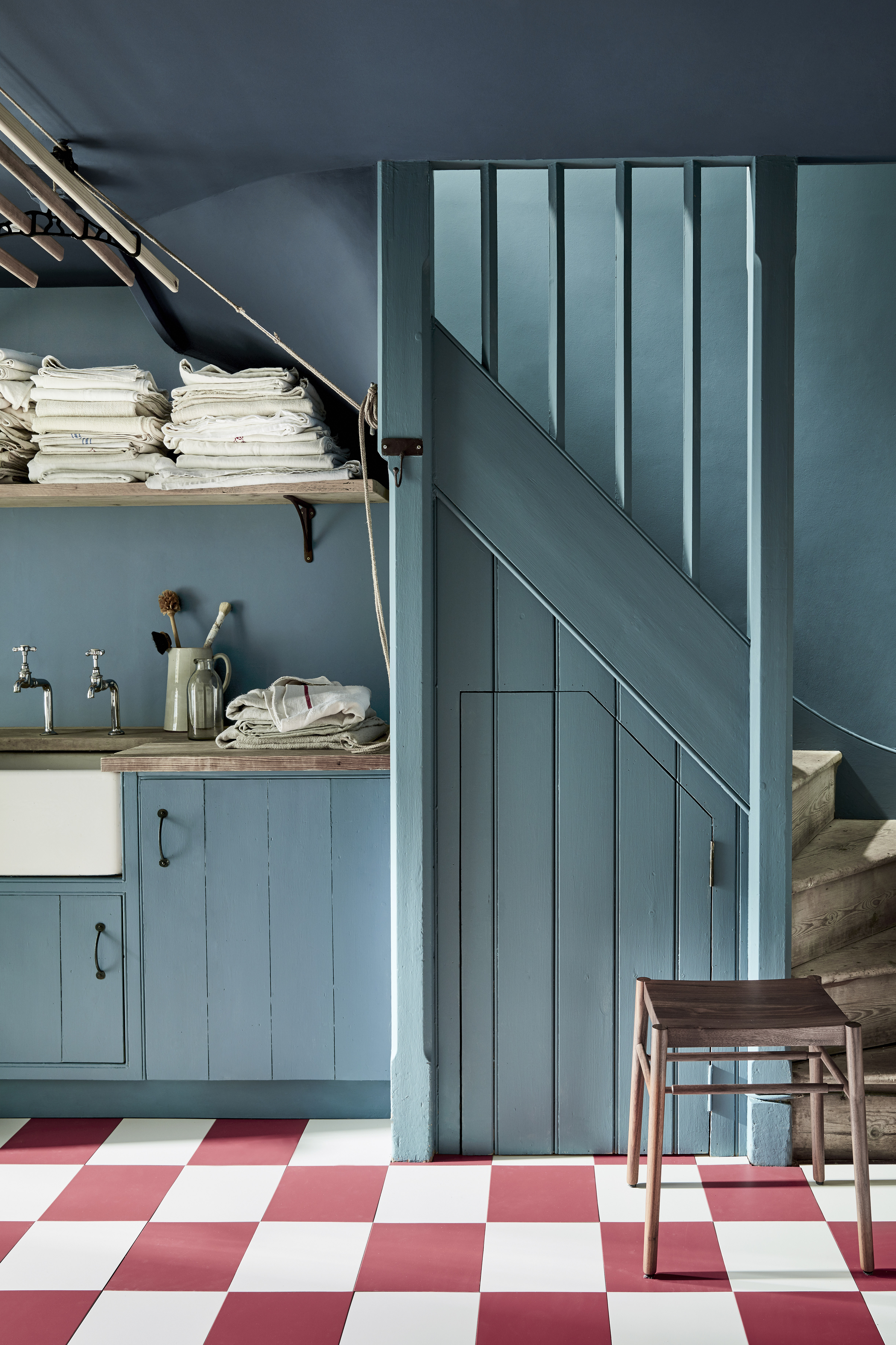
Ceiling: Hicks’ Blue 208 in Absolute Matt Emulsion; Walls: Etruria 326 in Intelligent Matt Emulsion; Cupboards & Panelling: Etruria 326 in Intelligent Satinwood
'Historical innovator and renowned potter Josiah Wedgwood named his Staffordshire ceramic factory Etruria in 1769. The title was a tribute to his passion for the forms, colors and decoration of ancient Etruscan and Greek pottery, which he expertly recreated and brought to English high society in the late 18th century,' says Ruth Mottershead.
'Etruria is a wonderful mid tone blue which looks fantastic used on a large expanse, or on all four walls in country homes and contemporary spaces alike.'
3. The new yellows: Bassoon, Indian Yellow and Giallo
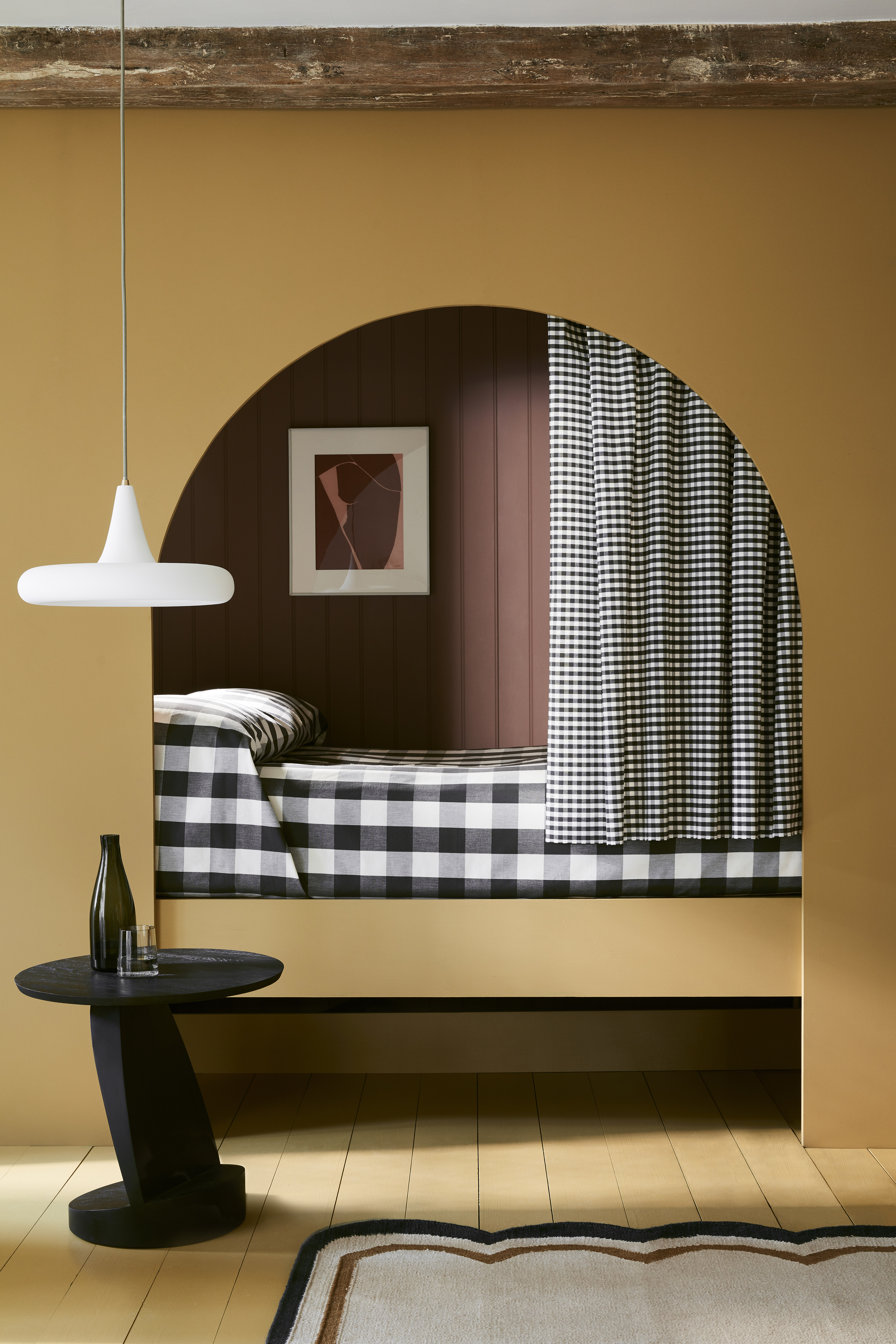
Arch: Bassoon 336 in Intelligent Eggshell; Panelling: Nether Red 315 in Intelligent Eggshell; Table: Jack Black 119 in Intelligent Satinwood; Floor: Bassoon 336 in Intelligent Floor Pain
'Yellow is a shade that provides positivity to a space. It is a color that makes us feel uplifted, happy, energized and invited. The perfect shade for a hallway, kitchen, living space or a front door, yellow provides a warm invitation to any home. It creates a feeling of warmth and coziness; it is sunshine in your home,' says Ruth.
'Alongside the cherished Little Greene signature color palette, it is wonderful to be able to introduce new yellows that celebrate the desire for warmth and joy such as Indian Yellow named after the traditional oil pigment used by fine artists, Bassoon with its deep-ochre undertone, and Giallo, an uncompromising, yet very easy-to-use, burst of golden sunshine.
'These bold and charming yellows illustrate our desire to return to warmth without regressing to cream. With its deep-ochre undertone, Bassoon (above) is an unsung hero of historical decoration. These drab colors were favourites in the functional back- of-house areas of yesterday’s grand homes due to their ability to disguise dirt, and the subsequent infrequency with which they needed to be repainted. The rich ochre toned Bassoon works beautifully with other earthy hues such as Nether Red and Bath Stone or with true black Jack Black for a high contrast and elegant feel.'
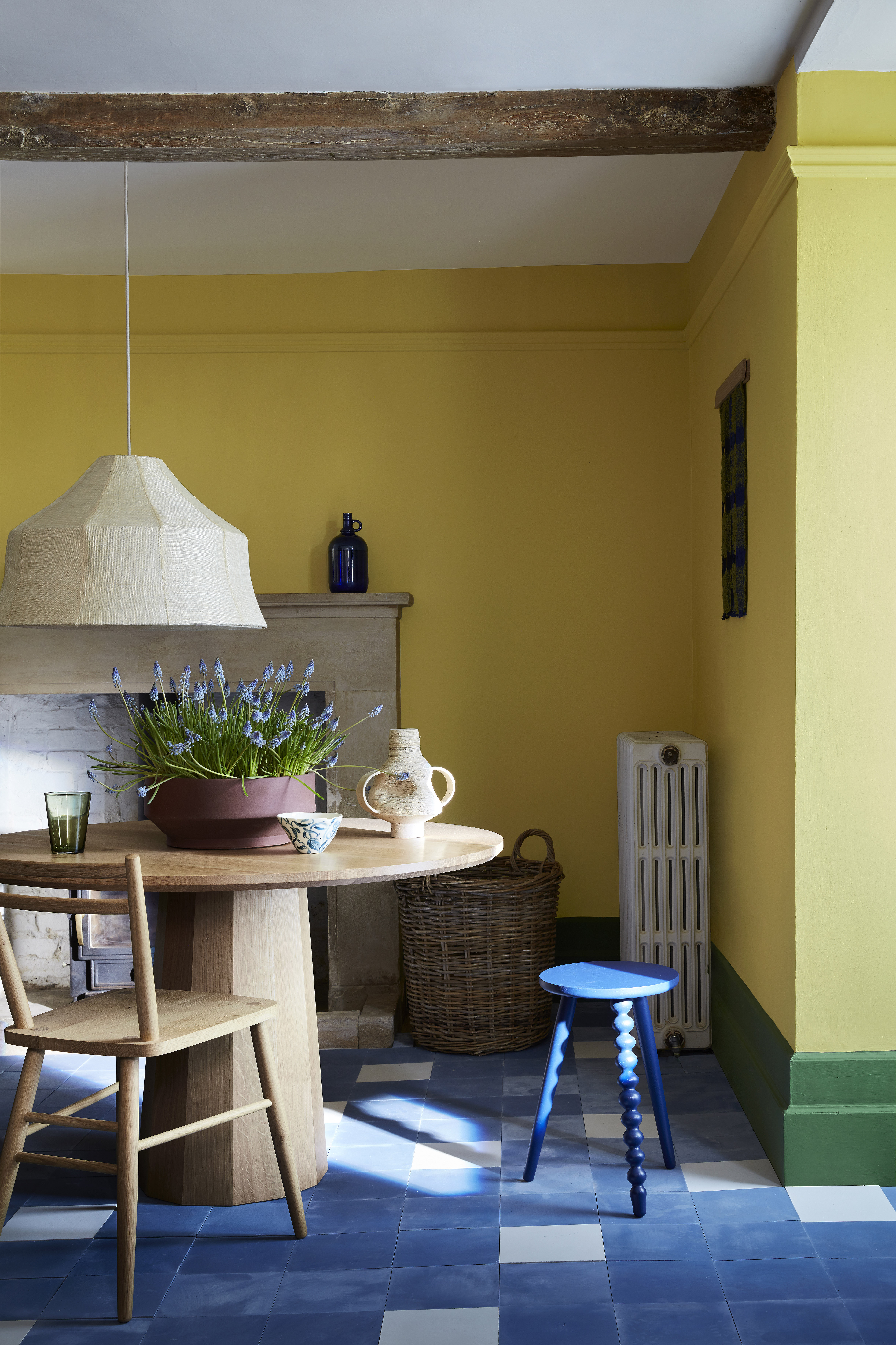
Ceiling: Flint 236 in Absolute Matt Emulsion; Walls: Indian Yellow 335 in Absolute Matt Emulsion; Skirting: Hopper 297 in Intelligent Satinwood
'Whilst the new Indian Yellow (above), with its undertone of green, looks stunning combined with bold greens such as Hopper or touches of deep blue Mazarine.
'Between the sixteenth and nineteenth centuries, the pigment, Indian yellow, was a much more prolific ingredient in the oil paint of fine artists, than in the decorative paints of the time. Our Indian Yellow color shares all the timeless qualities of its namesake, but thankfully none of its well- documented original ingredients or production methodologies.'
See: Yellow room ideas – guaranteed to turn up the heat

Ceiling: Giallo 337 in Absolute Matt Emulsion; Walls: Giallo 337 in Intelligent Matt Emulsion; Cupboard: Giallo 337 in Intelligent Satinwood; Left Wall: Bone China Blue - Faint 325 in Intelligent Matt Emulsion
'The third new yellow in the collection is Giallo (above), which celebrates the Italian influence on British architecture and interior design over the last 400 years. Giallo is an uncompromising, yet very easy-to-use, burst of golden sunshine. A charming highlight or accent color, it is most splendid when used in a large expanse on all four walls. Lighter and warmer than our ever popular Mister David, Giallo works beautifully in busy joyful spaces such as kitchens and living rooms.
4. Obscura
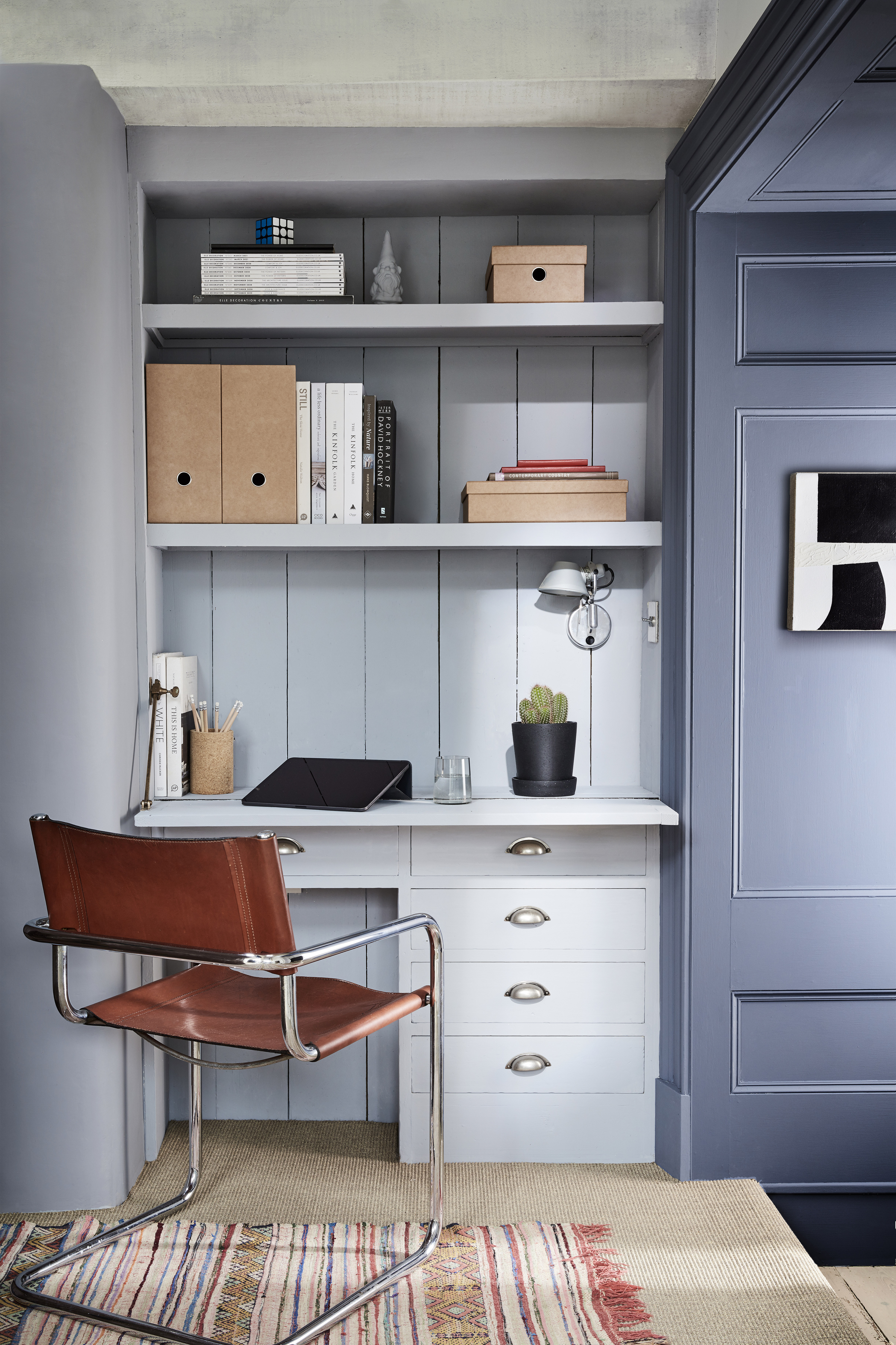
Left Wall: Obscura 327 in Absolute Matt Emulsion; Desk and Panelling: Obscura 327 in Intelligent Satinwood / Intelligent Eggshell; Right Panelling: Juniper Ash 115 in Intelligent Eggshell
'An elegant, gentle blue-grey, Obscura sits effortlessly in the tail of the Gauze Color Scales family, working fantastically with the Gauze color scales to create an elegant and harmonious design scheme.
'Equally elegant used in solitude as among the lighter Gauze shades, this cool neutral works beautifully with natural floor textures including sisal, coir and jute, or with paid back light wood finishes. For a more dramatic scheme pair with Juniper Ash or Dock Blue.'
5. Silent White
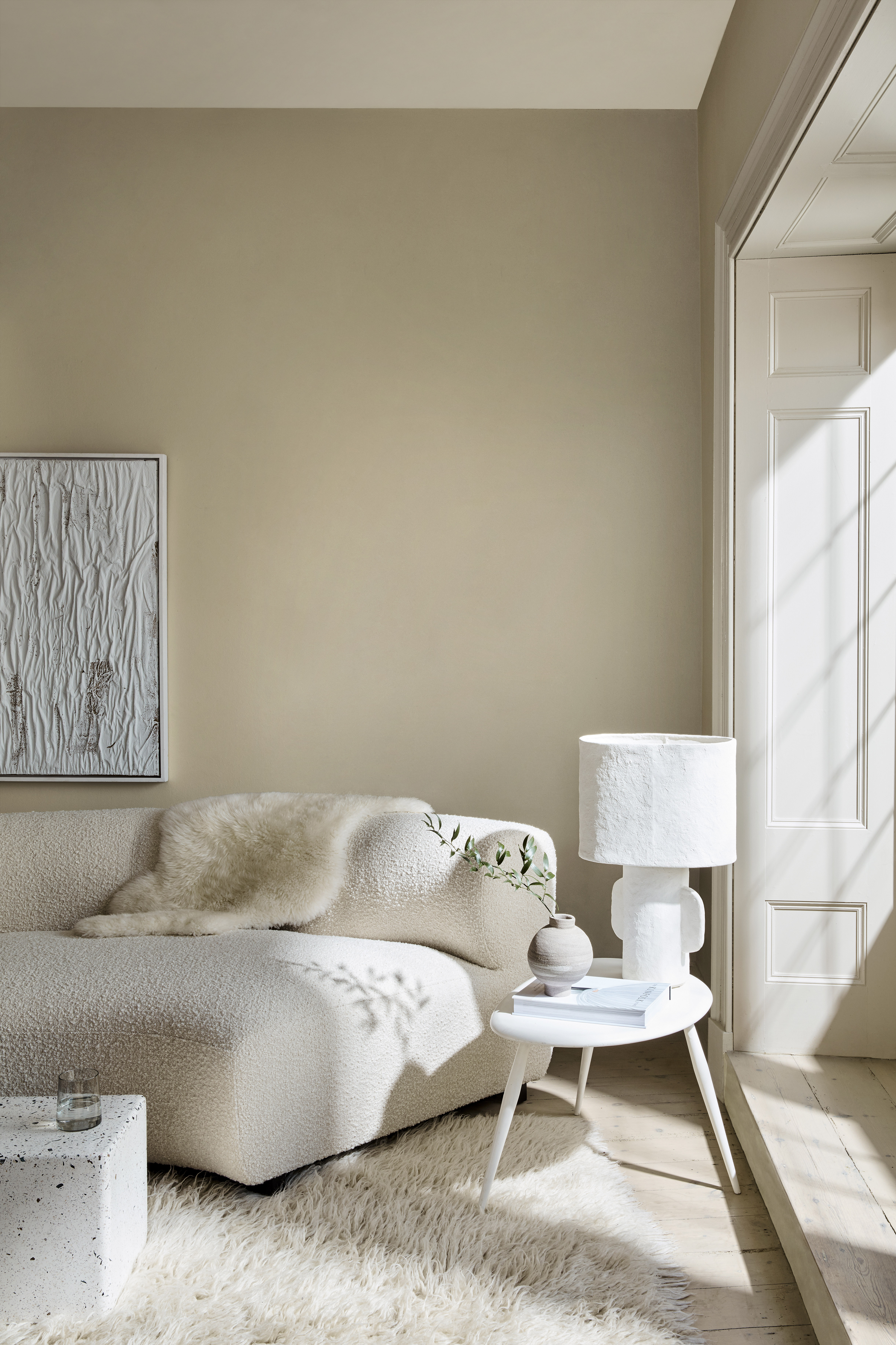
Ceiling: Silent White - Pale 328 in Absolute Matt Emulsion; Walls: Silent White - Deep 331 in Absolute Matt Emulsion; Panelling: Silent White 329 in Intelligent Eggshell
'White is one of the most versatile colors you can use in your decorating,' says Ruth Mottershead. 'It is timeless despite trends for stronger colors or dramatic wallpapers. It spans classic and contemporary schemes and can be used as both a striking main color or a quieter highlight, on all four walls or contained to just the ceiling or the woodwork.
'Fresh, vital and uplifting, white comes in many nuances and hues. Formulated in the quest for the perfectly balanced, neutral-warm white for a calm interior, the new Silent White adds softly spoken depth to an interior. Used in partnership with its lighter and deeper versions, Silent White – Pale and Silent White – Mid or Silent White – Deep on other walls, the ceiling and trim creates a serene neutral and inviting space.'
6. Garden
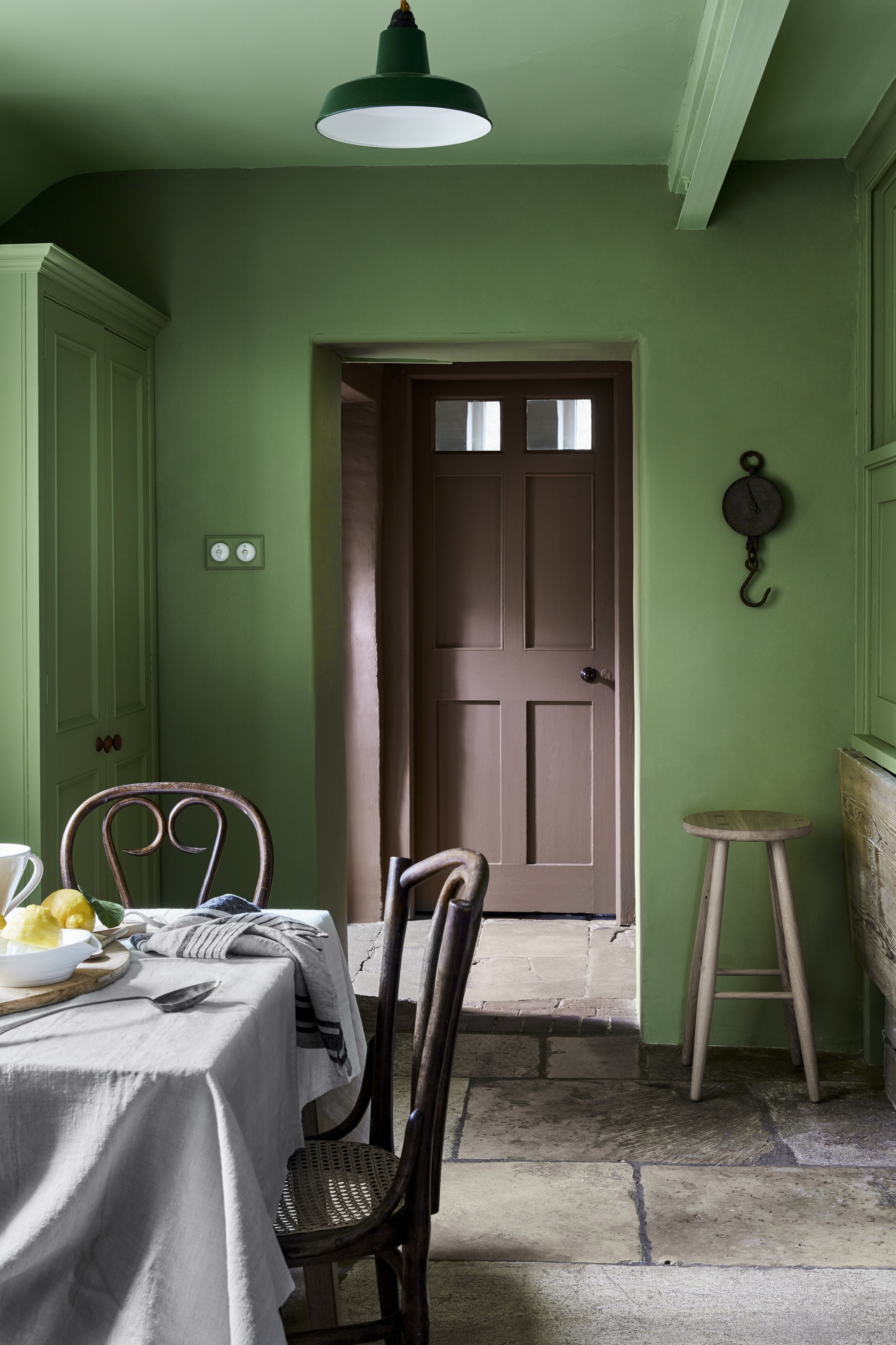
Ceiling: Pea Green 91 in Absolute Matt Emulsion; Walls: Garden 86 in Intelligent Matt Emulsion; Larder Cupboards: Garden 86 in Intelligent Satinwood; Far Walls: Scullery 318 in Intelligent Matt Emulsion; Door: Scullery 318 in Intelligent Satinwood
'The Garden color has been revived from our archive in response to the need to add a fresh and soft green to the collection. This reduced version of George Bernard Shaw’s Hopper brings a fresh ambience of midsummer itself.
'Soft Green Garden sits comfortably in any interior scheme because of its relationship with the natural environment and our longing to bring the outdoors inside. We feel soothed by green and its neutral base – it is neither too warm, nor too cool. It is the perfect tone for living rooms, kitchens and dining spaces, with enough strength to create an impact and provide energy to a space but muted enough to provide a little peace within a room.'
7. Vulcan
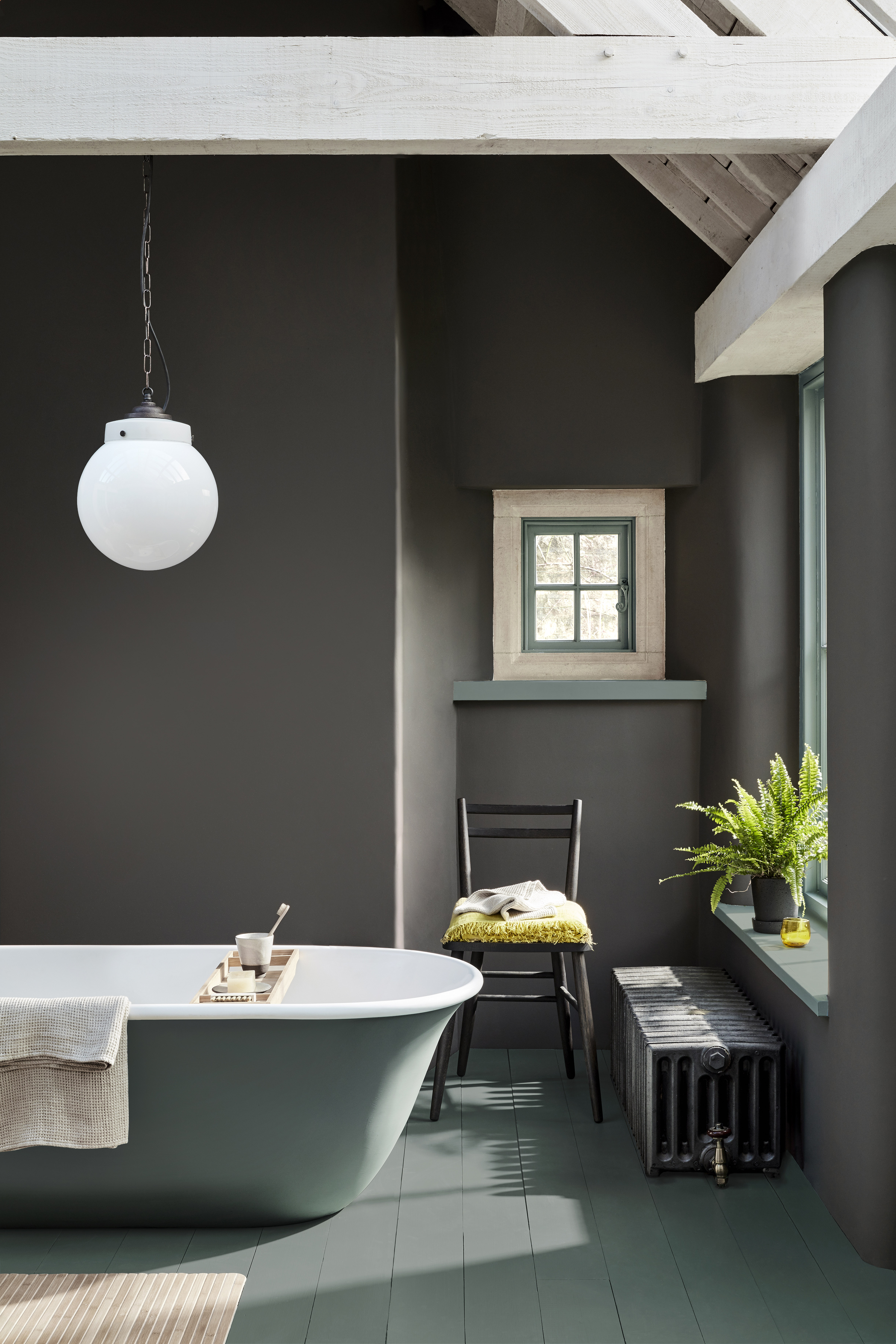
'The color grey has been at the root of historical decoration for centuries and, even now, remains a timeless staple. It is a signature shade for the most sophisticated interior design, working equally effectively in a classic or contemporary setting.
See: Grey living room ideas – inspiring neutral schemes that you'll love for years to come
'Vulcan, sharing its name with the Roman God of Fire, is inherently strong; a deep, charismatic, charcoal grey – with a little warmth retained. Vulcan offers the sophistication and boldness of a charcoal grey, but has the perfect mid tone balance, ensuring it never makes a space feel cold or austere.
'Pair with a rich green such as Livid for a contrasting color or combine with the versatile French Grey for an elegant and coordinated interior.'

Lucy Searle has written about interiors, property and gardens since 1990, working her way around the interiors departments of women's magazines before switching to interiors-only titles in the mid-nineties. She was Associate Editor on Ideal Home, and Launch Editor of 4Homes magazine, before moving into digital in 2007, launching Channel 4's flagship website, Channel4.com/4homes. In 2018, Lucy took on the role of Global Editor in Chief for Realhomes.com, taking the site from a small magazine add-on to a global success. She was asked to repeat that success at Homes & Gardens, where she also took on the editorship of the magazine. Today, Lucy works as Content Director across Homes & Gardens, Woman & Home, Ideal Home and Real Homes.
