Reese Witherspoon’s Powder Blue Front Door Isn’t Just Beautiful – Color Psychologists Say It Signals Prosperity While Making a Statement
See how Reese Witherspoon’s front door color combines style and psychology to increase your home’s curb appeal instantly


Design expertise in your inbox – from inspiring decorating ideas and beautiful celebrity homes to practical gardening advice and shopping round-ups.
You are now subscribed
Your newsletter sign-up was successful
Want to add more newsletters?
A gorgeous front door is a true focal point, instantly enhancing curb appeal and acting as an extension of your home – especially welcome as we move into the cozier autumn and winter months. However, choosing a front door color for this visible, yet often overlooked, spot can feel overwhelming for many. But not for Reese Witherspoon.
Your front door makes an important first impression and sets the tone for the interior. That's why selecting the right color is vital. For Reese Witherspoon, that meant choosing a powder blue front door, a bold statement for any home.
If you're wondering if front door colors mean anything, you're not alone. You want to ensure your door signals the right feel for your home.
Article continues belowWhatever your style or budget, there are many color ideas – each with its own meaning – that can transform your own humble front door. Here, we've consulted color psychologists, decorators, and interior designers for their take on Reese Witherspoon's front door color.
Shop the blue curb appeal edit
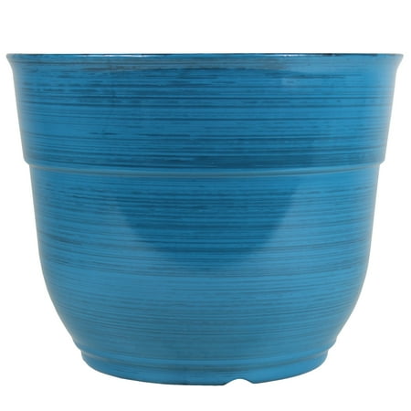
Taking a cue from Reese Witherspoon doesn’t require a full remodel. Her Southern-chic, welcoming style can be reflected in your front porch with simple touches, like a bright blue plant pot from Walmart. It adds a pop of color and personality, instantly boosting your curb appeal without any major work.

Featuring elegant brushed detailing, this planter showcases your plants’ foliage beautifully. Its versatile design accommodates both small and large plants, providing ample space for healthy root growth. Lightweight, stylish, and low-maintenance, it’s an ideal addition to any porch

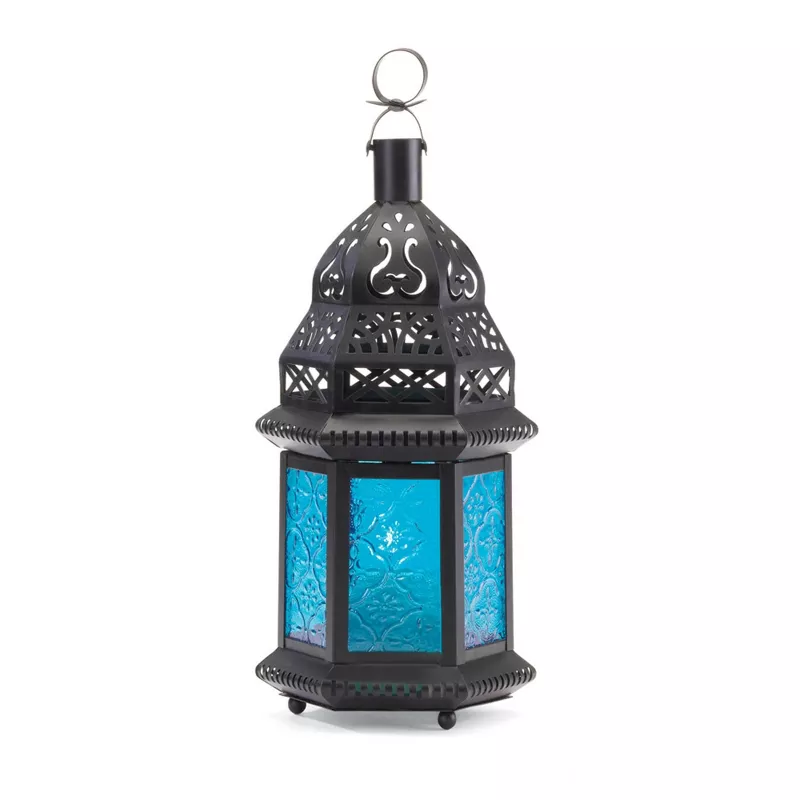
With intricate metal cutouts and ornate glass panels, this lantern casts a mesmerizing sky-blue glow that transforms any porch, patio, or garden path. Perfect for setting the mood at outdoor gatherings or adding a soft, elegant light to your tabletop, it brings instant charm to every outdoor space.

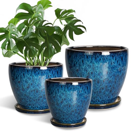
Crafted from high-fired ceramic for lasting durability, these planters feature a smooth, glazed surface that’s effortless to clean. Stylish and versatile, they make the perfect accent for any front door, complementing any color scheme.
The power of color is undeniably transformative. While you may want to know which paint ideas are best for your door, it's just as essential to understand if front door colors mean anything. According to many color specialists and Feng Shui experts, they most certainly do.
Research consistently shows blue is the world's favorite color. This is because we are constantly surrounded by it, argues Karen Haller, color psychology specialist, teacher, and best-selling author of The Little Book of Color – available at Amazon.
Design expertise in your inbox – from inspiring decorating ideas and beautiful celebrity homes to practical gardening advice and shopping round-ups.
'It is important to remember that blue is a psychological color primary color,' says Karen Haller. 'Some of its positive attributes include positivity and serenity. Lighter tones of blue are associated with mental calm, clarity, and reflection.'
Interior designers and decorators also love decorating with blue. It's a timeless color that's cool, calm, and contemporary, working well in both period and modern designs. This feeling of calm is particularly appealing as the days shorten and temperatures drop, making the entrance feel more welcoming.
'A beautifully painted front door is the way to my heart,' says Irene Gunter, co-founder of Gunter & Co. 'Even though neutrals are popular for interiors, external schemes often fall flat without the gusto of a generous splash of imaginative color. My favorite front door colors are those that put a smile on your face. Blues would be my first port of call.'
Bold, impactful, and elegant, light blue is known to be a very calming hue. This makes it an exceptional choice for those who want to signal prosperity, quiet intelligence, and abundance.
The owner of a blue front door has likely made their home a comforting haven away from the hustle and bustle of modern life – a perfect sanctuary during the holiday season.
Samantha Todhunter, founder of Samantha Todhunter Design, shares a similar love for blue: 'Working with blue is endlessly interesting and playing with tones can change it from a vibrant jewel box to subtle and serene.'
Do you think a light blue door would suit your home, or do you prefer a warmer color for the colder months?

Jennifer is the Digital Editor at Homes & Gardens, bringing years of interiors experience across the US and UK. She has worked with leading publications, blending expertise in PR, marketing, social media, commercial strategy, and e-commerce. Jennifer has covered every corner of the home – curating projects from top interior designers, sourcing celebrity properties, reviewing appliances, and delivering timely news. Now, she channels her digital skills into shaping the world’s leading interiors website.