Thom Browne and Andrew Bolton's living room color is a new classic – the perfect scheme invokes bold luxury
The designer and curator created a gorgeous home that's made contemporary with this one striking color


Design expertise in your inbox – from inspiring decorating ideas and beautiful celebrity homes to practical gardening advice and shopping round-ups.
You are now subscribed
Your newsletter sign-up was successful
Want to add more newsletters?
One word that comes to mind when admiring Thom Browne and Andrew Bolton's living room: chic.
Given that Browne's eponymous label forever upended the conventions around men's suiting and Bolton is the Curator in Chief of the Met Costume Institute, the beauty of their living room is expected. However, the way the timeless style comes together is more surprising. Browne and Bolton's designer, David Kleinberg Design Associates, has decided to shirk trends and instead go for a timeless, elegant look with emerald green at its center.
The striking look is more than a passing fad: it's a new classic. Bolton and Browne's combination of emerald green with a gray sofa, white walls, and yellow art celebrates transitional design and uplifts an unusual living room color scheme.
Article continues belowA post shared by William Abranowicz
A photo posted by wabranowicz on
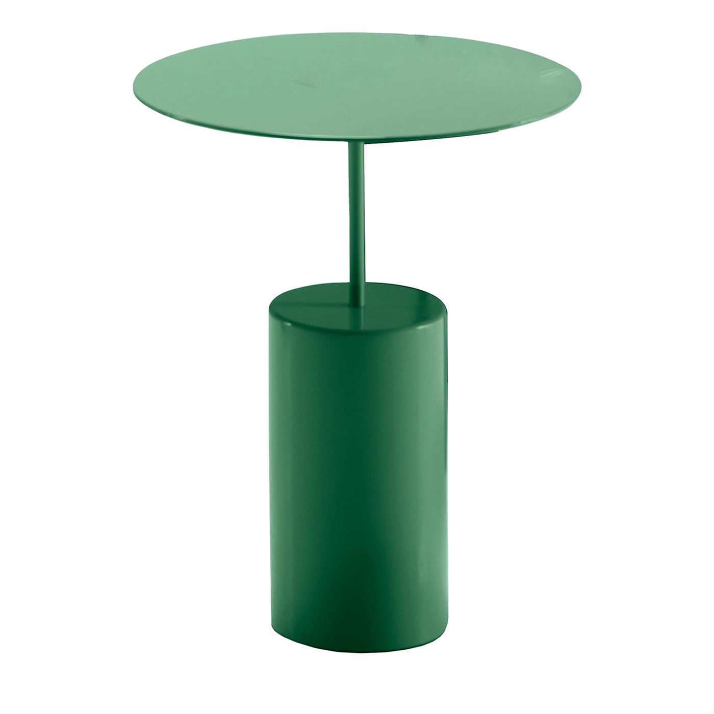
What makes the unexpected shade so appealing? 'The bright green tables immediately draw the eye, creating a strong visual focal point in the room. This pop of color contrasts sharply with the more subdued tones of the room, such as the dark furniture and neutral walls, making the space more dynamic and engaging,' Nicholas Kaiko, Sydney-based interior designer, tells Homes & Gardens.

Nicholas Kaiko, founder of Kaiko Design Interiors, is a highly sought-after interior designer based in Sydney, Australia. With over a decade of experience in the interior design industry, Nic has honed his skills as an interior architect and decorator, working on luxury hotels and high-end residential projects both locally and internationally.
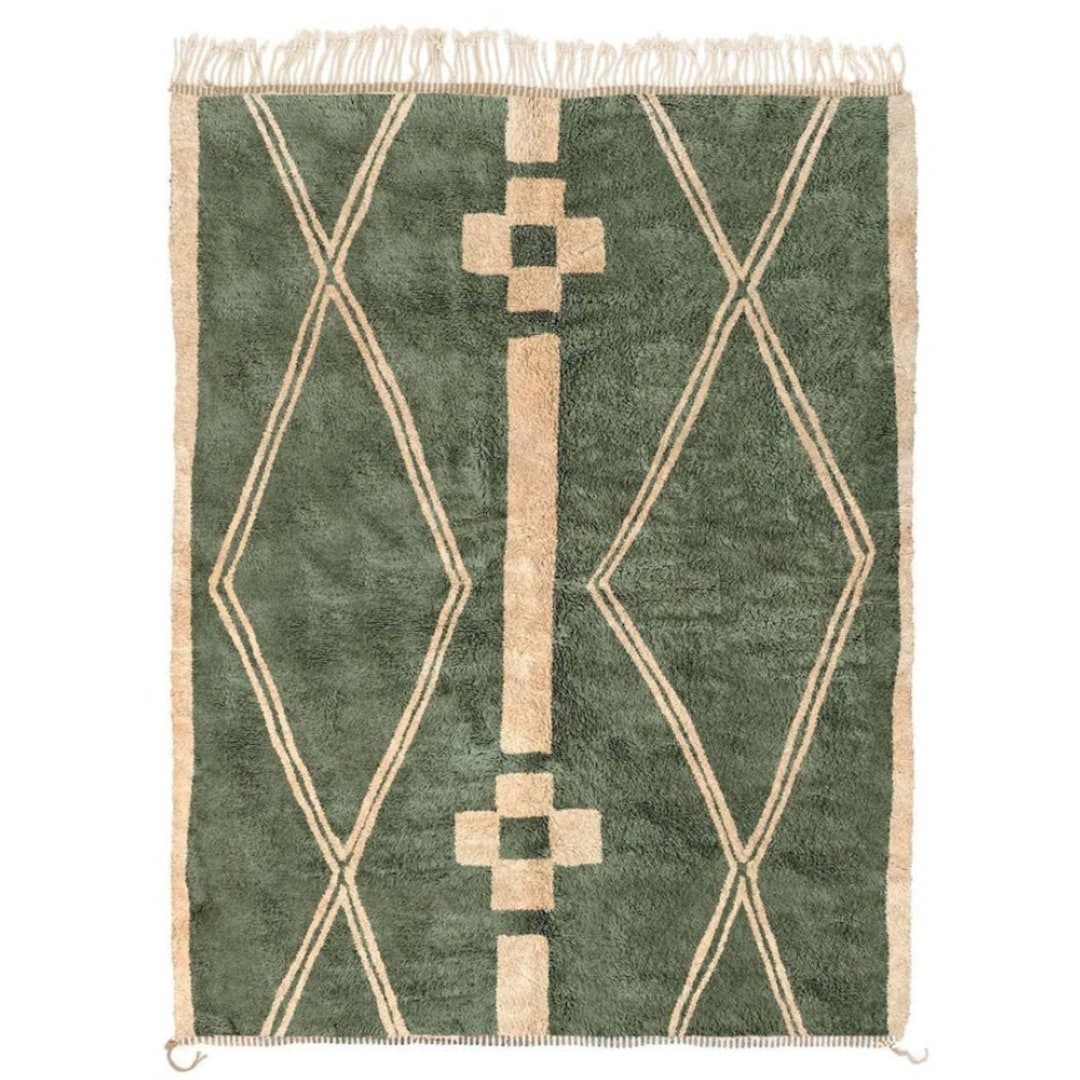
He continues, 'The green does not stand alone; it is echoed in the rug, which features shades of green in its pattern. This repetition of colour helps to unify the space and ties the different elements together, contributing to a cohesive look.'
The green living room toes the line between being both striking and grounded. Manuela Hamilford, Founder and Creative Director of Hamilford Design, states: 'Green is a very bold choice, especially contrasted against the orange artwork on the wall behind. It’s tempered slightly by the monochrome backdrop, which allows the green to be centre stage. Green is believed to be a color of tranquility and serenity, with the clean symmetry of this room, it certainly feels very calm.'

Manuela was born in Vicenza, Italy and then moved to New York City to start her career in design, where she gained a flair for interiors and a passion for bespoke home furnishings. She founded her luxury interiors studio, Hamilford Design, in London in 2000.
Of the timeless color scheme Kaiko adds, 'The room balances neutral tones with bold colours effectively. The deep green provides a refreshing contrast to the warm golds and browns in the painting and the sofa upholstery, as well as the dark tones of the furniture. This use of contrasting colors enhances the overall aesthetic appeal and makes the space feel balanced.'
Design expertise in your inbox – from inspiring decorating ideas and beautiful celebrity homes to practical gardening advice and shopping round-ups.
He continues, 'The colors in the painting are amplified by the nearby furniture choices, showing a thoughtful consideration of the color relationships within the room. The classical paneling detailing with the eclectic mix of mid-century style sofa and what appears to be a Märta Blomstedt armchair just out of frame to the right demonstrates a bold yet balanced approach to using color to define and enrich a space.'
Shop the Emerald Green Edit
Green is undeniably stylish, and it looks the best it has ever looked in Thom Browne and Andrew Bolton's living room.

Sophie is a writer and News Editor on the Celebrity Style team at Homes & Gardens. She is fascinated by the intersection of design and popular culture and is particularly passionate about researching trends and interior history. She is an avid pop culture fan and has interviewed Martha Stewart and Hillary Duff.
In her free time, Sophie freelances on design news for Westport Magazine and Livingetc. She also has a newsletter, My Friend's Art, in which she covers music, culture, and fine art through a personal lens. Her fiction has appeared in Love & Squalor and The Isis Magazine.
Before joining Future, Sophie worked in editorial at Fig Linens and Home, a boutique luxury linens brand. She has an MSc from Oxford University and a BA in Creative Writing and Sociology from Sarah Lawrence College.
