Nate Berkus says these are the best rooms to use bold wallpaper for an 'element of surprise'
The interior designer says kids' rooms and powder rooms are the best places to turn if you're looking to use bright, patterned wallpaper


Design expertise in your inbox – from inspiring decorating ideas and beautiful celebrity homes to practical gardening advice and shopping round-ups.
You are now subscribed
Your newsletter sign-up was successful
Want to add more newsletters?
Bright, whimsical, patterned wallpaper is a welcome addition to any home, but knowing where to use it can prove quite intimidating. A design choice that makes a true statement, wallpaper adds color and life in an instant – but it's easy to get lost in clashing colors or jarring patterns.
Luckily, celebrated interior designer Nate Berkus just took to social media to share just how much he loves 'high-energy' wallpaper, and he let us in on the two spaces that work best with bold pattern. If you're ready to take the leap and bring some vibrant pattern into your home, these are some of the easiest places to start. Here's what Nate had to say about decorating with pattern.
'I use wallpaper when I want a space to be playful or when I want a space to be surprising,' Nate says in the video.
The two rooms where Nate recommends bright wallpaper
A post shared by Nate Berkus (@nateberkus)
A photo posted by on
'A lot of you have been asking me questions about how to choose wallpaper – when to use a huge, multi-colored pattern and when to do something subtle,' Nate says in the video, standing in his son's bedroom.
The bedroom's walls are decked out in bright, animal-patterned wallpaper that features pops of primary colors – a playful yet elevated feature of the overall design scheme. Perhaps unsurprisingly, Nate then shares that children's bedrooms are the first place he suggests using bright, patterned wallcoverings. The second space he recommends? The powder room.
'I think that my answer has always been that kids' rooms and powder rooms are both great opportunities to use a multi-colored pattern,' Nate says.

Since Nate’s first appearance on The Oprah Winfrey Show in 2002, he has become one of the world’s most recognizable interior designers. He has authored two New York Times bestselling books and stars alongside his husband, Jeremiah Brent, in HGTV's Nate & Jeremiah Home Project.
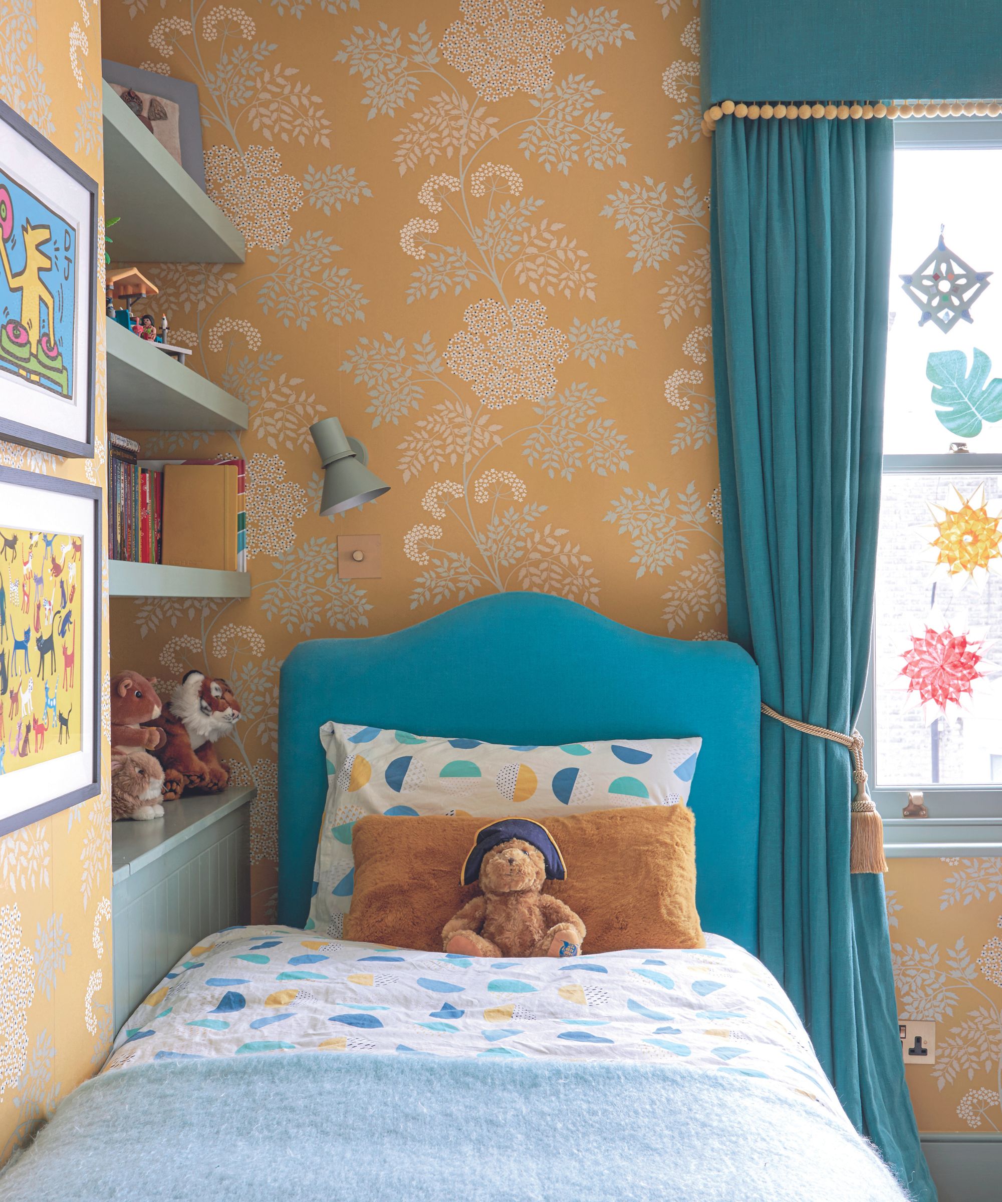
Nate goes on to explain that kids' rooms are an easy place to play with patterned wallpaper because their design schemes are typically brighter and more fun-focused. He suggests looking to the rest of the space before picking out a pattern to see if you're able to draw from the room's overall color palette.
Design expertise in your inbox – from inspiring decorating ideas and beautiful celebrity homes to practical gardening advice and shopping round-ups.
'The easy thing about that is that you can pick and pull from the colors in the wallpaper to match the carpeting, the bedding, the upholstery if you have a chair for reading or something in the space,' says Nate.
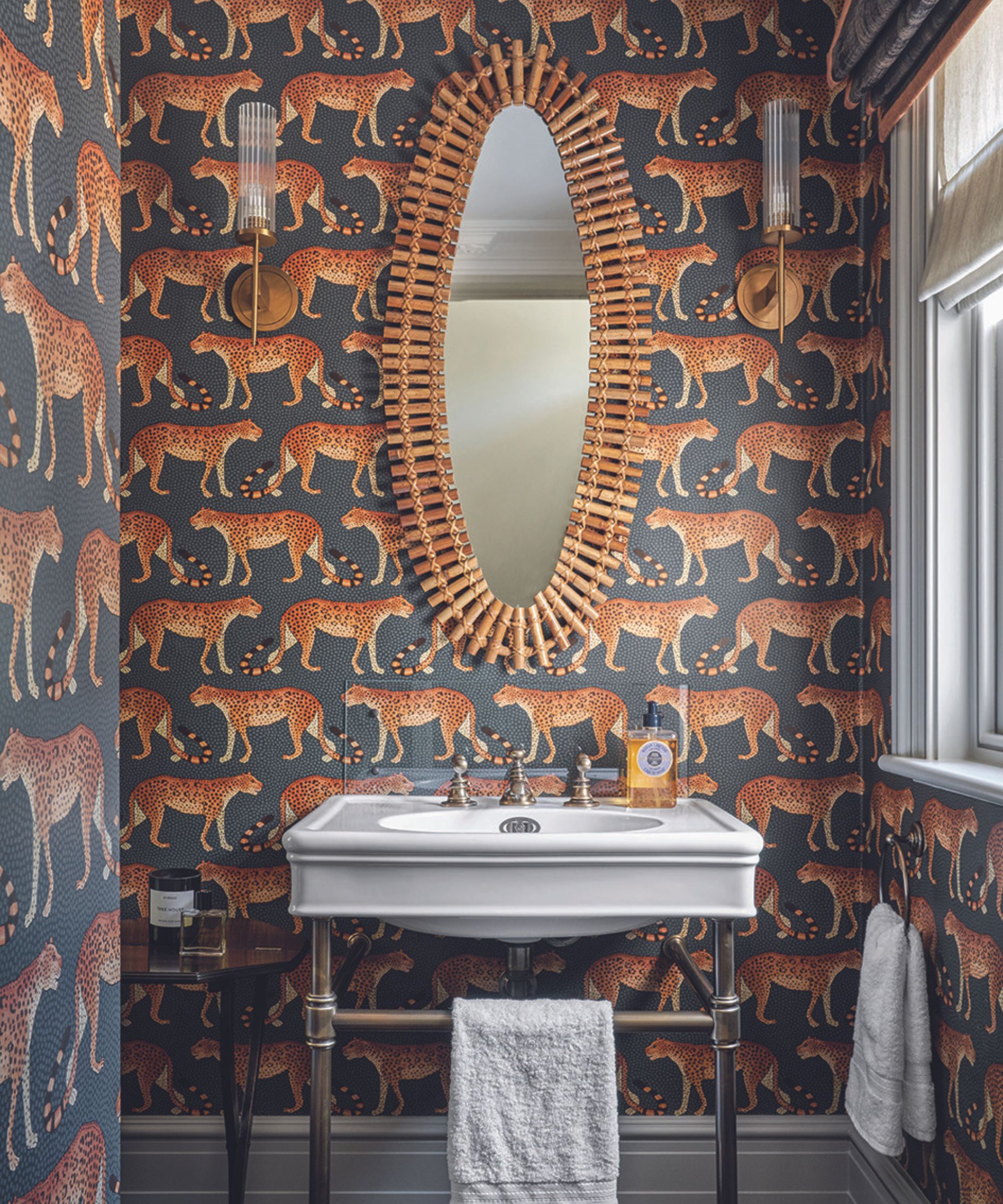
A powder room is a classic place to explore bold wallpaper options for good reason – tucked away from the rest of the home and usually only used when guests come around, it's a great place to experiment. Nate says that's why he loves 'doing a high-energy, high bold patterned wallcovering' in a powder room.
'It's a room that should have almost nothing to do with the way that you decorate the rest of the house. It's an opportunity, when someone's over for a dinner party, and they ask to use your restroom, I like the idea that it's an element of surprise,' he says.
In this small powder room, an unexpected blue and orange patterned wallcovering pictures cheetahs galore. Though bold and a bit in your face, the choice works wonders because of the small space it inhabits and the pared-back design details that accompany it.
If you're looking to make a fun, playful statement just like Nate in your home, take a look at these smaller spaces and pick out a pattern of your choice. The design opportunities are endless when you open your mind and embrace high-powered pattern in any space – but these are the perfect places to start.

Abby was the Interior Design News Editor at Homes & Gardens and is now studying for her Master's degree in Journalism at City University, London. Prior to joining our team, she worked with Better Homes & Gardens, where she wrote and edited content about home decor, gardening tips, food news, and more. She studied Journalism and English Literature at New York University and moved to London to pursue her love of writing in 2023.
