Sherwin-Williams has named the 5 brightest white paints that are most popular with designers – perfect for lightening dull and dark rooms
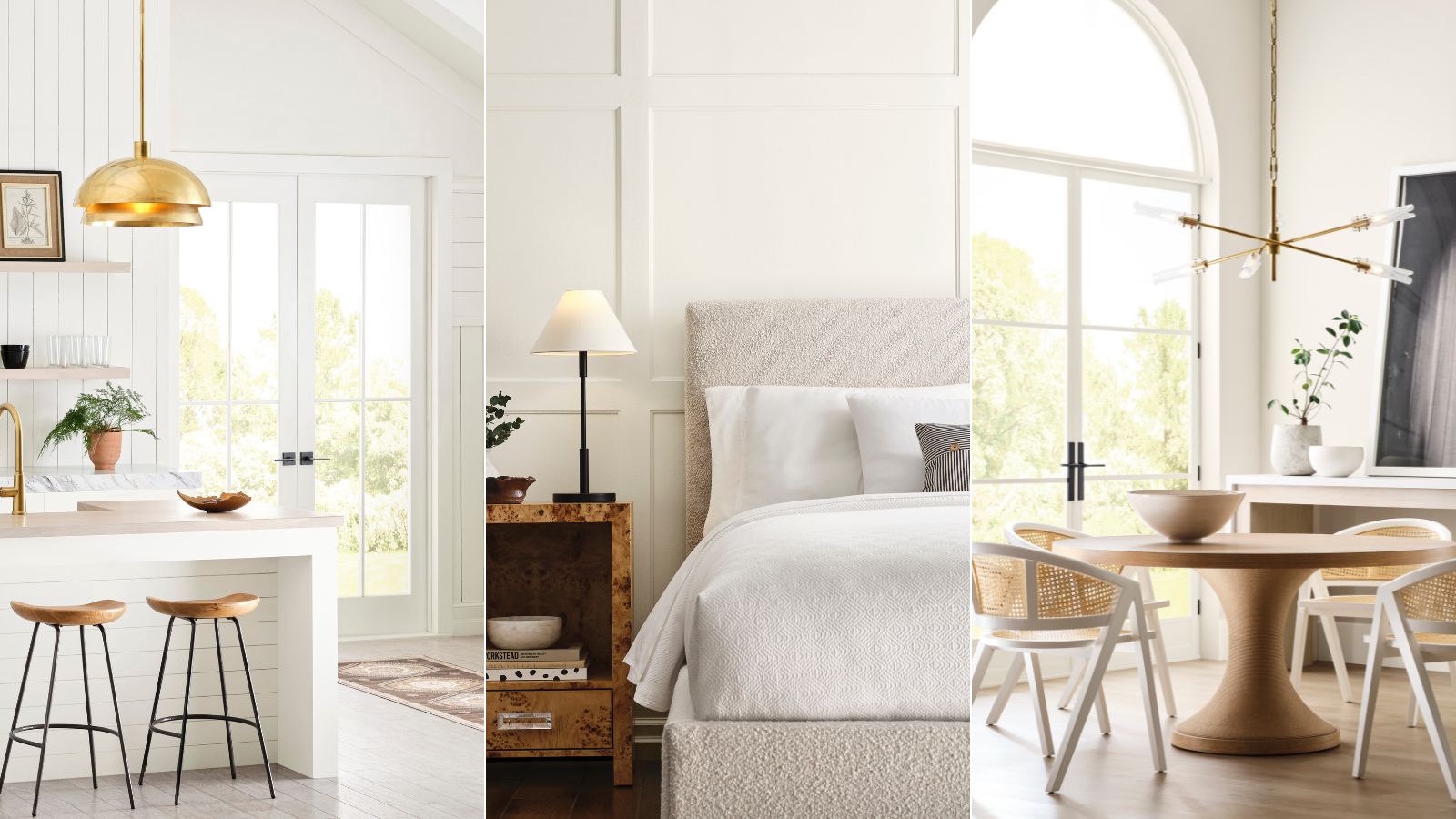
Looking for a bright white paint to freshen up your home? Look no further than these five Sherwin-Williams shades

Design expertise in your inbox – from inspiring decorating ideas and beautiful celebrity homes to practical gardening advice and shopping round-ups.
You are now subscribed
Your newsletter sign-up was successful
Want to add more newsletters?
If you've ever embarked on navigating the world of white paint, you can most likely attest to how complex it is. With so many options, it can often be tricky to know where to start and how to whittle down your options.
A good place to start is Sherwin-Williams, which offers a whole range of the best white paints that are used and loved by homeowners and interior designers alike. What's more, its recently launched Designer Color Collection is bringing the best of the best bright whites to the fore.
The Designer Color Collection features six different color palettes, comprising designers' favorite Sherwin-Wiliams shades, from neutrals to bolder colors to cater to all decorating styles. But the Pure & Pristine palette includes solely the best bright whites, acting as failsafe choices for your room color ideas.
Article continues belowIf you're in the market for a bright white, a paint color that will create a light, airy, and timeless look throughout your home, read on to explore the best Sherwin-Williams white paints.
A post shared by Sherwin-Williams (@sherwinwilliams)
A photo posted by on
Although white paints are amongst the most neutral and pared-back, the subtle differences in their undertone can make or break a space, so it's important to understand exactly what shades are available and how they work to set the right blank canvas throughout the home, from living spaces to bedrooms.
To help you make sense of the white paints within the Pure & Pristine palette, Sherwin-Williams' Director of Color Marketing, Sue Wadden, shares her favorite picks below, as well as her expert advice on how to decorate with them.
Snowbelt SW 9263
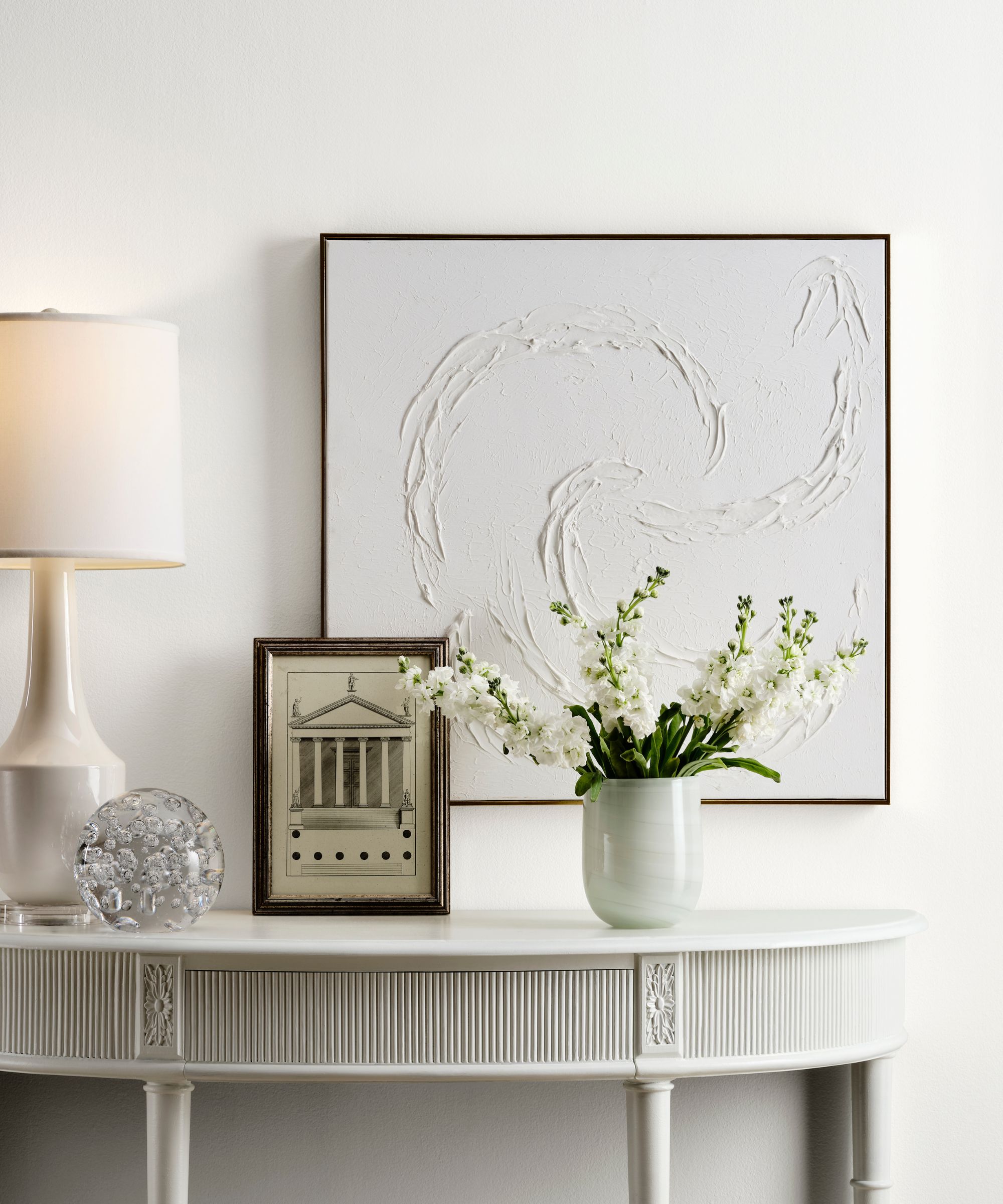
Beginning with a classic shade of white paint, Snowbelt SW 9623 offers a cool green undertone to ensure a light, airy, and fresh look.
Design expertise in your inbox – from inspiring decorating ideas and beautiful celebrity homes to practical gardening advice and shopping round-ups.
'This crisp white with slight green undertones is a great color to use in an entryway because it adds the right amount of understated coolness within the space,' explains Sue.
The color specialist continues to add that this white paint 'pairs nicely with neutral wood tones to create a clean and inviting first impression for guests to experience'.
Or, if you have a south-facing room that receives lots of warm sunlight throughout the day, these slightly cooler whites can provide balance and ensure the room avoids the appearance of yellow tones.
White Snow SW 9541
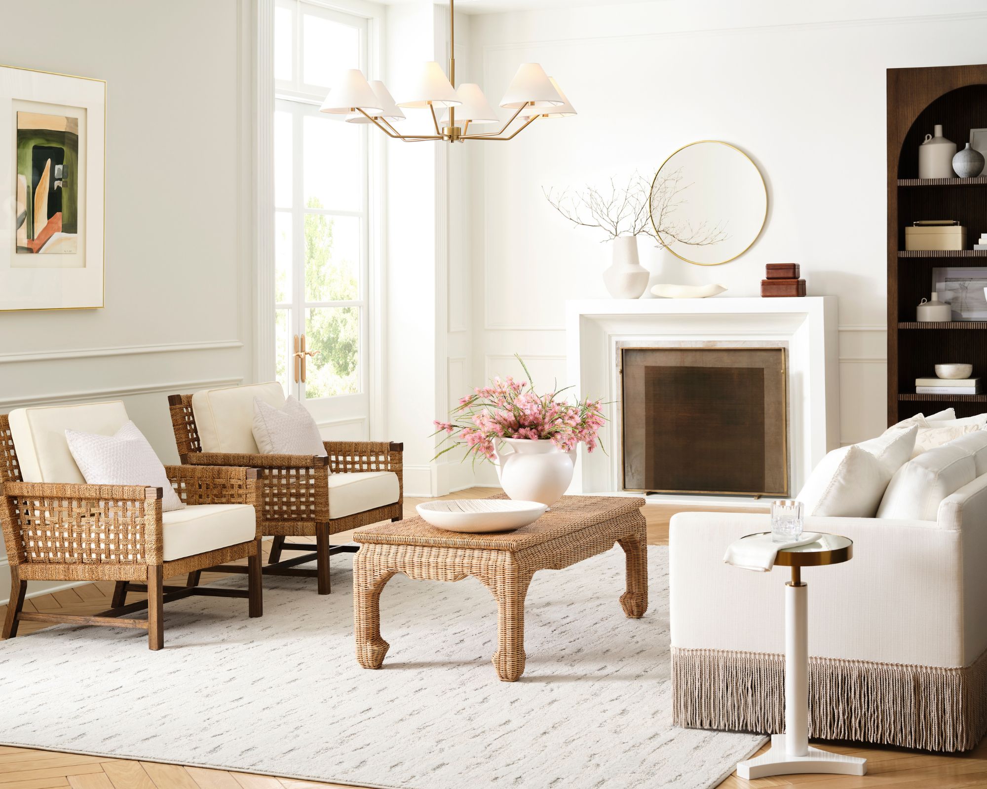
Secondly, White Snow SW 9541 is a bright white with a high light reflective value and very subtle warm undertones to ensure it doesn't feel too stark.
'Thanks to its high reflectance value, this clean bright white will reflect light throughout an entire space, making a gathering room like a living room appear more spacious and inviting,' says Sue.
If you're looking for a white paint to warm up a room, you'll probably want to opt for something with stronger warm undertones, such as Alabaster SW 7008; but if you want to lean into a bright and airy look, White Snow is a great option.
Cheviot SW 9503
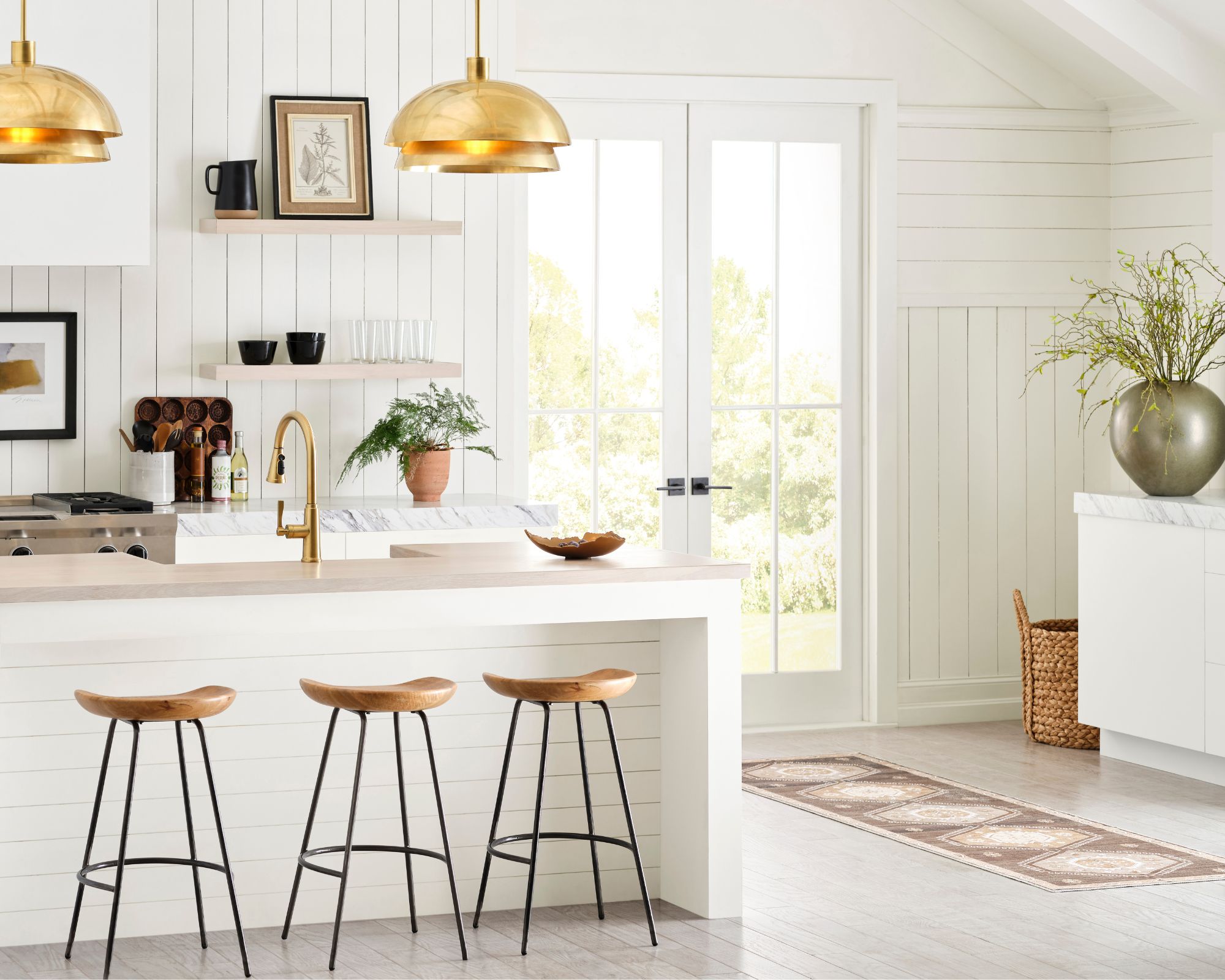
Similarly, Cheviot SW 9503 is a warm and welcoming white paint that features a subtle amount of yellow undertones, giving it a soft and cozy look. As seen here in this kitchen, Sue advises that this shade works especially well in the heart of the home, since it avoids looking too bright and clinical.
'This welcoming bright white with the slightest warm undertone is an ideal color to use in a kitchen since it pairs nicely with a variety of kitchen countertops, backsplash options, and wood tones that are found within a wide range of kitchen design styles,' adds Sue.
Snowbound SW 7004
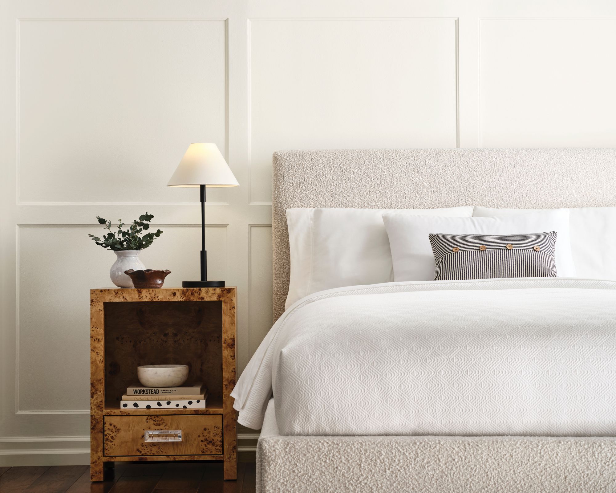
Snowbound SW 7004 is an endlessly popular white paint, one that we see crop up in interior designers' projects time after time. One of the brand's best-selling paints, Snowbound has a subtle gray undertone, giving it a slightly cool finish that provides rooms with that sought-after light and airy look.
'With its slight gray undertone, this shade is a versatile white that pairs well with other gray tones to create a calming atmosphere in respite rooms like a bedroom,' explains Sue.
Additionally, Snowbound would work just as well in bathrooms if you want to create a timeless, pared-back color scheme that's perfectly balanced.
Westhighland White SW 7566
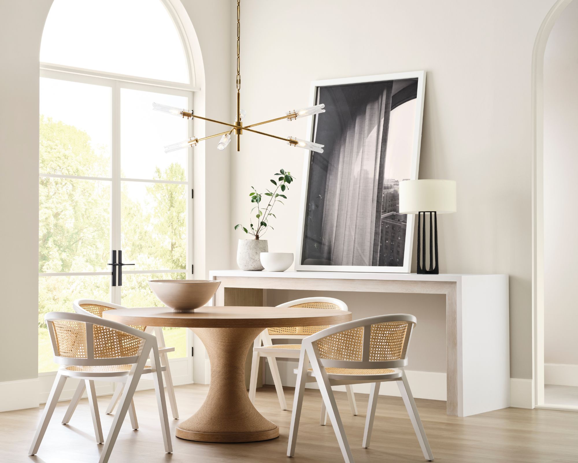
Lastly, Westhighland White SW 7566 is another bright white paint to have on your radar. Although bright, this particular shade has soft yellow undertones that give it a creamy look, but not so much so that it reads as a true cream color.
'This shade has the right amount of creaminess that adds a subtle warmth to any space, making it an excellent choice for a dining room to create a comfortable and welcoming atmosphere,' shares Sue.
Again, this white paint is the perfect backdrop color that we're often on the lookout for. While neutral paints can sometimes provide too much warmth and lean more toward the beige category; and some whites can feel too bright, Westhighland White falls somewhere in the middle.
Hopefully, with this expert advice, you'll have gained some useful advice on the differences between each of these similar bright white paints. If you're after more white paint options, take a look at the full Designer Color Collection, featuring many other popular shades to incorporate into your home decor ideas.
Once you've found a shade that seems like a fit for your space, remember to get swatches to see how the color appears differently throughout the day. Whether your room is north, south, east, or west-facing will impact how the paint looks throughout the day, amongst other factors.
We've also explained how to choose the best white paint according to experts to give you more helpful tips along the way.

Emily is a freelance interior design writer based in Scotland. Prior to going freelance in the spring of 2025, Emily was Homes & Gardens’ Paint & Color Editor, covering all things color across interiors and home decor for the Homes & Gardens website. Having gained specific expertise in this area, Emily is well-versed in writing about the latest color trends and is passionate about helping homeowners understand the importance of color psychology in home design. Her own interior design style reflects the simplicity of mid-century design and she loves sourcing vintage furniture finds for her tenement flat.