


This is the one kitchen trend I regret following in my remodel – it's so impractical
The trend for ridged wood cabinets is both minimalist and modern, but trust me, it comes with its own problems

Back when I was working on my kitchen remodel two years ago, kitchen trends were evolving. The classic Shaker style, with its rustic painted cabinets, was starting to look a bit old hat, and a new aesthetic was appearing.
Brands like the Scandinavian kitchen company Nordiska Kok were showcasing kitchen designs where the modern wood cabinets were framed with protruding wood surrounds, adding a graphic, grid-like appearance that seemed fresh, and interesting. They added an intriguing 3D element while still keeping to the calm, pared-back minimalist approach that was so appealing after all those dark blue Shaker cabinets. I embraced it for my own home, commissioning a local maker to create bespoke cabinets just like these.
And it's a kitchen trend I kind of regret choosing to follow.

Why I regret following this kitchen trend
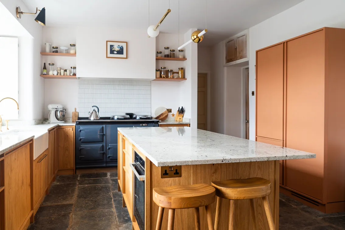
My own kitchen, with its ridged wood cabinets
I still love how this ridged trend looks. It still gives me all the minimalist kitchen vibes I was after, but with just the right amount of detail to create a sense that it has been designed, considered and curated.
The ridges catch the light in just the way, in the way a flat surface never could. The shadows change throughout the day subtly – only just – but enough to keep the kitchen feeling like an evolving, living space.
But I'll tell you this – those ridged ledges are a total annoyance when it comes to keeping them clean. Dust and lint just seems to gather on them. Spilled ingredients, drips of sauce, whatever gets thrown around when I'm cooking, all seem to end up on those edges. (Why is there always a stray grain of rice on one of them somewhere? What does this say about me?!).
When I'm working through my daily chores, just trying to keep the house in a vague sense of order, grabbing a cloth and running over each individual ledge is approximately a five-minute job. But add that up over the year? That's 1825 minutes spent wiping ledges I didn't need to install. Just over 30 hours. More than a whole day. Ouch.
What I probably should have done instead

I still maintain that texture in interior design is a good thing, that the interplay with light it creates is what makes a house feel more rich, more luxe, and infinitely more interesting. But I think there are easier ways I could have added texture that would have had me reaching for the dishcloth less often.
Take this impressive red kitchen, above, created by the Toronoto-based designer Ashley Montgomery. Not only is the color deep and fascinating, the side of the island has a ridged detail that seems to lift and energize this dark color, allowing an area of texture I'd wager you could wipe over in 30 seconds or less.
'The beadboard detail on the outer panels of the island is something that brings in a subtle bit of texture, while still staying true to the aesthetic of the rest of the space,' Ashley says of why she made this decorative choice. 'This project leaned very English, and beadboard is a very traditional element that was the perfect finishing touch to this island.'
More ways to add texture to a kitchen design

There are even easier-to-clean ways to add texture to a kitchen, that I'd be more inclined to follow were I to do my kitchen remodel again.
Reeded or mottled glass, as seen on the white kitchen above, is a smart choice for cabinet doors. It creates a sense of light that closed-off cabinets don't, but still manages to bounce that light in a more interesting way than totally flat glass does.

Or I could have gone for perfectly imperfect zellige tiles on the backsplash. Each one has its own unique character and shape, its ridges and its valleys. A simple wipe clean is all they need – a ten-second job at most – but they still manage to capture the light in the way that, say, flat subway tiles just don't.
The interior designer Enass Mahmoud recently employed this approach for a small kitchen, and the result is a fascinatingly layered space. 'I kept the walls and tiles the same tone which gave me license to be a bit more free when it came to putting personal objects on shelves,' she says. The result is a minimal space that is still so full of intrigue, the effect I was really trying to go for, and that wouldn't have lost me over a day each year in extra cleaning.
I might regret the maintenance that comes with following this kitchen cabinet trend, but the texture it adds to the space is something I still love. I would recommend anyone doing a kitchen project to think about how to add in texture, it creates depth and character to a normally very practical space. Plus it photographs beautifully.
