Design house: A cool Californian new build designed by Kate Lester
This once-bland West Coast home now has a curated, chic interior that’s brimming with personality.

Design expertise in your inbox – from inspiring decorating ideas and beautiful celebrity homes to practical gardening advice and shopping round-ups.
You are now subscribed
Your newsletter sign-up was successful
Want to add more newsletters?
This beautiful coastal home has been designed by Kate Lester, a Los Angeles based interior designer with her own home store at Hermosa Beach.
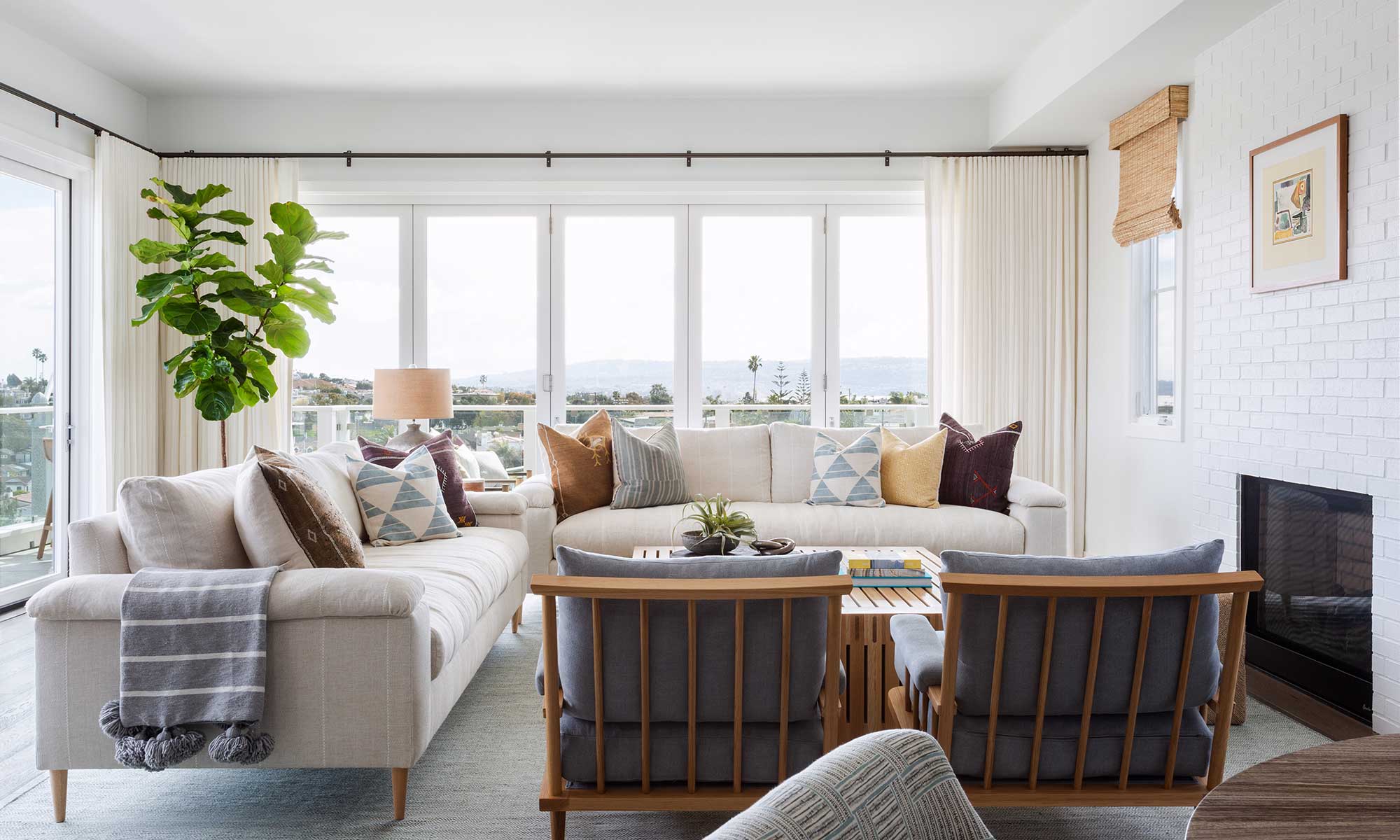
THE PROPERTY
This brand-new home, built over three storeys, is situated in an idyllic location just a minute’s walk from the ocean, and its generic interior provided a challenge for Kate.
‘We were brought into this project by our clients’ realtor, who sold them the property,’ says Kate. ‘The overall layout and bones of the house were solid, but the interior lacked the personality and wow-factor that our clients were looking for. They called us, and the rest is history!'
Article continues belowKate set to work and replaced all of the lighting, mirrors and cabinet hardware. She repainted everything and replaced the kitchen splashback, added built-in cabinetry, and turned an extra bathroom into a wine room. Then, she furnished and accessorised everything.
The owners were ‘dream clients’, according to Kate. ‘They said to us that they wanted to see my vision for the home before they made any suggestions or gave their thoughts. We all agreed that with the home’s close proximity to the ocean, the vibe should be effortlessly California-cool, with a little bit of wow-factor. Even though these clients have college-aged children, they are actually really hip. They wanted the home to reflect their personalities and feel curated and chic, and I think we did a really great job translating that. There were a few areas where they had more input as a family, but overall they trusted the process and really embraced our design direction and let us run with it.’
The initial design concept for the home was all about a California-cool vibe, with blues, teals, whites, warm woods, and a mid-century twist as well. ‘It was less about making it feel “beachy” (no shells or coral!) and more about it feeling fresh, unique, and curated. I wanted to make sure the effortlessly cool vibe that emanated from our clients was translated into the design.’
SeeDesign house: An oceanfront home in California, designed by Brandon Architects
Design expertise in your inbox – from inspiring decorating ideas and beautiful celebrity homes to practical gardening advice and shopping round-ups.
KITCHEN
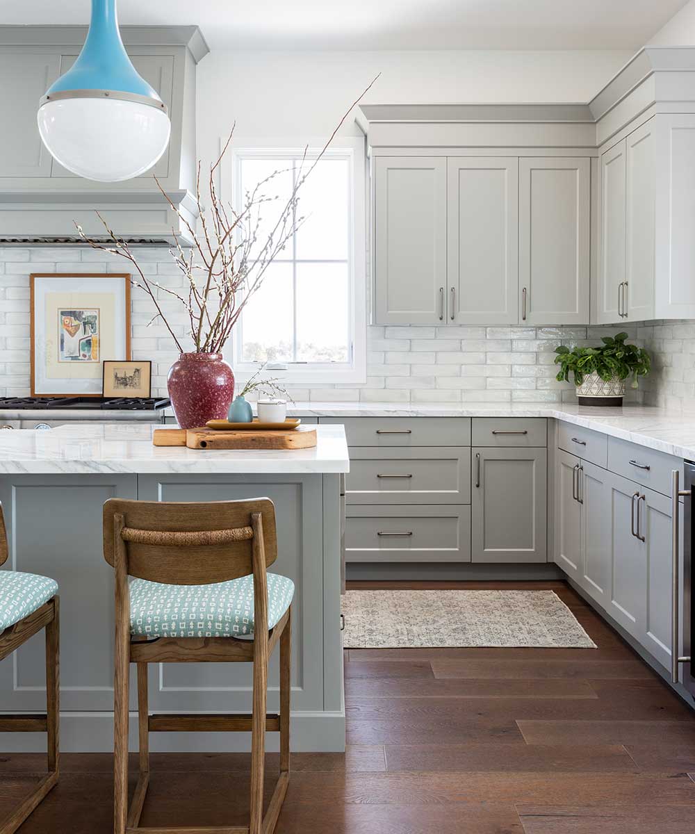
The builder had installed a shimmery mother-of-pearl-esque splashback that made the kitchen feel like a teenage girl’s bathroom. In addition, white cabinets emphasised the generic look. Kate replaced the pendant lights, painted the kitchen a warm shade of grey, replaced all of the cabinet hardware, and replaced the splashback with glazed brick tiles with a contrasting grout. ‘The end result feels more sophisticated and welcoming,’ says Kate.
DINING ROOM
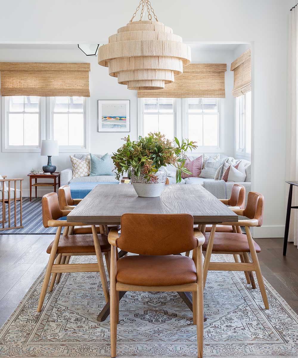
‘I wanted to create a place where our clients would easily be able to host a dinner party, but also nothing that felt too formal and stuffy,’ says Kate. ‘Since this space is situated off the stair landing, it’s really in the middle of an open floor plan. I wanted it to stand out and disappear at the same time.’ Chic Scandinavian-inspired chairs tone beautifully with the contemporary-style trestle table, complete with driftwood finish that’s a nod to the coastal location, while a statement pendant light draws the eye.
SeeDesign house: Small, space-saving bungalow in Texas, designed by Katie Davis
INFORMAL SEATING AREA
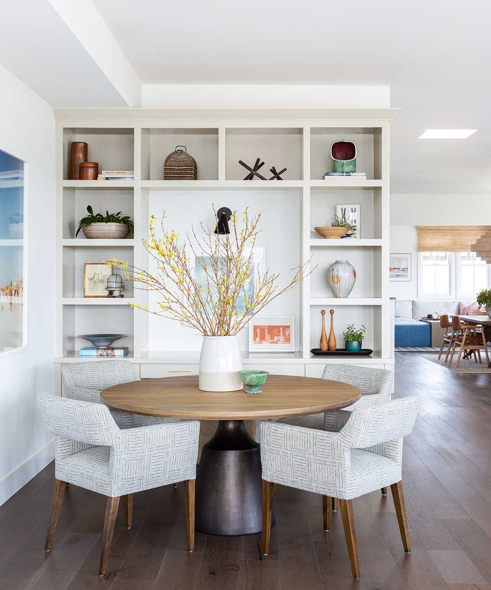
‘This area was a weird open space with no cabinetry when our clients purchased the home. We talked about how they envisioned using this space and eventually settled on an informal seating area that could be used as a breakfast area, but double as a game table.’ Kate built in some custom design cabinetry, as well as a small desk space. The cabinetry was used to showcase some of the clients’ favourite things, as well as art and accessories that Kate collected for them. ‘Our clients are lovers of vintage finds and art just as much as I am, so it was so fun procuring all of the decorative accessories for this project.’
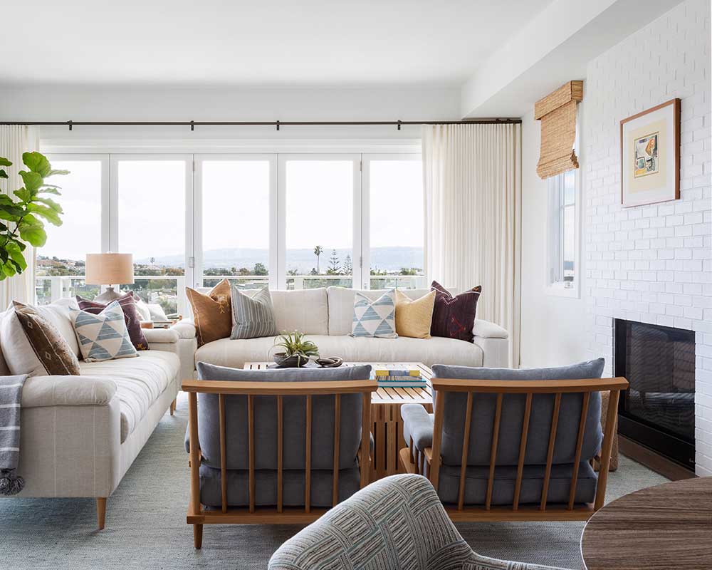
LIVING ROOM
‘When my clients purchased the home, the fireplace was tiled, with a heavy uber-traditional fireplace surround and hearth.' says Kate. 'It felt so out of place in our new plan, so we removed everything and, instead, opted for a white painted brick. This also ties in really nicely with the brick we installed in the kitchen, which is adjacent to this room. For the furnishings, we wanted to keep it comfortable, but interesting and I think we achieved this perfectly with the custom-designed sofas and chairs by Lawson Fenning. It’s inviting and comfortable, but still feels tailored and chic. It’s perfectly complements the sprawling 360-degree views.’
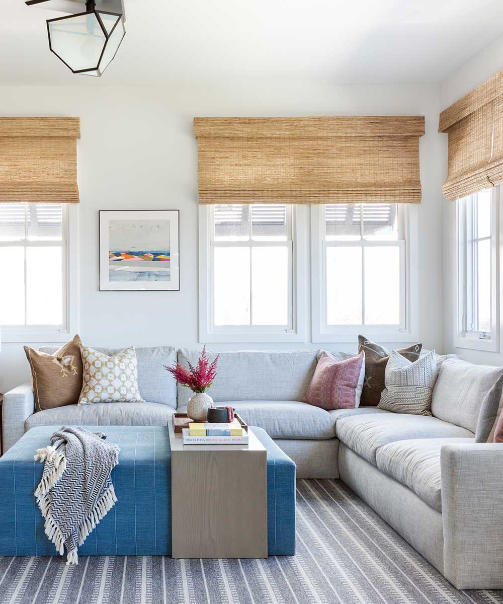
CHILL ROOM
‘As the home was a development, the builders had left this room as a sort-of flex room,’ says Kate. ‘It could have been used as an office, additional bedroom or den. We thought it would be absolutely perfect as a lounge area, but, as it is off the kitchen and dining room, I didn’t want it to feel too informal. It still needed to exude a bit of sophistication. We added an amazing light fixture from Urban Electric Co, as well as a built-in media cabinet/library. The colour palette is still very in line with the rest of the home and heavily reliant on textiles and fixtures for added texture and dimension. The woven wood blinds are actually a very unifying factor in the design - they run throughout the home and are only a slightly different colourway in the bedrooms.’
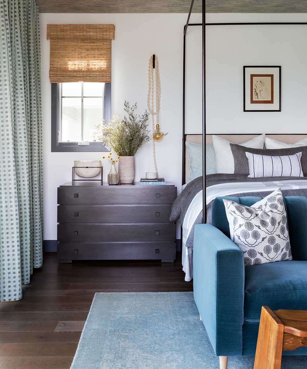
MASTER BEDROOM
Kate wanted to create a moodier scheme that contrasted with the other spaces. ‘We wallpapered the ceiling to add softness and dimension and then selected this incredible metal canopy bed. I wanted the visual presence of a canopy bed to anchor the large room, but I wanted it to feel fresh and slightly more contemporary. We also painted the window and door casing in a deep navy in the entire master suite. I wanted to do something to differentiate our clients’ refuge, and I wanted some added wow-factor. I think adding the deeper hues really makes the entire space unique.’
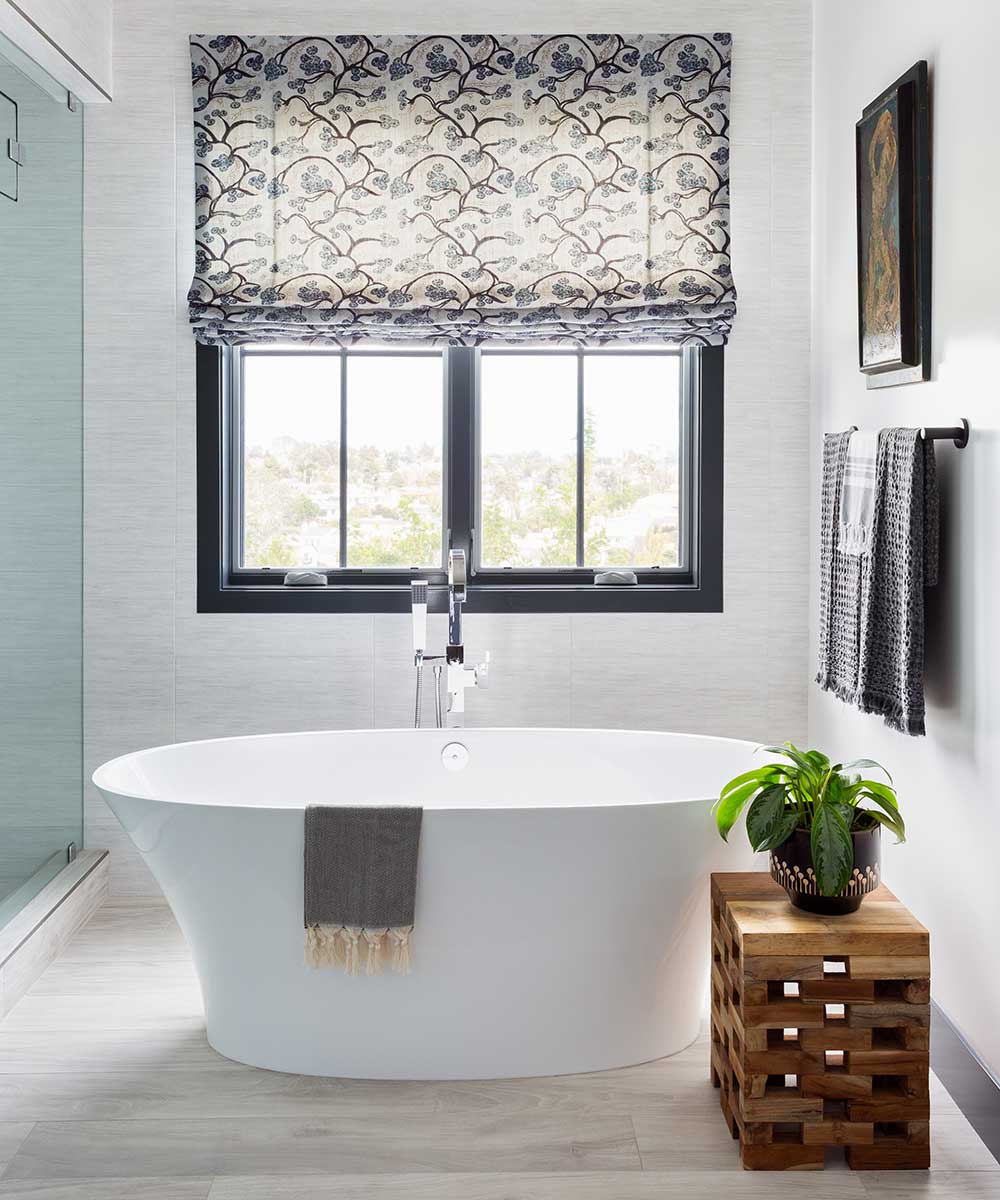
MASTER BATHROOM
‘The tub and tiles were already in place and were so neutral that they were easy to build on,’ says Kate. ‘We used a contrasting paint colour around the windows and continued it on the interior doors and vanities. We added a wooden stool and vintage abstract art for dimension, and the pattern custom Roman blind is the perfect added pop of movement that the room needed.’
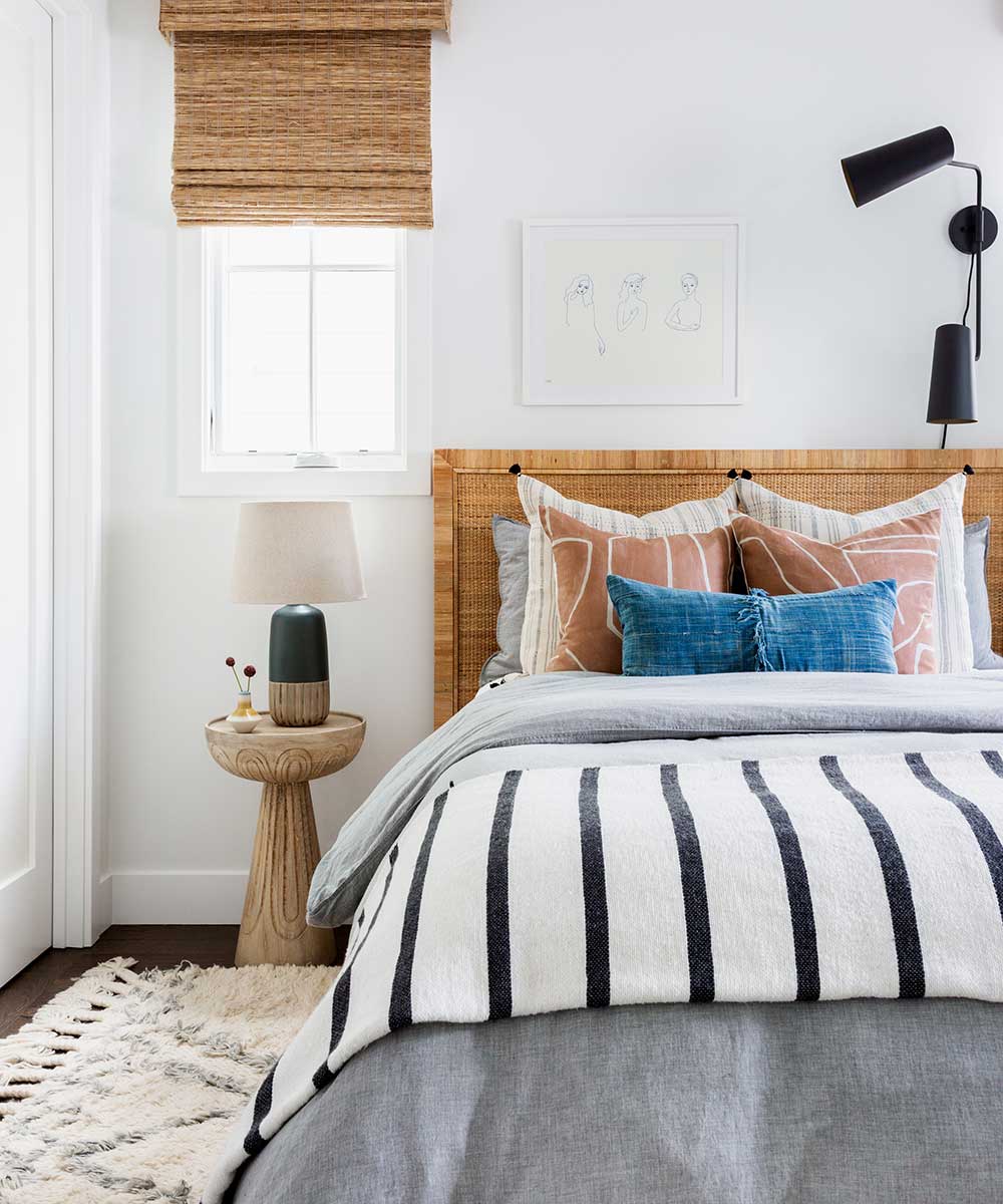
BEDROOM
Both daughters gave their input into their room schemes. This is the eldest daughter’s room and she gave Kate a Pinterest board full of design ideas and spaces she was inspired by. ‘We used that to create a room that was textural and fresh, but not too serious or matchy,’ says Kate. ‘The super soft Moroccan rug balances out the harder edges of the bed and woven wood blinds, and the bedding palette was designed to bring in a pop of colour without it feeling too forced.’
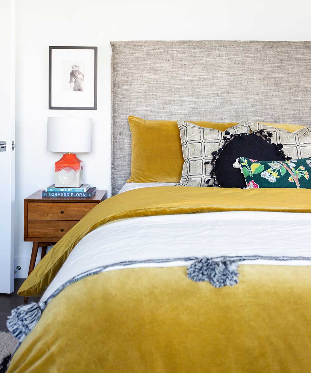
BEDROOM
This is the younger daughter’s bedroom. ‘I loved that the Pinterest board she gave us was completely different to her sister’s,’ says Kate. ‘It was infused with deeper pigmented colour and luxurious textiles, like velvet and silk. We had fun in here incorporating some of those punches of colour in the bedding and lamp. The end result was definitely a more bohemian, collected aesthetic.’
Words/ Vivienne Ayers
Photography/ Amy Bartlam
Interior designer/ Kate Lester

Interiors have always been Vivienne's passion – from bold and bright to Scandi white. After studying at Leeds University, she worked at the Financial Times, before moving to Radio Times. She did an interior design course and then worked for Homes & Gardens, Country Living and House Beautiful. Vivienne’s always enjoyed reader homes and loves to spot a house she knows is perfect for a magazine (she has even knocked on the doors of houses with curb appeal!), so she became a houses editor, commissioning reader homes, writing features and styling and art directing photo shoots. She worked on Country Homes & Interiors for 15 years, before returning to Homes & Gardens as houses editor four years ago.