I'm generally against open-concept living rooms, but Anthony Hopkins uses pops of color to elevate his into a cozy jewelbox I can get behind
Open plan spaces often look too contemporary for my vintage-loving taste, but Anthony Hopkins shows how to ground the layout with warm, personal accents


Design expertise in your inbox – from inspiring decorating ideas and beautiful celebrity homes to practical gardening advice and shopping round-ups.
You are now subscribed
Your newsletter sign-up was successful
Want to add more newsletters?
I won't sugarcoat it: I hate open concept living rooms. They tend to feel beige, and, frankly, devoid of personality. They lend themselves to minimal furnishings and often feel soullessly empty. This is distinctly not the case in Sir Anthony Hopkins's home.
The actor took to Instagram to share a dancing video, as he is wont to do, revealing his open layout living room in the process. Though it has classically modern wooden floors and white walls, Sir Anthony's space feels anything but boring. He has added height and interest to his white sofa with a sideboard stacked high with orchids. Large, colorful paintings fill the walls, warming the space.
As interior designers move away from open-plan layouts, Anthony's space is evidence for why we shouldn't count this setup out wholesale.
Article continues belowA post shared by Anthony Hopkins (@anthonyhopkins)
A photo posted by on
So, what makes the actor's take on open-plan living fly where so many have failed? First, it feels deeply personal. The large paintings on the wall are Anthony Hopkins originals. As we've often discussed at Homes & Gardens, design choices like this that transform the home into a biography of those who live there always create a warm and welcoming atmosphere. The bright colors and flamboyant swirls are a celebration of their creator.
Shop the look
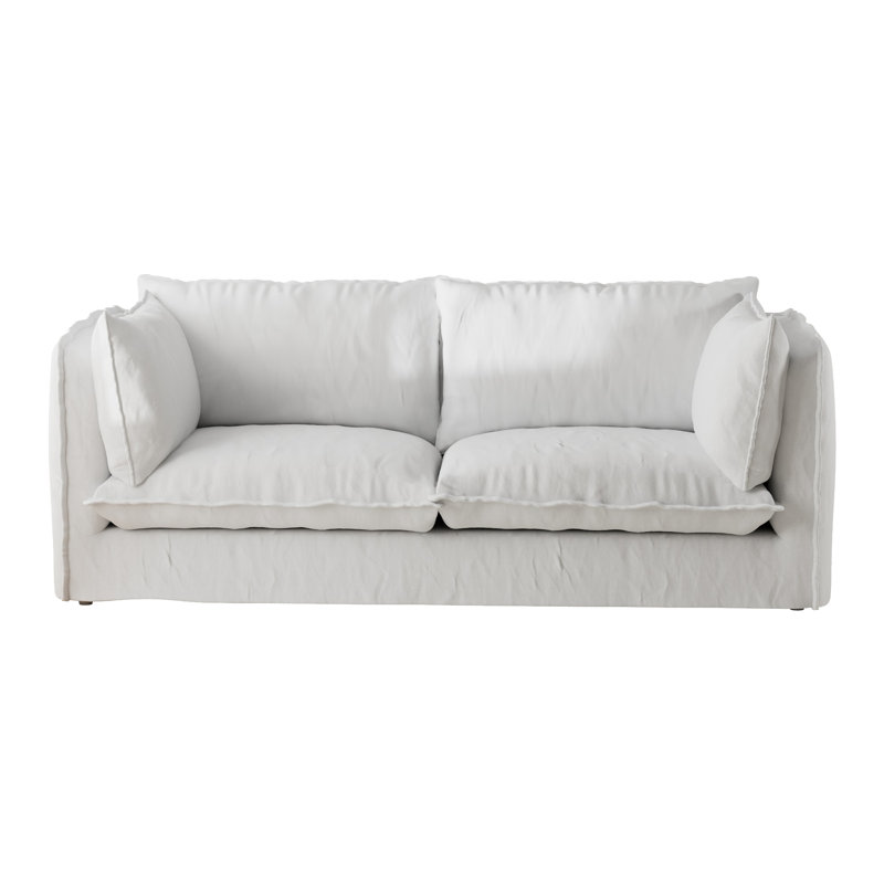
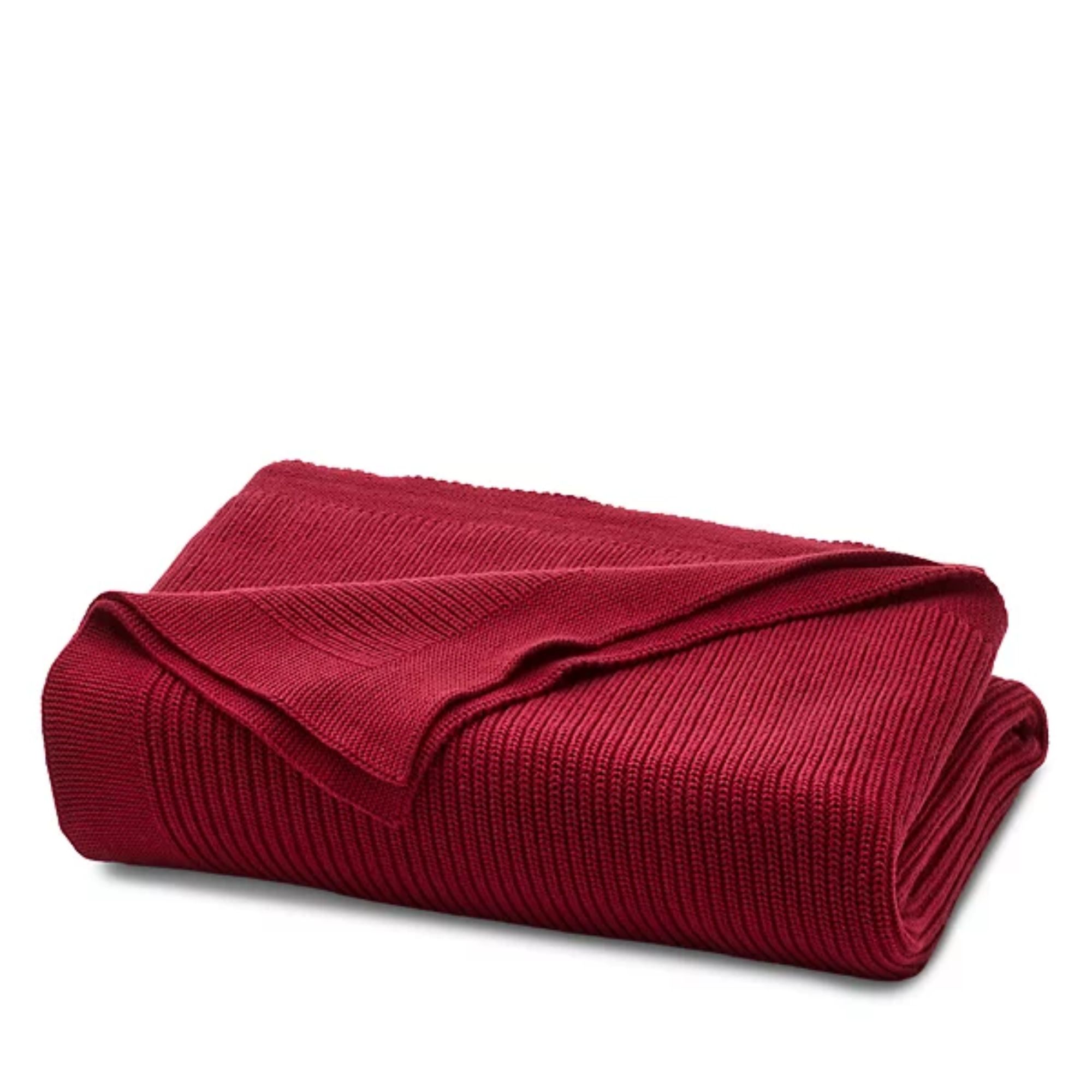
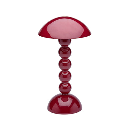
As seen in Anthony Hopkins' living room, creating a perfect open concept space requires an artful interplay between unexpected pops of color and minimalism. The pairing of a white sofa with pretty red accents is the perfect place to start. These are our editor's picks.

Crafted with a robust, solid, and engineered wood frame, this versatile loveseat offers long-lasting durability and support that feels quietly expensive. It's made from premium cotton fabric for a tactile feel and features two square throw pillows that add extra texture and charm in every living room.

Small decor items like cushions and throws are great ways to introduce a new color to your couch. This cozy ribbed knit throw adds texture, color, and warmth to snuggle up under.

Have you ever seen something cuter than this bobbin lamp from Addison Ross home? It's the perfect size and rechargeable for unlimited styling possibilities.
Another color trick Anthony uses that makes his open plan design work well is the unexpected red theory. In the background, a set of bright red chairs contrast the white walls, and create interest agains the wooden floors. The way he has played with height using the sideboard and planter of orchids keeps these pops looking subtle and understated for an ultra-stylish design.
Seeing Anthony Hopkins's vibrant living room changed my position as an avid open plan hater, to more of an 'it depends' person. The space is a lesson in challenging preconceptions about what good design looks like. The truth is, the pieces in the room are ultimately what makes it.
Design expertise in your inbox – from inspiring decorating ideas and beautiful celebrity homes to practical gardening advice and shopping round-ups.

Sophie is a writer and News Editor on the Celebrity Style team at Homes & Gardens. She is fascinated by the intersection of design and popular culture and is particularly passionate about researching trends and interior history. She is an avid pop culture fan and has interviewed Martha Stewart and Hillary Duff.
In her free time, Sophie freelances on design news for Westport Magazine and Livingetc. She also has a newsletter, My Friend's Art, in which she covers music, culture, and fine art through a personal lens. Her fiction has appeared in Love & Squalor and The Isis Magazine.
Before joining Future, Sophie worked in editorial at Fig Linens and Home, a boutique luxury linens brand. She has an MSc from Oxford University and a BA in Creative Writing and Sociology from Sarah Lawrence College.