Clashing colors – 10 expert ways to choose and use contrast
Yes, clashing colors can work brilliantly in interiors. We have poured over swatches and samples and bring you some inspiring looks and tips

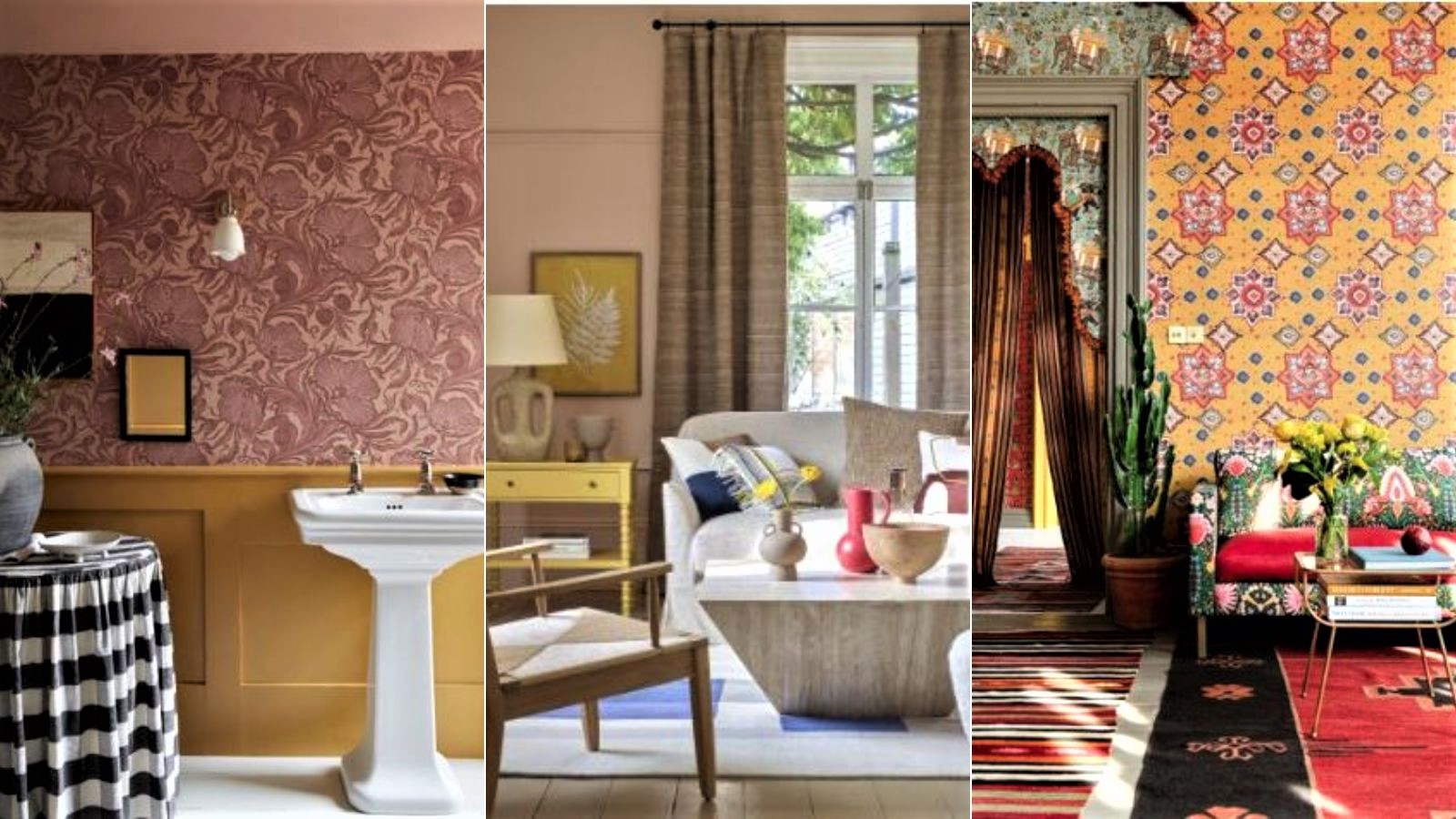
- 1. Use a contrasting color as a highlight
- 2. Pick a color clash based on its mood
- 3. Match clashing colors with maximalist layering
- 4. Find the saturation point
- 5. Have fun and play with color
- 6. Match color temperatures for a harmonious clash
- 7. Choose one dominant tone
- 8. Use the ceiling and floor for color clashing
- 9. Select clashing furnishings
- 10.Minimize the color clash to maximize impact
- FAQs
Clashing colors demand attention, with rooms that include them often seen as bold and challenging.
On the color wheel, colors that sit opposite each other are considered contrasting, and therefore, in color theory, clashing. Contrast is one the basic elements of design, as the eye is drawn directly to it. Common color combinations for rooms tend to use two or three contrasting colors.
But, rules, as we know, are made to be broken, so although color design principles are recognizable tools in color theory, you can, of course, chose any color combinations you desire. These are our favorite clashing color combinations.
How and when to use clashing colors
Clashing colors needn't just be about decorating with primary colors; you can employ contrast any of your room color ideas, even, say, when decorating with neutrals.
1. Use a contrasting color as a highlight

Interiors have changed over the last few years as people embrace color in their homes.
Ruth Mottershead Creative Director at Little Greene, says, ‘Color plays a crucial role in determining the atmosphere of a space. Reassuring and calming warm neutrals have replaced cool stark whites, whilst bold, deeper shades that bring intimacy and a cocooning feel, are being embraced alongside bright color highlights, adding an element of joy to interiors.’
Ruth advises that you opt for colors that appeal to you so that you are happy spending time with these choices. ‘If you are incorporating very bold, contrasting or vivid hues, consider the space you use them in carefully, as they will bring a sense of dynamism and energy to a space.’
Design expertise in your inbox – from inspiring decorating ideas and beautiful celebrity homes to practical gardening advice and shopping round-ups.
2. Pick a color clash based on its mood

‘A color clash will always put me in a good mood because it feels cheeky and daring and mischievous and heightens the qualities of each color to fabulous effect!’ says paint and color expert Annie Sloan.
Annie says we should, ‘Look at colors in terms of whether they’re active and dynamic or serene and calming, as these traits are less subjective. Use bright bold, active colors in social spaces like kitchens or living rooms.'
3. Match clashing colors with maximalist layering
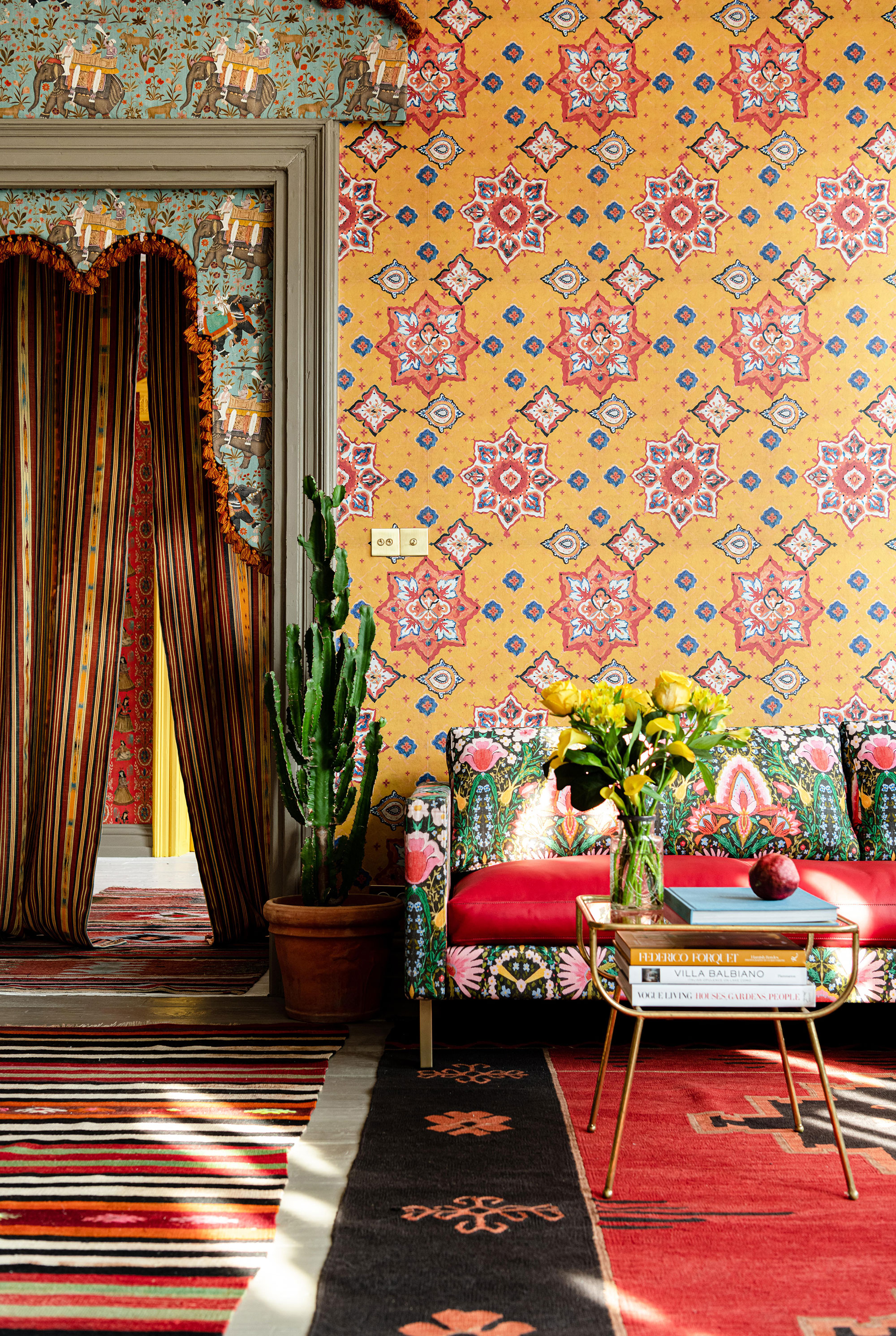
Clashing colors are subjective: what you may consider clashing could be someone else’s color match dream.
This is how Stefan Ormenisan, Creative Director at MindTheGap sees it. He explains, ‘It might seem strange, but I don’t think of it as clashing pattern, color and print; instead I just think of it as a room filled with different memories that bring a smile, with each motif bringing its own story, influenced by a certain time or place.’
Stefan loves to work with maximalist decor which he says means ‘more color, more pattern, more texture.’
He believes that clashing colors, maximalism and more layering is to, ‘chose patterns in varying colors such as Ikats, geometrics and stripes mixed with florals and botanical designs.
'If you are nervous about where to begin,' he says, 'it can be a good idea to begin with the smaller details such as accessories and adding a few colored cushions and a rug to deliver a jolt of pattern and color clashing. If you choose a design because you love it and it sings to you, then that is always a sure-fire place to start.’
4. Find the saturation point
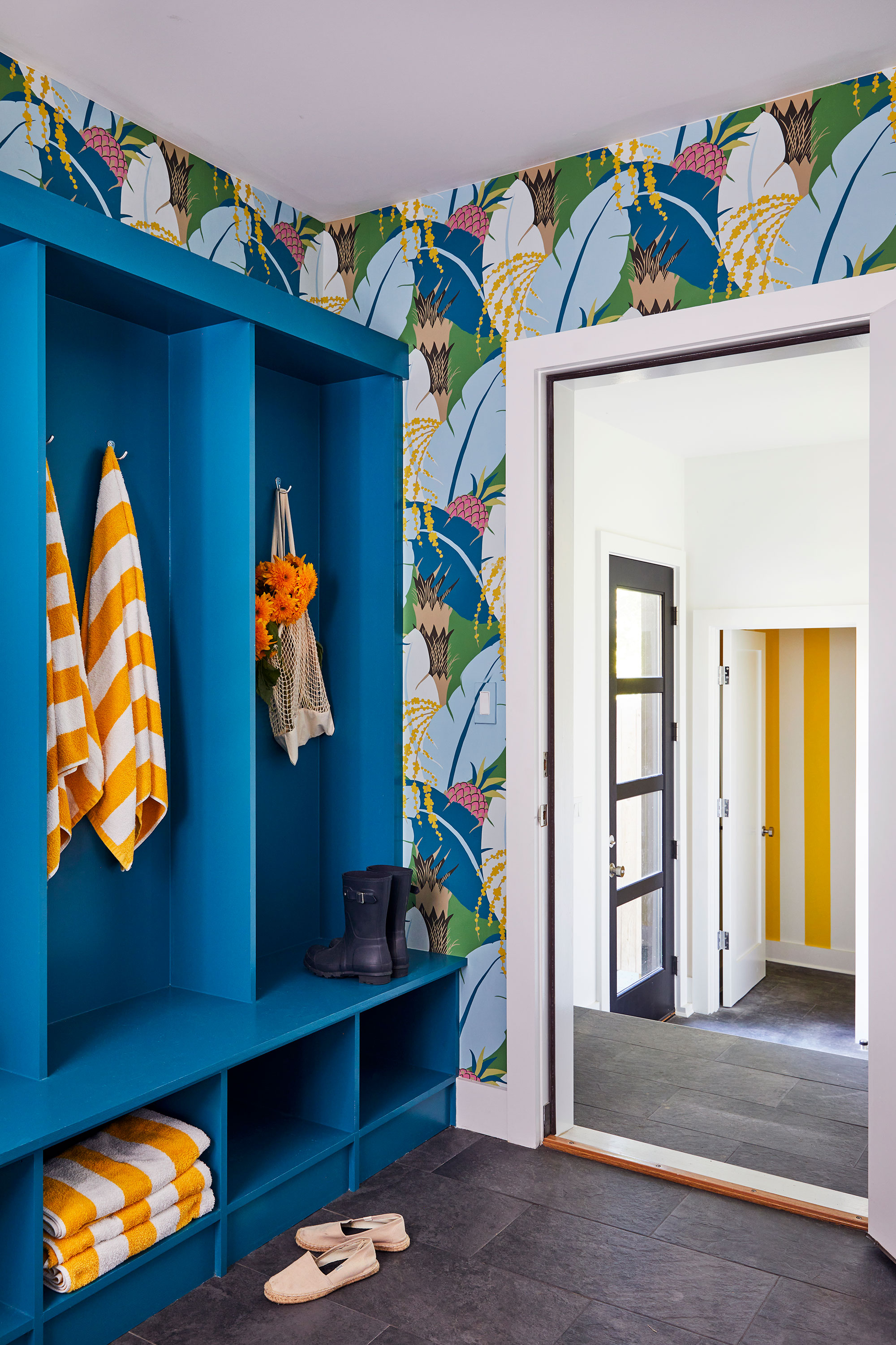
A design rule for using clashing colors is to ensure each color you chose has a similar saturation point.
Saturation literally refers to how bright a color is; if you select clashing colors to create contrast, ensure the colors have the same or similar saturation.
Hyphen & Co designer Eliza McNabb, explains, ‘When pulling many colors into a palette, consider keeping them all at a similar saturation to help it feel cohesive.
‘Using multiple hues of the same color can help provide a base palette into which additional colors can be introduced as accents.’
5. Have fun and play with color

Interior designer Victoria Sass, founder of Prospect Refuge Studio explains how to introduce clashing colors into a room.
‘Think of a classic combination that strikes a strong chord for you. For example, a Christmassy red and green. Now tweak each color so it is a little ‘off’ say, terracotta and mint. Voila!’
Victoria believes that it is important to have fun when designing and choosing colors: ‘While you are having fun with all these hues, don’t forget about value and saturation. Playing with the intensity and depth of each color will open up whole new worlds of "clash".'
6. Match color temperatures for a harmonious clash
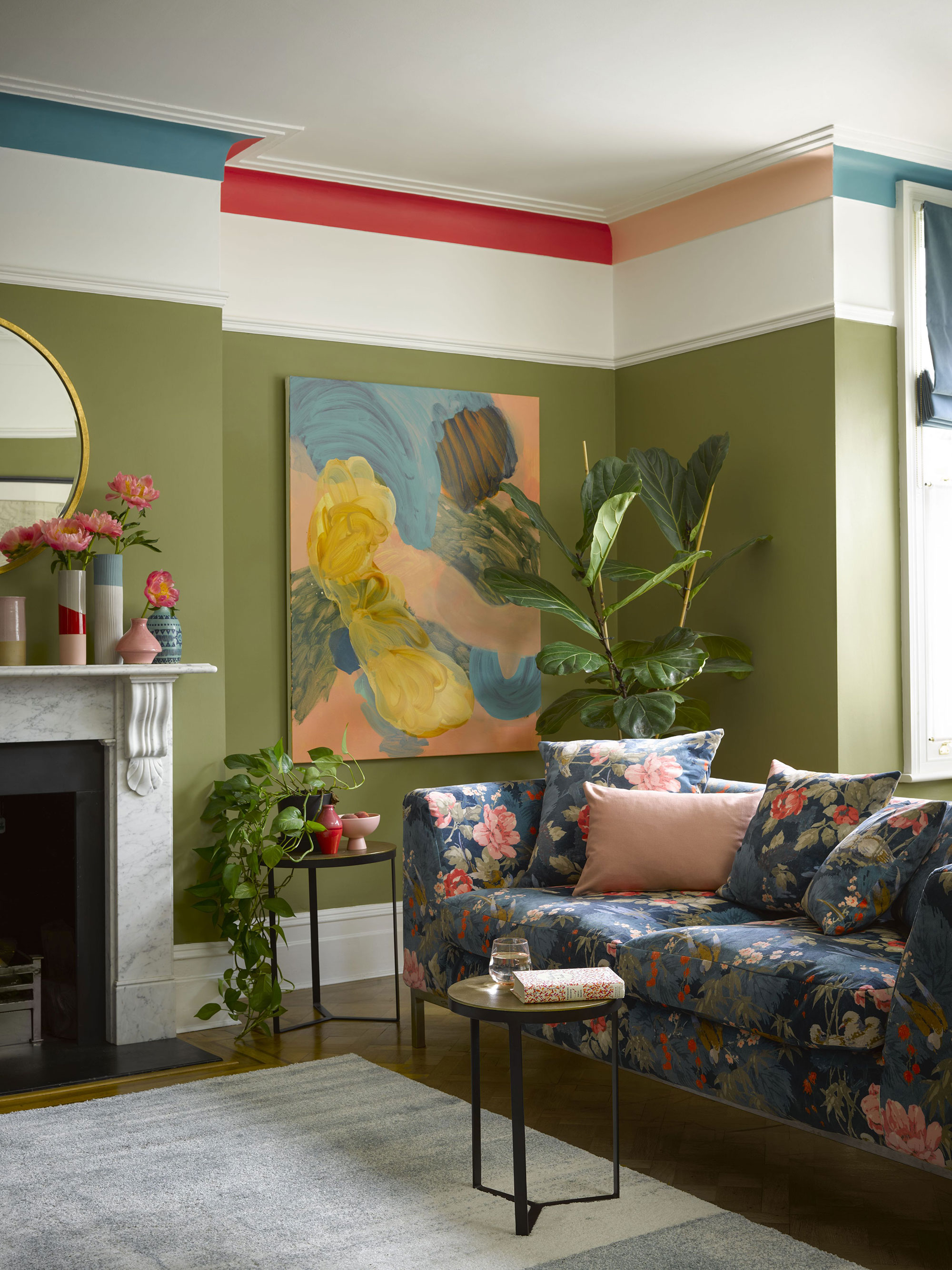
Choosing colors with a similar hue will connect two clashing colors together, creating a more coherent overall look, rather than overpowering.
Helen Shaw, at Benjamin Moore Paint, expounds, ‘The trick to choosing color combinations that will work together is to opt for colors with similar undertones, as these will work to complement each other.
'For instance, a pink and a blue, although very different hues, can appear complementary together providing that a cool shade of pink which leans more towards the lilac family is chosen. Following this technique is a fool-proof way to create unusual and eye-catching color pairings without forming an accidental color clash.’
7. Choose one dominant tone
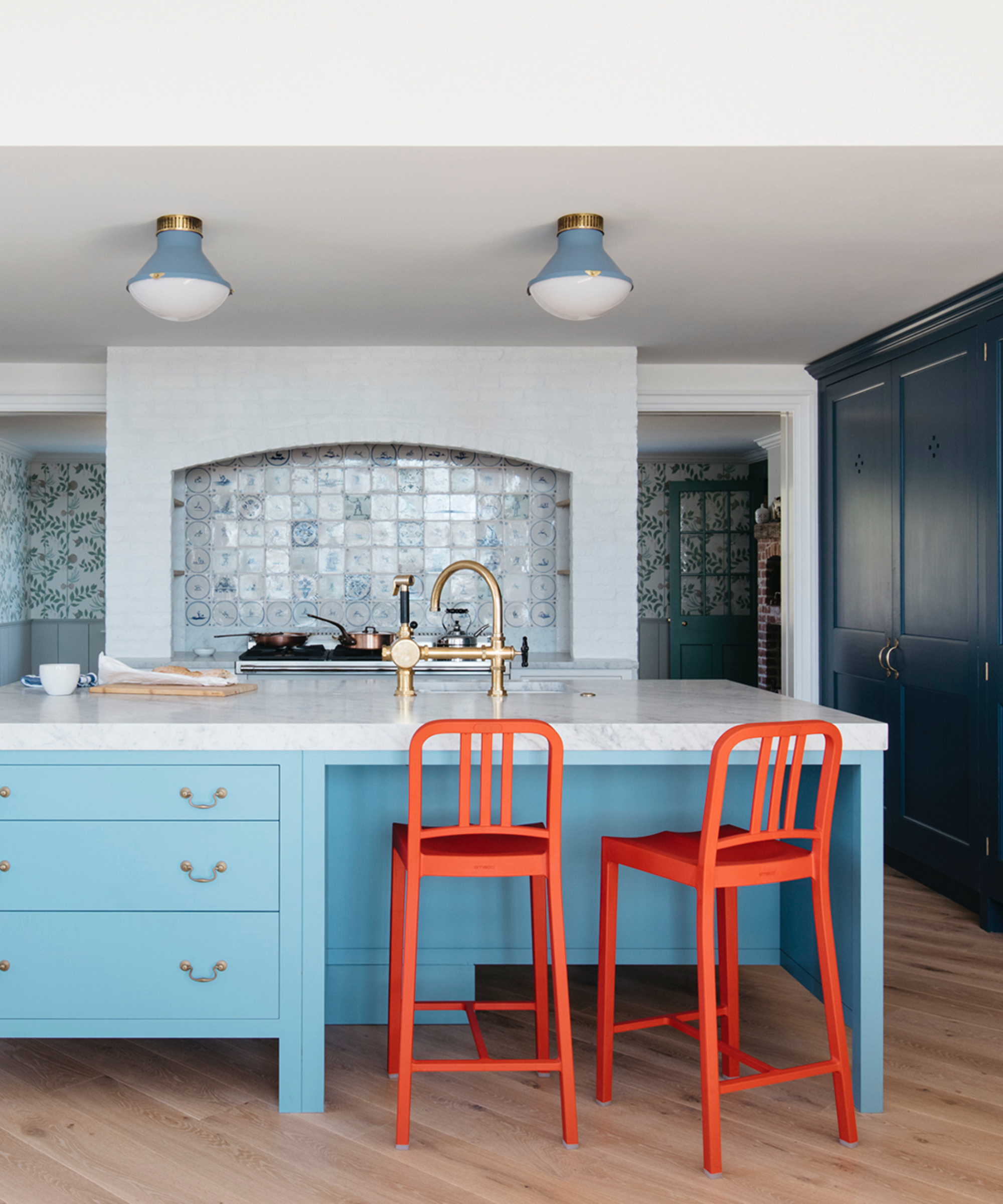
If you are very definite about one color you want to use, but you are not sure about how to choose a contrasting tone, then select this as your dominant tone and chose softer notes to use alongside it as an accent color.
Designer Liz Beal at Goddard Littlefair discloses how she uses clashing colors, ‘When incorporating clashing colors, it's often best to let one color take precedence as the dominant hue while using the other as an accent.
‘For example, you could paint the walls in a vibrant, clashing color and use softer, complementary tones for furniture, flooring, or accessories. This creates a harmonious interplay between contrasting elements.’
8. Use the ceiling and floor for color clashing

Being brave when choosing a color palette will provide a sense of action and dynamism to your space. Selecting different colors for the floor or the ceiling ideas is a great way to create clash.
While it is generally accepted that colors should be chosen to complement instead of clash, breaking this rule can add a sense of drama to a space. A palette of bright, vibrant shades employed throughout will create a backdrop that stimulates and engages.
Balance this the look by choosing natural more muted notes on the furnishings and accessories to allow the room to feel joined up but eye-catching.
9. Select clashing furnishings
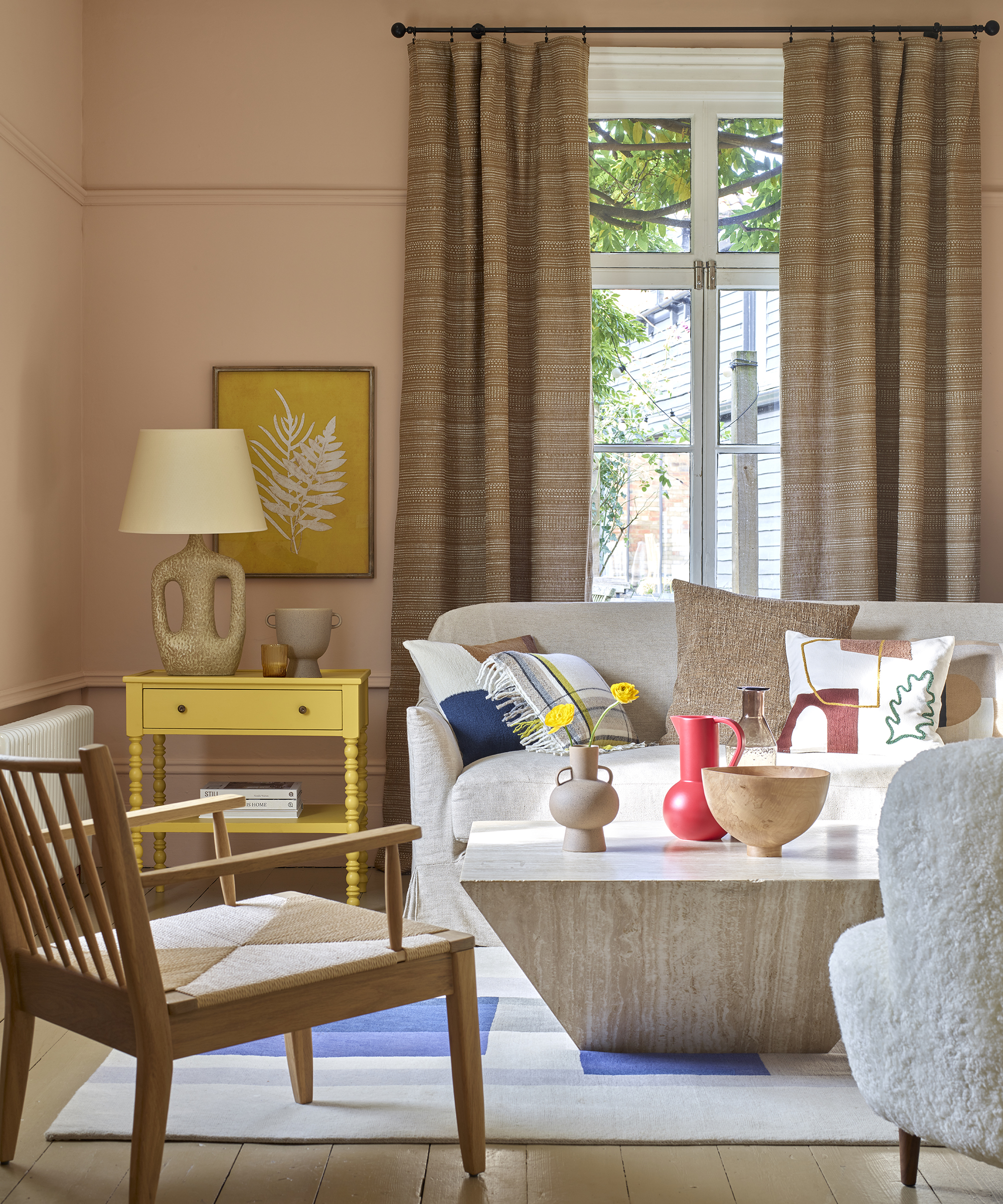
Bursts of color clashing can be introduced through furnishings, cushions, curtains or artworks. It may be that you prefer to bring bolder colors subtly without shouting too much in your interiors. This option allows you to play with a range of furnishings to achieve a bold style.
Martin Horner and Shea Soucie, Principals at Soucie Horner Interiors say, ‘One effective approach is to incorporate well-coordinated bursts of color through... colorful window treatments, pillows, accessories and art – all lend playful and decorative punctuation to glamorous spaces, giving a home a modern yet cozy feel.’
Designer Liz Beal at Goddard Littlefair agrees, ‘Consider using clashing colors for cushions, throws, artwork, or decorative objects to infuse the room with pops of vibrant contrast.’
10.Minimize the color clash to maximize impact

High contrast color choices demand attention and bring a visceral sense of excitement, celebration and joy to a home. If you want to create this kind of impact, take a leaf from Annie Sloan’s painting rule book.
‘Maximize impact by sticking to two or three clashing colors and keeping the rest of the room neutral, and make sure you use your chosen colors liberally enough to fully harness their statement power. Think clashing floors, chairs, tables or walls rather than a few mismatched candlesticks.’
FAQs
How do I choose and use clashing colors at home?
Clashing colors are entirely intuitive, so take this as your first guide, you can chose any colors you dream of putting together, be they opposites on the color wheel or neighbors.
Using them in an interior space gives you licence to design a room full of visual drama and excitement, or you can chose clashing colors more indirectly through furnishings, artworks or cushions and objects.
If you select one, two or even three contrasting tones, ensuring that each color has a similar saturation point will help to add cohesion to the total design. You could also chose just one dominant strong tone and use neutrals alongside it to soften its dominance.
When decorating for contrast, experimentation is key, but trust your instincts and make sure the clashing colors chosen agree with your personal style and the room's purpose.
Elisabeth Rogoff, Principal at Champalimaud Design, adds, ‘If you are using colors together in one space I wouldn’t consider them "clashing colors", rather "complementary colors". The challenge of a good designer is to balance color in a space and this is an instinct that comes from the eye of a creative mind.'

Hannah Newton is a lifestyle, interiors, travel and design journalist and editor who has been writing for the past two decades, she has written for national newspapers including The Times, The Telegraph, The Guardian and The Observer as well as interiors titles Elle Decoration and Architectural Digest in the UK and across Europe, South Africa and Australia.