5 ways to decorate with Pale Oak, Benjamin Moore's best-selling versatile greige
Pale Oak is the all-round neutral hue you need to know about

Design expertise in your inbox – from inspiring decorating ideas and beautiful celebrity homes to practical gardening advice and shopping round-ups.
You are now subscribed
Your newsletter sign-up was successful
Want to add more newsletters?
Neutrals will always be a timeless choice in home decor. From soft beige tones to off-whites, decorating with neutrals provides the perfect backdrop color trend in the home that can create a calming feel, while letting other elements of the room's decor make a statement.
With this year's popular quiet luxury trend, 2023 has seen neutral hues embraced for their understated and timeless appeal, and there's one color in particular that stands out: Benjamin Moore's Pale Oak.
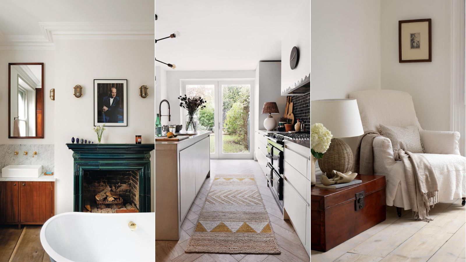
A warm neutral that strikes a balance between gray and beige, Pale Oak is a popular paint trend for its incredible versatility – easy to style in many rooms across different interior styles, from traditional decorating ideas to modern.
What color is Pale Oak?
'Pale Oak is a versatile neutral,' explains Helen Shaw, Director of Color Marketing at Benjamin Moore. 'The color has the softest hint of warmth, making it a quintessential light, useable grey. The muted hue is a popular choice and works perfectly as a backdrop that’s low-key but still makes a statement. Its versatility means it can work in many different spaces and will complement a range of flooring colors.'
While whites can come across as stark and some beige colors can look dated, interior designer Bethany Adams says that Pale Oak provides the perfect balance between the two: 'Warmer beige walls are definitely replacing stark white as the go-to neutral. If you have a hard time thinking of yourself as a "beige" person (I know I do!) dip a toe in by choosing a warmer white, like Benjamin Moore's Pale Oak.'

Helen Shaw is part of Benjamin Moore's UK division. Color expert and international marketing director, Helen and her husband Craig are founders of Shaw Paints, acquired by Benjamin Moore in 2020.
How to decorate with Pale Oak by Benjamin Moore
Since neutral hues are so versatile, there are endless ways to decorate with them. Whether you want to have it as a backdrop color on the walls or as an accent hue, Pale Oak can be used throughout the home for a timeless look.
'While grays and greiges have been all the rage for several years, Benjamin Moore's Pale Oak is a neutral that will withstand evolving trends and design styles,' says Veronica Colby, owner and designer at Evergreen Design Co. 'In my opinion, it's a safe bet when you're not sure if you want to commit to a color, but definitely don't want white.'
Design expertise in your inbox – from inspiring decorating ideas and beautiful celebrity homes to practical gardening advice and shopping round-ups.
Below, we've rounded up five different ways to decorate with Pale Oak throughout the home, as suggested by the experts to give you some inspiration to embrace this crowd-pleasing hue.
1. Use as a backdrop in the living room
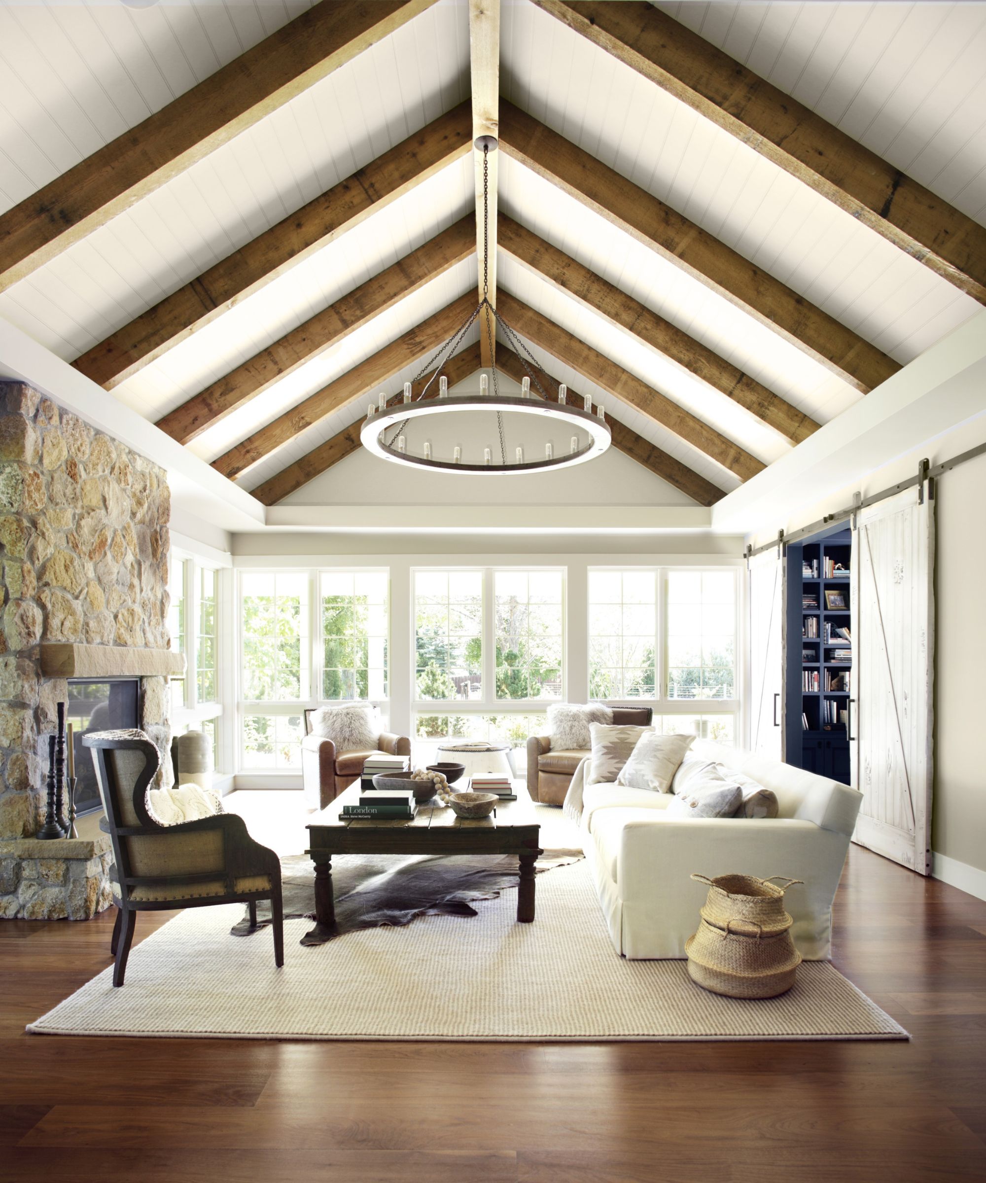
Pale Oak is a great choice for the living room as it sets a calming background that looks timeless and understated, tapping into the low-key luxe trend. You can either choose to pair it with other similar neutrals or with contrasting colors, as Helen Shaw explains: 'It works wonderfully in a living room, either layered with other neutrals such as White Dove or Cloud White or as an anchor for bolder shades to create a quiet, sophisticated aesthetic that is both warm and inviting.'
2. Paint the cabinetry for a cozy look
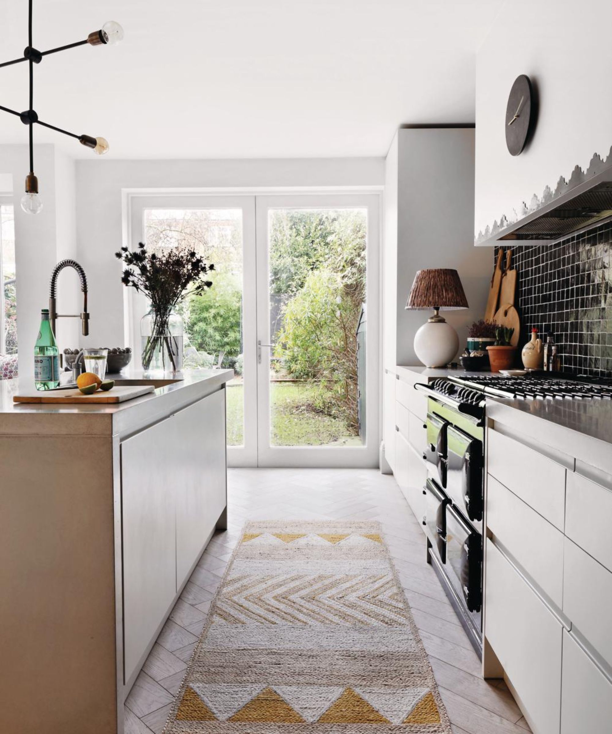
'Pale Oak is a gorgeous shade by Benjamin Moore and looks pretty on kitchen cabinetry,' says interior designer Kate Marker. 'Changing throughout the day, it moves from a slight greige with a touch of pink undertones to a warmer light beige depending on the natural light and time of day.'
Veronica Colby agrees, saying: 'My favorite application of Pale Oak has been kitchen cabinets – Pale Oak is a perfect light neutral for cabinetry. Richer than white but still light enough to brighten up a small space, I love to see Pale Oak in a kitchen. Extend this hue onto the interior trim and pair it with lighter walls, like Benjamin Moore's Steam, for a classic New England color combination.'
3. Create a timeless look in the bathroom
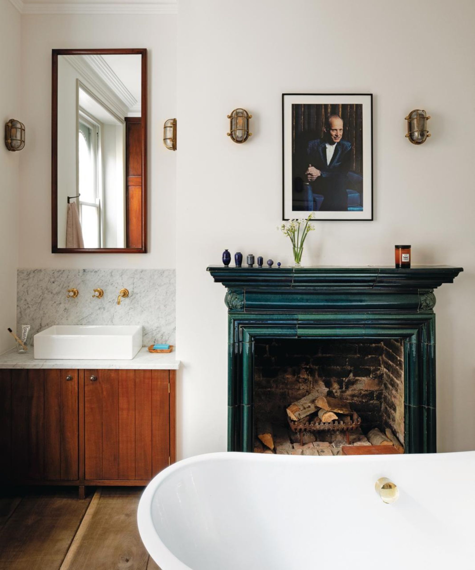
Pale Oak may just be the perfect hue to embrace in the bathroom. The bathroom should be a space in the home that feels calming and restful, and so opting for neutrals can go a long way in helping create this feel.
'For an instant upgrade that has a timeless but luxe modern feel, use Pale Oak on bathroom walls with fluted white oak cabinets, Arabescato Cervaiole or Calcutta Gold marble, and Benjamin Moore’s Chantilly Lace white ceiling and trim,' suggests Nicole Cullum, designer and founder of Color Caravan.
4. Incorporate nautral wood
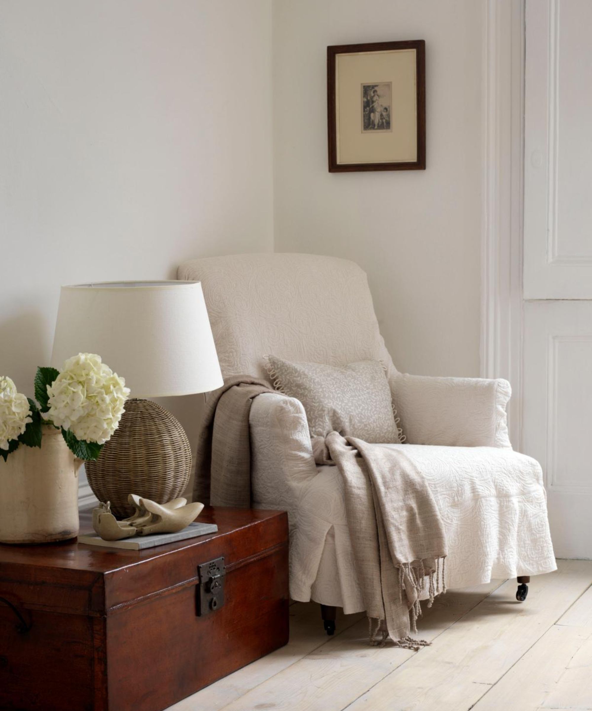
Pale Oak looks great next to the warm tones of natural wood, complementing the warm tones of the paint. 'Pale Oak can look more like a cool gray neutral at first, but combine it with wood tones, soft browns, and it transforms into an understated yet dramatic shade.' says Nicole Cullum.
Interior designer Artem Kropovinsky also suggests pairing Pale Oak with wood, and adds that this can create a sleek, minimalist look: 'Use Pale Oak with white trim and natural woods for a minimalist feel.'

Based in New York, Artem Kropovinsky, founder of Arsight, has a decade of extensive and considerable global design experience. Prioritizing minimalism, sustainability, and authenticity, Artem, alongside his team of professionals, works on projects in the US and worldwide.
5. Provide contrast with bright hues
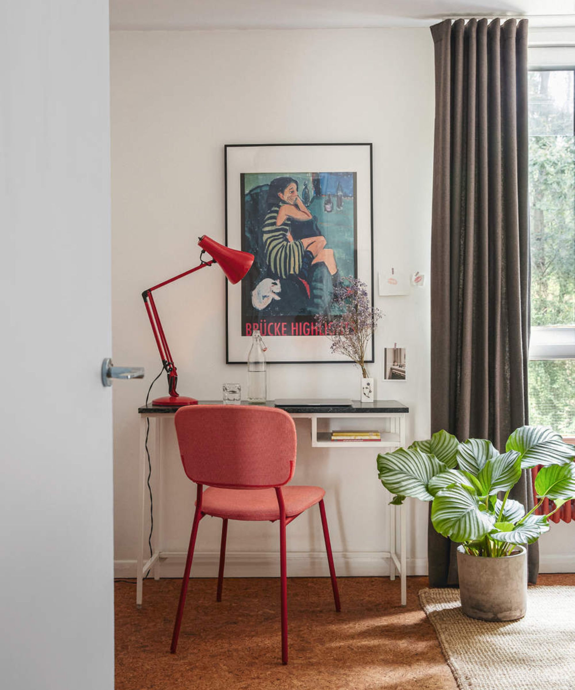
If you prefer more maximalist decor ideas, opt instead to contrast Pale Oak with a brighter color to create contrast and a more dramatic look. 'Soft Pale Oak goes so nicely with bold accents of deep blues, and greens,' says Artem Kropovinsky.
Since Pale Oak is such a pared-back and inoffensive hue, it means you can afford to be more daring with accents and channel bolder hues in this way. Whether that's through furniture or decorating with art, you can swap out accent colors over time while Pale Oak serves as a steadfast base color in your home.
Pale Oak is an incredibly versatile shade that strikes the perfect balance between cool-toned gray and warm beige. It's clear that interior designers love this hue for decorating in so many ways, and so we predict it'll be one that will dominate in 2024.

Emily is a freelance interior design writer based in Scotland. Prior to going freelance in the spring of 2025, Emily was Homes & Gardens’ Paint & Color Editor, covering all things color across interiors and home decor for the Homes & Gardens website. Having gained specific expertise in this area, Emily is well-versed in writing about the latest color trends and is passionate about helping homeowners understand the importance of color psychology in home design. Her own interior design style reflects the simplicity of mid-century design and she loves sourcing vintage furniture finds for her tenement flat.
