I'm an interior designer and these are my 5 rules for using bold color and pattern in my clients' homes
I know when to keep pushing and when to rein it in. And I love the thrill of adding unique and distinct materials, furnishings, and accessories on a whim

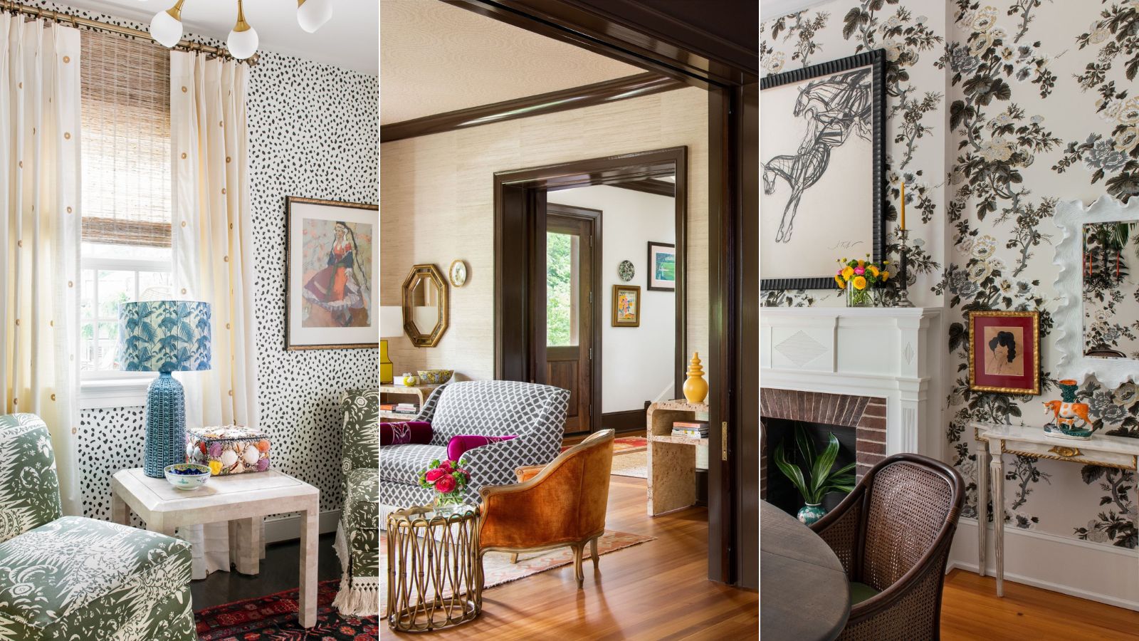
For me, design is intuitive. My Brazilian roots deeply impact my color sensibility and the carnival-like kaleidoscope of my creative brain.
A girl of many mantras, I love to preach: 'Beige is not a color. More is More; Less is a Bore. And above all else: Mix. Don’t Match.'
This is how I get my clients to embrace bold room color ideas: whether you are an interior designer or a homeowner, you may appreciate my approach.
1. More is more
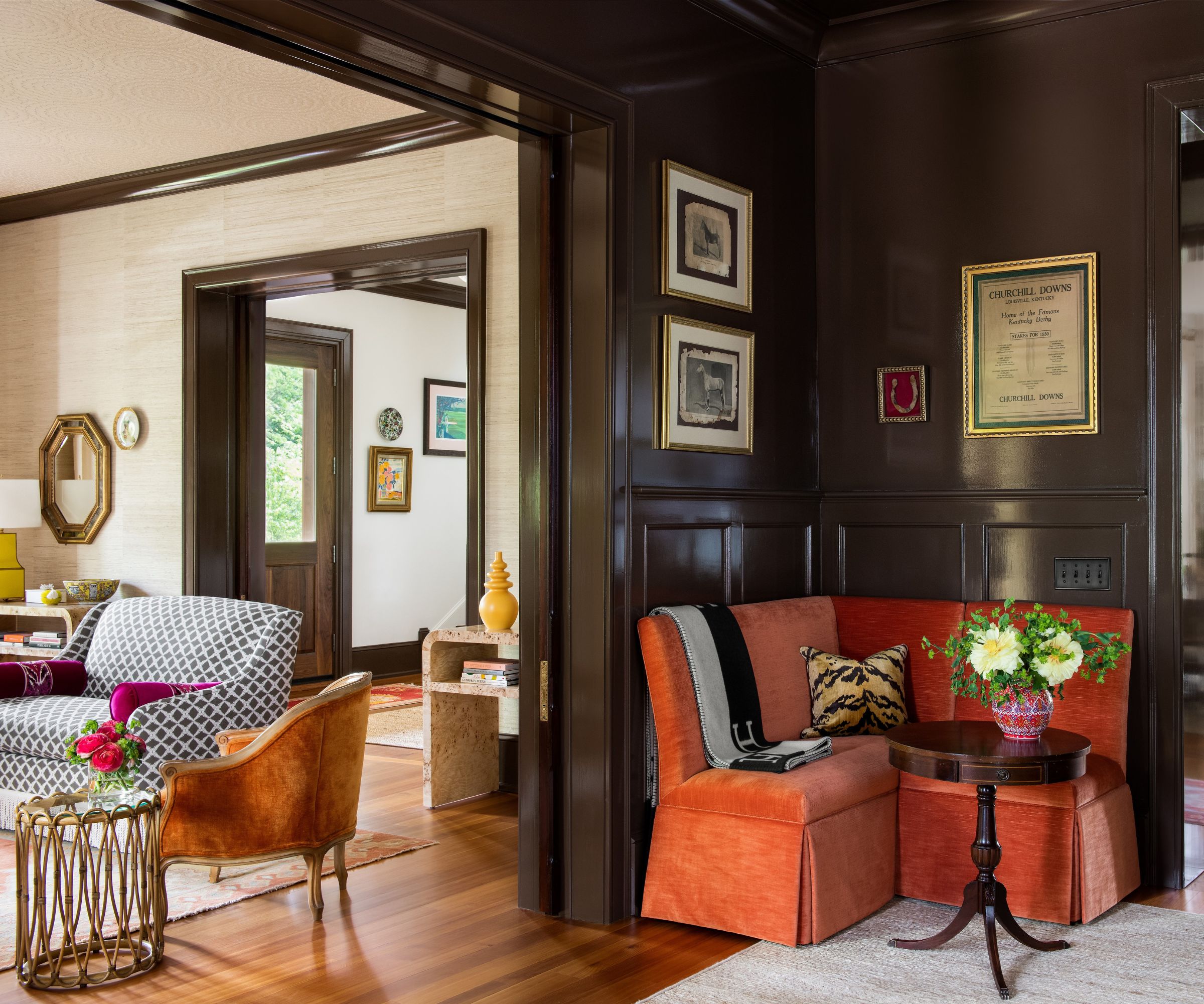
More is indeed more. But the 'more' is curated and strategic. Maximalism isn't throwing everything you love into one space or home. It is a conscious pairing of colors and patterns that play well with each other, carry an intrinsic tension and engage the senses.
Deeply saturated chocolate brown lacquered walls are carried on the trim throughout this 1882 historic home (above). The toned-down natural grasscloth adds texture and warmth.
At the same time, the pops of oranges, pinks, and yellows enliven this home without being too loud for the homeowner who thoroughly embraces color but wants a space that respects the home's deep history and architectural past.
2. Beige is not a color
I don't consider beige, white, or off-white as colors, but I respect that for some clients, every surface cannot be Isabel-a-fied.
Design expertise in your inbox – from inspiring decorating ideas and beautiful celebrity homes to practical gardening advice and shopping round-ups.
Decorating with beige is a necessary banality, a foundation to play off. But just because the foundation is beige or white doesn't mean it has to be boring.
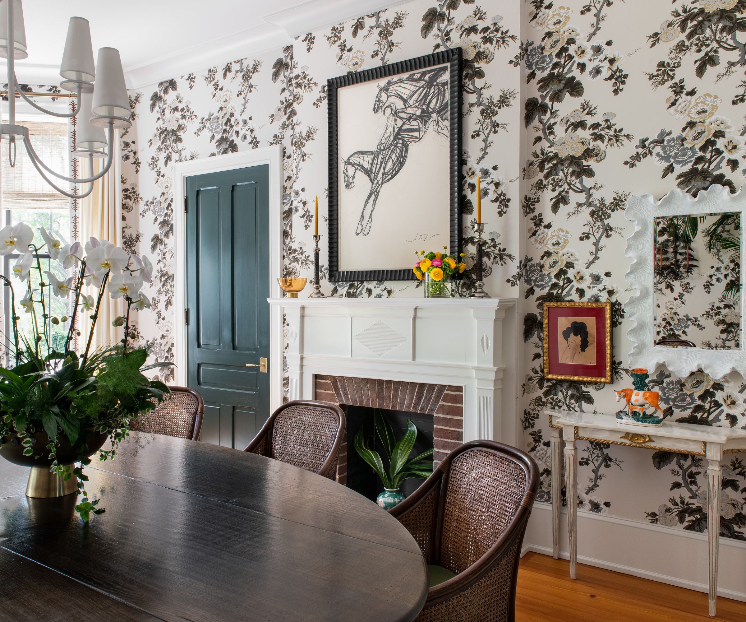
For this wallpaper (above), I take no issue with the ground color because the floral decor motif is so beautiful and plentiful that it doesn't feel 'beige' to me.
I love to play with layering and decorating with pattern. This Pyne Hollyhock Schumacher wallpaper is timeless and gorgeous. It's a bold, large-scale pattern. It brings this elegant dining room to life and serves as a bold backdrop punctuated by the green painted door and a curated mix of reproduction, new and antique pieces elegantly assembled to host a family dinner for eight or larger holiday fête.
3. When is enough, enough
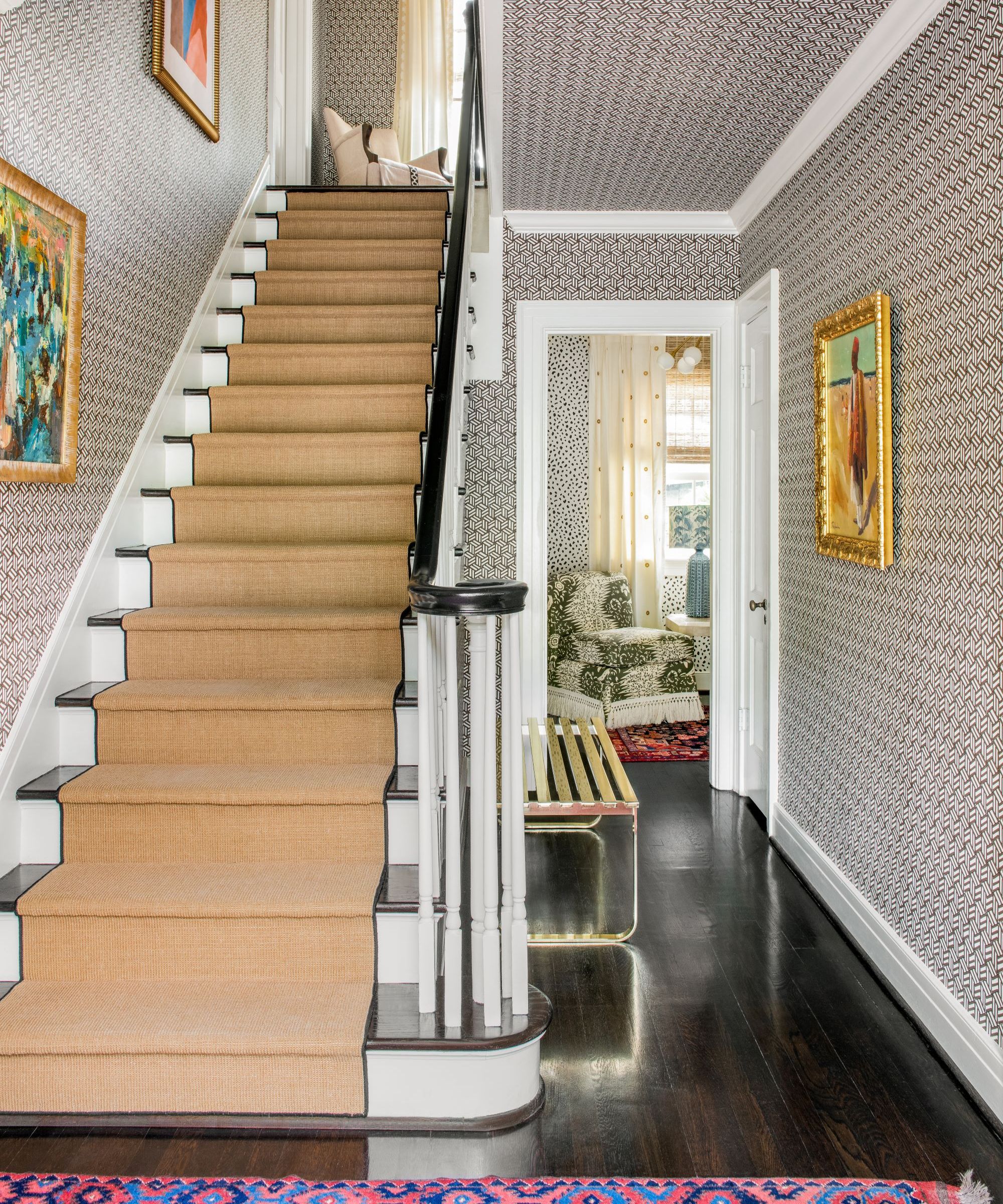
'The short answer for me in my own home is that enough is never enough. But for clients, I respect boundaries and work hard to discover their threshold for maximalism. They hire me knowing who I am and what I do as a designer, so there is an inherent baseline. But through conversations and visual cues, I can determine their threshold and how far to push the limit.
I always start with the five walls because you can never forget ideas for ceilings.
Graphic wallpaper is one of my great loves; I love it so much that I use it generously in all my projects. With endless options from bright and bold to graphic and sublime, the choices expand every day. If I am not using lacquered or high gloss walls, flat solid paint feels boring to me, and instead, I cull from across several brands to wrap walls and surfaces in graphic, floral, and colorful wallpapers.
If the walls don't have definitive start/stop points, carry the wallpaper beyond the foyer, up the stairs, into the upstairs landing, and on all the ceilings. Using only two colors and a zippy pattern keeps the spaces feeling balanced.'
Wallpaper: Tumbling Blocks by Miles Redd for Schumacher.
4. Create your happy place
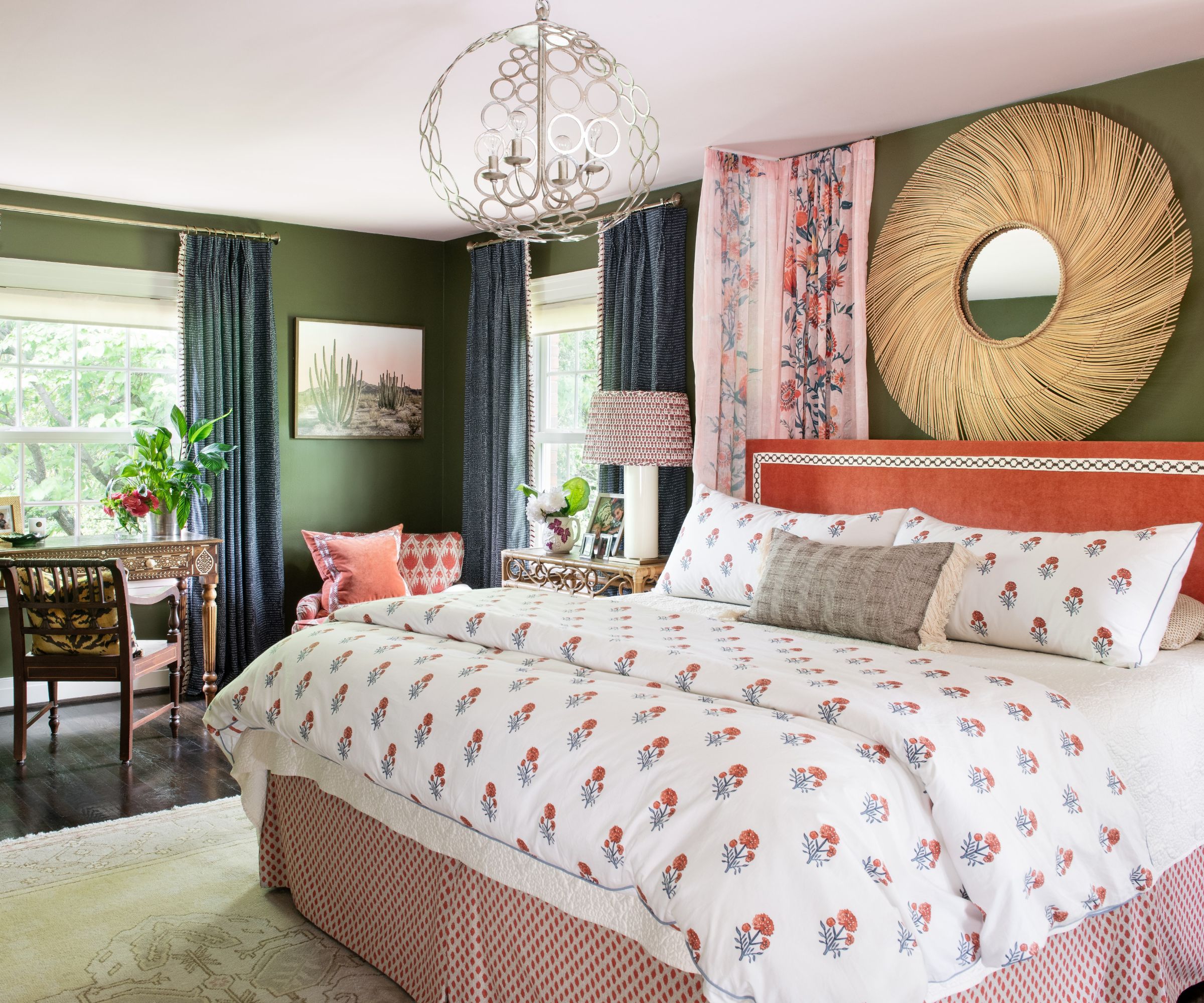
What I love the most about design is its ability to transform how you feel. Design can energize or calm you and certainly make you feel content and grounded when you walk into your home, your happy place, your retreat from the world.
Explosive, vivid, saturated color makes me the happiest. In many ways, my design sensibility reflects how I dress and live: very passionately and in full color.
Rather than letting one single style drive the design, I leaned into my favorite things, like the pairing of pink and green. Olive and grass greens can feel drab, but they serve as a beautiful foil for vibrant pinks and allow for a sharp contrast that plays into maximalism beautifully.
Wicker, reed, and other natural fibers temper the bold and bright and add texture and warmth, and my bedroom is the perfect example of this.
5. Mix and don't match
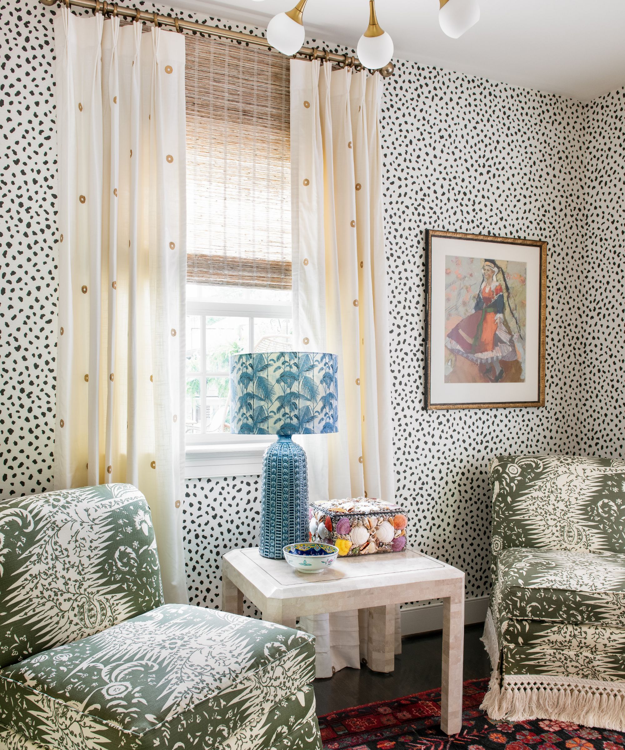
This room is a perfect glimpse into my brand of maximalism. Nothing in the space matches, yet everything works.
When using multiple patterns, there must be a connection point; scale in interior design is king for me. The large-scale print on the pair of slipper chairs is a classic from Quadrille called Les Indiennes, and instead of choosing the multicolor version, I chose the Olive single color and paired it with another single color but smaller scale wallpaper.
They play off each other, causing a natural tension but work together to play off the antique rug and soft curtains. The blue lamp and tropical patterned lampshade are wild cards that keep the botanical theme going while also being a strategic pop of color that draws your eye.
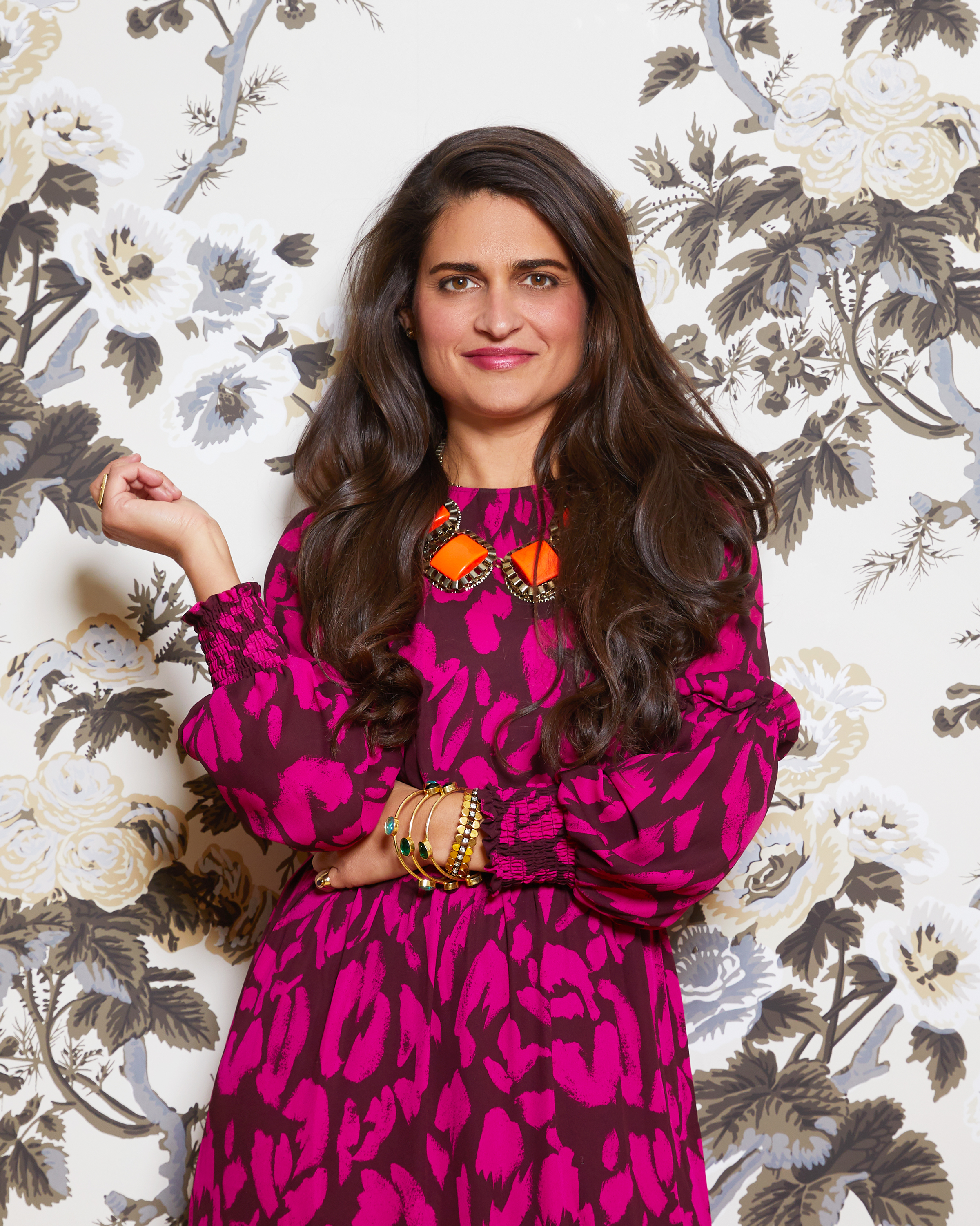
Isabel thrives on creating homes saturated in a kaleidoscope of meticulously layered patterns and colors. An intuitive and enthusiastic designer, she dubs her style 'Curated Maximalism': an intelligent yet intuitive layering of colorful elements that all relate to and build upon one another. A Brazilian native, Isabel moved with her family to raise horses in Kentucky. After Fashion School, she found her footing in the thriving Los Angeles fashion world and the maximalist was born! Her work in the fashion and textile industry instilled a love of fabrics and prints, which segued into a love of interiors. Isabel participated in Kip’s Bay Designer Showhouse in Dallas, and her work is regularly featured in design and lifestyle outlets. Isabel’s team continues to grow with the long-term goal of expanding her brand into the home furnishings market with her iconic Curated Maximalist collection of fabrics, wallpapers, lighting, furniture, and accessories. A girl of many mantras, Isabel loves to preach: Beige is not a color. More is More; Less is a Bore. And above all else: Mix. Don’t Match.