5 color lessons we have learned from this luxuriously layered member's club
Am Hof 8 is filled with covetable furnishings and decor, but it's the rich jewel like colors that really intrigued us - here the designer Theresa Obermoser talks us through the scheme

Design expertise in your inbox – from inspiring decorating ideas and beautiful celebrity homes to practical gardening advice and shopping round-ups.
You are now subscribed
Your newsletter sign-up was successful
Want to add more newsletters?
You expect a member club to be luxurious, you expect it to be incredibly stylish, that's why we so often look to these spaces for interior inspiration. And Am Hof 8 is no exception.
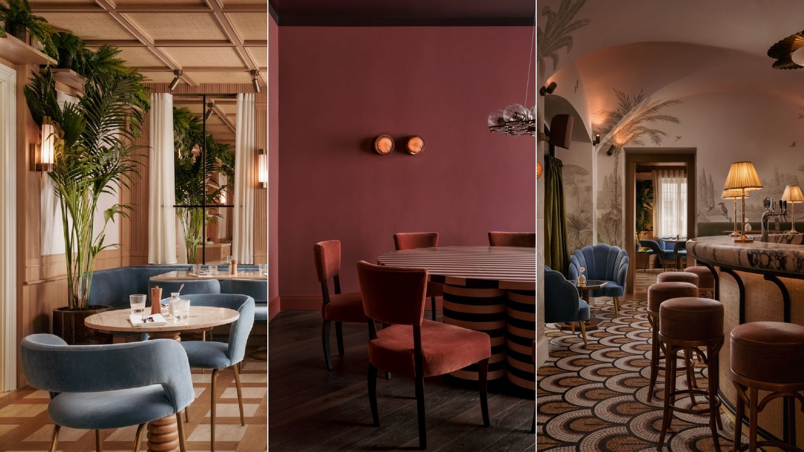
Founded by Johannes Kattus and designed by Theresa Obermoser, this member's club in the heart of Vienna is filled with gorgeous pieces and interior design trends – there's so much to learn from these room color ideas. The artful layering of textures and finishes, the sumptuous shapes, the way the spaces are filled with so much character but still err on the side of minimalist, and the way there are so many bold color combinations and yet the overall feel is as soft and serene as if the scheme was entirely made up of neutrals.
It was the use of color that in fact intrigued us most. How can a color scheme be so brave and playful and yet feel so luxurious and sophisticated? We asked Theresa Obermoser to explain her approach to color for the project.
1. Keep the colors balanced
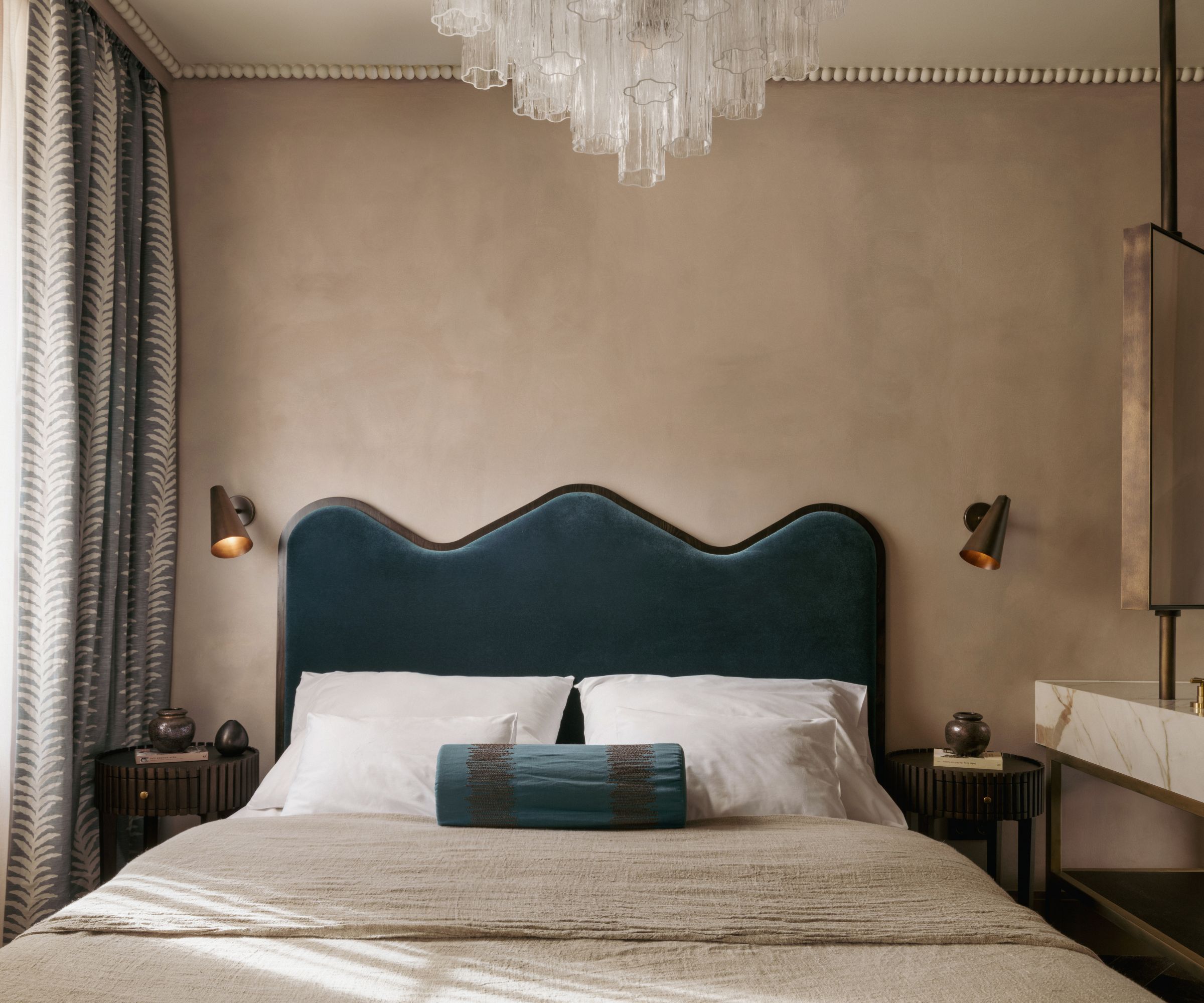
'When it comes to hotel rooms, I prefer decorating with neutrals with a patina, such as beige Bauwerk Walls walls. To add some contrast, I like to choose one main color, but I prefer to avoid rooms that are too vibrant or loud. It's important to maintain a sense of balance, especially in a bedroom,' explains Theresa.
'For example, in one design of this club, we opted for blue as the main color and combined it with curtains in a lighter shade of blue. We also incorporated Calacatta marble with Bordeaux's veins as a complementary color to blue.'
2. Peach can be a sophisticated shade
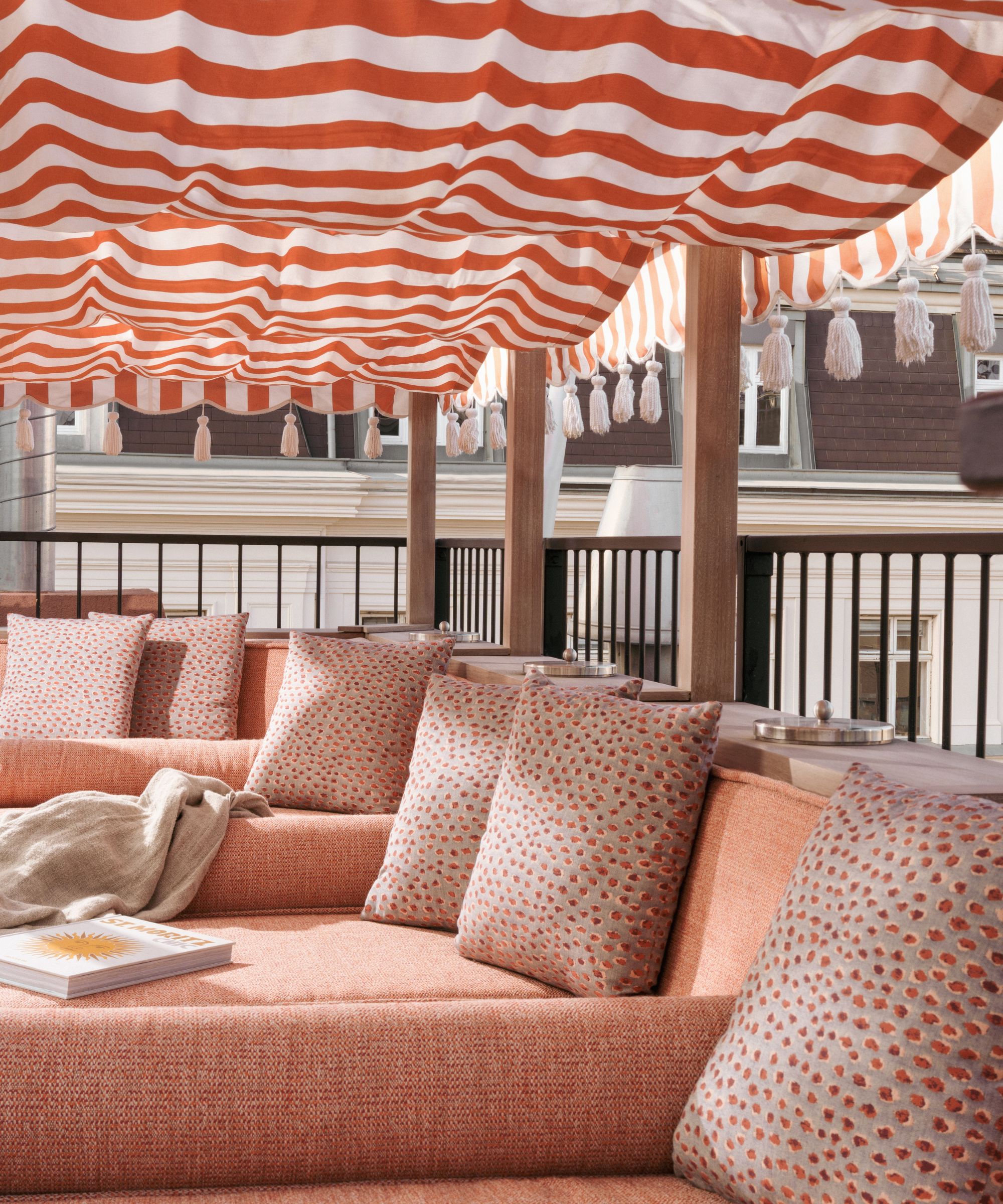
'On the terrace, creating a friendly and fresh vibe was crucial. Therefore, I chose peach as the main color, specifically Perennials coral. The cushions had a grey base with a pattern in the exact same peach shade. Additionally, the valance for the Moroccan fabric roofs featured peach and white stripes.'
3. Light blue can act like a neutral
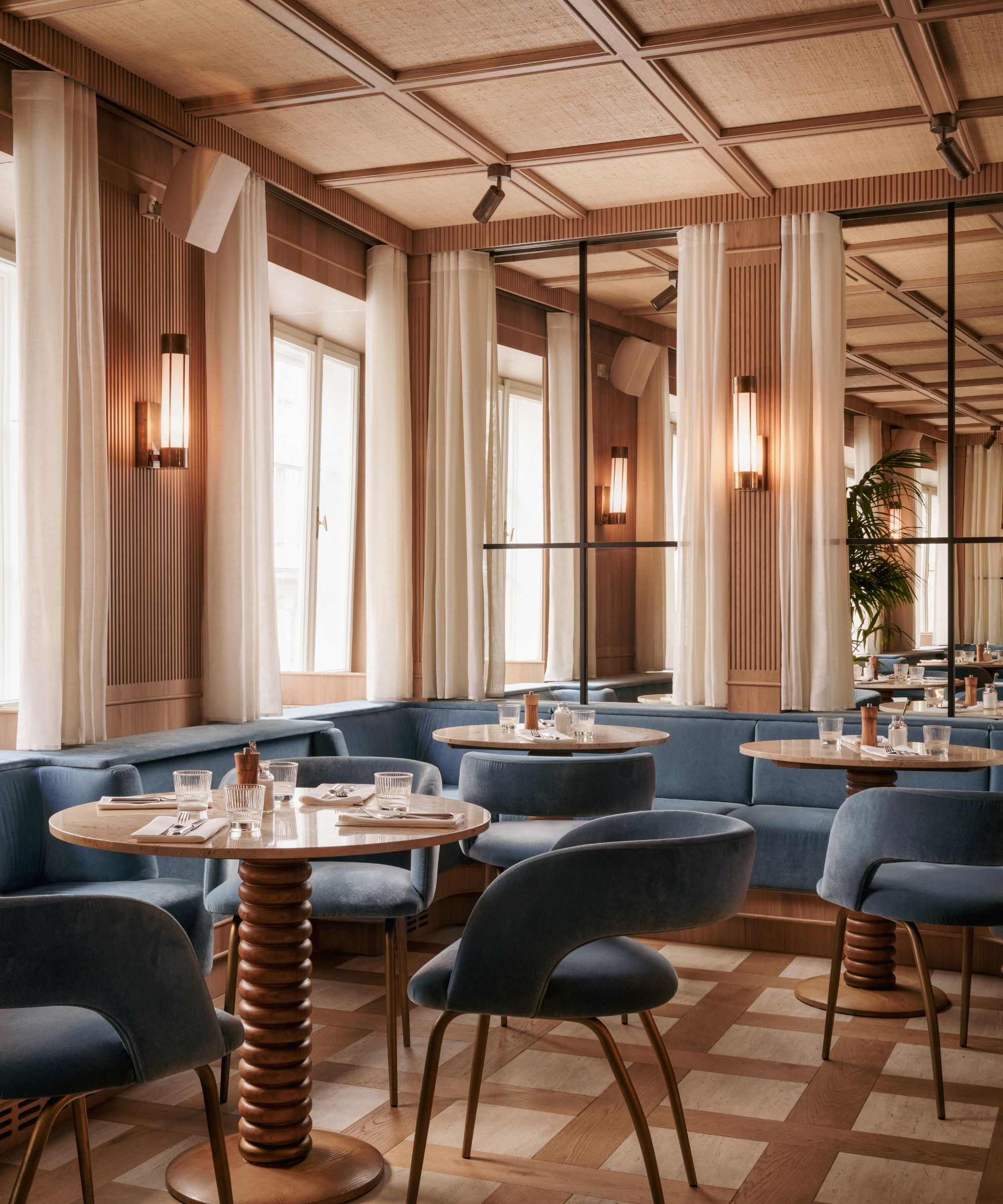
'For the casual restaurant, I wanted to incorporate a lot of timber to make it comfortable. Since the rest of the club already had plenty of marble, I aimed for a casual atmosphere by using travertine stone. This combination created a neutral backdrop. To add some color, I introduced the Zimmer and Rhode Infinity Light Blue, which harmonized well with the natural color of the massive palm tree positioned in the middle of the room,' explains Theresa.
Design expertise in your inbox – from inspiring decorating ideas and beautiful celebrity homes to practical gardening advice and shopping round-ups.
4. Blue and green should always be seen
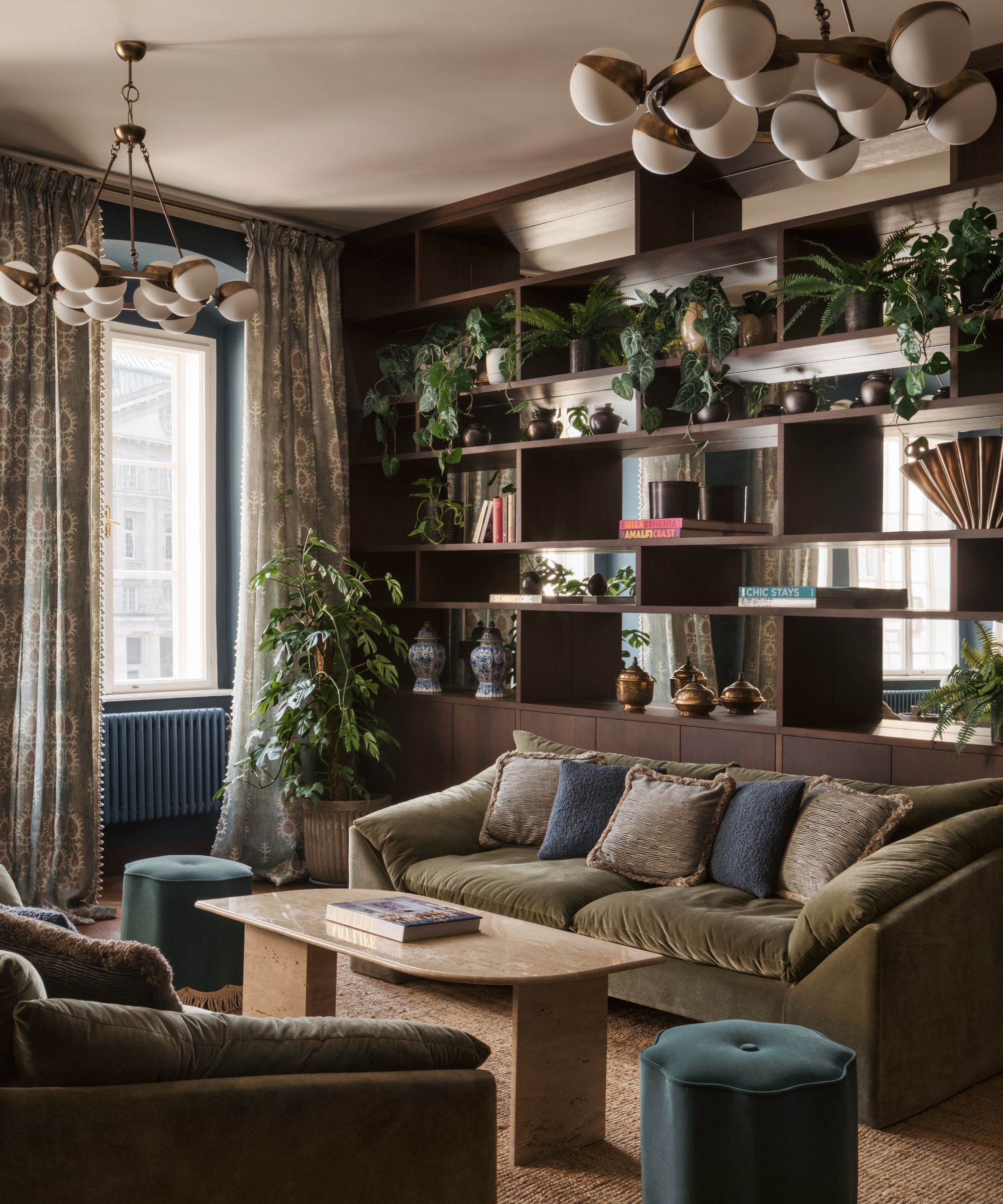
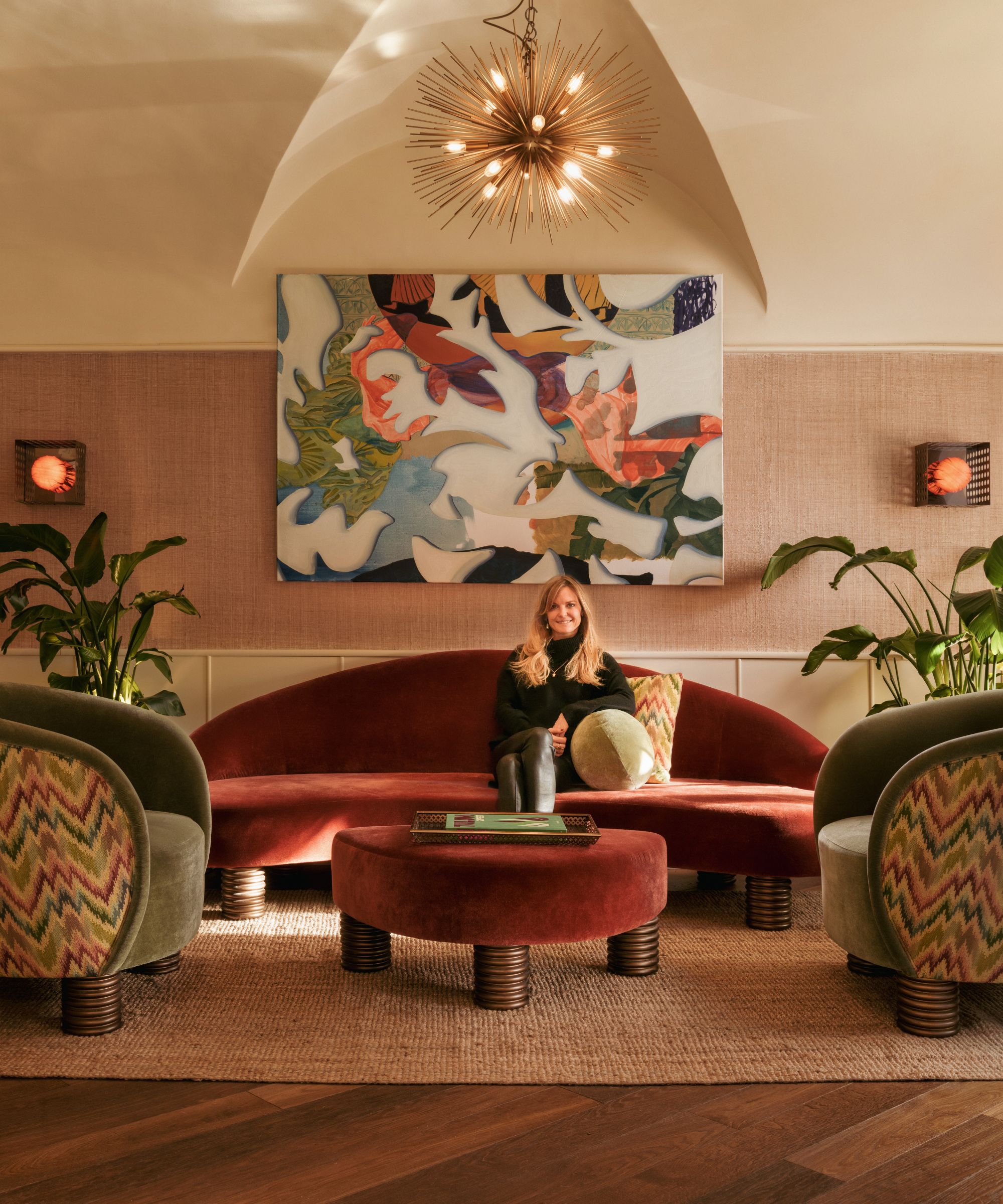
'The lounge area features a base of dark mahogany timber, including floor and wall paneling. This is complemented by subtle Bordeaux, dark blue, and pale mint green as the main colors. The walls are blue, while the sofas are in shades of red and green. The cushions incorporate a mix of these colors, creating a cohesive color scheme.'
5. A dark eggplant hued ceiling works
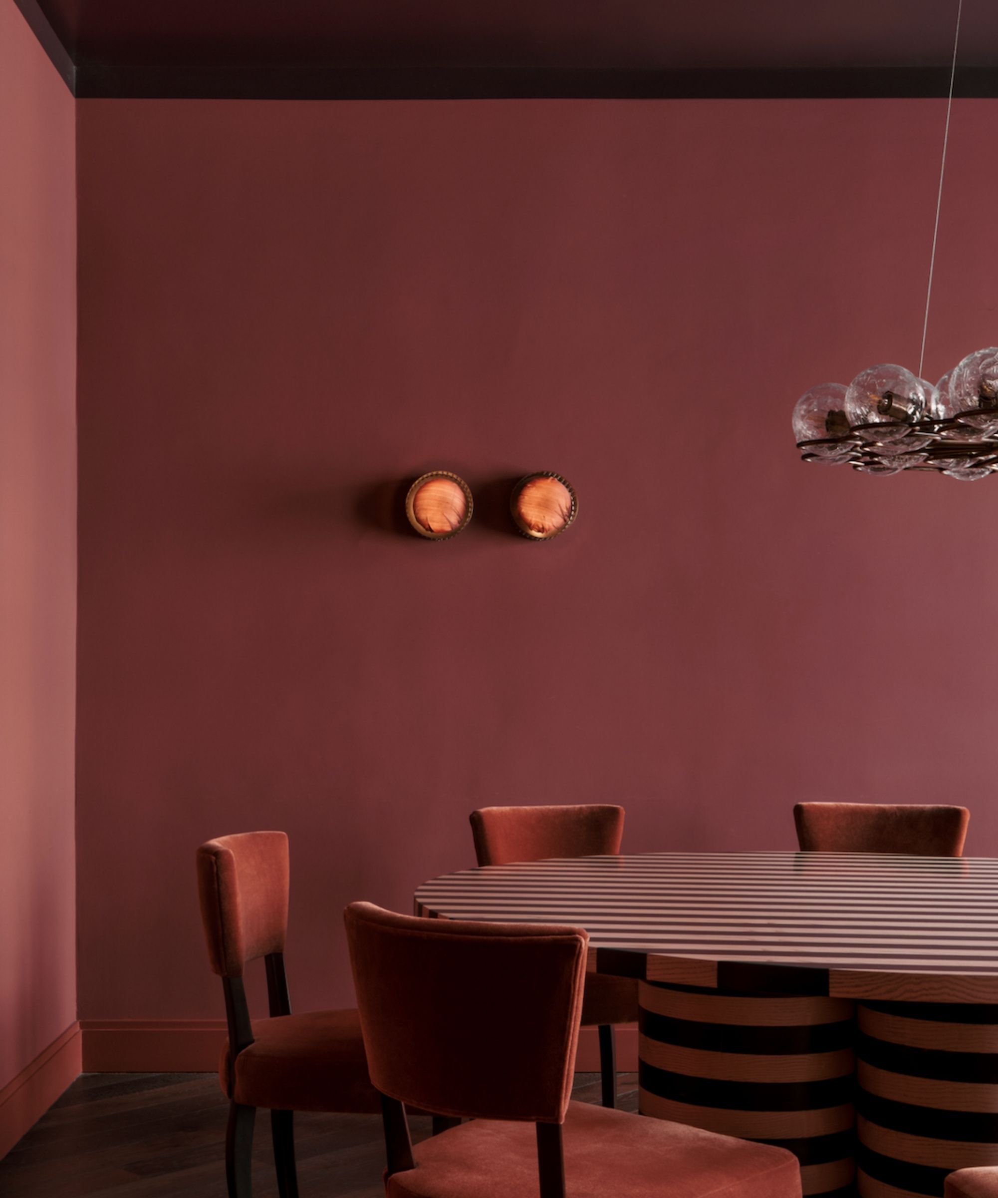
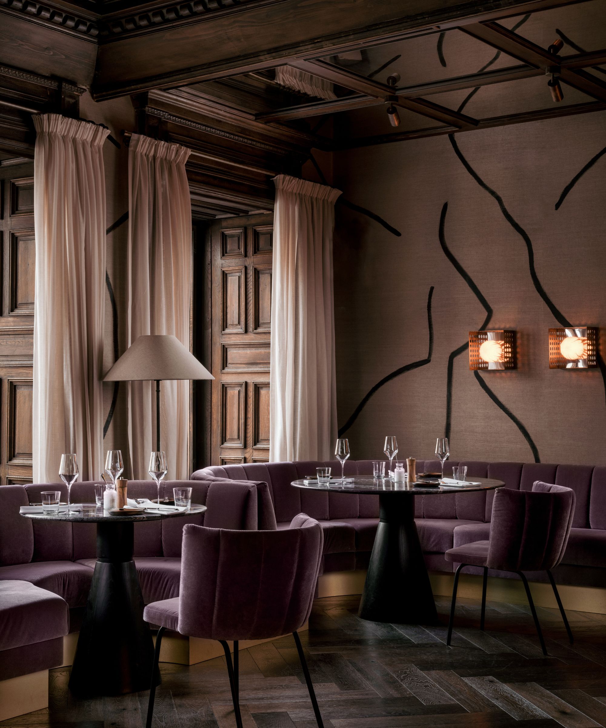
'The zebra dining room is actually my favorite. I discovered an impressive table and thought, 'Wow, I need this in a rectory red shell.' To add some drama, I opted for a glossy F&B Brinjal ceiling. That's all it took to create a captivating ambiance.'
'In general, I follow the rule of not mixing more than three colors, and I always balance them with neutral elements such as micro cement or timber,' adds Theresa.
About the project
Location
In the heart of Vienna, Austria
The “Am Hof” square is one of the historically most important squares in the center of Vienna. Between 1155 and 1275, the Dukes of Babenberg built their residence here, which consisted of several buildings grouped around an open square, a courtyard. Overall, the medieval house (from 1508) stretches over 9 floors.
Interior Design
TO Interior Design (founded and led by Theresa Obermoser who is from Austria and is based in London. She also has offices in Vienna and Kitzbühel)
Sources of Inspiration
The history of Vienna with an international twist.
“As it should be a home away from home and a very exotic place for all local members it was important to create a bridge between both worlds,” says Theresa. “A local member wants to feel like this is something new and extraordinary and an international member wants to feel like he arrived in Vienna.”
Design style
Vibrant colors meet the sophisticated historic elegance of Vienna. Every room of the club is different. The interior designer strove to create a journey through different worlds.
'Vienna has so many beautiful architectural landmarks,' she says. 'I wanted to bring them all in. The night club is an homage to the safari of Schönbrunns Zoo (a 17-hectare zoo in Vienna) with wild animal prints and lots of exotic plants.'
The heart of the club is the stairway and empty void around the lift, which is an homage to the Palmenhaus Schönbrunn, which is a large greenhouse in Vienna, featuring plants from around the world. It opened in 1882, it is the most prominent of the four greenhouses in Schönbrunn Palace Park and it is among the largest botanical exhibits of its kind in the world with around 4,500 plant species.
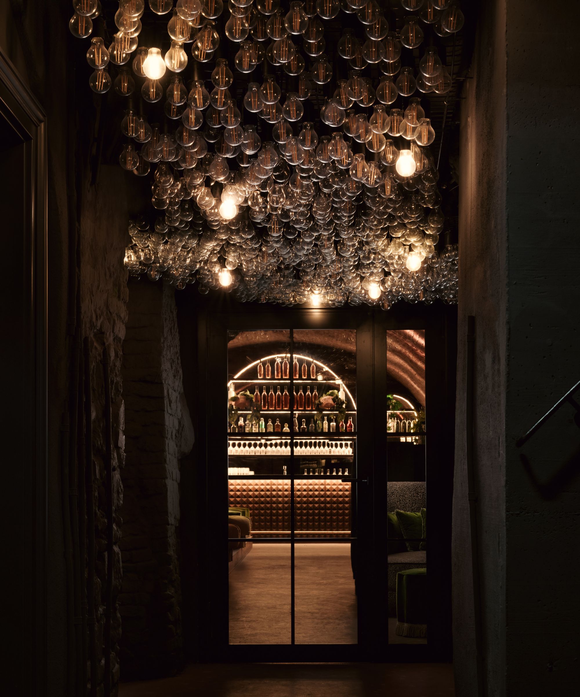
'In between all the plants we added a disco ball installation to create a party vibe as soon as the sun sets,' says Theresa. 'When you arrive, you just see a very narrow, cute pink house with some French bistro chairs and a black and white canopy. Then, you enter a new world of something that has not been seen in Austria so far.'
Organization of the spaces
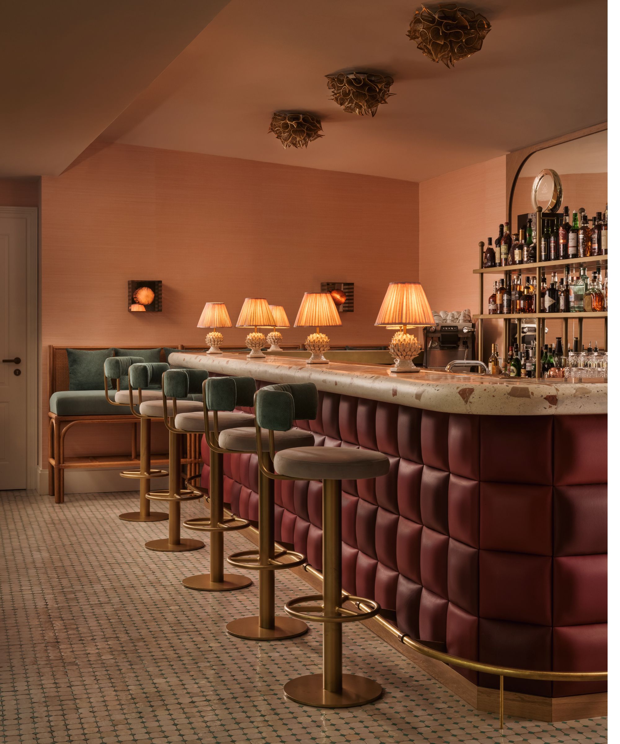
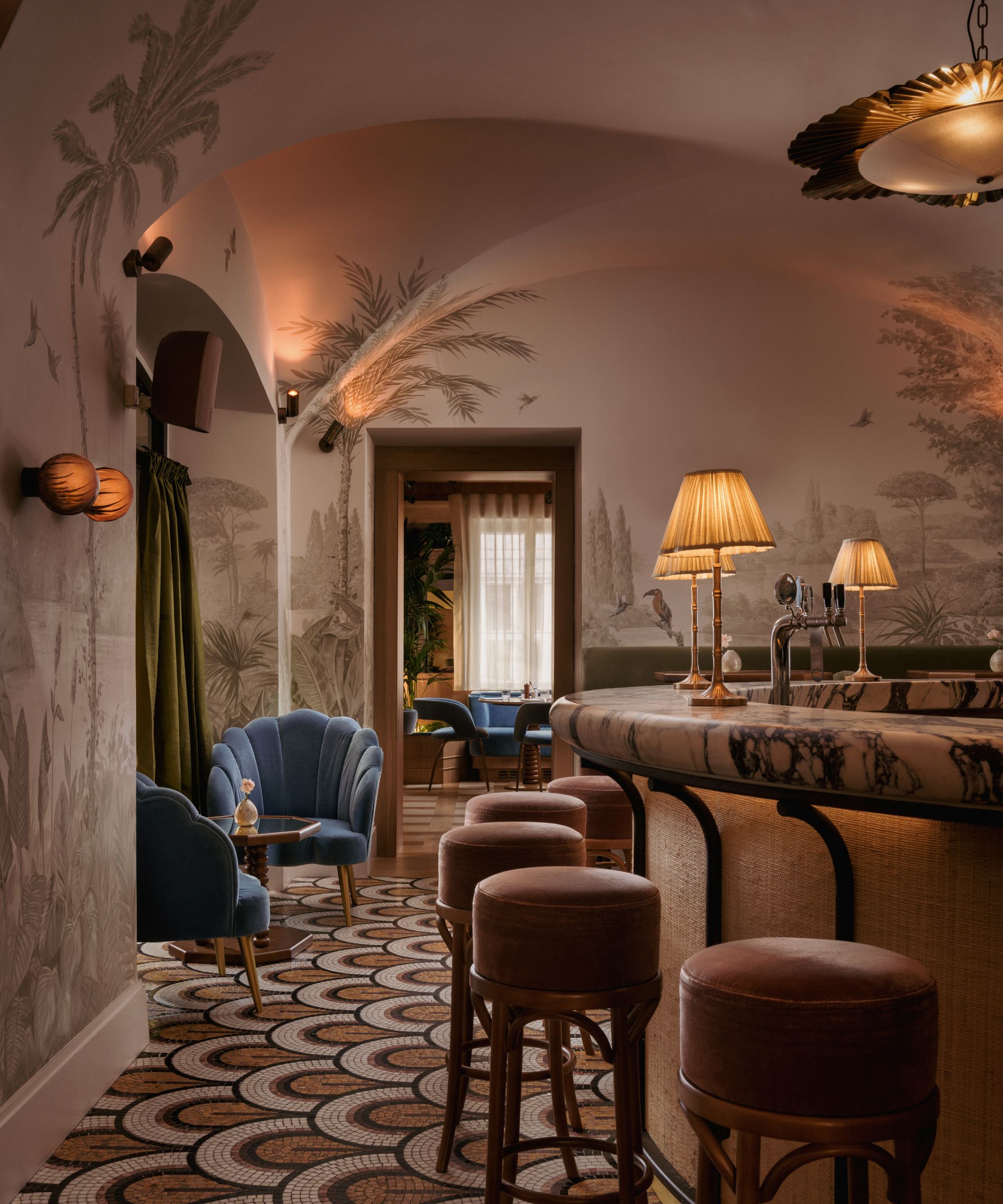
Ground floor: the bird bar in rattan with Calacatta viola marble is a piece of art in itself. The floor is by Otto Tiles, fabrics are by Zimmer + Rohde. Next to the bar is the bistro – a very light-colored day restaurant for a quick meeting or lunch with a French vibe.
First floor: the fine dining features a lot of original architectural features, such as the timber cladding. 'We added a new wallpaper by Pierre Jeffries and velvet booths with Brazilian black marble,' says Theresa. 'The open plan kitchen is clad in Marazzi ceramic tiles and the vent is covered in timber paneling.' For an even more exclusive experience, there is a private dining room with a custom-made zebra table.
Second floor: the blue lounge and a wild meeting room.
Third floor: five hotel rooms so members can host their international guests and international members have a home away from home. Each room has a different color palette: yellow, blue, green, pink, purple.
Fourth floor: a shared workspace with a ping pong table that can be used as a shared work table during the day while it turns into a party area in the evening.
Fifth floor: a rooftop bar with an upholstered vintage leather front. The bar top is a customized Mortadella Terrazzo to match the pastel colors of that room. There is an outdoor shower, which allows members to sunbathe while answering business calls or just end the day early with a bottle of wine to enjoy the nice weather.
Color and material palette
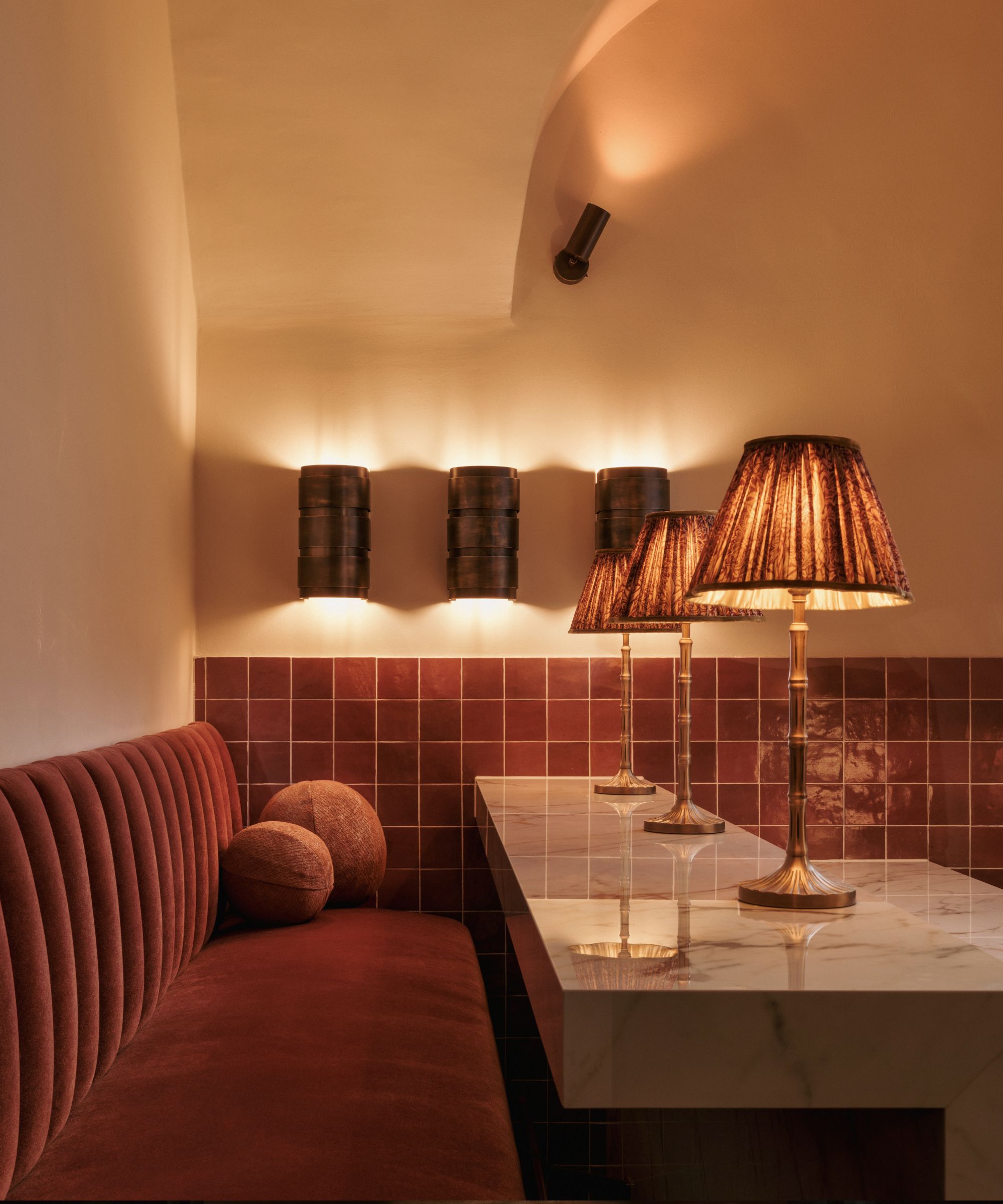
Every space has a different color scheme. For example, the brasserie is oak timber with beige travertine and baby blue velvet while the bird bar is grass green and blush pink.
'I love to mix rough materials with soft elements,' says Theresa. 'Because of its durability, we used a lot of velvet for the upholstered items and combined it with silk and linen cushions and curtains.'
Most of the lamps are covered with silk to add some pops of color. Aged brass was used for the hardware. Natural stone and ceramic tiles were also used.
Biggest challenges for the interior designer
The narrow building with its many floors. Considering the logistics of a restaurant/hotel business. This historic building is grade 3 listed so many elements have to be preserved.
Who are the members?
A very diverse community – from young artsy professionals to established entrepreneurs from different industries. A committee of eight people decides who is a good fit after being recommended by three members.

Lucy Searle has written about interiors, property and gardens since 1990, working her way around the interiors departments of women's magazines before switching to interiors-only titles in the mid-nineties. She was Associate Editor on Ideal Home, and Launch Editor of 4Homes magazine, before moving into digital in 2007, launching Channel 4's flagship website, Channel4.com/4homes. In 2018, Lucy took on the role of Global Editor in Chief for Realhomes.com, taking the site from a small magazine add-on to a global success. She was asked to repeat that success at Homes & Gardens, where she also took on the editorship of the magazine. Today, Lucy works as Content Director across Homes & Gardens, Woman & Home, Ideal Home and Real Homes.