5 entryway color schemes that will make you feel happier at home in an instant
A well-designed entryway sets you up to leave the house and welcomes you home with good looks and a happy color scheme

Design expertise in your inbox – from inspiring decorating ideas and beautiful celebrity homes to practical gardening advice and shopping round-ups.
You are now subscribed
Your newsletter sign-up was successful
Want to add more newsletters?
Finding colors that make an entryway look and feel happy should be a priority. After all, the entryway sets the tone for the rest of the home, so choosing entryway color ideas that sing should always be your first port of call.
As well as looking inviting in its own right, an entryway color scheme should set the tone for the rest of your happy home. Move it up on your decorating agenda: it’s a place to be bold and show your personality. Winning room color ideas and entryway paint ideas pay attention to the mood, size, and natural light, so whether you go for something playful or serene, here is a carefully-curated selection of our favorite colors to make you feel happier at home.
How to make an entryway happier with color
Rooms such as entrances and hallways are often left behind when it comes to planning impactful designs. However, they can be the perfect place to experiment with bold colors and patterns that make you feel happy.
Color is a remarkable decorating medium and is an easy way to make your entryway more inviting. Here, we've chosen, along with the experts, our five favorite color schemes.
1. Mimic nature with a sage green color scheme
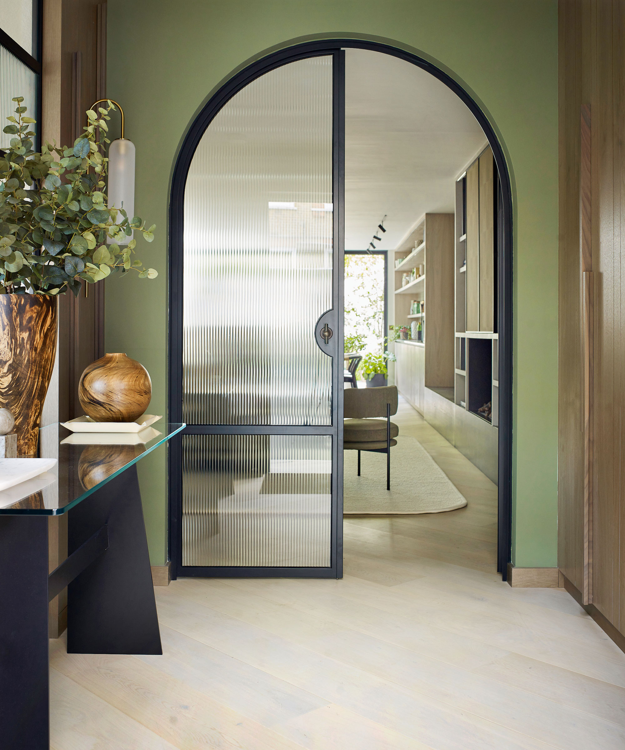
Symbolizing nature, freshness and vitality, the color green is an enduring favorite when it comes to interiors.
The color also acts as an effective bridge between the outdoors and inside when used in threshold spaces. When seen in enclosed rooms on wallpapers or furnishings, the color brings relief and reassurance and elegantly reminds us of the living world beyond our four walls, but its benefits don't end there.
Sage green has enormous scope as a mindful décor mainstay, and is also seen as an effective backdrop for other organic shades. ‘We are noticing a change to the use of softer hues, such as sage, being used all over as a base color, just how neutrals have been used traditionally,’ says Ruth Mottershead, creative director at Little Greene.
Design expertise in your inbox – from inspiring decorating ideas and beautiful celebrity homes to practical gardening advice and shopping round-ups.
‘These are very calming, positive shades with a timeless quality, that are muted but not enough that they fade into the background, so they work beautifully as a foil for similar earthy tones and richer colors such as browns and ochre, which can give a more dynamic effect.’
2. Instil a sense of 'quiet luxury' with off-white
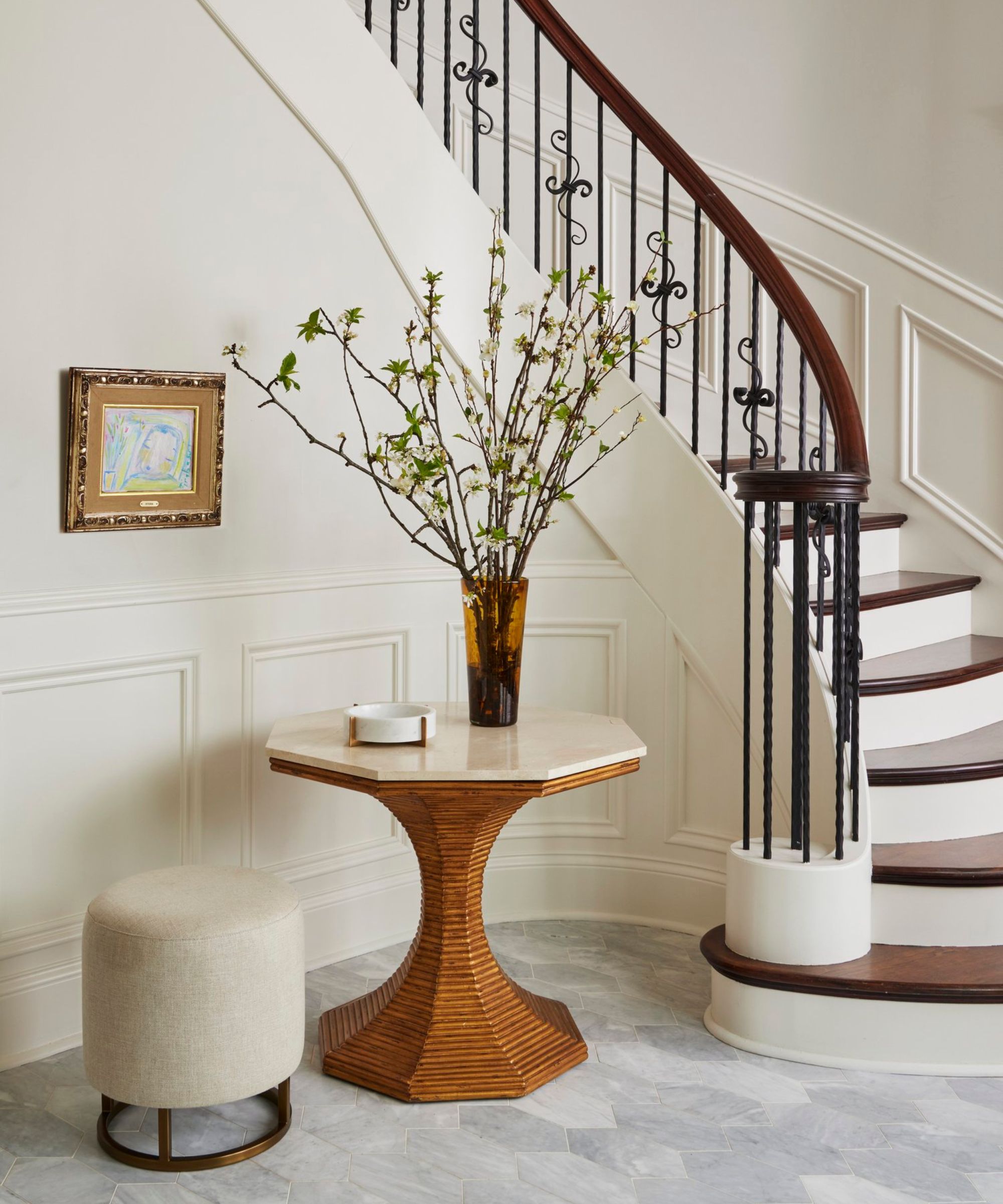
There is a lot to be said for decorating with white. This versatile neutral is one of the most popular paint ideas for interiors, and it is easy to see why.
Decorating with white offers a blank canvas that illuminates dark spaces and can make even small entryways feel spacious, light and bright.
'White is an instant fixer; it can resolve color conundrums, and declutter and realign your room scheme,' says Arianna Brissi, co-founder and creative director of Brissi. 'But, best of all, if you choose to introduce another hue it will work with whatever you select.'
To avoid a white hallway or entryway feeling sterile, get tactile. ‘A good way to warm your whites is through textures,’ says interior designer Claudia Afshar. ‘Also, try choosing a high-pile rug, warm timber furniture, indoor plants, or a textured wallcovering to make your whites interesting.’
3. Energize with red
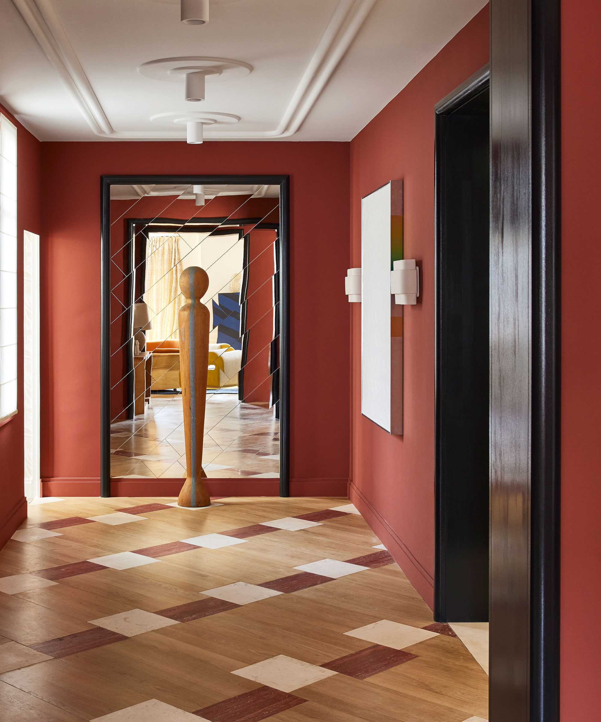
Evoke happiness and warmth with an uplifting terracotta tone. The warm, earthiness of terracotta is a blend of red and orange tones, but with an emphasis on the red. It works beautifully with warm neutrals, natural timbers and accents of black and brown.
‘I chose an earthy red color for the hallway to create an immediate sense of warmth in this family home,' says Fabrice Juan, an interior designer. 'As the entrance links the reception rooms, I chose a color that subtly harmonizes the tones in these spaces while creating a contrast with the black woodwork.’
As the most stimulating and powerful color in the world, red can add excitement and drama to a space, but it can also be overwhelming in rooms where you want to relax and unwind.
4. Add cheerful optimism with yellow
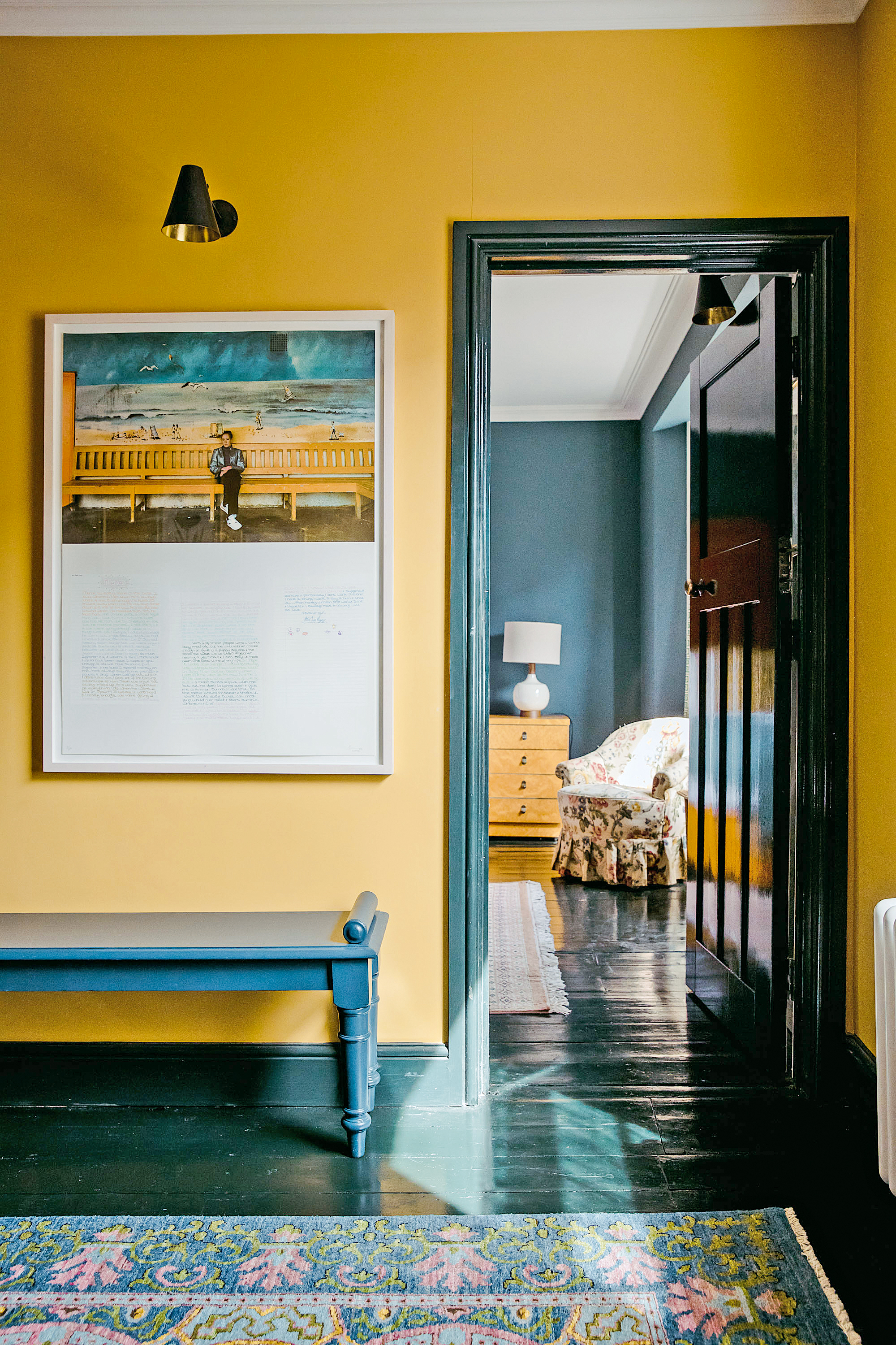
Be inspired to decorate with yellow in your entryway – the most cheerful color, guaranteed to inject warmth and vibrancy into any space.
The versatility of yellow makes it a favorite element in decorating schemes for interior designers, however, yellow is a color that people are often scared to use, but it’s a fantastic color to really lift a space and create interest.
‘This cheery color imbues the room with optimism and is perfect for bringing a sense of positivity into the home,’ says Justyna Korczynska, senior designer at Crown. ‘Yellow is also very soothing, particularly when paired with cool, calming tones such as greys and pale, muted blues. The color creates a sense of calm with a feeling of well-being, restfulness, and happiness.’
5. Calm the mind with cobalt blue
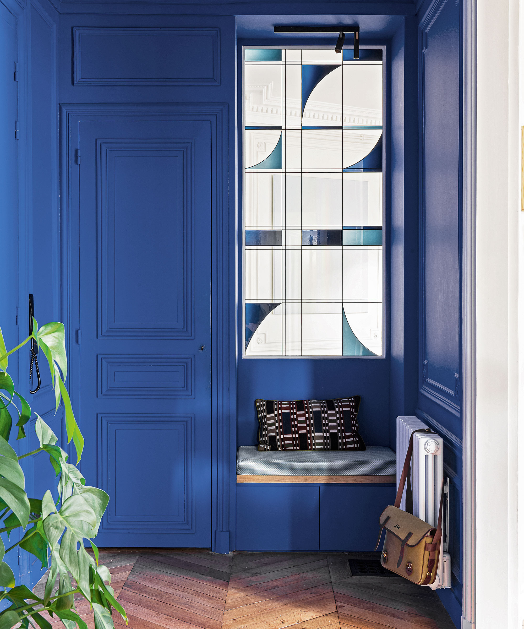
From the moment Morocco's Jardin Majorelle put this hue on the design map it has been making waves.
‘Cobalt blue, a favorite of artists and ceramicists, is a great choice for interiors due to its intensity, brightening even darker spaces with its visual punch,' says Robert Whitaker, creative director, Claybrook. 'The shade goes well with lighter hues for a sense of Riviera chic, or go for an all-over color-drenched look if you want to make a statement.'
This is exactly what interior designer, Vanessa Faivre has done in this bold entryway: ‘I wanted to make a bold statement in this entrance hall and chose the Ressource Peintures Yves Klein blue – it is deep and has a warm tone to it,' she says. 'The living room is neutral, so the blue entrance, seen from the living room, creates a great contrast.’
David Mottershead, marketing director at Little Greene shares our approval of this dramatic room color: 'Never be afraid to decorate with blue,' he says. 'Smart and stylish, luxurious and hypnotic, cobalt blue is totally on trend at the moment, and the latest designs dispel the myth that the color is cold or masculine.'

Jennifer is the Digital Editor at Homes & Gardens, bringing years of interiors experience across the US and UK. She has worked with leading publications, blending expertise in PR, marketing, social media, commercial strategy, and e-commerce. Jennifer has covered every corner of the home – curating projects from top interior designers, sourcing celebrity properties, reviewing appliances, and delivering timely news. Now, she channels her digital skills into shaping the world’s leading interiors website.