What is the most eye-catching color? For creating a bold statement in your home
Paint experts reveal the most eye-catching color and how to use it around your home

Design expertise in your inbox – from inspiring decorating ideas and beautiful celebrity homes to practical gardening advice and shopping round-ups.
You are now subscribed
Your newsletter sign-up was successful
Want to add more newsletters?
When you want to make a bold statement in your home, highlight a particular feature or simply use bright shades, eye-catching color is a great way to draw attention and add an interesting focal point to any room. So, what is the most eye-catching color to incorporate into your space? And what is the best way to go about introducing it?
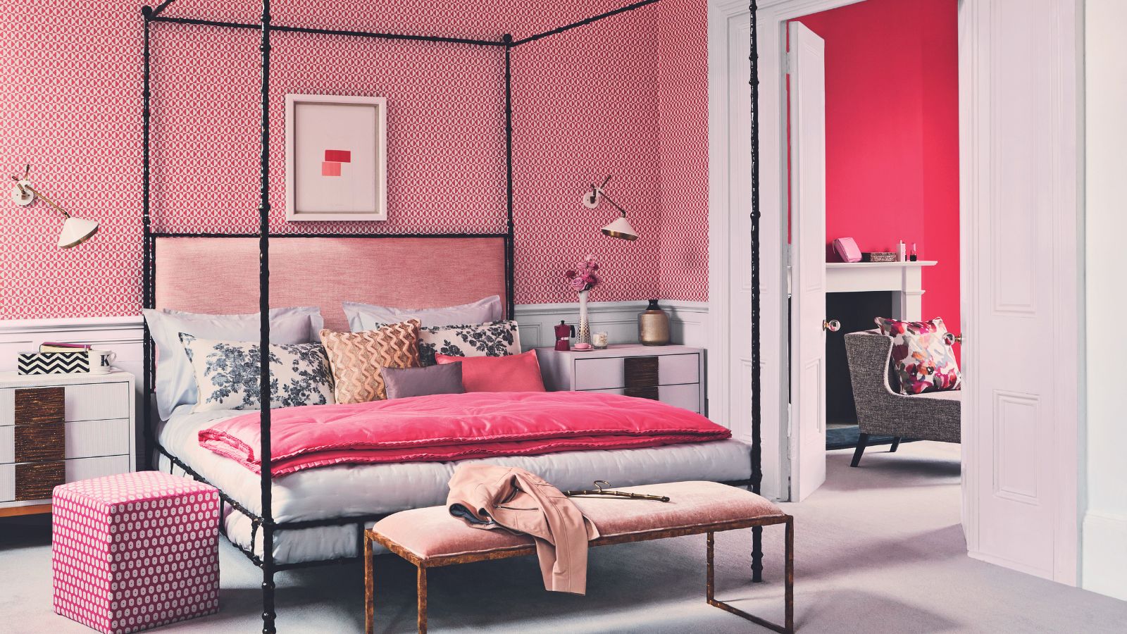
Room color ideas are often used as a baseline for the room, however adding bold accents of color to a space, either through home decor ideas or clever paint tricks, can help to make even the most neutral of rooms more interesting and sure to grab attention.
Here, paint experts and designers have their say on the most eye-catching colors for your home and offer suggestions as to how you can use them throughout.
Article continues belowWhat is the most eye-catching color?
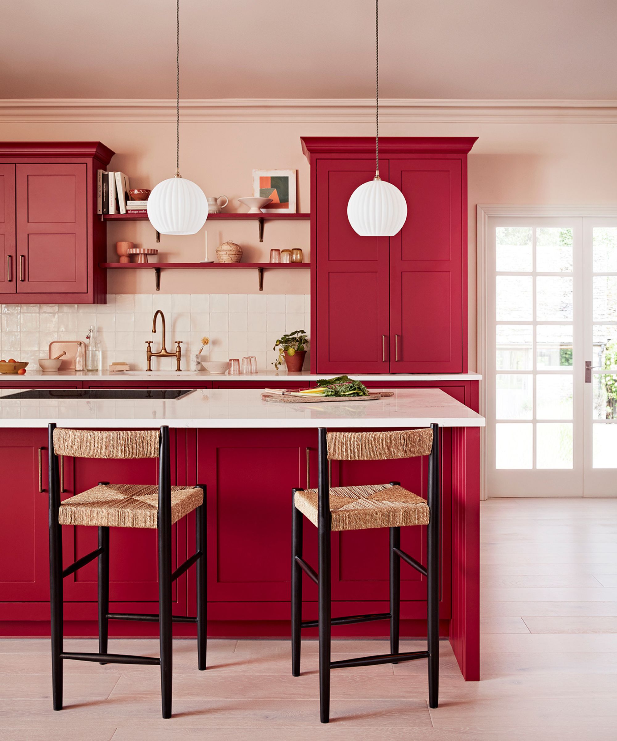
Decorating with red is thought to be the most eye-catching way to use color in any space, experts agree. Although it can be the most stressful color when painted in a whole room, there is a specific scientific reason that reds grab our attention the best.
'When you look at color what we see is the wavelengths coming into our eyes and hitting a part of your brain called the hypothalamus,' explains Natasha Bradley, director of interior design at Lick. '
The color that has the shortest wavelength that we see and register first before any other color is red. It is the most eye-catching literally. For instance, if you went to a party and everyone was dressed in blue and grey and there was one person in red, you would be drawn to that person first. This is also why all stop signs are in red, as it is a color that catches our eye the most,' she continues.
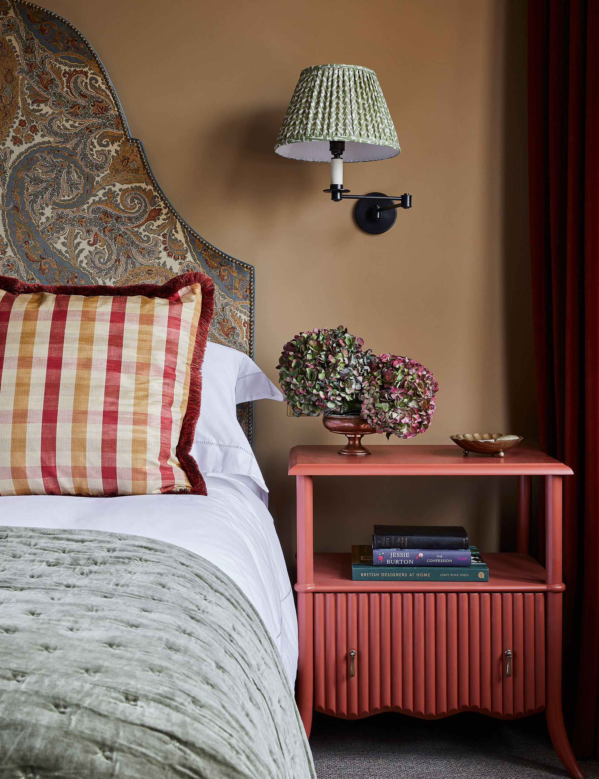
Red room ideas can become overstimulating quickly, so knowing how to use this bold shade makes all the difference between an eccentric space and a bold yet considered statement.
Design expertise in your inbox – from inspiring decorating ideas and beautiful celebrity homes to practical gardening advice and shopping round-ups.
'When decorating with red, I wouldn't recommend painting a whole room red but using red to really highlight an object of an area of a room, whether that is through a sofa you really want to have as a focal point or on a window frame,' says Tash.
Consider easing yourself into using bold colors in space by introducing red through colorful textiles or soft furnishings that can be changed easily and moved around with little long-term commitment. Alternatively, use a more natural looking red such as an earthy terracotta or a berry red for a sophisticated touch as opposed to a childlike fire-engine red.
'It doesnt have to be a bright red,' she adds, 'it can be a more muted, dusky, earthy red. A nice color pairing that is really on trend at the moment is a pale sky blue with a bright laquer red in a high gloss – I am seeing this pairing everywhere. For example. play with having a wardrobe in red and then the walls in a pale blue. Balancing the warm tone with a cooler tone really helps.'
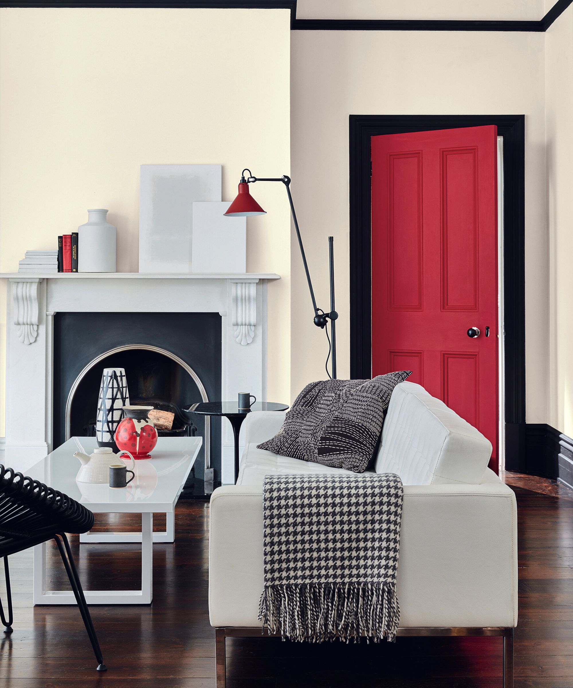
Bold colors like red can be daunting, especially as we typically live with more neutral room ideas than saturated statement spaces. Starting with smaller areas such as accent wall ideas or even just a doorway or chimney breast will help to introduce the color without it dominating the room.
'They are a fantastic tool for highlighting architectural detailing or creating design interest. You don’t need to paint the whole room to create eye-catching impact,' says Ruth.
'Burnt oranges or reds are a great color for ‘creative heads’ so can be used in home office ideas, but for more general appeal use in a small, poorly lit space like powder room ideas for an unexpected hit of color saturation,' suggests Patrick.
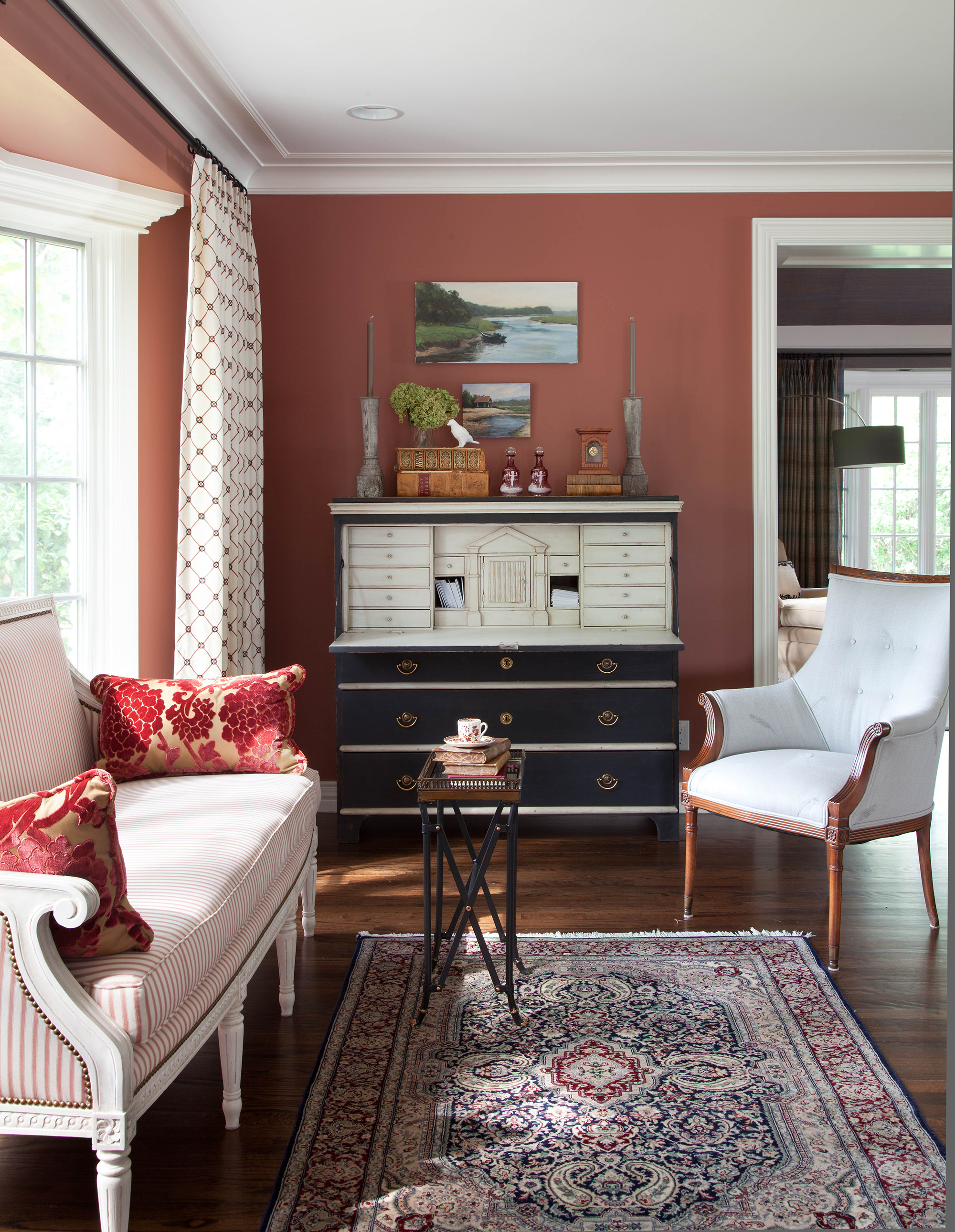
If you want to introduce a warm statement shade into your home but are not comfortable with red, using fellow warm-toned shades from the color wheel will help to achieve a similar eye-catching effect without you having to stray too far out of your comfort zone. Think terracotta at the more muted end of the scale, bold orange at the other.
'Hot oranges and bright and bold pinks are truly eye-catching colors when used in an interior,' says Ruth Mottershead, creative director at Little Greene, suggesting an alternative to harsh red while sticking in the warm-toned portion of the color wheel.
'Use dramatic bright pink ‘Leather’ as a highlight color above a picture rail alongside peaceful ‘Pea Green’ or pair playful orange ‘Marigold’ as a highlight stripe combined with cool ‘Grey Teal’,' she says.
'Think burnt oranges or spiced reds to get the heart pumping!' continues Patrick O'Donnell, international brand ambassador, Farrow & Ball.
If red is not for you, however, decorating with yellow is arguably a safer, more muted option for a hit of warmth while also remaining eye-catching, Patrick continues.
'What can be more uplifting than a big, bright dollop of sunshine? Babouche delivers this in spades, but use judiciously as a highlighting accent on areas such as a chimney breast, or a piece of free-standing furniture like a bookcase or kitchen island. It will team perfectly as a pop of color in a sea of warm, soft greys such as Ammonite or Purbeck Stone, and will also add vibrancy to a mid-century palette of Arsenic and Mere Green.'
What colors pop out the most?
While reds are the most eye-catching shades, other primary shades such as blue, green, and their secondary colors such as orange and yellow stand out the most and 'pop'. When using these attention-grabbing colors, use only one or two complementary colors or, alternatively, consider toning them down with neutrals, or using earthier hues to prevent an overstimulating space.
What color is pleasing to the eye?
Blue and green are the colors that are most pleasing to the eye. These calming shades allow the eye to rest and are not overstimulating (unless used in neon hues), pleasing the eye and instantly relaxing our bodies and minds.

Chiana is Homes & Gardens’ kitchen appliances editor. With a lifelong passion for cooking and baking, she grew up experimenting in the kitchen every weekend with her baking-extraordinaire Mom, has spent time cooking with Le Creuset's expert chefs, and has developed a great understanding of how tools and appliances can make or break your ideal relaxing kitchen routine.