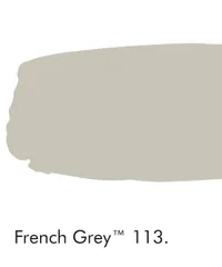
Little Greene's Creative Director reveals their most popular gray paint – and the secrets to its success
This century-old shade is at the top of the contemporary design world – this is why it has stood the test of time

Design expertise in your inbox – from inspiring decorating ideas and beautiful celebrity homes to practical gardening advice and shopping round-ups.
You are now subscribed
Your newsletter sign-up was successful
Want to add more newsletters?
Should we look to the 19th Century for the best gray paint color? According to Ruth Mottershead, Creative Director at Little Greene, we should. French Grey is Little Greene's most popular gray paint color this year – but with roots in the Victorian era, this contemporary craze has already been admired for more than 100 years. So, why do we keep falling for this eternal hue, and why does its timeless elegance show no signs of wavering in popularity? Here, Ruth shares why.
See: Grey living room ideas – inspiring neutral schemes that you'll love for years
What is the most popular grey paint color?
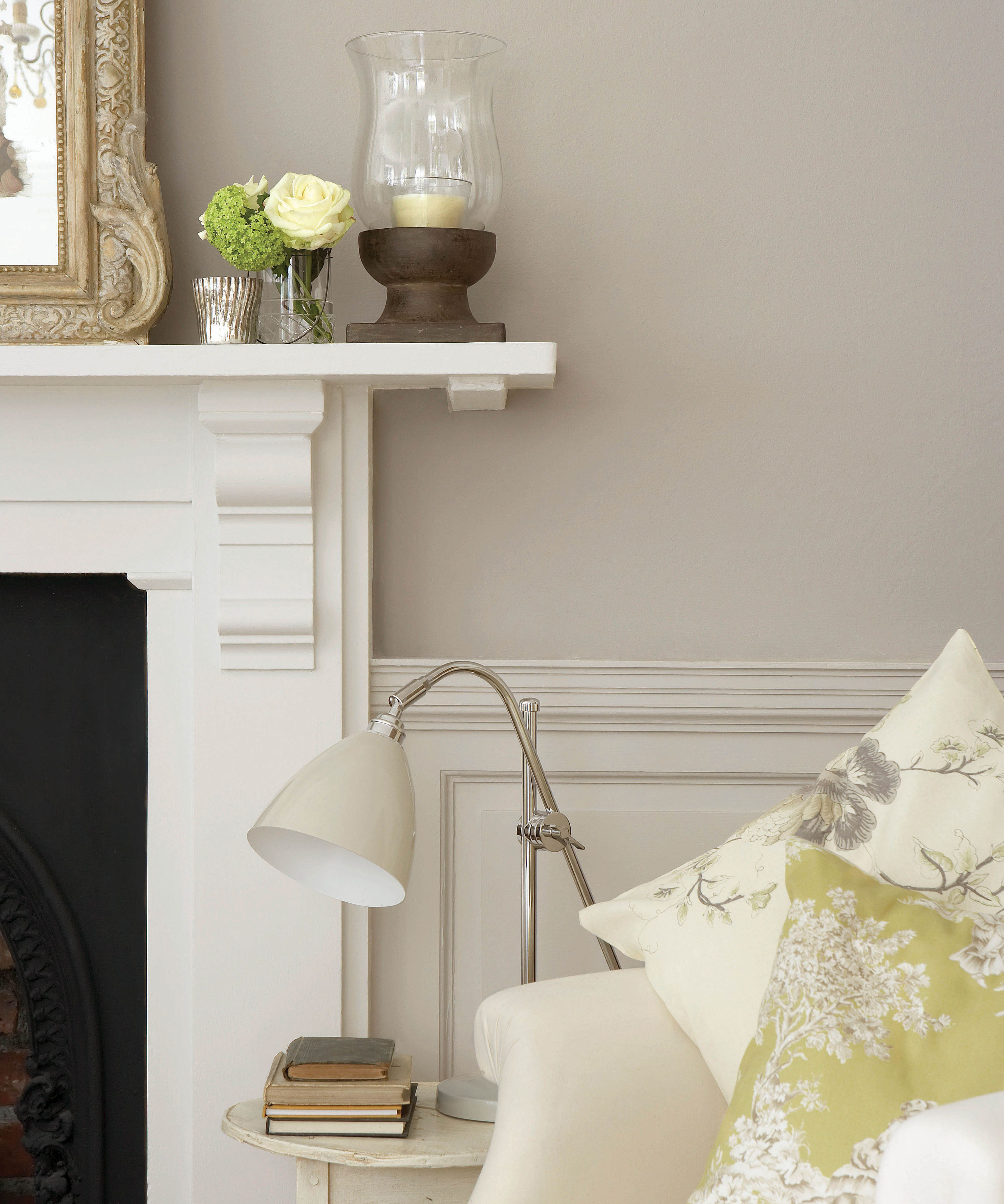
For Little Greene, it's French Grey.
Article continues below'It is often the case that the oldest shades are the most popular and timeless colors. French Grey, one of Little Greene's most popular shades, is actually a Victorian tone, but due to its incredible versatility, it has remained ever popular,' Ruth shares.
'From the palest, almost white, tones through to charcoal, brown and blue-black hues, gray has been a 'go-to' interiors color for centuries, working equally effectively in classic and traditional or modernist settings, often as a backdrop for decoration rather than the highlight itself. Originally, grays were based only on carbon black (soot) and ochres; today, our grays encompass a wide variety of base tones, including verdigris, umber, ochre, and red oxide, to name just a few,' she adds.
See: Living room paint ideas – stylish ways with paint, and expert decor tips
It sits seamlessly alongside other shades

'French Grey's wider mix of base pigments allows these neutral grays to team more easily with other surfaces and textiles within an interior,' Ruth shares.
Design expertise in your inbox – from inspiring decorating ideas and beautiful celebrity homes to practical gardening advice and shopping round-ups.
'The shade combines seamlessly with a myriad of other tones due to its small components of blue and red base pigments, making it a great solution for any interior.'
And, 'to create subtle nuance between walls and woodwork, use a differing scale from the same family, for example, French Grey Pale on the walls combined with French Grey on trim,' she adds.
See: Grey bedroom ideas – for a neutral scheme that is classic and modern
It looks good in every type of light
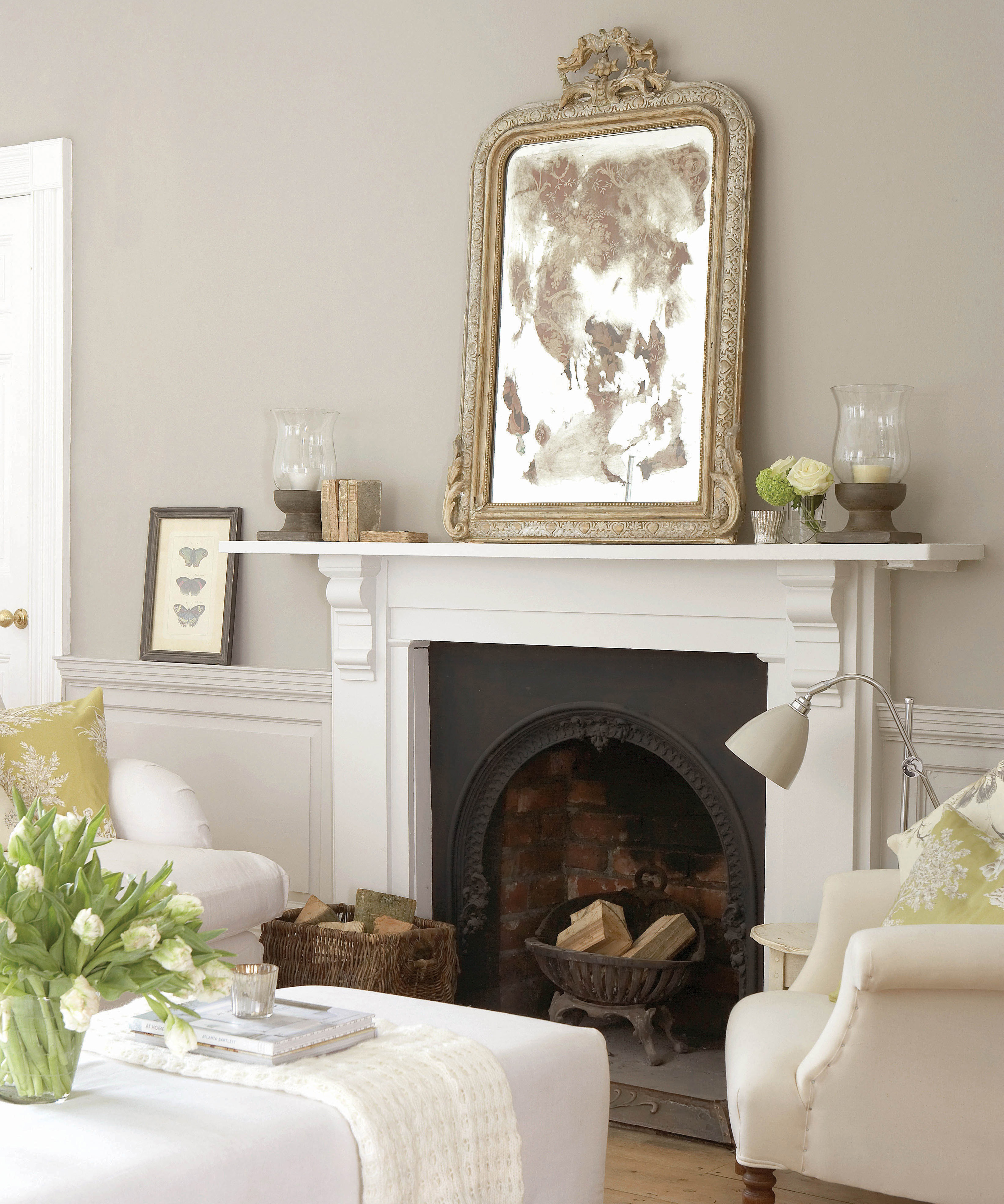
While we're all guilty of lusting after shades on Instagram, these tones might not always look how they do in your favorite designer's home – and this is because of its orientation. However, as Ruth shares, the versatility of French Grey means it works well in all light.
'Paint choices are all about the atmosphere you wish to create, but when selecting a shade for your home, the orientation of the room should be a consideration as the amount and direction of light entering a room can completely alter the appearance of your color choice,' Ruth begins.
However, French Grey 'works well in all situations; [as it is] made from a mix of pigments, because it contains a little blue and a red it adapts well to different light settings.'
See: Easy paint ideas – clever ways to decorate your home with color
It can be used to create a continuous color scheme
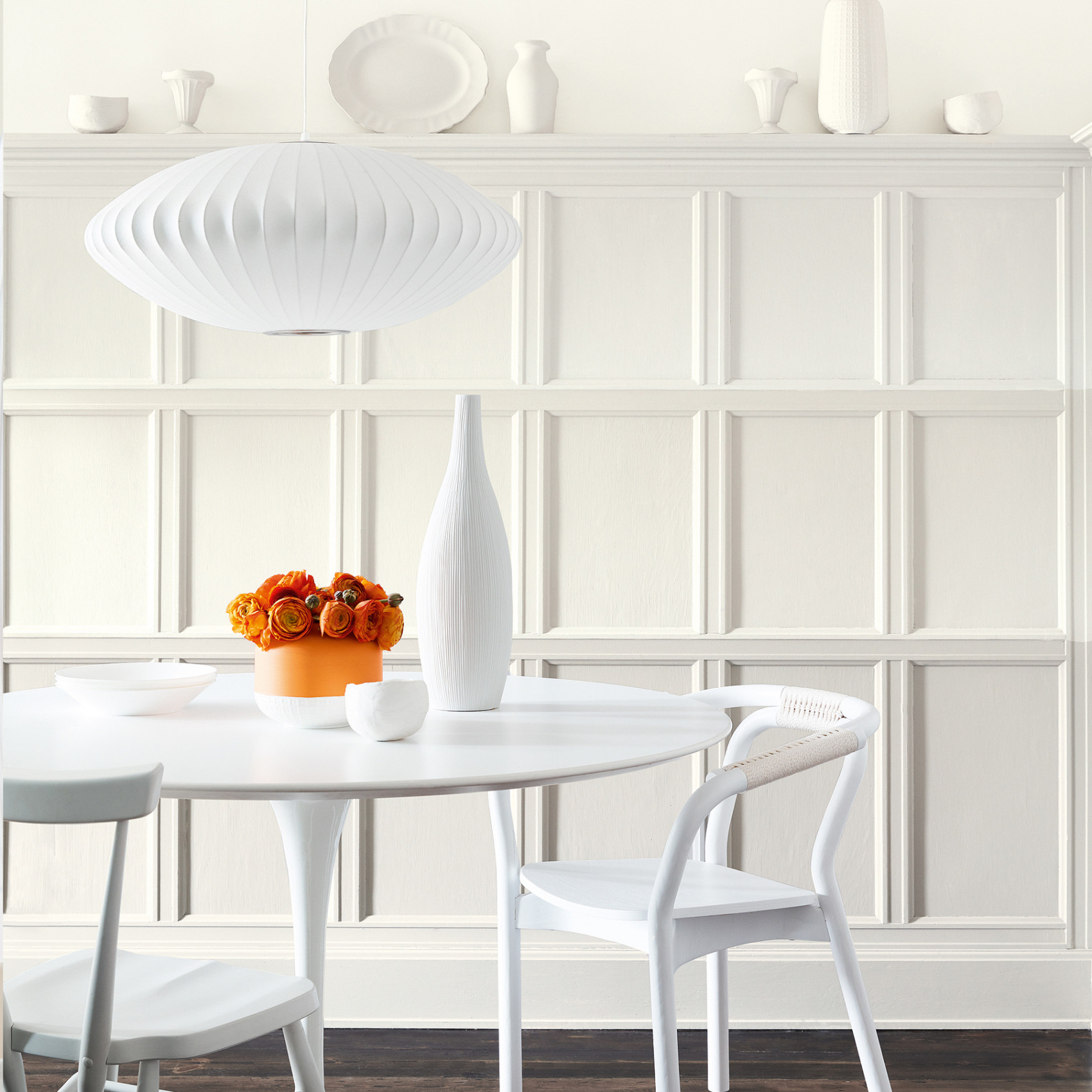
While French Grey works well alongside bold, contrasting colors, it can be used to create a flow of similar shades around your home.
See: Little Greene's color expert reveals the best shade of green for your home
As Ruth suggests: 'If you're aiming for continuity within the home, using shades from the same color family is a good way to add harmony in a subtle way. Our Little Greene Colour Scales collection is a wonderful solution for creating natural movement throughout a home; here, our most popular colors sit within families of four graduated tones, made using the same pigments, but in different strengths.'
Ruth then focuses on the elegance of French Grey's Color Scale, saying: 'These groups of colors are a timeless choice that are easy to use in combination on walls, ceiling and trim to provide a seamless color journey from room to room. Versatile French Grey Pale works beautifully alongside French Grey Dark and French Grey to create an elegant and welcoming living room scheme,' she adds.
With so much to love about this shade, we have a feeling it will remain at the forefront of our homes for centuries to come.

Megan is the Head of Celebrity Style News at Homes & Gardens, where she leads the celebrity/ news team. She has a history in interior design, travel, and news journalism, having lived and worked in New York, Paris, and, currently, London. Megan has bylines in Livingetc, The Telegraph, and IRK Magazine, and has interviewed the likes of Drew Barrymore, Ayesha Curry, Michelle Keegan, and Tan France, among others. She lives in a London apartment with her antique typewriter and an eclectic espresso cup collection, and dreams of a Kelly Wearstler-designed home.
