Why Blake Lively and Ryan Reynolds' dark paint always looks elegant instead of gloomy, according to designers
This painting technique comes with its intricacies – but designers say we should begin by replicating their sophisticated space


Design expertise in your inbox – from inspiring decorating ideas and beautiful celebrity homes to practical gardening advice and shopping round-ups.
You are now subscribed
Your newsletter sign-up was successful
Want to add more newsletters?
Decorating with dark paint is not for the faint of heart, not least because, in all their beauty, these hues can be hard to get right. However, for failsafe lessons in styling hues, we should look no further than Blake and Ryan Reynolds.
Hollywood's favorite couple (who have settled on the opposite coast, in Pound Ridge, New York) has allowed their home's woodland surroundings to influence their design decisions – paint choices included. This is particularly the case in (what appears to be) a cozy home office adorned in a midnight black-blue hue.
This dark tone is the most striking part of Ryan's backdrop – but despite attracting our attention, it does not overpower the space. Instead, it complements the other accessories – creating a contrastable base that allows the lighter artwork and glass fixture to impress.
Article continues belowA post shared by Ryan Reynolds (@vancityreynolds)
A photo posted by on
It can be tricky to introduce dark paint without appearing too gloomy or overpowering – but as Blake and Ryan demonstrate, it is possible to make a color statement without overwhelming your other design choices. But how do they get it so right? New York designer Artem Kropovinsky says choosing the right shade is the key starting point.
'Dark-colored rooms can exude a sense of elegance and refinement. However, it's crucial to select the appropriate hue of paint. A shade too dark might render the room stifling, while a hue too light might strip the space of its dramatic aura,' he comments.

Based in New York, Artem Kropovinsky, founder of Arsight, has a decade of global design experience. Prioritizing minimalism, sustainability, and authenticity, Artem, alongside his team of professionals, works on projects in the US and worldwide.
When choosing paint colors, Artem says there are three key considerations: our room's dimension, access to natural light, and our home's wider style.
'Dark paint colors can make a compact room appear even smaller. If your living area is small, opt for a lighter variant of a dark color,' he says. 'Also, spaces abundant in natural light can accommodate darker hues better than those lacking natural light. If your living area lacks abundant natural light, opt for a lighter variant of a dark color.'
Design expertise in your inbox – from inspiring decorating ideas and beautiful celebrity homes to practical gardening advice and shopping round-ups.
As mentioned, Blake and Ryan's home features a contemporary rustic aesthetic, meaning its dark, daring hue doesn't look misplaced. However, choosing a dustier or paler alternative may be better in more traditional homes.
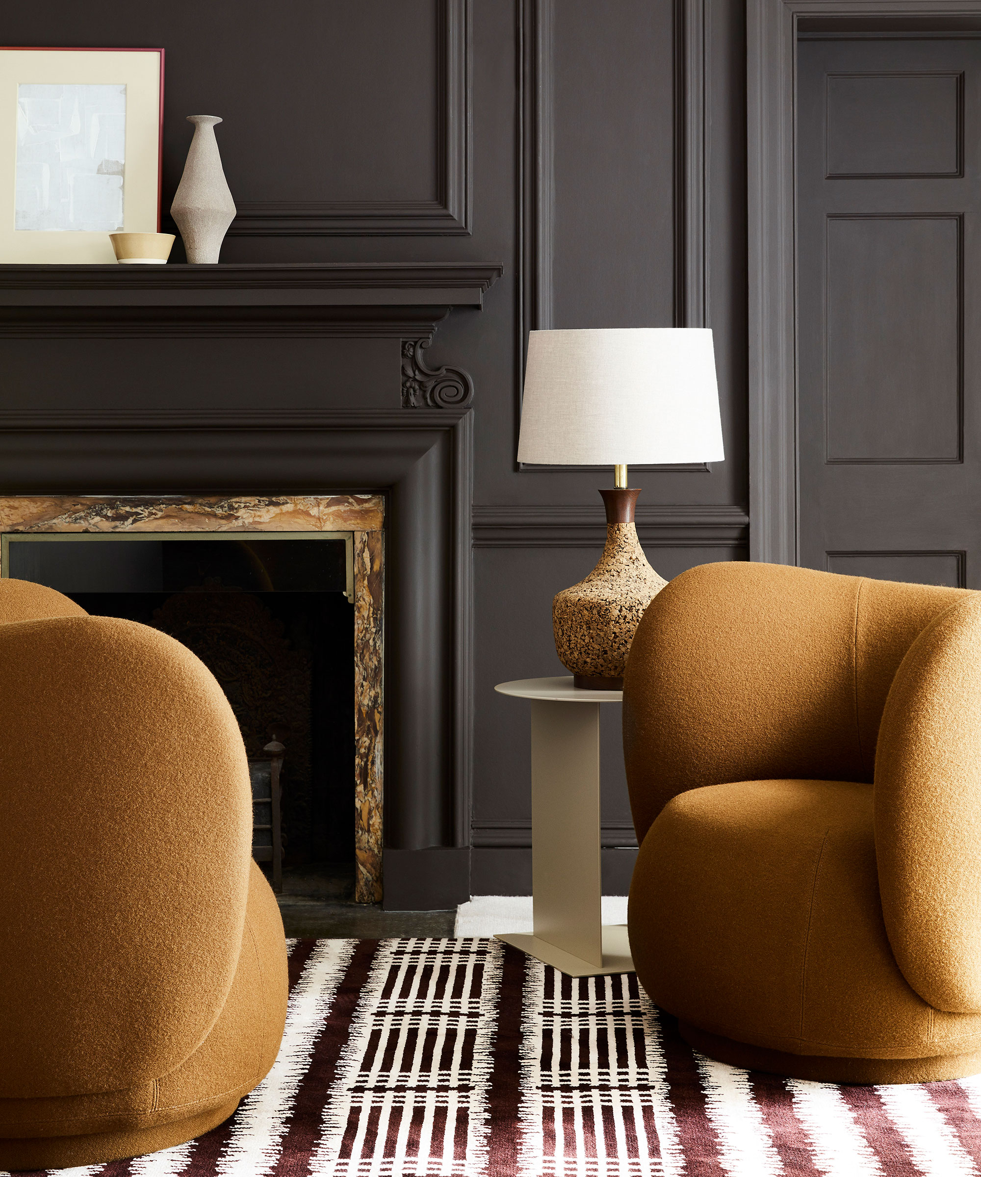
When it comes to accessorizing, Blake and Ryan have once again set a precedent. Artem recommends following their lead by infusing dark spaces with lighter cushions, throws, and (crucially) artwork that will juxtapose against the rich backdrop.
Plus, alongside accentuating natural light, we should maximize brightness by installing decorative features (like their glass fixture) that ensure the space won't appear too dark in winter months or evenings.
'The key strategy when decorating an inherently dark living space is to introduce light,' Artem adds. 'You can also achieve this by using light-colored furniture, incorporating mirrors, and drawing back curtains or blinds during daylight hours.'
Whether styling a dark living room or not, we're investing in some Blake and Ryan-inspired buys below.

Megan is the Head of Celebrity Style News at Homes & Gardens, where she leads the celebrity/ news team. She has a history in interior design, travel, and news journalism, having lived and worked in New York, Paris, and, currently, London. Megan has bylines in Livingetc, The Telegraph, and IRK Magazine, and has interviewed the likes of Drew Barrymore, Ayesha Curry, Michelle Keegan, and Tan France, among others. She lives in a London apartment with her antique typewriter and an eclectic espresso cup collection, and dreams of a Kelly Wearstler-designed home.
