4 lessons on how to use color in the bedroom, from interior designer Natalie Tredgett
Choose the right colors for your sleep space, for day and for night

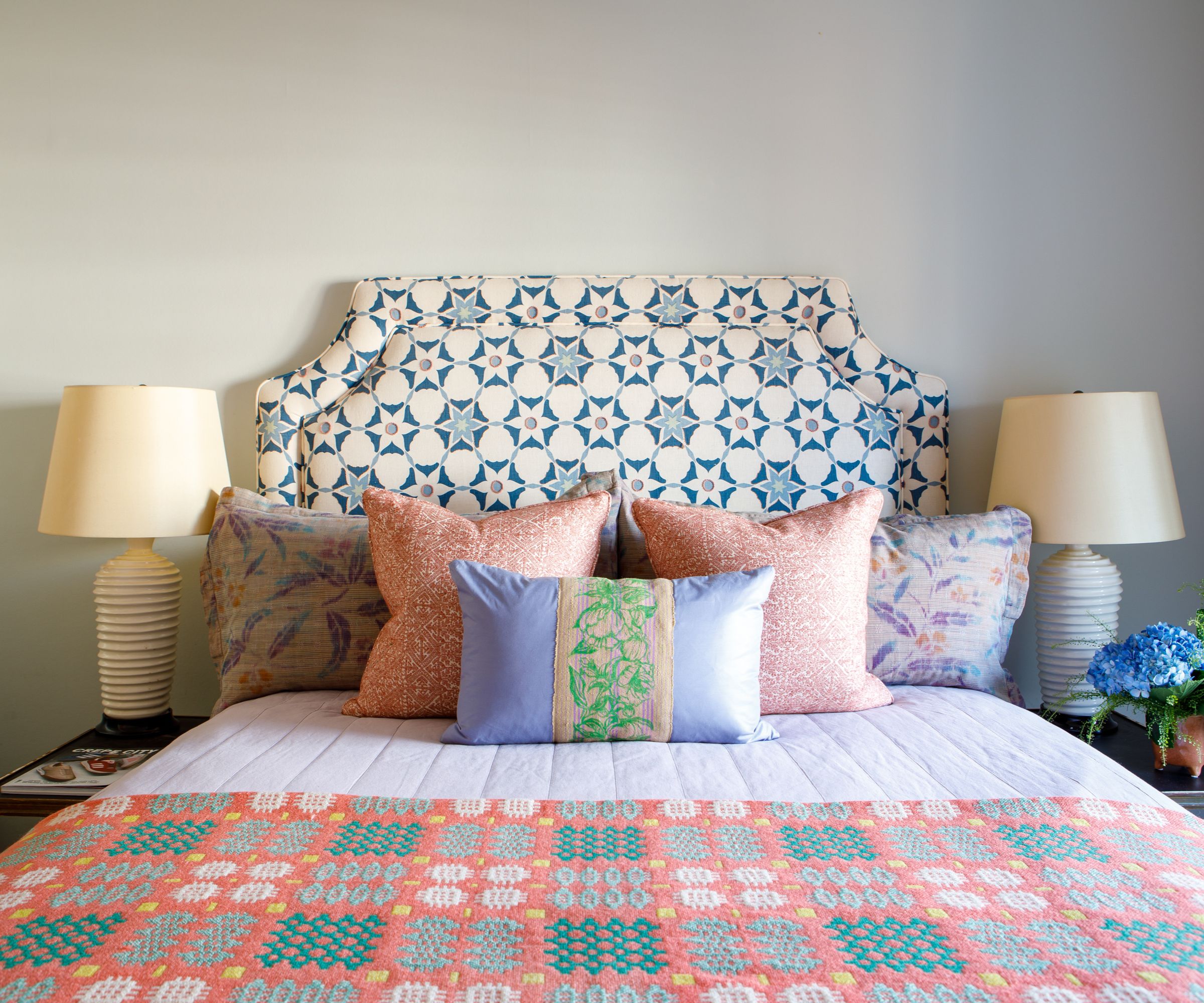
There's a fine balance to be sought when choosing bedroom color ideas. You will want a shade that encourages relaxation, good sleep, and happiness. Most of all, what you choose has to suit you, and you alone.
'Bedrooms are personal spaces. They are rooms to retreat to, be yourself and remove yourself from the public spaces in the home. When deciding how to design a bedroom, I invite you to consider how else to use a bedroom other than sleep? ' asks interior designer Natalie Tredgett.
'Some use their bedroom all the time, others truly only to sleep. Whichever way you use or want to use a bedroom, the colors you choose will evoke the mood and encourage how it feels.
Article continues below'The first thing that often comes to mind when one thinks of a bedroom is for it to be restful and calming. Natural and practical. The bed is the most important piece of furniture in the room. However, focusing on other parts of the room – and giving them equal focus – can open the door to creating an environment that is much more than "just a bedroom".'
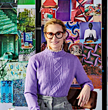
Natalie Tredgett is a London-based interior designer known for her inimitable use of color in combination with distinctive artworks. Natalie founded her studio in 2012 having established herself under design guru Nicky Haslam. She trained in Interior Design at KLC, has an MBA from the University of Edinburgh, holds a Bachelor of Art from the University of Western Ontario and has a background in management consultancy.
1. Use warm, cocooning colors
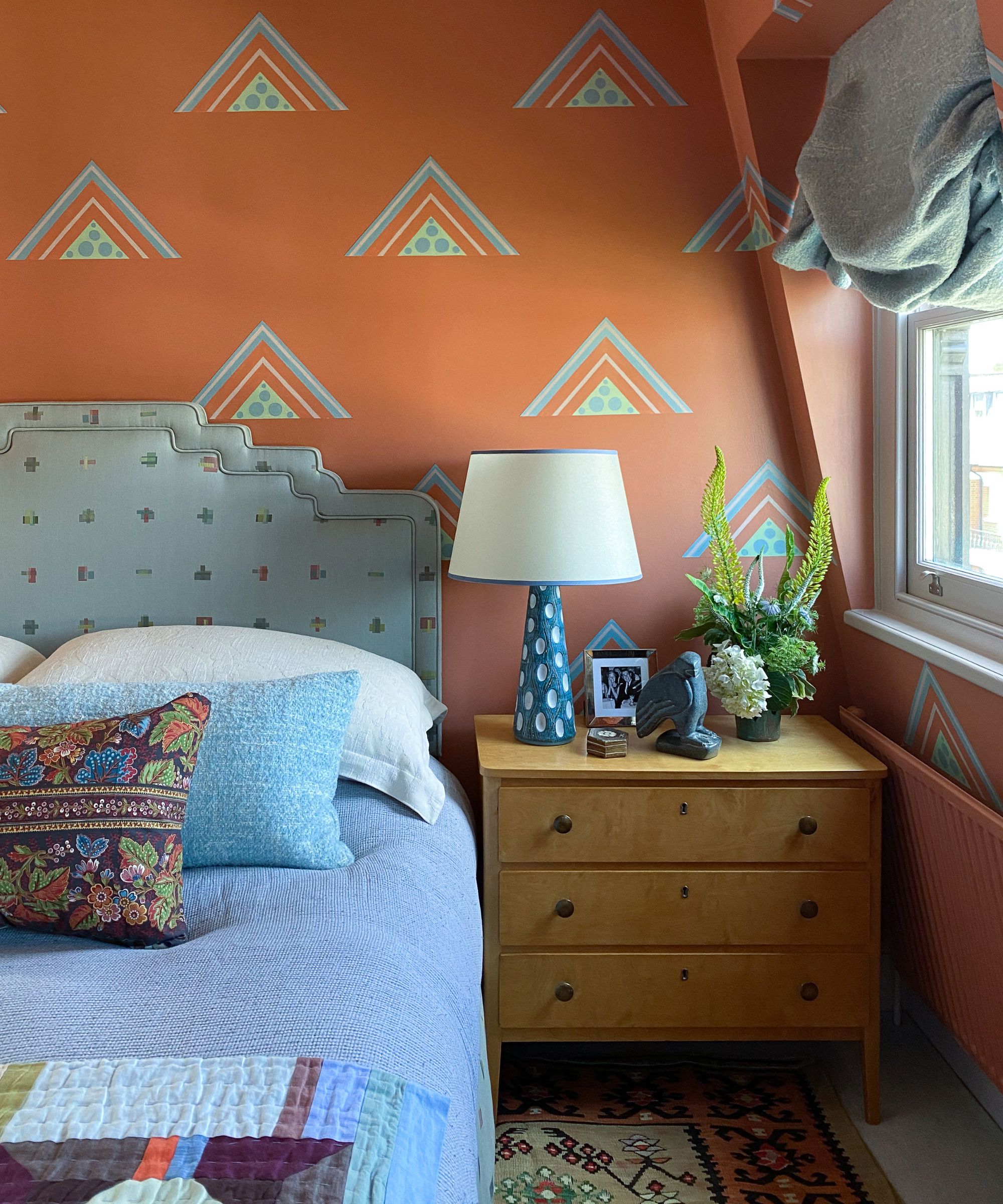
'Oranges, browns, and aubergines are warm and cozy. Their nod to nature calms the soul. They are invigorating and contemplative colors – absolutely fitting for rooms where we want to retreat, read and rest. These tones are amazing in the natural light and just as relaxing when lit at night,' says Natalie.
'To help bring calm and cool it off, add blues and greens. These cooler colors add some freshness and deepen the complexity of warmer palettes. Better still, painted decoupage geometric shapes stuck on the wall like wallpaper.
'By using contrasting cooler colors you break up the warmer tones. They give the room an imaginative and artistic character. The effect is dreamlike, inspiring and serene. The paint colors here are by Edward Bulmer. The walls are Brick, the blue is Gater, the green is Roger and the ceiling, which looks white in combination with the palette, is a mauve called Laylock. The finishing touch is the cushion fabric, which encapsulates all the colors – this is from the Haines Collection, by Decors Barbares.'
Design expertise in your inbox – from inspiring decorating ideas and beautiful celebrity homes to practical gardening advice and shopping round-ups.
2. Let a fabulous fabric be your inspiration
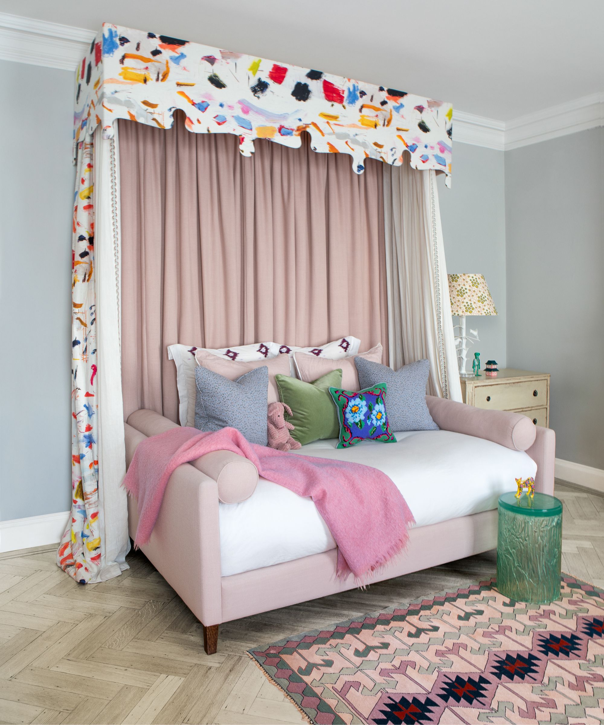
'This bedroom was designed with playfulness in mind,' says Natalie. 'The centerpiece is the bed and the canopy fabric dictates the color palette for the room. The painterly fabric is a nod to an artist at work.
'Creativity and imagination is at the heart of this room. The bed frame is designed like a sofa to encourage reading, games and laying around giggling with a friend or two. The inner curtains of the canopy can be drawn around the bed to give the feeling like you are in a mosquito-tented bed in a far-off land.
'The palette of the room is built off the back of the painterly fabric by Pierre Frey. To calm its boldness, complementary paler pinks and grey blues were pulled from its colors.
'This sentiment is further reinforced by adding a similar toned rug. The rug’s geometric shapes offset the organic shapes in the painted fabric and elevate the interest of the room. The overall blue-grey color of the walls is used to bring the bed in as its central piece. The color is Tablecloth by Paper & Paint Library.
3. Bring in the morning sunshine with yellow
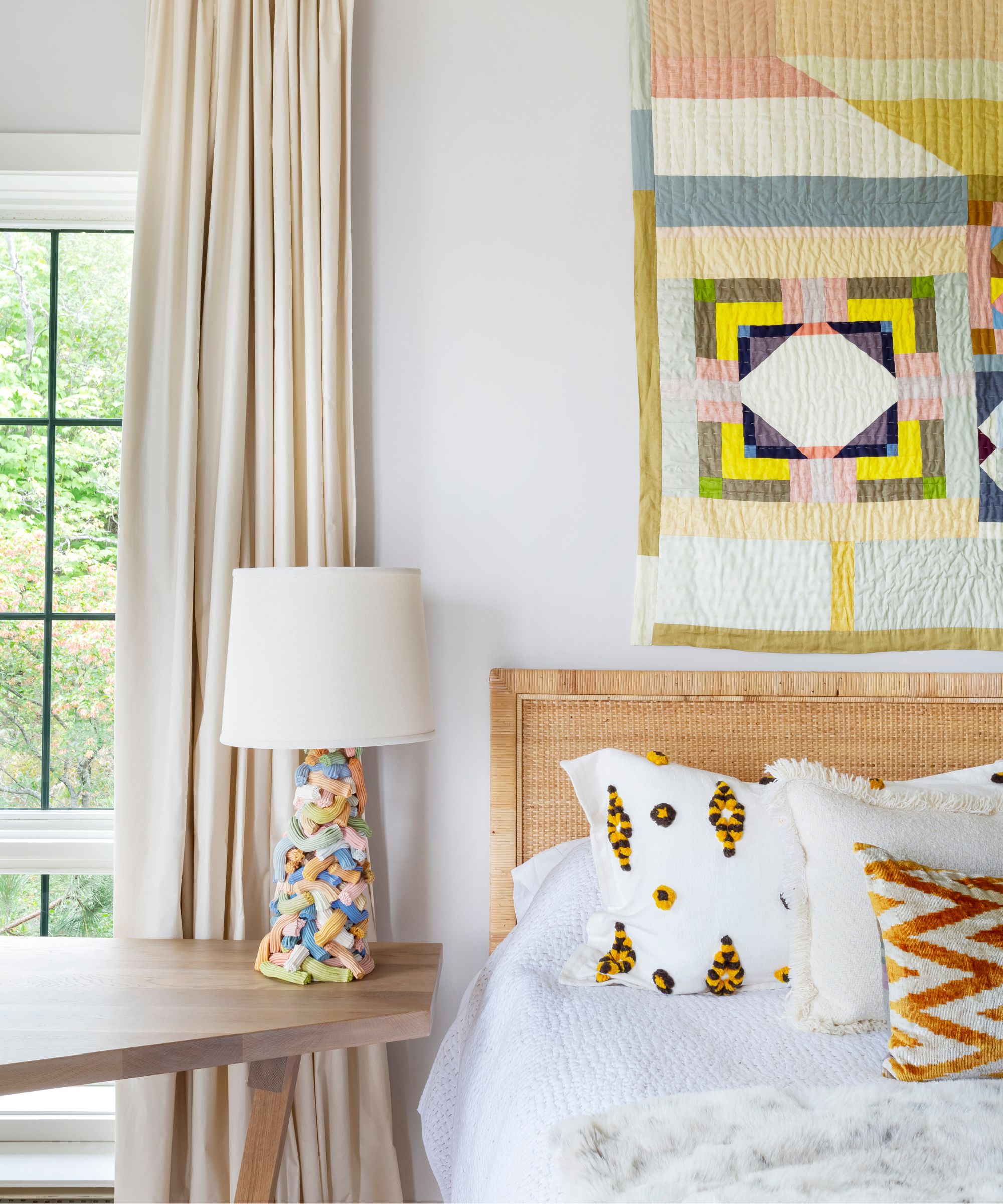
Considering yellow bedroom ideas? Be inspired by this space.
'The sun pours into the south facing windows of this bedroom. It was hard to ignore the outside when considering the inside. Sunflower yellow was the obvious choice. Yellow is the color of the sun and all its light-giving sources.
'Yellow is positive, happy, and optimistic. It’s a wonderful color to wake to and start the day. Its natural contrasting companion is blue. Here, a blue-grey was used on the walls and bed cover to add balance to the yellows in the rug, wall-art, and accessories.
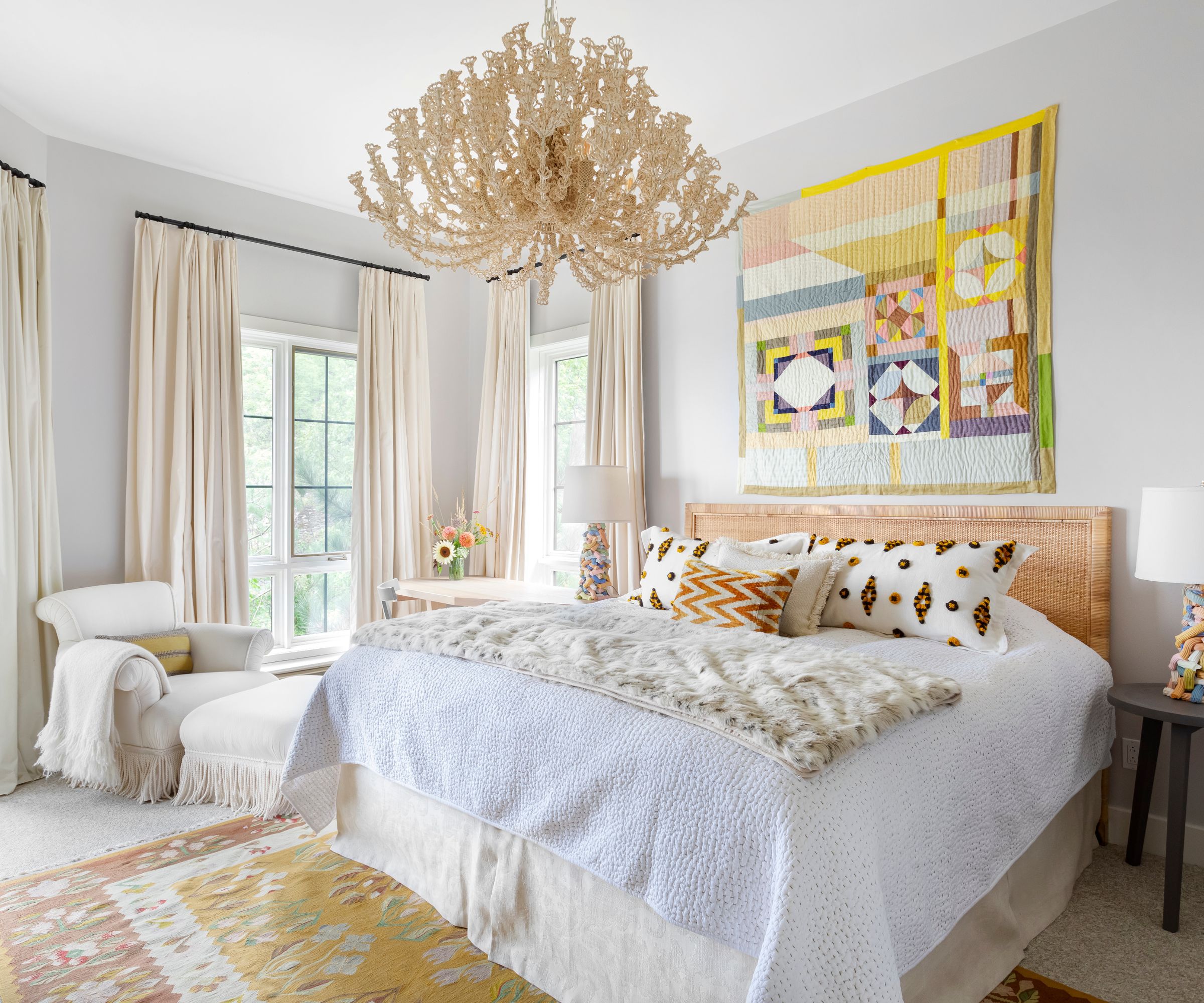
'The off-white chair, bed valance and curtains reinforce and culminate up to the chandelier. The balance of these colors playing off one another moves in stillness. It provides the perfect backdrop for a mid-morning break to catch up on the news and with friends.
'A daytime nap is even encouraged by having a throw on the bed, meaning there’s no need to unmake it. Here, a textural animal print is playful and warm. Wall color is Wilcote by Konig Colour.'
4. It’s all about the bed

Bed ideas can be your color inspiration. And styling a bed with color can be incredibly impactful, with headboard ideas the focal point.
'Small bedrooms need not be limited by their size, and color is never to be confined to only the walls. The bed can be the most impactful object of layered mastery,' says Natalie.
'Firstly, the headboard is an opportunity to create this impact and provide a focal point to the room. Create a bold shape or choose special fabric that’s eye-catching.
'For the bed valance, there’s power in repetition. One can repeat the headboard fabric, use the reverse side of the fabric or change it to a coordinate fabric.
'Next are the cushions, and in particular, the larger ground cushions. I love the layering opportunity that bringing in complementary tones presents. Don’t be afraid to play with contrasting colors – colors that are the reverse of the headboard fabric both in saturation and pattern. For example, if the headboard fabric is pale and geometric in nature, use more colorful organic shapes to achieve impactful layering. The added benefit is that it allows the opportunity to add more color options to pull from, such as additional decorative cushions.
'Here, building on contrasting hues can be a great way to inject more complexity. Lastly, is the throw. This to me is an opportunity for playfulness, color and art. It’s the finishing touch and can make or break "the bed". Like a scarf or hat to an outfit, the rule of thumb is to complement, add drama yet never compromise comfort. The headboard fabric here is by Vanderhurd.'
'Color is emotive. It warms, invigorates, calms and encourages behavior. Lean into the colors you love. Remind yourself what makes you feel good and start there. Then build complexity by adding complimentary and contrasting tones – further reinforcing the palette with patterns and objects to keep stimulating and bringing in joy. Before you know it, you will be retreating to the bedroom more often for rest and rejuvenation from the outside world.

Lucy Searle has written about interiors, property and gardens since 1990, working her way around the interiors departments of women's magazines before switching to interiors-only titles in the mid-nineties. She was Associate Editor on Ideal Home, and Launch Editor of 4Homes magazine, before moving into digital in 2007, launching Channel 4's flagship website, Channel4.com/4homes. In 2018, Lucy took on the role of Global Editor in Chief for Realhomes.com, taking the site from a small magazine add-on to a global success. She was asked to repeat that success at Homes & Gardens, where she also took on the editorship of the magazine. Today, Lucy works as Content Director across Homes & Gardens, Woman & Home, Ideal Home and Real Homes.