Dark green paints are the 'it' color right now – here are 4 shades from Benjamin Moore to use in small rooms
Moody, cozy, and timeless, there's much to love about trending dark green paints, and these are some of the best out there

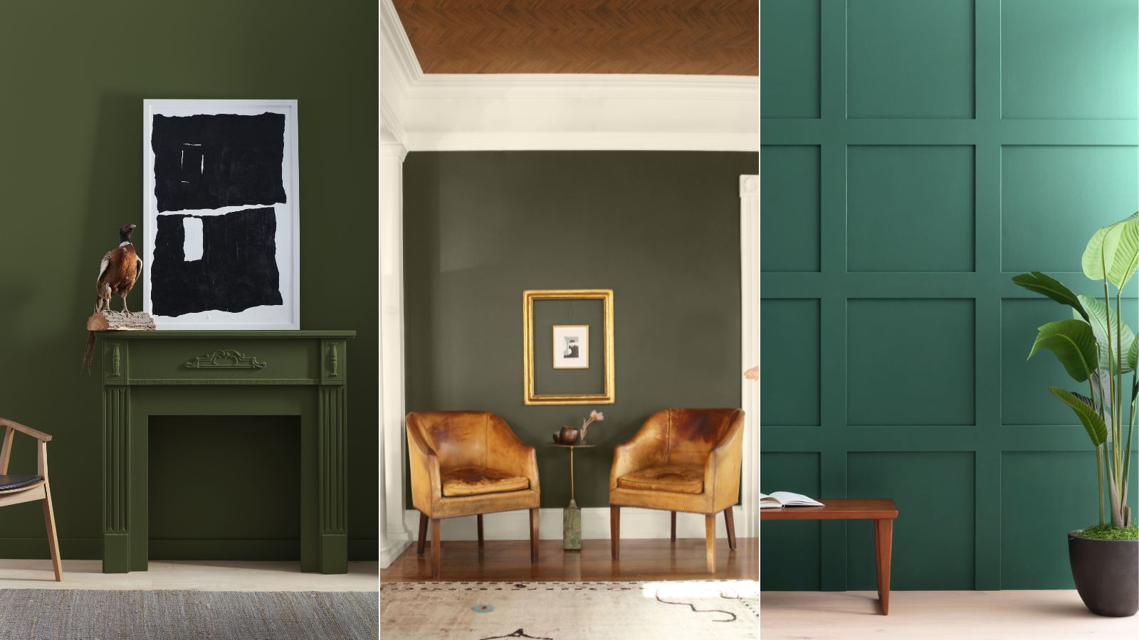
Decorating with green has had somewhat of a resurgence this year, transitioning from light, gentle greens to the richest, most opulent greens that fill our homes with drama and sophistication.
While moody dark greens have been cropping up in many rooms, from kitchen cabinets to home offices, we'd argue that small rooms are where they come alive. Used to drench small spaces, dark green paints create cozy, cocooned spaces perfectly suited to the fall and winter months.
If you're as won over by this color trend as we are, you may be wondering where to start with finding the perfect dark green paint. Thankfully, Benjamin Moore has suggested four dark green paints that work perfectly in small rooms. We spoke to Arianna Barone, Color Marketing Manager at Benjamin Moore who talks through each of them below.
A post shared by Benjamin Moore (@benjaminmoore)
A photo posted by on
Named one of 2025's biggest color trends, dark green is predicted to endure into the new year, and for good reason. This shade may be trending, but it's every ounce timeless and feels reminiscent of centuries gone by.
Boreal Forest AF-480
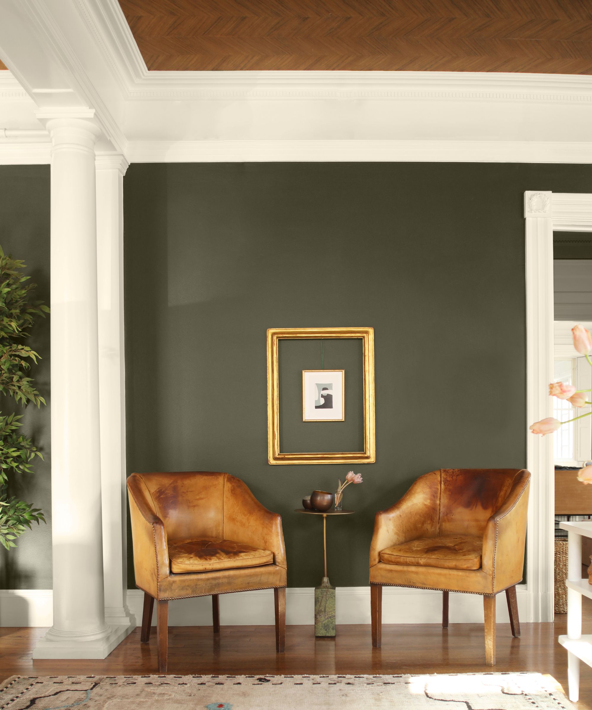
If you're looking for a dark green paint color that isn't too saturated, Boreal Forest AF-480 makes a great choice. Dark and moody, this forest green has a subtle, muted quality which ensures spaces feel fairly neutral and not too stimulating.
'Lush yet livable, this verdant shade is the quintessential forest green,' explains Arianna. 'It works particularly well in dining rooms and breakfast nooks to create a cozy but inviting space.'
This shade would work wonderfully with farmhouse decorating styles, complementing materials like warm wood tones and rustic brass. While color drenching with Boreal Forest would up the cozy factor, alternatively, you could opt to pair this hue with lighter shades for a less intense look. Benjamin Moore recommends Wind Chime AF-465 as a coordinating color, a light gray-green paint.
Design expertise in your inbox – from inspiring decorating ideas and beautiful celebrity homes to practical gardening advice and shopping round-ups.
Lafayette Green HC-135
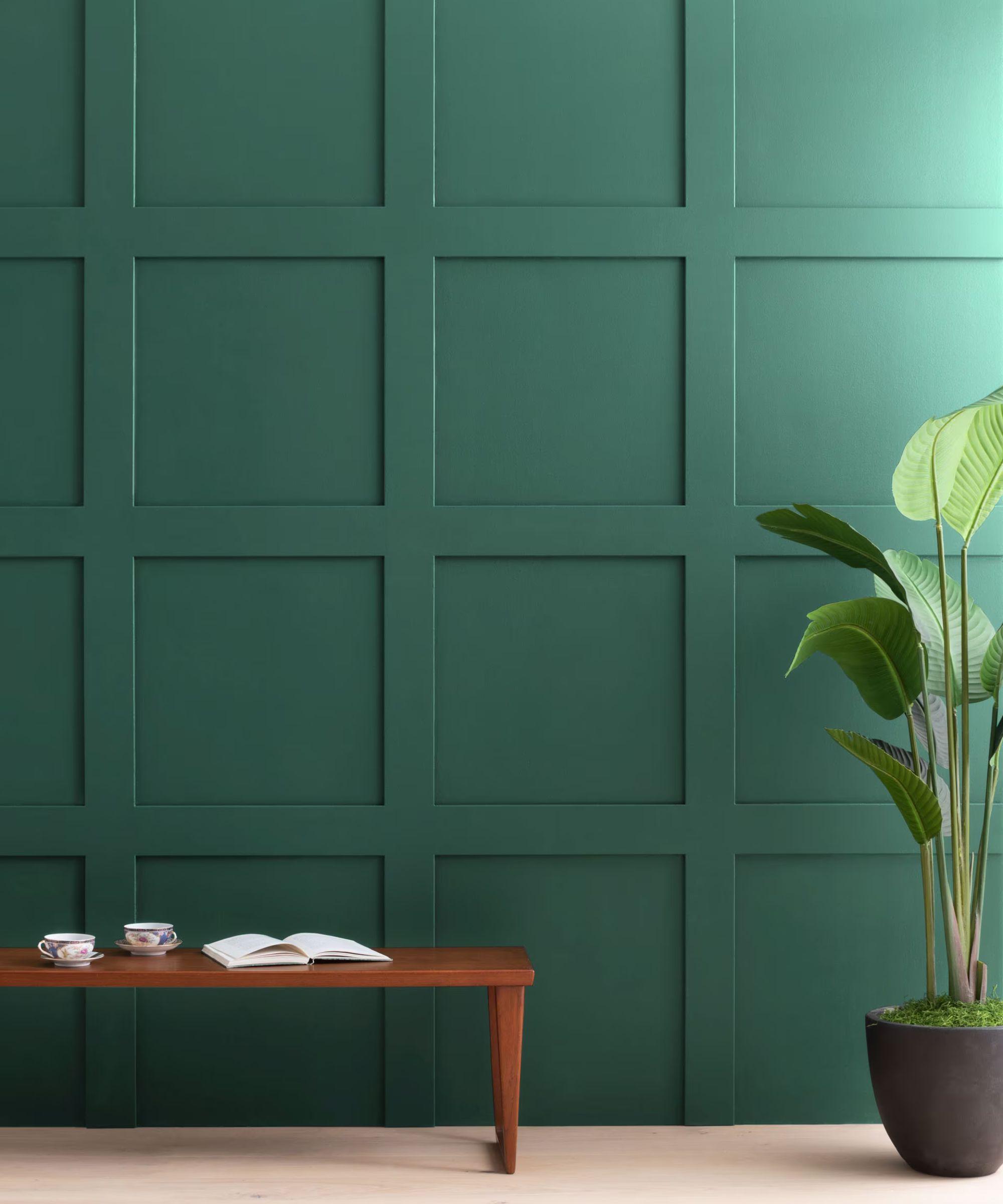
Part of Benjamin Moore's historical collection, Lafayette Green HC-135 is a dark green guaranteed to add drama to the home. Although bold, this color maintains a sophisticated, timeless feel that doesn't feel too trend-led.
'A handsome hunter green, this dark hue exudes ease and elegance,' says Arianna. 'Not too dark, it has just the right amount of depth to bring contrast and color to a space without overwhelming it. I love to use this hue in home offices, libraries, and reading nooks.'
To complete the color scheme, Benjamin Moore suggests teaming it with warm neutral paints, specifically Clarksville Gray HC-102 and Glacier White OC-37.
Windsor Green CW-505
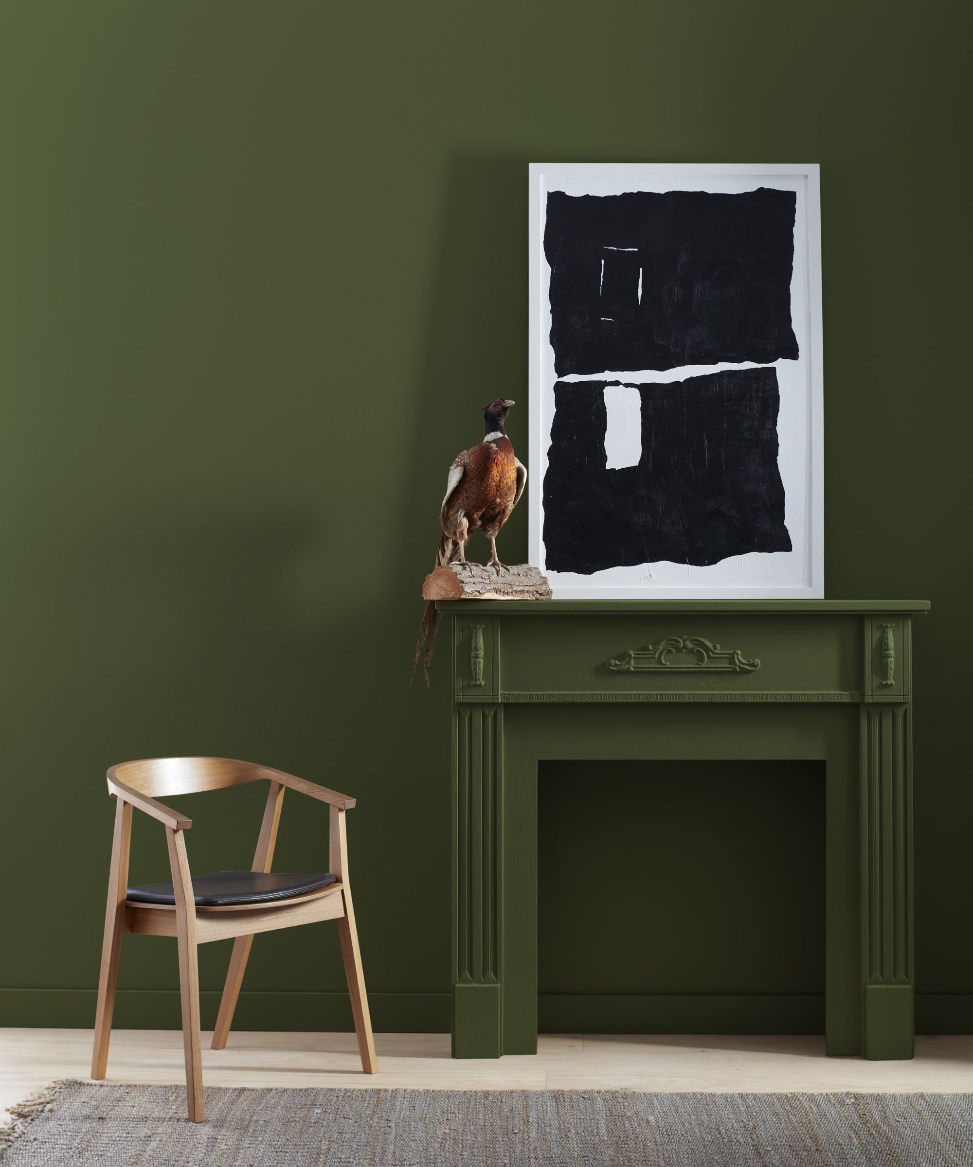
Looking for a warmer dark green paint? Windsor Green CW-505 is an opulent shade reminiscent of popular 18th-century colors, lending itself to traditional decorating ideas.
'With more of a mossy undertone, this mid-tone green works beautifully in smaller spaces like mudrooms or entryways,' adds Arianna. 'Paired with wallpaper or used on decorative paneling, it can easily blend modern and traditional styles.'
To make the most of this paint color, go all out with color drenching in small rooms for an unexpected yet timeless hit of color. Or, if you want to team this shade with a neutral, Benjamin Moore recommends Harwood Putty CW-5, a classic white paint as a coordinating shade.
Jade Romanesque 476
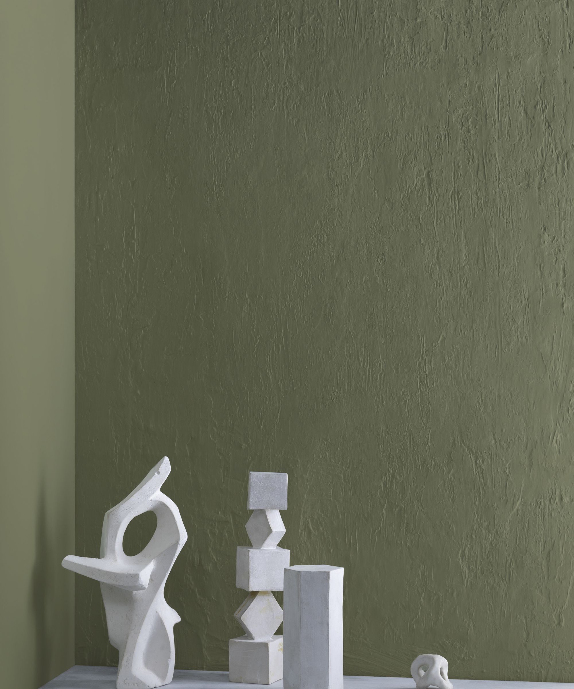
Jade Romanesque 476 has more of a muddy appearance, meaning it doesn't feel too lively and instead works as a neutral shade in the home.
'Exuding old warm charm, this serene green has more of a toasted olive undertone,' says Arianna. 'It leans slightly more neutral than our other suggestions and works beautifully in transitional spaces like hallways and stairwells that connect multiple rooms in the home. These spaces are often overlooked as more utilitarian rooms but they can create a great opportunity for a bolder color statement.'
Lean into lighter shades when decorating with this shade to maintain the natural look; Benjamin Moore suggests White Down 970, a light greige paint, and Grasslands 502, a lighter warm-toned green.
Whichever you choose, these four paint colors are equally stylish and you can be assured you're in keeping with 2025's color trends by incorporating them into your home.

Emily is a freelance interior design writer based in Scotland. Prior to going freelance in the spring of 2025, Emily was Homes & Gardens’ Paint & Color Editor, covering all things color across interiors and home decor for the Homes & Gardens website. Having gained specific expertise in this area, Emily is well-versed in writing about the latest color trends and is passionate about helping homeowners understand the importance of color psychology in home design. Her own interior design style reflects the simplicity of mid-century design and she loves sourcing vintage furniture finds for her tenement flat.


