Dulux's 2025 Color of the Year is an 'energizing and motivating yellow' – the ultimate cheerful hue for color lovers
If you're looking to bring some sunshine-filled color into your home this fall, look no further than True Joy

Design expertise in your inbox – from inspiring decorating ideas and beautiful celebrity homes to practical gardening advice and shopping round-ups.
You are now subscribed
Your newsletter sign-up was successful
Want to add more newsletters?
Color of the Year season is in full swing, and the latest paint brand to reveal its standout shade for the year ahead is Dulux, unveiling True Joy for 2025.
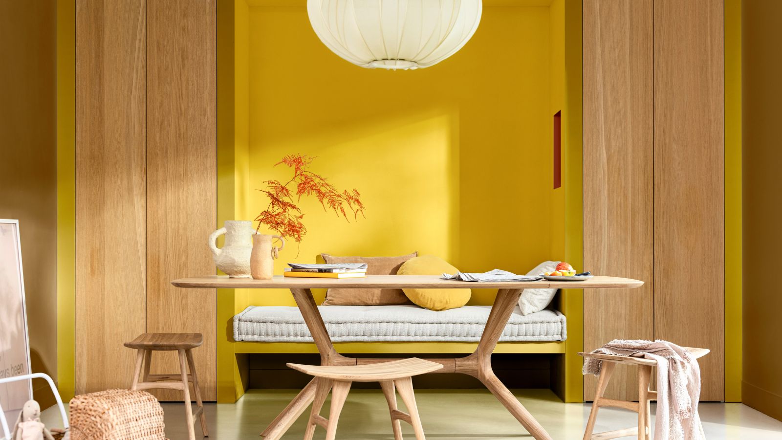
Described as an 'energizing and motivating yellow', True Joy is a cheerful, mood-boosting yellow paint color set to add an instant dose of warmth and energy to our homes. Although bold, this positive color is versatile to incorporate throughout interior schemes, as we explore below.
We're certainly intrigued by this all-out hue, and there's no question that it makes for a cheerful – and slightly unexpected – addition to our roundup of 2025's Colors of the Year so far. We've seen a whole lot of love for deep and dark moody hues, but True Joy goes against the grain with a bold and bright celebration of color.
Article continues belowRead on to find out more about this color trend and how to best decorate with it, for a joy-filled home year-long.
Color of the Year 2025: True Joy
True Joy is all about uplifting room color ideas. Paying homage to the dopamine decor trend, this energizing shade of yellow allows homeowners to fill their spaces with a feel-good dose of color, whether used liberally or sparingly.
'The meaning behind the color’s choice is so impactful,' explains Marianne Shillingford, Creative Director and Color Expert at Dulux. 'The sheer bliss the color exudes physically pushes us to create something better for ourselves; it allows us to put the past behind us and gives us the inspiration we need to forge a future for our proudest, most confident selves. Put simply, True Joy™ is a call to action.'
While there's no denying the mood-boosting appeal of this paint color, which we could no doubt all do with as the winter months loom close, decorating with yellow can be daunting. Since it's so saturated and warm, it can be tricky to know how to successfully incorporate it into home decor ideas without going overboard. However, Marianne assures decorating with this sunshine shade is easier to style than you might anticipate:
Design expertise in your inbox – from inspiring decorating ideas and beautiful celebrity homes to practical gardening advice and shopping round-ups.
'Whilst yellow is one of the bolder colors on the spectrum, True Joy™ is complementary to a vast range of palettes; it brings out the positivity in even the most neutral of shades and is the figurative glue that binds more daring color stories together.'
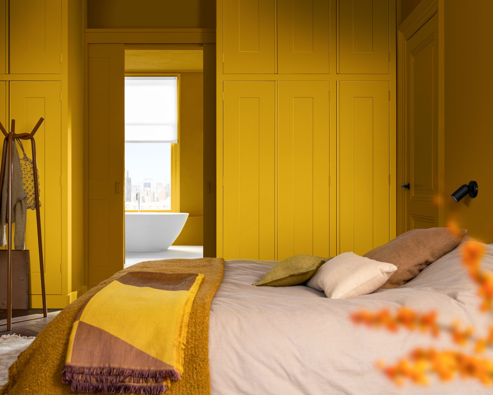
Or, for those who prefer a bold take on decorating with color, why not fully embrace this warming yellow and use it for color-drenching ideas? Much like this cozy bedroom, using this color in large doses to include the walls, ceiling, and built-in cabinetry creates a cohesive and statement look.
Color Palettes for True Joy
Looking for some expert-suggested color palettes to help you master yellow room ideas? Color experts at Dulux have crafted three color palettes for True Joy, each designed to cater to different decorating styles. Whether you want to transition the color scheme towards earthy tones or lean into vibrant brights, these palettes cover both.
The Bold color story
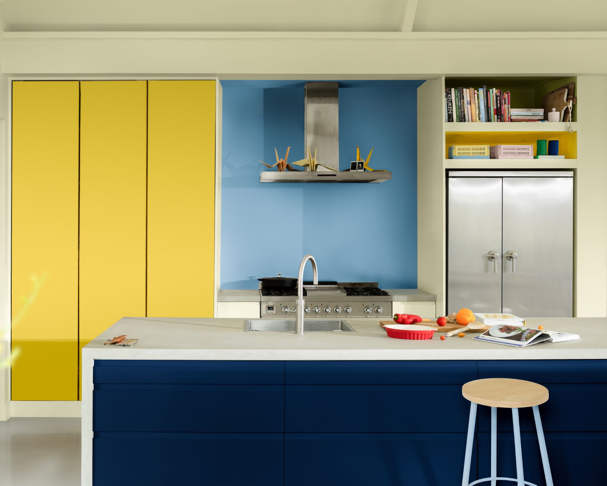
If you're a fan of maximalist color ideas, the Bold color palette is for you; a celebration of bright and cheery hues. In addition to True Joy, the palette includes shades such as Exquisite Coral, a firey orange; Intense Azure, a bright mid-tone blue; and Sapphire Salute, a rich navy blue.
As seen in this colorful kitchen, these bold shades are go-to choices for a vibrant color scheme that feels instantly mood-boosting year-long.
The Human color story
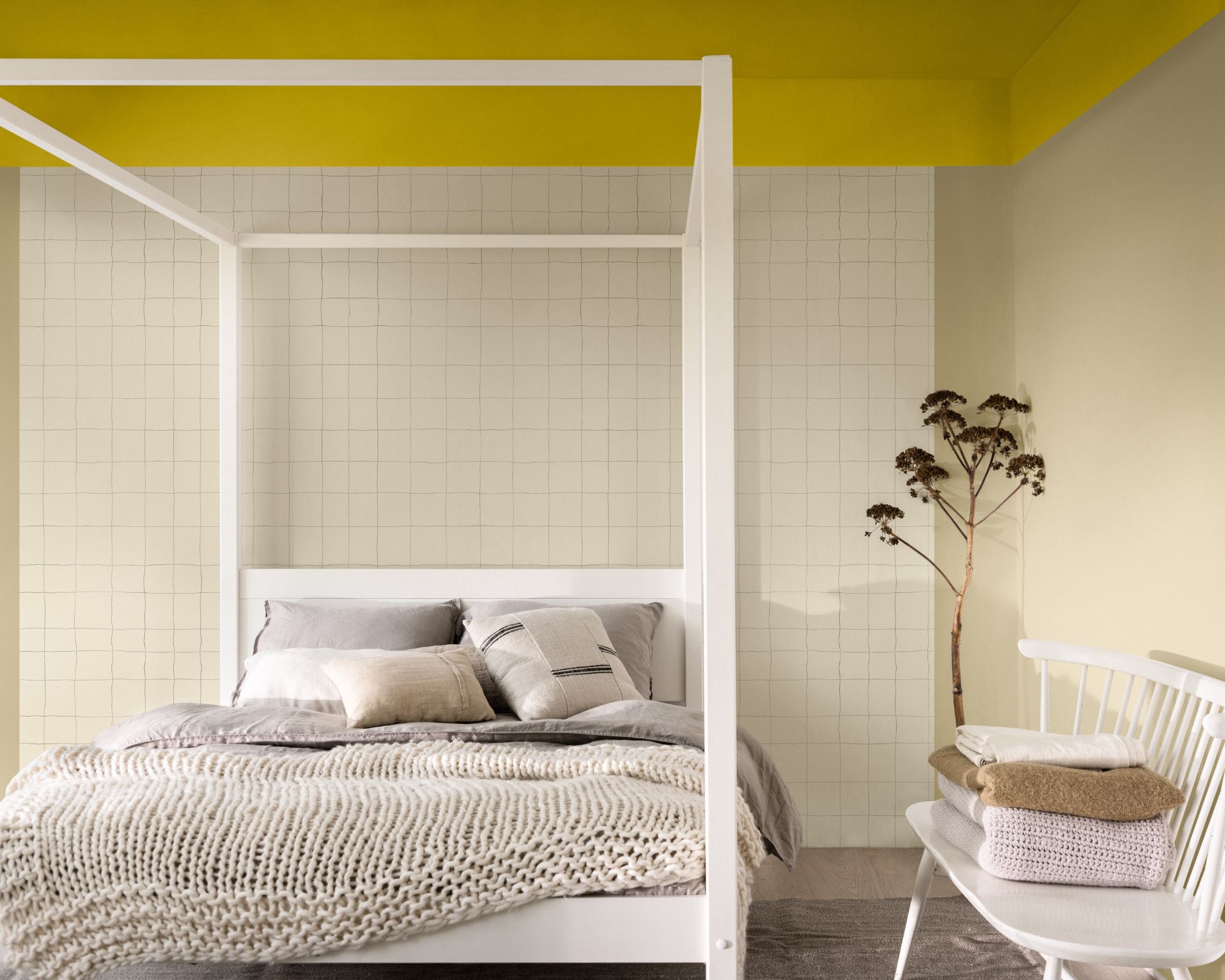
If you prefer decorating with neutrals, there's lots of inspiration for decorating with True Joy with the Human color palette. Offering a timeless color scheme that withstands trends, this palette is all about gentle neutrals that allow True Joy to shine.
Perfect for creating a relaxing bedroom, there are plenty of neutral paint colors in this palette; from the beige tones of Wild Wonder to the warming mid-brown, Acorn Cap.
The proud color story
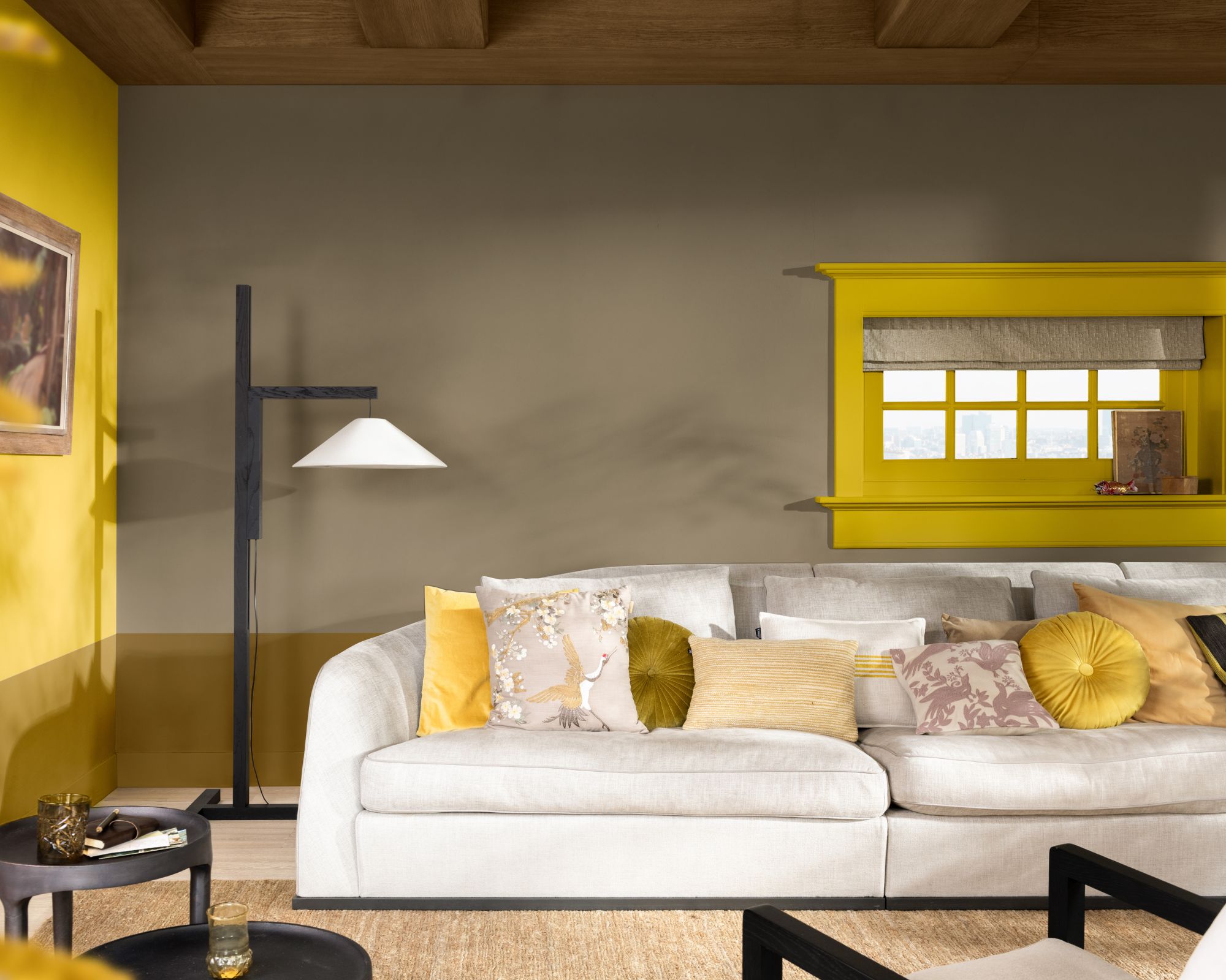
Lastly, the Proud color palette is all about 'eclectic' decorating, comprising a selection of rich, earthy hues to complement True Joy. These include Spiced Terracotta, a rich and earthy orange; Holiday Bough, a deep, moody green; and Moody Cobalt, a rich blue teal.
As seen in this living room, this palette is a great way to add depth to the vibrant tones of True Joy; while also offering a fall-ready scheme thanks to the colors' grounding, darker tones.
If the start of fall is quickly making your home lack color, we can't think of a more fitting hue to boost warmth and energize spaces. To find out more about this uplifting paint color, head to the Dulux website.

Emily is a freelance interior design writer based in Scotland. Prior to going freelance in the spring of 2025, Emily was Homes & Gardens’ Paint & Color Editor, covering all things color across interiors and home decor for the Homes & Gardens website. Having gained specific expertise in this area, Emily is well-versed in writing about the latest color trends and is passionate about helping homeowners understand the importance of color psychology in home design. Her own interior design style reflects the simplicity of mid-century design and she loves sourcing vintage furniture finds for her tenement flat.