This is one of the 'biggest decorating mistakes' you can make, according to an expert interior designer – here's what to do instead
Experts warn you should avoid making this classic mistake when it comes to choosing colors


Design expertise in your inbox – from inspiring decorating ideas and beautiful celebrity homes to practical gardening advice and shopping round-ups.
You are now subscribed
Your newsletter sign-up was successful
Want to add more newsletters?
While decorating your home can often be an ongoing project – swapping out items over the years to create a personal and homely space – when it comes to the basics of a room, you'll want to make sure you get it right the first time to avoid making interior design mistakes.
Warning us of one of the biggest decorating mistakes when it comes to color trends is interior designer Ines Kelly Mazzotta, Principal Designer at Kelly Hopter Interiors, who took to Instagram to share a video in which she says: 'The biggest decorating mistake that I see is homeowners matching colors with their furnishings and decor too closely, or pulling a color directly from one element and repeating.'
Inspired by the expertise of Ines, we're exploring this color mistake as well as explaining what you can do instead for more expert-approved home decor ideas.
Article continues belowA post shared by Ines Mazzotta (@kellyhopterinteriors)
A photo posted by on
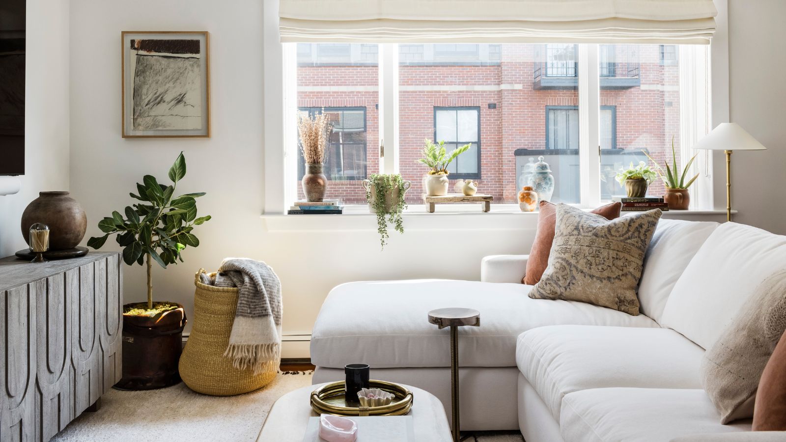
Admitting that this goes against 'conventional wisdom', Ines advises that for a cohesive look in a room, you should 'consciously choose different shades, tones, and tints of a color,' once you've chosen the primary color for your decor. 'That's what creates that beautifully nuanced and layered effect you see in spaces created by designers,' she continues.
This can be achieved by adding variations of one hue through soft furnishings, for example, rather than finding the perfect match to the color of the wall paint ideas. While neutrals may be forgotten about when it comes to color rules, Ines uses neutral living room ideas as an example to show that this approach can be just as effective, opting for a mix of neutral hues to create a layered look.
To aid you in choosing the right colors, Ines recommends taking reference from the color wheel, suggesting using adjacent colors to give a room 'real depth.'
But what makes this approach to working with color so effective? Ines tells H&G: 'I believe we are hard-wired to appreciate this level of nuance because that's what we see in nature – and we are part of the natural world. Look at any landscape and you realize it never includes just one shade of green or brown. There are darker greens and lighter greens, emerald greens and olive greens. It is that variety that gives a landscape depth and that's what we appreciate in our interiors too.'
Design expertise in your inbox – from inspiring decorating ideas and beautiful celebrity homes to practical gardening advice and shopping round-ups.
Whether you prefer warm color schemes or cool color schemes, this expert rule surrounding decorating with color is perfect for all of your home decor.

Emily is a freelance interior design writer based in Scotland. Prior to going freelance in the spring of 2025, Emily was Homes & Gardens’ Paint & Color Editor, covering all things color across interiors and home decor for the Homes & Gardens website. Having gained specific expertise in this area, Emily is well-versed in writing about the latest color trends and is passionate about helping homeowners understand the importance of color psychology in home design. Her own interior design style reflects the simplicity of mid-century design and she loves sourcing vintage furniture finds for her tenement flat.