7 reasons interior designers love Farrow & Ball paint – and why it's worth the investment
This is why interior designers swear by Farrow & Ball paint in their projects, and why you should too

Design expertise in your inbox – from inspiring decorating ideas and beautiful celebrity homes to practical gardening advice and shopping round-ups.
You are now subscribed
Your newsletter sign-up was successful
Want to add more newsletters?
If you want to know which paints are worth your spend, interior designers are the people to ask. And one of the paint brands they love to include in their designs is Farrow & Ball.
Even if you haven’t used the company’s paints, you might have heard of their fabulously named colors, like Dead Salmon or Hague Blue. But what are the reasons why Farrow & Ball is worth it in the opinions of the professionals, and – aside from being intrigued by the names – why might you want to follow suit when painting a room in your home?
To find out, we put the question to the interior experts and this is what they told us.
Reasons to use Farrow & Ball paint
When you’re searching for paint ideas, it’s great to see what interior designers select. Interior designers’ favorite Farrow & Ball colors include shades you may have heard of already even if you haven’t tried them, but here they explain why Farrow & Ball paint is worth investing in generally – inspiration to check out all the hues in the range.
1. Color favorite
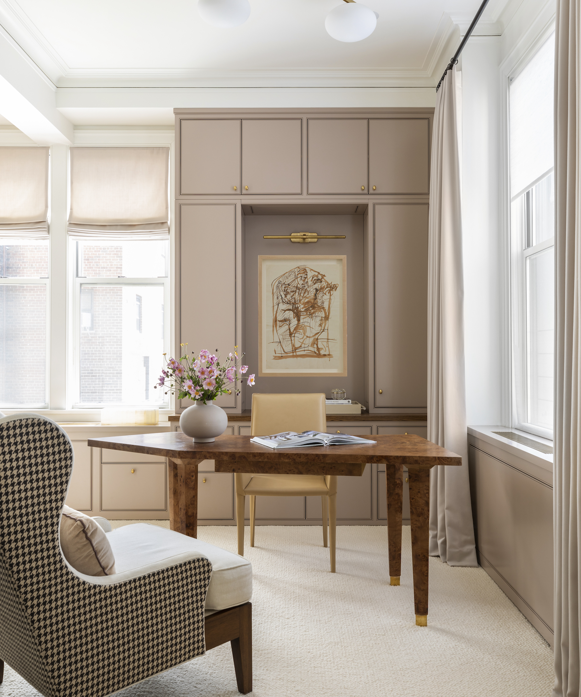
Marie Flanigan of Marie Flanigan Interiors frequently opts for Farrow & Ball’s paints, and there’s one color in particular she’s using currently.
‘Farrow and Ball paint, renowned for its exceptional quality, is a brand that I am constantly using in client homes,’ she says. ‘Most recently, my team and I have been using Farrow and Ball’s Dead Salmon color, but don’t let the name fool you. Dead Salmon is a gorgeous hue with a subtle blend of pink and gray undertones that make it incredibly versatile, effortlessly transitioning between traditional and contemporary aesthetics.
‘Whether being used on the walls of a sophisticated living room or bringing warmth to a quaint office, Dead Salmon infuses spaces with a rich depth that captivates and adds interest.’
Design expertise in your inbox – from inspiring decorating ideas and beautiful celebrity homes to practical gardening advice and shopping round-ups.

Marie Flanigan is an award-winning interior designer whose passion and achievements in design have positioned her as one of the nation’s best. She is classically trained and practiced architect, and her trademark style is evident through the sophisticated use of color, texture, and light. Every home she designs receives her personal signature of timeless elegance and innovative simplicity.
2. Sophisticated shades
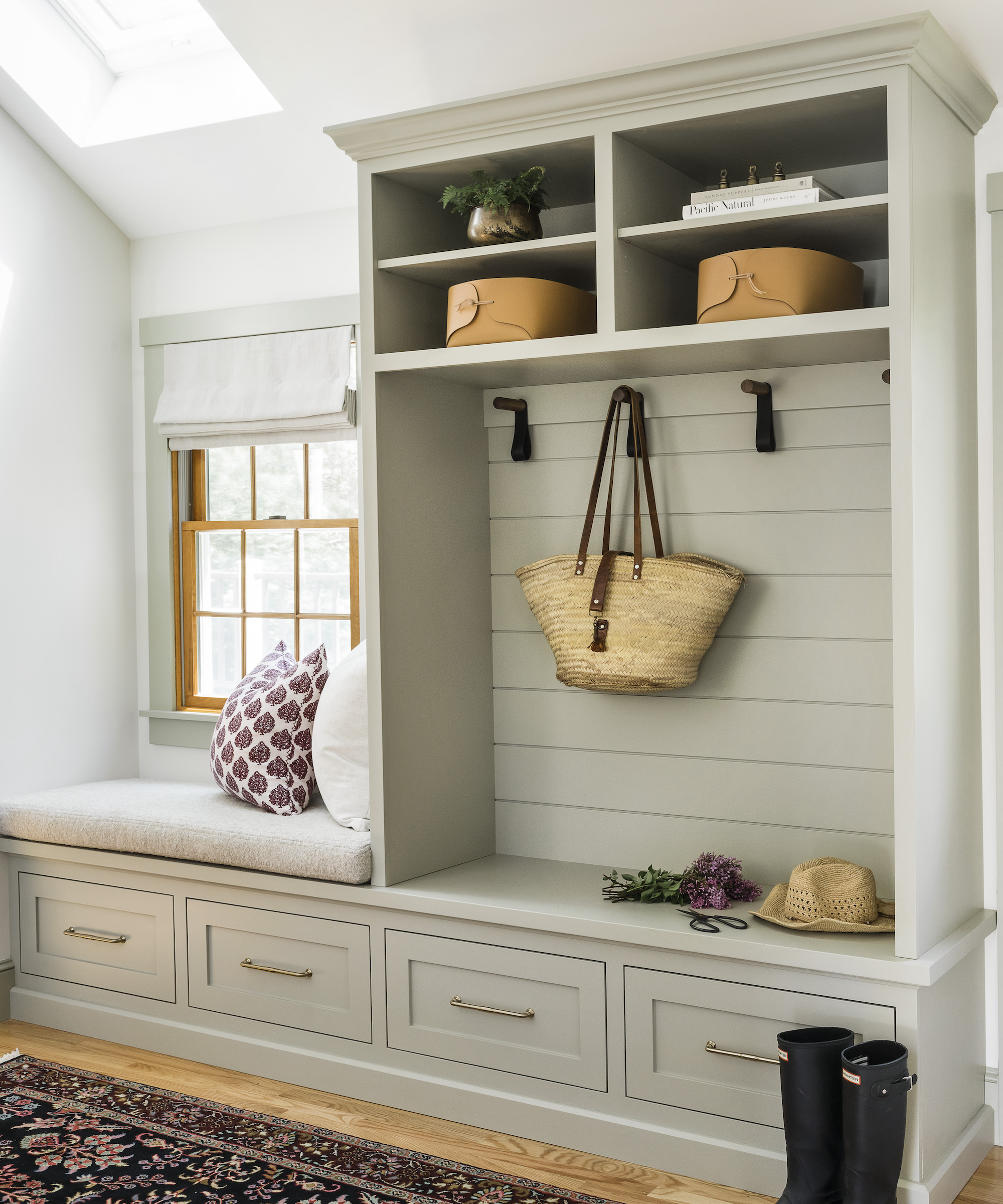
For Angela Hamwey, owner and creative director of Mackenzie & Co, the company’s paint colors offer what she’s looking for.
‘As interior designers, it is our job to understand and predict the trends for the design world,’ she says. ‘Right now, I think we can all agree that the stark whites and grays are out and we are seeing more people gravitating towards color. We find that Farrow & Ball has the perfect tones. As an English-inspired design studio, it is crucial that we select the perfect tone when adding color to a space. We tend to lean toward moodier tones where the colors do not seem “primary” and that have a sense of sophistication to them.
‘In our opinion, there are certain spaces that need color, especially mudrooms. In our Apple Lane project (shown above), we used Farrow & Ball French Gray for the cabinetry and trim color. While being a neutral color, Farrow & Ball captured a green undertone which is a great option for a client considering color but not wanting something bold. ’
Angela Hamwey is the owner and creative director of Mackenzie & Co, a full-service interior design firm located in Massachusetts. After completing a fashion degree, a realization occurred that her passion for textiles and good taste went far beyond clothing. Her creative intuition soon led her to Rhode Island School of Design to pursue her true calling of interior design. Her vast education coupled with her Scottish heritage have laid the foundation for what is now an award-winning design studio located on quintessential Cape Cod.
3. Beautiful blues
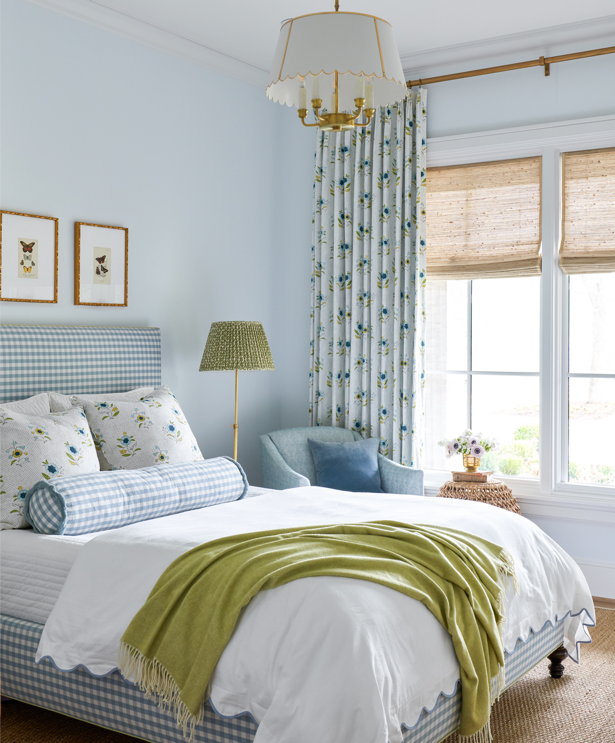
Katie Davis of Katie Davis Design is an enthusiast. ‘I always try to use Farrow & Ball in my projects,’ she says. ‘They have the best, richest colors. There’s nothing quite like it on the market.
‘In this project we used Borrowed Light in the primary bedroom – a go-to soft blue that we love. This color is calm and classic, adds a pop but isn’t overwhelming.’
4. Rich finish
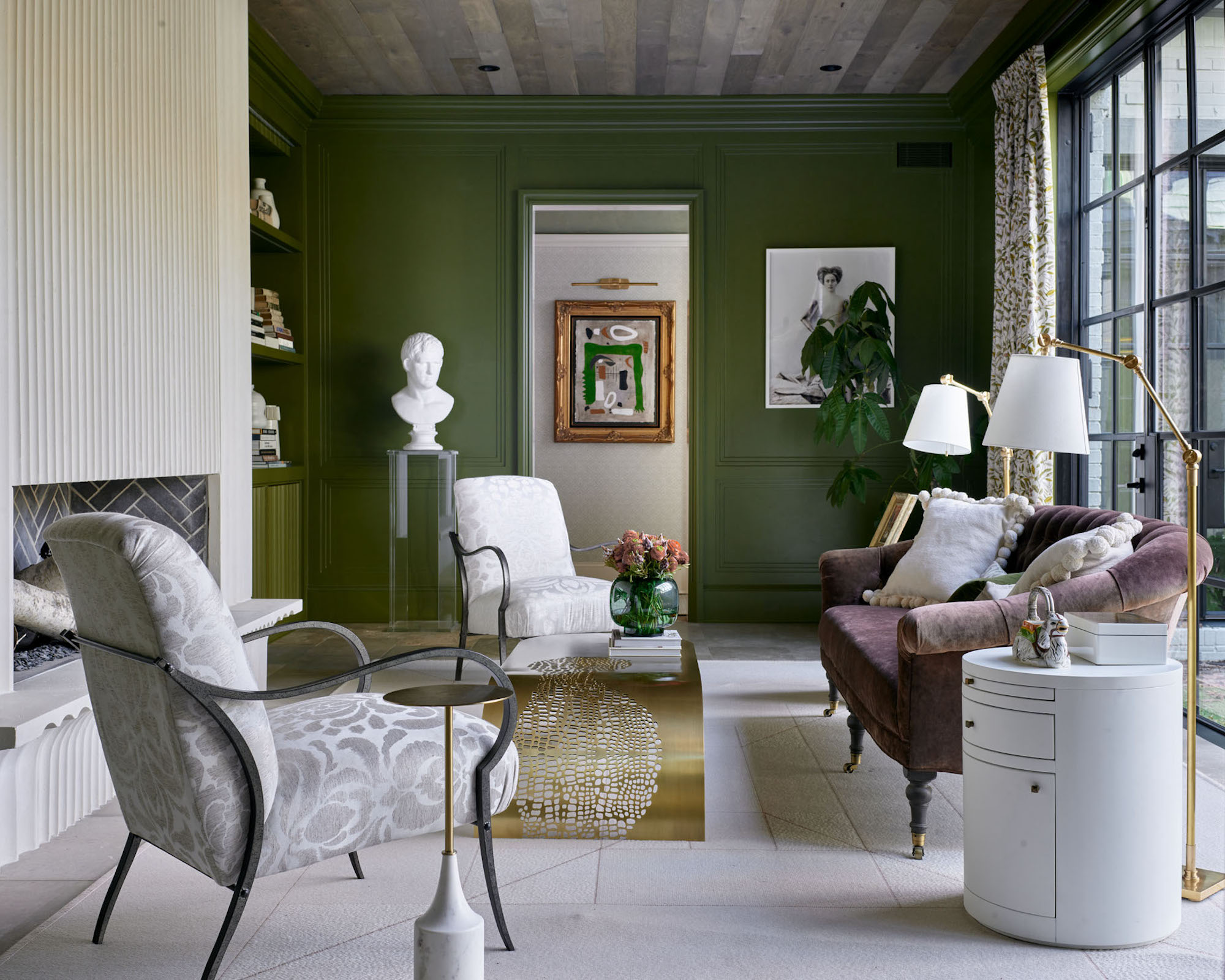
For Mark Williams and Niki Papadopoulos of Williams Papadopoulos Design, the depth of color is a reason to choose the paint.
‘Farrow & Ball paint offers a color range that is unique, rich, and provides a depth in hue that provides an elevated sophistication to interiors,’ they say. ‘In this project, we specified Farrow and Ball’s Bancha, a deep fresh green that makes a statement with its rich color.’

Mark Williams and Niki Papadopoulos are principals of Williams Papadopoulos Design. Williams Papadopoulos Design, formerly Mark Williams Design, offers a holistic view of how projects work inside and out. Whether creating whole home designs for new builds or renovations, respectfully updating historic homes, or reimagining upscale high-rise condominiums, the team at WP Design knows which elements are critical to the success of each client’s project.
5. Couture choice
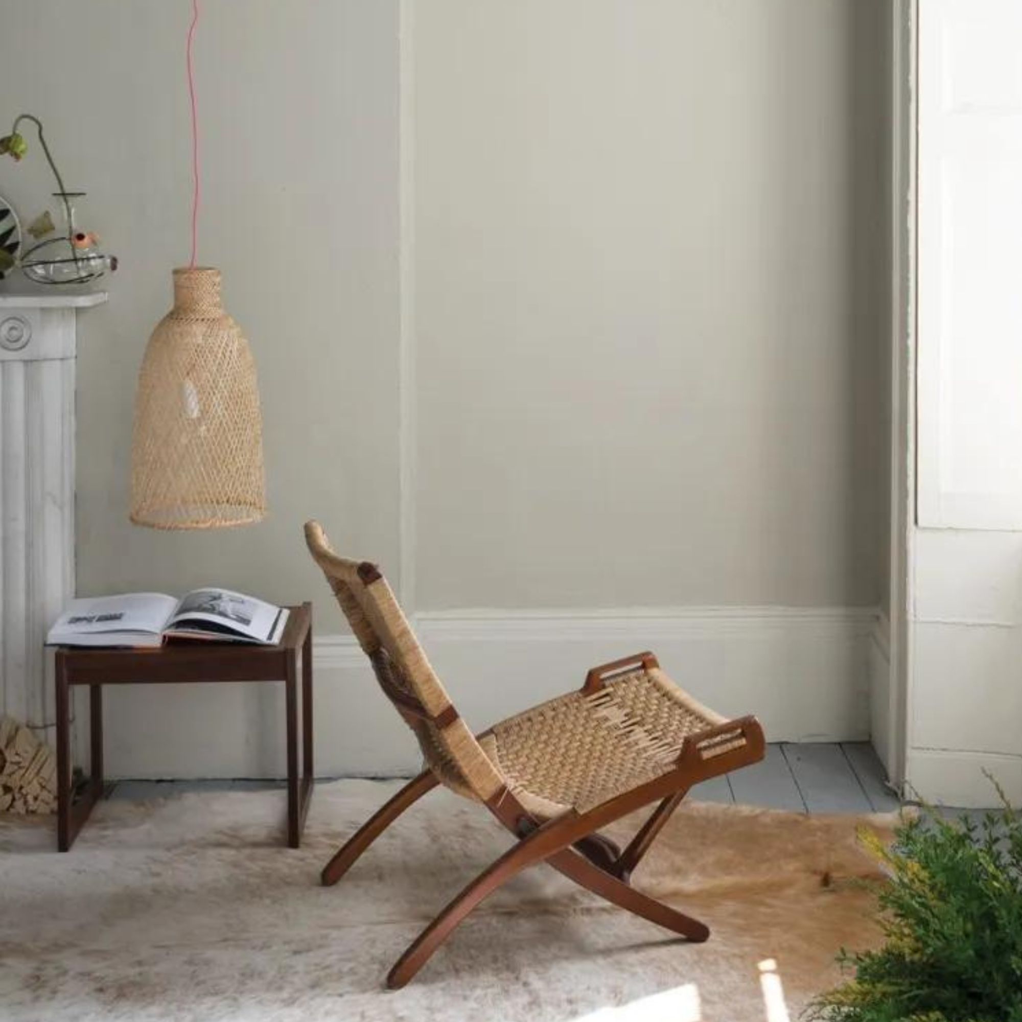
Farrow & Ball’s paints are worth it for the discerning paint buyer, according to Gaia Guidi Filippi, owner of Gaia G Interiors.
‘Farrow & Ball can be seen as a “couture” line of paint, and just like a couture fashion house, you aren’t just paying for a high quality product, but for a legacy and a level of research and expertise that speaks very much to the most discerning tastes,’ she says.
‘Farrow & Ball’s pigmented colors are so unique and so evocative, each one has a way of creating a whole mood. Redecorating and remodeling are expensive endeavors and I feel that, in the grand scheme of these expenses, paint is the absolute least of them and yet it has such an enormous impact.
‘If you select a Farrow & Ball color for a project, chances are that you were intensely drawn to that color for its depth and nuance. In my experience, once I have selected a color from this brand, nothing else will do.’
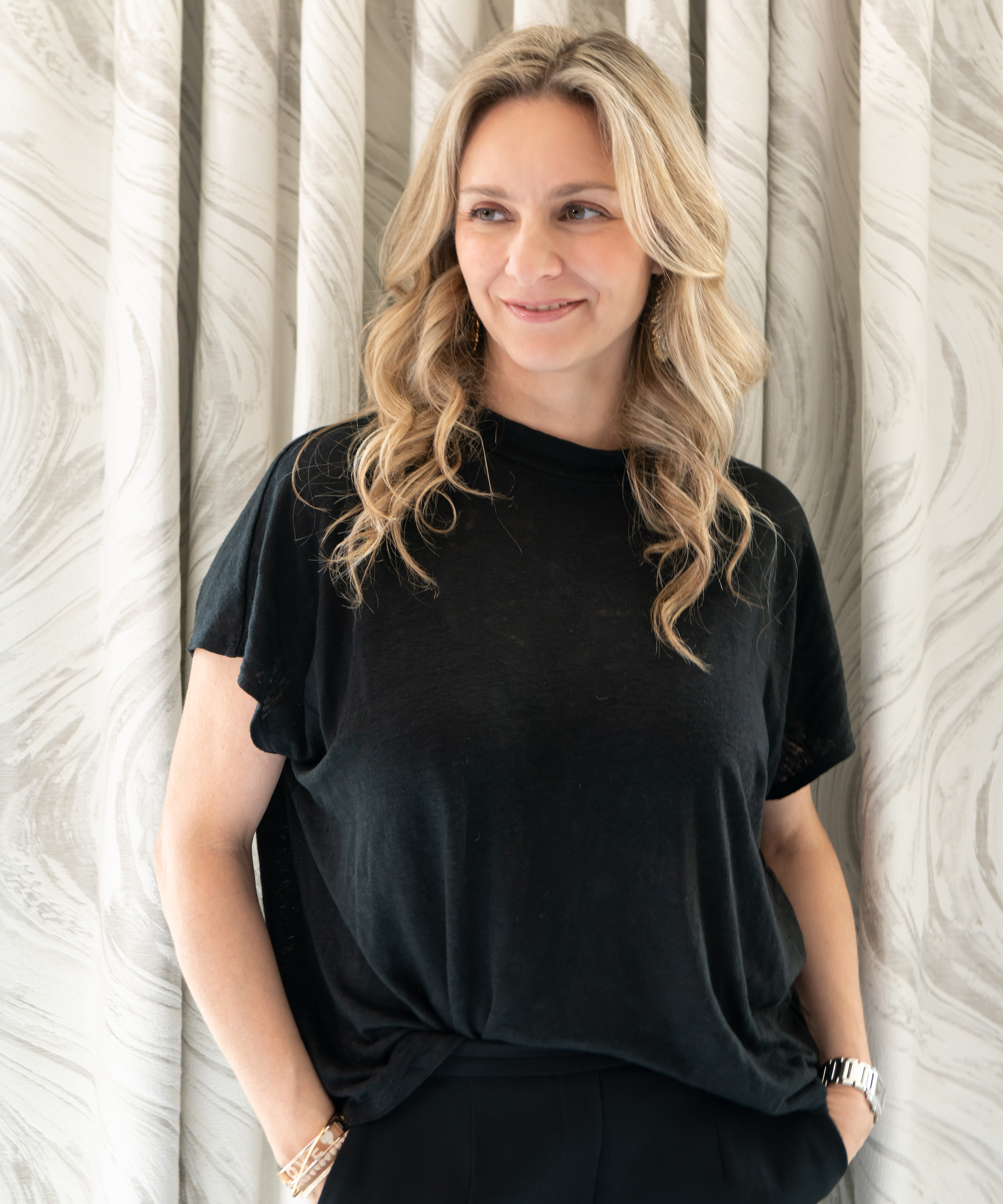
Gaia Guidi Filippi is the owner and principal designer of Gaia G Interiors in Dallas, TX. She founded her interior design firm out of a love of combining her innate creativity, discerning eye and endless resourcefulness to help people create spaces they can’t stop looking at. Her creative process merges beauty and functionality, culminating in bespoke, design-forward yet welcoming spaces.
6. Eco credentials
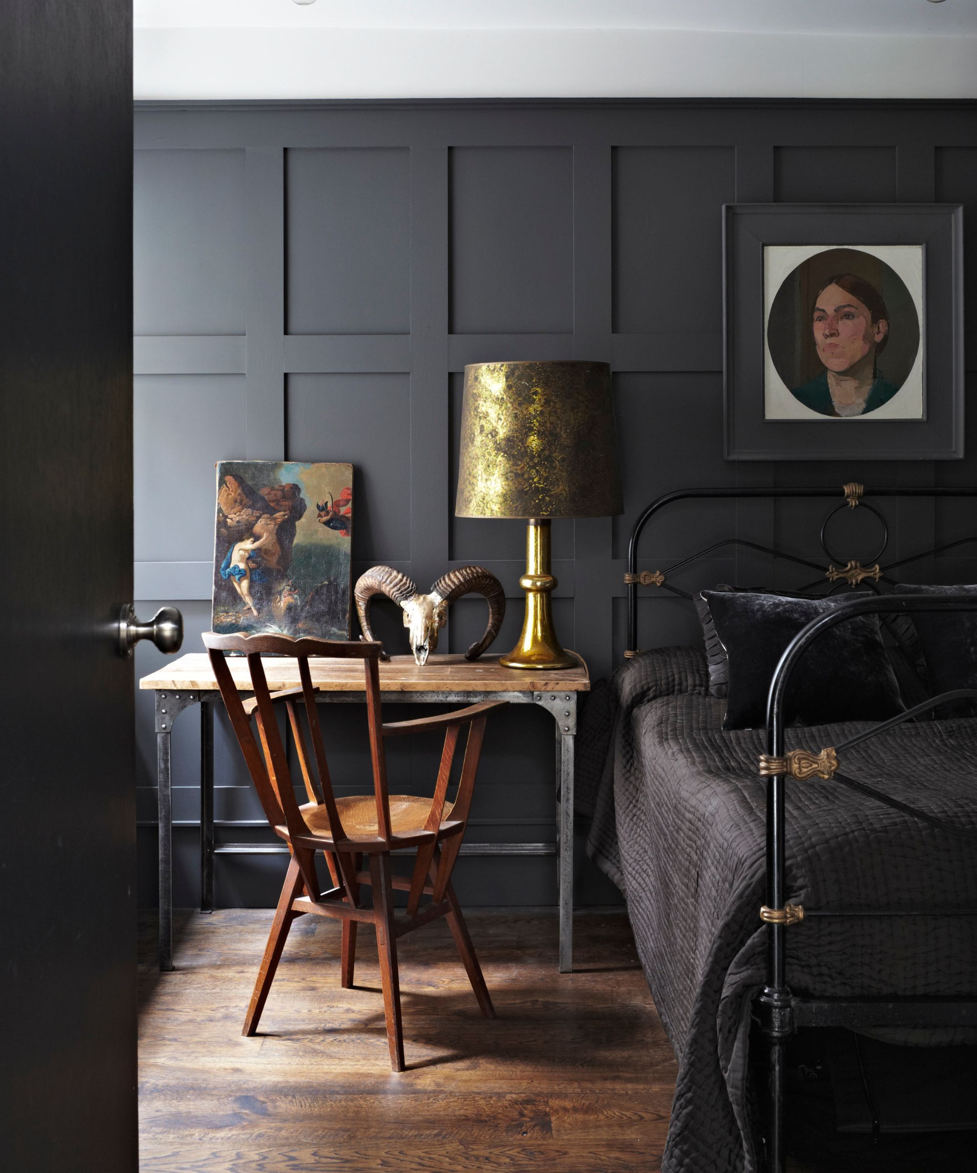
Interior designer Artem Kropovinsky considers Farrow & Ball’s paints worth it for their eco credentials, along with their other features.
‘Its high quality and unique color depth characteristics make it the number one choice for the projects where these features play a crucial role, which makes the paint more expensive, though for those who value incomparable color and finish in their designs it is worth every cent,’ says Artem.
But he equally praises its eco-friendly qualities – as do his clients. ‘It is a good investment for eco-conscious clients due to its low VOCs and high quality and environmentally friendly ingredients,’ he says.

Based in New York, Artem Kropovinsky boasts extensive global design experience spanning a decade. With a commitment to sustainability and authenticity, Artem, alongside his dedicated team, undertakes projects both in the US and internationally, earning recognition through prestigious design awards. Artem is the founder of Arsight, an esteemed global design firm known for its expertise in residential and commercial interior design.
7. Made to last
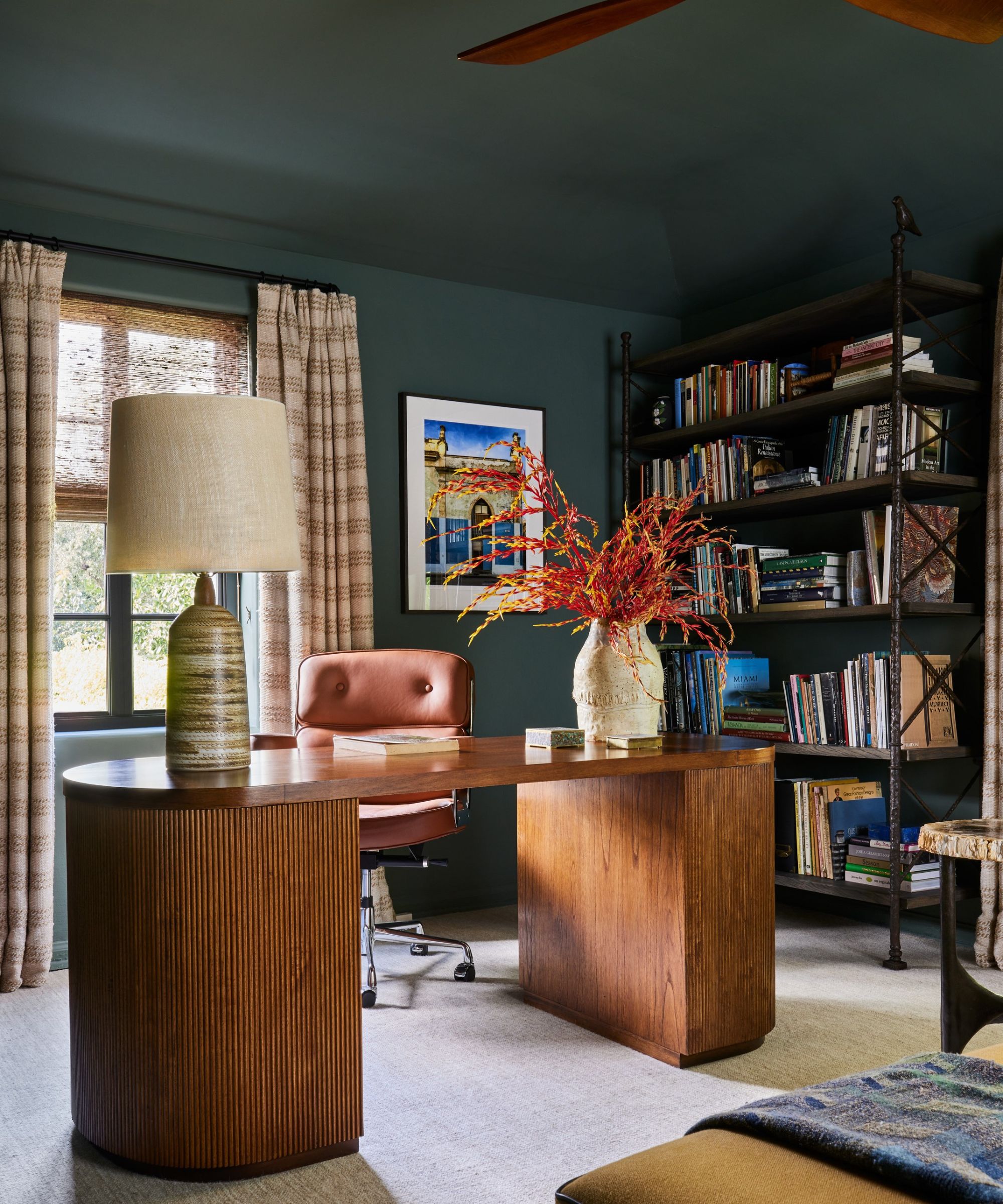
For Kathy Kuo, founder at Kathy Kuo Home, it’s paint that offers great durability. ‘Ideally, you want your interior paint to look fresh and beautiful for years to come so it really is worth it to invest a little more in high quality paint like Farrow & Ball,’ she says.
‘Farrow & Ball is known for its meticulous color development process and high quality materials and formulas; you’re ultimately going to get a deeper and more precise color and a finish that is going to look like new for longer.’

Kathy Kuo is a celebrated interior designer and international guru within the home and lifestyle space. She has over 20 years of experience in the design industry.
If you follow the lead of these interior designers and opt for Farrow & Ball paint for your interior, think paint finishes as well as colors for a look that lasts. Choose a finish that can stand up to heavy traffic for entryway paint ideas and kids’ room paint, and one that will tolerate humidity for kitchens and bathroom paint ideas.

Sarah is a freelance journalist and editor. Previously executive editor of Ideal Home, she’s specialized in interiors, property and gardens for over 20 years, and covers interior design, house design, gardens, and cleaning and organizing a home for Homes & Gardens. She’s written for websites, including Houzz, Channel 4’s flagship website, 4Homes, and Future’s T3; national newspapers, including The Guardian; and magazines including Future’s Country Homes & Interiors, Homebuilding & Renovating, Period Living, and Style at Home, as well as House Beautiful, Good Homes, Grand Designs, Homes & Antiques, LandLove and The English Home among others. It’s no big surprise that she likes to put what she writes about into practice, and is a serial house renovator.