This is the ‘somber’ color combination to avoid in your garden, reveals expert
Landscaper and gardening expert Dan Pearson is acclaimed for his plant pairings – but this is the one he always avoids


Garden landscaper Dan Pearson has built his career around his rich exteriors color palette. The designer and RHS Chelsea Flower Show regular has curated spaces for the likes of Paul Smith and Jonathan Ive – but there is one painting that you will never see in his portfolio.
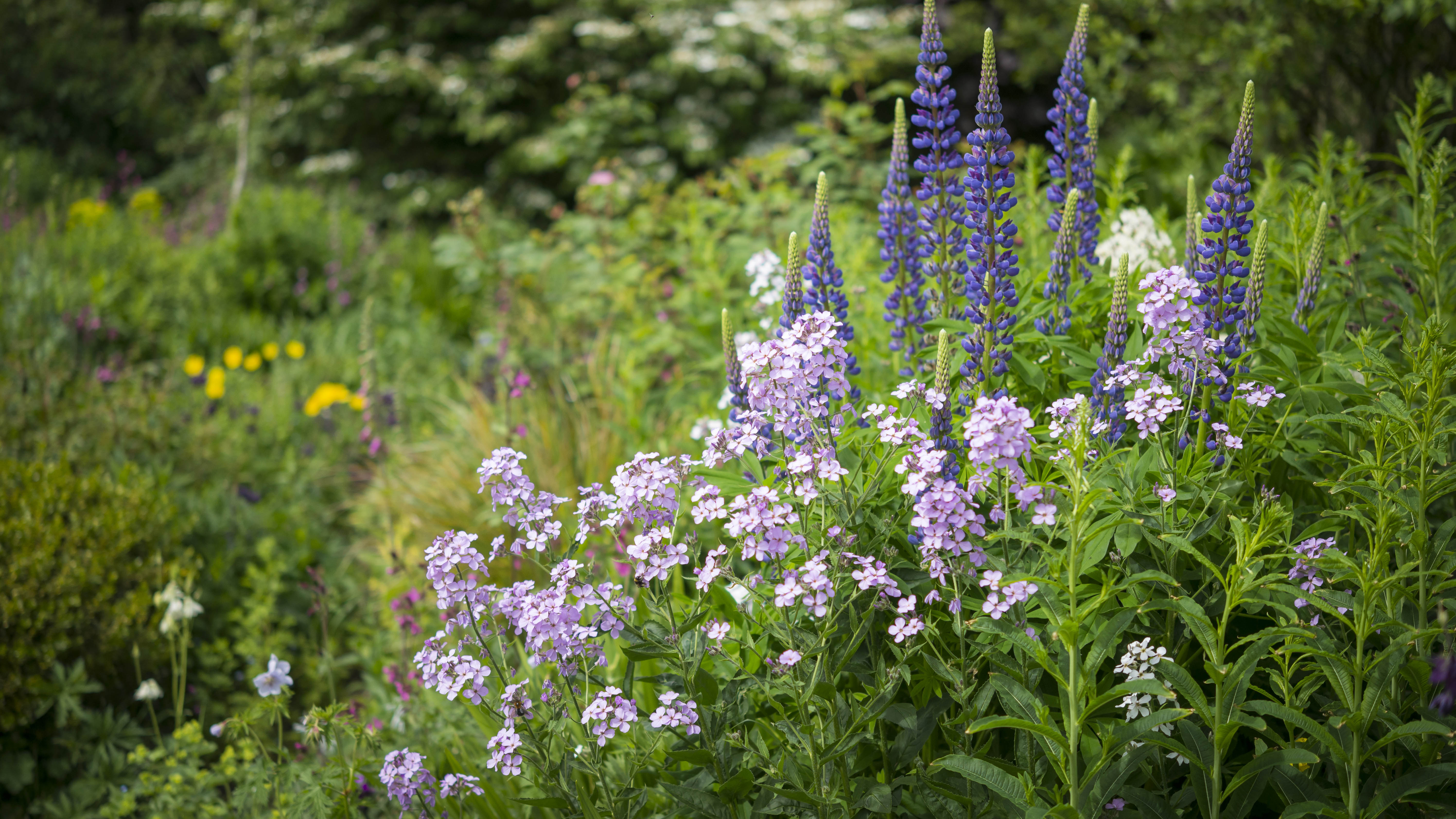
Sharing his colorful garden ideas with H&G, Dan Pearson warned against pairing purple – explaining that – despite its richness – the shade holds ‘somber’ undertones.
Why you should avoid a purple pairing in your garden – according to Dan Pearson

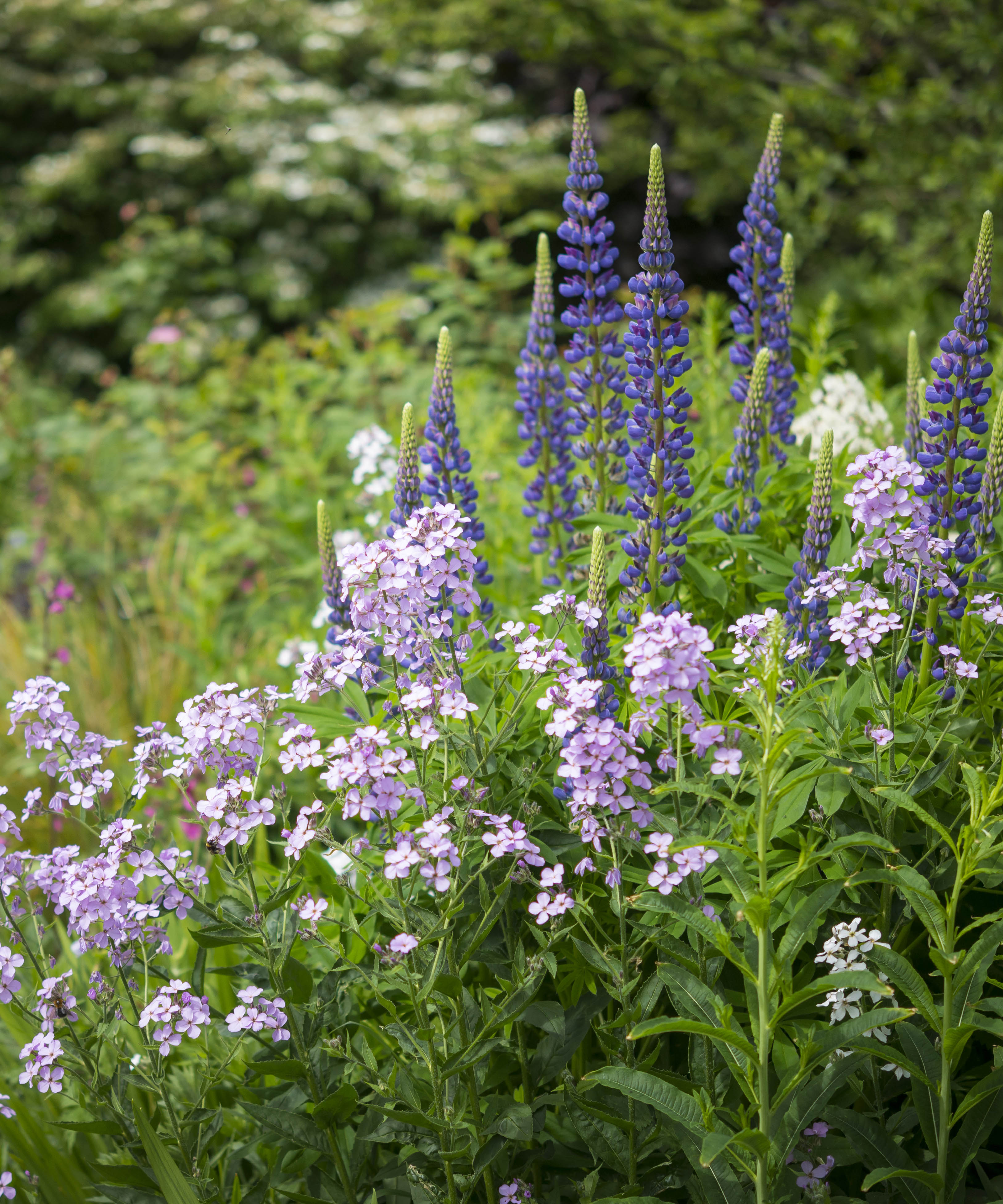
‘Purple is a really interesting color. It can be rich and sumptuous, and it can make somewhere feel quite sophisticated. But it can also be somber,’ Dan explains. ‘In some cultures, it is used as a color that lines coffins. I had never thought of it like that, but some people feel quite strongly about it in terms of it being a somber color.’
Article continues belowTherefore, with these associations in mind, Dan revealed that he avoids using purple and purple together. ‘I wouldn’t tend to think about doing a garden that is all purple as it might all get a bit serious,’ he says.
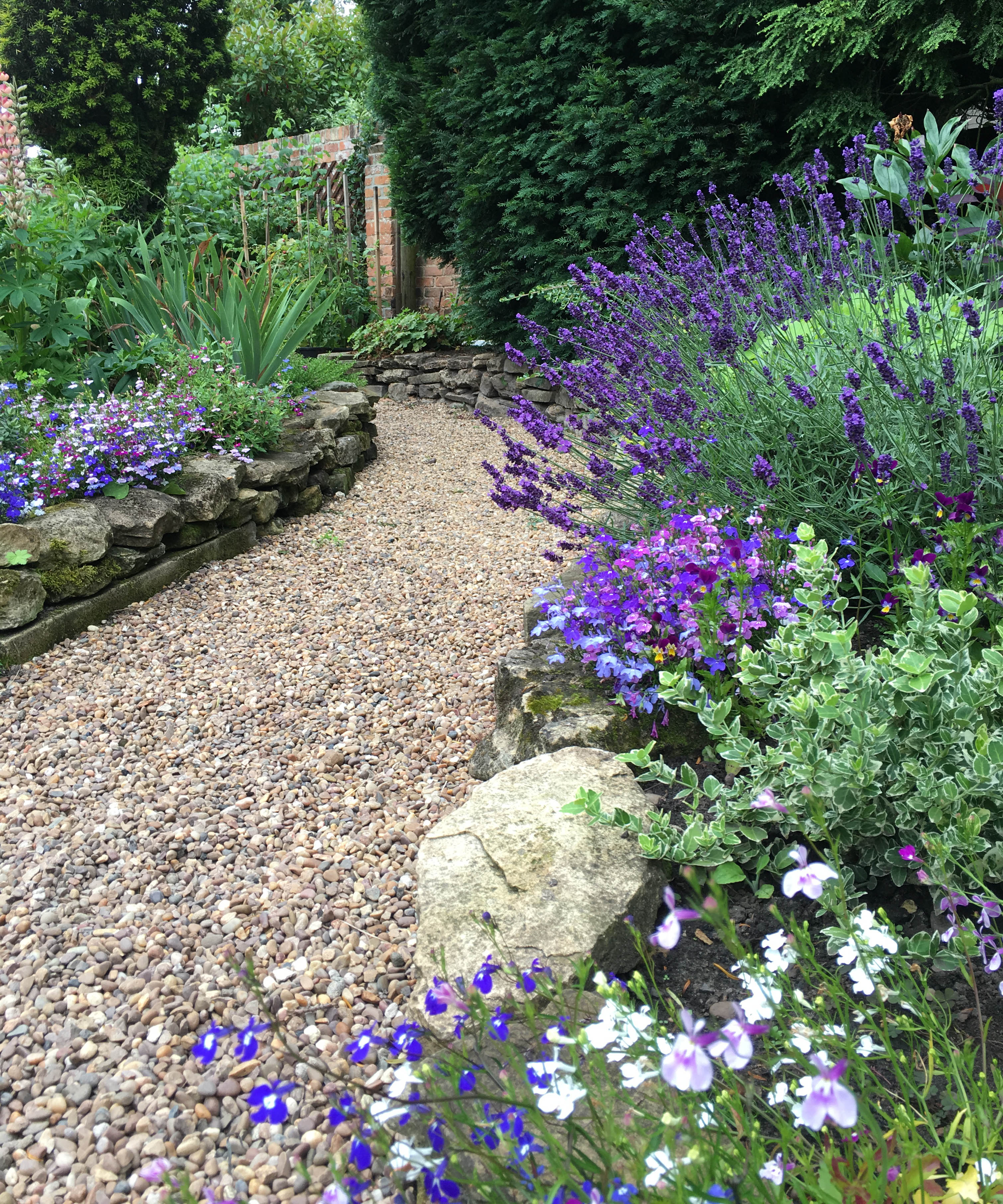
However, you don’t need to rearrange your backyard landscaping ideas entirely. Instead, the designer suggests that you can still bring purple into your scheme when paired with the right colors.
Which colors work best with purple?

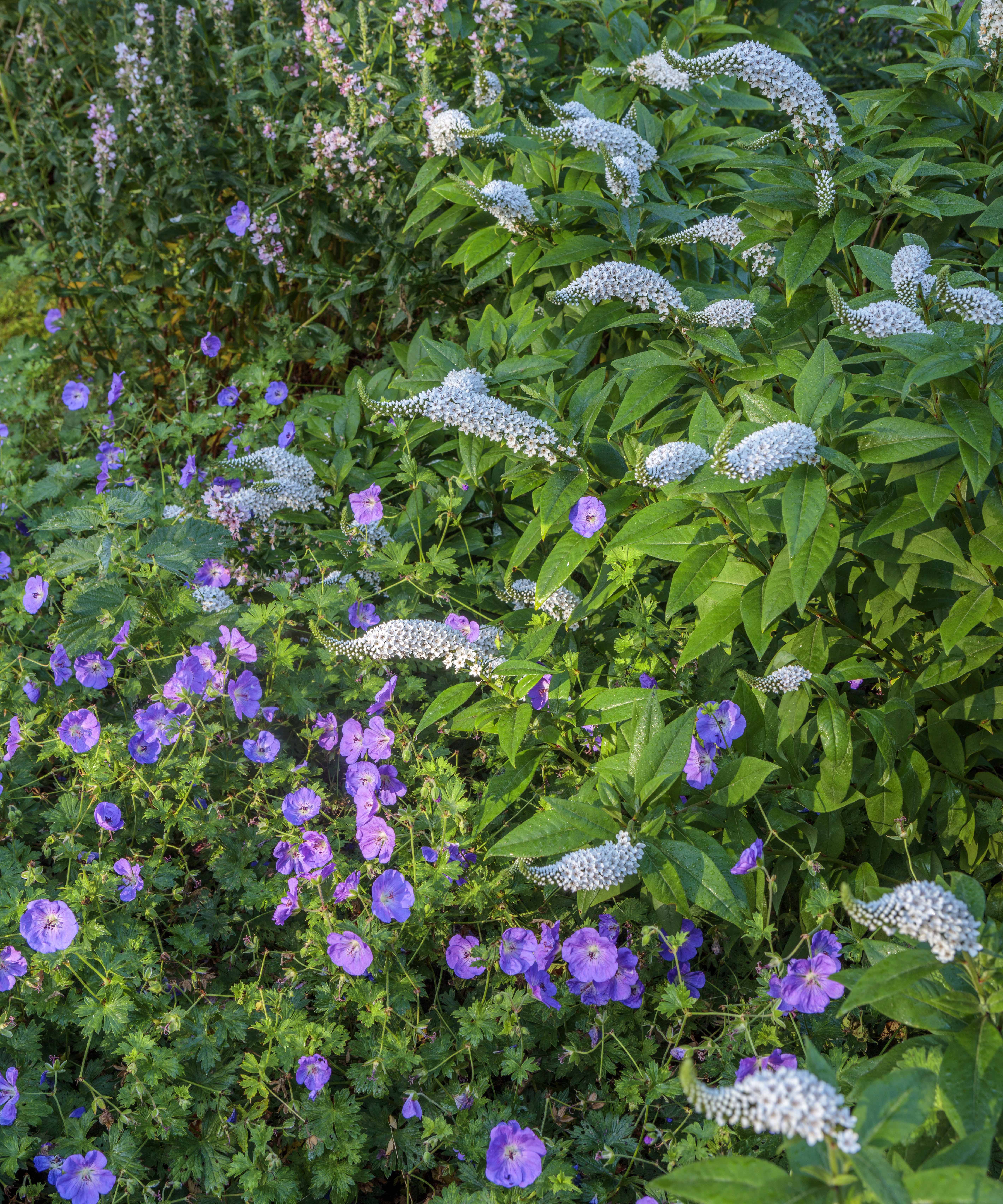
‘I like to use purple for its richness and its ability to absorb light,’ Dan says. ‘I tend to contrast it with an accent. You might put it against its opposite, which might be lime green, for instance. This will punch the purple. ’
If you’re looking to ensure you avoid a somber aesthetic, Dan recommends pairing purple borders with a contrast of silver. ‘This takes the somber feeling away because you’ve pulled the color forward against the light of the contrast,’ he says.
Design expertise in your inbox – from inspiring decorating ideas and beautiful celebrity homes to practical gardening advice and shopping round-ups.
When thinking about color combinations in the garden, the rules remain similar to what you may practice in your interiors. ‘In terms of layering or grouping, it’s quite important that you have a degree of contrast, but not so much of it that it becomes distracting or confusing,’ the designer adds.

Springtime 2022 is no longer somber – and our country garden ideas have never felt quite so lively.

Megan is the Head of Celebrity Style News at Homes & Gardens, where she leads the celebrity/ news team. She has a history in interior design, travel, and news journalism, having lived and worked in New York, Paris, and, currently, London. Megan has bylines in Livingetc, The Telegraph, and IRK Magazine, and has interviewed the likes of Drew Barrymore, Ayesha Curry, Michelle Keegan, and Tan France, among others. She lives in a London apartment with her antique typewriter and an eclectic espresso cup collection, and dreams of a Kelly Wearstler-designed home.