9 on-trend beige bathroom ideas that create a soft and calming space
Warmer than white, cooler than cream, here's why beige is the perfect neutral for your bathroom...

- 1. Get the beige right
- 2. Pair white and beige for a fresh color scheme
- 3. Go for a darker shade of beige for a touch of drama
- 4. Choose a warm beige in a bathroom to soften the space
- 5. Layer up textures in a beige bathroom
- 6.Contrast biege with a soft green
- 7. Pair beige with darker finishes for a more moody feel
- 8. Lean into the warmth of beige with natural materials
- 9. Contrast shapes and finishes
Design expertise in your inbox – from inspiring decorating ideas and beautiful celebrity homes to practical gardening advice and shopping round-ups.
You are now subscribed
Your newsletter sign-up was successful
Want to add more newsletters?
Beige is such a versatile shade, and yes we know it has a reputation for being a bit safe, some have even called it boring, but this chameleon of a neutral can look every bit as chic and interesting as a bolder color palette. And we would also like to make the point that playing it safe is in fact no bad thing, especially when it comes to rooms that see a lot of use like bathrooms. You want to pick colors that will stand the test of time and won't date just a few years after you have your new bathroom installed.
'I think neutrals, especially beiges, and that whole coffee and cream aesthetic were over-used in the early noughties and are now associated with that era of London luxury property development. However, I feel something timeless about a layered off-white or beige interior, especially in a bathroom where we seek shades that we won’t tire of,' says designer Deborah Bass.
And what's great about decorating bathrooms is that paint isn't the only way to bring in color. You have plenty of opportunities to bring in different textures, finishes, and materials in the form of tile, hardware, and accessories. It's this depth that's going to give you beige at its most interesting. But more on that to come.
Here we are going to make a solid case for beige bathroom ideas. We asked some of our favorite designers for tips on decorating with beige to create a calming and serene space that feels both classic and on-trend.
1. Get the beige right
Beige, like any neutral has many forms. There are darker beiges that border on being pale brown (doesn't sound lovely but these are the most on-trend way to do beige right now) then you have yellowy beiges and super pale beiges that border on white. There are plenty of shades in between too. And then there's the added complexity that they can all look different in different spaces depending on the light, aspect, and size. So the key to getting the right beige is to order samples – whether that's paint, tile, or wallpaper.
'Beiges and other lighter tones adapt more strongly to the light and so sampling in situ is of paramount importance, paint samples in various parts of the room and check them at various times of day, making sure to paint onto the correct substrate,' suggests designer Deborah Bass.
'Always checking against the ceiling and woodwork colors too; pairing a beige wall with a brilliant white ceiling can be jarring if the undertones clash – beiges or neutrals usually have blue, yellow, red, or lilac undertones, and can be well paired with off-whites with similar undertones. Researching the age of the property that is being painted will also push you in the right direction, beiges that we have used effectively recently in period London properties have had warm, red undertones which balance a cool light beautifully – Farrow & Ball’s Stony Ground is a good example.'
Design expertise in your inbox – from inspiring decorating ideas and beautiful celebrity homes to practical gardening advice and shopping round-ups.
2. Pair white and beige for a fresh color scheme

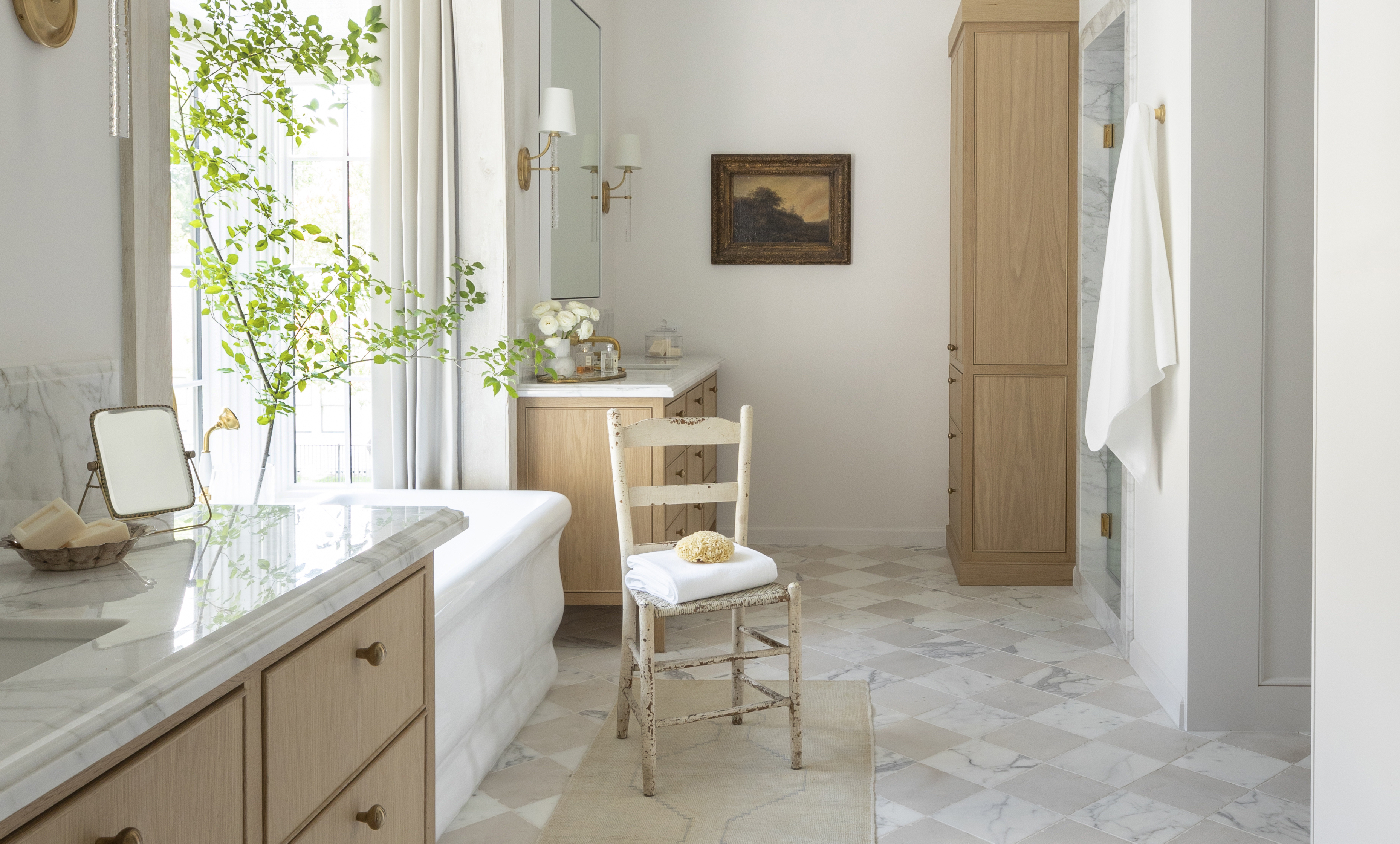
Beige and white are such a classic combination. In fact, we would go as far as to say, if you are using beige in any space you need to bring in a dose of white. White contrasts the beige in a really subtle way, it lifts those slightly muddier tones and gives the color palette a freshness that would definitely be lacking if you went for an all-beige scheme.
Likewise, beige warms up white. So you get this neutral, bright but warm, fresh but welcoming space. And it can work well as a bathroom color scheme because you have plenty of opportunity to bring in both of these shades with tiles, paint, furniture, and finishes. We love the white and beige pairing in the checkerboard tiling used in this bathroom designed by Marie Flanigan, as she says: 'It's the details that make the design in this space. The checkerboard flooring includes warm beige accents that beautifully play off of the white oak accents and light paint color.'
3. Go for a darker shade of beige for a touch of drama

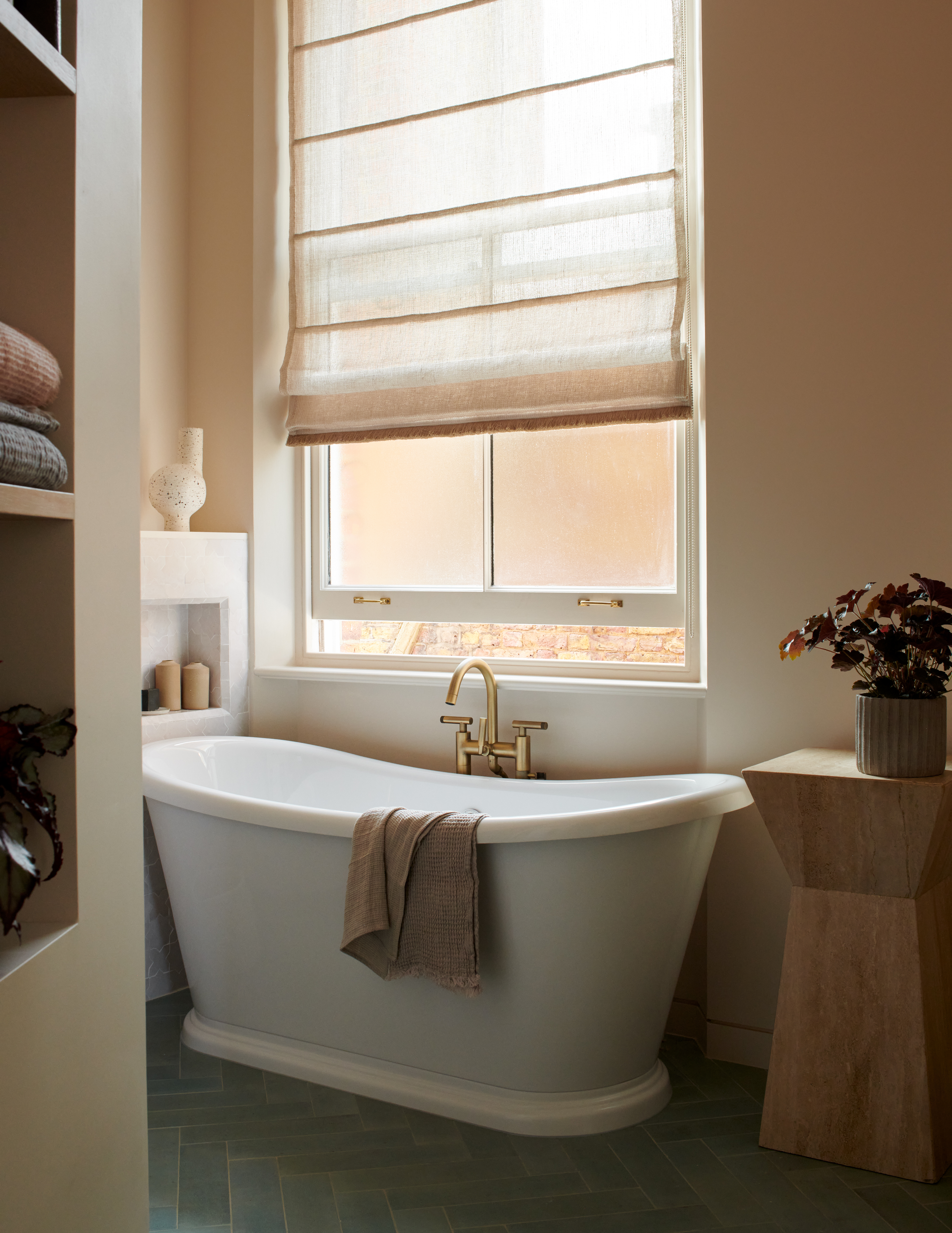
When we talked earlier about the color trend for those darker, almost brown, beige tones, this shade is what we were referring to. It's still beige, it's still light and still neutral but there is a touch of drama here. It's a lovely shade for grounding a neutral scheme, adding something just slightly deeper.
It works so well used as an accent color in this bathroom designed by Colombe. It's the perfect room color for the slubby texture of the shower curtain and highlights the floor tiles too. 'This bathroom is very bright and spacious and the brief was a delicate reference to the 1950s when the tenement house was built, hence the white and beige tiles on the floor,' explains the studio's founder Marta Chrapka.
'They were combined with white tiles on the walls and to complete the whole neutral scheme, the walls were painted in a lighter milky beige color too. I think that's how beige works best in a bathroom, when combined with various shades of white on the sanitary tiles and stoneware, warming the room and nicely reflecting the light.
4. Choose a warm beige in a bathroom to soften the space
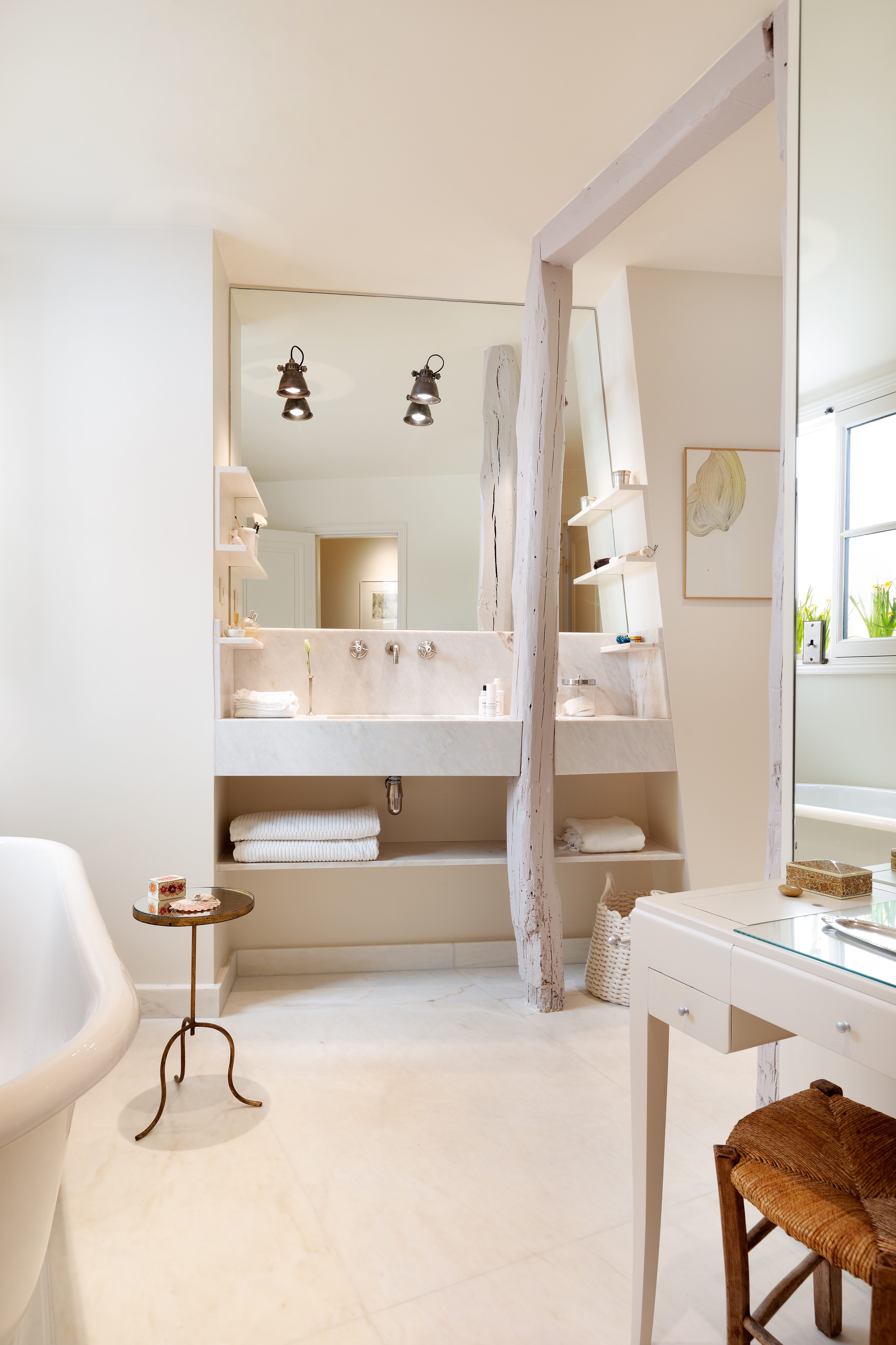
There's one beige we would always say to avoid and that's a cool beige, especially in a bathroom that's likely to be filled with hard surfaces and shiny finishes. Not only is a grey-toned beige going to look cold and unwelcoming, but it's also a really unflattering color that creates unflattering light. Something you definitely don't want in a bathroom.
This covetable bathroom designed by Kasha Paris perfectly demonstrates why a warmer-toned beige is always the way to go. This bathroom feels cozy and welcoming as well as sleek and sophisticated. 'This is actually my bathroom!' says founder Betsy Kasha. 'I chose the warmer shade as I always think about what colors will be most flattering. Any surface that reflects light will affect what you see in the mirror. This is why a warm beige is better in a bathroom than a grayer beige, no matter your complexion.'
'That beam was supporting and could not be removed, so I decided to build the marble sink and counter around it. I am grateful for the constraint because, in the end, it made me more creative and adds wonderful texture.' she adds.
5. Layer up textures in a beige bathroom
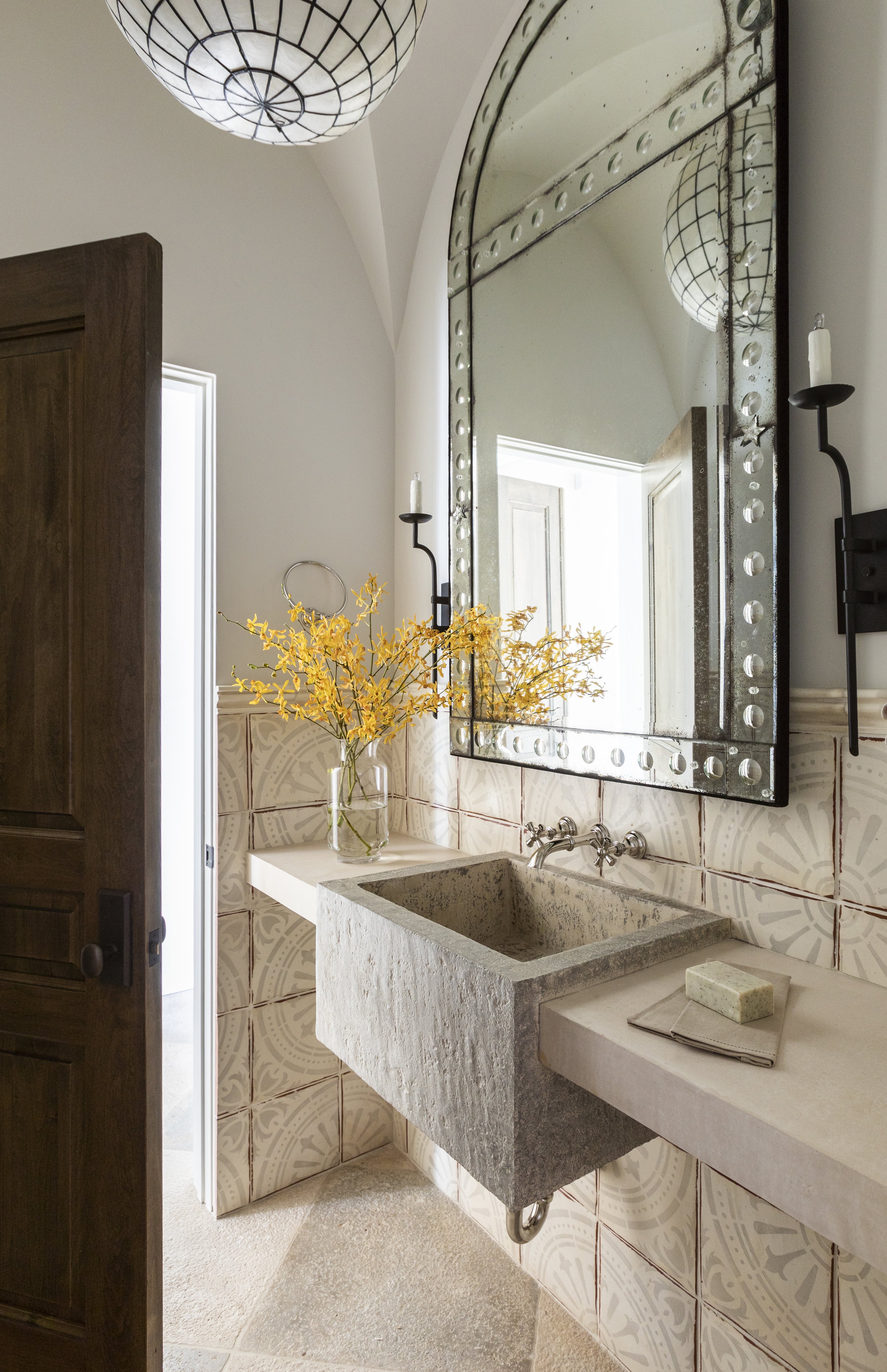
When going for a neutral color scheme in any room, textures are key. Now, in a bathroom, you don't have the accessories that make this simple – the cushions, the throws, the bedding, but you can bring in that texture in your fixtures, fittings, and of course tile choices.
This bathroom is filled with tactile finishes – the marble countertop, the stone sink, the textured tile, and the beveled mirror. For a tiny powder room, it's filled with interest. 'This color was chosen to make the powder bath feel like a jewel box space,' explains Marie Flanigan. 'The beige undertones are a departure from the rest of the home and complement the stone slab sink and tile wainscotting.'
'In a beige bathroom I would always suggest working with texture and a variety of finishes to create a richer scheme that chimes well tonally without being dull' adds Deborah Bass. 'I adore some of the neutral stones such as Branco de Mos limestone for creating a crisp and practical background stone against which other finishes, such as a beige tadelakt or a fun marble mosaic tile, can feature. The more utilitarian elements of bathrooms such as white WCs and the interior designer's nightmare – towels – often look better against more neutral finishes.'
6.Contrast biege with a soft green
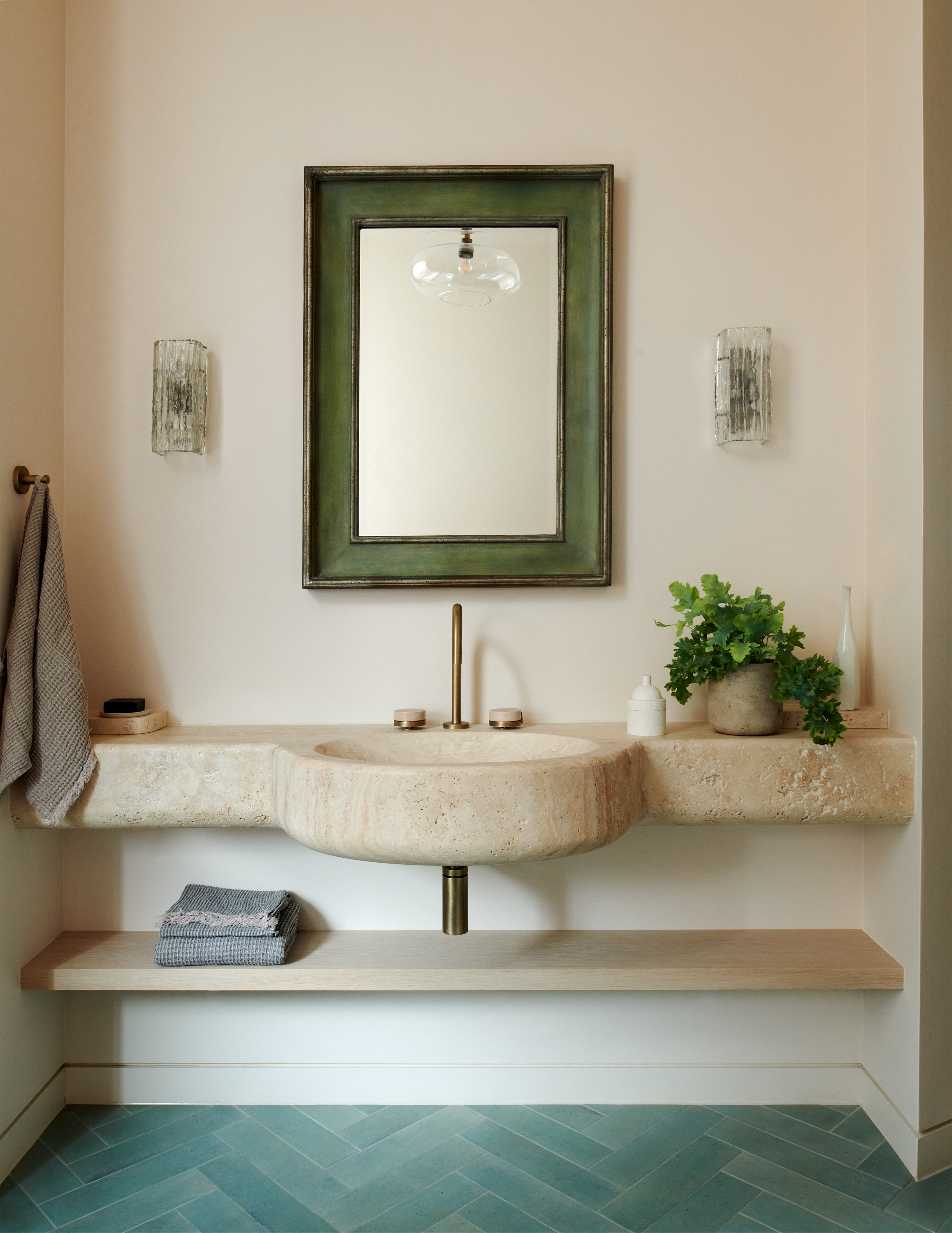
If you are looking for the best accent color for beige, a soft sage green works perfectly. As can be seen in this bathroom designed by Tala Fustock, it creates a contrast but not a really stark contrast. The scheme is still very much on the soft and calming side. Like white, it adds a freshness to the beige and creates a very natural color palette that's perfect for a bathroom.
'Beige can work great throughout many rooms because of its calming neutral color. It also provides an easy way to switch up the accent colors in your space whenever you want to freshen the room!' says designer Joshua Smith. 'In a beige bathroom, you can accessorize with hand towels, bath mats, and even a shower curtain if applicable. To modernize a beige space, you can incorporate green to continue the neutral and natural feeling for a peaceful space.'
7. Pair beige with darker finishes for a more moody feel
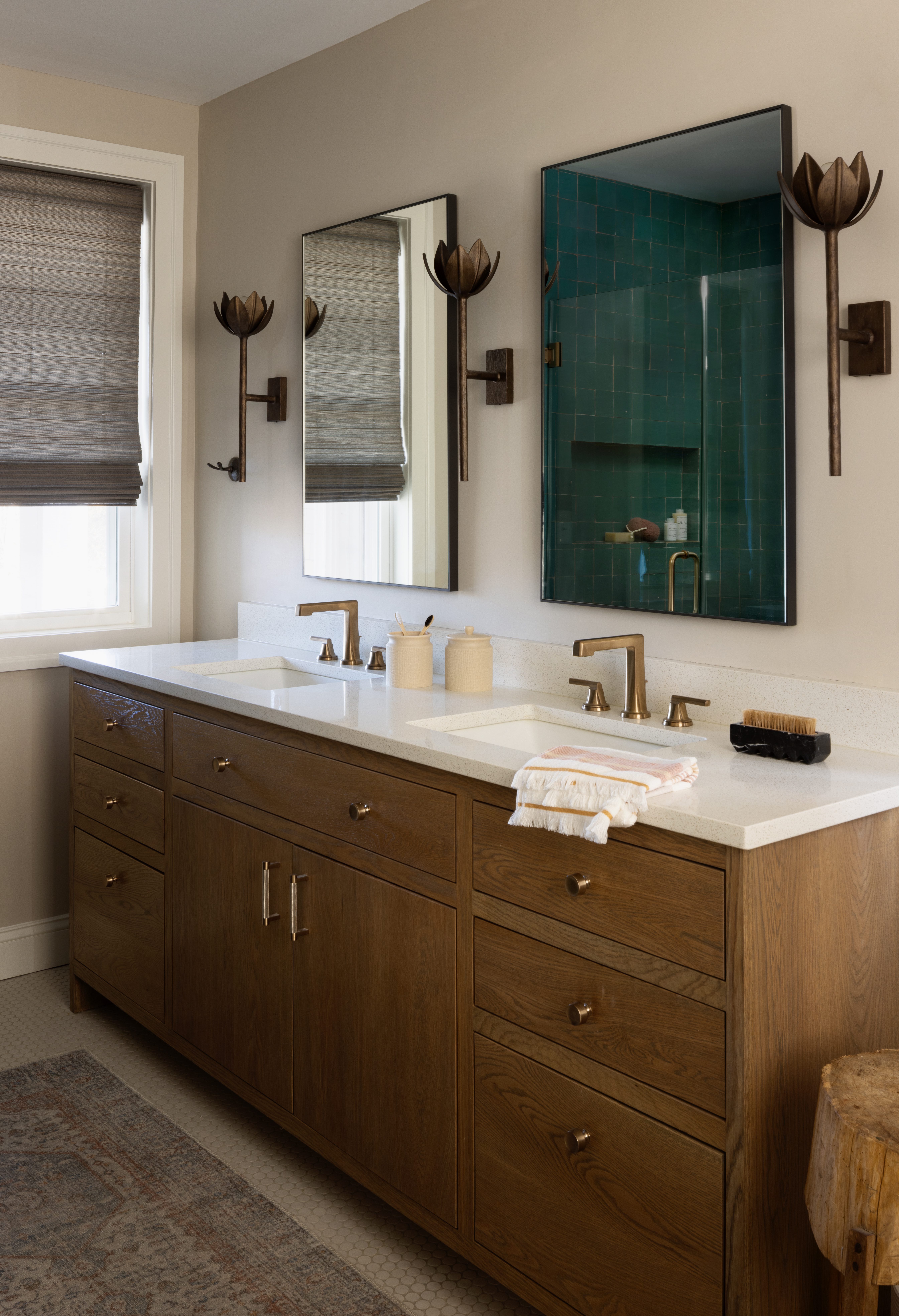
And if you want to keep the scheme totally neutral, but create some contrast, brass and beige were a combination made in interior design heaven. The warm tones of both work beautifully together. Choose it for your bathroom lighting fixtures, fittings and hardware to add a moody edge to a beige bathroom.
'This bathroom gets the most amazing afternoon sun and we wanted to capitalize on that with a quiet white oak vanity custom designed and stained for this client' explains Jennifer Walter, founder of Folding Chair Design. 'We opted for a neutral paint on the walls and ceiling (Benjamin Moore Edgecomb Gray HC-173) and kept the overall look pretty moody with these bronze sconces by Julie Neill for Visual Comfort. The homeowner’s love of the feminine came through when we showed her these and she just knew they were right for the room!'
8. Lean into the warmth of beige with natural materials
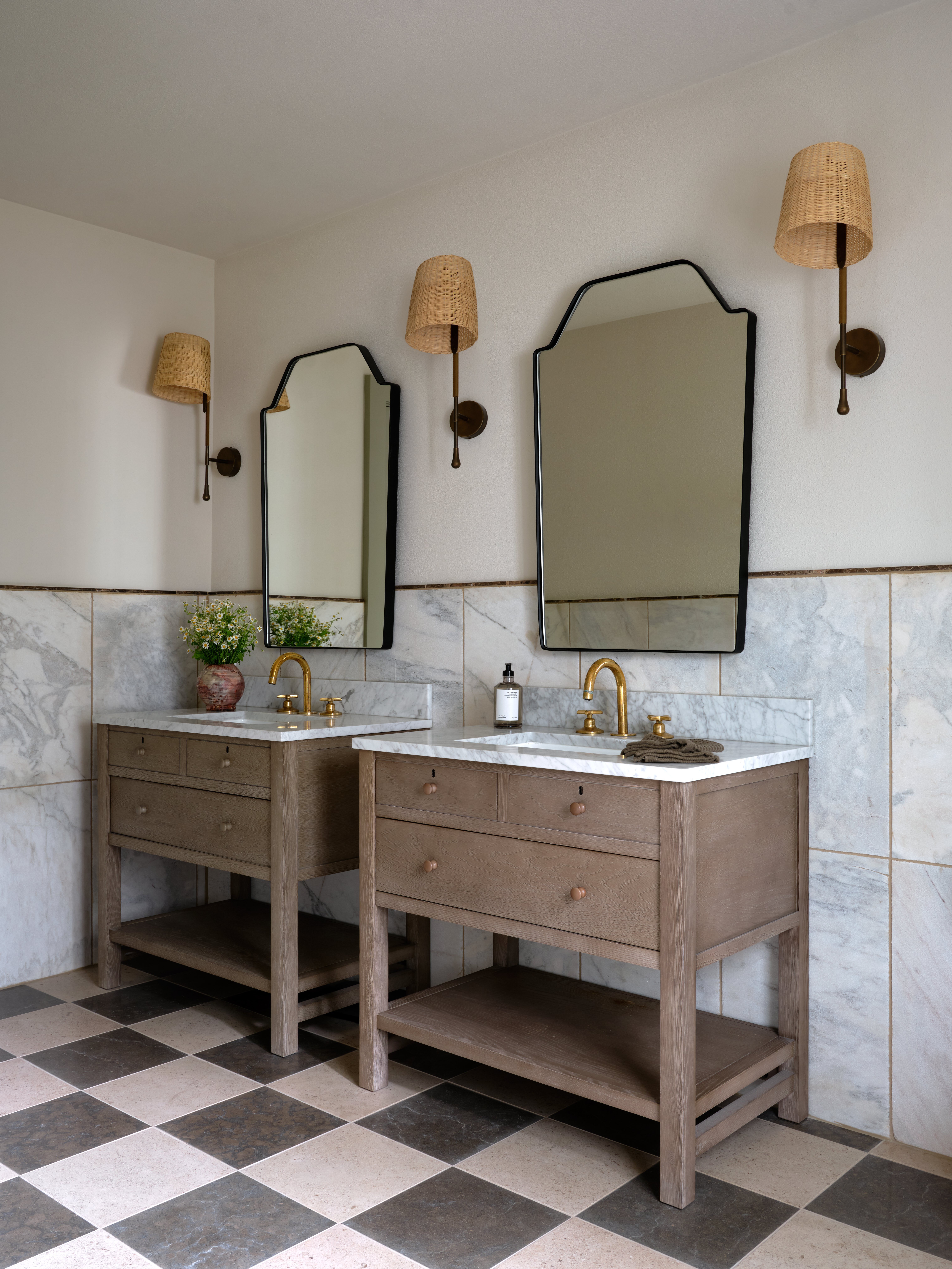
Wooden hues and beige are another beautiful pairing that works wonderfully in bathrooms. We love how wooden furniture instantly softens a bathroom, making it feel less... bathroom-like, and is a lovely contrast to all the hard surfaces going on.
However, you want to make sure you pick a wood that matches the undertones of the beige you have chosen (or vice versa). See how in this space designed by IDCO Studio the wood has a warm greige finish, and the beige used for the walls mirrors those undertones. The darker grey tones used in this space do the same, the grey on the marble tiles works with the warm woods and beiges because it too has the same warmer undertones. Essentially, when creating this kind of tonal neutral effect, success lies in the right undertones – order samples, bring them together, and check it works.
9. Contrast shapes and finishes
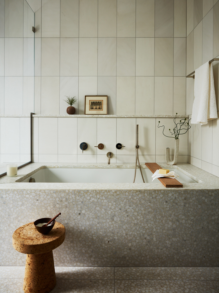
Terrazzo has definitely shed its retro skin and is becoming a really chic alternative to tile in a kitchen or bathroom. It adds so much depth and interest, hence why it can be a great addition to a beige bathroom where the color scheme is going to be relatively simple but you still want the space to have character.
Its beautiful busy design is the perfect way to bring some subtle pattern into a space where wallpaper might not be an option and is ideal for breaking up blocks of tile as seen in this terrazzo bathroom designed by J. Patryce Design & Company. Combined with the larger-scale bathroom wall tiles and the accents of wood and cork, this bathroom is filled with beautiful contrasts.

I am the Head of Interiors at Homes & Gardens. I started off in the world of journalism in fashion and luxury travel and then landed my first interiors role at Real Homes and have been in the world of interior design ever since. Prior to my role at H&G I was the digital editor at Livingetc, from which I took a sabbatical to travel in my self-converted van (not as glamorous as decorating a home, but very satisfying). A year later, and with lots of technical DIY lessons learned I am back to writing and editing, sometimes even from the comfort of my home on wheels.