This home is a masterclass in clever color choices – you'll want to replicate the smart-looking brown grouting in the kitchen
Botanical prints and rich jewel tones abound in this upscale retreat...

Design expertise in your inbox – from inspiring decorating ideas and beautiful celebrity homes to practical gardening advice and shopping round-ups.
You are now subscribed
Your newsletter sign-up was successful
Want to add more newsletters?
A busy family with three school-age children embarked on this beautiful French-style new build to create more space in a 'forever home' that they loved.
The French country decor in this home is easy to recreate as it doesn’t rely on closely coordinated accessories, matching suites of furniture, or lots of designer pieces. Instead, its eclectic, mismatched style is all part of the charm.
The project was carried out by Naomi Rigas, of Envy Interior Design Studio. Naomi says: 'We built on the site of the client's existing home, which was a small three-bedroom cottage built in the late 1920s. Rather than remodeling their existing home, which still would have left them with limited space for their family, they decided to build a new home that could be customized to fit their needs.'
Article continues belowThe house is located in the Easton Addition neighborhood in Burlingame, California, which is about 30 minutes south of San Francisco. A charming neighborhood full of older, it's peppered with original houses from the 1920s, with wonderful large trees and close proximity to the city’s main street.
The clients really wanted a French country-style home and sought out Michael Imber of Michael Imber Architects to make that vision come to life.
A large kitchen was integral to the design of the house as the owners both cook daily – the space planning of the house revolved around this idea of a larger, very functional kitchen with a spacious family room area right off it for lounging and TV watching.
'Each space needed to be functional to maximize the square footage,' says Naomi. 'Even the formal living room and dining room are used by everyone in the family for puzzles and crafts.
Design expertise in your inbox – from inspiring decorating ideas and beautiful celebrity homes to practical gardening advice and shopping round-ups.
'In addition to the family room off of the kitchen, they also needed more play space for the kids along with a small gym area. Because the neighborhood is mostly on the smaller one and two-story houses, a basement was added to accommodate these areas.
'It was also necessary that the materials and finishes we chose didn’t feel too "new" as the goal was for the home to look like it had always been there.'
Take the full tour below:
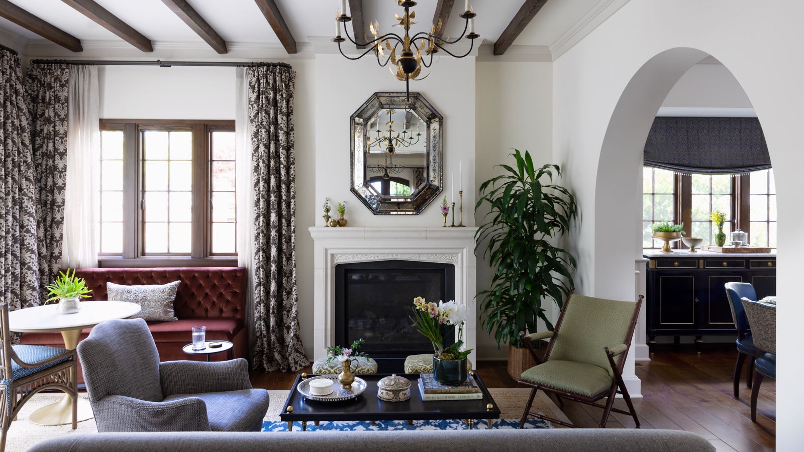
Living room
'I wanted this room (pictured above) to feel warm and rich since it is the formal living room, which is why I worked in some of the more jewel-toned colors,' explains Naomi.
'At the same time, it needed to feel inviting and get used, so I chose a soft wool herringbone for the sofa that I think grounds the room and helps make it feel just a bit more casual.
'I love the campaign chair because it adds a bit of interest and has a less heavy silhouette than the other upholstery, so it has a lightness about it and can be moved around easily if needed. This chair was actually the one thing the clients were quite unsure about because they thought it looked uncomfortable, but it actually ended up being one of the most comfortable chairs in the house.'
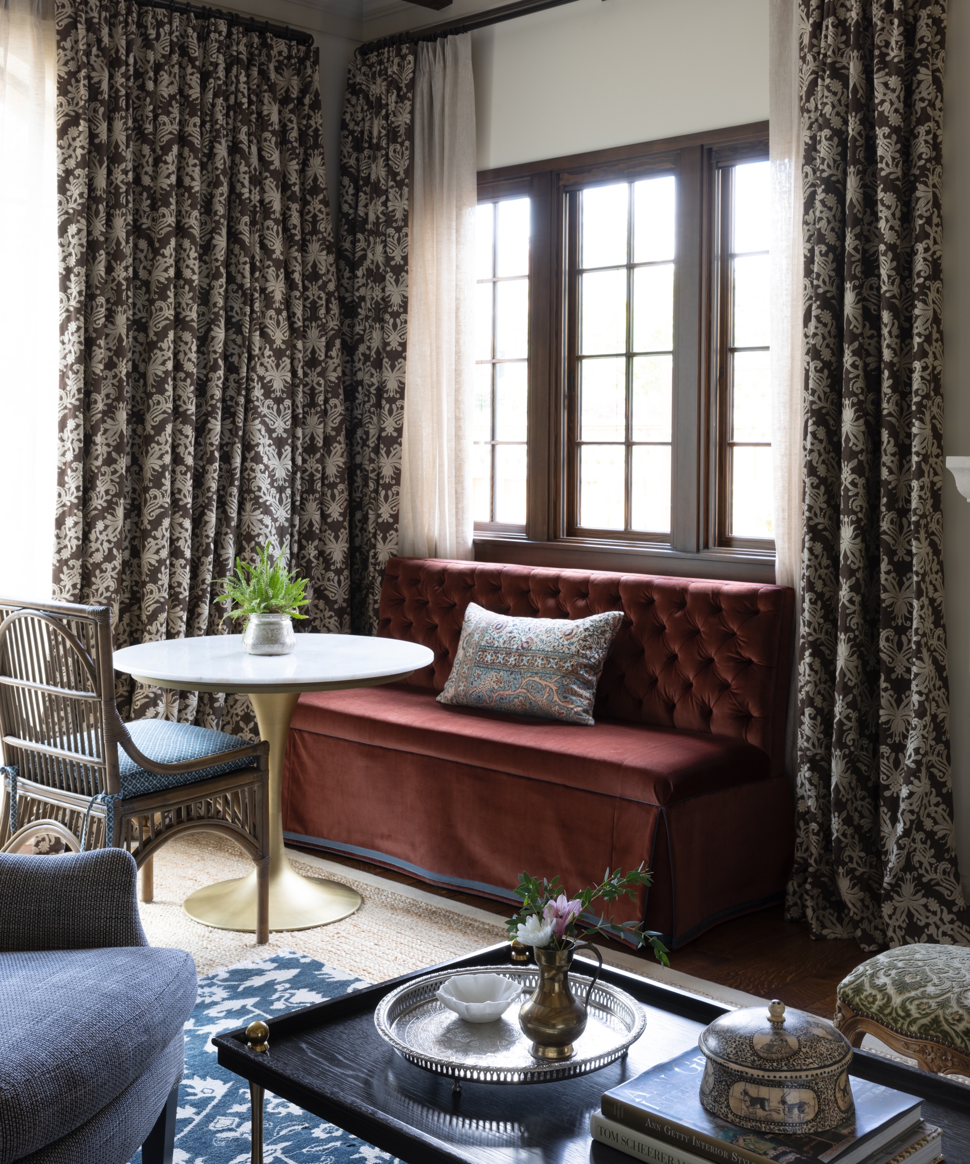
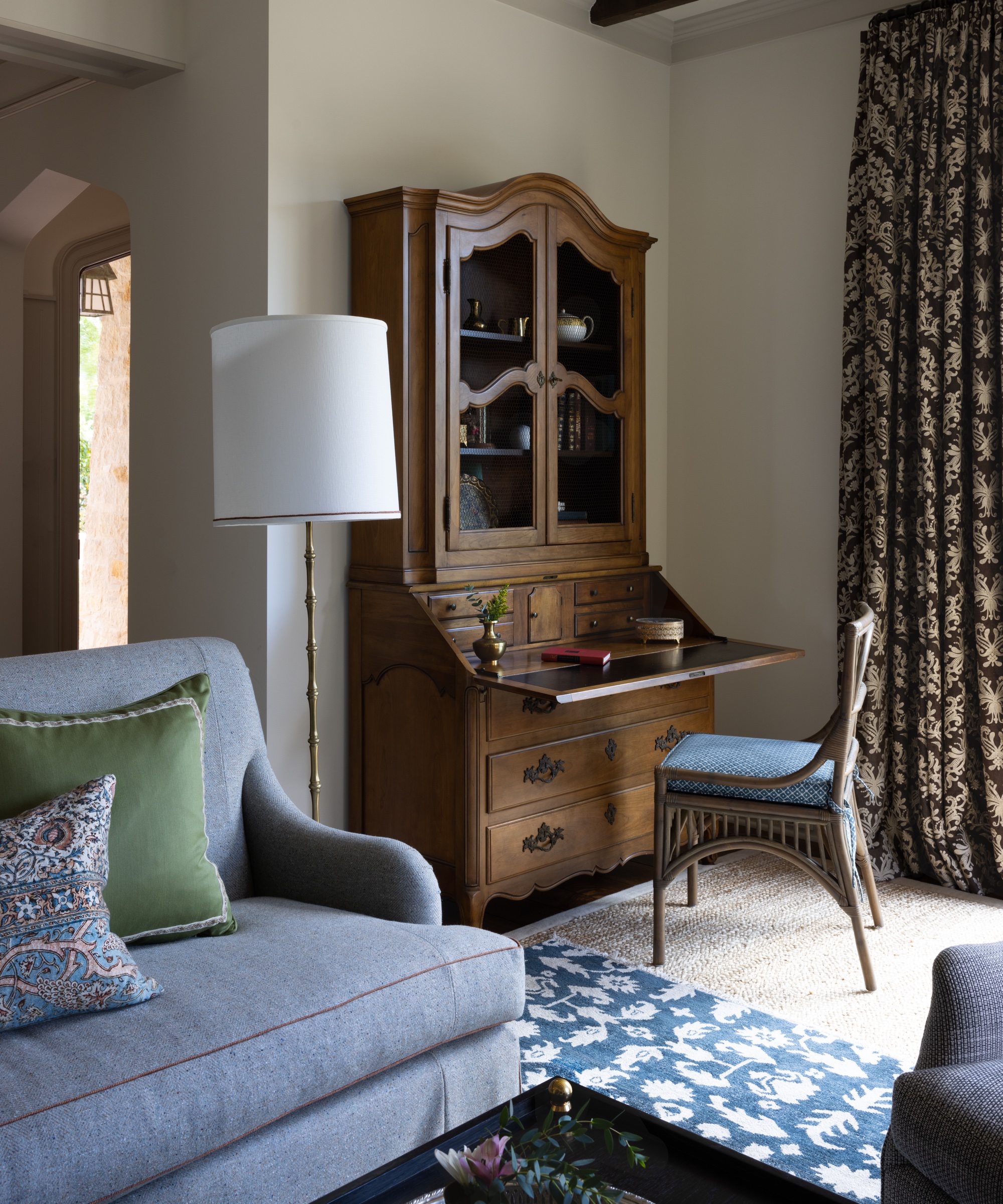
Naomi continues: 'There are a lot of work spaces in this room to add versatility and make it more useful; there are so many nooks and crannies that can be used for homework areas and work surfaces in.'
The wall color throughout the common areas is Benjamin Moore OC-39 Timid White, which, Naomi says, 'is a lovely warm white that worked so well throughout this house'.
Dining room
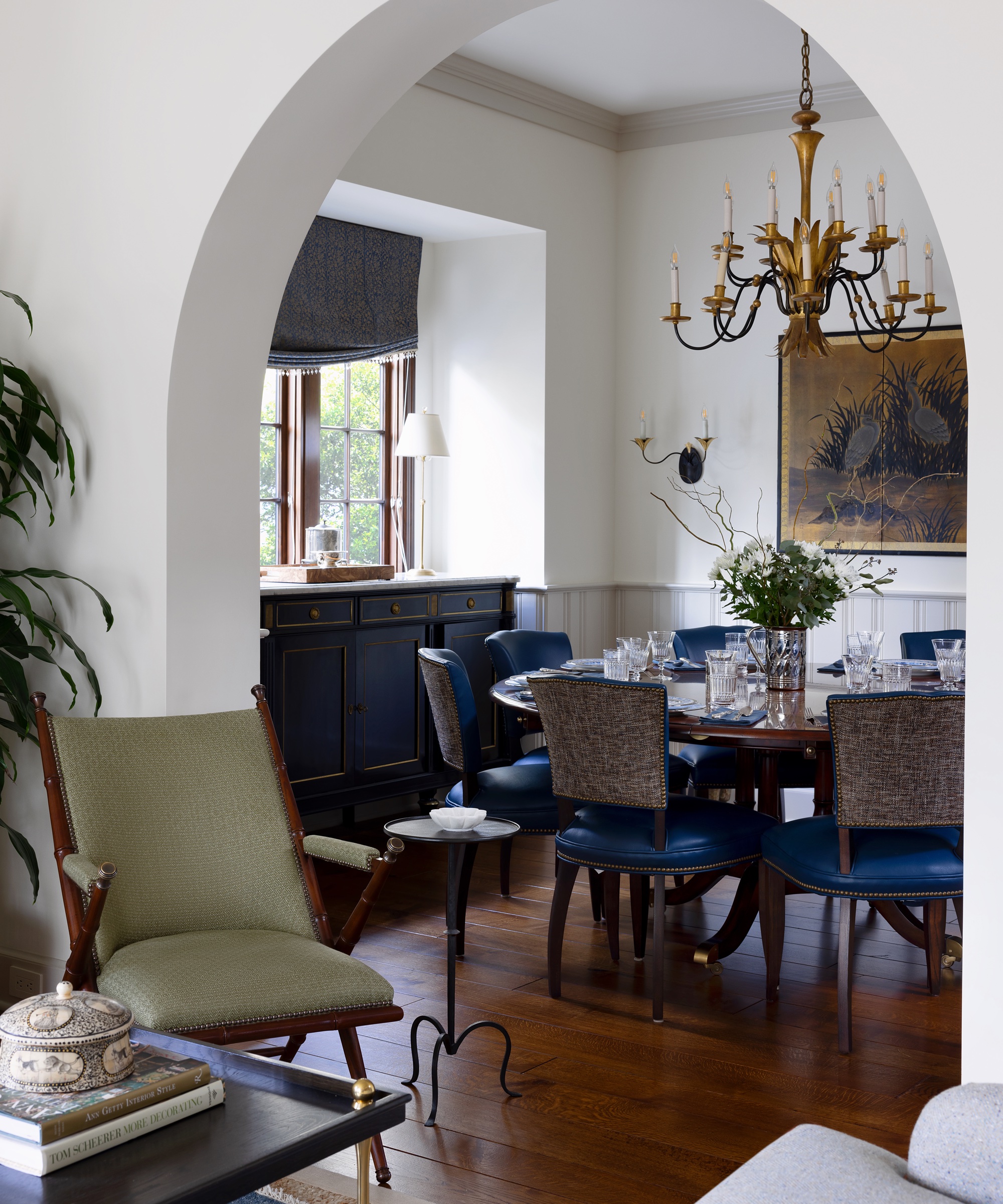
'This was quite a challenging room to source for because the room itself is square and doesn’t lend to typical rectangular dining tables,' says Naomi.
'The owners wanted to be able to seat eight so a round table was a must and was actually their idea.'
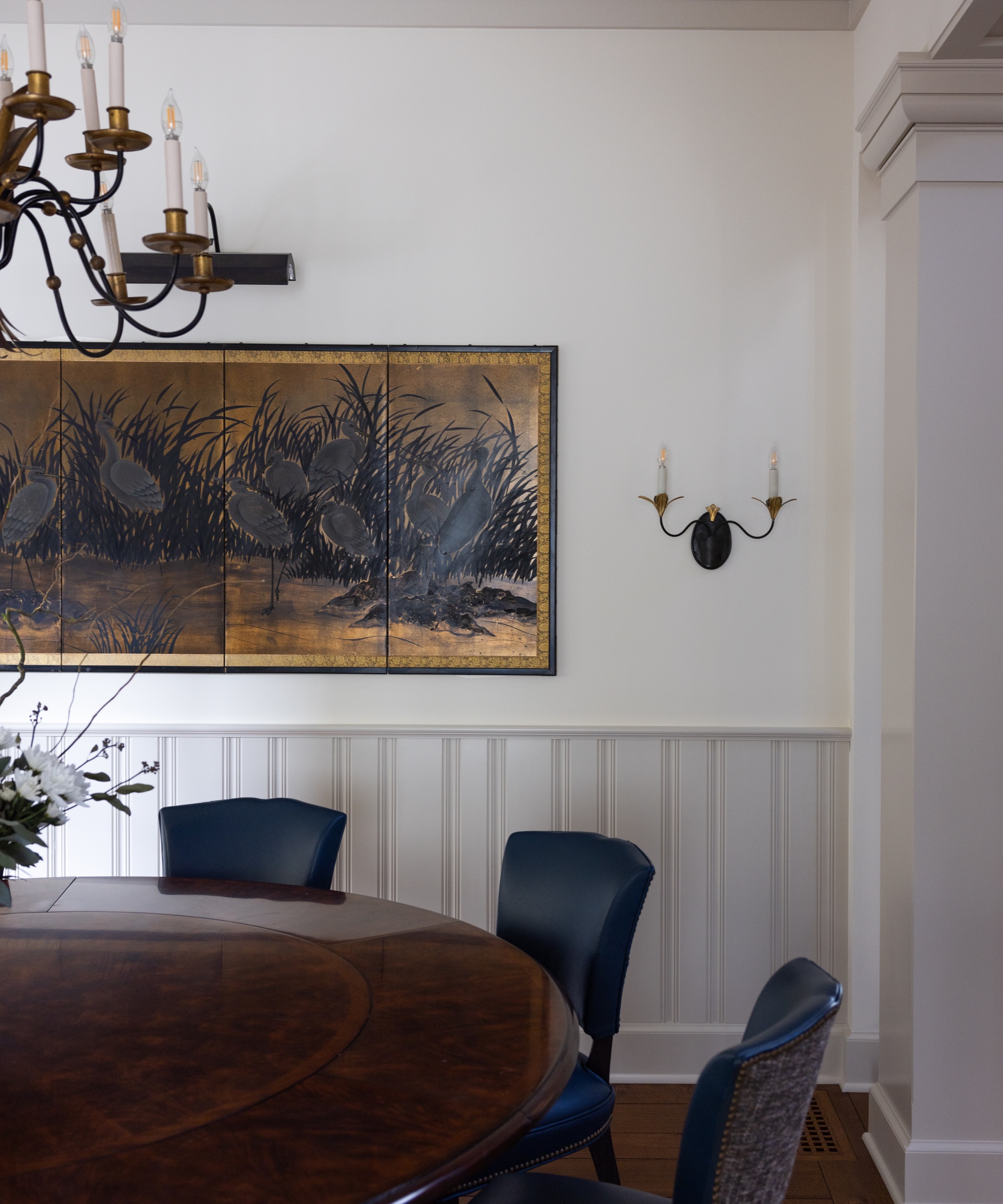
She continues: 'The colors in this room had to coordinate with the living room since the rooms open to each other, so I kept the color palette simple and picked a pretty blue leather for the dining chairs and Roman shade and let the furniture and lighting shine in this room.
'Mixing in an antique French enfilade and vintage chandelier and art really helped lend some age to the house, so everything didn’t feel so 'new'.'
Kitchen
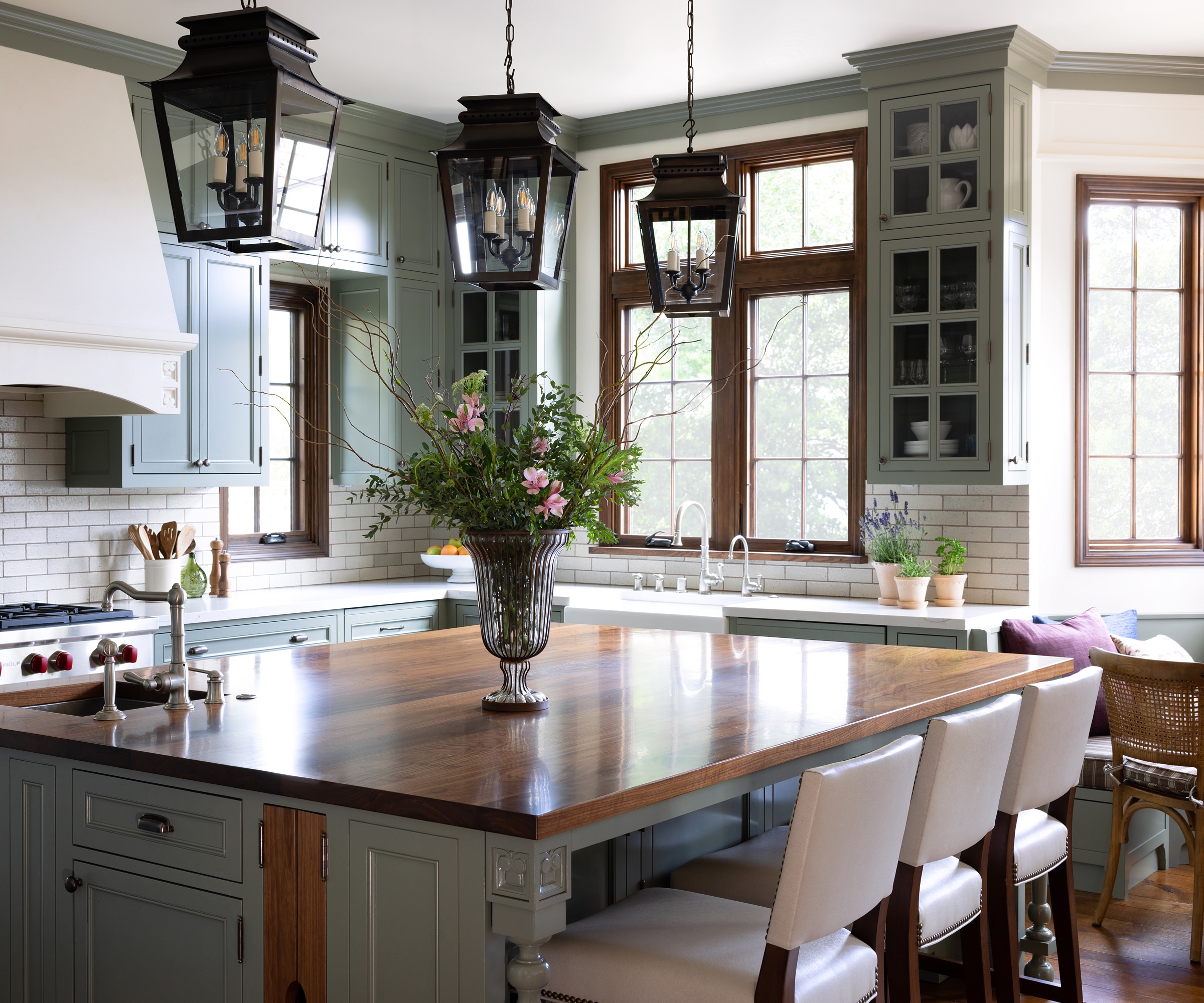
Durability for daily use was key in the kitchen.
Naomi says: 'Marble stains so easily so we selected quartz countertops that look like marble. The backsplash tile is a pitted glazed brick that lends itself so well to this kitchen, and we selected brown grout to bring out the warmth in the tile and stained wood windows.
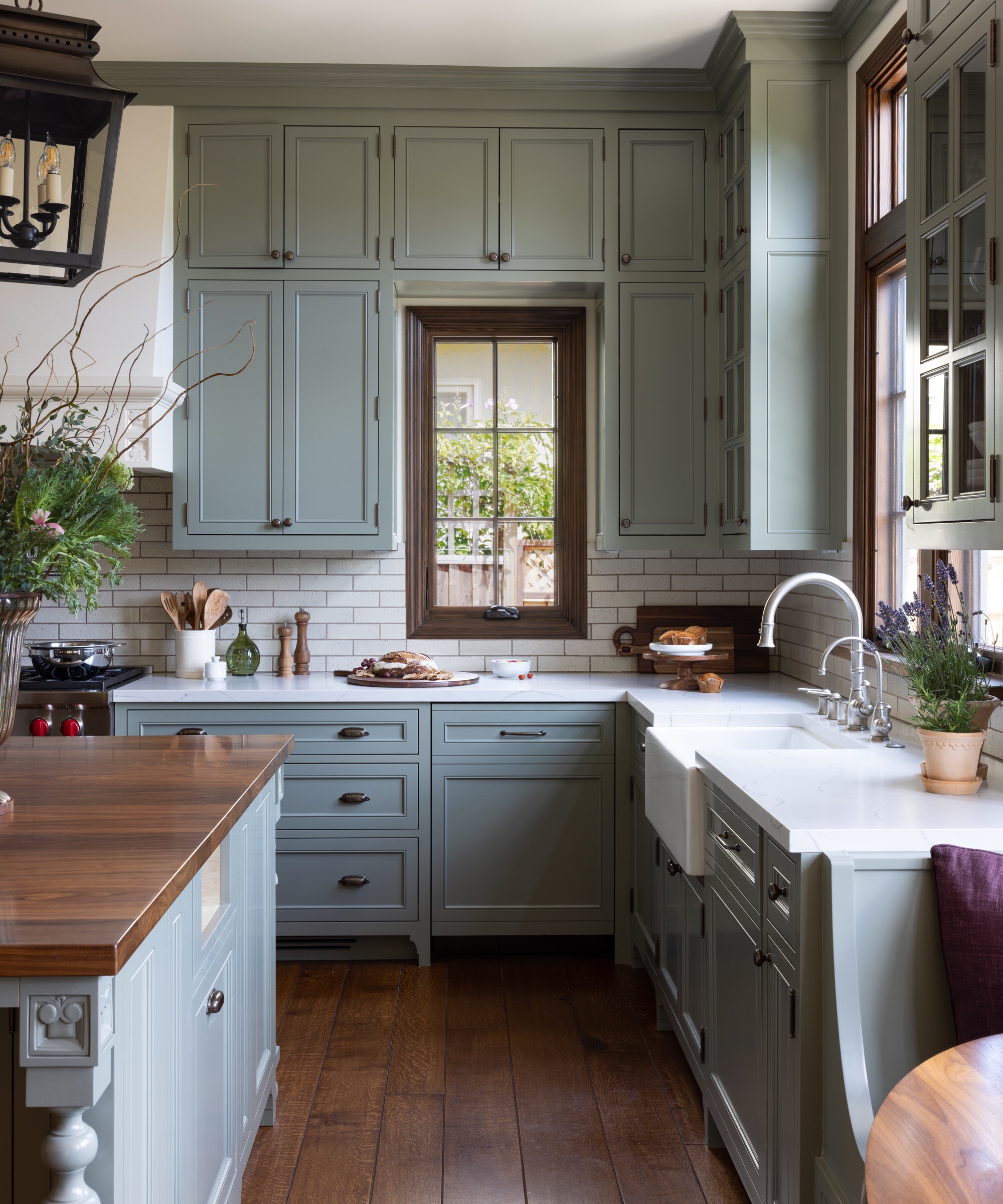
'The cabinet hardware is a lovely feature of this kitchen as it will lighten to a brassy finish over time as the antique finish wears off with use.'
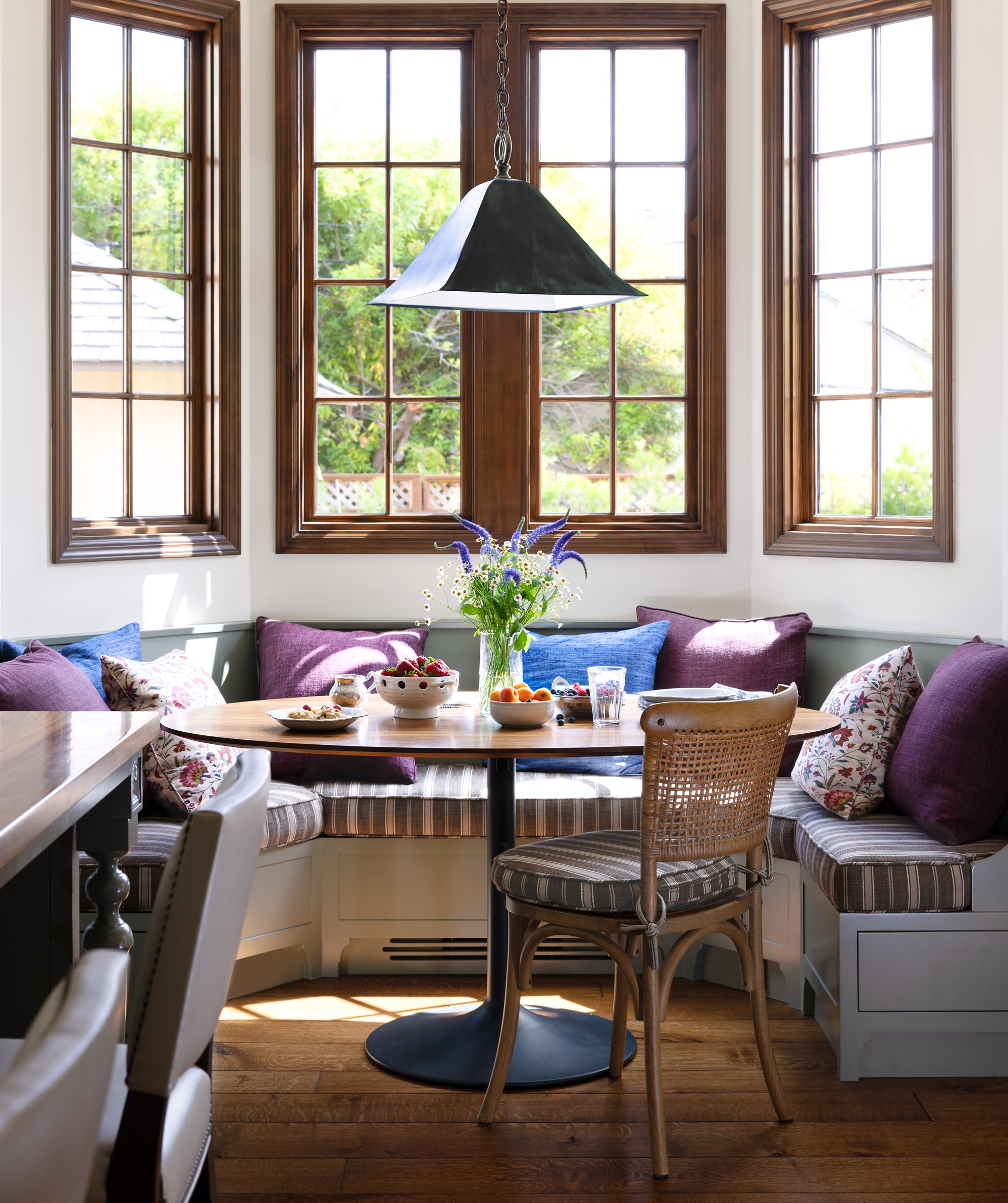
She adds: 'The breakfast nook is one of my favorite aspects of this kitchen, as it is so charming and cozy and brings in the colors of the adjacent family room through the cushions. The bench cushions are an indoor/outdoor fabric for added durability and stain resistance.'
Family room
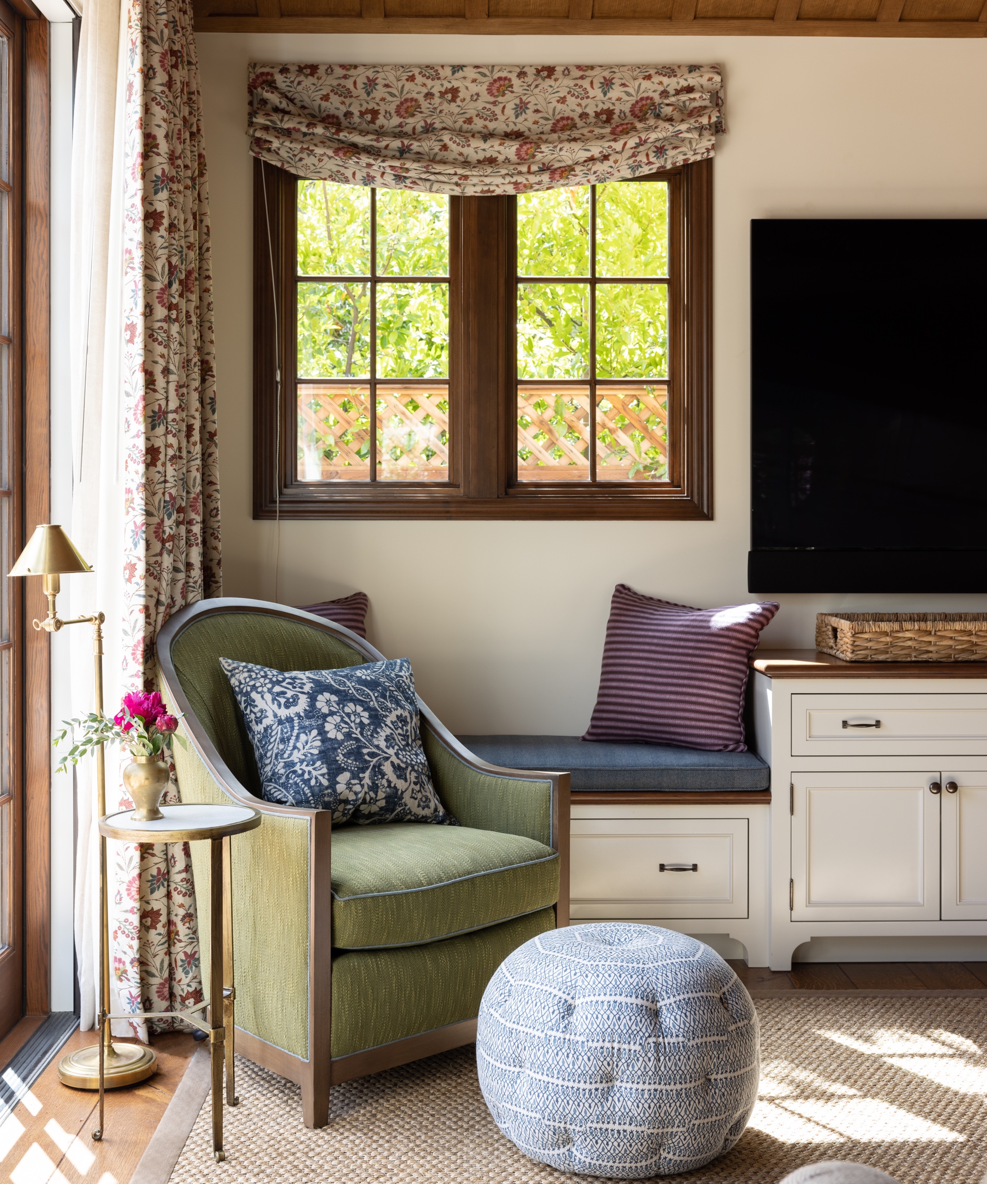
This room is an extension of the kitchen and also opens up to the backyard with a Centor door system.
'I love the stained tray ceiling in this room as it adds so much warmth and character to this area and really dresses up a more casual living space,' says Naomi.
'The key here was to make this room as comfortable and as durable as possible since it is the room that is used most in the house.
'A cozy reading chair echoes the green cabinets in the kitchen and a brown linen herringbone English arm sofa anchors the room.'
Primary bedroom
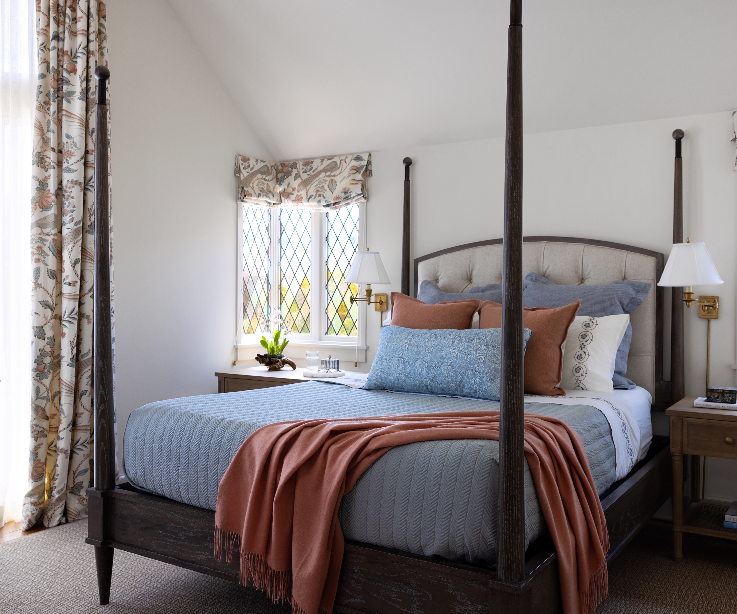
The clients really wanted a canopy or four-poster bed to complement the tall ceilings in this bedroom, but one of the challenges was the height limitations of the start of the sloped ceiling.
'Luckily, we were able to find a four-poster bed that fit perfectly before the start of the ceiling slope,' says Naomi. 'We selected a large-scale pattern for the drapery that complemented the pretty leaded glass stained windows in the room and was a great scale for the tall floor-to-ceiling bay windows that fill the room with light.
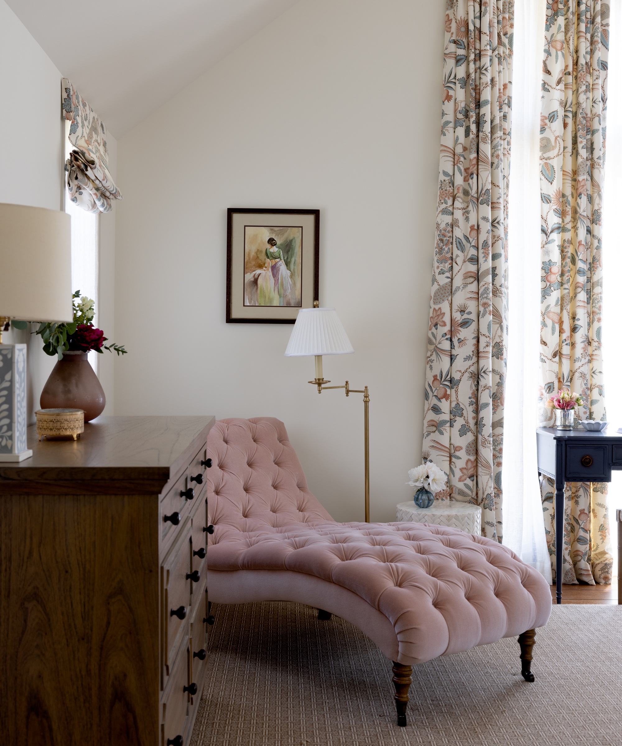
'I didn’t know it at the time, but peacocks are meaningful to them so it was a perfect suggestion for their bedroom. A warm dark brown and ivory wool looped area rug is a cozy complement to the peaches and blues in this room.'
Primary bathroom
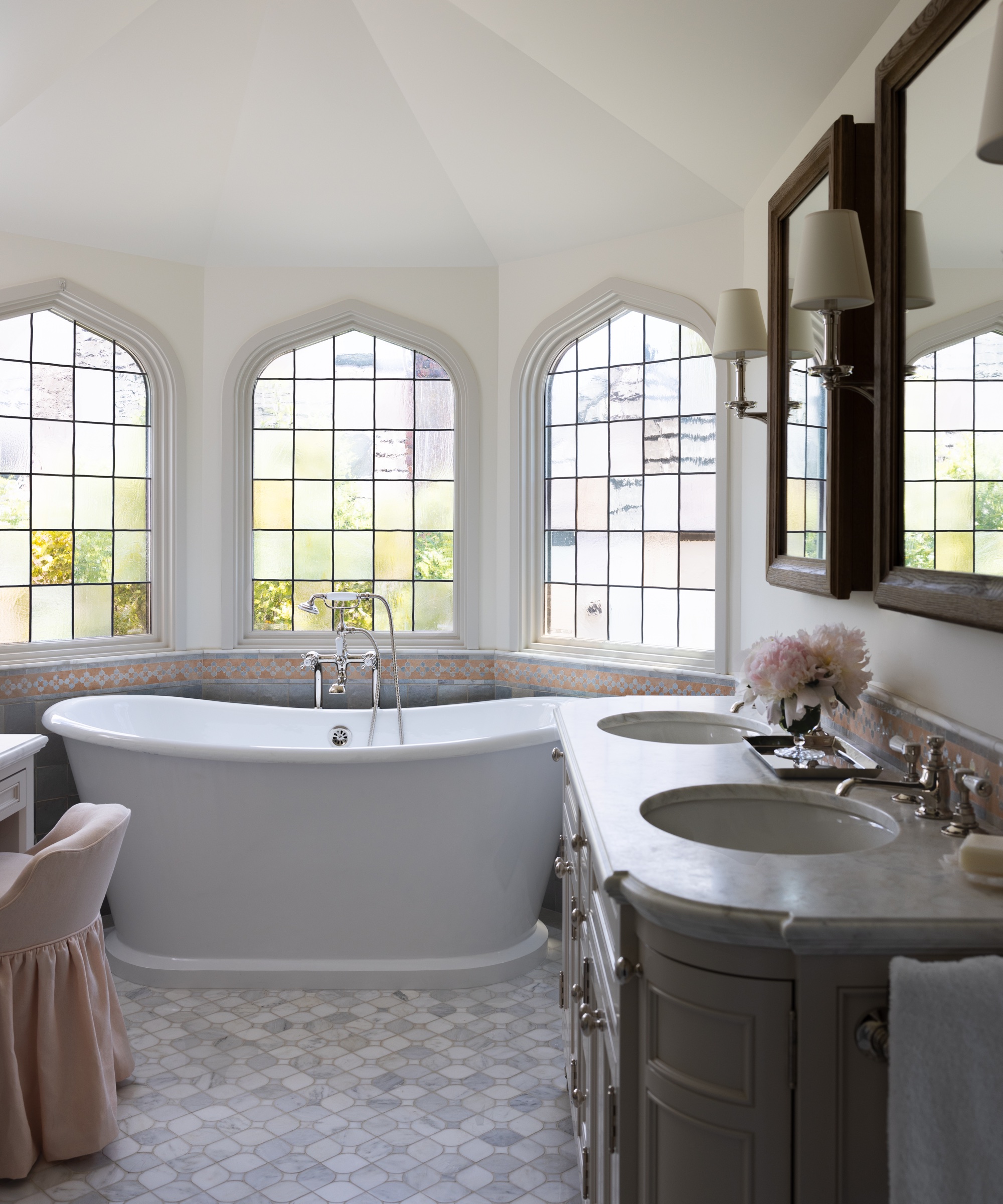
'This room is so special because of the beautiful architectural elements – the vaulted ceiling and the Gothic style leaded stained glass windows,' says Naomi.
'Because of the reflective polished Calcatta mosaic floors and the pretty Zellige tile we used as the wainscoting on the walls, the room seems to glimmer in person.'
Girl's bedroom
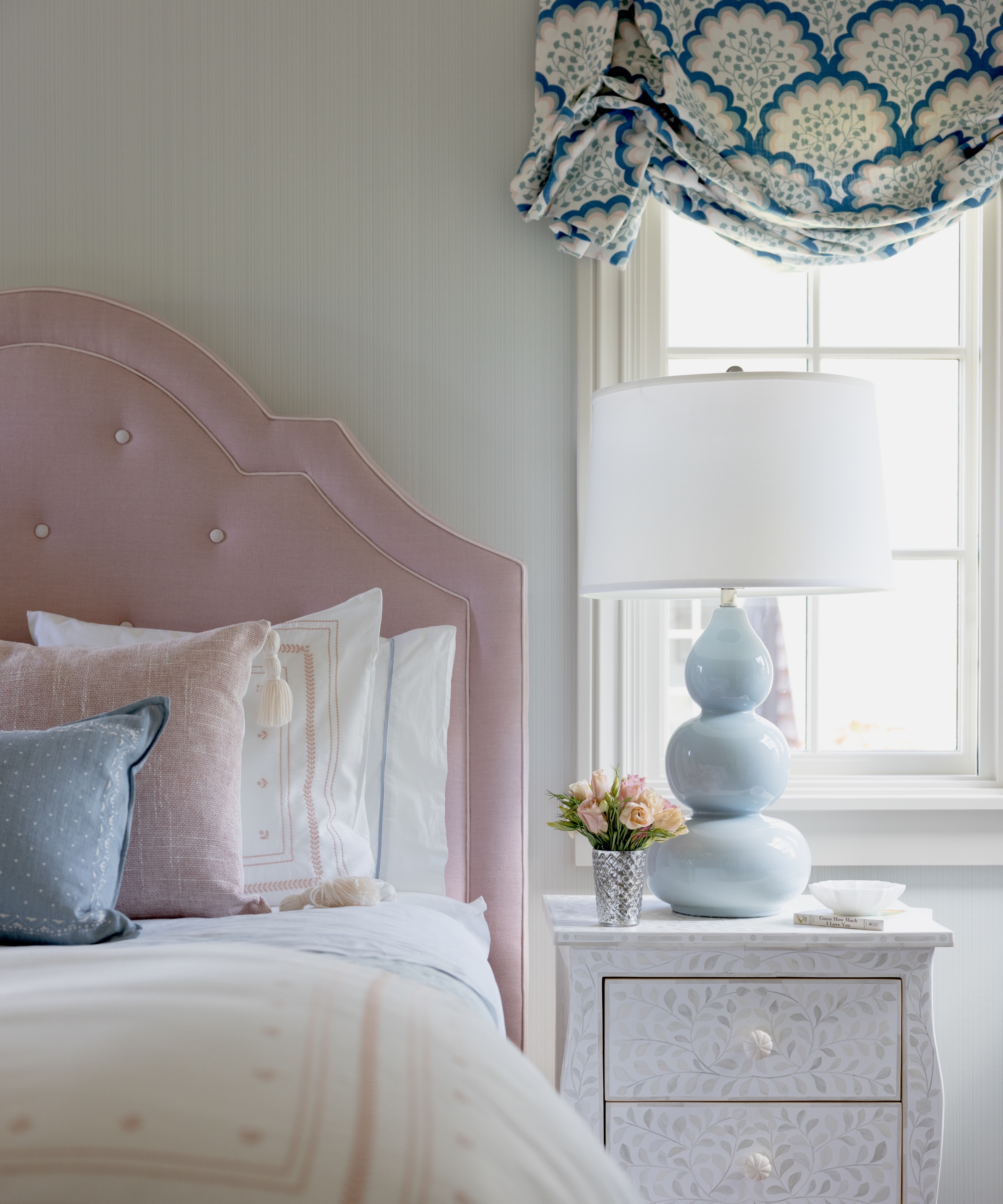
'This was such a fun room to design - I started with the Roman shade fabric and built from there,' says Naomi.
'We wanted to use a wallpaper that wasn’t too bold but still offered more color and interest than painted walls, so we selected a subtle painted aqua stripe wallpaper that didn’t compete with the shade fabric.
'We painted the ceiling a soft pink to complement the pink headboard and the pink in the shade fabric.'
Girl's bathroom
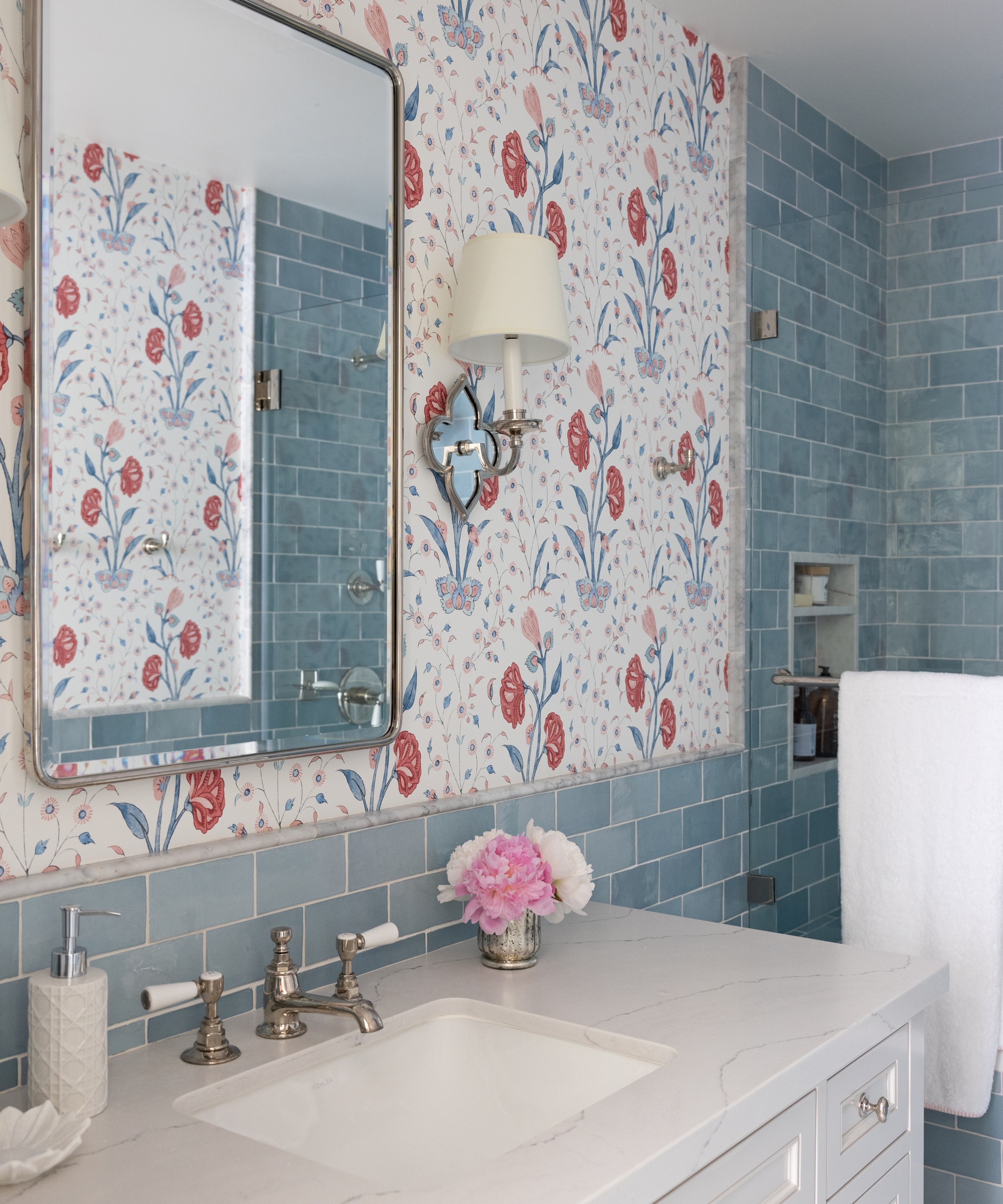
Naomi comments: 'I really wanted to this bathroom to have a fun pop of color, so we chose a classic wallpaper that brought out the blue of the shower and wainscoting tile, and added a punch of color.
'This is also the bathroom guests use when they are staying so it couldn’t lean too juvenile.'
Boys' bedroom
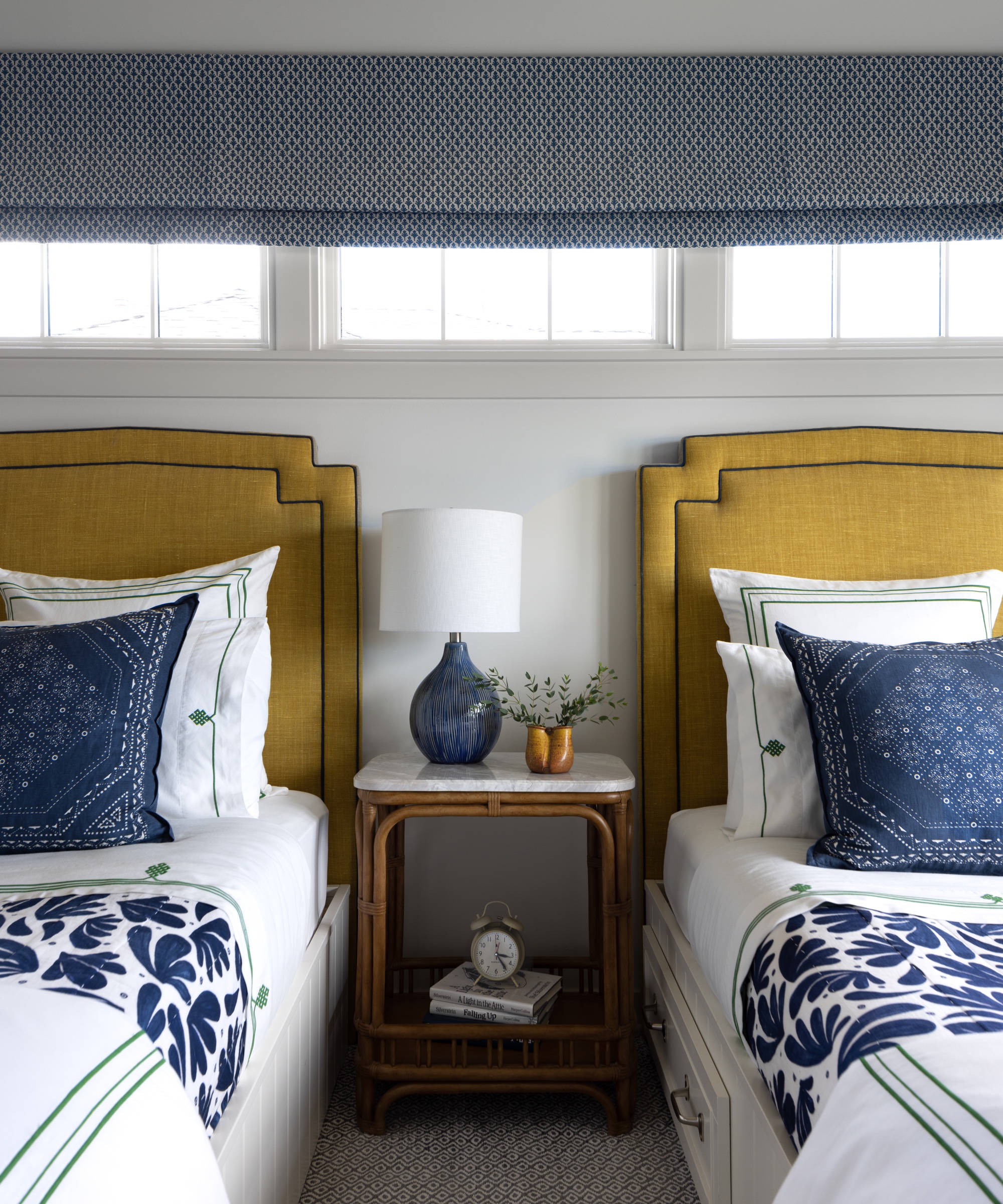
'This was another fun room to design, as I always love to play with color in kids’ bedrooms,' smiles Naomi.
'This design started with the navy in the existing quilts the boys already had and their existing bed platforms. I wanted to add a dash of color that would complement the navy, so we did the headboards in a beautiful mustard linen, which I think really makes the room.'

Ruth Doherty is an experienced digital writer and editor specializing in interiors, travel and lifestyle. With 20 years of writing for national sites under her belt, she’s worked for the likes of Livingetc.com, Standard, Ideal Home, Stylist and Marie Claire as well as Homes & Gardens.