5 common gallery wall mistakes designers warn to always avoid – to create the chicest of displays
Even we are guilty of some of these gallery wall mis-steps

Design expertise in your inbox – from inspiring decorating ideas and beautiful celebrity homes to practical gardening advice and shopping round-ups.
You are now subscribed
Your newsletter sign-up was successful
Want to add more newsletters?
It's easy to get gallery walls wrong.
A display technique that's stood the test of time, they are always in style, whether that's the very sleek structured look of repeated matching frames, the delicious chaos of a total mix-and-match set up, or the plate displays we have seen re-emerging along with all the grandma/cottage core/preppy styles that are on rotation at the moment.
Gallery walls are ever-popular because they are so diverse, any style has its own take on a gallery wall. And they are such an obvious way to add personality and character to any room.
But it's not usually as simple as bringing together a collection of prints and decor. The best gallery wall ideas do need some curation in order to work, and there are mistakes to be made here – easy ones too, that we are probably all making. We asked designers what are the most common mistakes you can make when adding a gallery wall, and, more importantly, how to avoid them.
Gallery wall mistakes designers want you to avoid
Below, we showcase some beautiful ways to get gallery walls right, alongside advice on what to do when you've been getting it wrong.
1. Not finding a common ground
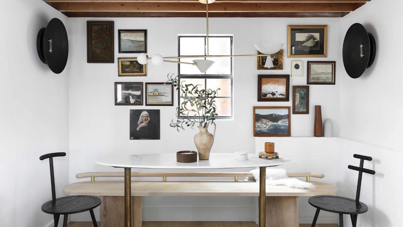
We love an ever-so-slightly chaotic gallery wall, but one big mistake you can make is not having some kind of cohesive link between the pieces you bring in. You need a theme, be that in the colors, the frames, or the actual prints and decor you choose. See in this dining room wall set up, designed by Urbanology, the frames have that link with the colors and the vintage vibe, and the prints have a similar shade running through them too.
'There are no hard and fast rules regarding coordinating a gallery wall, but our rule of thumb is to stick to at least one common ground to keep the look cohesive, which can be: frame finish and style, art medium, art colors, or art style,' explains interior designerr Victoria Holly.
Design expertise in your inbox – from inspiring decorating ideas and beautiful celebrity homes to practical gardening advice and shopping round-ups.
'Some gallery walls we like to do in a grid format where we maybe utilize a collection of pieces from an artist. Other gallery walls look great when you've collected different and unique pieces of art from a variety of sources and are going for a more eclectic look.
'We like to make sure either the artwork ties together or the framing ties together. If the art pieces are really different, we love to spice it up with a gallery rod and antique chain to create a more cohesive look.'
2. Not planning the layout
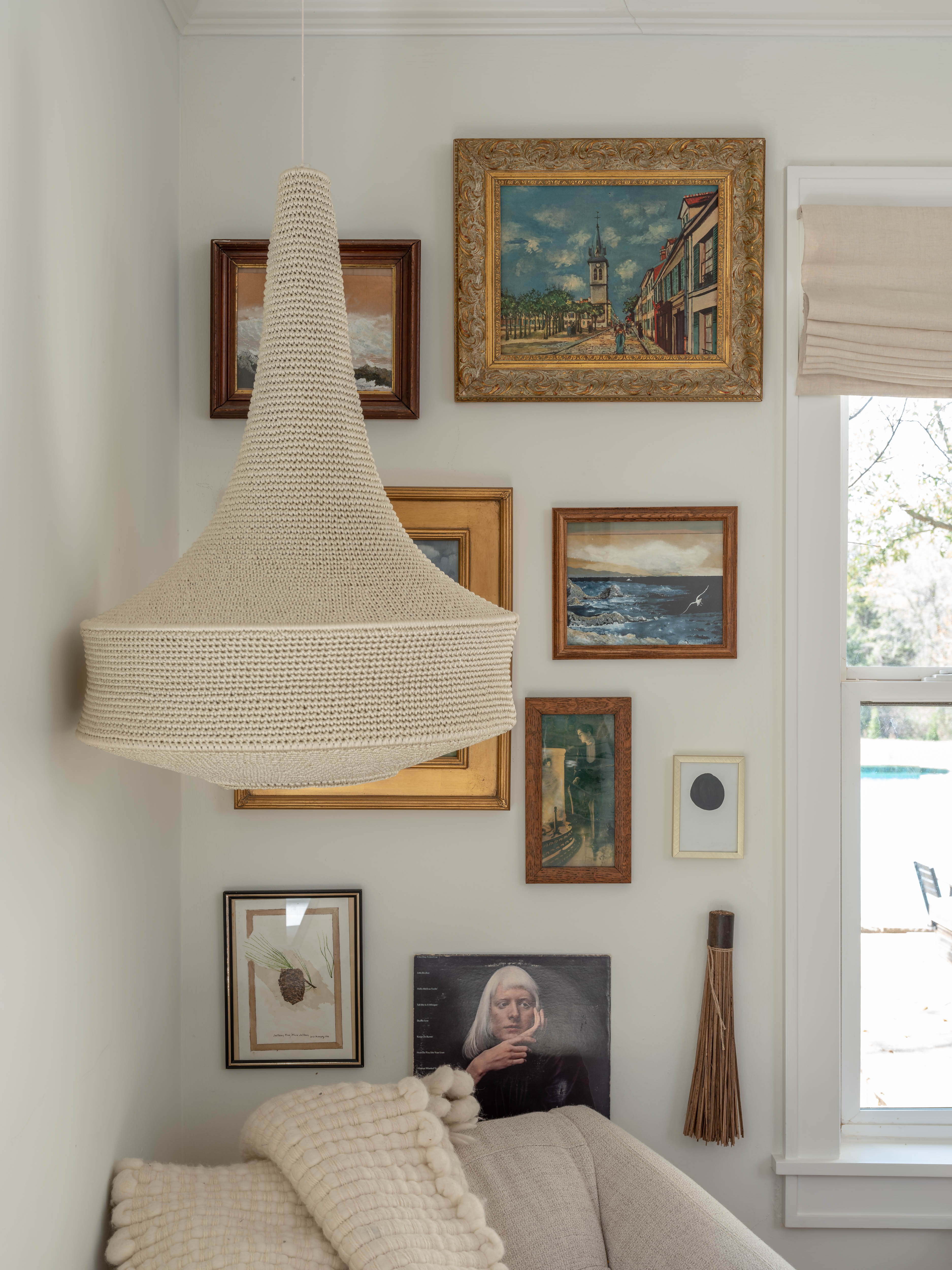
Don't just go hammering and hanging without having a clear plan first. You need to know exactly how your gallery wall will look before you get it on the wall. There are a few options for planning your gallery wall – if you have the floor space you can plan it out there, laying the prints out in front of you as they would appear if on the wall. Or you can create a template on the wall it's using Frog Tape.
'Two of the most common mistakes that people make when creating a gallery wall revolve around inconsistent placement of the frames and a lack of planning prior to hammering nails into the wall. Inconsistent placement can lead to a cluttered and disjointed look, making it difficult for the eye to find a focal point. Without proper planning, frames may end up skewed or positioned too closely together, undermining the intended visual impact.' explains interior designer Jennifer Davis.
'To avoid these mistakes, take the time to carefully plan your gallery wall layout. Measure the available wall space and consider the dimensions of your frames to ensure even spacing and alignment and plan how many pictures to hang on your wall.
'Prior to hanging anything, lay out your frames on the floor or use paper templates on the wall to experiment with different arrangements. We try to keep the spacing between the frames at 2 to 3 inches. This thoughtful approach will result in a visually appealing gallery wall that captures attention for all the right reasons.'
Designer Kathy Kuo agrees, 'The biggest mistake you can make when putting up a gallery wall is not measuring and mapping it out first. The eye of "eyeballing it" is appealing and may seem like it will save you time, but trust me, you'll find yourself stepping back and seeing something very different from what you had in mind. I recommend using painters' tape to outline where you envision each piece so you can get a sense of where you might need more breathing room or a different configuration.'
You can buy painters' tape on Amazon.
3. Sticking with the same frame

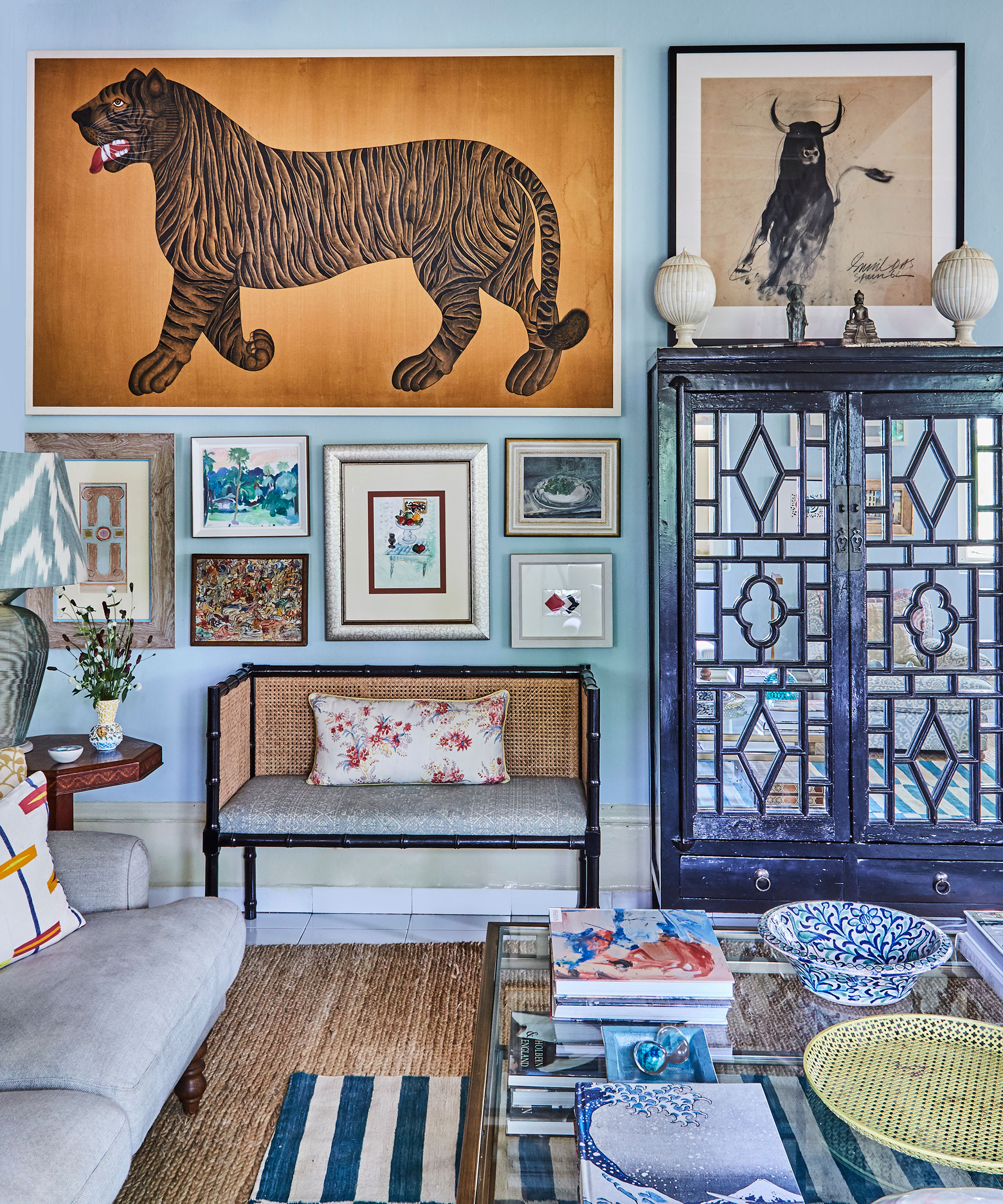
When decorating with art the frames you choose can be every bit as important as what is in them. A mistake you want to avoid when designing your gallery wall is to go really matchy-matchy with the frames. You want them to feel cohesive, but not too formulaic.
'When putting together a gallery wall, I’m all for mixing and matching things you love. One common misstep is using identical frames for all pieces. While this might seem like a safe choice, it can result in a monotonous and uninteresting display. A blend of different frame styles and sizes can add depth, color, and texture to your gallery wall, making it more dynamic and engaging.' explains designer Kati Curtis.
Interior designer Marie Flanigan agrees matching frames is a no-go, but as we mentioned, there should be a similarity between them, whether that be color, shape, or material. 'One of my favorite ways to make a gallery wall feel complete is to make sure that it’s comprised of different artistic mediums. I love juxtaposing different types of artwork and subjects like pen and ink with oil paintings, textural pieces with black and white photography, and even nudes with a still life.' Marie explains.
'However, the key to making the wall look cohesive is to ensure that all of the framing is relatively complementary in color and style. Don’t be afraid to mix woods or framed finishes, but keep the framing and matting sleek and streamlined. Avoid anything overly ornate as it will dominate the space.'
4. Not getting the space between frames right
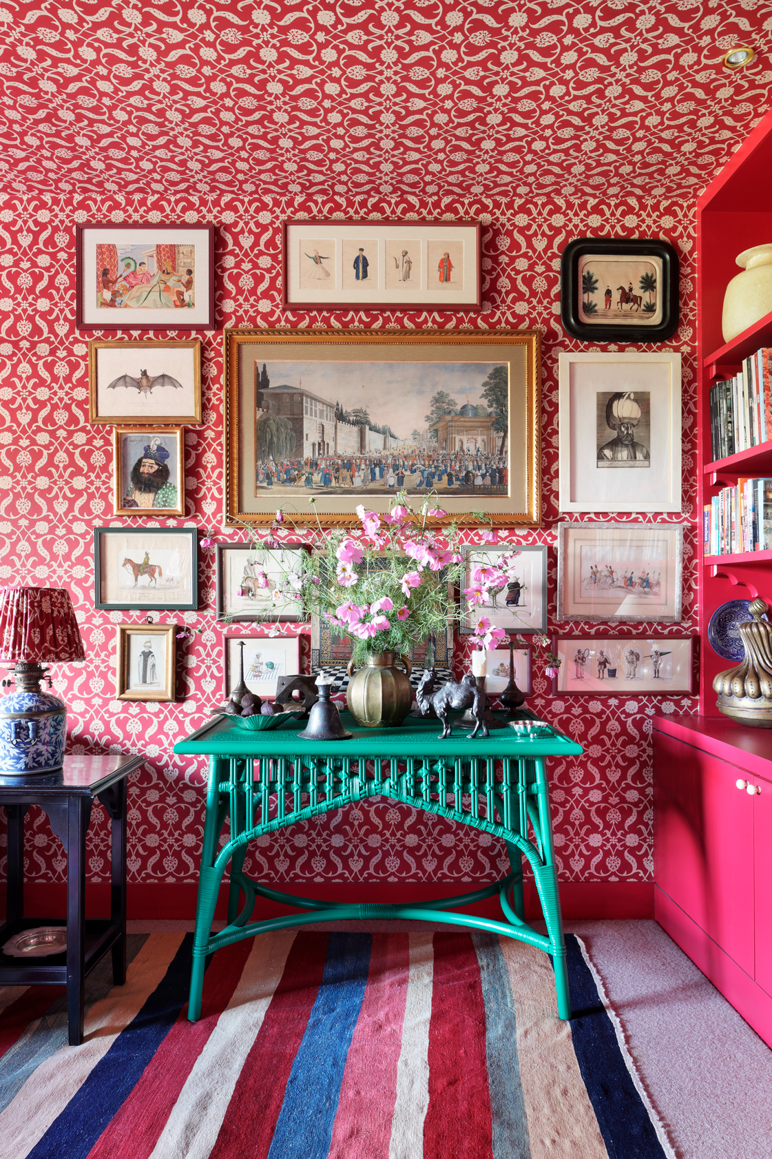
We are loving the clashing colors and prints and styles going on in this colorful living room, and the reason the gallery wall really works even against the busy wallpaper is the clear spacing between the prints. Getting the spacing wrong, and having the prints either too close together so they all just merge into one overwhelming block, or too far apart so they look like they are floating in a sea of wall, is an easy mistake to make, but one that's easy to avoid too.
'You really need to consider the spacing between your frames, the alignment of your pieces, and ensure your wall decor complements the existing room design,' says Kati Curtis. 'The spacing between your frames is a critical aspect that can either make or break the visual balance of your gallery wall. While there's no hard-and-fast rule, a general guideline is to aim for a gap of about 2 to 3 inches between each frame. This can create a cohesive yet distinct presentation of each artwork.'
'However, bear in mind that the optimal spacing may vary depending on factors such as the size and style of your frames, the dimensions of your wall, and the overall aesthetic you want to achieve. It is advisable to experiment with different arrangements and distances before finalizing the placement of your frames. Remember, the goal is to create a harmonious blend between unity and variety,' she adds.
5. Not considering the rest of the room
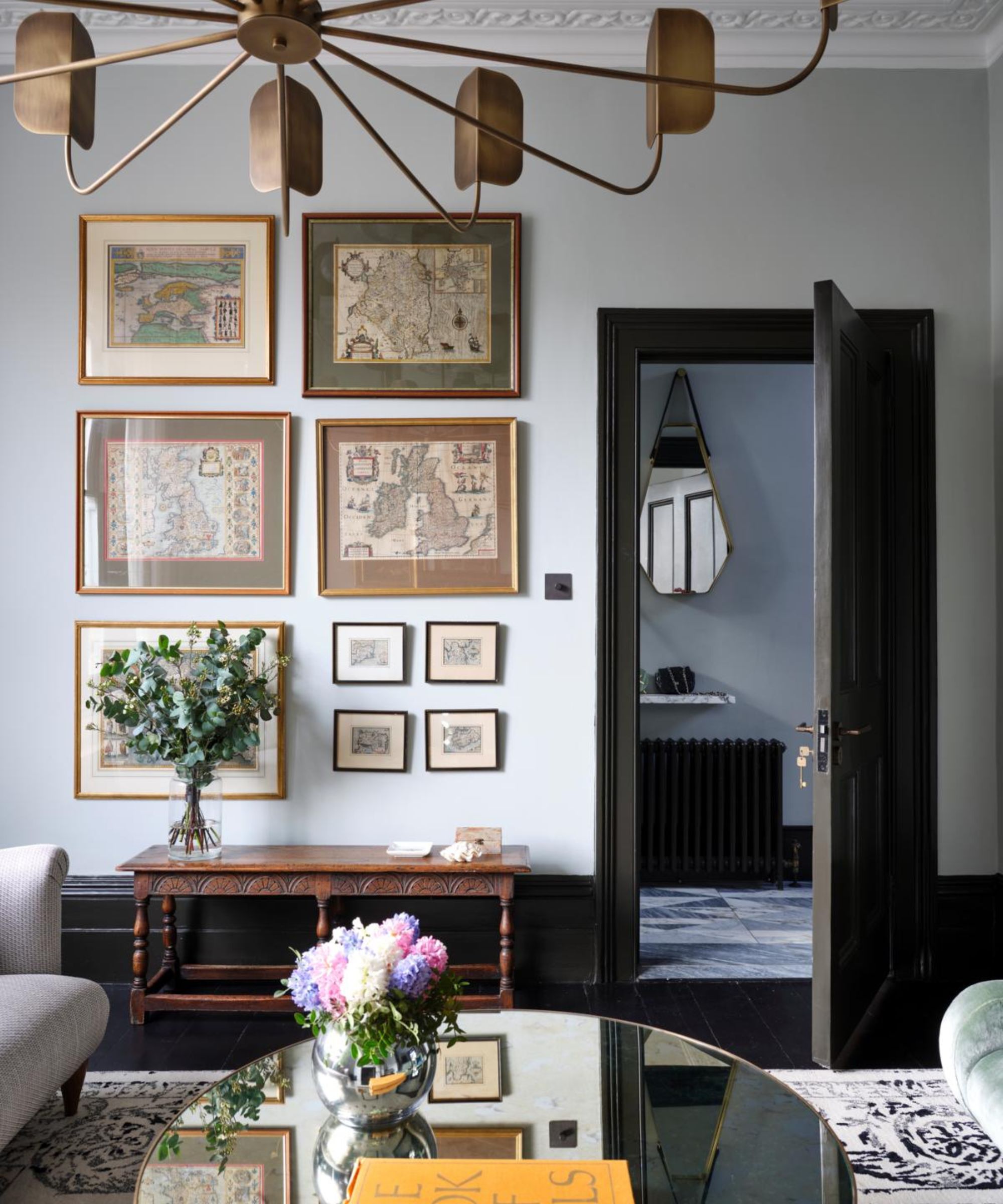
A gallery wall is a big feature, it will likely be the accent wall in the room and become the focal point of the space. So don't just consider it as a stand-alone project, consider how it's going to work with the rest of the space – the style, the colors, the texture, even the layout. A simple place to start is to pull shades from the already existing color scheme, that will instantly create a cohesiveness.
'Color and balance are important for any space. You must consider the wall space available and ensure there is balance within the room. Don't overcrowd or overwhelm your available space. The color palette is always the most important factor to consider when choosing artwork for a space,' explains Jerad Gardemal founder of JF Gardemal Designs.
'We certainly want to consider the theme, but the color palette within that theme is the most important consideration when putting together artwork for a space. Ensuring artwork complements what is already present in the room is also of utmost importance. If the decor is neutral, wall art is a great opportunity to inject color and life into the room. By ensuring the frames coordinate, you can create continuity among a variety of pieces. It is not uncommon to use different styles or periods of artwork and tie them all together with complementary frame styles or colors.'
Ginger Curtis adds, 'When selecting art for a gallery wall, be careful not to have it clash with what's already in the room. Consider the colors and tones that will harmonize with the room's existing palette. It's important to think about the placement and arrangement of the pieces, ensuring a visually pleasing flow and balance.'
FAQs
What are the rules when designing a gallery wall?
We always encourage taking the fast and loose approach when it comes to interior design 'rules', but when adding a gallery wall to your space there are a few tips to follow that we ensure its success and to avoid mistakes.
The main rule to always follow is to plan out your layout first. Decide on all the prints and pieces you want to include and, before starting to hang, create the design on the floor or using a template.
'A large downfall in crafting a gallery wall is not adequately planning your layout. If you try to freestyle the hanging process, you can end up with a lot of extra holes in your wall and ultimately create more work for yourself!' says Ginger Curtis, founder of Urbanology. 'The easiest way to hang a gallery wall is to plan ahead and use templates. Cut out paper or cardboard templates in the same sizes as your artwork and arrange them on the wall using painters' tape. This allows you to experiment with different layouts without putting unnecessary holes in the wall. Once you're satisfied with the arrangement, you can then hang your art using appropriate hooks or picture-hanging hardware.'
Have a theme too. Whether that be the color, the frame, or the content. And have a real mix of sizes in there, with a couple of larger frames to add an obvious focal point – lots of small frames in a group is going to look too busy and fussy.
A gallery wall is all about adding character to a room, letting your personal style take center stage in a display that's made up of pieces you love. They are timeless wall decor ideas and can add so much to any room so long as you get them right, so be sure to pick a theme, get the frames right, and plan plan plan!

I am the Head of Interiors at Homes & Gardens. I started off in the world of journalism in fashion and luxury travel and then landed my first interiors role at Real Homes and have been in the world of interior design ever since. Prior to my role at H&G I was the digital editor at Livingetc, from which I took a sabbatical to travel in my self-converted van (not as glamorous as decorating a home, but very satisfying). A year later, and with lots of technical DIY lessons learned I am back to writing and editing, sometimes even from the comfort of my home on wheels.