Benjamin Moore's Spanish Olive is a subtle take on green that feels 'effortlessly sophisticated' – here's how to decorate with it
This gray-green paint is subtle and restful – a great alternative to classic neutrals

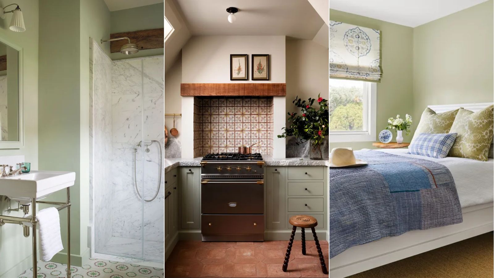
Of all the most recent color trends, green stands out as one that designers can't seem to get enough of. From deep forest greens to light variations of this color, we're seeing so much popularity for this nature-derived hue.
There are many reasons why green is retaining its popularity throughout home decor. It's known for its ability to create calming and restful schemes which is something we all want more of in 2024, while it can also be an incredibly versatile color that pairs well with many different interior design styles.
While there are endless green paints to embrace, Benjamin Moore's popular paint Spanish Olive is one that's currently trending, and for good reason. This gray-toned green is the perfect subtle nod to this tranquil color trend. Without being overly saturated, it's a liveable and soothing paint that serves almost as a neutral.
What color is Spanish Olive?
'Spanish Olive is a beautiful take on both green and gray tones,' explains interior designer Kathy Kuo. 'It's softer and subtler than a full-on olive green color and it also feels brighter and more uplifting than a traditional mid-tone gray paint. I love that this light green feels both nature-inspired as well as effortlessly sophisticated.'
Helen Shaw, Director of Color Marketing at Benjamin Moore elaborates, noting the soothing qualities of this paint color: 'With its faded olive notes, Spanish Olive offers a touch more character than your basic gray. The dusty hue connotes relaxation and peace. Sitting in the corner of the color spectrum, it symbolizes balance and harmony.'
Spanish Olive is a versatile color that can be used throughout the home, but Helen says it's best placed in well-lit rooms: 'Due to the presence of gray in this hue, it is best suited to south-facing rooms where natural light fills the space.'

Helen Shaw is part of Benjamin Moore's UK division. Color expert and international marketing director, Helen and her husband Craig are founders of Shaw Paints, acquired by Benjamin Moore in 2020.
3 ways to decorate with this trending green paint
1. Provide contrast with light or dark accents
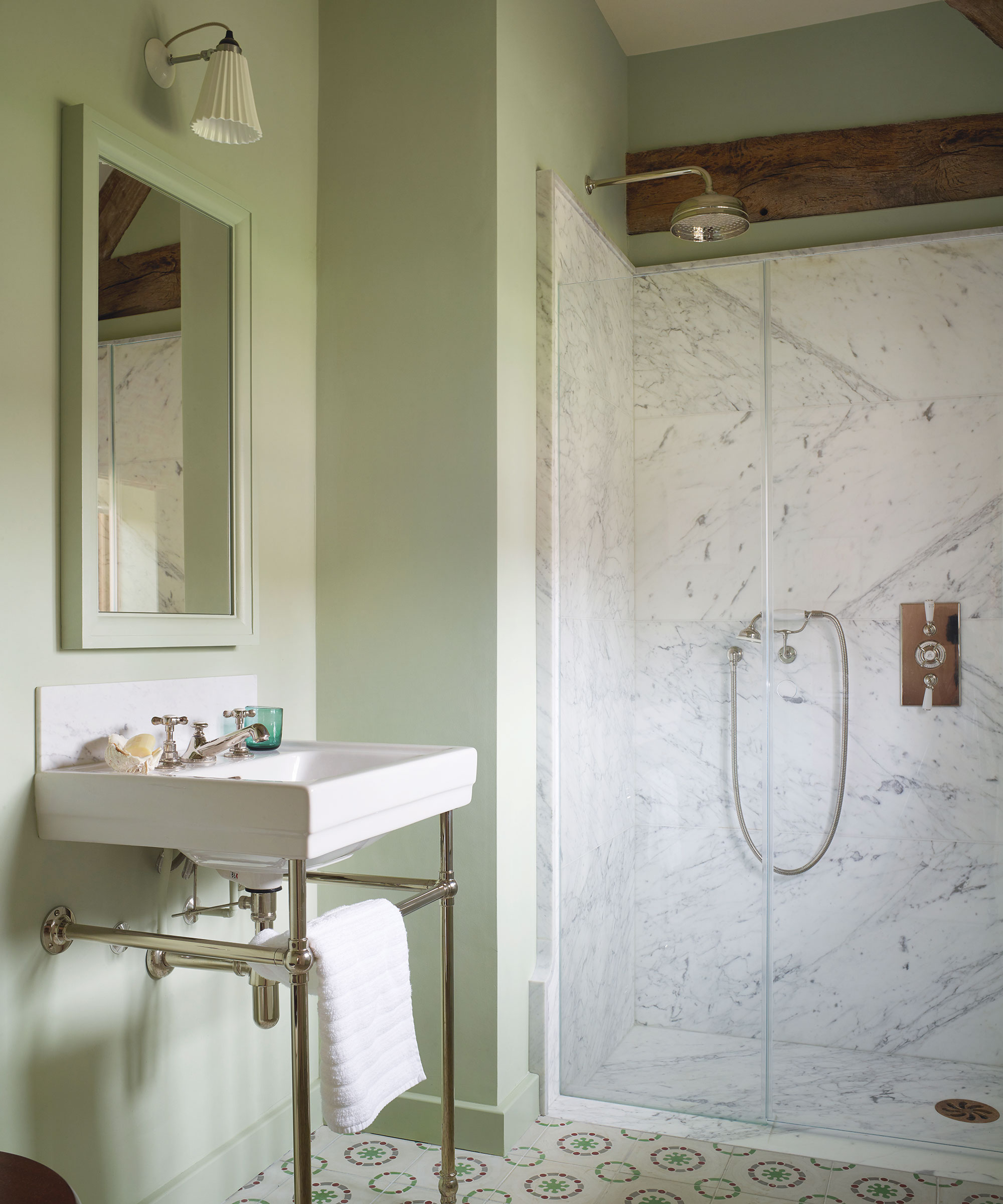
For a pared-back scheme that lets this green hue act as the focal point of a room, keep things simple by pairing Spanish Olive with either bright white paints or a deep charcoal color for contrast, as Helen advises: 'This mid-tone pairs beautifully with a soft crisp white and a deep slate to create an elegant, contemporary scheme.'
Design expertise in your inbox – from inspiring decorating ideas and beautiful celebrity homes to practical gardening advice and shopping round-ups.
Interior designer Luis Carmona also recommends these contrasting pairings, adding: 'Because Spanish Olive can resemble taupe, I would pair this paint color with either a much lighter shade, such as Alabaster, or a darker, cooler shade like Temptation. The brighter and darker shades will help balance Spanish Olive, counteracting some of the tones that come through.'
'Painting the ceiling or baseboards a lighter paint can help accent Spanish Olive, almost framing out the space. If considering a darker shade, more specifically some shade of gray, try using it as an accent color in cabinetry. The darker color will act as an anchor in the space allowing Spanish Olive to fill in the rest of the space with its lighter, almost creamy color.'

Luis Carmona is the owner and lead designer at VERDE Interior Design. With almost two decades of experience in the creative space (interior design, advertising, and marketing), Carmona gets to blend his many passions into one design studio, offering services to commercial and residential clients in both Houston and Dallas.
2. Create a calming bedroom
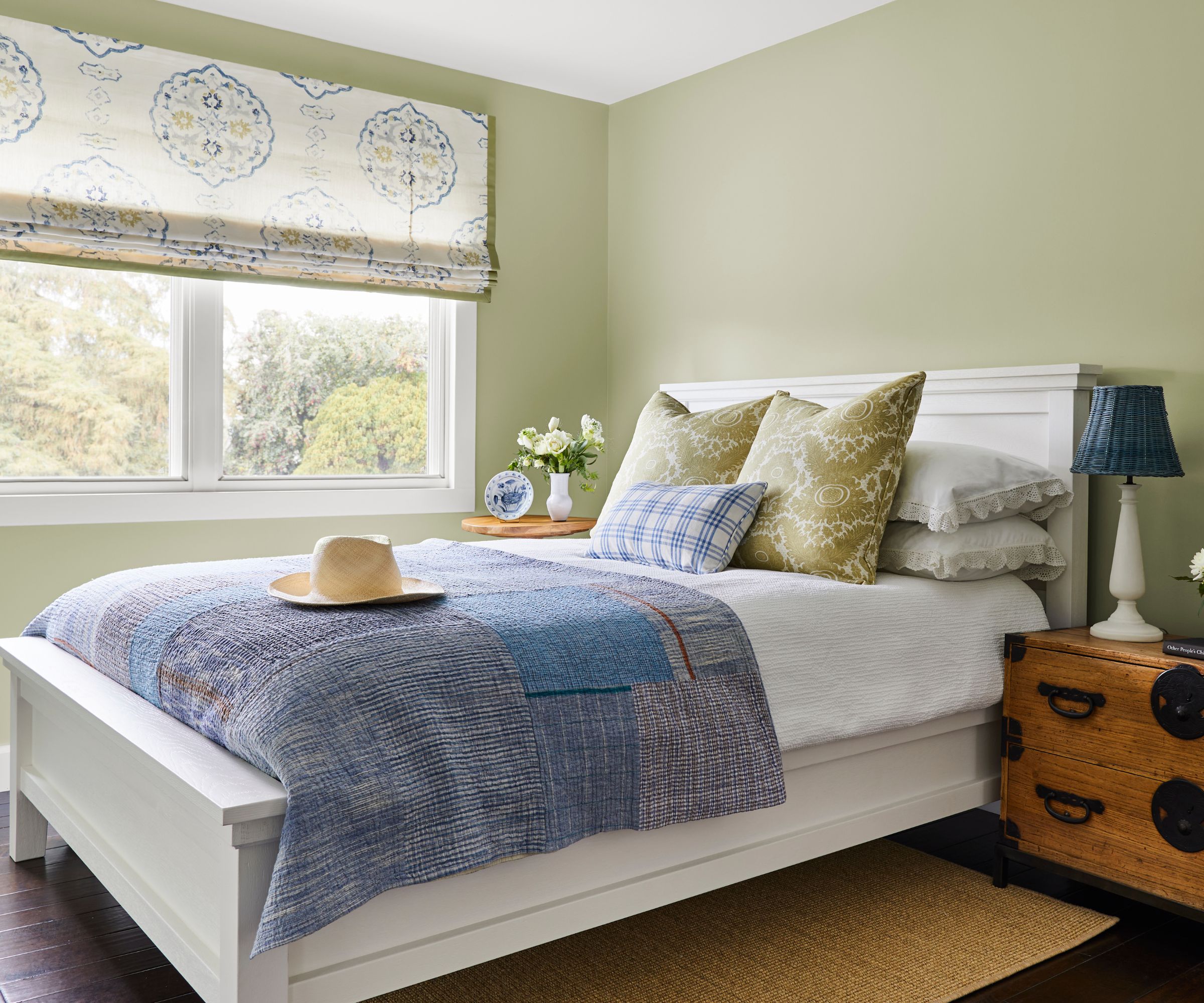
Since Spanish Olive is known for creating a calming feel, it makes an obvious choice for a bedroom, helping you create a space that feels restful, yet provides more interest than other classic neutral colors such as white or gray.
'Because it is a bit warmer with a tint of yellow, Spanish Olive would be great to use in bedrooms,' says Luis Carmona. 'The color is muted and light enough where coverage on all four walls would add a nice, subtle color to the space without it being overpowering. The use of natural or more yellow light will bring out the warmer hues in the paint while still keeping the space looking fresh and not dingy.'
To really lean into a cozy look, opt to color-drench a bedroom in this paint, as Helen suggests: 'For a fully immersive experience paint the ceiling of a room, in addition to the walls – this will achieve an enveloping sensation transforming the room into an oasis.'
3. Add a natural look to the kitchen
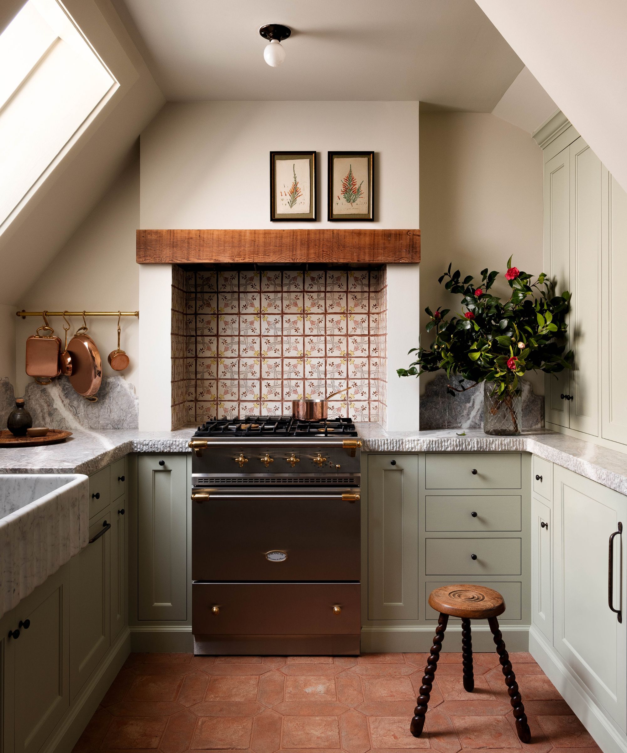
Green kitchens are replacing ever-popular navy blue, and while this prominent kitchen trend focuses on richer, forest green shades, opting for Spanish Olive instead is a far more subtle take on this trend. Whether that be on the kitchen walls or the kitchen cabinets, the end result will feel neutral, yet with more warmth and interest than pared-back colors such as beige or gray.
The added benefit of embracing a green kitchen is that it helps establish a tranquil feel thanks to its links to the natural world, which is often an appealing quality for highly frequented spaces such as the kitchen. Opt to pair this shade of green with plenty of other natural materials such as wood, which will further achieve an organic, timeless look.
If you're looking to decorate with green but don't want to make too much of a statement, Spanish Olive is a great choice. Style it in pretty much any room throughout the home, and by keeping it simple by pairing it with crisp white and natural wooden accents you can't go wrong.

Emily is a freelance interior design writer based in Scotland. Prior to going freelance in the spring of 2025, Emily was Homes & Gardens’ Paint & Color Editor, covering all things color across interiors and home decor for the Homes & Gardens website. Having gained specific expertise in this area, Emily is well-versed in writing about the latest color trends and is passionate about helping homeowners understand the importance of color psychology in home design. Her own interior design style reflects the simplicity of mid-century design and she loves sourcing vintage furniture finds for her tenement flat.
