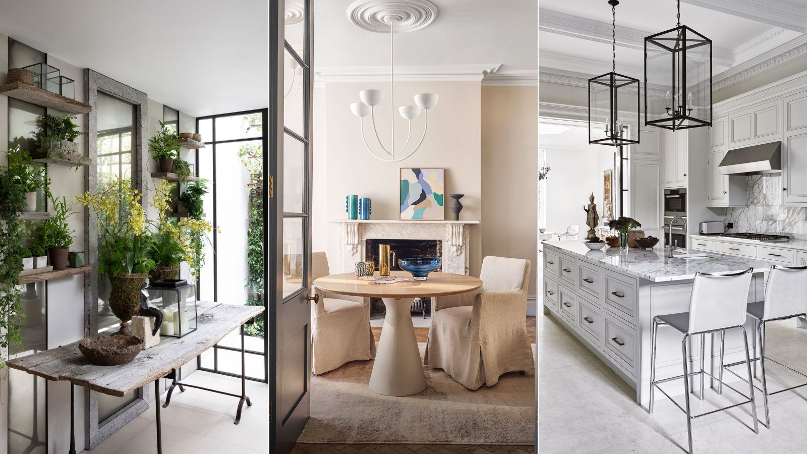
It's official: these are the 6 home decor trends that I am 'quiet quitting' in 2023
Take a 'new year, new me' approach to the trends that you don't actually love...

Design expertise in your inbox – from inspiring decorating ideas and beautiful celebrity homes to practical gardening advice and shopping round-ups.
You are now subscribed
Your newsletter sign-up was successful
Want to add more newsletters?
There is a lot to be said for 'quiet quitting' – the affirmative life trend that is making us all reevaluate our tolerances. It's about giving voice to disengaging with anything that no longer makes us happy, and while this 'trend' is reflective of pandemic-induced burnout at work, it has become something that we can apply to other areas of our lives too, not just our careers.
Now, I adore a design trend as much as the next person. Yes, even I succumb to the whims of fast trends every now and again, but not this time; this year I am taking a breather and reassessing my furniture fails in the name of fashion and joining the 'quiet quitting' movement by slowly phasing out the popular modern trends that no longer bring me joy, or in some cases, never did.
Before I delve further into the interior design trends I will be 'quiet quitting' this year, let me first say that trends are entirely subjective, and while there are generalities we can make about certain trends and what people associate with them, interior trends and our affinity toward certain looks, materials and colors have a lot to do with our personalities, environment, and experiences, so it is imperative to choose decor that makes you happier at home. After all, English textile designer William Morris once said: 'Have nothing in your houses that you do not know to be useful or believe to be beautiful.' It is this very philosophy that I am taking into 2023, and I advise you to do the same.
Article continues belowInterior design trends I am quiet quitting in 2023
When it comes to the best interior design trends, it can be a minefield of styles, colors, and materials, so we can't be expected to get it right every single time. Here are the modern interior trends that I plan to leave behind in 2023.

Jennifer Ebert is the digital of Homes & Gardens, overseeing all features for the website. Covering the latest trends is her forte, as well as discovering the psychology and meaning behind color, and what is the now and next in design.
1. Stark minimalism
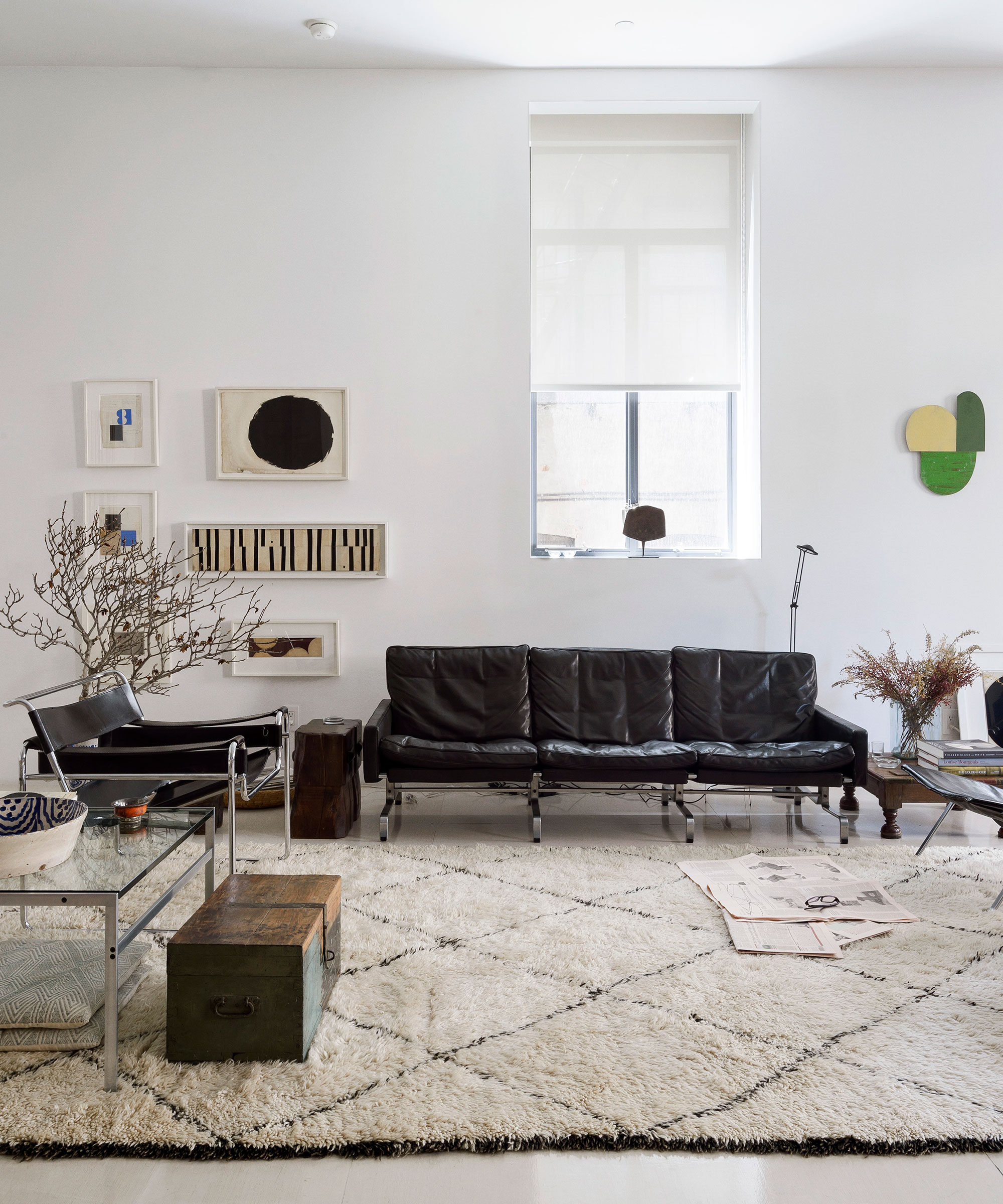
Pre-2020, minimalism was everywhere – it was modern, cool, and calm – and we extolled its virtues. For the longest time, minimalist design was seen as aspirational. A movement that would harness the power of 'clean' living; a dirty word that has lost its true meaning. However, fast-forward a few years, and the minimalist aesthetic is no longer the height of fashion. Yes, modernism and minimalism can be sleek, but just as often it feels devoid of any character and playfulness.
'Far removed from the starkness of the past – today’s contemporary interiors are anything but clinical – maximalist decor ideas are back with aplomb. Think warm, cozy environments rich with character and texture,' says Lucy Searle, Homes & Gardens' global editor-in-chief.
Much like Lucy, it is this exact feeling I wish to replicate in my own home; one of warmth and welcome, like a friendly hug that cossets and cocoons me on entry. So, with this, I say farewell to what I like to call the 'nobody is at home' aesthetic.
Design expertise in your inbox – from inspiring decorating ideas and beautiful celebrity homes to practical gardening advice and shopping round-ups.
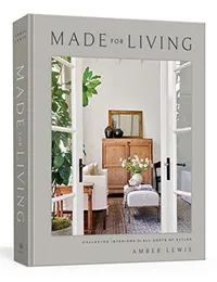
Made for Living: Collected Interiors for All Sorts of Styles, Amber Lewis | From $24.58 at Amazon
This national best-seller is a success for a reason: within the pages, interior designer Amber Lewis trains your eye on everything from nailing the perfect paint shade to matching patterns to choosing countertop materials.
2. All-white everything
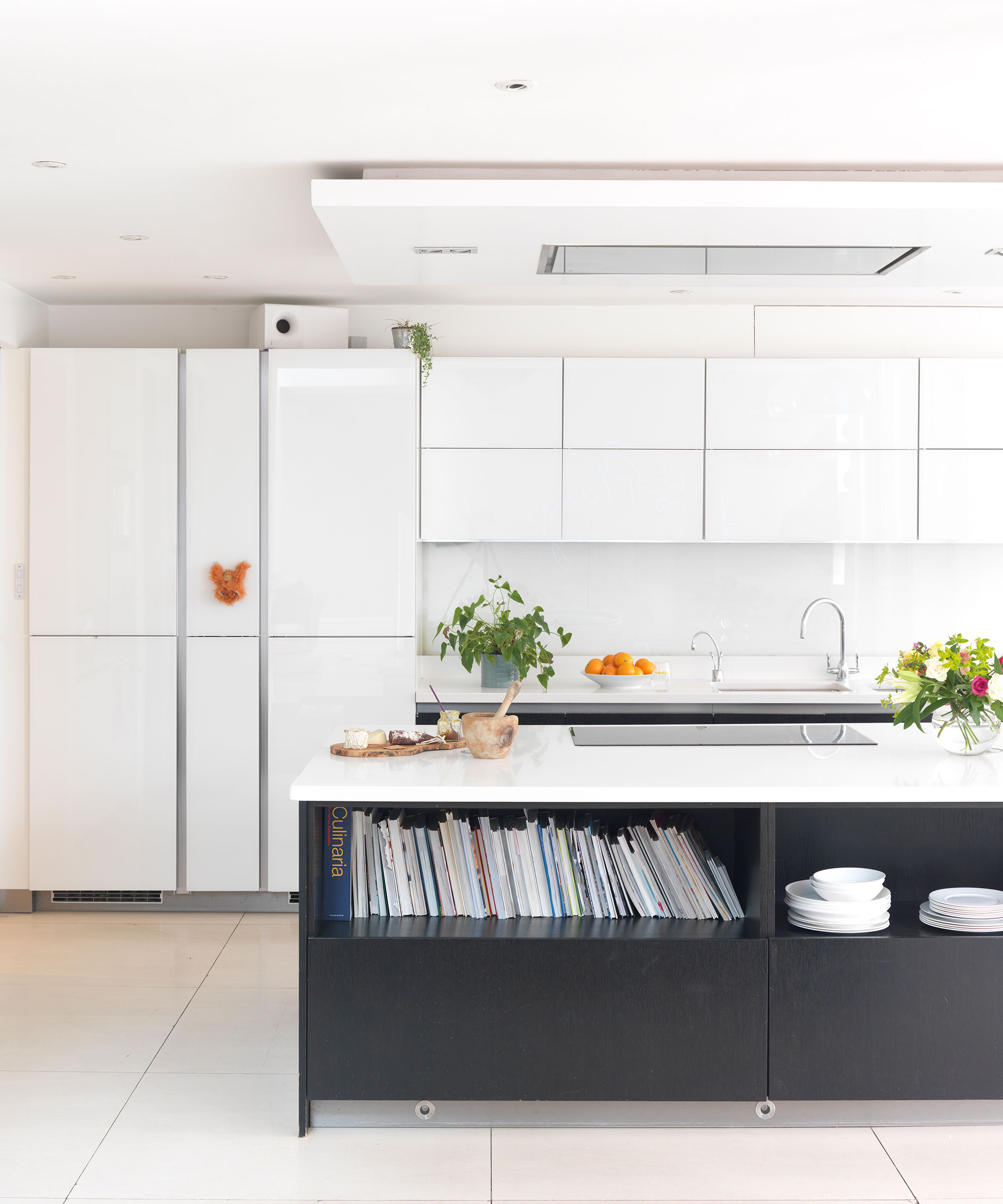
Much like minimalism, for a 'look' that represents clarity and restfulness, I find all-white interiors draining and tiring.
As it turns out, I am not alone in this thought. 'While white is pure and unblemished, it can also be perceived as cold, sterile, and isolating,' says Karen Haller, color psychology specialist, teacher, and best-selling author of The Little Book of Color. 'It may help calm the noise and chaos of modern-day life, but it can do so at the point of shutdown.'
Hospitals are a good example of how we can experience a color's psychological duality. In the 1950s, psychiatric wards were kitted out in all-white because it was believed that all-white would lower temperature. So why is white so popular? For me, this 'no-decision' color is easy, simple, and precise, but it is also one that I am happy to see the back of, for now at least.
3. Open-plan living
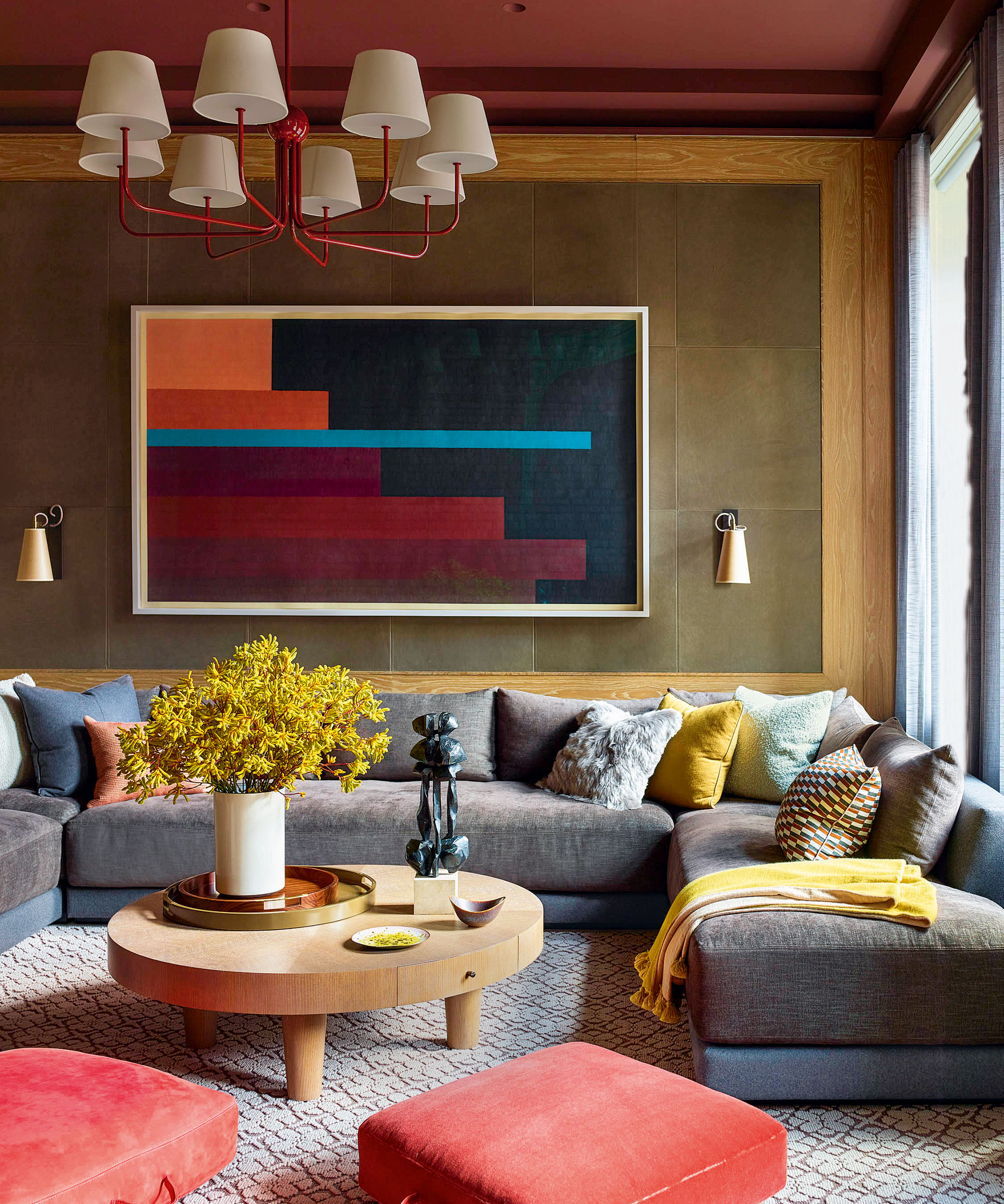
Open-plan living shows no signs of abating, but post-pandemic life has made me entirely rethink the floor plan in my current living situation. Now that hybrid working is a way of life for many, myself included, my home needs to function as not only a place to rest and entertain but also as a space for work, and with this in mind, the open floor plan has become redundant and quite frankly, unwanted.
The solution? A sub-divided with a physical partition; a midway point between an open plan and a separate room, also known as a broken plan.
A broken plan layout can be much more practical than an open-plan living room, allowing different members of the family to inhabit the same space without distracting or interrupting each other. But it's not just a practical move. The smallest rooms in the home are often the coziest, like this warm Kevin Dumais-designed snug room.
4. An overzealous use of house plants
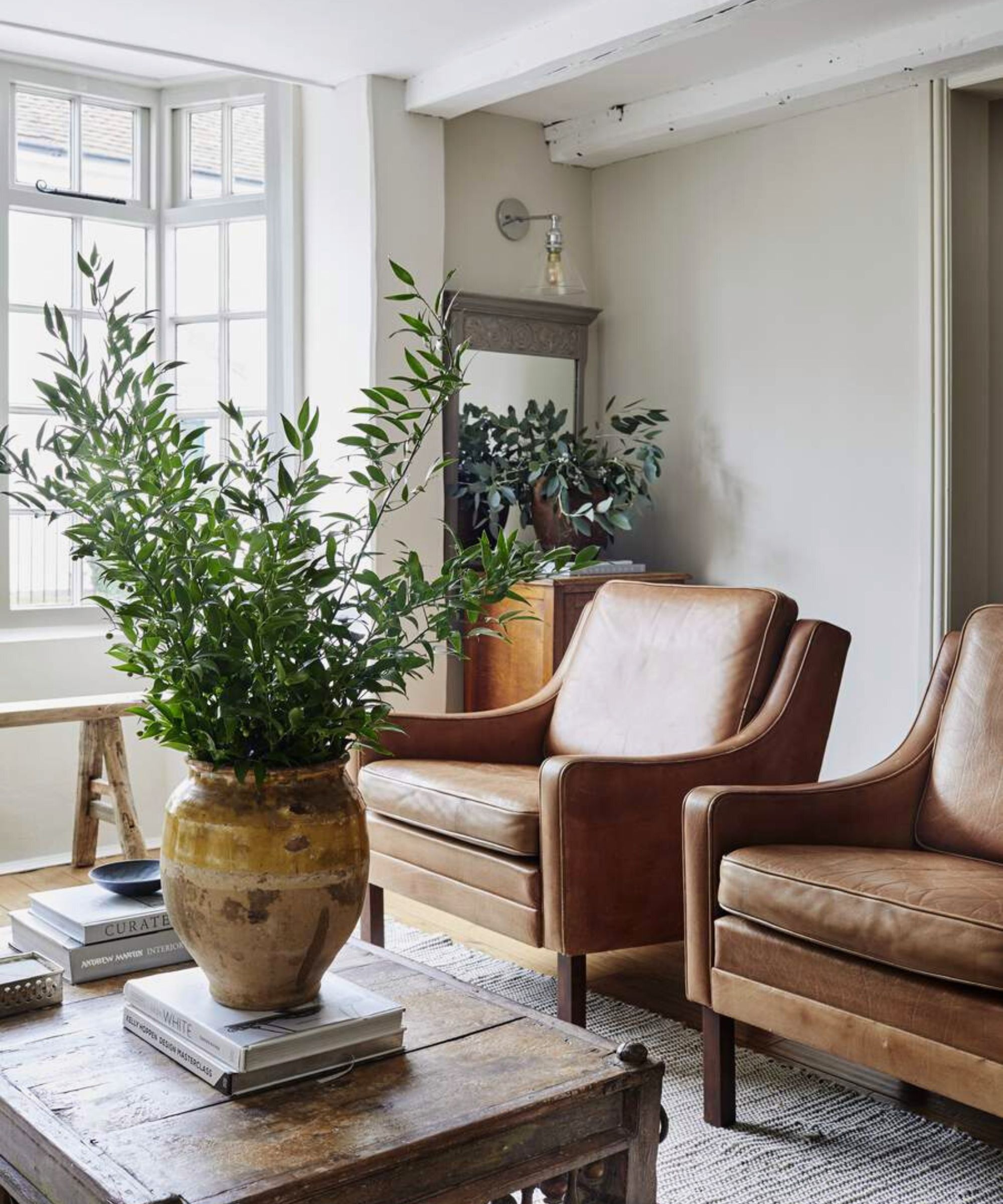
I find green as a color, and biophilic design in general, to be hugely grounding and inspiring – especially important if you are working from home. House plants are a useful decorating tool and can add visual interest to just about any room. But have we gone too far in our quest for bringing the outdoors inside? Yes, it seems you can definitely have too much of a good thing, and surely no one wants to live in an indoor jungle, do they?
Curating a beautiful home is all about balance, and that includes the overzealous use of houseplants, too. Balance in interior design is used by designers to visually stabilize a space. It ensures that no single element in a room overpowers another in terms of visual weight or dominance.
It's high time we opened our minds to new possibilities when decorating. Sorry spider plant, you have got to go.
5. Whole house color schemes
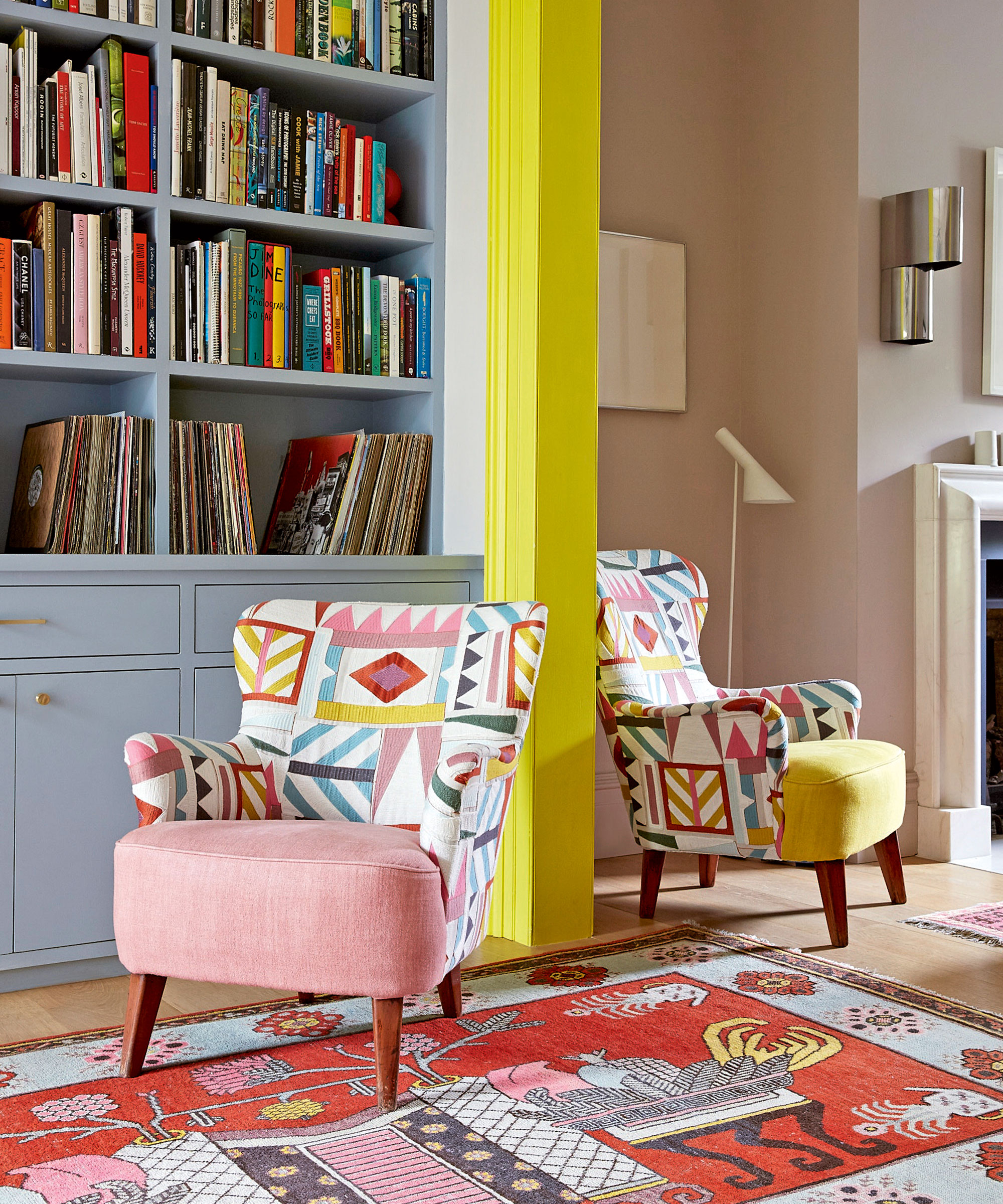
Let me start by saying that there are so many benefits to whole-house color schemes; they are cohesive and calm and some world's greatest interior designers routinely use single color schemes for a unified home. However, at a time when economic instability looms, all I crave is playful, dynamic design, and the easiest way to achieve this is through color and plenty of it.
The benefits of painting your home using contrasting colors are endless. The addition of an accent color is a quick and easy way to transform a space, define an area, or highlight architectural elements, believes Ruth Mottershead of Little Greene. ‘If you’re lucky enough to have wonderful architectural details, like in interior designer Suzy Hoodless’ home above, paint is the perfect way to highlight them to create a design detail.’
6. Too much co-ordination
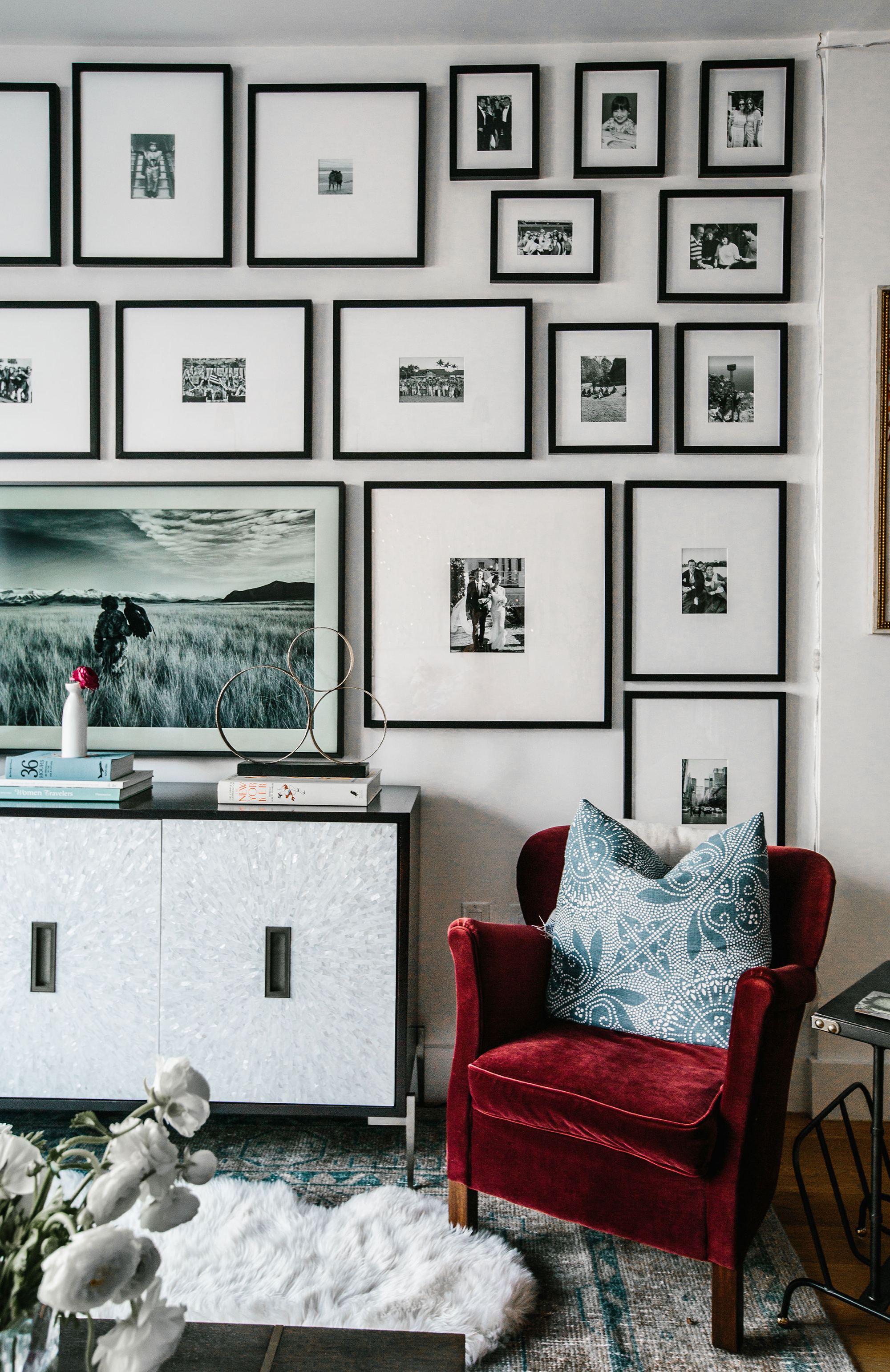
By no means is coordination a bad thing, but if your home reflects the picture-perfect pages of a glossy magazine or a Pinterest board – and not your true self – then you've gone wrong. It's unnatural and at times, feels utterly unliveable. You should be able to put something down and not worry if it looks out of place.
The whole purpose of interior design is to create a room or rooms, which answer the needs of the individuals living in them whilst reflecting their personalities with good design, space, and functionality. It's 2023, embrace the chaos and have some fun with your home decor ideas.

Jennifer is the Digital Editor at Homes & Gardens, bringing years of interiors experience across the US and UK. She has worked with leading publications, blending expertise in PR, marketing, social media, commercial strategy, and e-commerce. Jennifer has covered every corner of the home – curating projects from top interior designers, sourcing celebrity properties, reviewing appliances, and delivering timely news. Now, she channels her digital skills into shaping the world’s leading interiors website.
