Exclusive: Joanna Gaines' new paint collection channels the great outdoors – these 7 shades are 'comfortable, timeless and grounding'
Fixer Upper: The Lakehouse inspired Magnolia to release an all-new color palette, inspired by natural beauty and '60s charm. We sat down with Joanna to get the inside scoop

Design expertise in your inbox – from inspiring decorating ideas and beautiful celebrity homes to practical gardening advice and shopping round-ups.
You are now subscribed
Your newsletter sign-up was successful
Want to add more newsletters?
To celebrate 10 years of Fixer Upper, Chip and Joanna Gaines recently took on a brand-new project – and it brought them closer to nature than ever. Tasked with renovating, restoring and styling a 1960s-style lake house near Lake Waco, Texas, the famed husband-wife team shared their journey with us all throughout six entertaining episodes. And while we're sad to see the Lakehouse project come to a close this Sunday, the Magnolia team has left us with something lasting to remember it by.
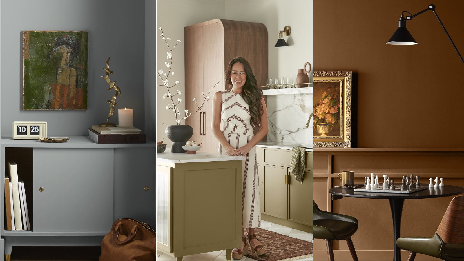
Joanna just launched The Lake House Collection, a fresh color palette from Magnolia and KILZ that takes inspiration from 'the peaceful charm of lakeside living.' Boasting five fresh shades (and two returning classics), the collection is soothing, nostalgic, and right in line with nature's finest qualities.
To share more about the palette and how you can decorate with earthy colors in your own home, H&G sat down with Joanna herself – here's what she had to say about the brand-new hues.
Article continues below 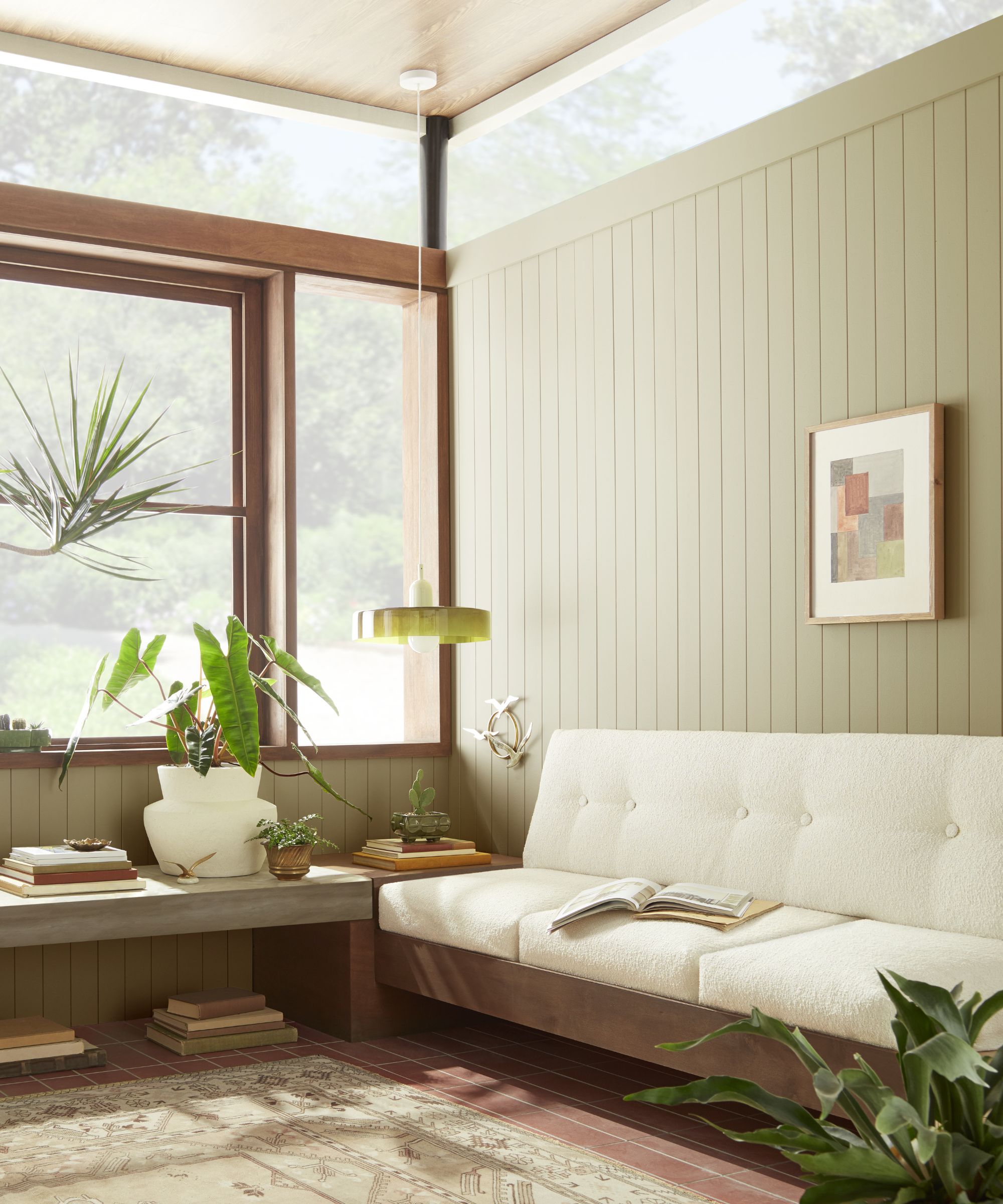
Joanna shares that often, the color scheme is the first design element she considers when going into a new project. And though it's an important feature of a successful design scheme no matter the backdrop, color played an especially integral role in bringing the lake house decor back to life. The natural scenery surrounding the property made Joanna's usual question of 'What is the color palette of this home?' a bit more complex.
'With every project that we tackle, I always feel like color is always the first story I'm trying to figure out,' Joanna tells H&G. 'I always have believed that color is one of the most powerful storytellers when it comes to these homes.'
What's inside the Lake House Collection?
The designer says she wanted to channel Texas' natural beauty through a cohesive color palette but also sought to take a step back in time. She often tells Chip that if she could be born in any time period, it'd be between 1965 and 1978. This palette gave her the perfect opportunity to tell the time period's story through timeless shades and retro decor.
'With the lake house, I knew right off the bat what I was wanting. I wanted it to feel like you stepped back into time [to] the '60s and the '70s. Some of those colors, especially the greens, were really popular back then, and green happens to be my favorite color,' says Joanna.
Design expertise in your inbox – from inspiring decorating ideas and beautiful celebrity homes to practical gardening advice and shopping round-ups.
'I just felt like this lake house needed its own collection,' she continues. 'We started with these very tonal, earthy colors and then from there decided, "How do you punch up some of these colors so that it's a really beautiful palette when it's all combined?"'
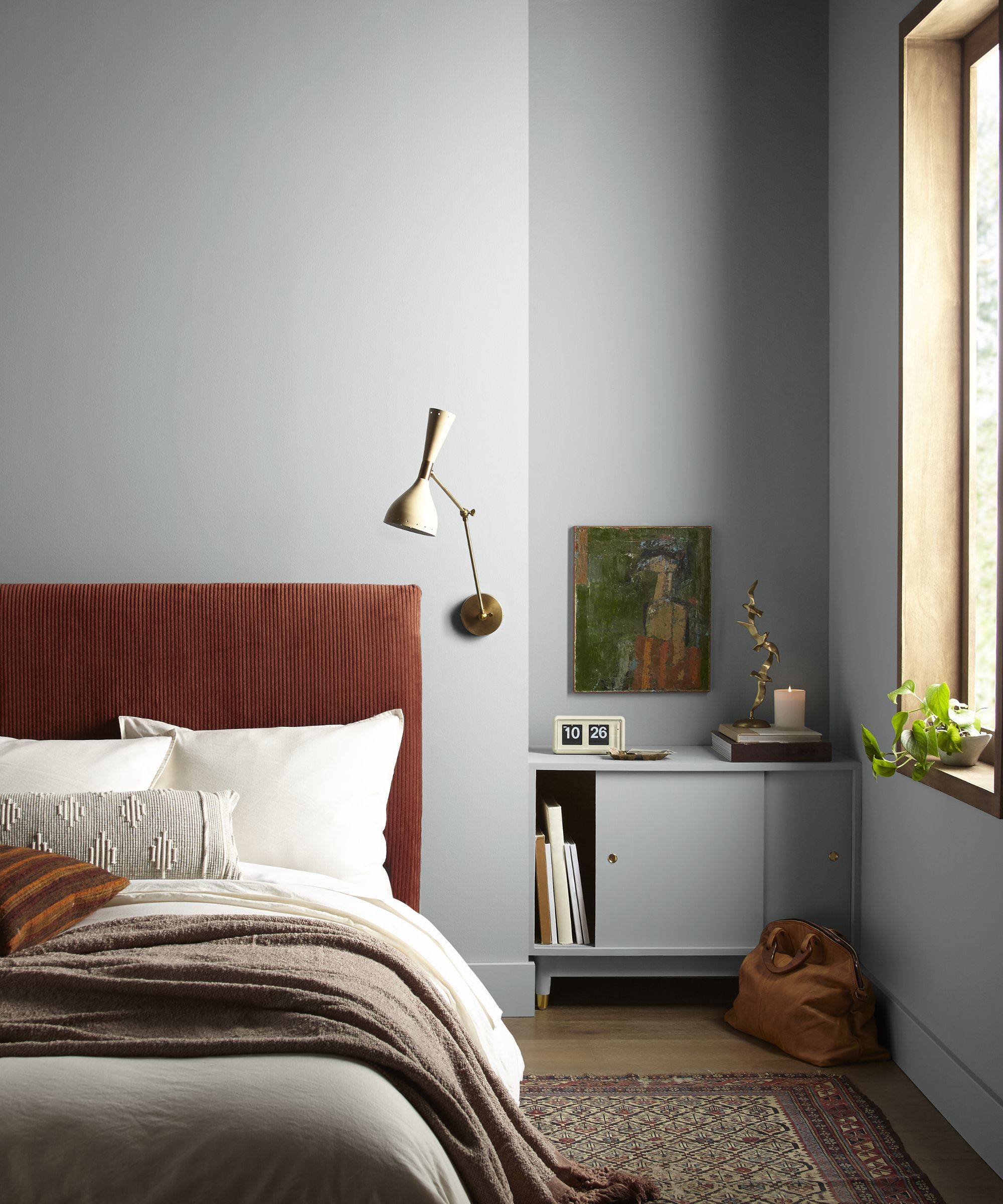
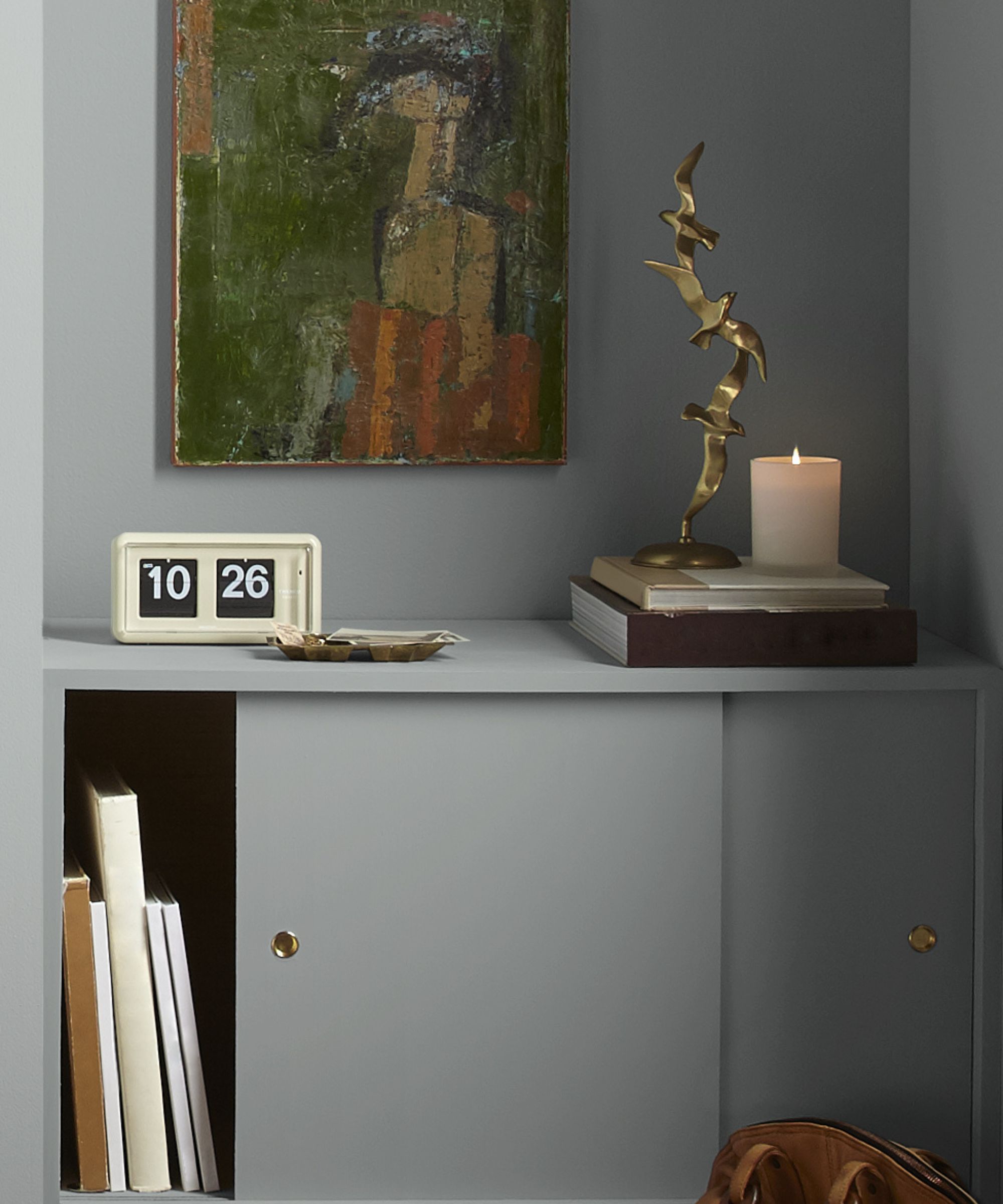
The collection includes five never-before-seen shades, in addition to two Magnolia must-haves. Tranquil Waters, pictured above, is the first new hue of the bunch, 'a neutral gray with a tinge of blue inspired by still water.'
Found in the lake house's relaxing bedroom, which features the hue combined with a dark, rust-colored headboard and plenty of natural light, this shade is a barely-there blue-gray that works with a wide range of interior design styles. It serves as a stunning example of the feeling Joanna says the lake house's style exudes.
'There's a sense of comfort and timelessness and grounding that happens. When you walked into the house before we ever even renovated it, you felt those same words just by looking outside. When you looked at the lake, when you looked at the woods with all the trees, you felt like you were in this place of comfort, you felt like you were being grounded. Nature has a way of doing that to all of us, and so to be able to translate that through color on the interior was really important,' says Joanna.
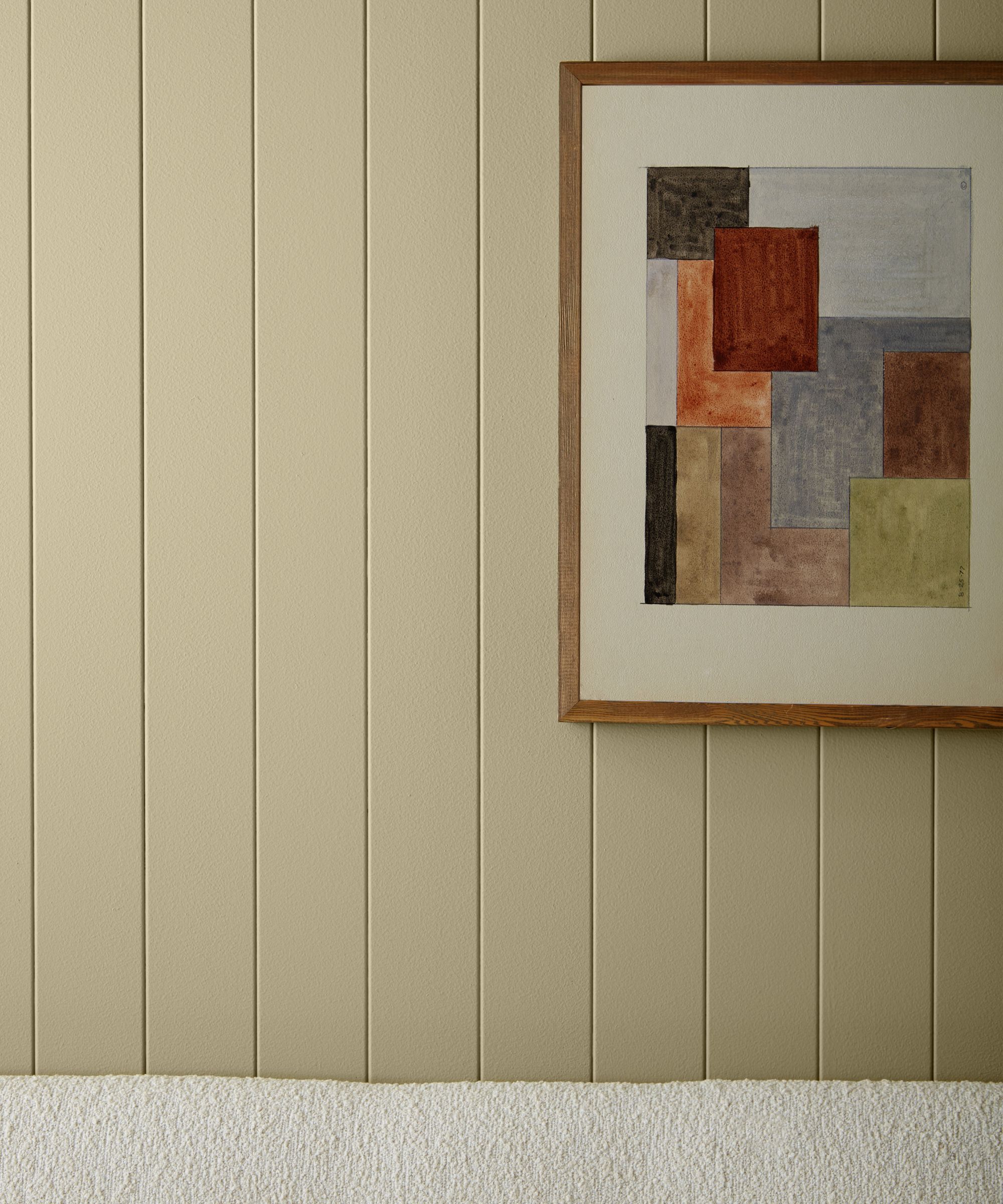
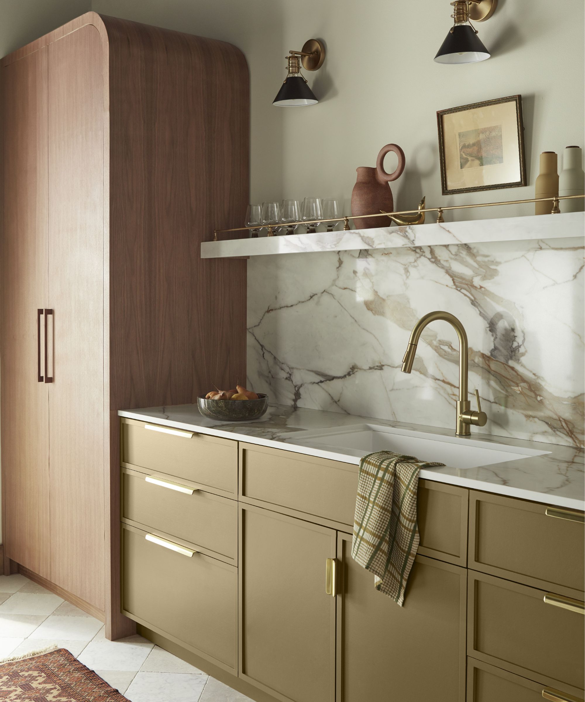
Juniper Tree, Tranquil Waters' green counterpart, is a 'warm, sun-washed green that nods to secluded pathways and untouched landscapes.' It's found in the lake house's sunroom, paired with bright whites and natural wood tones. Its subtle, soothing look complements the outdoors without distracting from the real star of the show.
'These colors really give me that feeling of comfort, of familiarity, but also in some ways, this boldness that you'll see hints of throughout the house. But not so much that it takes away from the view, and the true hero of it all, which was the lake view and the trees. It helps tell that story in a way that's not too much but just enough to be like this is just right,' Joanna tells us.
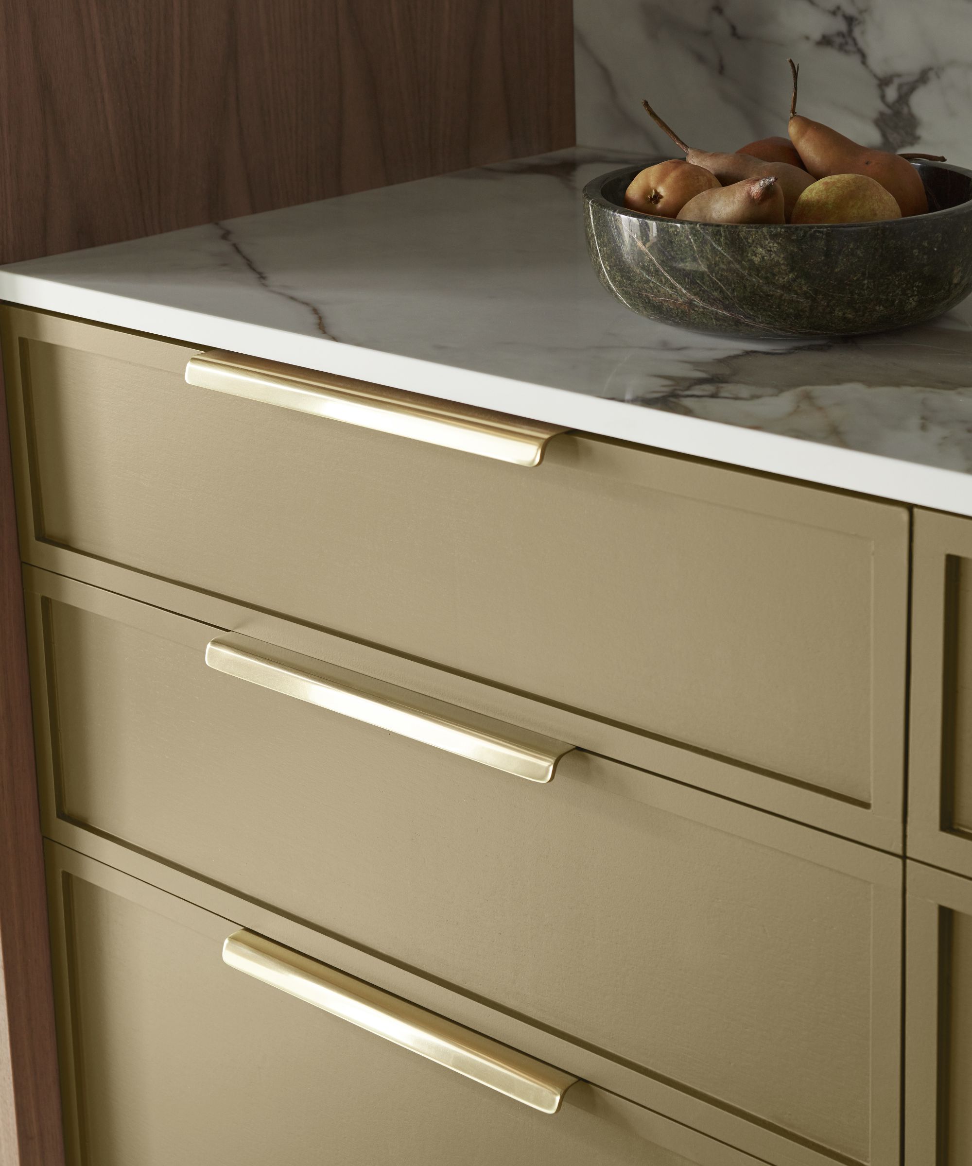
Juniper Tree isn't the darkest green in the seven-shade collection, and Joanna shares that the darker hue is her personal favorite. KILZ describes it as 'a rich green hue with warm undertones that captures the grounding qualities of nature.' Called Remote Trail, this moody, impactful color was used to 'anchor' what Joanna considers 'the most important room of the house': the kitchen.
'It took a while to find that perfect green. It's like that green that felt kind of vintage but still had that level of interest where you looked at it and you had to double take, because it's like, "Oh, that's an interesting shaded green,"' she says.
Because green is Joanna's favorite color in general, and perhaps the most fitting hue to accompany a stunning outdoor view, she says it can be found in every nook and cranny of the lake house – far beyond the paint on the walls.
'You'll see it in the textures with the textiles and the sofas, you'll see it in the pillows, you'll see that accent and that tone of green throughout that you see translated differently. So you see it in paint, but you also see it in texture that I carry throughout the house,' she says.
Which existing colors made it into the collection?
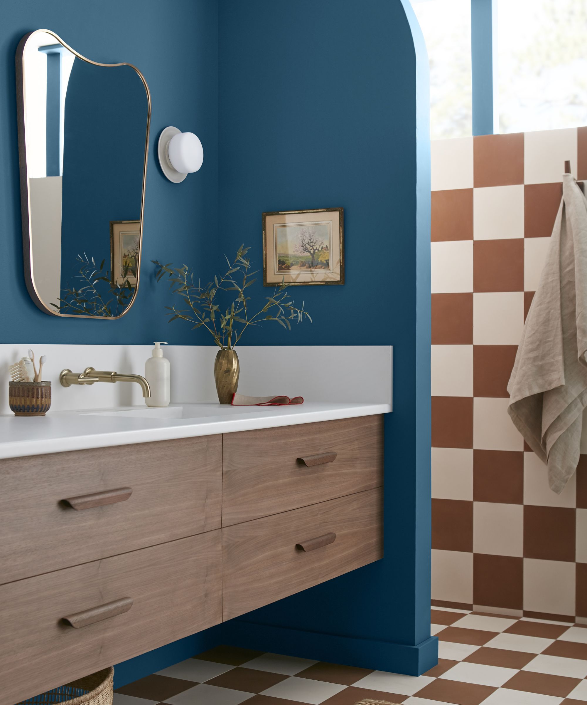
Two bolder shades round out the selection of new colors: Superior – 'a true blue hue with a sense of sophistication and ease,' pictured above – and Cognac – 'an earthy brown with rich, reddish hues that evoke warm elegance and depth.' The two deeper colors make a lasting impact, and make this collection stand out from the crowd. When paired with a playful orange-and-white checkerboard pattern in the lake house's bathroom, Superior has a calming presence.
'With the color Cognac or even Superior (which are a little bolder, a little more unique), if you want to try those colors, try those in a bathroom or a smaller space where you can experiment. Then from there, build out that story,' says Joanna.
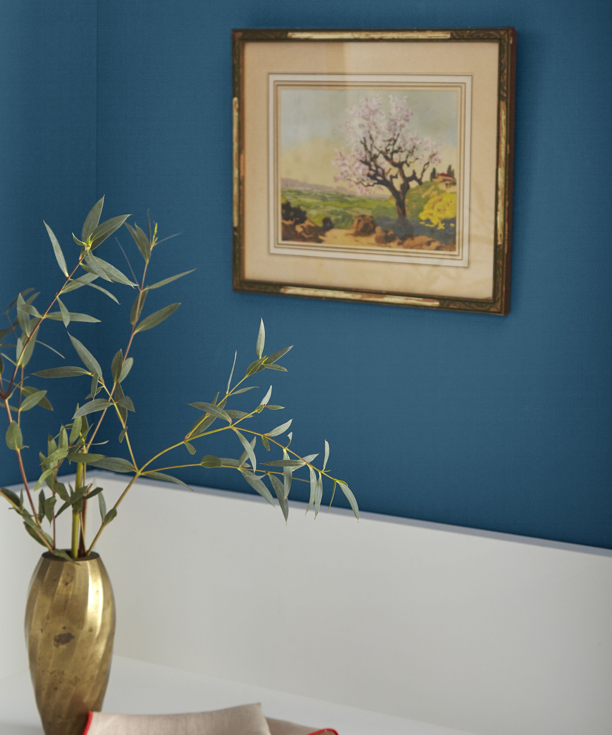
While these two hues bring a bit more richness and depth to the collection, Joanna says the goal was to create an approachable and accessible palette that would allow homeowners everywhere to tell their own stories. Whether you're designing your very own lake house, or your guest bathroom just needs an extra coat of paint, these colors are versatile and meant to last.
'To me, this color palette kind of can go anywhere,' says Joanna. 'These colors, they're not too risky. They're still beautiful, but I think you can't go wrong, and it's just [deciding] how bold you want to go and what you want to highlight in each space. Then use that color to tell that story.'
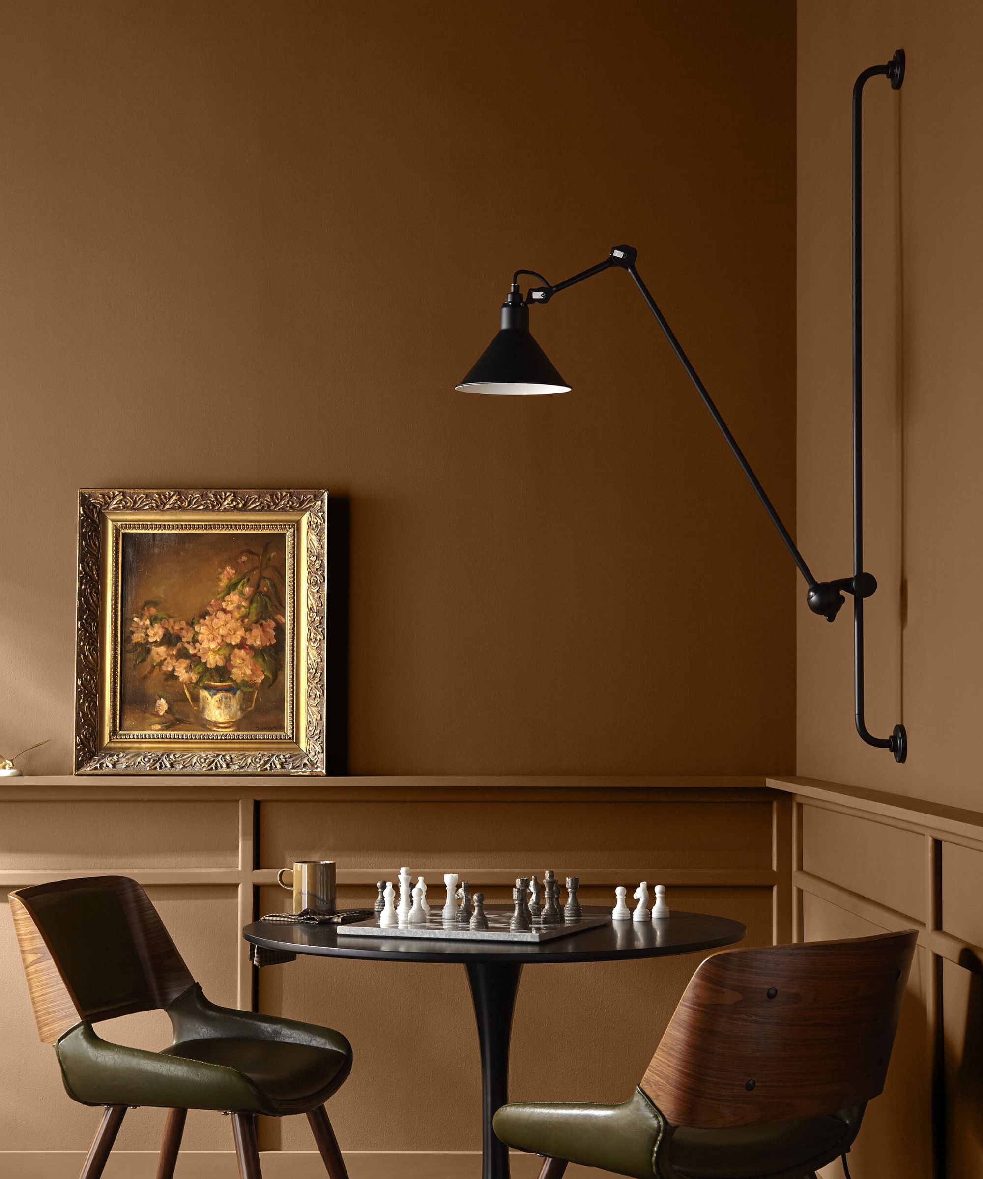
Magnolia Home by Joanna Gaines already has a stunning, sweeping collection of over 150 colors, and past palettes include the Castle Collection and Market Collection. With so many carefully crafted hues already on offer, it's no surprise a couple of standbys made it into the final Lake House lineup.
Wooded Acres, 'a warm and woodsy brown with a touch of green' and Blanched, 'a versatile, warm beige that pairs well with a range of other hues' were the 'tried and true colors' Joanna opted to bring in to the overall collection.
'Truly, the creamy white Blanched is throughout the entire house. That's like every wall color ... I was just like, "I can't compete with what's beyond those windows. I can't compete with nature." And so for me, it was really important to keep it super neutral on the walls, but then infuse that color in other ways in smaller moments,' says Joanna.
If you haven't yet caught up with Fixer Upper: The Lakehouse, it's still available to stream on Max and Discovery+. And if you're feeling inspired after watching, bring the color palette home by picking out a shade (or seven) from Magnolia Home – the serene, earthy feeling is hard to beat.

Abby was the Interior Design News Editor at Homes & Gardens and is now studying for her Master's degree in Journalism at City University, London. Prior to joining our team, she worked with Better Homes & Gardens, where she wrote and edited content about home decor, gardening tips, food news, and more. She studied Journalism and English Literature at New York University and moved to London to pursue her love of writing in 2023.