What colors create a mid-century modern color scheme? 10 retro combinations to try
Find out what colors work best with everyone’s favorite mid-century style

Design expertise in your inbox – from inspiring decorating ideas and beautiful celebrity homes to practical gardening advice and shopping round-ups.
You are now subscribed
Your newsletter sign-up was successful
Want to add more newsletters?
Unquestionably the most enduring design influence to ever hit our homes, the sleek lines and organic forms of mid-century décor never falls from grace. Rooted in the post-war optimism of the 1950s and 1960s, but updated annually to stay fresh and relevant, mid-century modern ideas can always be relied upon to captivate the imagination.
Unlocking the endless allure of mid-century modern style often begins with a carefully curated color palette that effortlessly blends modernity with nostalgia. Wood and brass accents are never far away, and many colors are blended with natural finishes to double down on the retro feels.
Whether you're drawn to the earthy warmth of teak, oak and ash, or the vibrant optimism of jewel tones, sunshine brights and tantalizing teal, discover how to harness the power of mid-century color schemes and transform your home into a stylish homage to everyone’s favorite era.
Article continues belowMid-century modern color schemes
To uncover the secrets to retro styling, we asked the experts to reveal their perfect mid-century modern color palettes. Find out their recommendations for tackling this timeless aesthetic and bring mid-century influenced schemes up-to-date with a modern twist.
1. Mustard Yellow
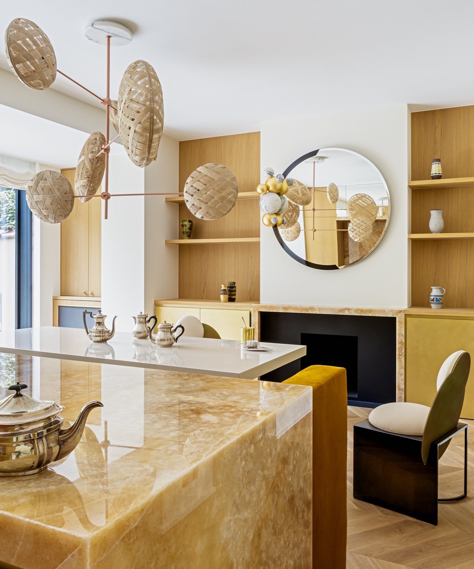
If you’re a fan of bright colors but need warmth in your life, the spicy tones of mustard yellow are spot on for a bit of retro coziness. Keep the mid-century mix strong by going heavy with timber accents, like this mustard and ash kitchen diner by Victoria Maria Interior Design.
‘Mustard yellow is a warm and vibrant color that offers a subtle yet effective contrast with gray and ashy tones. This difference in tone creates an interesting visual balance without being too overwhelming,’ says founder, Victoria-Maria Geyer. ‘This color combination is often perceived as elegant and sophisticated. Whether in fashion, interior design, or even art, this palette is appreciated for its mid-century modern, chic aesthetic.’

Self-taught, with an unparalleled holistic vision, Victoria-Maria Geyer has been passionate about decoration and design since her early childhood. Based in Brussels, this German interior designer founded her agency in 2008. Victoria-Maria has always had a passion for beautiful objects and stylish, eclectic decors. She enjoys combining patterns, materials and eras, creating colorful interiors that are a source of infinite joy.
2. Orange and Teak
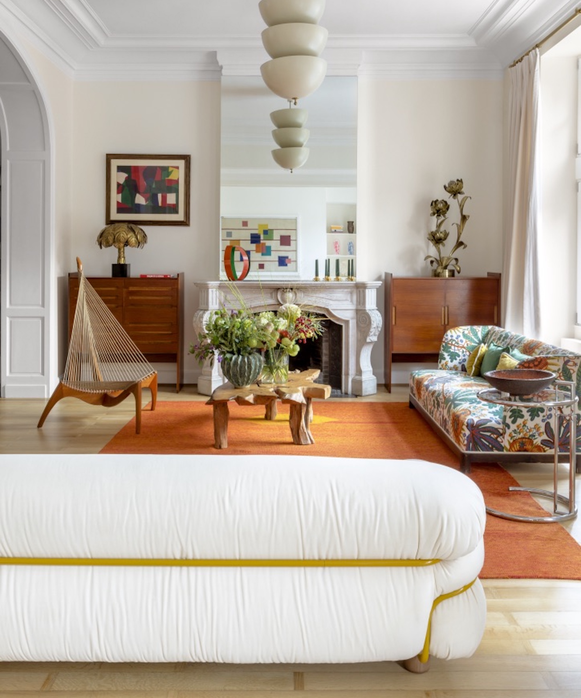
Teak is a strong feature in mid-century modern design. Original ‘50s pieces are easy to source at vintage fairs and antique centers – lookout for vintage furniture by G Plan. Dial up the retro vibes by pairing orangey woods with orange accessories, as Victoria-Maria Geyer has in this striking mid-century inspired living room.
Design expertise in your inbox – from inspiring decorating ideas and beautiful celebrity homes to practical gardening advice and shopping round-ups.
‘Orange provides a dynamic visual contrast with the warm tones of woods such as walnut, cherry, and teak. This contrast creates visual interest and enhances the natural beauty of the wood. Orange is strongly associated with the aesthetic of the 1960s and 1970s, a period when mid-century design was very popular,’ says Victoria-Maria.
3. Emerald and Black
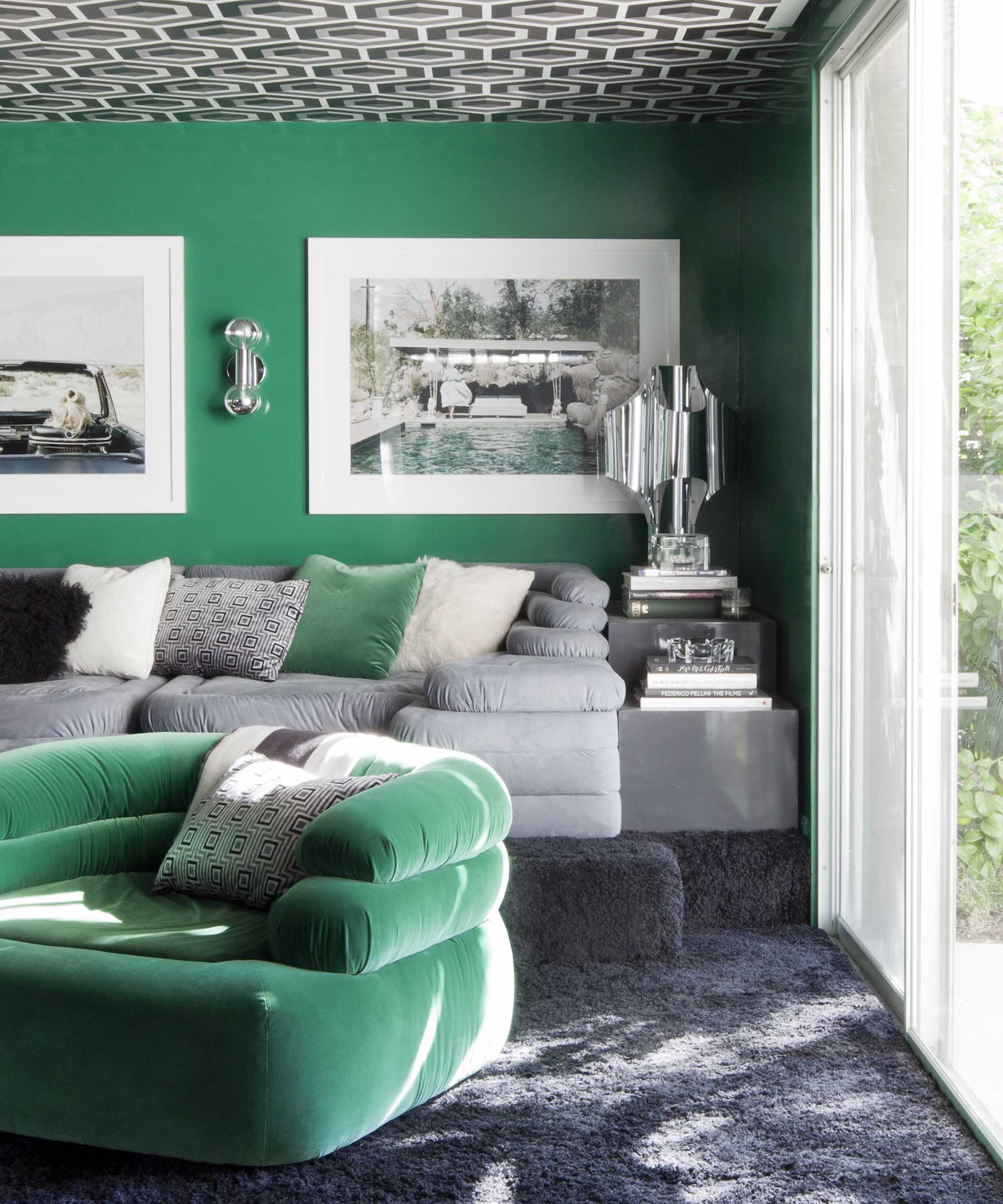
Opulent emerald green and dramatic black create a bold aesthetic that feels both classic and contemporary – exactly the ingredients required for a stand-out mid-century modern scheme. ‘Emerald is a great choice for mid-century modern color schemes, embodying the era's vibrant yet refined aesthetic,’ agrees interior designer, Martyn Lawrence Bullard
‘Pair emerald with black for a striking contrast reminiscent of mid-century boldness. Emerald's richness complements black's timeless elegance, creating sophisticated and dramatic room uplifts, whether it's through bold wallpaper or accent pieces.’

Los Angeles-based Martyn Lawrence Bullard is an award-winning designer renowned for his broad range of styles and ability to create globally inspired, sophisticated, and inviting interiors. He’s a TV personality and has designed collections in collaboration with prestige brands like Schumacher, Ann Sacks, The Rug Company and La Cornue.
4. Purple and Tan
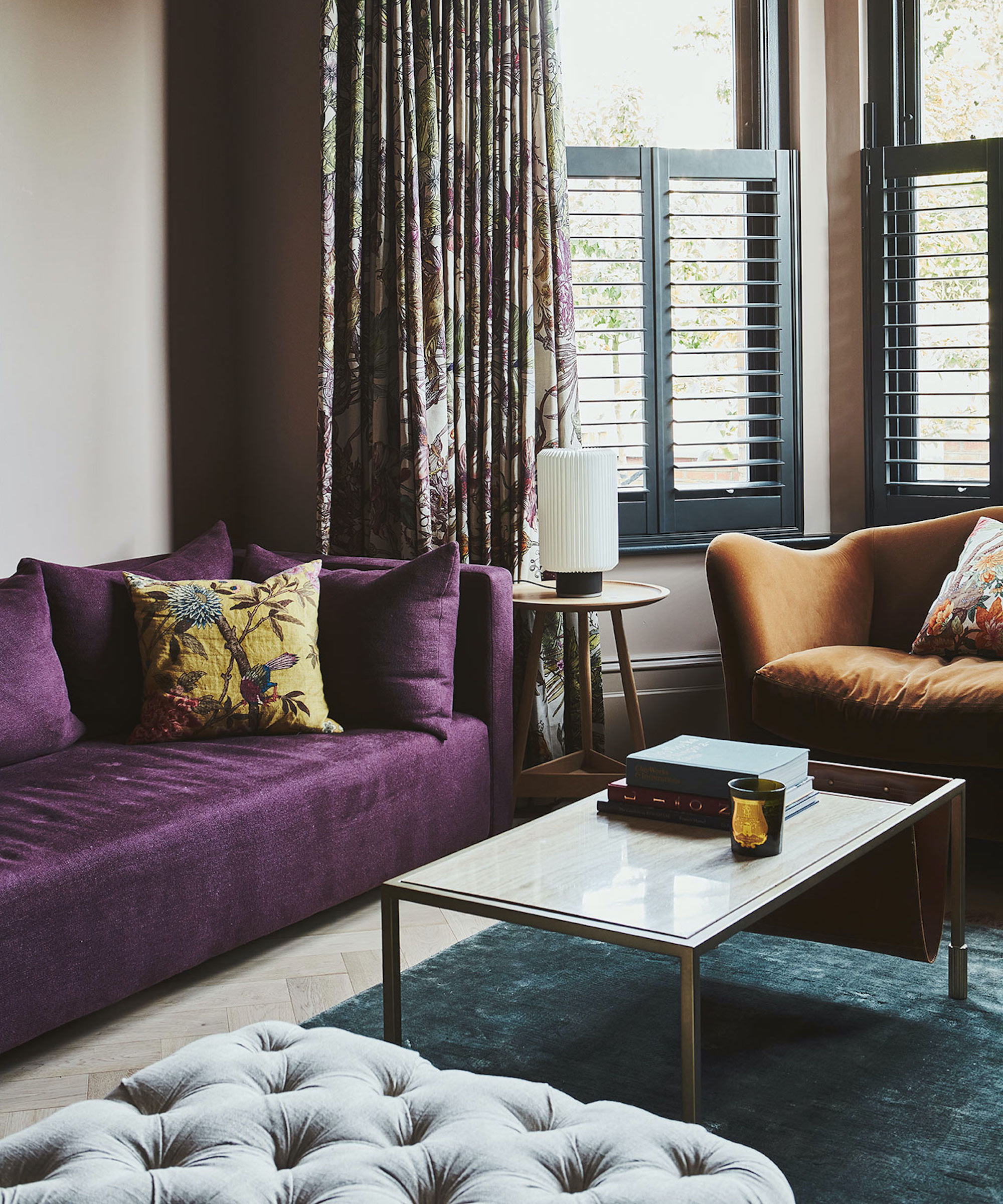
Jewel tones, browns, tans, and leathers are all classic mid-century colors, infusing your space with rich hues reminiscent of the era's opulent interiors. The Vawdrey House has put purple, emerald, and tan to good use in this cozy and inviting living room.
‘The choice of deep vibrant purple velvet works particularly well for this mid-century scheme as a color that transitions between vintage and contemporary without feeling dated. The burnt orange chair works like a tan or leather, providing an inviting warmth that works as well in a mid-century setting as it would in any other period,’ explains Sophie Chapman of The Vawdrey House. ‘Timber accents always help to add warm tones and brass further accentuates the mid-century vibe complementing the rich textures of the fabrics.’

A founding member of The Vawdrey House, Sophie oversees the design team, bringing her energy and creativity to projects. She has a BA in Interior Design & Environmental Architecture. When not curating unique furniture proposals or styling, Sophie loves nothing more than digging for treasure at antiques fairs and French brocantes.
5. Royal Blue and Smoked Glass
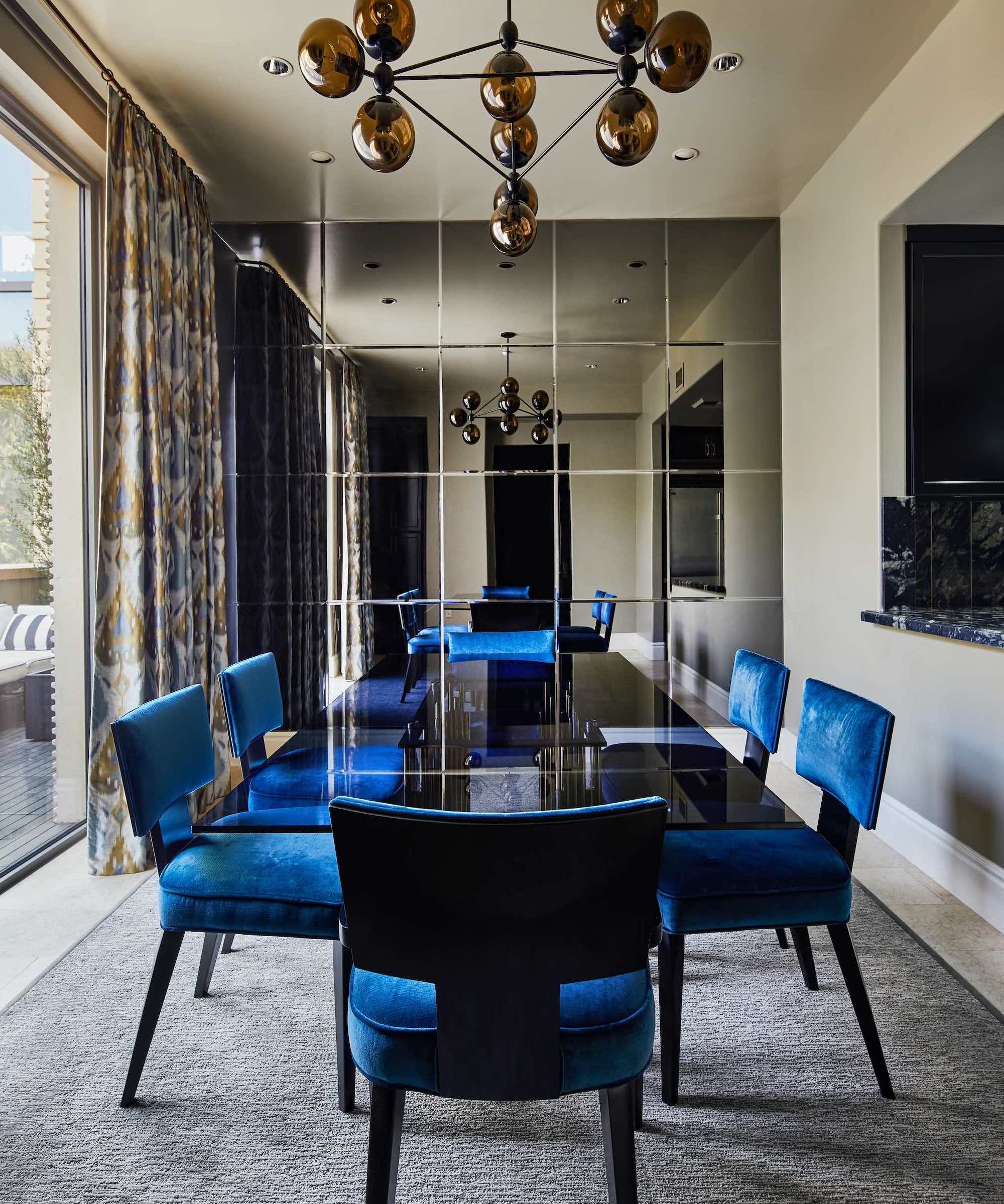
During the mid-20th century, smoked glass was a popular choice for furniture, lighting fixtures, and decor items and used to add a touch of glamor and mystery to interiors. Paired with elegant Royal Blue, smoked glass feels extra luxe – think gentleman’s club meets front salon.
‘In crafting this pied-à-terre, we endeavored to fuse the richness and class of the Ralph Lauren American aesthetic with a contemporary, masculine flair. Drawing inspiration from mid-century design principles, we curated a space that marries tradition with modernity, offering a sanctuary that resonates with our client’s refined tastes and nostalgic sensibilities,’ explains Southern California-based interior designer, Hanna Li.
‘Utilizing silk blends for the drapery and seating upholstery, we achieved a tactile experience that exudes sophistication. We selected the royal blue color to contrast the lush green of the climbing fig and roses in the outdoor terrace. The color felt like the calm ripples of the deep ocean as the velvet fabric sheen changes color with the natural light and was beautifully complemented by the smoked glass accents.’

Hanna trained in furniture design at Rhode Island School of Design (RISD), where she apprenticed under industry masters. Established in 2016, Hanna’s namesake firm is grounded in human emotions and visual impact, and her belief that how a space looks and makes you feel is equally important.
6. Sunshine brights
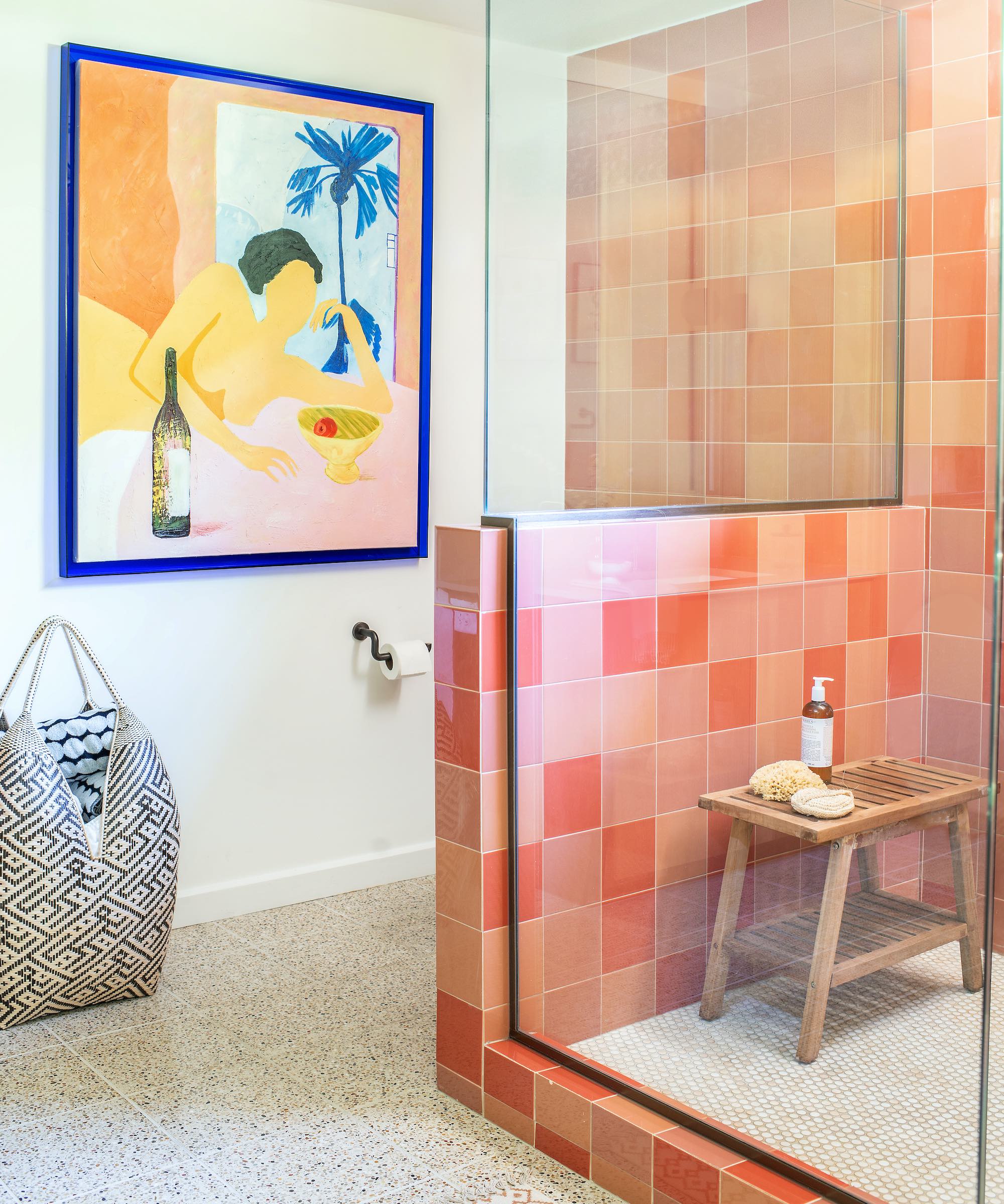
Mid-century modern interiors can be incredibly joyful. To get all the California-beach retro vibes, look to sunshine brights in reds, yellows and oranges. North Carolina-based interior designer Carrie Moore, explains how to work sunshine shades to create an uplifting retro space.
‘Sometimes a bright color works perfectly on its own if given the right amount of breathing room to pop. Other times a bright color may need to be offset by another contrasting color/element of equal or greater saturation/magnitude to create both visual tension and a level of harmony,’ says Carrie.
‘Here we chose art with a striking ultramarine frame to amplify the impact of the tile colors. And speaking of tile, to make this specific palette work, we decided to take the tile color in a more tonal direction which feels a bit more modern.’
7. Earthy beige tones
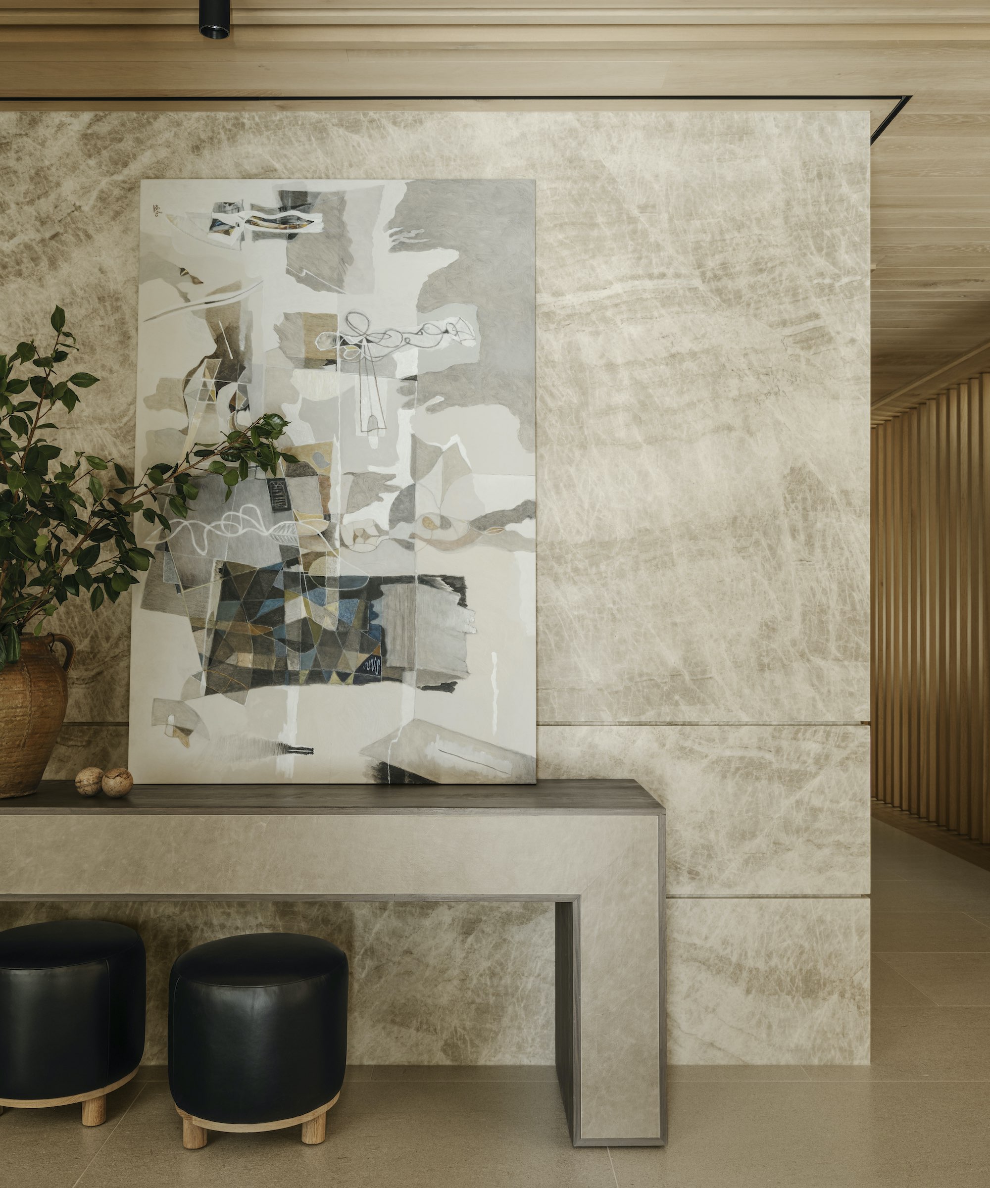
Decorating with beige is far from boring when treated to a mid-century modern twist. Combining beige, creamy stones and wood tones promotes a soothing retro aesthetic and will lend an earthy, grounded feel to your home.
‘Mid-century modern design often incorporates neutral materials, such as wood, and emphasizes a connection to nature,’ agrees Denise Morrison, founder and principal designer of Morrison Interiors. ‘Beige tones can often serve as a backdrop for the clean lines and organic shapes of mid-century modern furniture. It allows design elements to stand out without overwhelming the space. Here, the soft, neutral palette of beige creates a serene and welcoming atmosphere, while the rich warmth of wood tones adds depth and character to the space. This calm mid-century color scheme remains fresh and relevant over time.’
8. Brown and Baby Blue
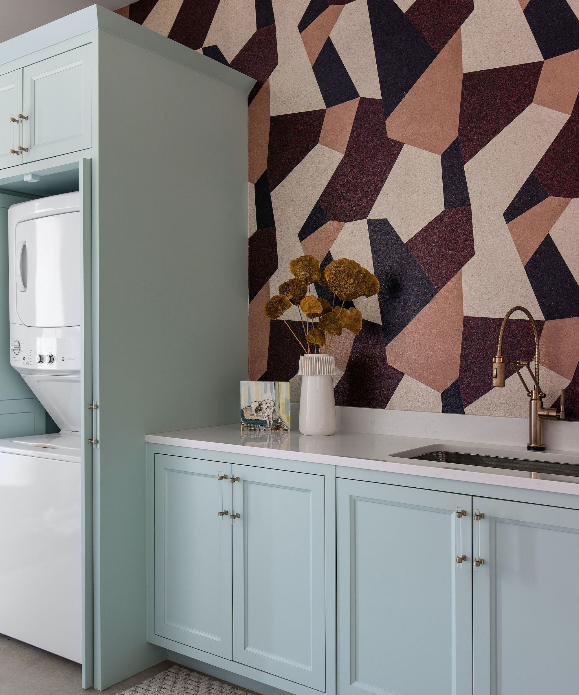
Mid-century modern color schemes can work in every room in the house, even the more utilitarian spaces. The balance of warm and cool tones gives this laundry room such a vibrant energy, characteristic of mid-century modern design.
‘The goal for this space was to create a moment with color, pattern, and scale while paying homage to mid-century design principles,’ says Lindsie Davis, founder of Blueberry Jones Design.
‘The color palette of Sherwin Williams' Waterfront Blue paired with the saturated shades of brown in the geometric wallpaper helped channel a playful mid-century vibe while feeling fresh and unexpected. A barely-there baby blue pops against the restrained, earthy tones of the Arte wallpaper, created with real mica flakes as a nod to retro terrazzo.’
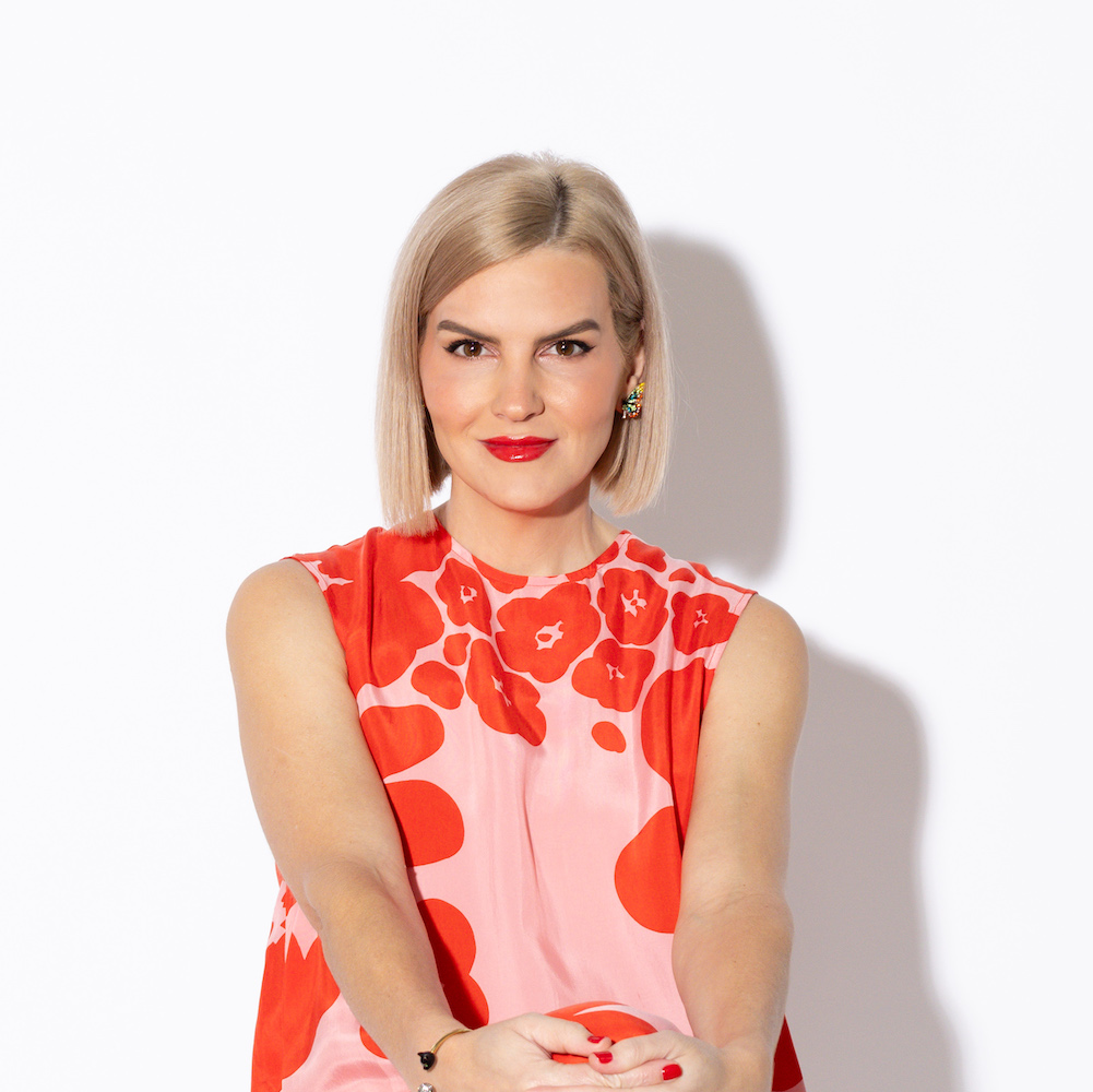
With an extraordinary command for color and an eye for mixing styles, Blueberry Jones’ founder and principal designer Lindsie Davis loves to keep a space lively with unexpected playful moments. Based in Texas, Lindsie is not afraid of color and believes patterns can be neutrals.
9. Peach and Brass
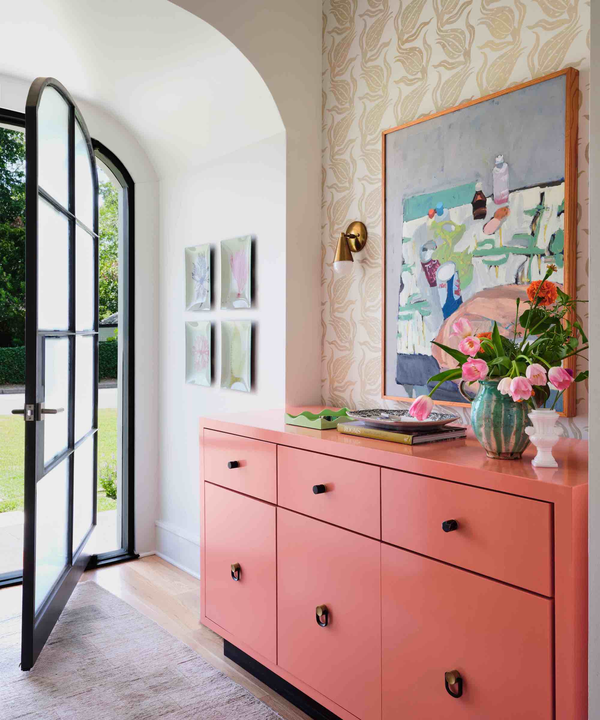
Match peach and brass with wallpaper in a mid-century modern print to enjoy a fresh, uplifting space with industrial touches as seen in this entryway design by Avery Cox Design. To get the look, mix peach and brass with plenty of white, Crittall-style glazing, wood flooring, and color pop accessories.
‘The entryway of this home has a vibrant peach palette, complemented by teals, blues, and a true pink accent. The addition of black metal hardware to the lacquered sideboard, and burnished brass sconces keep the space from leaning too sweet or precious,’ adds Avery Cox.
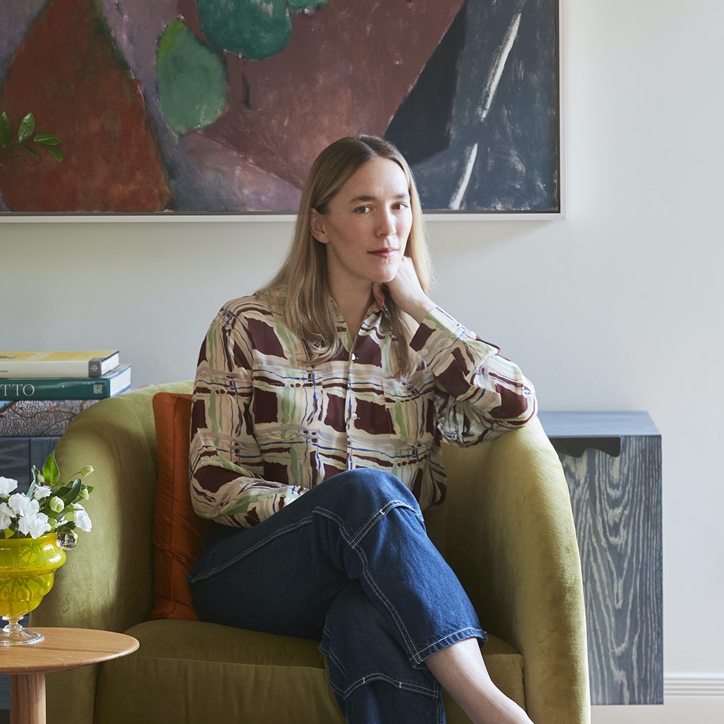
Avery specializes in curating distinctive spaces, combining architectural details with antique and modern elements of style in a way that’s both contemporary and timeless. Avery incorporates classic American craft, New York glamour, and vibrant Southwestern color- providing clients with spaces that are functional, fresh, and uniquely their own.
10. Teal and Oak
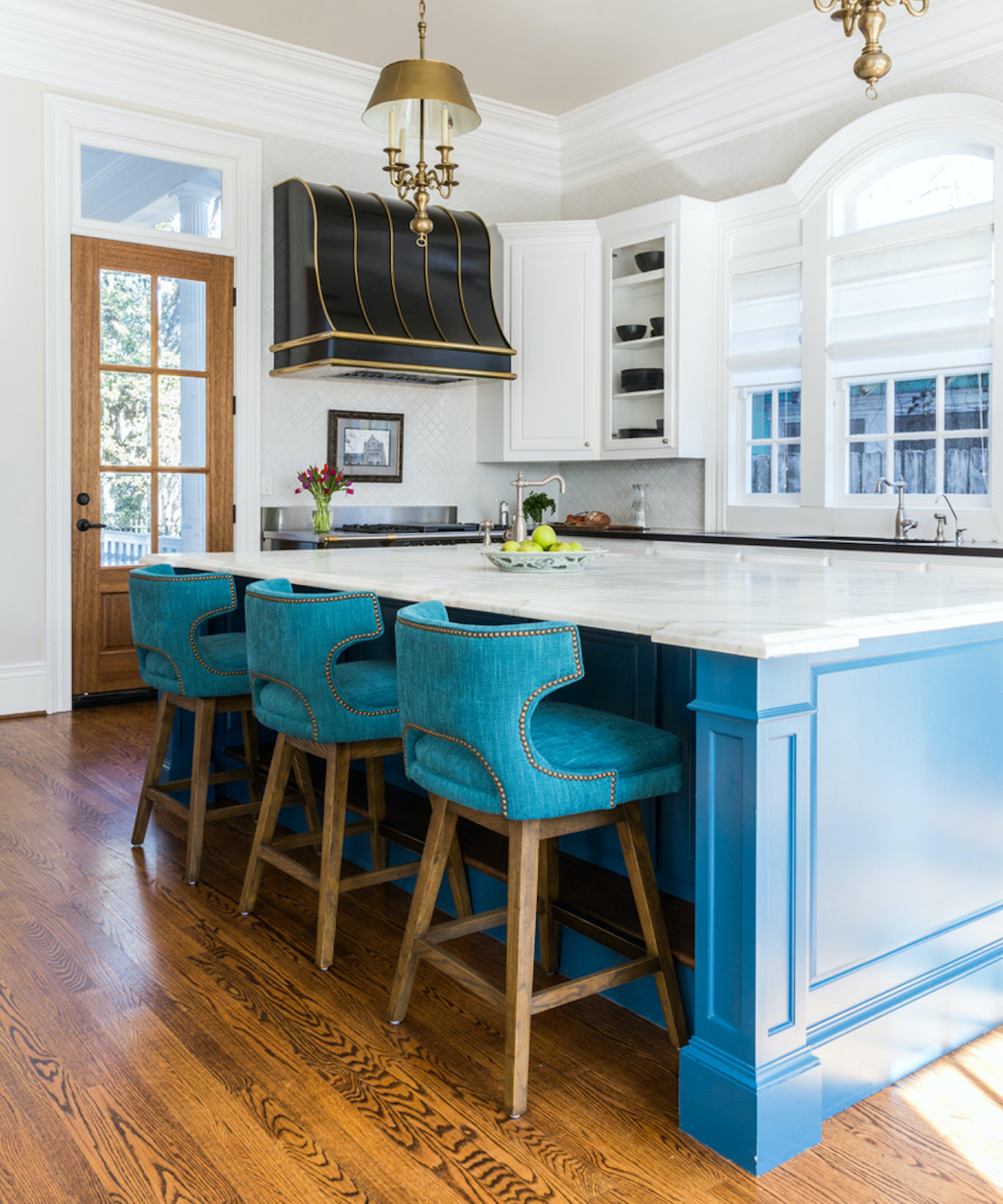
Pairing bright colors with natural wood tones is a classic mid-century modern move, so says interior designer Linda Eyles, who is a big fan of pairing teal and oak to channel retro overtures in a modern way.
‘As it utilizes opposites on the color wheel, a palette of teal and oak is in perfect harmony, using contrast to balance the space. The visual opposition of the two colors pulls out the full depth of both shades. Each finish enriches the other,’ she explains.
FAQs
Is purple a mid-century modern color?
Purple may not have featured as commonly as mustard yellow or brown in mid-century décor, it’s certainly considered a quintessential hue in the mid-century modern palette. Shades like lavender and mauve fall into the pastels category that was popularized in the 1950s and 1960s, but more recently the retro purples we see most frequently in mid-century influenced schemes are rich and deep, often used on silks and velvets for extra luxe appeal.
What paint colors are mid-century modern?
Anjelica Delfino, paint and interiors expert at V&Co Paint, talks us through some of the most classical mid-century paint colors. ‘In the Mid-Century, the preferred color palettes leant towards soft, sweet hues such as light reds, as a focus on comfort and style over formality and functionality became more popular post World War II,’ she explains. ‘Introducing a touch of pink is the perfect neutral backdrop to make any Mid-Century furniture shine. Combine this neutral pink base, with a soft orange and deep red accents for a tonal Mid-Century palette.
By the 1950s, Angelica continues, people were becoming brave with color, opting for more daring, eye-catching color schemes while maintaining a distinct influence from nature. ‘Cobalt blue and turquoise blue, inspired by the ocean and the sky, to deep forest greens and olive sage greens were everywhere in homes after Yves Klein, one of the world’s most famous designers at the time, famously chose blue as his favorite color,’ she says.
‘Alternatively, you could introduce an olive green and burnt orange color scheme to achieve a classic Mid-Century look in the home. Burnt orange will add that retro look, it’s super playful, so for a more subtle look, just add a few accessories or patterns here and there. Burnt orange would make the perfect kid’s bedroom. The olive green provides the earthiness you need to achieve this aesthetic.’
Linda graduated from university with a First in Journalism, Film and Broadcasting. Her career began on a trade title for the kitchen and bathroom industry, and she has worked for Homes & Gardens, and sister-brands Livingetc, Country Homes & Interiors and Ideal Home, since 2006, covering interiors topics, though kitchens and bathrooms are her specialism.
