5 outdated entryway trends that designers want us to stop following immediately
Interior designers and decorators alike are doing away with certain trends in entryways, and the reasons why are fascinating...


Design expertise in your inbox – from inspiring decorating ideas and beautiful celebrity homes to practical gardening advice and shopping round-ups.
You are now subscribed
Your newsletter sign-up was successful
Want to add more newsletters?
It's all too easy to fall foul of outdated entryway trends, namely because you may not consider them as 'trends' in the first instance. Yet there are certain design directions you can take that are likely to date your living area quickly – some glaring, others seemingly harmless, and a matter of personal taste.
Perhaps the more obvious entryway trends trap is to commit to a current feature or entryway color scheme without factoring in its longevity. One of the most important spaces in the home, the entrance is an underused yet incredibly versatile space, so it should be one of the first rooms you think about when planning an overhaul – and there is always room for improvement and inspiring change with the latest entryway ideas.
Much like with outdated living room trends, one of the biggest entryway design mistakes is to eschew character for fear that your space will age badly. However, avoiding certain interior design trends can age an entryway, too. The clinical all-white color scheme and the abundance of animal prints that have made this list are proof that sticking with certain trends isn't always a good idea in the long term.
Outdated entryway trends to avoid
When it comes to designing an entryway, almost anything goes, but our panel of experts advises approaching the following trends and features with extreme caution.
Here's what designers and decorators recommend you do instead...
1. All-white, featureless spaces
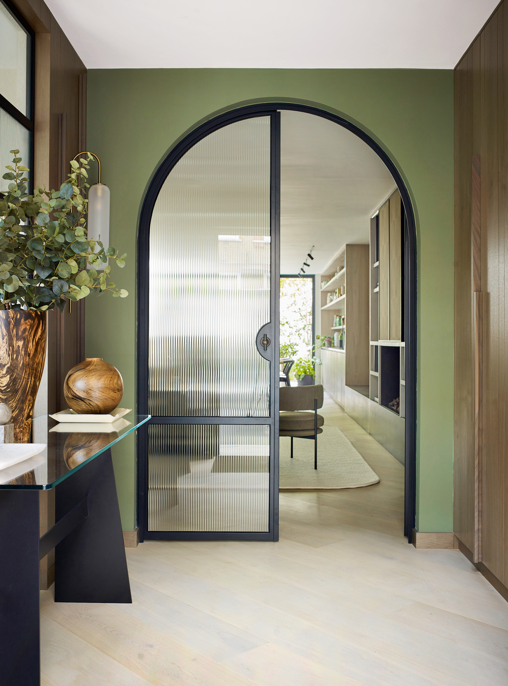
White is a wonderful canvas, but too much can leave an entry space feeling cold and empty.
Rooms such as entryways are often left behind when it comes to planning impactful designs. However, they can be the perfect place to experiment with bold colors and patterns.
Design expertise in your inbox – from inspiring decorating ideas and beautiful celebrity homes to practical gardening advice and shopping round-ups.
While some decorators instinctively lean towards white hallways and entrances, many agree that new neutrals; ones largely inspired by colors emanating from the natural world, will help us to feel grounded in our homes, and should be considered instead of white. In fact, using only pale colors is a small entryway mistake to avoid.
'White is perfection,' says Karen Haller, color psychologist, and best-selling author of The Little Book of Color. 'It is pure and unblemished, and gives a feeling of peace and quiet, however, white can also be perceived as clinical, uncaring, and sterile.' Much like a hospital setting, and not what you want welcoming you into a place of residence.
An entryway is one of the main rooms in the home that connects us to the outside, so enhancing this relationship and using green shades in the space can create a unique, indoor-outdoor effect, bringing in the beauty of nature’s palette.
Farrow and Ball: Recipes for Decorating | $43.16 at Amazon
Farrow & Ball is a leading producer of high-end paint and luxury wallpaper, and their design experts share their wisdom for creating harmonious interiors and creative color combinations.
2. An overuse of animal prints
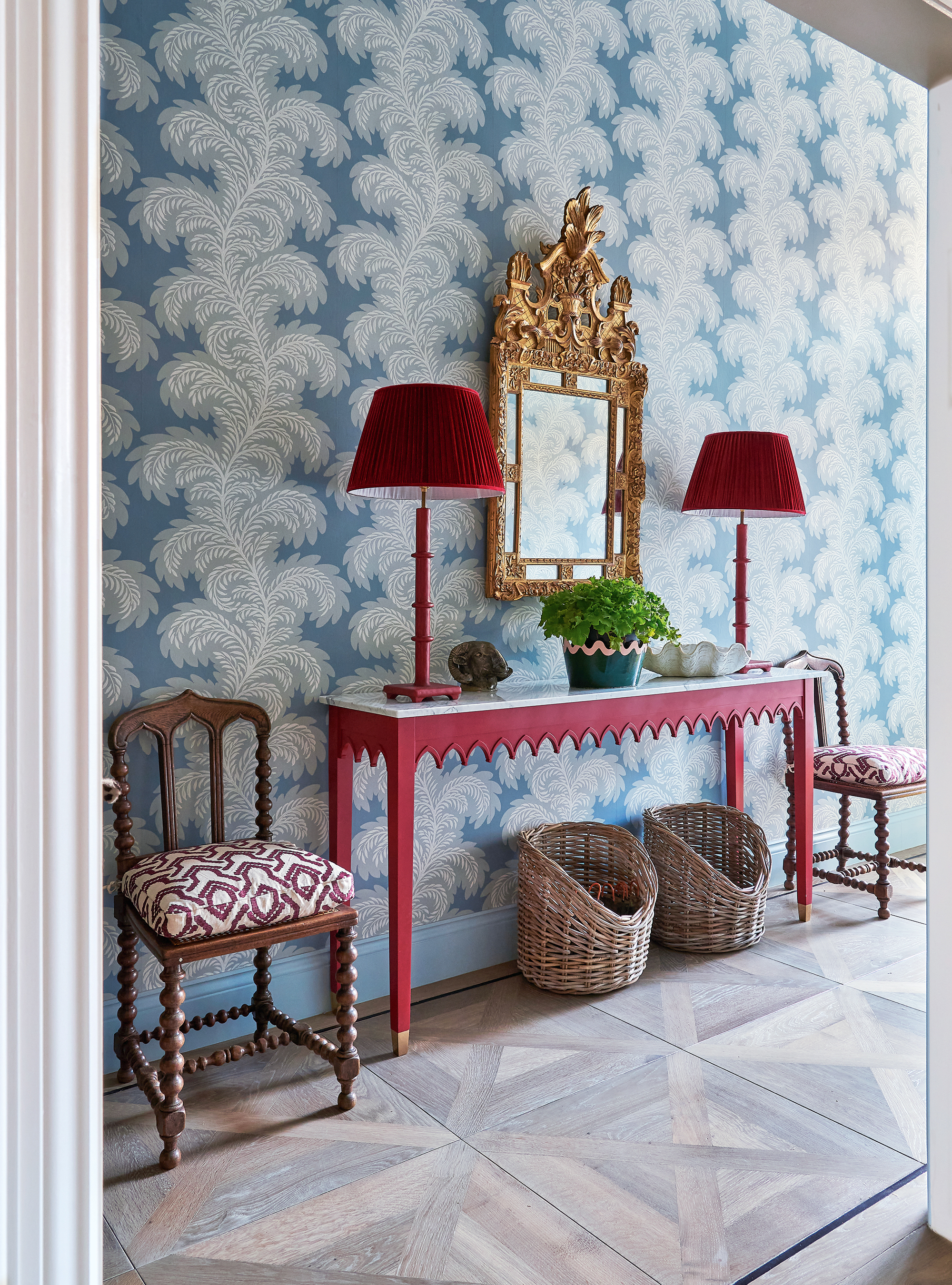
Decorating with pattern will never get tiresome, but sometimes you can have too much of a good thing, and that 'thing' is animal prints. Once the look of the 1970s, these days animal prints, including cowhide rugs, tend to look more cheesy than exotic or worldly. But that is not to say you shouldn't play with patterns in their entirety.
Renowned designer, Matthew Williamson extols the benefits of using patterns in design. 'I’ve always been a maximalist, a lover of ornamentation,' he says. 'I want to create things that make others feel happy. I’ve never been able to get my head around minimalism or flat color. When I start a room design, I think about how I can make an empty space give joy.'
'I like all the classic, timeless patterns – the florals, ikats, stripes – but I bring in unexpected color for a modern look. I would advise less confident decorators to keep the color palette tight in a scheme for a calm overall result. Restrict yourself to half a dozen colors and try not to veer from them.'

Matthew Williamson is an award-winning, British interior designer known predominantly for his unique use of pattern and color. Alongside his growing residential and commercial design portfolio, Matthew has also launched a series of homeware collections in collaboration with John Lewis, Pooky, Roome London, Obeetee, and more.
3. Anything mass-produced and soulless
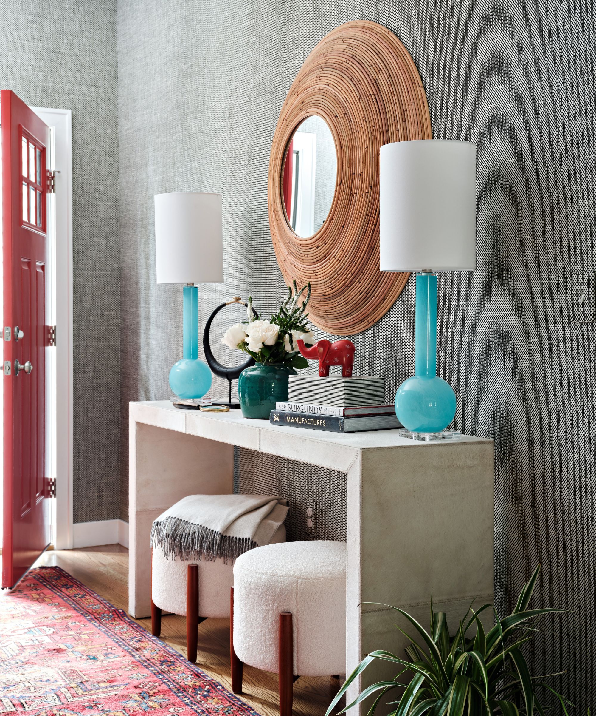
Cookie-cutter, mass-produced furniture did a roaring trade in the 1990s but has more recently fallen out of favor with homeowners and decorators alike.
The whole purpose of a home is to answer the needs of the individuals living in them whilst reflecting their personalities with good design, space, and functionality, which is why over-produced, impersonal purchases are making our homes look dated and undesirable.
Thankfully, recent trends have shown a shift towards curating more sustainable, soulful spaces. 'If in doubt, be bold,' advises Tiffany Duggan, founder and director of Studio Duggan. 'Clients hardly ever regret investing in one-of-a-kind vintage pieces. Think of your space as a carefully curated Aladdin’s cave of treasures, with each item on display even more fascinating than the last.'
Undeniably, individualism is in, as more and more people turn their back on over-consumption and mass-production and towards vintage, bespoke, made-to-measure goods and services.
Style mavens such as hotelier Kit Kemp are masters in the fine art of embracing individual design. But if you're new to this trend, you’d be wise to exercise caution, otherwise, your experimentation could end up one hot mess. So prefix maximalism and individualism with an adjective such as ‘considered’, ‘elegant’, or ‘curated’ and you can make it work.
The trick to pulling off a unique aesthetic is finding a common hook off which everything else hangs. Leave matchy-matchy to the minimalists, you just go with whatever you love and it will work. Happy considered – and sustainable – gathering.
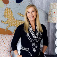
Renowned British interior designer and founder of the hotel chain, Firmdale Hotels, Kit Kemp has been creating and designing beautiful interior spaces for over 3 decades.
4. Furniture and furnishings that are too small
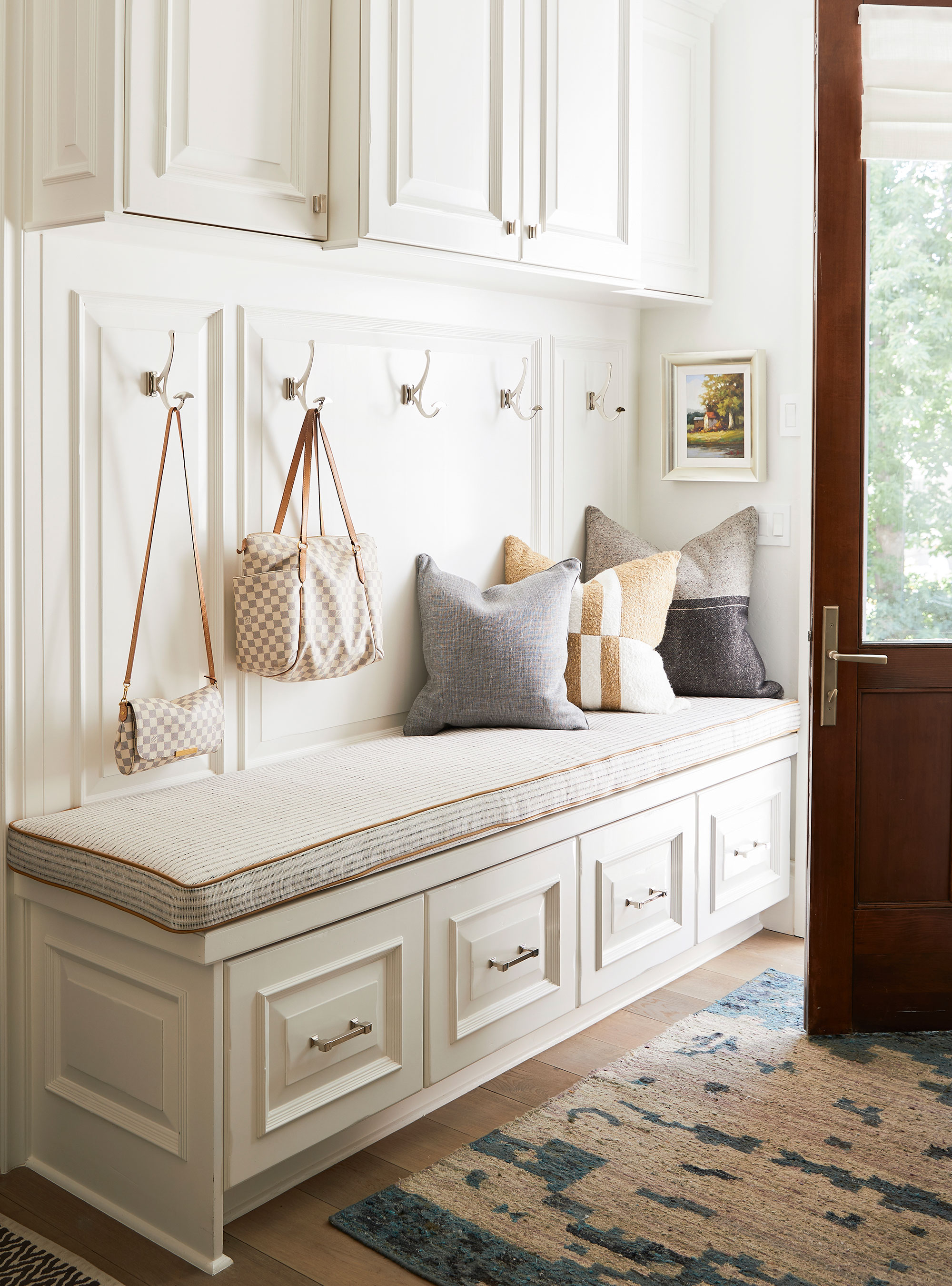
It is a common misconception that the smaller the room, the smaller the furniture and furnishing should be. In fact, the opposite is true. For the longest time, we'd spot slimline consoles, narrow runners, and barely-there coat hooks. But we've since moved on from this doll-house aesthetic. Today, more is more when it comes to proportions, so go large.
‘People often assume they should buy small-scale entryway furniture if you have a modest home, but that actually makes a space feel smaller,' says Sheena Murphy, partner, Nune. 'Don’t be afraid to fill the room – get a rug that fully fits the space, and don’t buy a single chair if you can actually fit a storage bench in the room. Not only will buying larger scale furniture look better, but it will also make your experience of the entrance to your home so much more comfortable and considered: win-win!’
5. Themed schemes
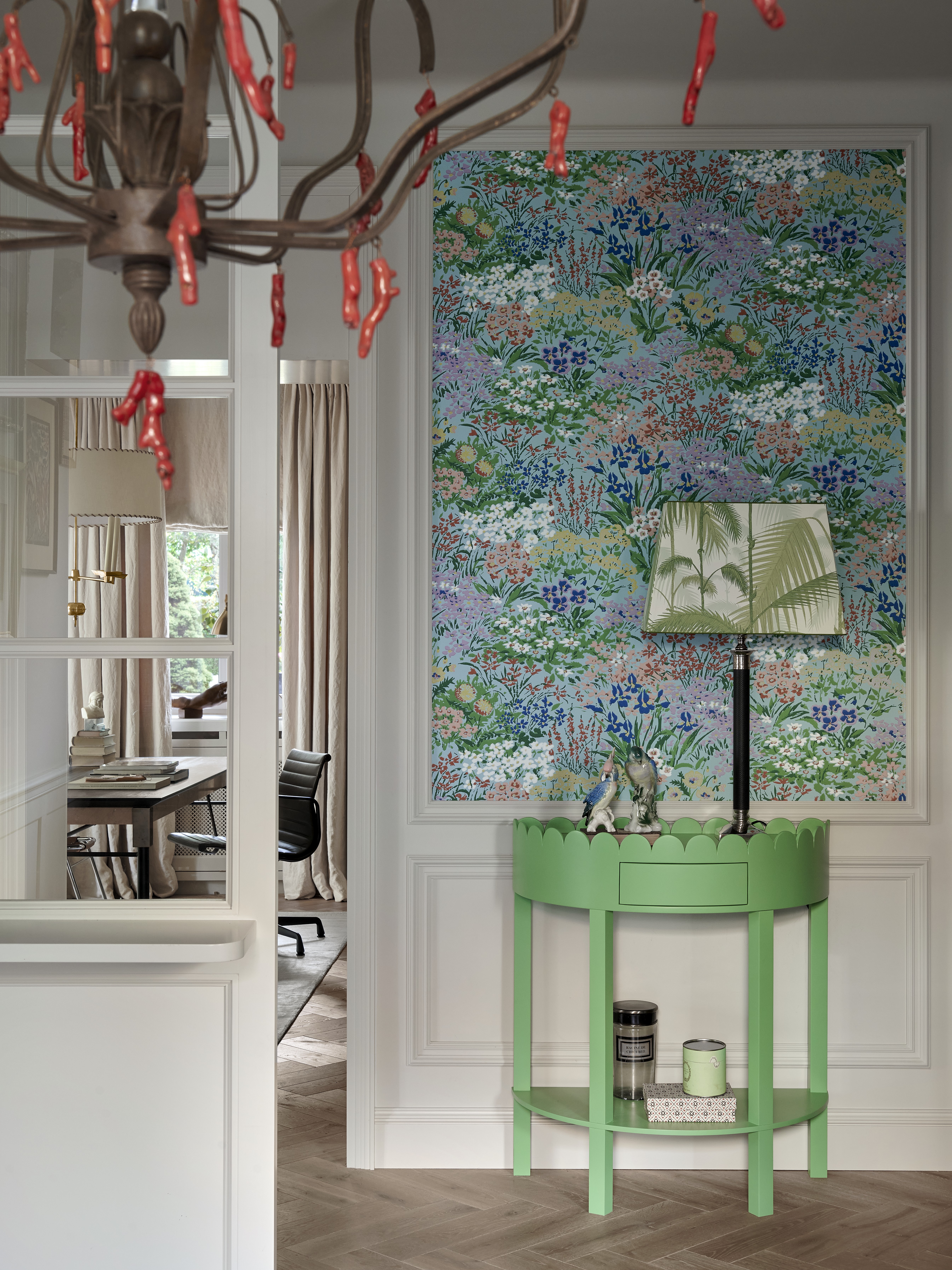
It wasn't so long ago when themed spaces adorned homes up and down the country, but these days, any sensible designer will resign the hokey signage, and steamer trunks to the history books.
Instead, if you want to give your entrance character and personality, use tried-and-tested color combinations, made-to-measure entryway storage, clever lighting and furnishings that add texture and warmth.
The entryway is a room of its own and should be treated as such with a bold design that will wow. As the entrance is where guests are welcomed, it should say something about you and set the mood for the rest of the house, says Henriette von Stockhausen of VSP Interiors.
‘An entryway should flow into the rooms that come off it,’ she adds. ‘Art collections work well in spaces with vast walls and help lead the eye onwards. I keep flooring uniform throughout as it helps enlarge the space and avoids it from looking disjointed.'
‘In any space, I’d suggest one be aware of shapes near the area and use these details to mimic the same patterns. This looks considered and subtle.'
Another way to make your entryway more inviting is to work with the wall space on offer. An entryway is an ideal place to layer up your favorite artwork.
‘There are two really effective ways to make a statement with art in a hallway,’ notes Camilla Clarke, creative director at Albion Nord. ‘The first is to play with scale. Make the most of the wall space and choose a large-scale artwork that spans the full height of the wall. It will feel bold and impactful.
Another interesting way to make a statement is to create an art wall. Play with a mixture of work in different sizes, colors and genres.’ Martin Waller, founder of Andrew Martin advises to ‘hang art at eye level or just above and never underestimate the importance of framing – this is a cost you should never hold back on. The right frame can transform a picture and is critical to the overall feel of the artwork.’

Jennifer is the Digital Editor at Homes & Gardens, bringing years of interiors experience across the US and UK. She has worked with leading publications, blending expertise in PR, marketing, social media, commercial strategy, and e-commerce. Jennifer has covered every corner of the home – curating projects from top interior designers, sourcing celebrity properties, reviewing appliances, and delivering timely news. Now, she channels her digital skills into shaping the world’s leading interiors website.
