
Spring is synonymous with the start of new life. Its much-anticipated arrival is marked by the uplifting sight of green shoots and new buds appearing, and the magical sound of the dawn chorus. As the long winter nights give way to lighter mornings and evenings, the reawakening of nature outside provides wonderful inspiration for us to refresh our homes for seasonal change, too. One of the most effective ways in which you can reinvigorate your space is to update the colour palette.
As anyone who has been through the process of searching for room colours will attest, choosing the right colour for a room can be a minefield with endless choices and subtle nuances to understand and overcome, but with Benjamin Moore, the choice has never been easier, or better.
Using only the best quality paint, Benjamin Moore has over 3,500 colours to choose from, and with stockist locations across the UK and a fast on-line ordering process, you’re never going to be far away from finding your dream colour scheme. Here, we’ve narrowed down five of our favourite colours for adding a touch of spring sparkle to your home.
1. Add delicate lilacs come spring

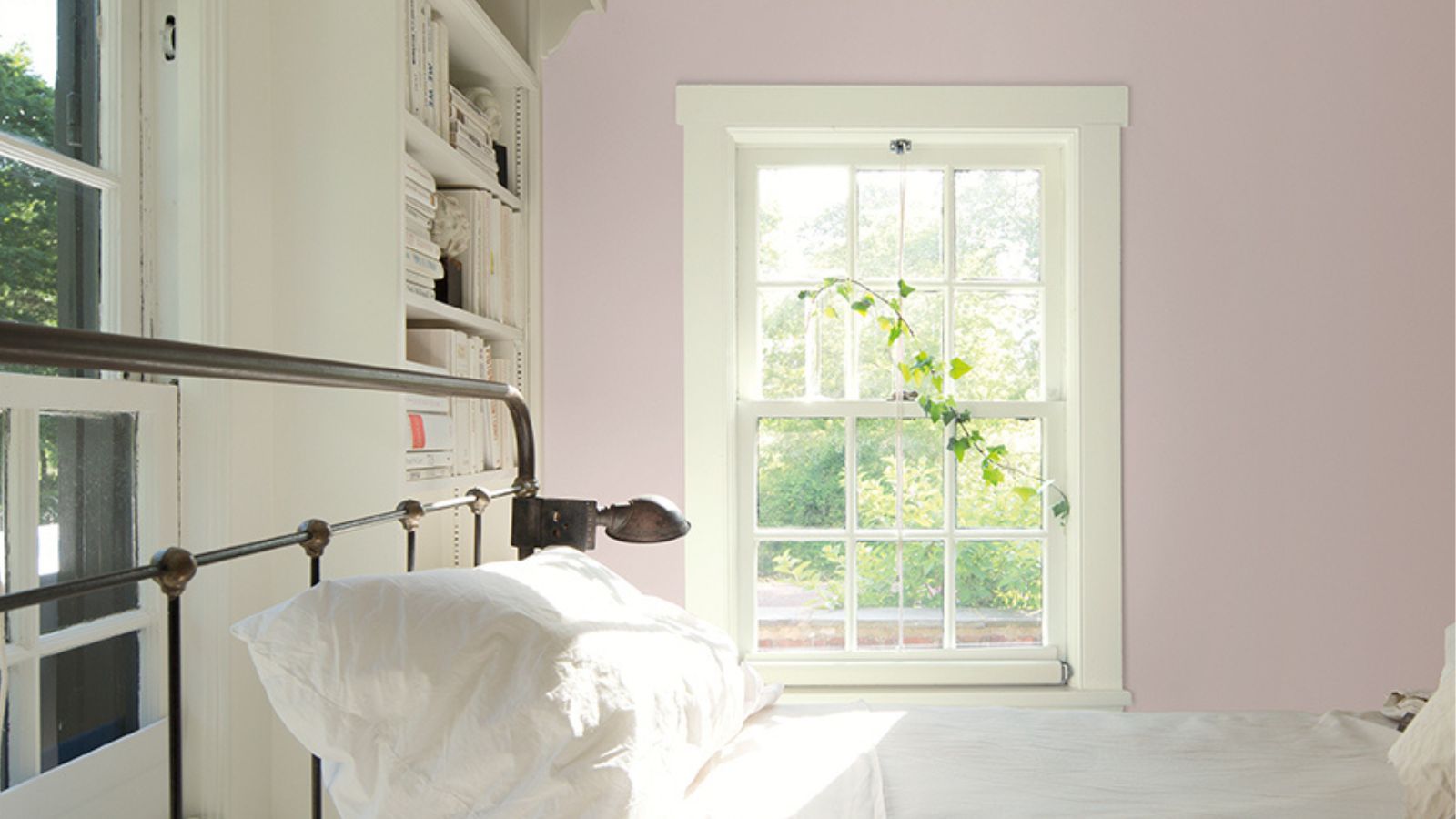
Conjuring scenes of trailing wisteria and swathes of moorland heather, the myriad variations of this delicate pastel shade can inspire the most elegant and restful interiors. If you’re looking to bring delicate colour and warmth to a cool, north-facing room, consider a lilac paint with red undertones. Benjamin Moore’s African Violet would make for a calm and feminine bedroom scheme – finish the look by pairing it with rustic accessories and neutral linens.
2. Introduce a sunshine shade

As the daffodils begin to bloom, the chicks start to hatch, and the first signs of spring begin to appear, banish winter blues and warm up interiors with sunny yellow.
Natural and mellow, creamy buttermilk and earthy pigments, such as Benjamin Moore’s pastel Pale Moon, sit well with the aged materials and textures of old country homes.
Used wall-to-wall, sunshine shades are guaranteed to help you feel uplifted all year round, or simply update a single feature or accent wall for a quick injection of fresh seasonal colour; they’re a great partner to neutrals but also to on-trend deep dark green, charcoal and indigo.
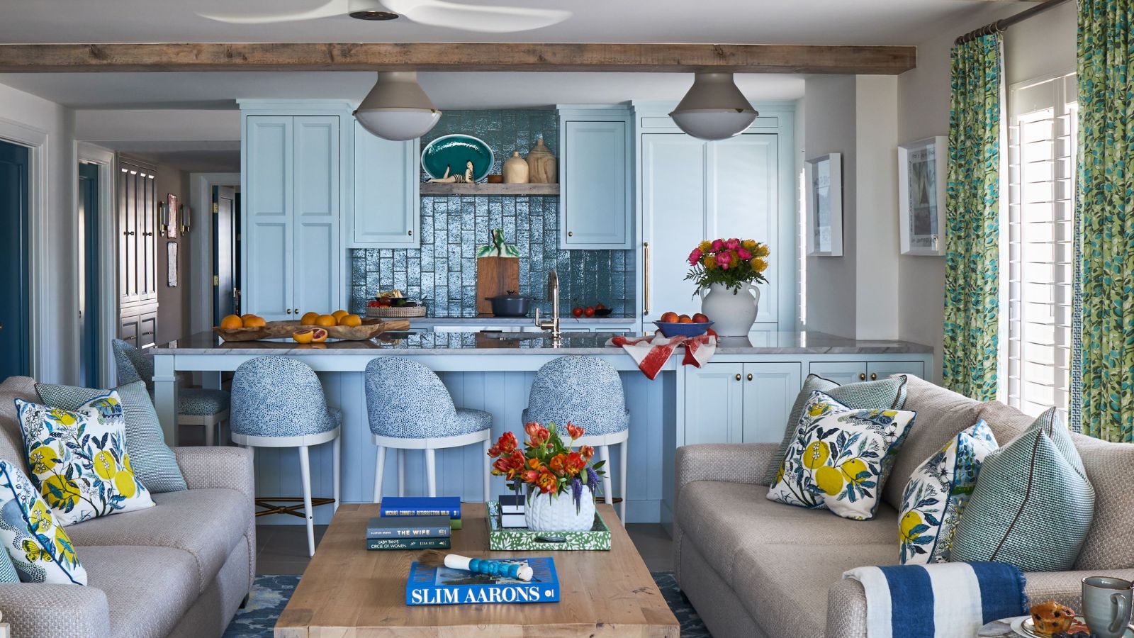
3. Brighten with white

Be inspired by the serenity of the coast by decorating with a timeless white colour palette. Popular in homes the length and breadth of the country, Benjamin Moore's White Snow will work in any setting, from country to contemporary. Using a white or natural palette is all about adding depth and contrast in different layers and textures. White is one of the most versatile shades in all of design – it instantly brightens while evoking a sense of calm and flawlessness. Add interest through colourful art, accent soft furnishings and antique furniture and objects. It also makes it easier to change up the look of a room once the season - and your tastes - change.
4. Breathe in new life with blue

Calm and sophisticated, teal blue can sometimes be perceived as a cold colour so choose richer shades for a more inviting feel. The uplifting yet serene teal is an interesting contradiction, blurring the boundaries between blue and green, and equally between fun and sophisticated when added to an interior scheme.
Bring the outdoors in by having teal blue walls or furniture in your home is always a good idea; the nod to nature will create a calm atmosphere however busy the space is. Benjamin Moore's Caribbean Blue Water would find the perfect setting in an east-facing room, as the moody feel of its blue pigments will feel brighter in the morning - while calming that strong early life – and cosier in the afternoon and evening.
5. Invite nature in with a gorgeous green

Reconnect with nature through one of the most popular colours in the design world: gorgeous green. Symbolising nature, freshness and vitality, the colour green is an enduring favourite when it comes to interiors. Whether using it as a bold block colour or a subtle accent, Benjamin Moore's Cedar Green is bound to inspire. Strong yet soothing, it brings an enveloping feel but can also sit quietly and allow bold furniture to shine.
Choosing paint colours is an art form, and Benjamin Moore is sold through local family-owned paint stores that offer expert knowledge and great service, meaning you can be sure you have the right paint for your home and exterior.
Benjamin Moore products are available from independent paint and decorating retailers nationwide, with prices starting from £20 for 0.94L.

-
 ALDI’s New $25 Portable Vacuum Might Be the Easiest Cleaning Upgrade You Make This Year – Tackle Messes in Seconds, Not Hours
This compact ALDI vacuum turns everyday mess into quick, 10-second clean-ups around the home
-
 Backgammon Sets Are the Coffee Table Trend the Chicest Homes Have in Common – These Are the 16 Best to Shop
Part coffee table decor, part conversation starter, these games are the 'it' way to make sure a gathering never falls flat


-
 Benjamin Moore's Boothbay Gray May Be 50 Years Old – But Designers Say It's Still an Easy, Timeless Color for 2026
Designers say the popular gray paint 'finds an easygoing balance between refined and welcoming'
-
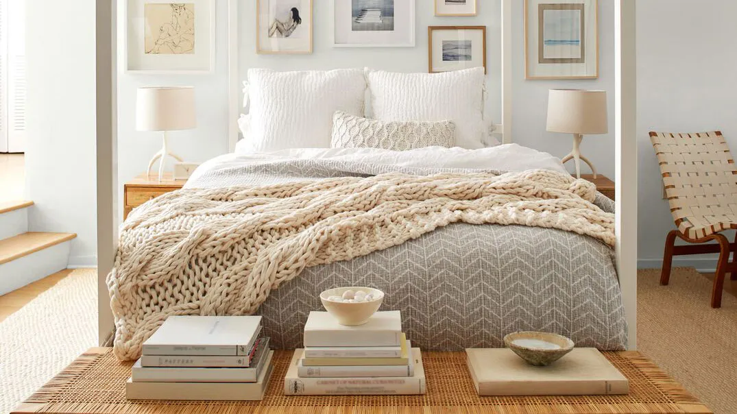
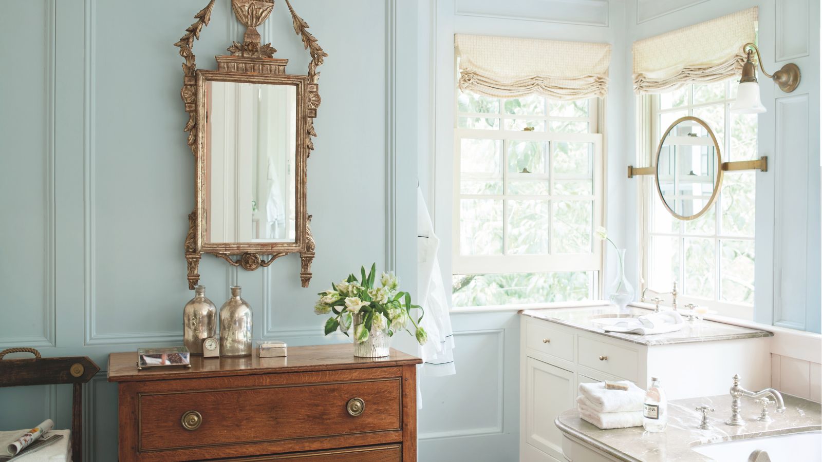
 Benjamin Moore Reveals Its 4 Most Popular Bedroom Colors – 'They All Exude That Gentle, Easygoing Feeling'
From grounding sage green to dusty lilac, these beloved Benjamin Moore colors are perfect for your sleep space
-
 Designers Can’t Get Enough of This Best-Selling Benjamin Moore White Paint – the Warm Shade That Works in Every Room
Here's why Benjamin Moore's Cloud White is one of the most popular white paints out there
-
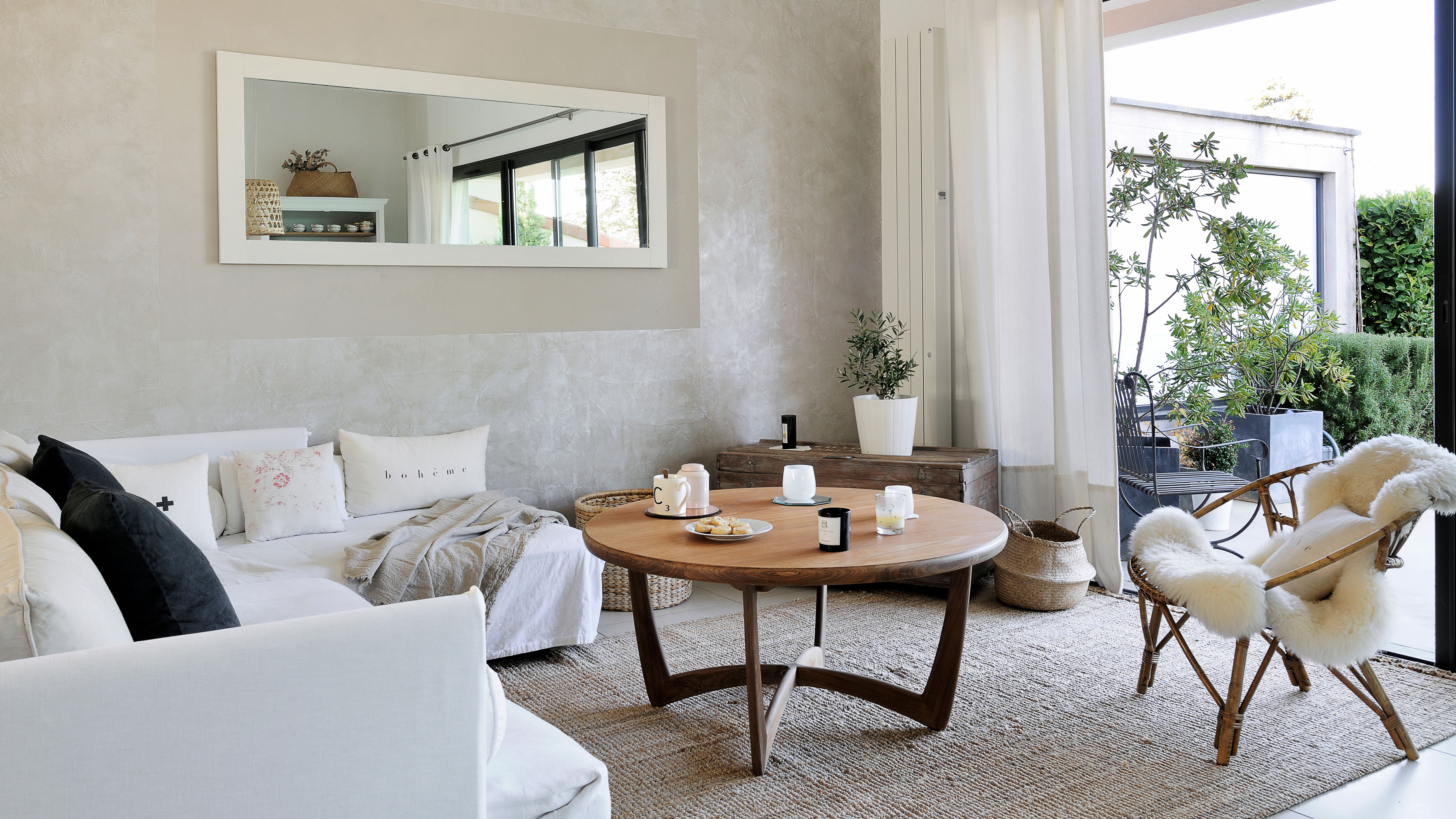
 5 Benjamin Moore Colors Perfect for Small Living Rooms
These are the Benjamin Moore paints that help blur boundaries, add depth, and create a small living room you'll gravitate towards every time...
-
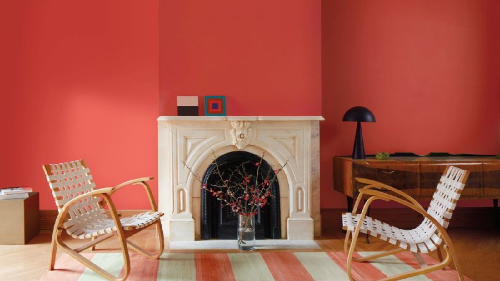 Benjamin Moore Has Revealed Its Spring Color Palette – It's an Unconventional Balance of Sophisticated Pastels and a Zingy, Unexpected Red
Benjamin Moore's spring palette is refreshingly unique. Composed of pastels and deeper, more vibrant shades, it's a color family that will last beyond the season
-
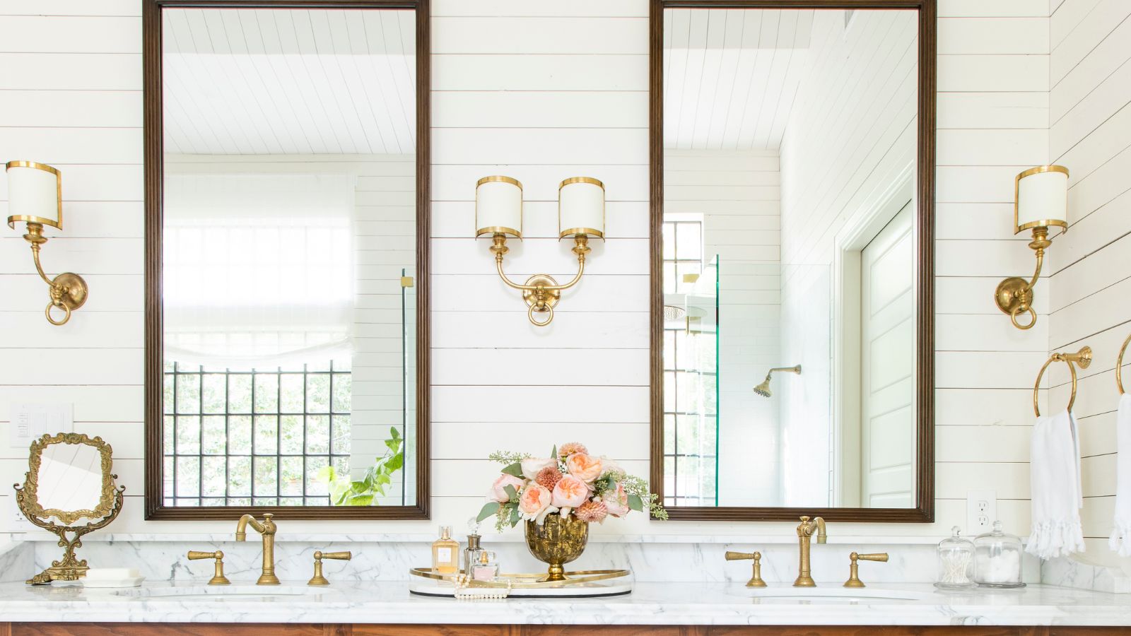
 Benjamin Moore Reveals Its 4 Most Popular Bathroom Colors – 'These Shades Take an Easy-Going Approach to Color, Making Them Inherently Adaptable'
From crisp white to romantic lilac, these four long-loved Benjamin Moore colors are perfect for bathrooms
-
 These Are the 5 Best Benjamin Moore Colors for a Small Kitchen – and No, They Aren’t All White Paint
The designer-approved Benjamin Moore shades to bring big personality to your small kitchen
-
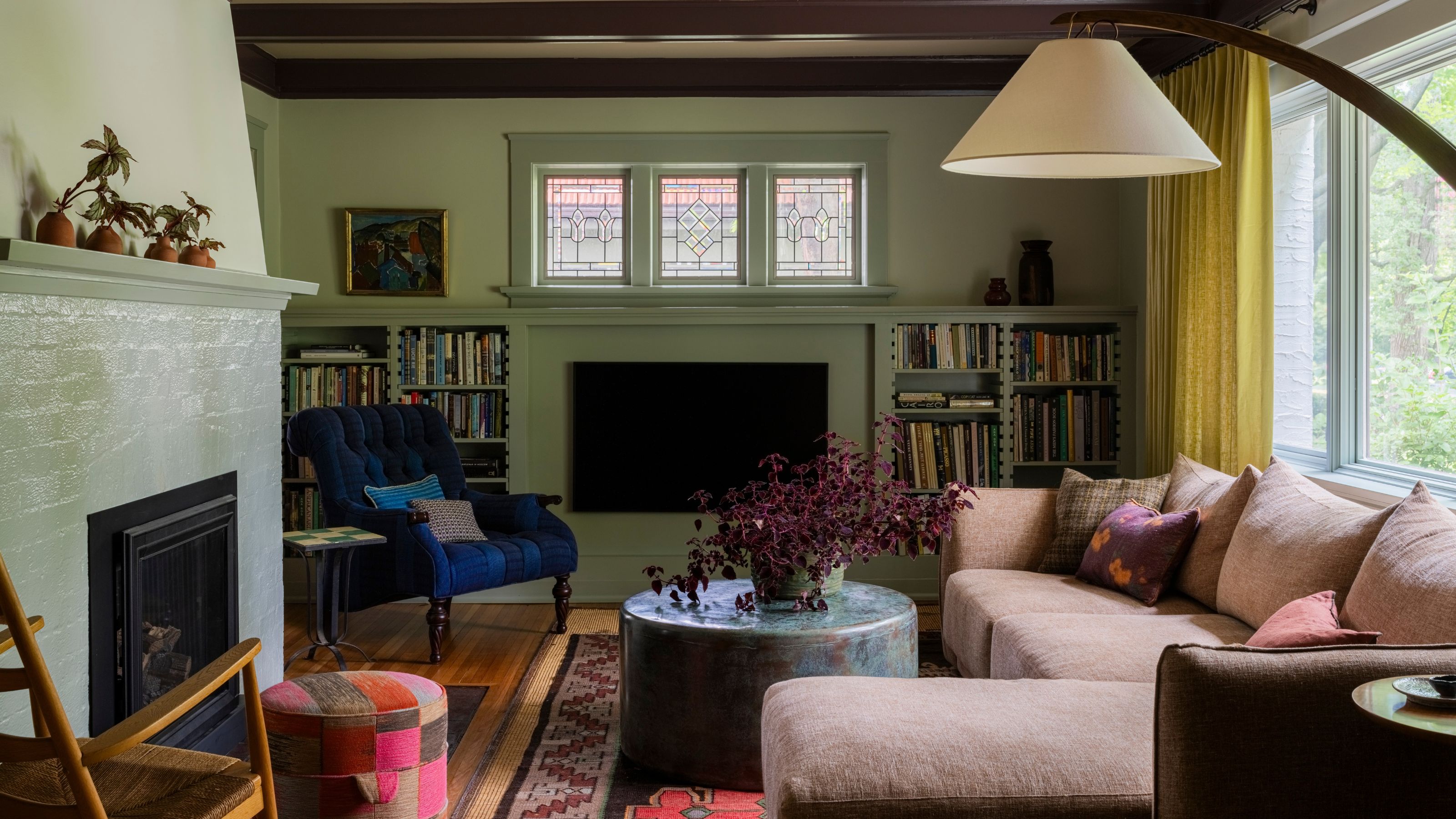
 Benjamin Moore Reveals Its 4 Coziest Shades for an Instantly More Welcoming Living Room
Turn your living room into a cocooning, warming sanctuary with these Benjamin Moore best sellers


