Should your trim match your wall color? Experts reveal 6 color tips that can lead to decorating success
Whether you want your trim to seamlessly blend in or proudly stand out, our six ideas can help you choose the perfect paint palette

Design expertise in your inbox – from inspiring decorating ideas and beautiful celebrity homes to practical gardening advice and shopping round-ups.
You are now subscribed
Your newsletter sign-up was successful
Want to add more newsletters?
There is so much to consider when painting a room, from color, finish and paint placement, and when it comes down to deciding whether your trim should match your wall color, are there any specific rules to follow?
We have spoken with a collection of paint experts who share their advice on choosing the right colors for your trim, and how enhancing this often-overlooked architectural detail with paint ideas, can create a more unique and stylish design.
Overall, our experts are in agreement that trims can both match and contrast with your wall color, it all depends on the overall look you are wanting to create. From color-drenching to bringing in a beautiful accent color, explore how best to enhance the trim in your chosen design scheme.
Article continues belowShould your trim match your wall color?
Andy Greenall, creative director at Paint & Paper Library says, 'architectural features are a fantastic host for making a statement with color, be that skirting, trim, paneling, doors cornicing and ceiling. Yet these elements are so often – by default – painted white, without consideration for how that affects the space. But whites aren't the only option for woodwork and trim...'
We have curated a collection of inspiring design ideas and helpful advice from our paint experts to help you make the right decision for the trim in your home, and whether it should match or contrast with your wall color.
Yes, for a coordinated and unified look
Create a color drenched effect
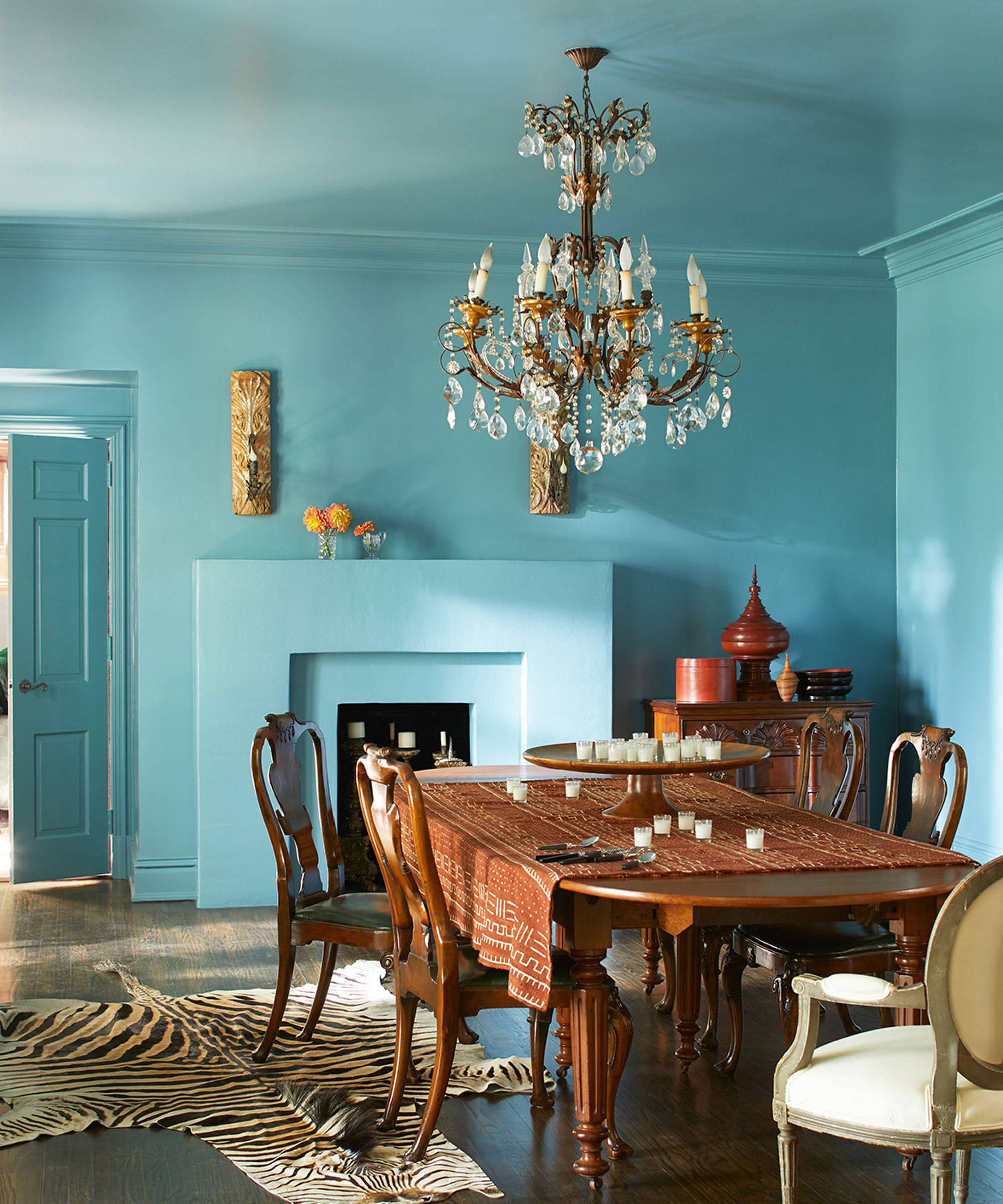
'For a bolder approach to painting woodwork, create an enveloping and intimate feel by embracing ‘color drenching’ and paint your doors, woodwork, walls, and ceiling in a single color. The color drenching approach is particularly well suited to living rooms, bedrooms, and hallways, delivering a contemporary and cocooning finish,' says Ruth Mottershead, creative director at Little Greene.
International director at Benjamin Moore, Helen Shaw, also supports this and says, 'an all-encompassing floor-to-ceiling color is one way to go, creating a strong statement look and providing the perfect foundation for your favorite furnishings and accessories. This effect can also make the space seem larger due to the seamless lines and edges.'
Design expertise in your inbox – from inspiring decorating ideas and beautiful celebrity homes to practical gardening advice and shopping round-ups.
As shown in this beautiful blue dining room, the bright Spectra Blue finish by Benjamin Moore used across the walls, trim and ceiling creates a truly immersive and mesmerizingly modern effect and establishes a stylish contrast with the traditional antique furniture and chandelier.

Ruth Mottershead is creative director of the family run paint and wallpaper businesses Little Greene and Paint & Paper Library, who specialize in creating luxurious paint and wallpaper that represent 300 years of decorative history.

Helen Shaw is part of Benjamin Moore's UK division. Color expert and international marketing director, Helen and her husband Craig are founders of Shaw Paints, acquired by Benjamin Moore in 2020.
No, create a stylish element of contrast
Use your trim to bring in a strong accent color

'The addition of an accent color is a quick and easy way to transform a space, define an area, or highlight architectural elements. If you’re lucky enough to have wonderful architectural details such as archways, deep skirting, or picture rails in your home, paint is the perfect way to highlight them to create a design detail,' says Ruth Mottershead from Little Greene.
Using your trims to create a colorful accent can establish a stylish element of contrast and eye-catching visual interest in a space. In this kid's room, the trim details have been elevated by the Cedar Green shade by Benjamin Moore. A brilliant example of how to enhance a room with color and character without painting the walls, the white and green work in perfect harmony to create a fun, vibrant, and inviting space.
Turn to shades in the same color family
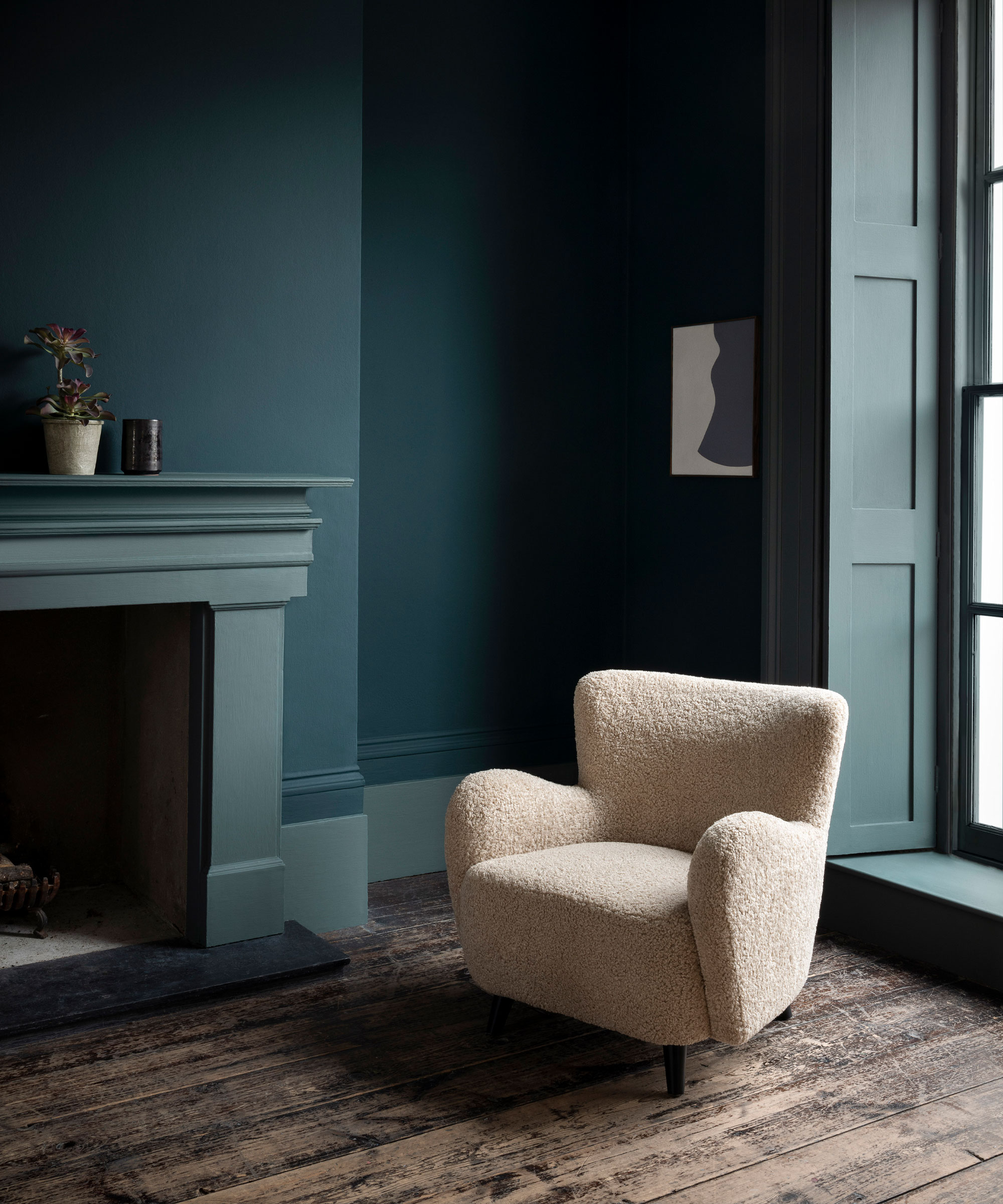
For a more subtle element of color contrast between your walls and trim, stick to using different shades that sit in the same color family – explore our guidance on using the color wheel for further inspiration.
'Consider using a lighter version of a color within your interior palette, this will highlight your architectural detailing whilst creating a more nuanced and tranquil atmosphere,' says Andy Greenall from Paint & Paper Library.
Ruth Mottershead from Little Greene also adds, 'a light neutral hue or a lighter version of your wall color will create contrast, but deliver a more harmonious scheme, making the space feel more considered,' as demonstrated in this green living room above, which has Paint & Paper Library Kigali on the walls and Squid Ink on the trim.
Choose white for a clean finish

Keep things simple and traditional
If you're looking to keep things more traditional and simple, then, of course, you can't go wrong with a classic, white painted trim, as interior and paint expert, Sarah Lloyd, from Valspar says, 'white is the most common colored trim in homes as it universally goes with everything and creates a sleek, clean look.'
However, this year's color trends are influencing a whole new wave of color confidence, and many of us are taking bigger and bolder risks when it comes to the room color ideas in our homes – and colorfully painted trims are definitely on the rise in 2023.
Ruth Mottershead from Little Greene shares, 'many opt to use bright white on skirting and woodwork out of habit. The use of a smart and simple white creates a traditional feel, however, a very bright white can create a high contrast with a wall color or wallpaper which can make it feel stark and less considered.'

Color and paint expert Sarah Lloyd is a senior brand manager at Valspar and has worked for the paint brand over the last 3 years.
Coordinate with your ceiling color
Use your trim to enhance ceiling paint ideas
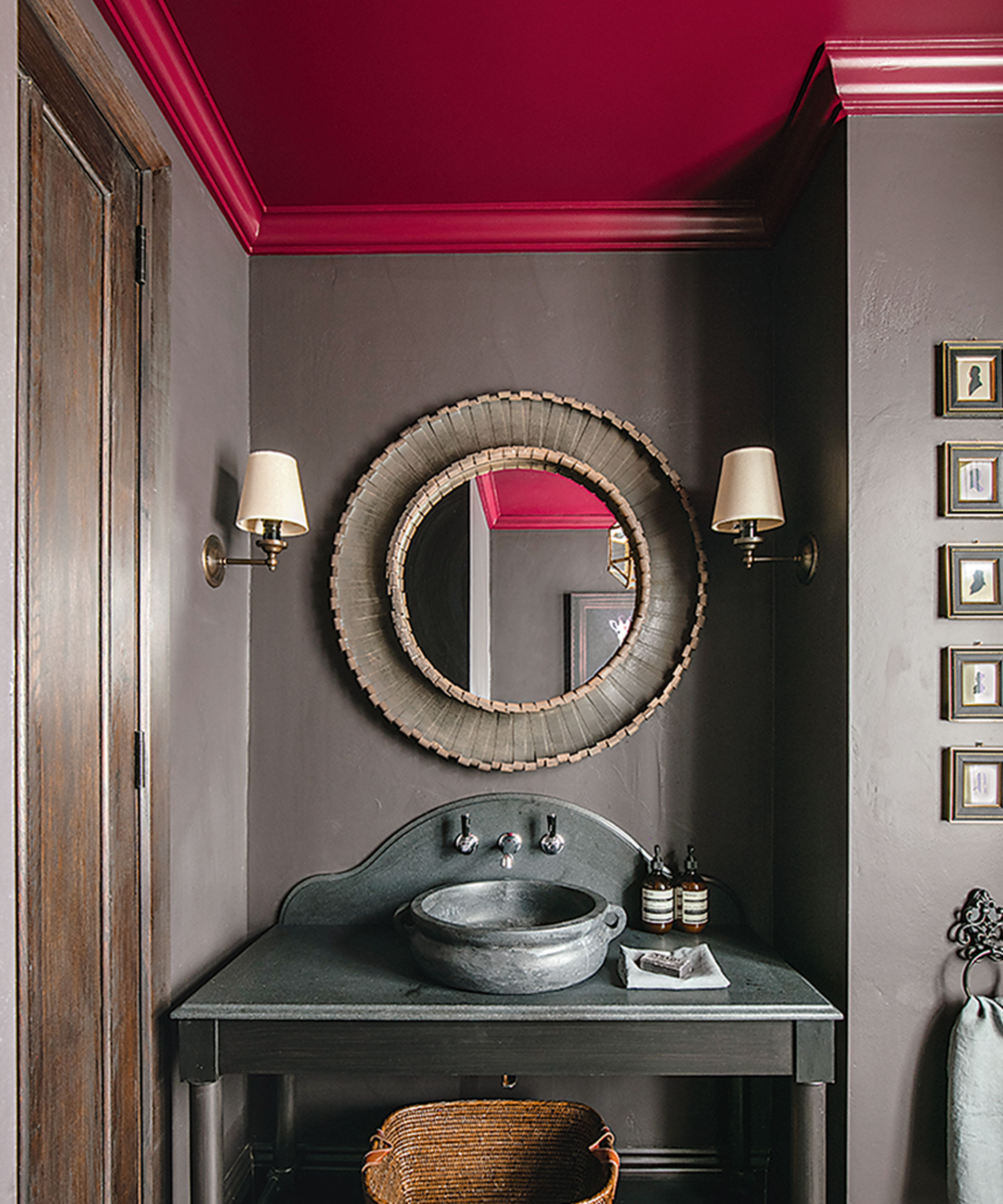
'Most of us default to a white ceiling, but this can be a hugely missed opportunity to add another layer of design to a room. Looking at ceiling paint ideas in a considered way can enhance the room design, such as the scale, lowering the height, or softening awkward angles in an attic space,' says Patrick O’Donnell, color consultant and brand ambassador at Farrow & Ball.
'Use one color all over the ceiling and trims – this is one of the most useful paint tricks, especially if your ceiling height feels low. It will remove the visual contrast where the wall stops, and the ceiling begins and accentuate a seamless flow in your room.'

Patrick O’Donnell is Farrow & Ball's color consultant & brand ambassador and has been with the brand since 2012. Patrick works with designers in the UK and North America, helping to bring their projects alive with the iconic, F&B color palette.
Embrace a collection of different colors
Mix and match for a contemporary look
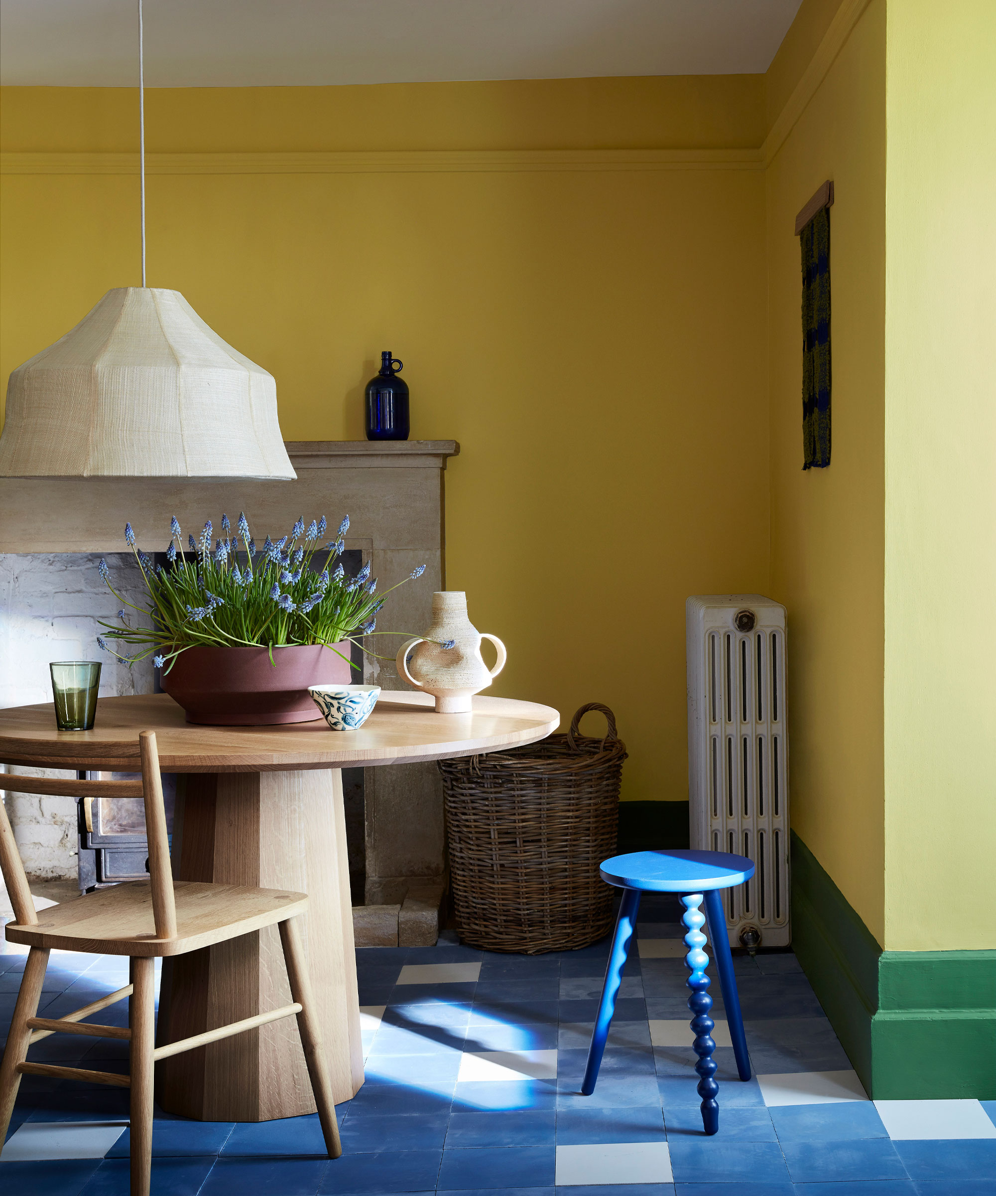
For a truly modern and unique design, why not embrace a collection of different colors across your walls and trim areas?
'For a stronger scheme, use contrasting colors across the walls, paneling and woodwork to highlight structural architectural details,' says Andy Greenall from Paint & Paper Library.
Whether you create a tonal color scheme and choose shades in the same color family, or opt for white walls and a different bright color on each separate trim, highlighting these classic architectural details through a beautiful color palette will only serve to create a beautiful, one of a kind interior design.
FAQs
Should my trim be lighter or darker than my walls?
There are no set rules on whether your trim should be lighter or darker than your walls, it completely depends on your overall design and vision for your chosen space.
As we have explored in this piece, both coordinating with your wall color and creating a stylish contrast – using both light and dark colors, can work well for interior trims.
For example, Sarah Lloyd from Valspar provides her advice for choosing a lighter or darker color for skirting boards, 'darker boards can look more modern – and if it’s a dark color, it’ll easily hide the marks and dust – and lighter skirting boards will make the room feel bigger, as it gives the illusion that the walls are receding.'
Should trim be the same color in every room?
Using the same trim color throughout your home will create a united, and cohesive flow, however, there are no rules to say you it has to be the same color in every room – do what feels best for the particular design in each room – and as our experts have shared – do not be afraid to use different colors!
'Keeping the space cohesive is the most important thing – bolder, contrasting trims are a fantastic way to liven up your space, but should still work with the flow of the home. Too many different colors and shades can seem a little busy and overwhelming,' says Sarah Lloyd.
Whether you decide to match or contrast, painting your ceiling trim can dramatically alter the appearance of a room, and help to celebrate and bring to the forefront these beautiful architectural details that for so long have remained in the background.

Zara is the Managing Editor at Homes & Gardens. She joined the brand in February 2022 as an Interiors Content Editor, specializing in writing content on interior color trends, decorating ideas and design inspiration. After studying English Literature at University, she worked as an Ecommerce Website Editor, Content Writer and Buying Intern at multiple independent businesses within the luxury retail and lifestyle sectors. She enjoys nothing more than discovering new trends, brands and products, whether that be in fashion, interior design or lifestyle.