These are the underrated paints interior designers say we should be using more
Which underrated paint colors don't get the love the deserve?

Design expertise in your inbox – from inspiring decorating ideas and beautiful celebrity homes to practical gardening advice and shopping round-ups.
You are now subscribed
Your newsletter sign-up was successful
Want to add more newsletters?
Color trends move so quickly, some come and go before they have time to have their time in the spotlight. It's often these shortlived colors that we don't give the attention they deserve, they aren't allowed to become the classic, versatile shades they have the potential to be.
We've asked designers which colors do they think deserve more attention, ones that might not be high on the list of color trends right now but should be? Which colors are underrated in the interior design world? And more importantly, how can we use them in our interiors in ways that feel chic and current?
5 underrated paints to try
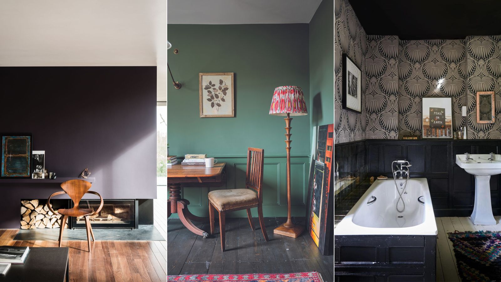
One thing all these underrated shades have in common is that they are bold, yes, but the best way to use them is to go dark and earthy. Choosing richer, softer, more muted versions of bold shades makes them far more livable and makes them far more timeless. And you can be creative with your paint ideas too, we think most of these shades work best if you really commit to the look and take it over the majority of surfaces, however, there are ways to bring it in smaller doses like on the woodwork or paint your doors.
Article continues below1. Orange

Decorating with orange doesn't sound that simple. It's often seen as a very vibrant shade, but in its more muted and earthy forms it can act almost like a neutral and pairs so beautifully with creams, white, and beige to create a color palette that's warm and sophisticated.
'We’re seeing a rise in popularity for colors within the burnt orange, rust, and earthy-brown family,' explains Scott Richler Founder and Creative Director of Gabriel Scott. 'Warm and vibrant, when the right tone is chosen, this color palette can elevate any luxury living environment. More often than not we see it used with an accent piece to add a punch of color to more neutral rooms, for example, sofas, cushions, and headboards. It’s always fun for us to customize our lighting fixtures to complement these tones.'
2. Purple
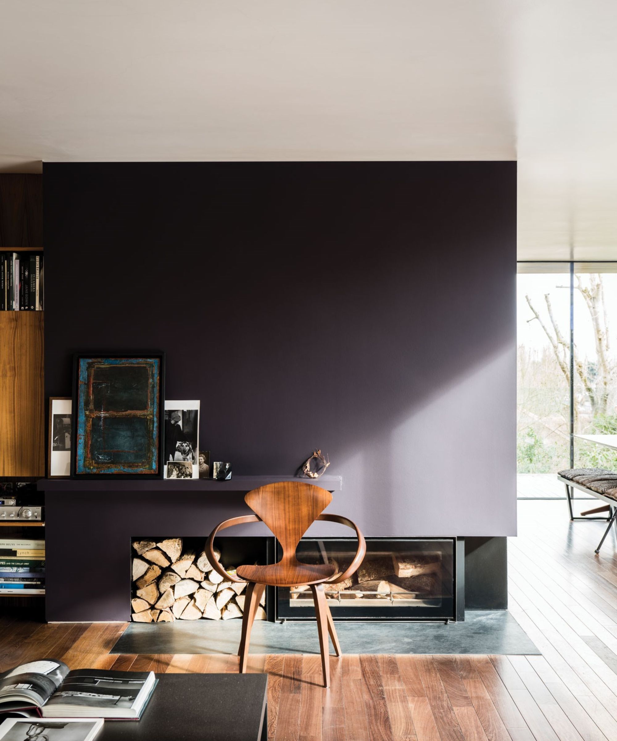
'Purple is a highly underrated interior color that we love for its ability to create warm, inviting, and cozy spaces. It pares well with greens and timbers and as such we think it will pop up with more frequency in coming years. In fact we rate it so highly we used Mylands Rothschild Street on our studio kitchen island.' explains designer Cherie Lee.
And it's again the darker versions of purple that designers say we should be using more of. Think eggplant and purplish dark blues. 'Farrow & Ball Pelt is a great color,' says designer Tom Rutt. 'It’s deep and feels very luxurious and exudes a certain energy which I love. In some lights, it can look almost black like the skin of an aubergine. As a color, it works equally as well in a large space such as a living area as it does in a small niche.'
Design expertise in your inbox – from inspiring decorating ideas and beautiful celebrity homes to practical gardening advice and shopping round-ups.

Tom Rutt has worked in the offices of Norman Foster and Michaelis Boyd before founding TR Studios in 2015.
3. Brown
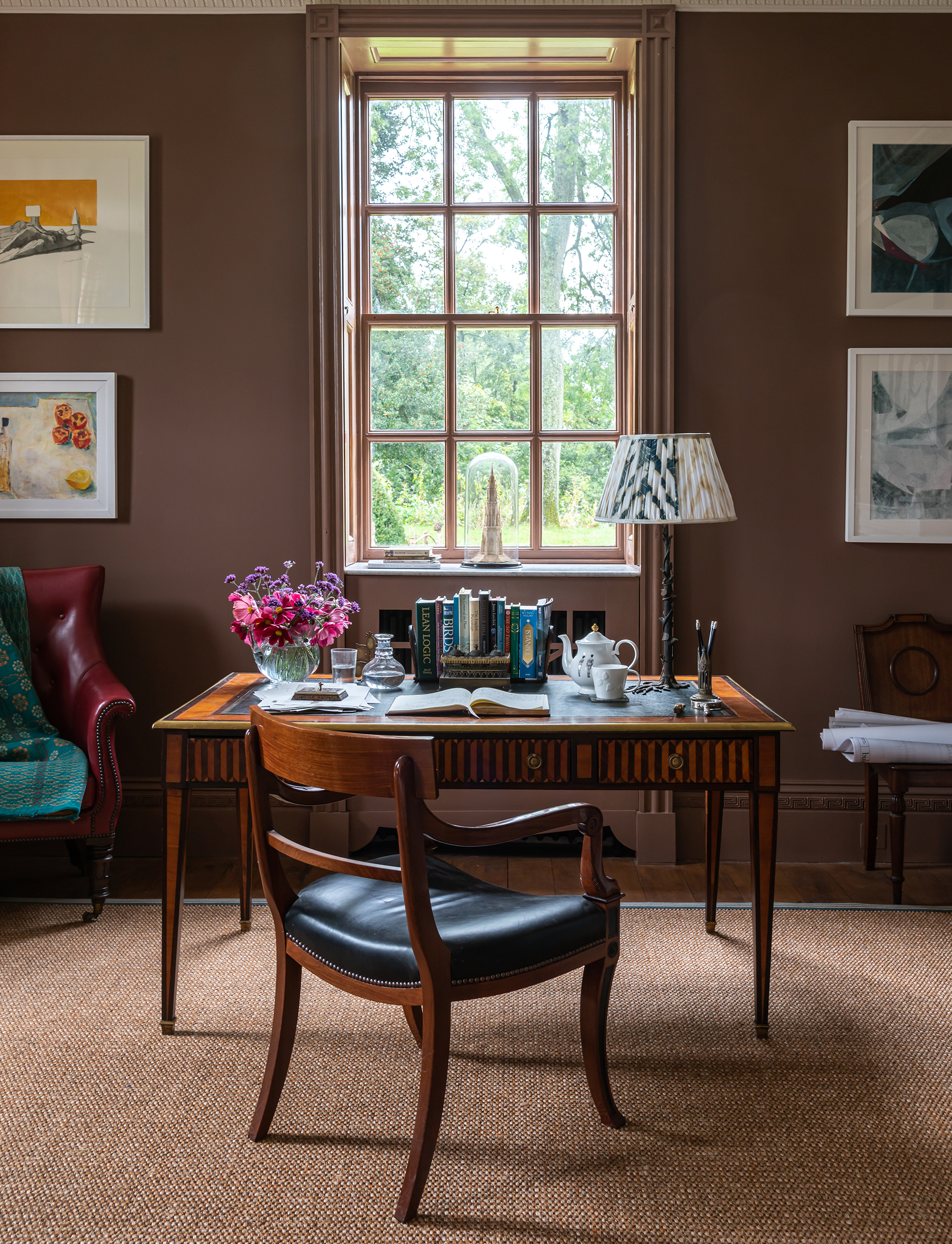
Brown is a shade that we do often see come up in color trends, however, we rarely see it being used. Decorating with brown needn't be as dull as it sounds, it can be a gorgeous rich shade that creates a cozy, cocooning space. It's the perfect shade for a bedroom or a living room.
'In the 80s and 90s there was an overuse of the 'magnolia' shades which could read aged, dusty, and dated. We are welcoming the return of yellow, ochre and brown shades as an alternative to a white paint, and feel like they are neutrals in their own right. Drawing colors that you find in nature and your immediate natural surroundings can always feel more toned down than expected.' explains the team at Stelly Selway
4. Dark teal
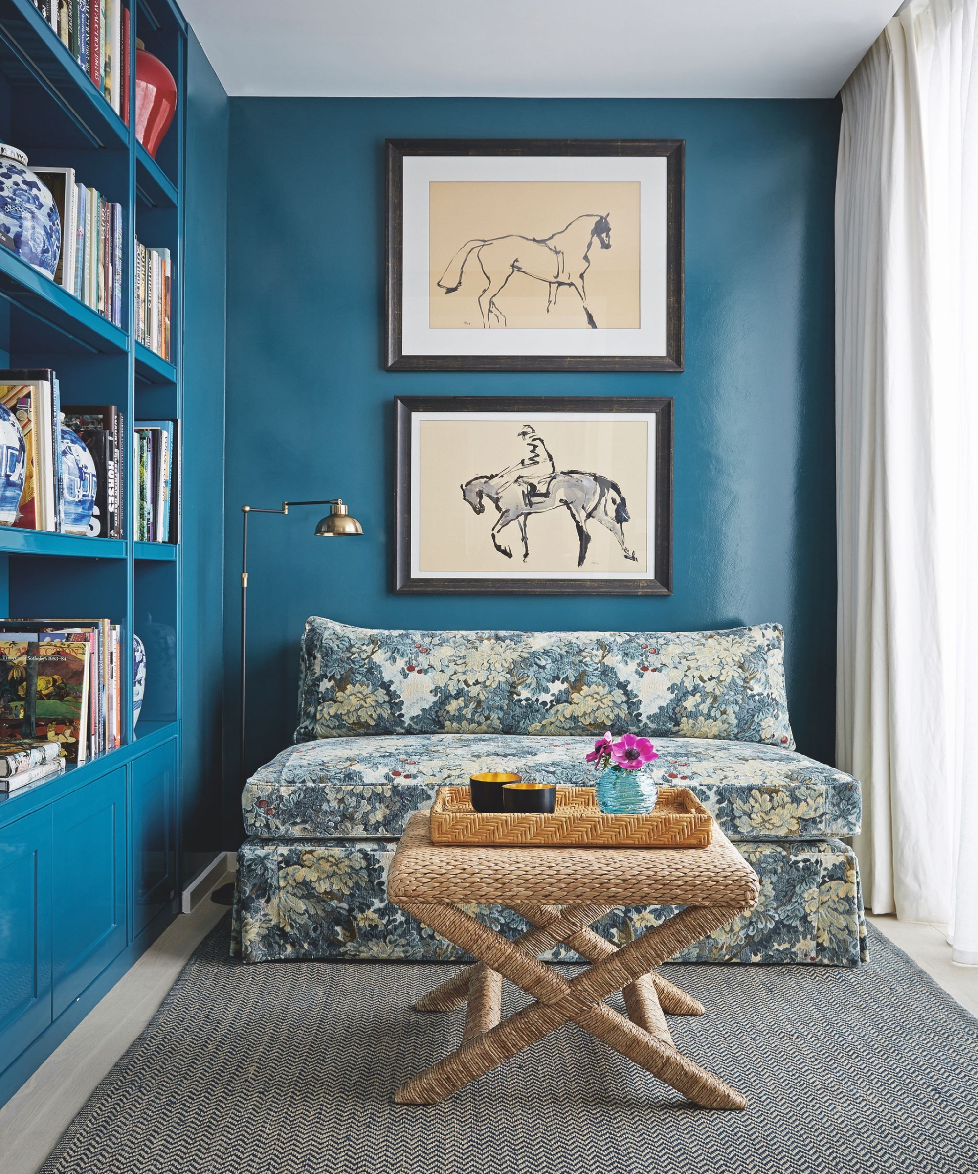
'Maybe it’s because I just returned from an inspirational trip to Mexico, but it made me realize that certain hues, unduly sidelined, hold the power to dramatically elevate a space. Dark teals and deep terracottas can transform an interior without looking too contrived.' explains Kati Curtis.
'Dark teal colors like Farrow and Ball’s "Bardo" and Little Greene Paint Company's "Canton", lend depth and intrigue, introducing an undercurrent of discreet elegance. Equally transformative is the gentle rusticism of terracotta, specifically Little Greene's "Tuscan Red." This warm, inviting hue sets a cozy atmosphere and is readily harmonious alongside any neutral.'
Kati Curtis is the founder of Kati Curtis Design, an design firm based in New York City specializing in classic design with a global influence. Kati founded the studio in 2005 after 12 years of working with international architecture and engineering firms.
As all these underrated paint colors prove, underrated needn't mean they aren't on trend and really usable. These rich, deep shades are room-changing colors and if you pick the right shade they can be as classic as a safe neutral, so experiment, paint is one of the easier things to change in your home so don't be afraid to try something unexpected.
I am the Head of Interiors at Homes & Gardens. I started off in the world of journalism in fashion and luxury travel and then landed my first interiors role at Real Homes and have been in the world of interior design ever since. Prior to my role at H&G I was the digital editor at Livingetc, from which I took a sabbatical to travel in my self-converted van (not as glamorous as decorating a home, but very satisfying). A year later, and with lots of technical DIY lessons learned I am back to writing and editing, sometimes even from the comfort of my home on wheels.