What is a monochrome color scheme? 5 rules to follow when decorating with a single color
Because decorating with one shade can have as much impact as decorating with a rainbow of colors

Design expertise in your inbox – from inspiring decorating ideas and beautiful celebrity homes to practical gardening advice and shopping round-ups.
You are now subscribed
Your newsletter sign-up was successful
Want to add more newsletters?
When decorating a space, choosing a color is the most important decision you will make. The shades you pick for everything that comes into your room have as much impact as the shapes or the styles – color is what is going to be noticed first.
It's a tricky call to make, having to consider the size of your room, the light it gets, and the aspect of the space, so it makes sense that monochrome color schemes are increasing in popularity – they are a simple approach that's easy to make work, using just one section of the color wheel.
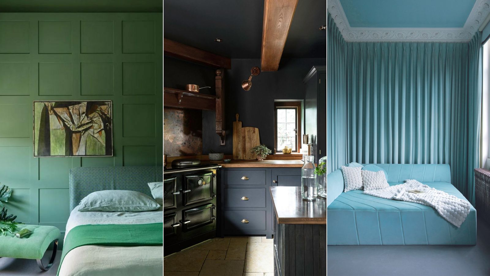
Monochromic color schemes are one of the most used color theories in interior design, using just one color in varying shades to create spaces that are layered and have a ton of depth. And, while the idea of using the same color throughout your entire palette may sound a little safe and boring, the color-drenching approach can have as much impact as bringing numerous bold colors into your rooms. We find rooms that really commit to the look have an impact and really have an effect on how the room makes you feel too since color is such a focus.
Monochrome is so often associated with neutral schemes, but it's a look that can work with any color, it just depends on the look you are after. Decorating with a single room color can create calming spaces, energizing spaces, and cozy spaces. But regardless of what vibe you are after, there are a few rules that will ensure the look works.
What is a monochrome color scheme?
'A monochromatic color scheme is a single color scheme that is created using different tones of that one color. Think green and all its shades from deep forest through to sage. Or black and all of the variations of grey through to white.' explains founder of TR Studios, Tom Rutt.
'Every time you say monochrome to someone, they always just think black and white. When actually, I think the power comes when knowing that monochromatic means taking one hue (a color in its purest form) and adding in white or black pigment to make it into a tone and a tint.' adds Tash Bradley, Director of Interior Design at Lick.
'Color theory and actually looking to the color wheel to help choose a paint color is a really nice place to start when it comes to deciding on your scheme. And a monochromatic color scheme is one that's always going to work,' adds Tash. 'But it's also a chance to be a little bit bolder in your color choices, rather than defaulting to a white or a beige, going for a layering monochrome look transforms a room, making it so much more interesting.'
Design expertise in your inbox – from inspiring decorating ideas and beautiful celebrity homes to practical gardening advice and shopping round-ups.

Tash is trained in color psychology and theory, she helps people around the world bring their dream decorating projects to life and utilize color to impact personal spaces, as well as overall lifestyle and wellness. Tash leverages her expertise in color psychology and theory, as well as interior design, to lead Lick’s design studio and curate the brand’s global paint and wallpaper offerings. To date, she has led 1,000+ color consultations for Lick clients, providing customers the confidence they need to create a home they’ll love.
1. Get the undertones right
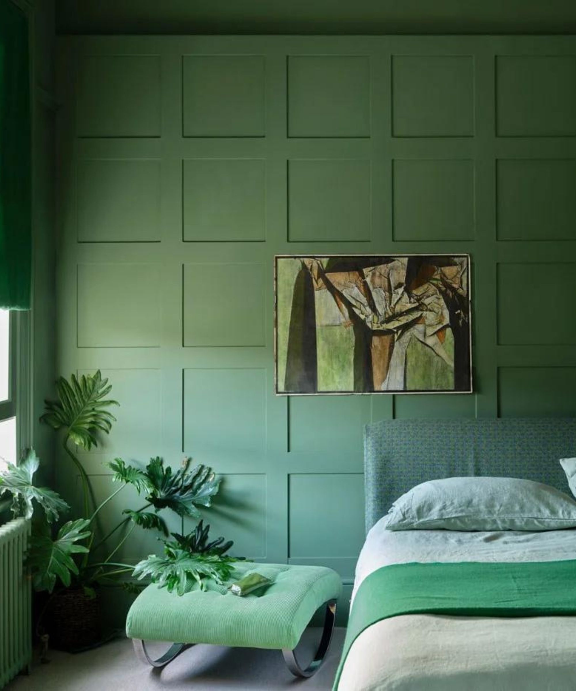
This is so key to a successful monochrome scheme. If you are going to layer different shades of the same hue, you really need to make sure that they have the same undertones. As Tash and Tom both mentioned, pick one main color, then layer with shades of the same hue but different tones and tints (darker and paler versions of that core color).
'Tone is key to a monochrome scheme and creating a graduated look. Ensuring the tones are right will create a cohesive and seamless interior scheme,' explains Tom. 'If you are unsure, look to a paint chart, choose your shade, then compare your chosen color with graduated tones from the same color family on the paint chart in lighter and darker shades. Texture and soft furnishings have a key part to play in this aesthetic otherwise your room will look flat, so ensure your material palette is as rich and layered as your color palette.'
Swatches and samples are key before committing to this look. Order plenty and test them out together in your space so you can see how all the shades sit together and how they are affected by the light in your space.

Tom Rutt has worked in the offices of Norman Foster and Michaelis Boyd before founding TR Studios in 2015.
2. Texture is as important as color
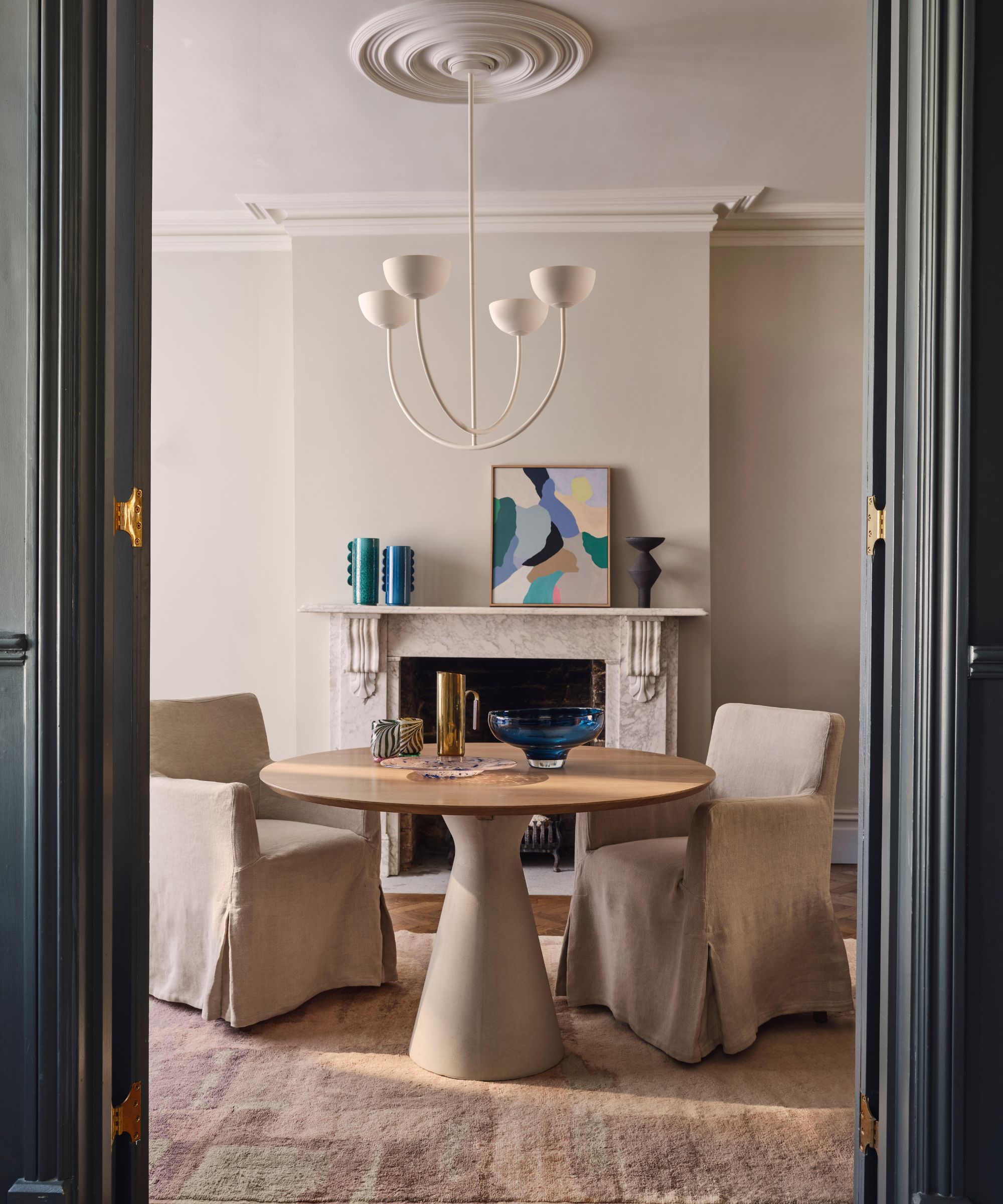
A monochrome scheme needs plenty of texture. Using a single color does risk looking a bit flat, so the texture will add to the depth and interest. This is especially important if you are decorating with neutrals so really need some contrast of materials going to ensure the room doesn't look dull.
'A monochrome color scheme is a design approach centered on a single color's variations. To achieve a successful monochrome look, it leverages diverse textures, finishes, and fabrics, alongside different shades of the same color,' explains designer Jennifer Davis.
'These elements are essential to prevent the design from appearing flat and one-dimensional. By incorporating a rich tapestry of textures and layers, a monochrome scheme can sustain visual interest and depth within its constrained color palette.' she adds.

Jennifer fell in love with design at a young age and has been working in the industry for over 25 years. She has developed an eye for detail and a talent for creating timeless designs. Jennifer offers a balance of creativity and forward-thinking with a structured, organized, and detailed mentality. Jennifer is driven by her deep passion for design while curating an exceptional client journey, ensuring pure delight from the very beginning to the end.
3. Consider how you want the room to make you feel
We all are aware of the impact that color can have on your mood. So when you are taking one color across the whole of your space, you really need to consider how that color will make you feel. How do you want the room to feel?
There is one color we would recommend never using in a monochromatic scheme and that's gray. It's a popular shade yes, and comes back year after year in color trends, but imagine how walking into a room decorated completely in gray would make you feel. It would be like a gloomy day, all the time.
These color schemes work best with bolder or softer shades. Blues, pinks, and greens create beautiful monochromatic schemes that are mood-boosting and invigorating. We see them work really well as bedroom colors where you can be a bit bolder in your color choices – plus remember a monochromatic scheme can be subtle too, just move further towards the paler end of the spectrum to create a much softer palette.
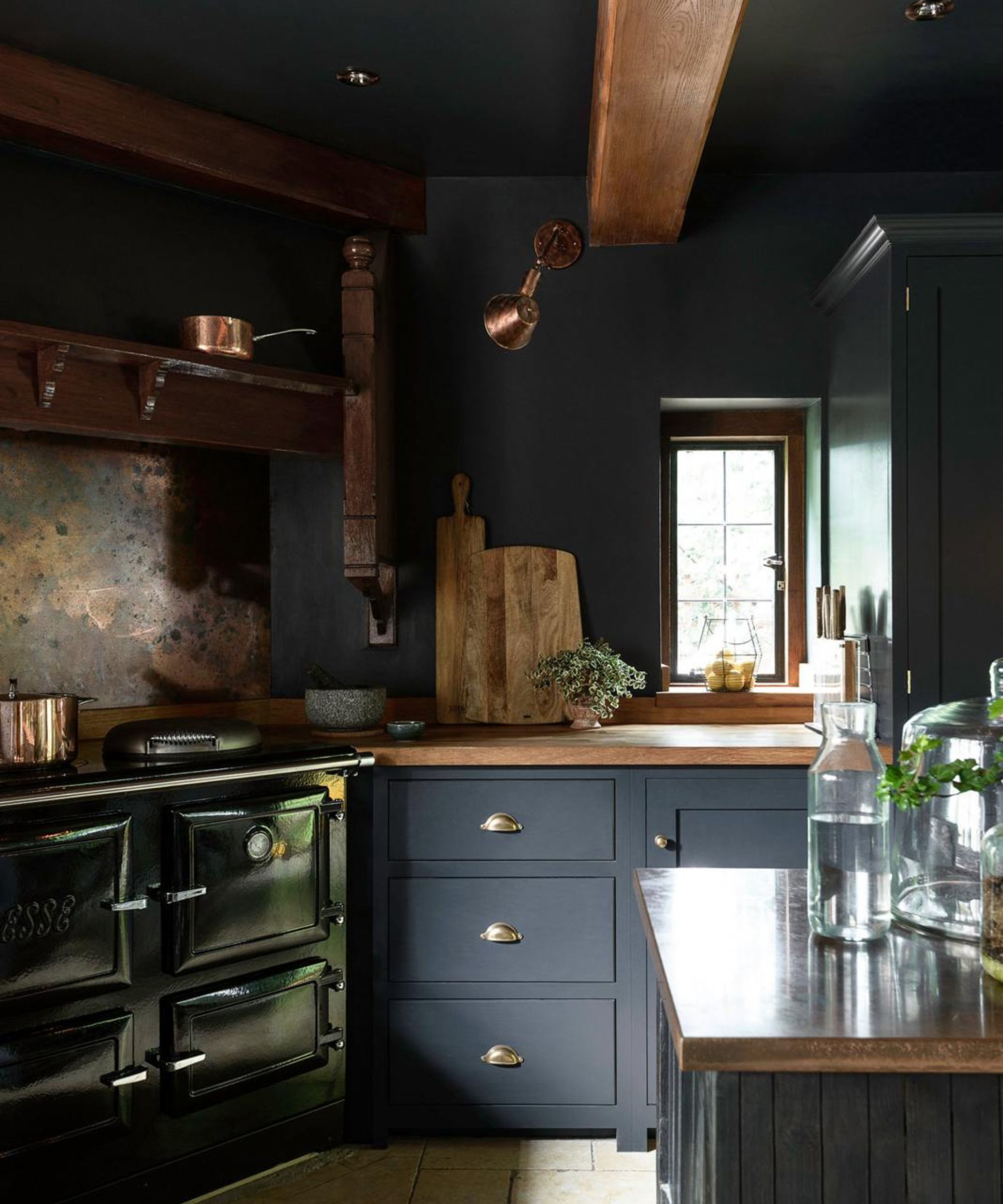
For living room colors, beige can look lovely, layered up with lots of different neutral tones and textures. And if you want to experiment with a dark monochromatic color scheme, the kitchen is the place to do it – this design by deVOL takes an inky black over all the cabinets walls, and ceilings, which sounds super dramatic, but actually, the result is a cozy, chic dark kitchen.
4. Add interest with shapes and styles
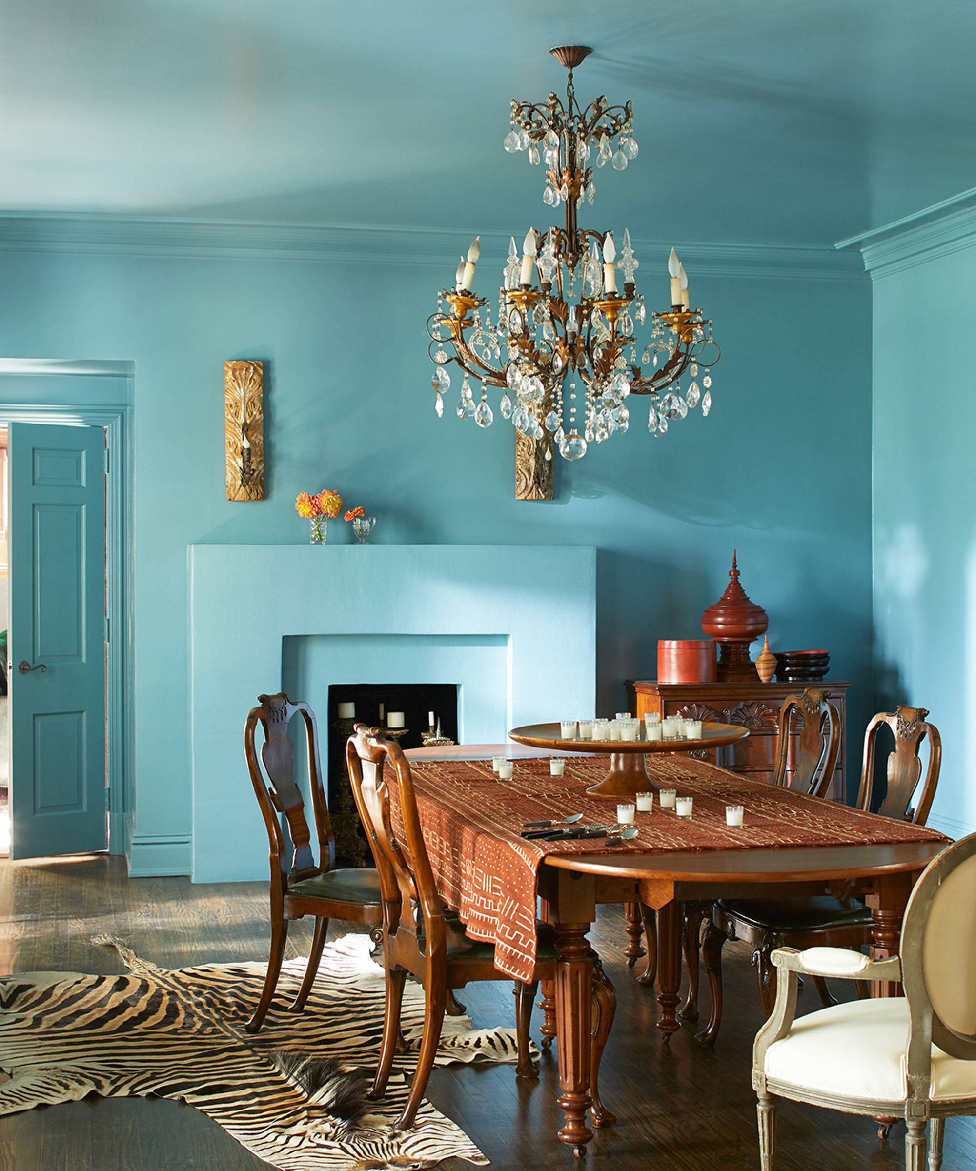
'When you strip back to just one color, you need to be very considered with what furniture and decor you bring in, they are going to be doing a lot of the work to ground the room and prevent things from looking too flat,' suggests Jennifer Ebert, editor of homesandgardens.com. 'Look out for interesting shapes and silhouettes. Blend styles, mix old and new, and pieces from different eras to ensure there's plenty of character to the room.'
A monochromatic scheme is the perfect backdrop for bringing in some bolder shapes and styles and contrasts with your furniture and decor. The simple color palette can really elevate your furniture and make it more of a focal point in the room.
It's also a very chic way to blend more modern styles with more traditional pieces. Color drenching your walls and ceiling in a bold shade instantly gives a room a more contemporary feel, but then you can create some really cool contrasts by decorating with antiques or bringing in some characterful decor. It won't feel overly fussy because you have that simple, statement backdrop. This blue dining room makes the point – it's energetic, it's playful but the antique furniture gives it a sophistication.
5. Break the rules with caution
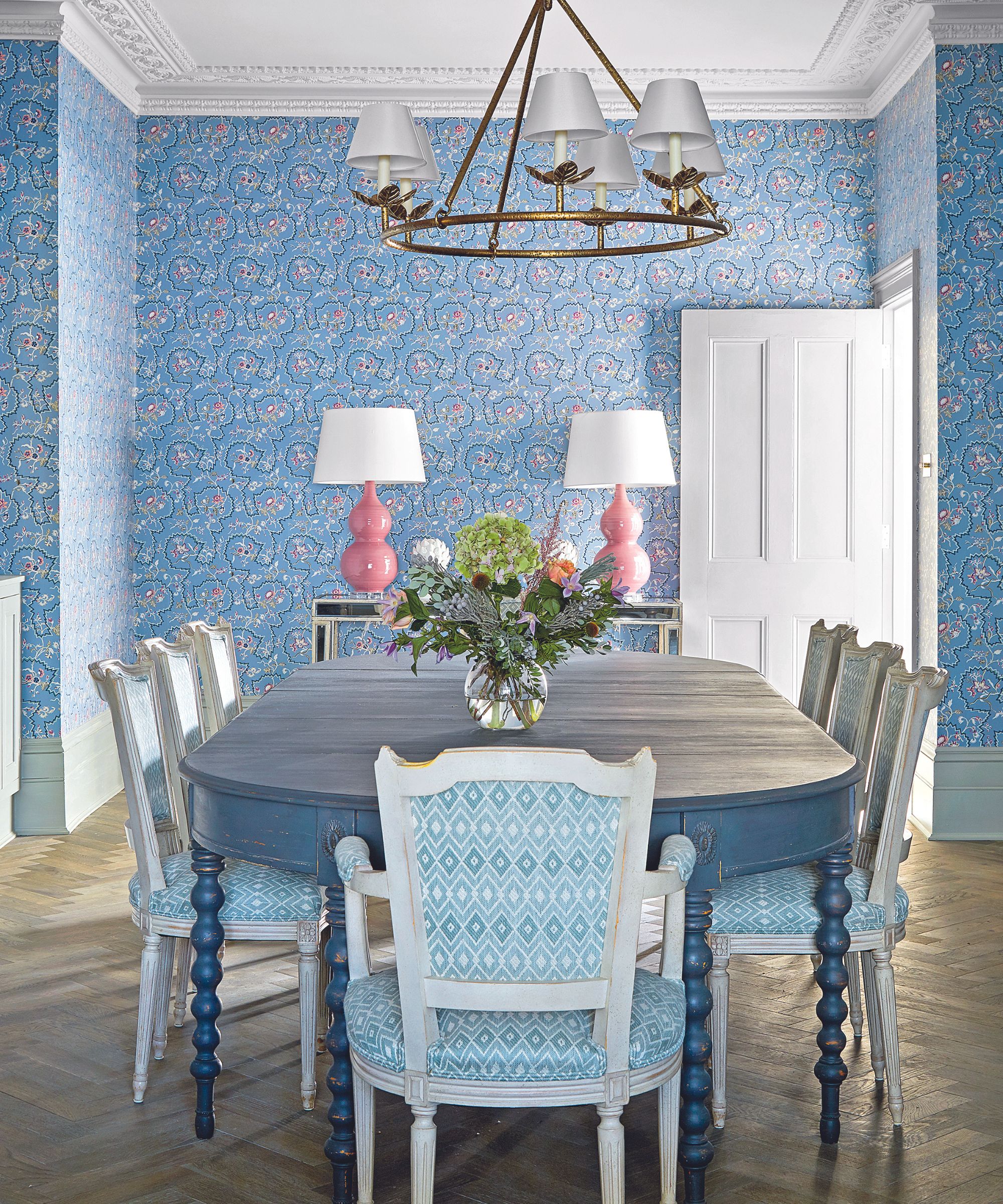
Adding an accent color to a monochrome scheme is something that should be done with caution as it can look forced and you can lose that tonal look that a monochrome scheme is all about. It can be done, you just have to do it carefully.
Pick a color that's going to stand out against the rest of the scheme. That could be from the opposite side of the color wheel if you want to go bold and really up the contrast (for example blue and pink) or go for something slightly more subtle and pick a color that's next to your main hue on the wheel (for example, blue and green). And avoid bringing in lots of solid 'pops' of the accent color, add the color in with prints and patterns that bring the two colors together in the same design.
See how in this dining room there are subtle hints of pink in the blue wallpaper and side lamps add another hit of color, and bring out the pink from the print too.
What makes up a monochromatic color scheme?
A monochromatic color scheme is made up of one color in different tones and tints – different lighter and darker shades of the same color. You've got the hue, which is the main shade, then you've got tones which are the hue color plus different amount of black and tints which are the hue color plus different amounts of white.
Inspired to go for a monochromatic color scheme? They are really easy to get right, and they work with so many colors and styles. You can really choose how bold or how subtle you want to go depending on what's going to suit your home. You could go super on trend with a tonal pink bedroom, or keep it chill with a layered neutral living room. Just be sure to add in plenty of texture and interest to the space too and you'll create rooms with just as much impact as if you were to use a rainbow of colors.

I am the Head of Interiors at Homes & Gardens. I started off in the world of journalism in fashion and luxury travel and then landed my first interiors role at Real Homes and have been in the world of interior design ever since. Prior to my role at H&G I was the digital editor at Livingetc, from which I took a sabbatical to travel in my self-converted van (not as glamorous as decorating a home, but very satisfying). A year later, and with lots of technical DIY lessons learned I am back to writing and editing, sometimes even from the comfort of my home on wheels.