These are Behr's best-selling paint colors of all time – and there's something to suit every style
Behr's best sellers range from bright and white to dark and moody. We spoke with the brand's VP of color to get the inside scoop on each shade

Design expertise in your inbox – from inspiring decorating ideas and beautiful celebrity homes to practical gardening advice and shopping round-ups.
You are now subscribed
Your newsletter sign-up was successful
Want to add more newsletters?
There's nothing like a fresh coat of paint to transform a space, and certain shades are known for their versatility and universal appeal. It's no secret that neutrals work well in just about any room of the house, while bold accent colors add layers and depth. And over time, the most tried-and-true hues have gained quite the following for their timeless nature and their alignment with recurring color trends.
Whether for ease of use or eye-catching color, certain shades captivate more homeowners than others. We spoke with Erika Woelfel, VP of color and creative services at Behr, about the brand's top 10 all-time best-selling colors, and how to use the hues to elevate your home. Here's all you need to know about these popular paint colors.
Behr's best-selling paint colors
From clean, white paints to deep, moody accents, the Behr best-selling list runs the gamut of classic paint colors. Fit for full walls, finishing details, or outdoor areas, these shades have proven quite popular over the years. Here's what you should know about Behr's top hues.

Erika Woelfel is the VP of Color and Creative at Behr. She has over 20 years of experience across color consulting, visual merchandising, graphic design and marketing.
1. Ultra Pure White
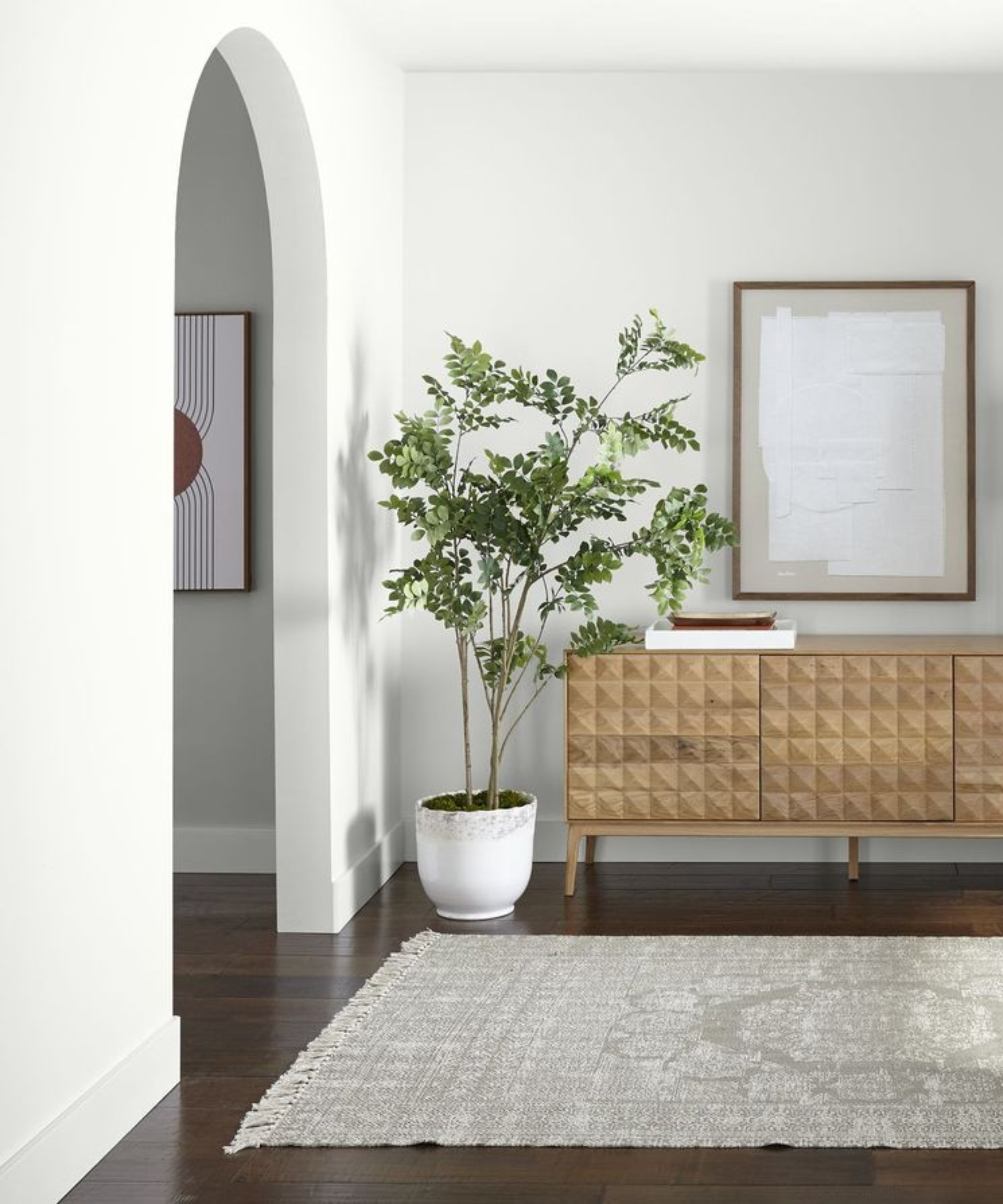
'Ultra Pure White is a clean, pure white that can serve as the backdrop to highlight the textures and structure of a space. The color is a great choice for walls and trim,' says Erika.
Erika suggests pairing Ultra Pure White with other similar shades to achieve a layered space that has depth and interest. If you're looking for a bit more color, she says opting for blue tones with leave a space with a clean coolness, while yellow and orange tones will add some warmth.
The shade acts as the perfect blank slate for a variety of interior design styles. In this entryway, Ultra Pure White walls complement the warm hues of a wooden console table and the pale gray tones of the rug.
2. Swiss Coffee

'Swiss Coffee is an off-white with subtle yellow undertones that create a creamy, warm base within a space,' says Erika.
Design expertise in your inbox – from inspiring decorating ideas and beautiful celebrity homes to practical gardening advice and shopping round-ups.
Like many white and especially warm white paints, Swiss Coffee's tones shift as a room's lighting changes. In this kitchen, bright lighting allows the color to work perfectly alongside darker accents, like gray appliances and black light fixtures.
'More light exposure will bring out the inviting, warm qualities while dimmer lighting creates a cooler, muted appearance,' says Erika.
3. Dolphin Fin
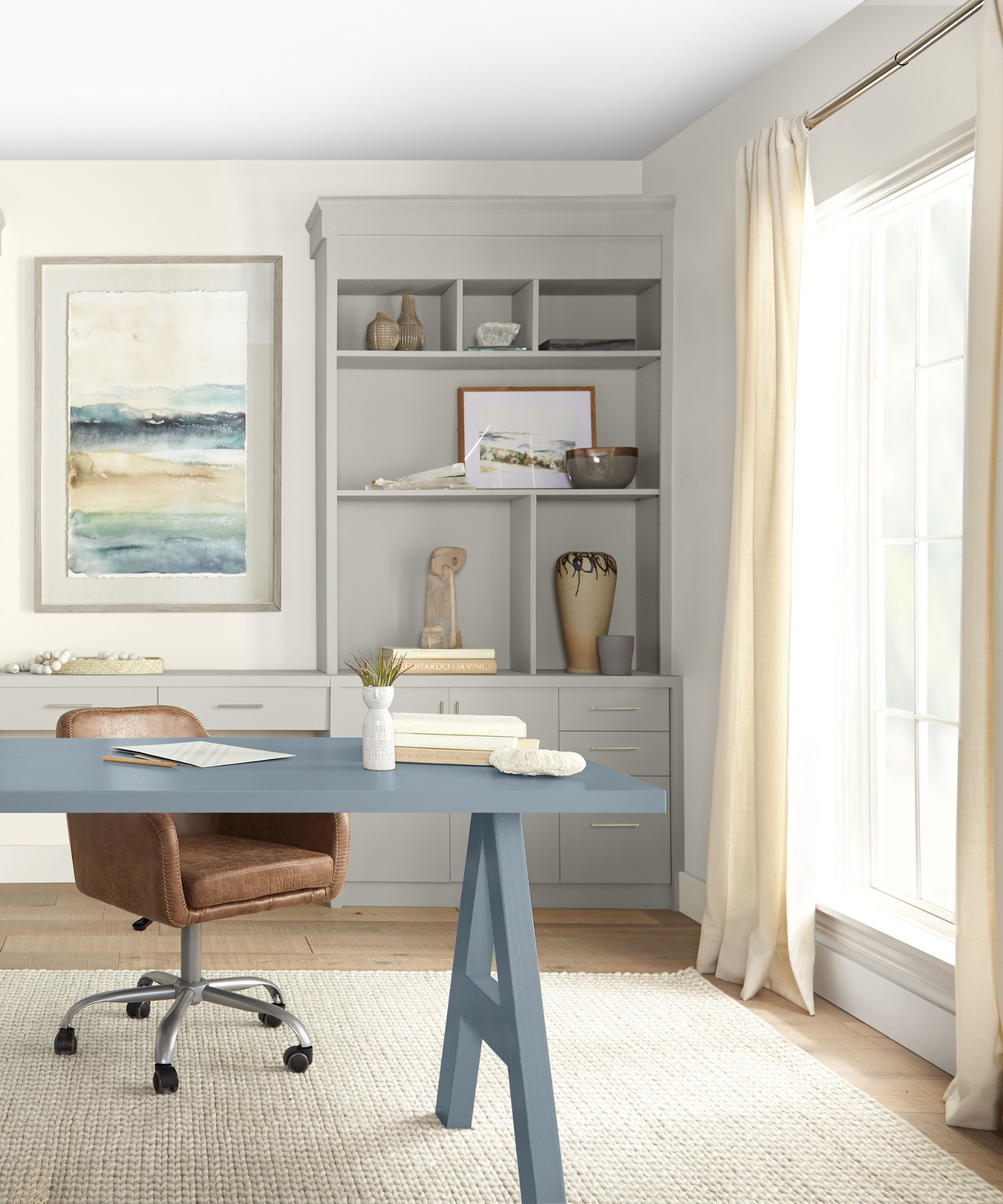
A timeless neutral, Behr's Dolphin Fin brings understated yet impactful depth and interest to any room. 'Dolphin Fin is a gray that leans slightly warm due to its undertones. It is a popular color choice for both the exterior and interior of homes,' says Erika.
4. French Silver
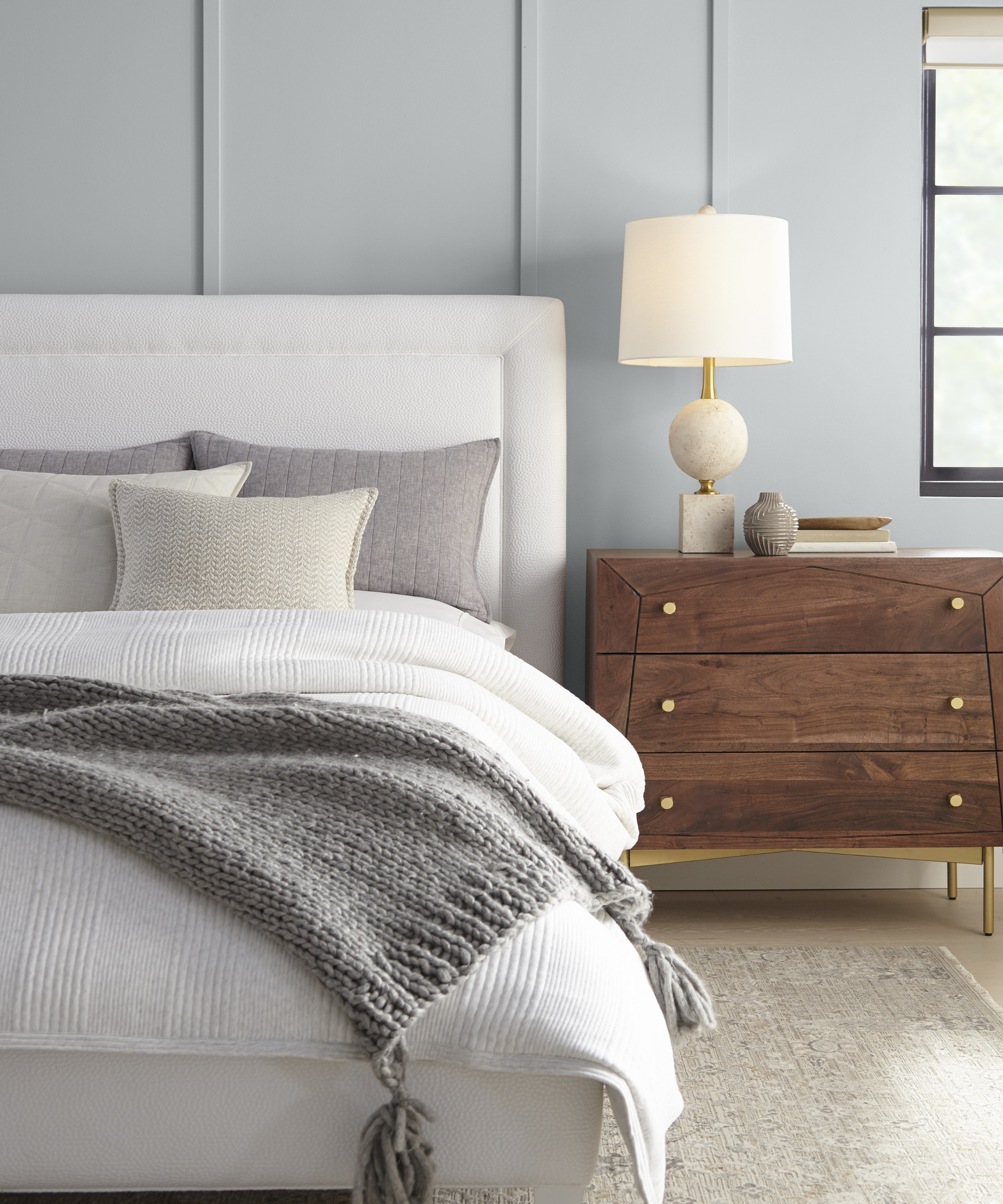
'French Silver is an elegant cool gray that can be used to make small rooms look bigger. Also, as a mid-gray it can be used on the exterior of homes for classic and modern style,' says Erika.
In this bedroom, the color is used on wall detailing to add an extra layer of dimension. Paired with deep wood tones and lighter neutrals, it provides a sense of calm.
5. Etched Glass

In this bedroom, Behr's shade Etched Glass is paired with warm neutrals and airy sunlight for a fresh yet cozy look. Undeniably blue yet still relatively neutral, the shade is best used for creating soothing spaces,' says Erika.
'Etched Glass is a frosty blue with hints of gray that creates a relaxing atmosphere. The color suits rooms that are designated spaces to unwind like a bathroom or bedroom setting.'
6. Adirondack Blue
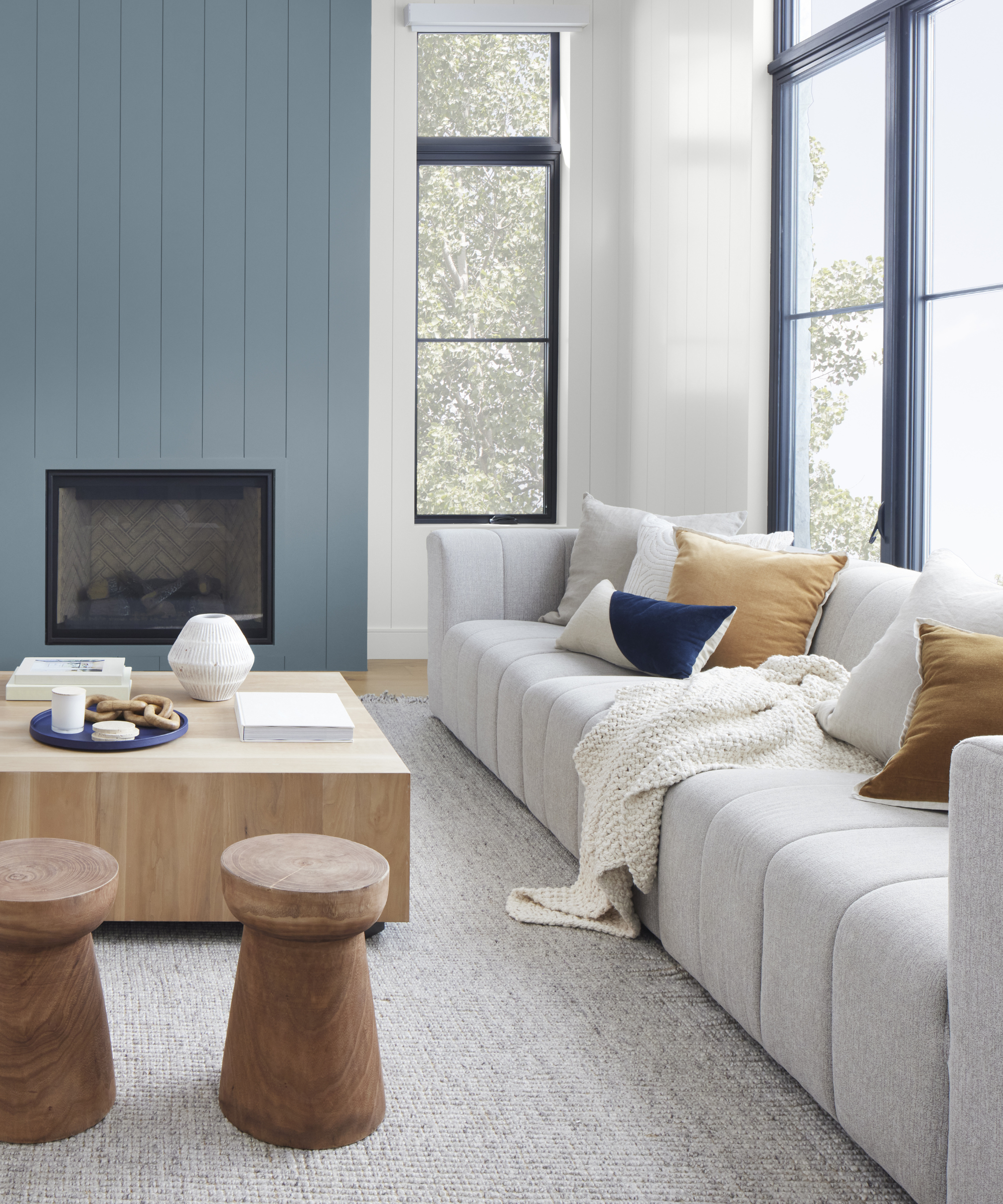
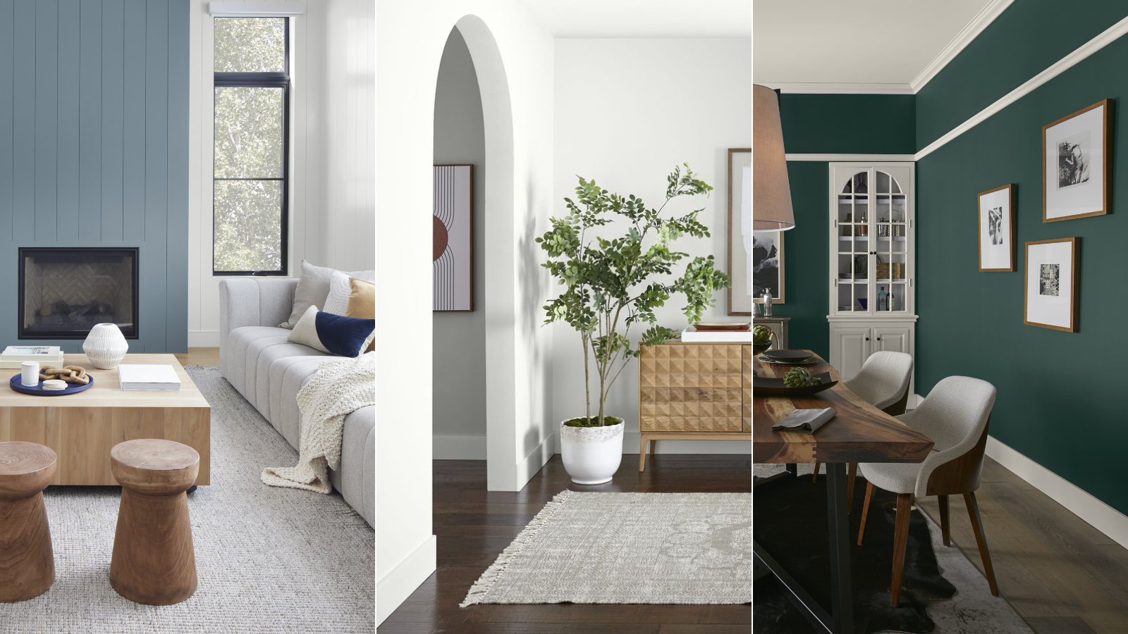
'Adirondack Blue is a sophisticated, slate blue that evokes feelings of the outdoors. The pop of blue is a popular choice for small accents whether it's cabinets, built-ins, or one wall in a bedroom. Adirondack Blue pairs well with natural elements like wood and stone as well as other neutral colors such as white, beige, and gray,' explains Erika.
This living room utilizes the deep, cool shade to bring a fireplace accent wall to life, a pop of color in an otherwise clean, neutral space. The wooden coffee table and stools, plus outdoorsy views, offer perfect examples of the natural, organic elements that work beautifully alongside this shade.
7. Black
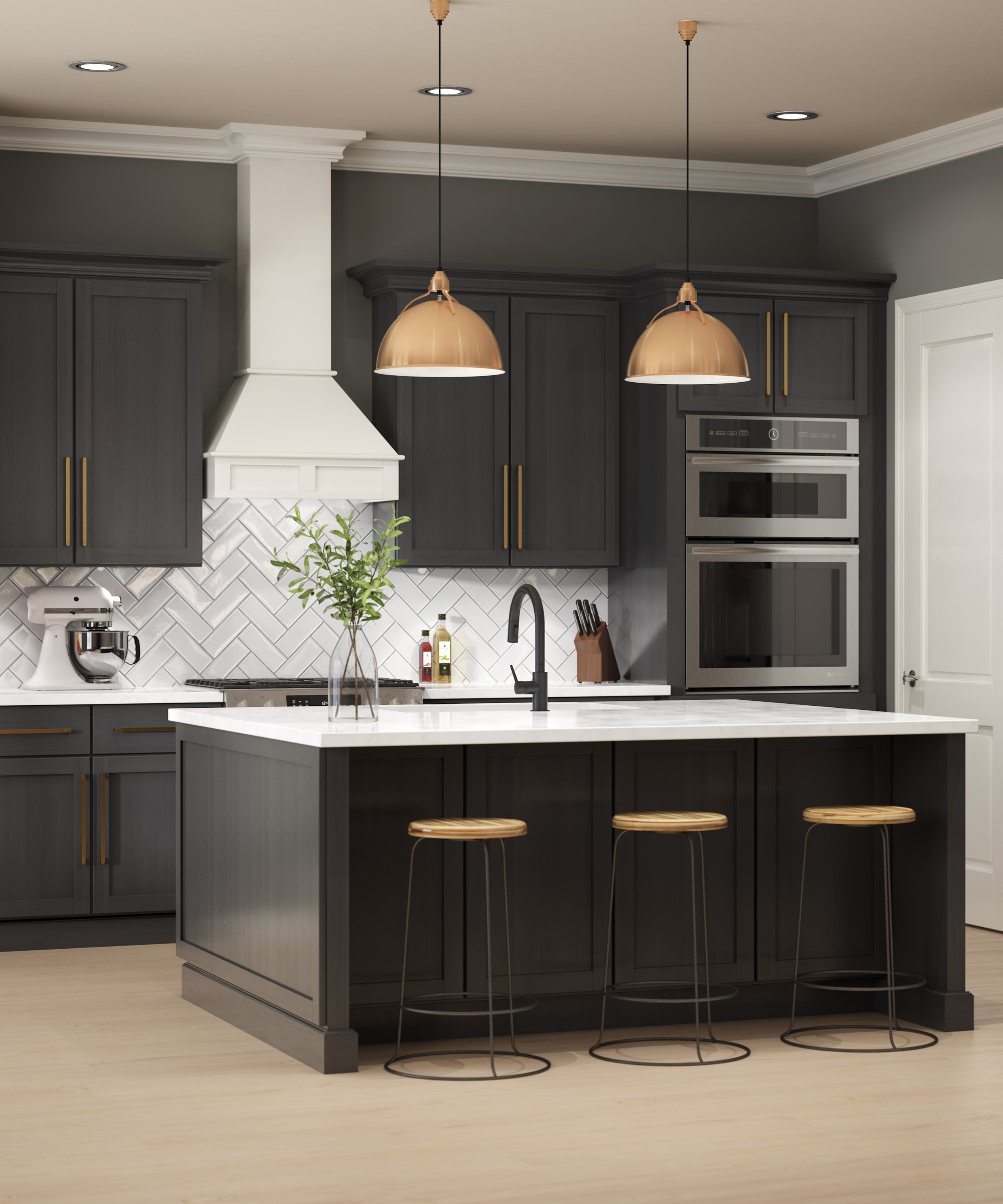
'Black is beautiful and pure in its timeless simplicity. For those looking to experiment with this bold color choice, consider trying the shade on an exterior door, accent wall, or fireplace to add drama. Using the color in a matte or eggshell finish will soften the dark appearance. Opt for this color if you are looking for a true black color with no undertones,' suggests Erika.
Decorating with black works best when painting small details, but can also be used to make a large statement in just about any room – take, for example, this sophisticated kitchen design. Paired with bright white and metal fixtures, these black cabinets define the space.
8. Brook Green
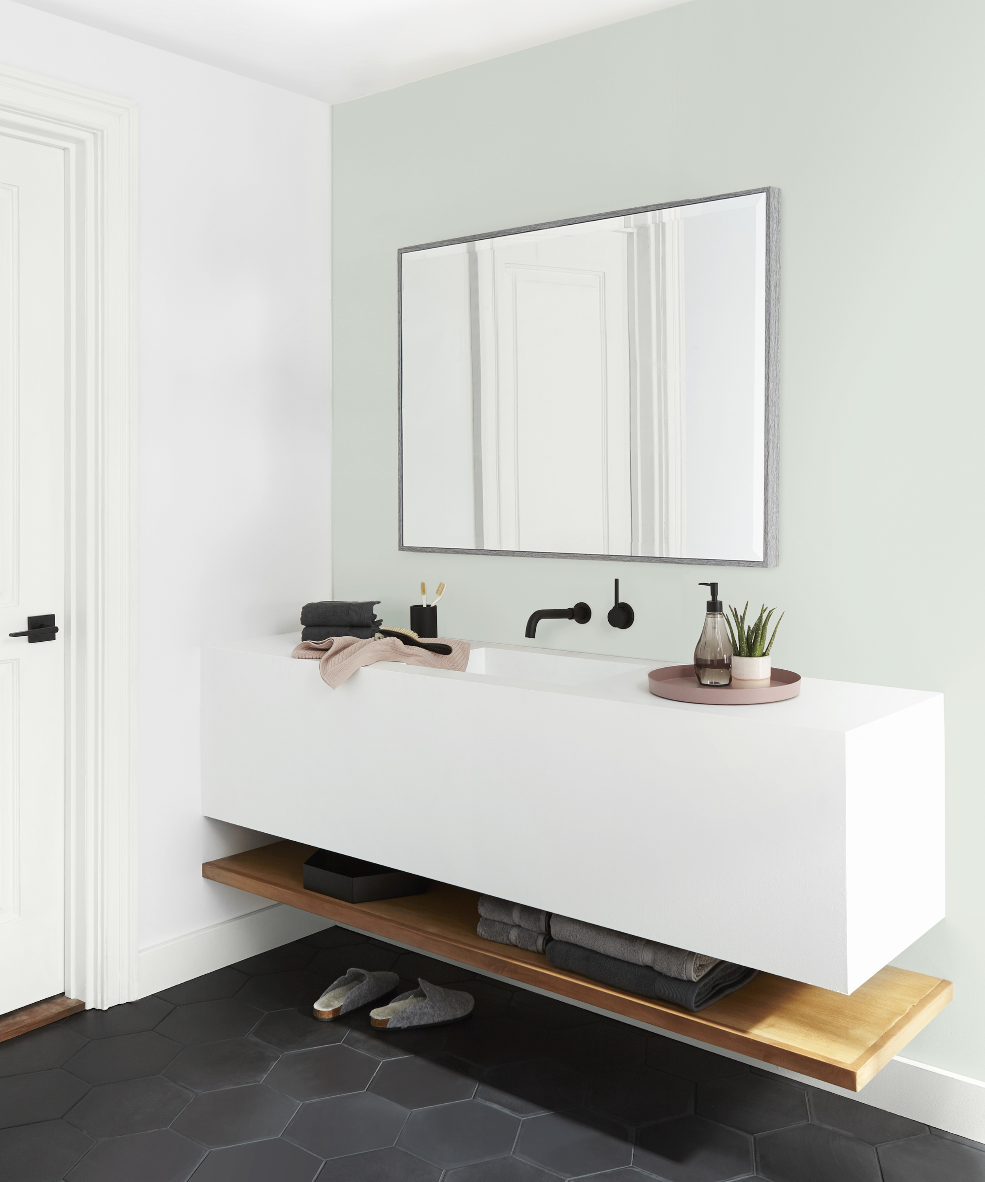
'Brook Green is a gentle sage green that pairs wells with creamy whites like Swiss Coffee and Silky White. As it is less intense than a true green paint, it serves as a nice accent color in a neutral color scheme. The soothing nature of the color makes it a great choice for a bedroom or living room,' advises Erika.
A minimalistic pop of color, Brook Green can be accessorized with wooden furnishings, neutral-toned materials, and house plants. This calming bathroom employs the shade for a fresh yet laid-back space.
9. Dark Everglade

One of the list's boldest hues, Dark Everglade exudes depth and sophistication. In this dining room, it serves as a beautiful backdrop for a small collage of black-and-white photographs and a tall antique cabinet.
'Dark Everglade is a rich, deep green that creates a moody ambiance within a space. Choose a high-gloss sheen to lean into a glamorous style or pair it with natural elements to incorporate more of a traditional feel. This color would be a perfect choice for a study or sitting room where you are looking for an extra touch of elegance,' suggests Erika.
10. Dark Crimson
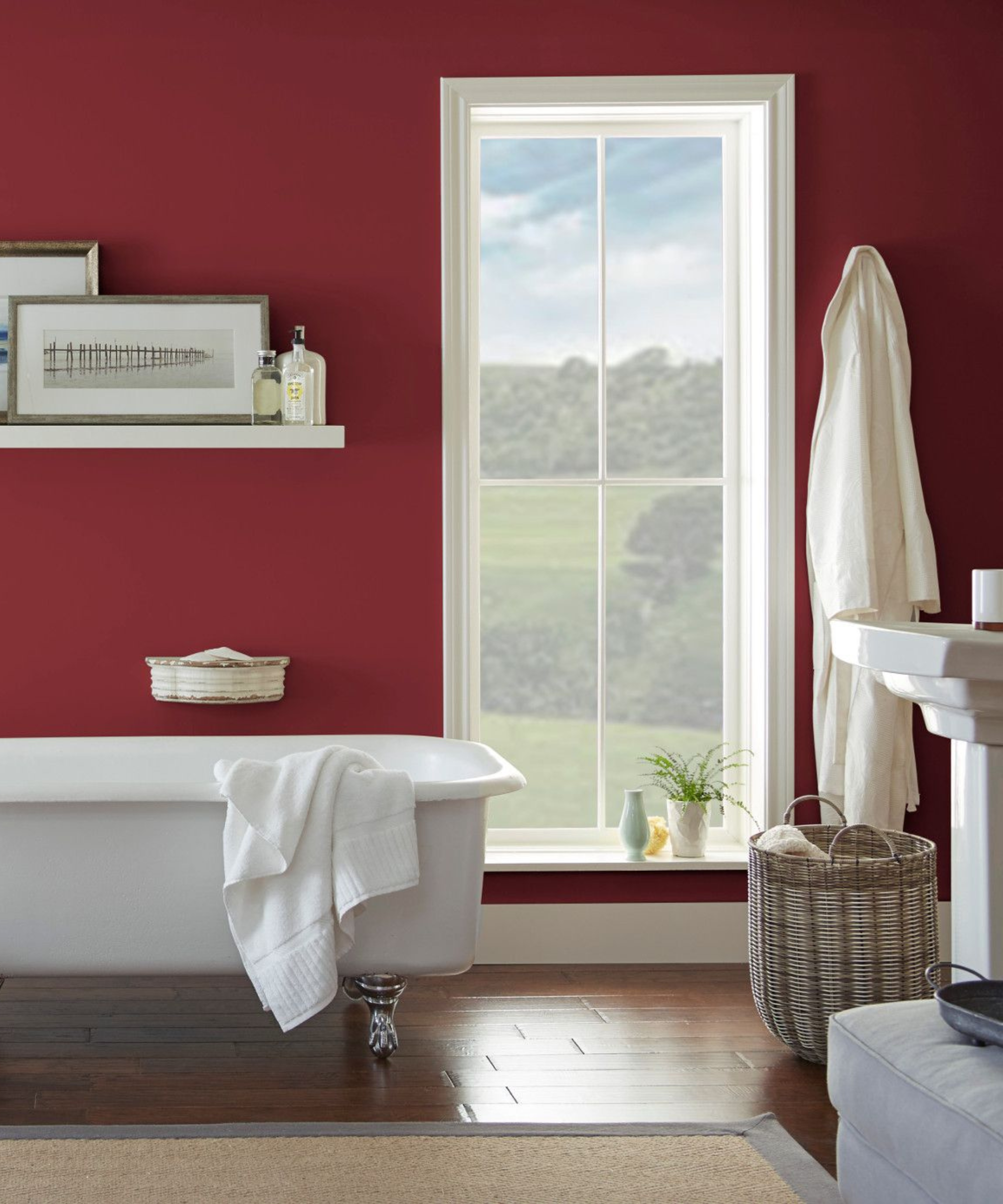
In this classic bathroom, Behr's Dark Crimson pairs with bright white accents and organic touches – including an outdoor view. But the shade also works alongside similar hues.
'Dark Crimson is a scarlet red hue that can be paired with other colors within the red family to create a chic, monochromatic look. To create a feeling of opulence within a space, choose an emerald or deep indigo hue to style with the deep, red hue. The color can work nicely on the exterior door of a home as an accent or coating the walls of a dining room,' says Erika.
This diverse range of hues has led the pack over at Behr, and it's easy to see why. Filled with plenty of neutrals, plus pops of dark, sophisticated hues, this list of best-selling shades will likely keep its popularity for many years to come.

Abby was the Interior Design News Editor at Homes & Gardens and is now studying for her Master's degree in Journalism at City University, London. Prior to joining our team, she worked with Better Homes & Gardens, where she wrote and edited content about home decor, gardening tips, food news, and more. She studied Journalism and English Literature at New York University and moved to London to pursue her love of writing in 2023.