Benjamin Moore just revealed the easiest way to choose paint colors for the entire home – here's what you need to know
Knowing where to start with mastering a home's color palette can be tricky, but these expert tips make it simple


Embarking on choosing colors for the whole home can be daunting at the best of times. Not only is it about mastering the right colors for each room, but ensuring they each relate to one another from room to room to ensure cohesion runs throughout the home.
Thankfully, Benjamin Moore has shared useful insights about choosing colors for the whole home. The paint brand shared a video on Instagram in which their color expert Anastasia Davydenko breaks down the process, sharing three simple steps to follow.
If you're looking for some expert paint ideas for your room color ideas, read on.
A post shared by Benjamin Moore (@benjaminmoore)
A photo posted by on
1. Identify your central room and choose a dominant paint color

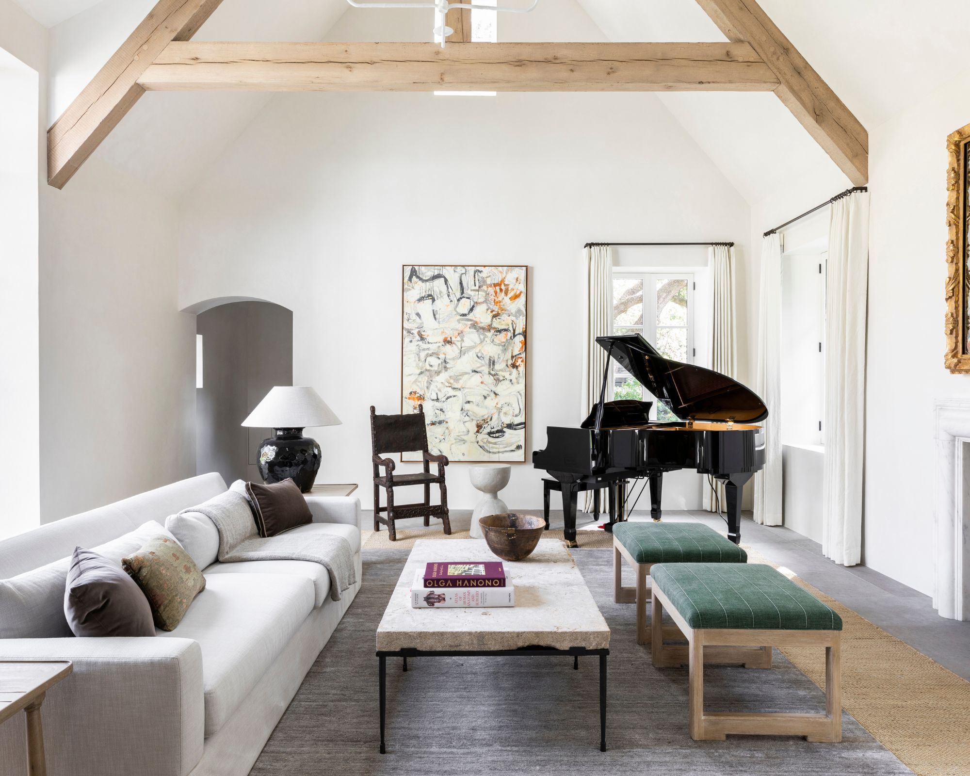
'To start, we have to identify the central room in the home,' says Anastasia, who sees this as 'the room where we spend the most time'.
Once you've identified the central room of your home, you need to select a dominant paint color for this space. 'When we're selecting a dominant paint color for the central room of the home, it’s important to consider some of the fixed elements in the space,' continues Anastasia. 'Things like furniture, cabinetry, countertops – we want to work with these features, not against them.'
Your dominant paint color should, as Anastasia explains, complement existing elements, but it should also relate to your interior design style. If you love maximalist decor and colorful spaces, this should be reflected in your dominant paint color. Or, maybe you're more like Anastasia who favors decorating with neutrals.
'I personally love to use neutral paint colors as the dominant paint color in a central room... I find that these hues create a really great base for then layering additional color throughout.'
Design expertise in your inbox – from inspiring decorating ideas and beautiful celebrity homes to practical gardening advice and shopping round-ups.
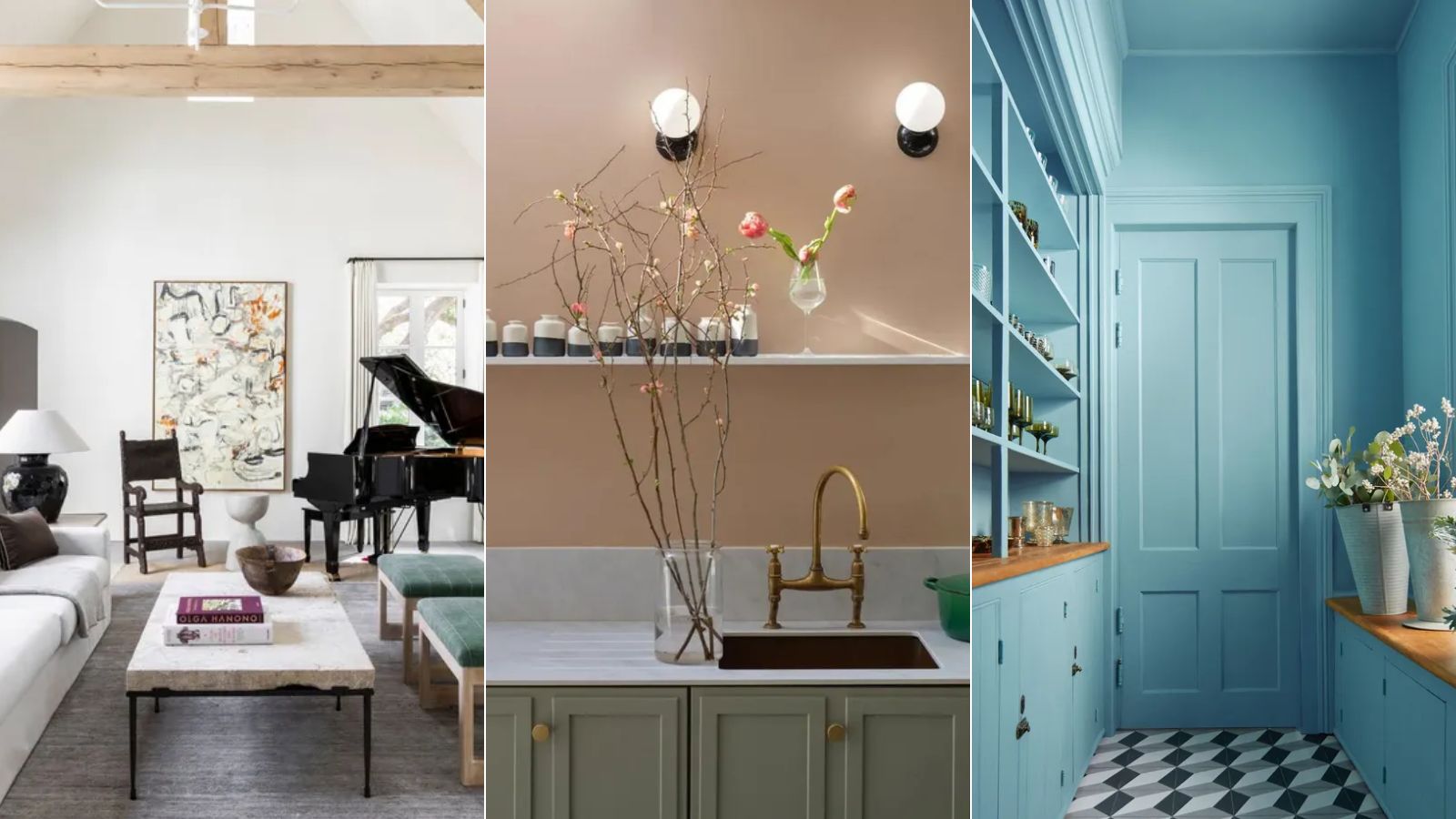
In this living room designed by Marie Flanigan Interiors, white paint is used across the walls, showing how effective calming neutrals can be in central rooms.
2. Choose a nuanced color for secondary rooms

Once a dominant paint color has been chosen for your home's central room, the next step is to decide on a color for 'secondary' or 'adjoining' rooms, explains Anastasia.
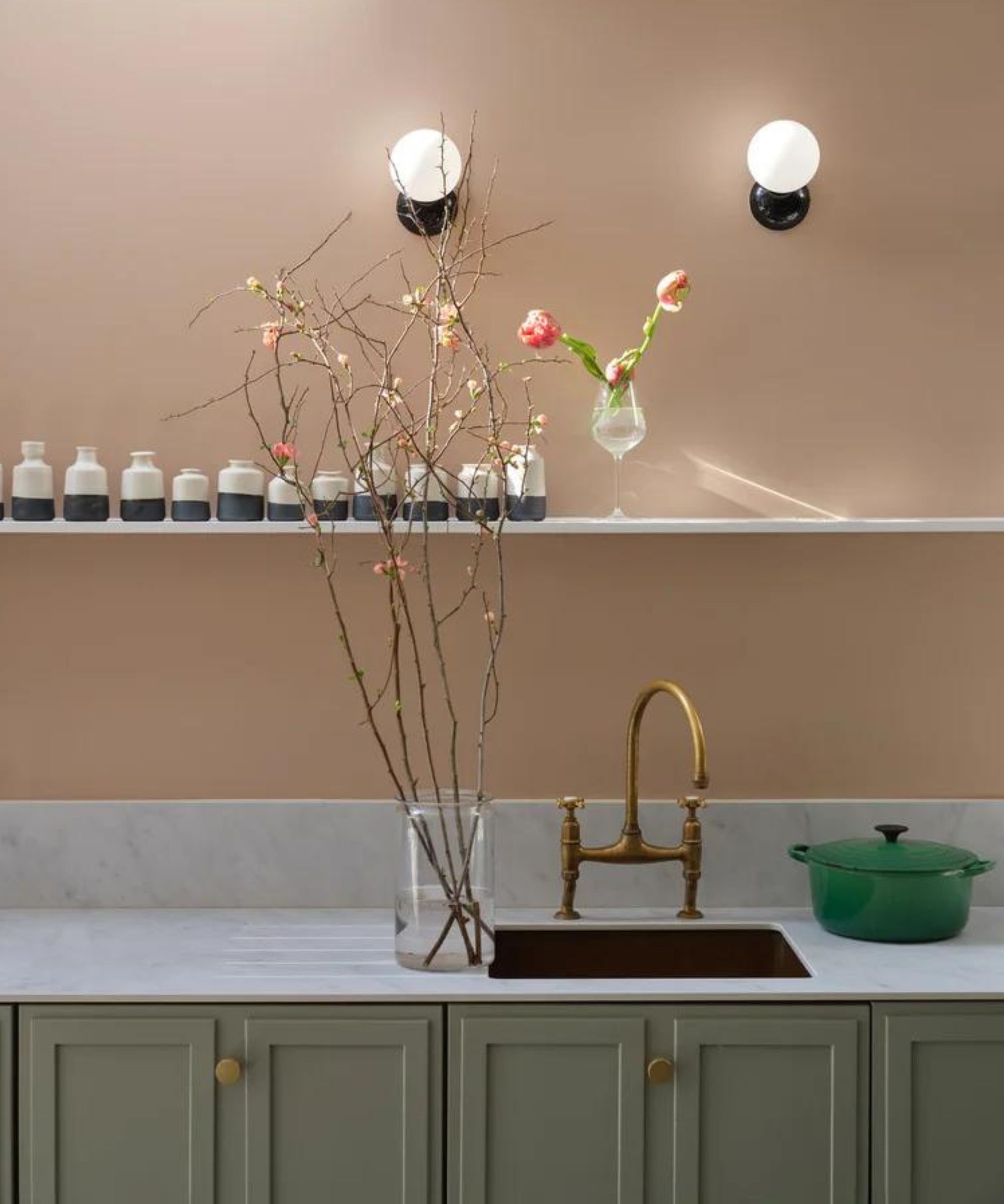
In these spaces, which could be rooms like bedrooms, dining rooms, or any less frequented living spaces, Anastasia recommends nuanced paint colors 'that live in between two color families', such as 'pink-beige' or 'blue-gray'. 'I find these hues create a really beautiful layered effect in the space.'
Consider how your color for secondary rooms works with your already-chosen dominant paint color to create cohesion throughout the home. Earthy pinks such as Farrow & Ball's Templeton Pink used in this kitchen would work well in homes where white or light neutrals are used in the central room.
3. Color drench in sectioned-off spaces

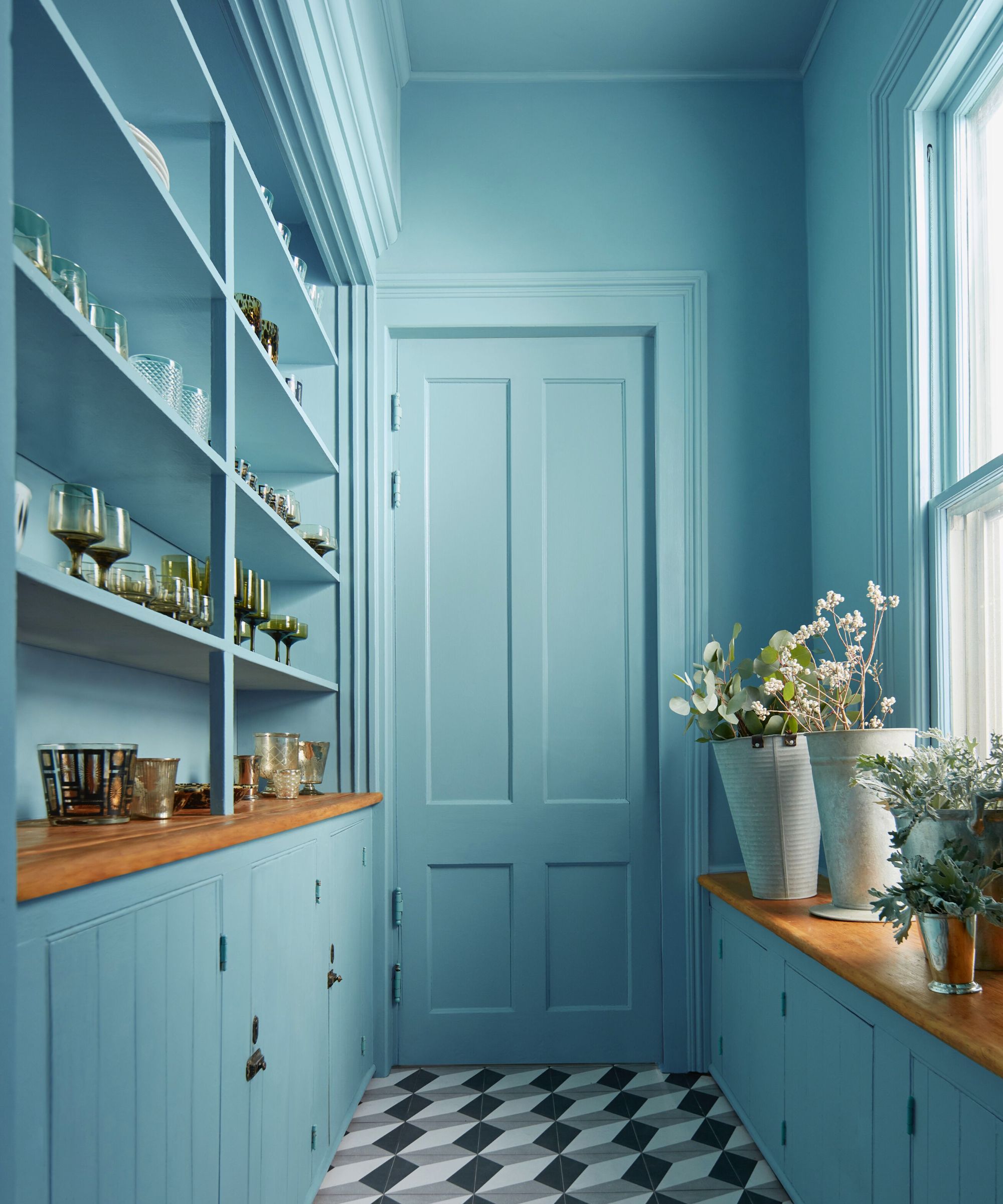
Once colors have been chosen for the main living spaces, Anastasia recommends using bolder and brighter hues in any less frequented rooms that are 'sectioned off and closed or even oddly placed in the layout of a home'.
'Of course, you can absolutely use more saturated hues throughout your home, however, I like to save saturated hues for what I call a pool of color,' says Anastasia.
Otherwise known as color drenching ideas, this would see one color used across the whole room, including across any woodwork and the ceiling in addition to the walls. This technique creates a 'beautiful, envelopment or pool of color,' adds Anastasia.
When choosing a color for your color drenching scheme, you can afford to be slightly more experimental since these are not the main living spaces. Opt for on-trend hues such as mid-tone blue to create an unexpected and playful splash of color.
With any of the paint colors you're considering using in your home's color scheme, Anastasia reminds you to always test them before committing.
'Lighting can vary from room to room in a house, even drastically from one end of the home to the other. So it’s really important to sample the actual paint colors in the room you intend to apply them in,' says Anastasia.

Emily is a freelance interior design writer based in Scotland. Prior to going freelance in the spring of 2025, Emily was Homes & Gardens’ Paint & Color Editor, covering all things color across interiors and home decor for the Homes & Gardens website. Having gained specific expertise in this area, Emily is well-versed in writing about the latest color trends and is passionate about helping homeowners understand the importance of color psychology in home design. Her own interior design style reflects the simplicity of mid-century design and she loves sourcing vintage furniture finds for her tenement flat.
