These are the best color schemes for a guest bedroom, according to paint experts at Farrow & Ball
Embrace delicate neutrals with a pop of color for a guest bedroom

Design expertise in your inbox – from inspiring decorating ideas and beautiful celebrity homes to practical gardening advice and shopping round-ups.
You are now subscribed
Your newsletter sign-up was successful
Want to add more newsletters?
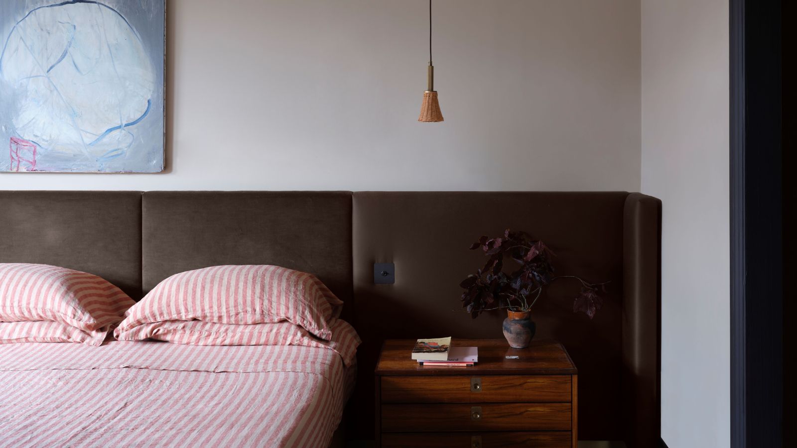
The guest bedroom can often end up overlooked amongst the rest of the home. If it's not a room you need to use often, it's easy to not pay as much attention to it as you would with other rooms. But that doesn't need to be the case, with a great color scheme you can create a cohesive guest bedroom that feels cozy – giving your guests a calming space to stay.
But what are the best paint colors for a guest bedroom? We're turning to Farrow & Ball's color expert Patrick O'Donnell, who suggests three separate schemes to decorate this room. Avoiding anything too bright, these color palettes are delicate and warm, creating a timeless look that you won't tire of.
A post shared by Farrow & Ball (@farrowandball)
A photo posted by on
Scheme One: Layered warm whites
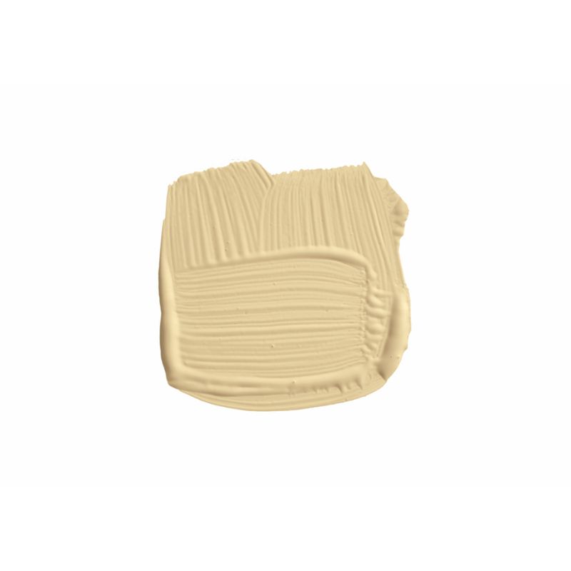
Patrick starts the first scheme with Farrow & Ball's String, a yellow-based neutral, explaining: 'The reason I’m choosing String is not because it’s on trend, but we’re seeing a lot of love coming back for more nostalgic neutrals and off-whites.'
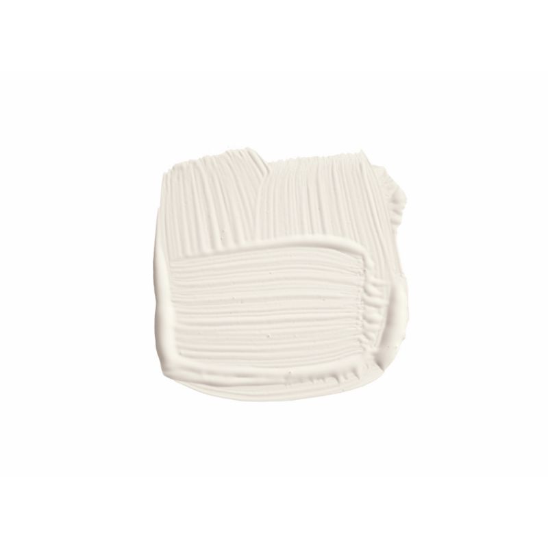
Article continues belowUsing this creamy neutral as a base, Patrick suggests painting the woodwork in White Tie, which he explains has 'just a dose of yellow through it.' For the ceiling color, he continues with the same color family by adding Wimborne White which again has yellow tones to it. By embracing this soft neutral color scheme, you can be more experimental with the rest of the room's decor, as Patrick remarks: 'You can throw anything at that.'

Patrick O’Donnell is Farrow & Ball's color consultant & brand ambassador and has been with the brand since 2012. Patrick works with designers in the UK and North America, helping to bring their projects alive with the iconic, F&B color palette.
Scheme Two: Neutrals with a pop of blue
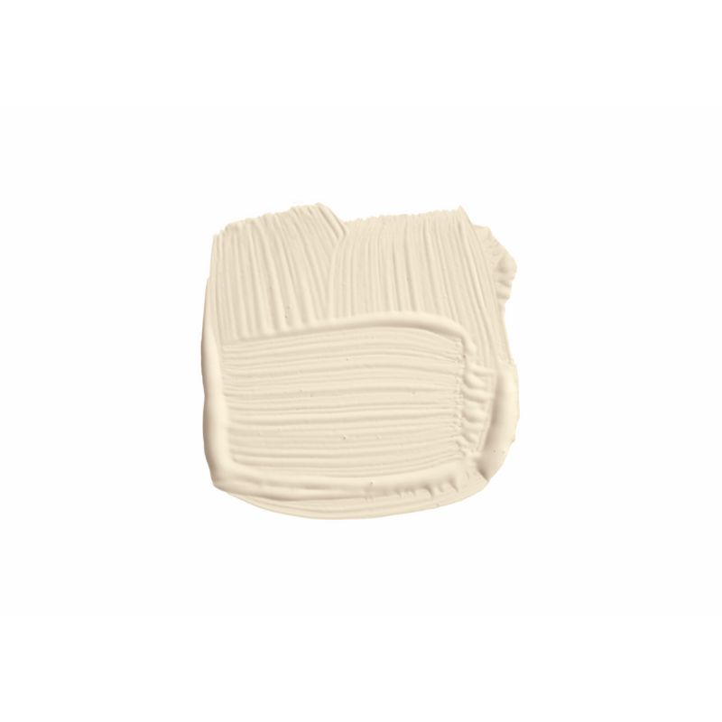
Patrick's second scheme sticks with neutrals as a base but includes decorating with blue for added interest. 'The second scheme is the lovely gentle Bone,' he explains. 'This is really good for a south-facing room, because sometimes in north-facing with not too much light it can feel quite drab.'
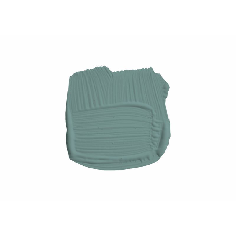
'And then your woodwork here and ceiling color is Slipper Satin. Just very soft, very gentle, nothing too sharp.' Referring to Sugar Bag Light, a muted blue-green, Patrick adds: 'If you’ve got fitted wardrobes in this space bring in a little punch of color, a little bit of fun here. Again, it’s a pretty gentle, pretty lovely scheme to work with.'
Scheme Three: Earthy pink
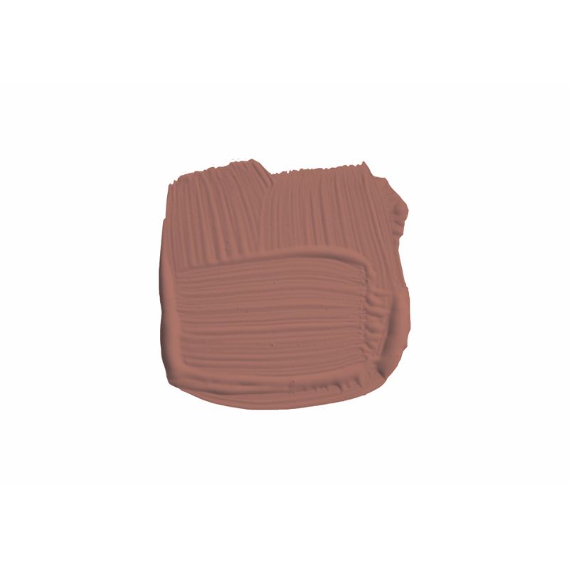
The final Farrow & Ball scheme suggested by Patrick is the boldest, perfect if you love decorating with richer colors. The main color for this look is Porphyry Pink, of which Patrick explains: 'It's more pink than a terracotta, but beautiful for a north-facing room. Not exclusively, but it will deliver just a big bang of warmth to you.'
Design expertise in your inbox – from inspiring decorating ideas and beautiful celebrity homes to practical gardening advice and shopping round-ups.
Opt to use this pink hue by color drenching in Farrow & Ball's Dead Flat finish, including the woodwork and radiators, which Patrick notes would work particularly well in a room with low ceilings. For the ceiling, choose Joa's White to complete the look.
Knowing where to start with color schemes can be difficult, so using these ideas as a reference point will no doubt help you on your way to creating a stylish and restful guest bedroom.

Emily is a freelance interior design writer based in Scotland. Prior to going freelance in the spring of 2025, Emily was Homes & Gardens’ Paint & Color Editor, covering all things color across interiors and home decor for the Homes & Gardens website. Having gained specific expertise in this area, Emily is well-versed in writing about the latest color trends and is passionate about helping homeowners understand the importance of color psychology in home design. Her own interior design style reflects the simplicity of mid-century design and she loves sourcing vintage furniture finds for her tenement flat.
